
All 20 files here are 1664 × 2432 portrait wallpapers. The set ranges from pale lavender and soft gradients to darker purple and more distorted, trippy designs.
For a Home Screen, the quieter pastel images are the easiest to read behind. The darker and more textured wallpapers make better Lock Screens, where they can carry more detail without competing with a full grid of icons. These are high-resolution phone backgrounds, not native 4K files.
Open the full-size image before saving it and check the crop on your own screen. For related palettes, browse the broader aesthetic, pastel and black aesthetic wallpaper pages.
Choose a purple wallpaper by screen use
| Style | Usually works best on | Why |
|---|---|---|
| Soft lavender / pastel | Home Screen | Lower contrast is easier behind app icons and labels. |
| Dark purple | Lock Screen or simple Home Screen | Strong contrast looks dramatic but can compete with widgets. |
| Trippy / textured | Lock Screen | The artwork has more room to be visible without a full icon grid. |
| Clean purple composition | Either | Works well when the main detail stays clear of the clock and dock. |
Free purple aesthetic phone wallpapers
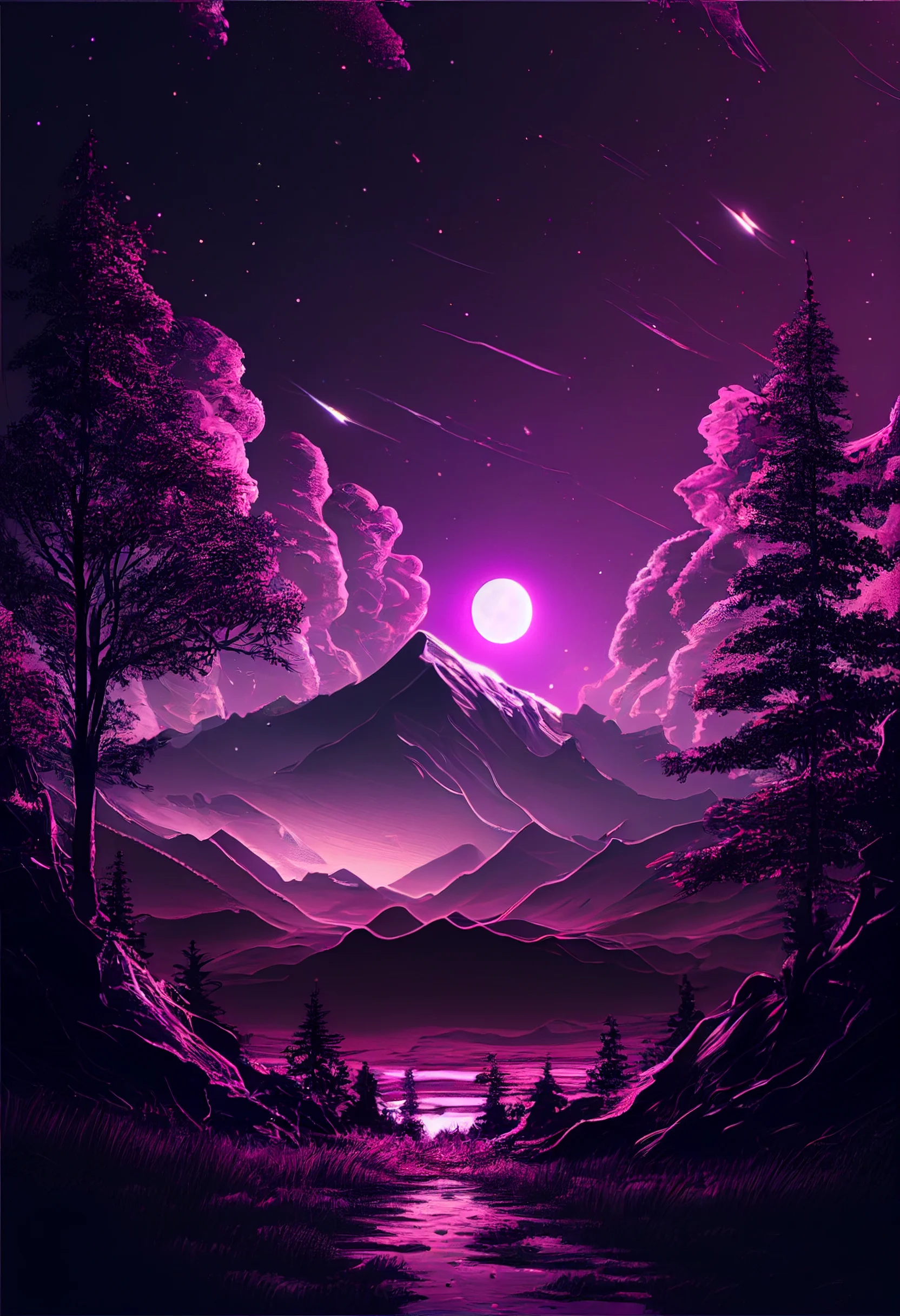
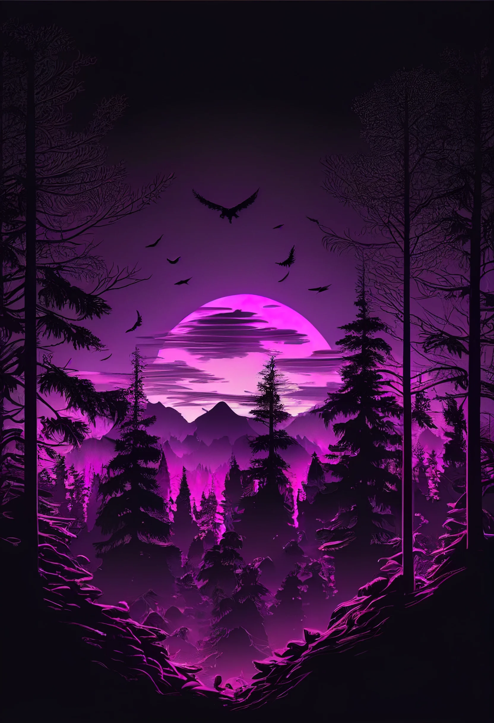
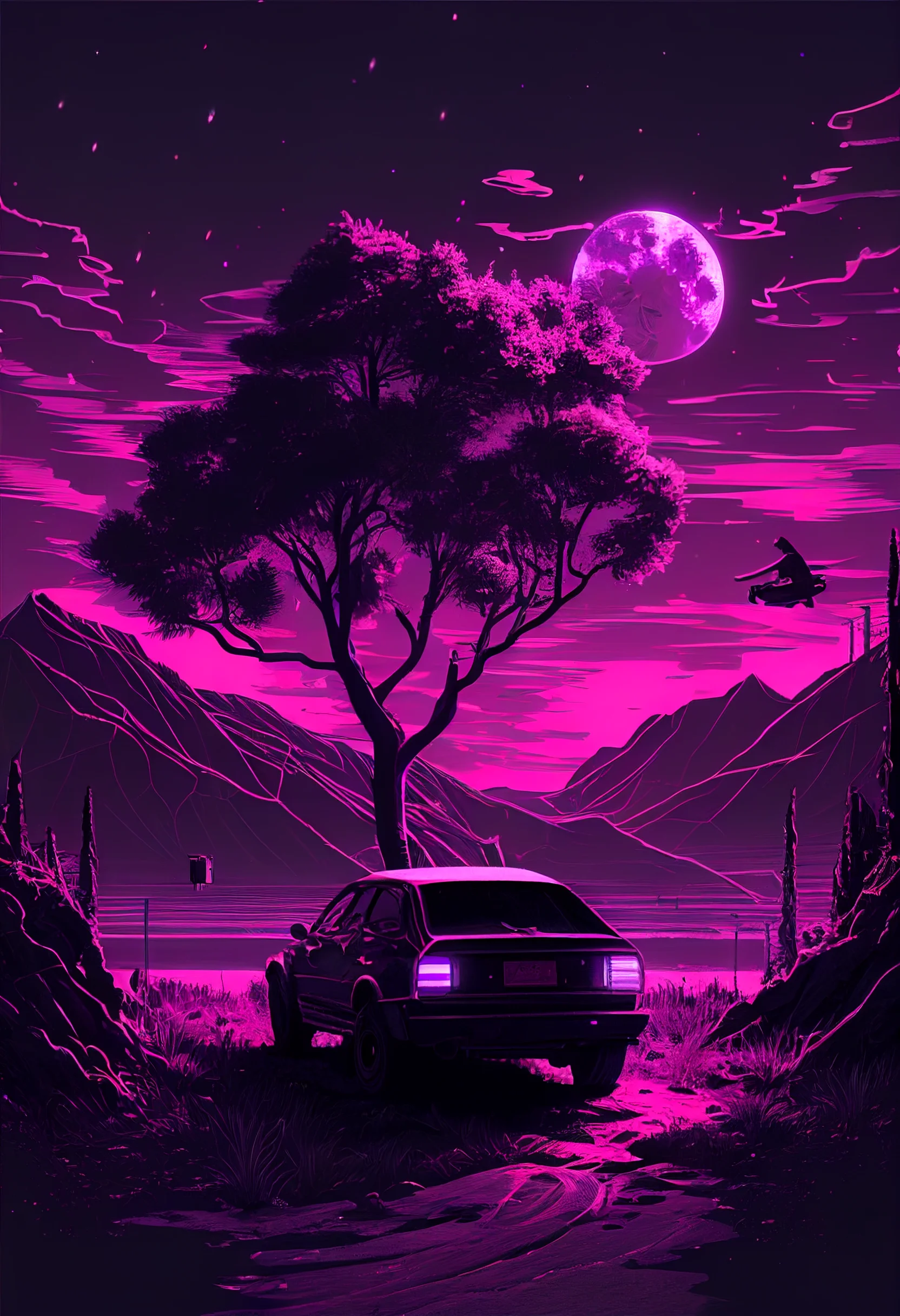
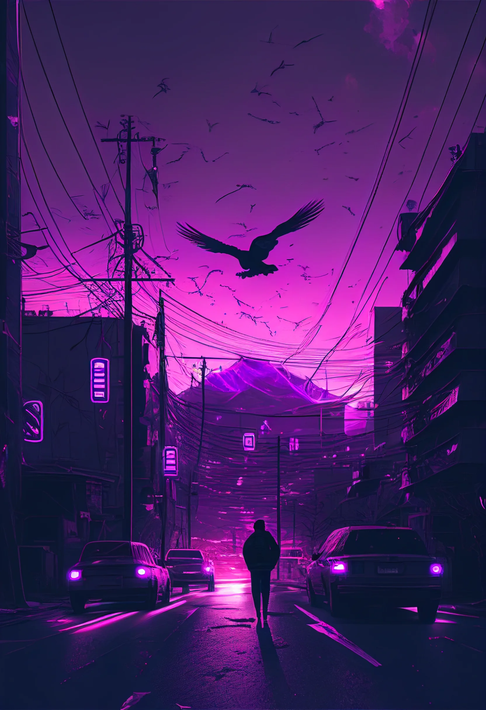
First group: the pastel and softer images are the safest Home Screen choices. If app labels disappear, use the lighter wallpaper with the least texture rather than increasing contrast through phone settings.
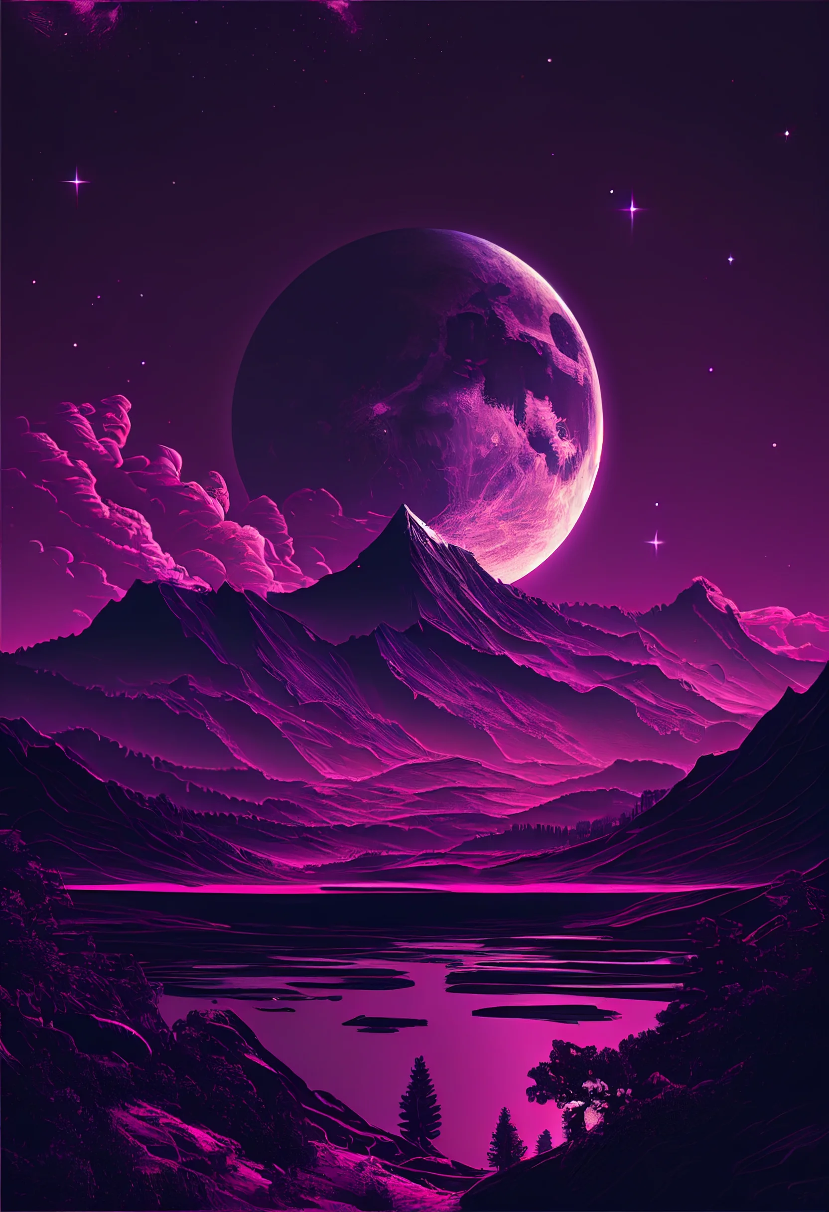
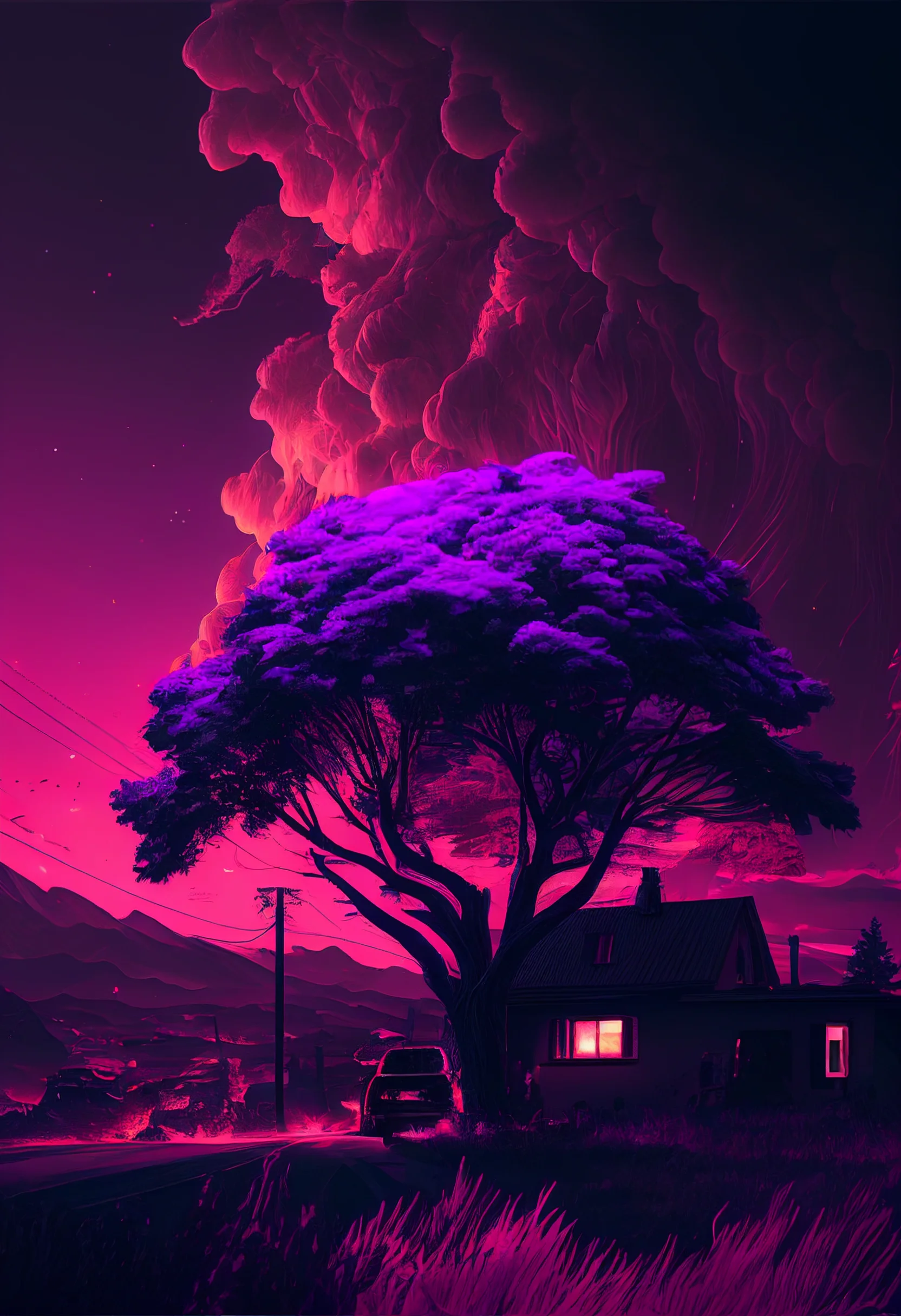
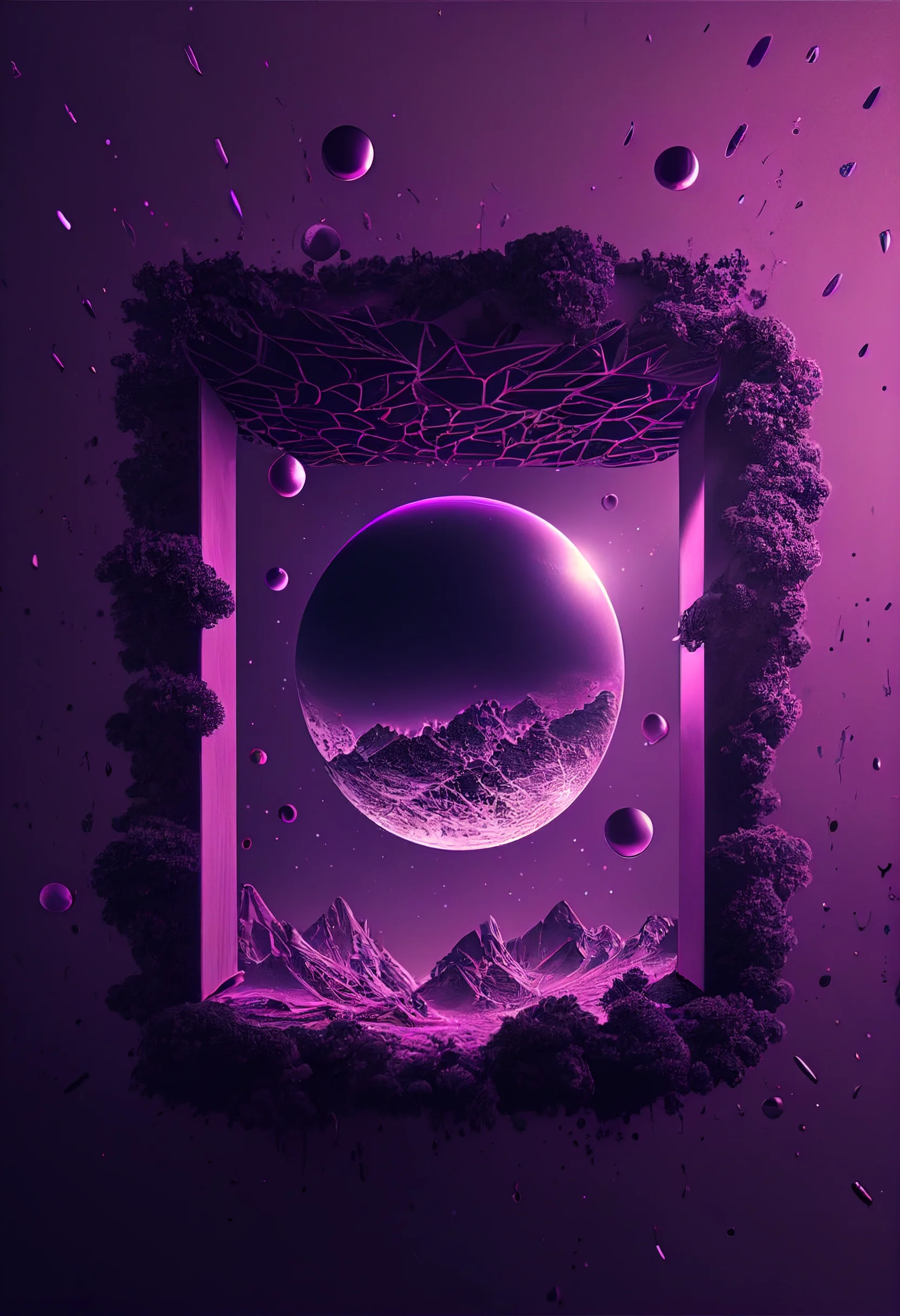
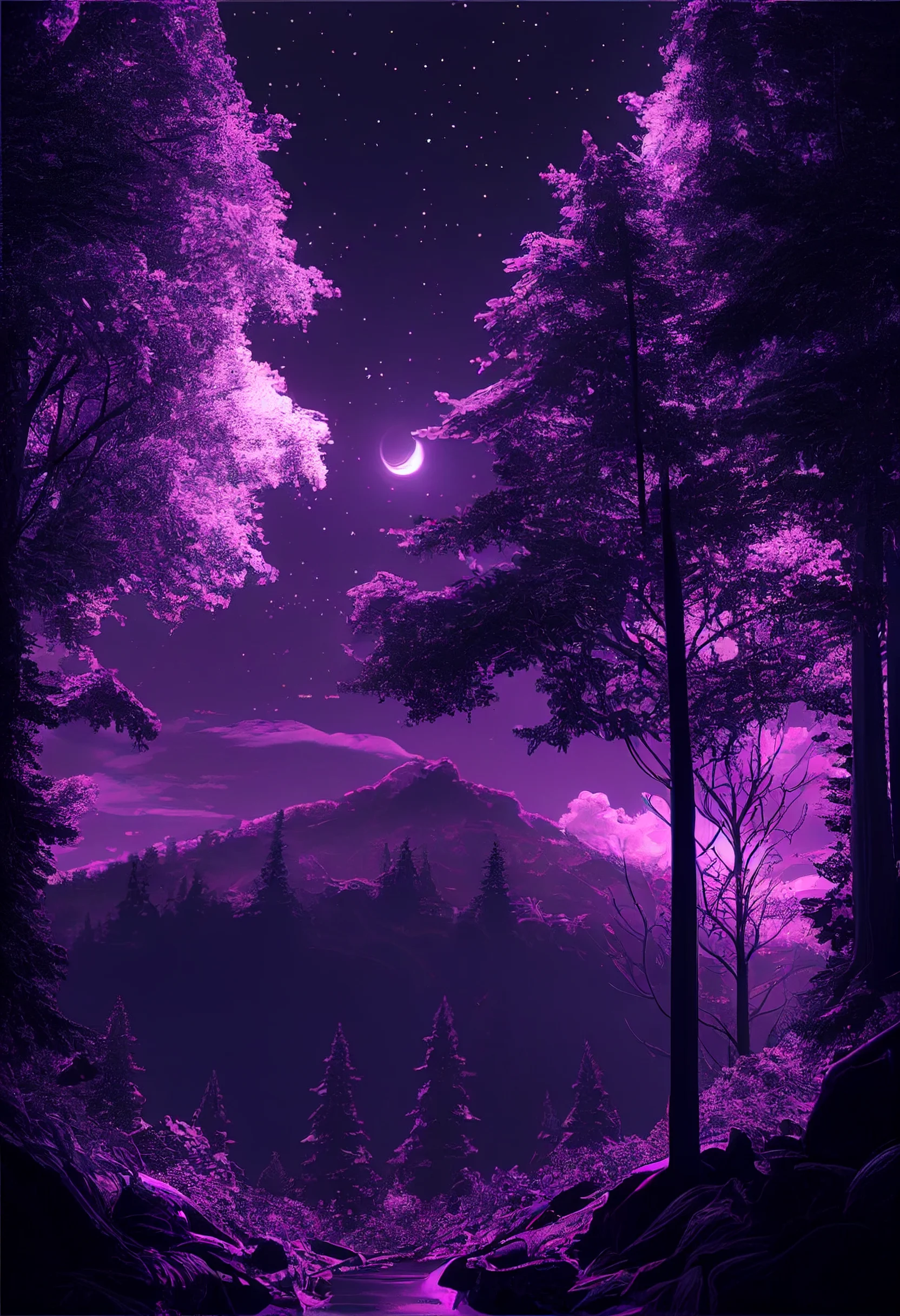
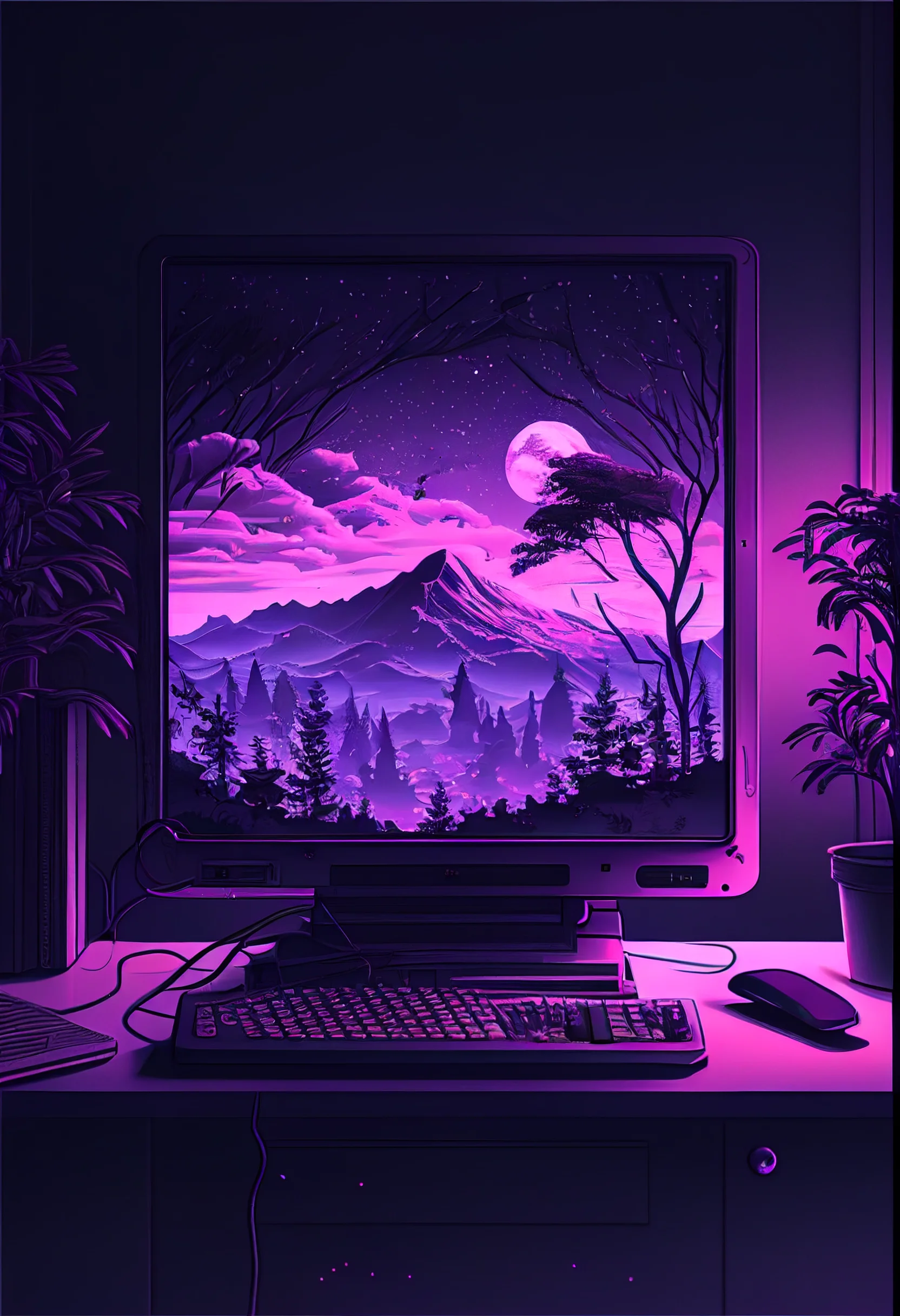
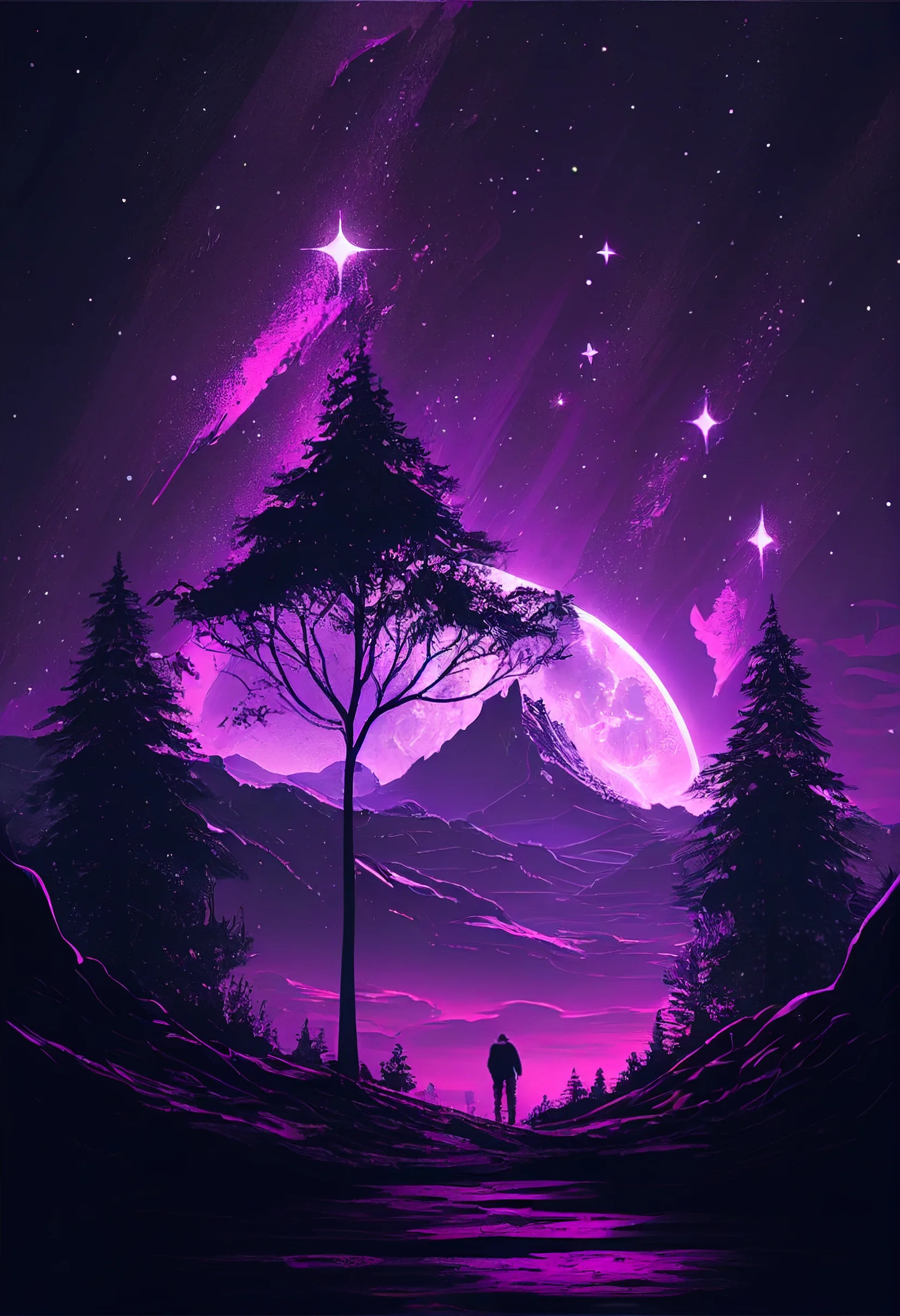
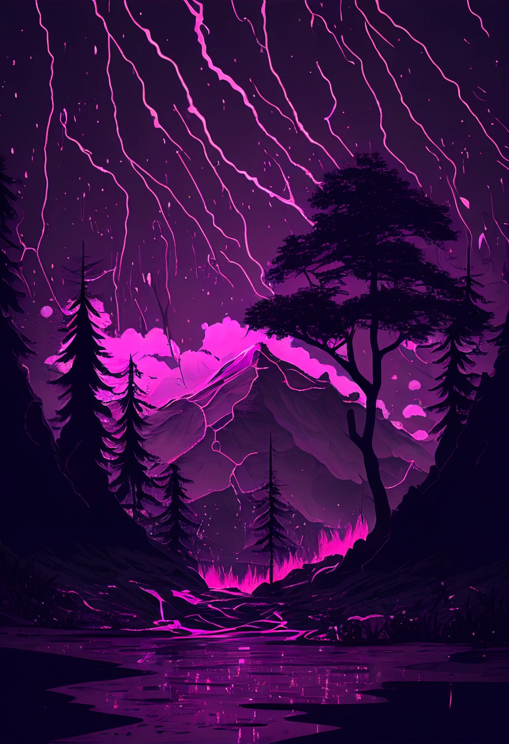
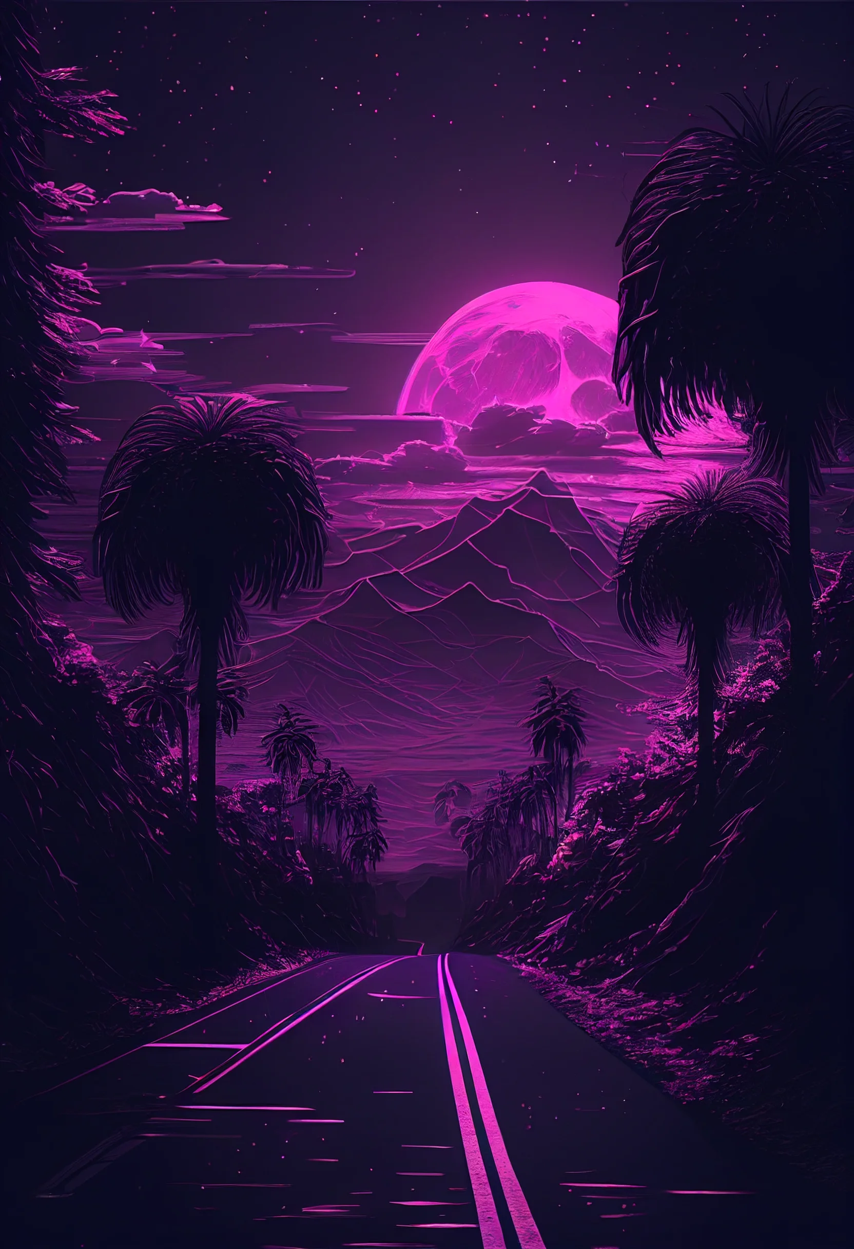
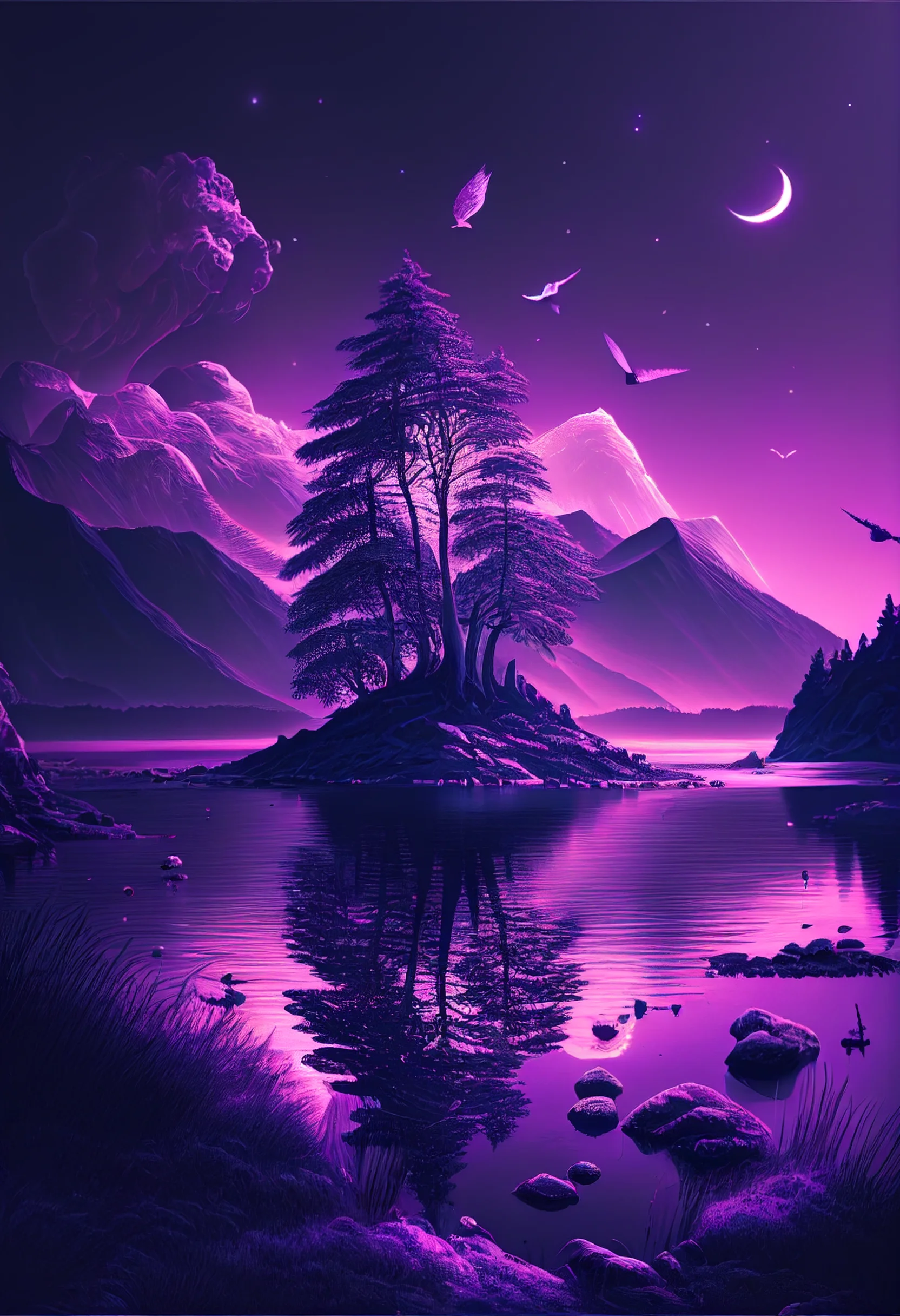
Dark-purple group: these are useful if you want the clock or light-colored interface elements to stand out. On a Home Screen, check whether dark app icons disappear into the image; if they do, use the darker design on the Lock Screen instead.
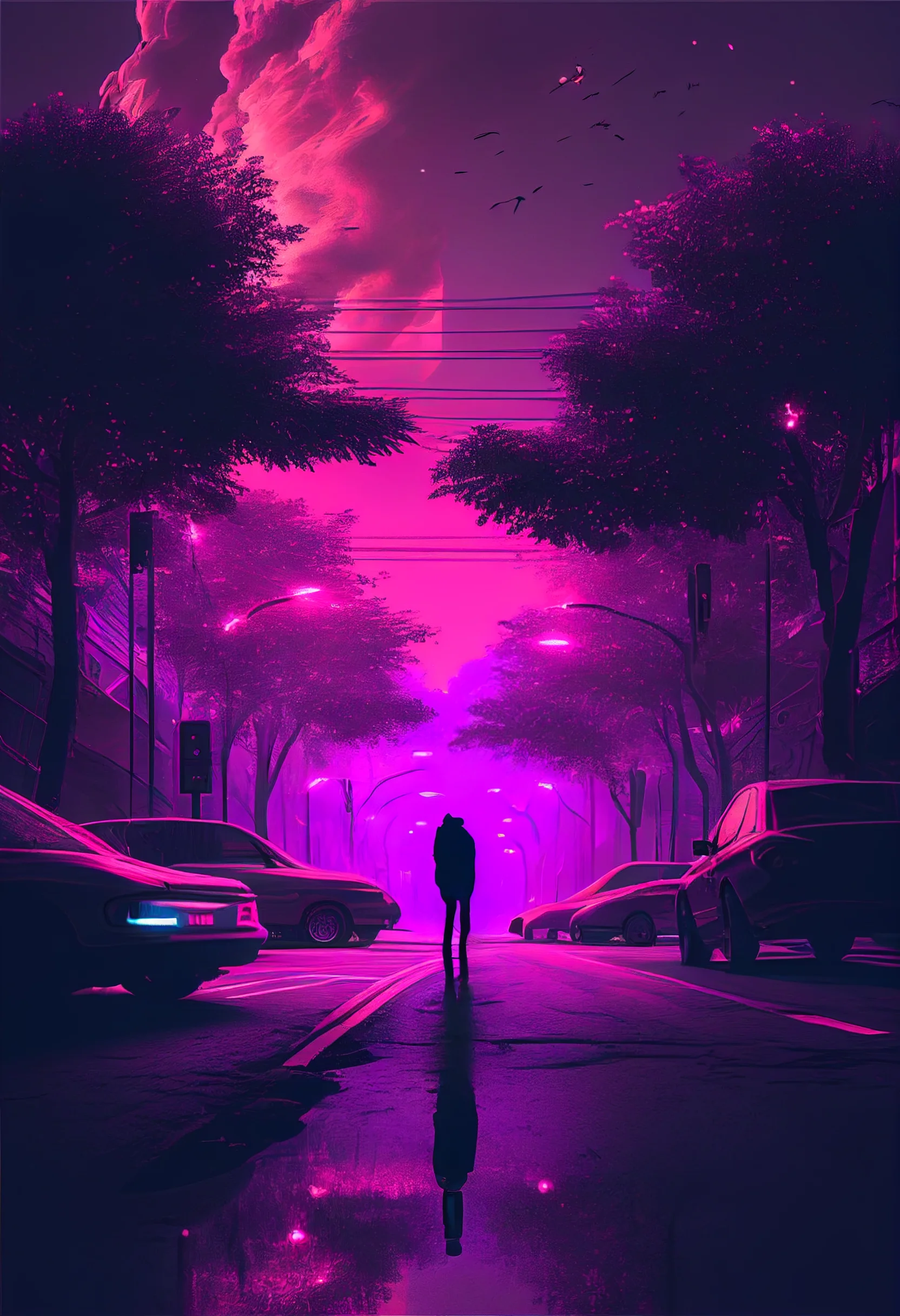
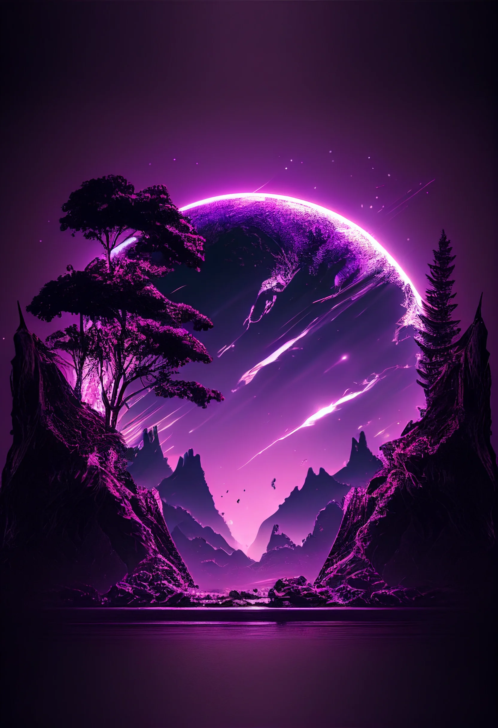
Cute and pastel options: these are good candidates for a coordinated Home Screen. If you use widgets, place them over the quietest part of the image rather than directly over the main decorative detail.
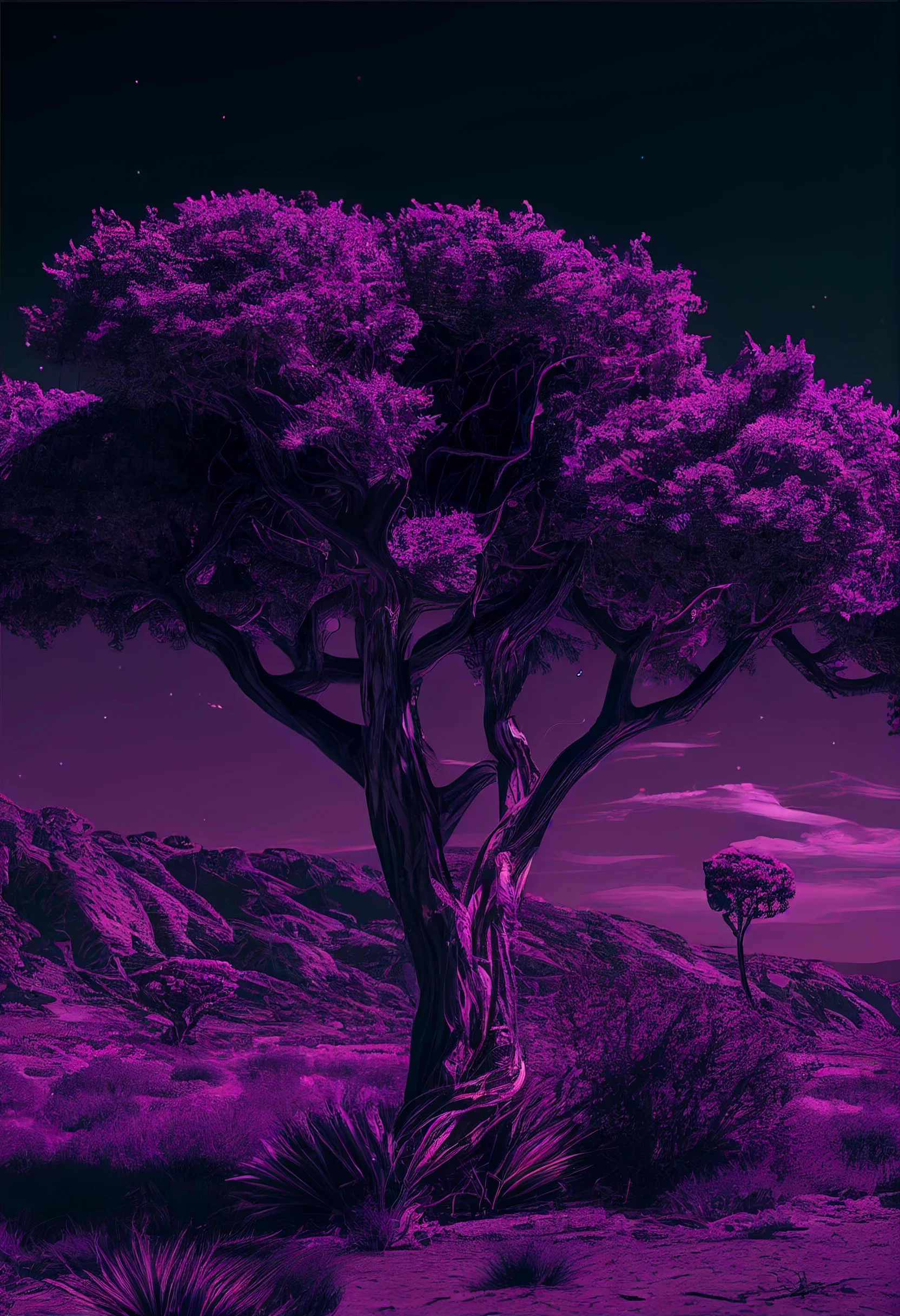
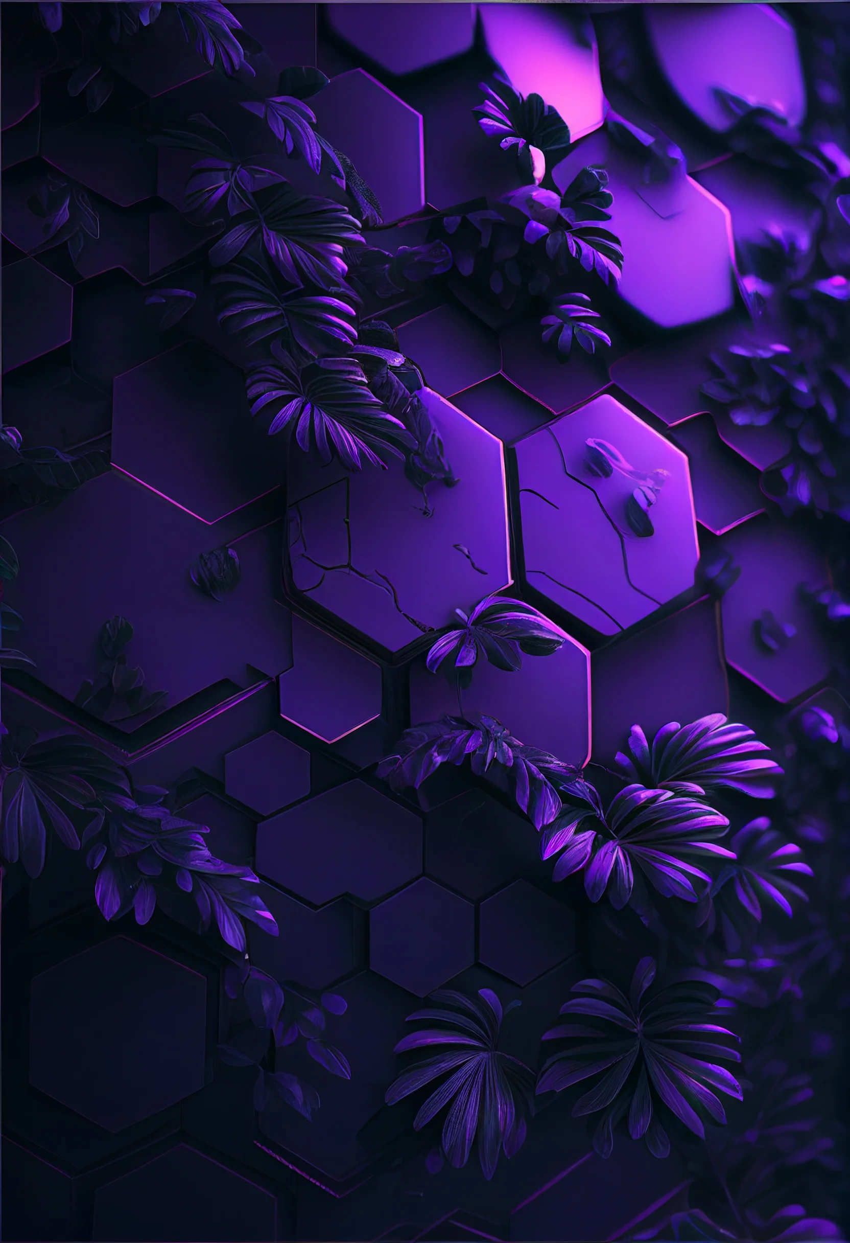
Trippy purple pair: let these stay visually busy. They are stronger Lock Screen choices because you can see more of the artwork there; behind several rows of apps, the same texture may make the screen harder to scan.
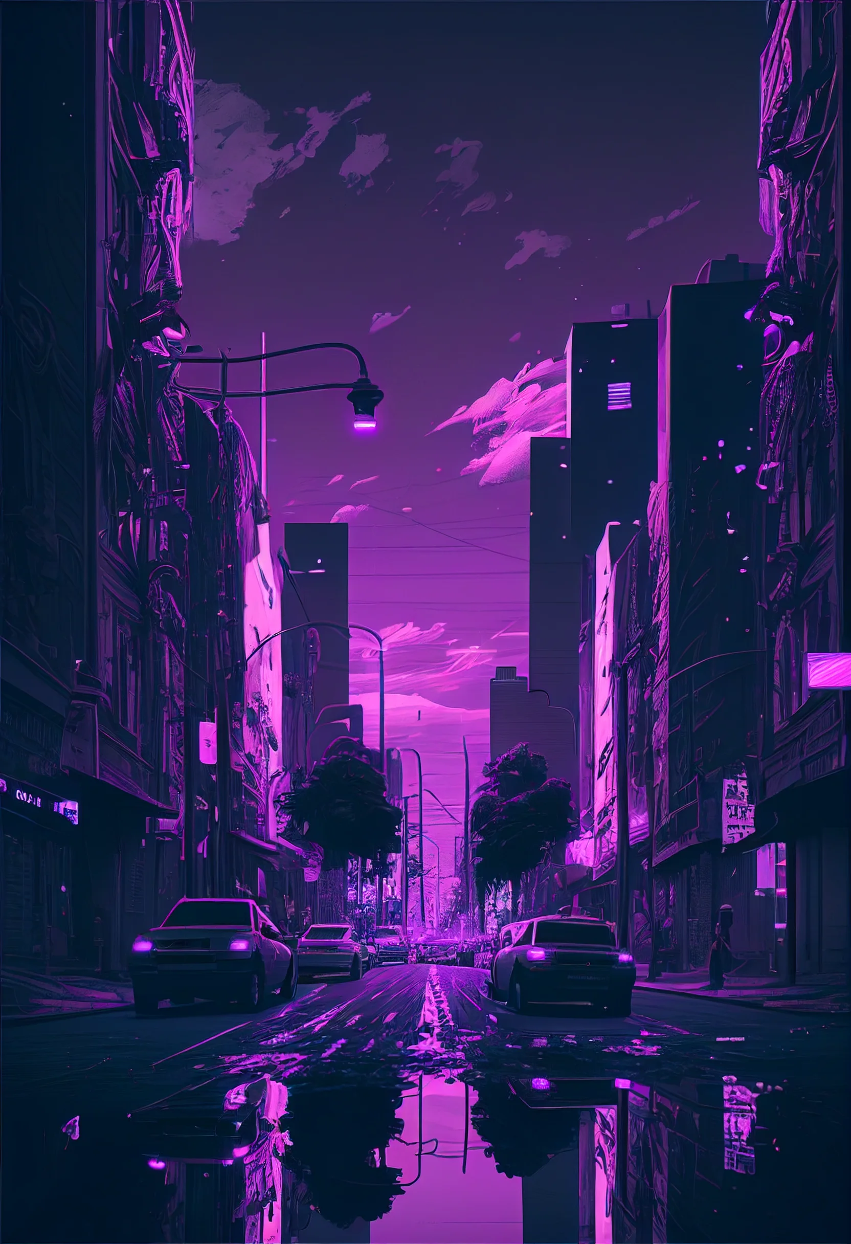
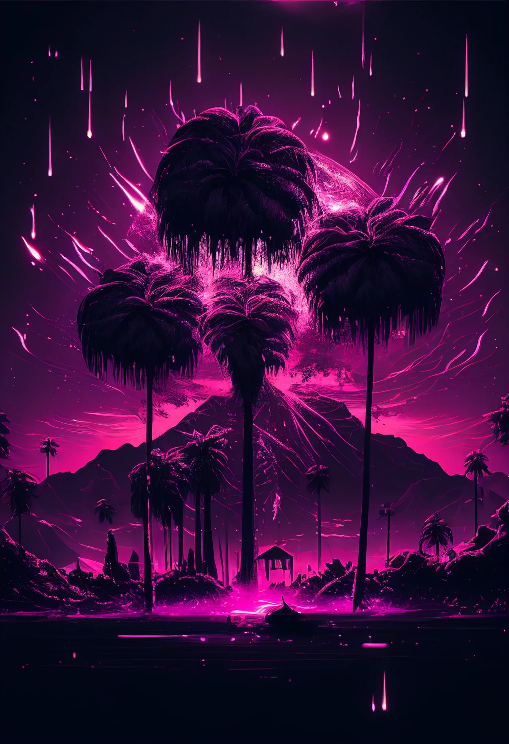
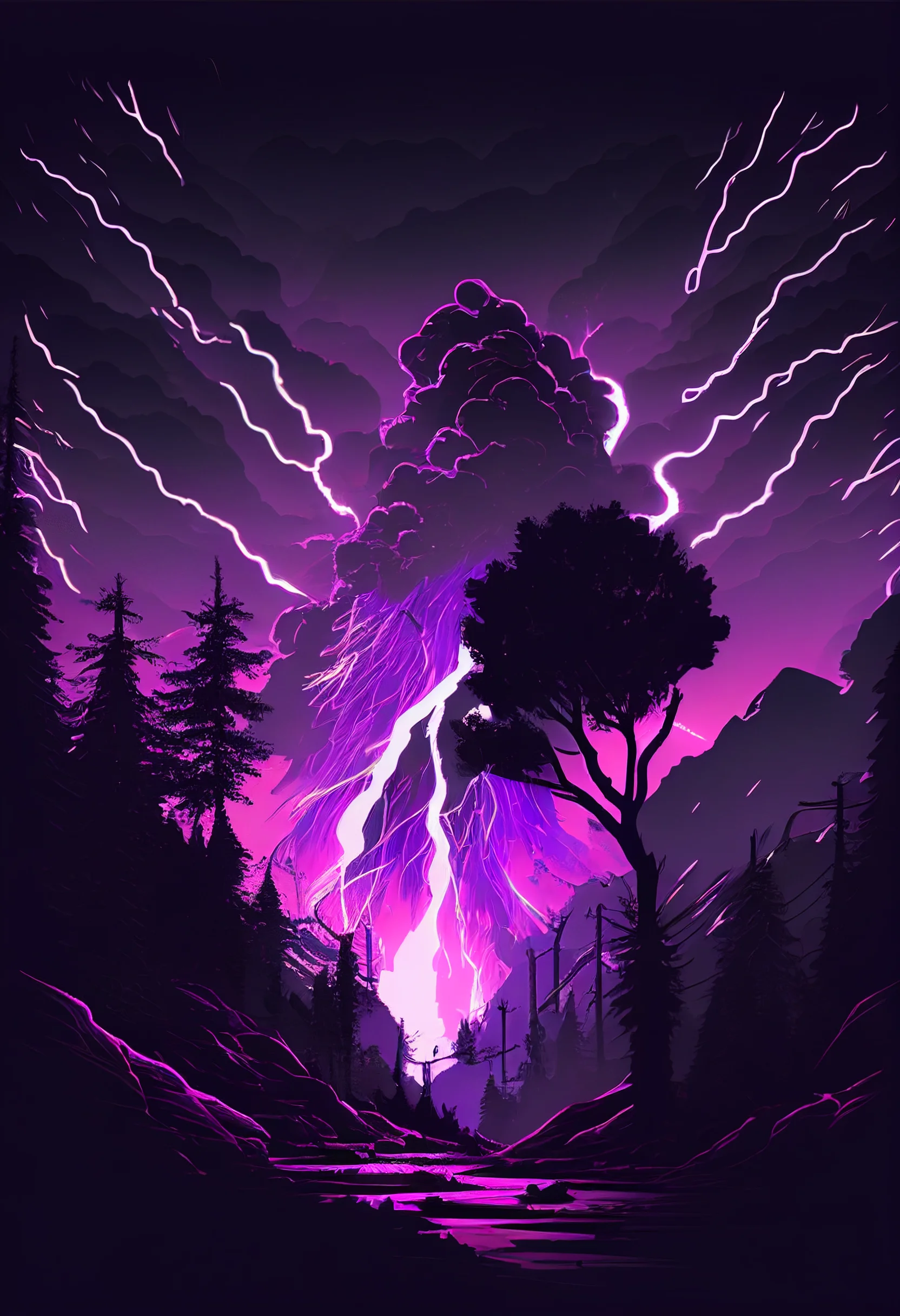
Simple rule: if the wallpaper has a lot of texture, use it where the screen has less interface clutter. If it is mostly soft color and empty space, it will usually sit more comfortably behind apps and widgets.


I’m sure these backgrounds are gonna be nice fit for my phone
Beautiful pictures! It should be on my lockscreen!