
Eighteen pastel iPhone wallpapers in blue, pink, purple, muted and vintage-leaning styles. Some are quiet enough for a busy Home Screen; others work better on the Lock Screen where the artwork has more room. Tap any image to open the full-size wallpaper.
Jump to: pastel collection · pink, purple & vintage · setup notes
Pastel wallpapers — 1–12

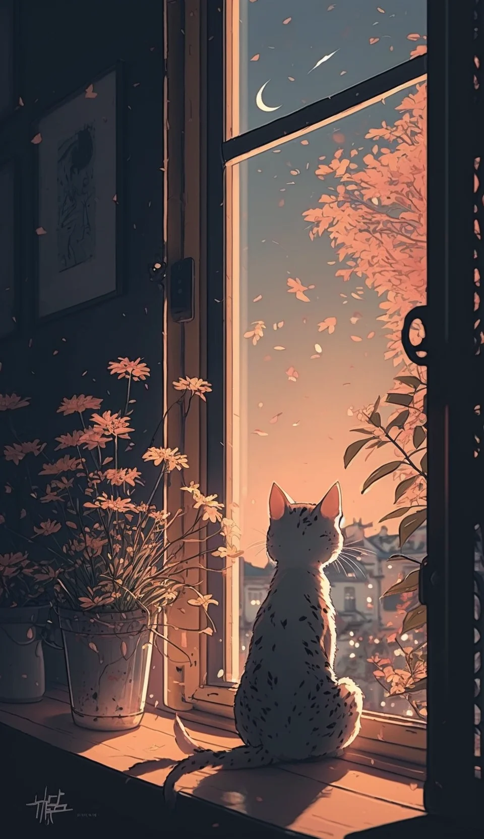
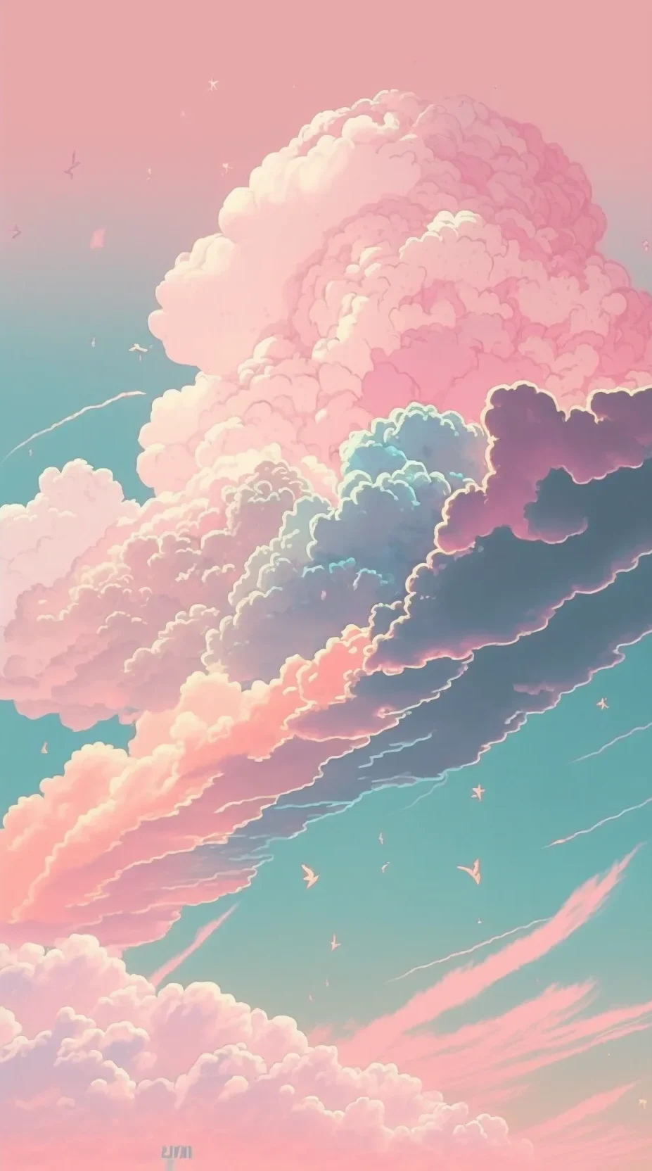
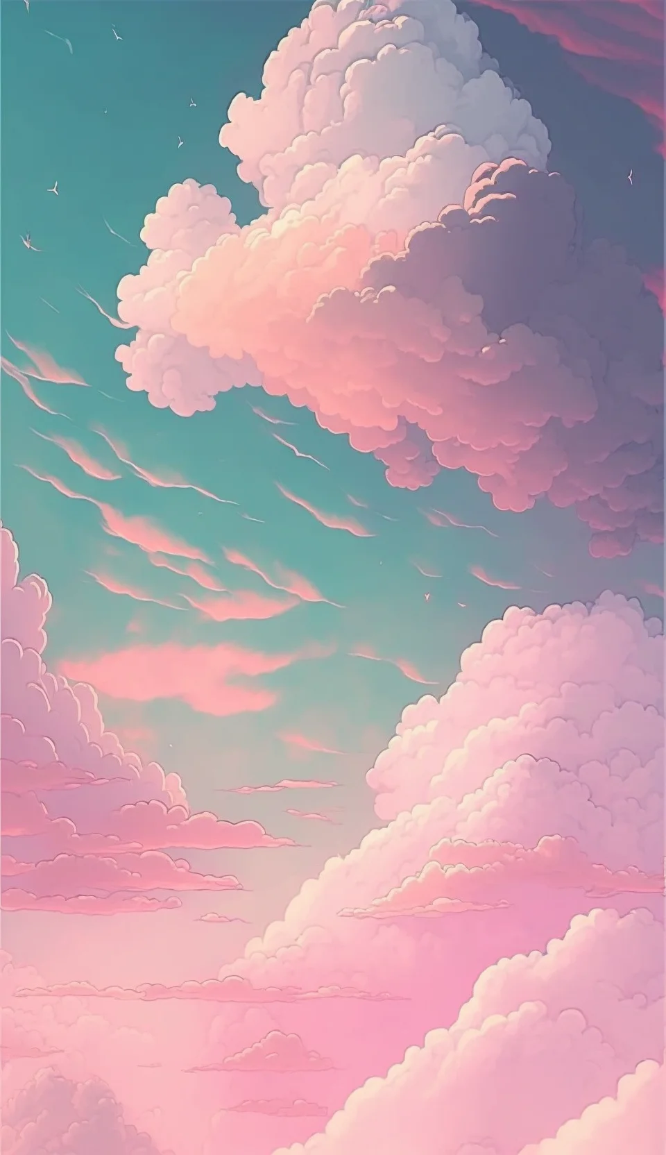
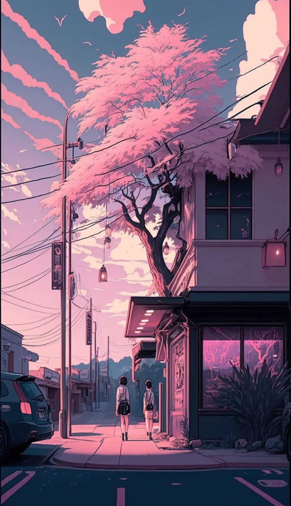
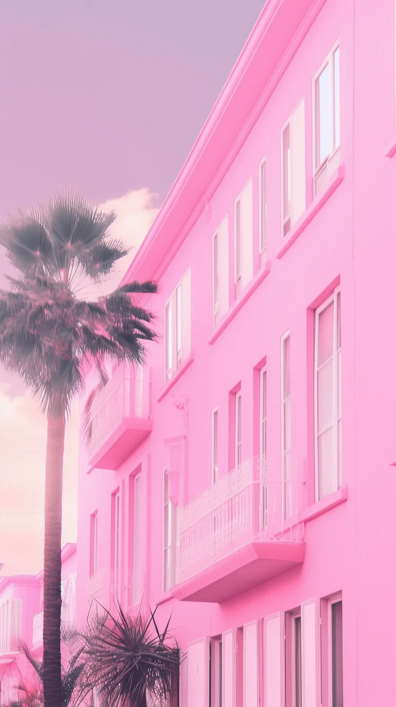

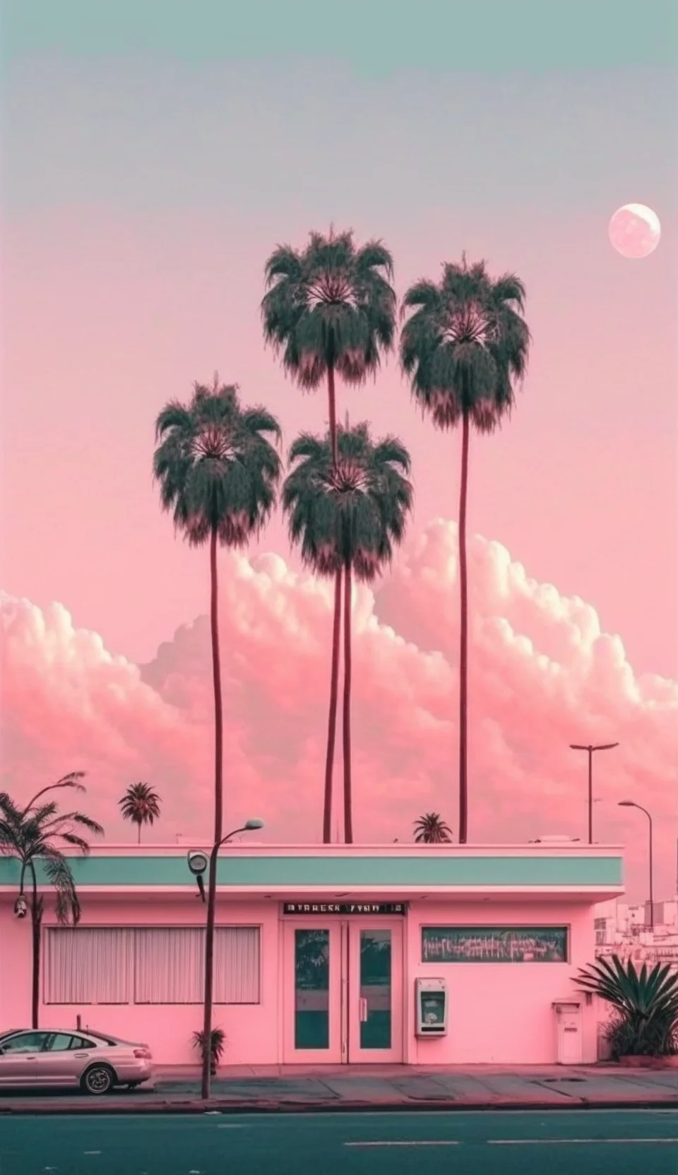
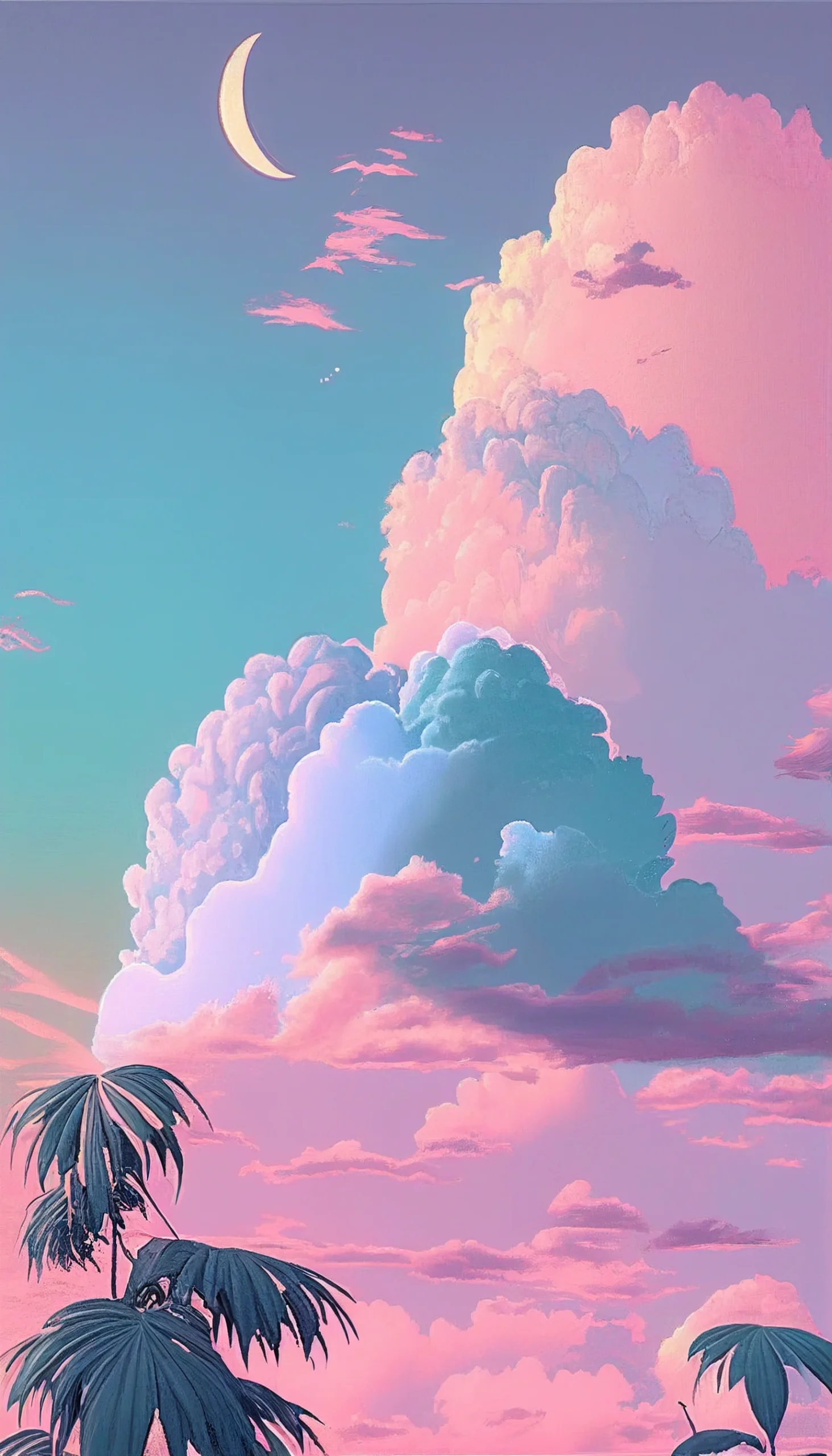
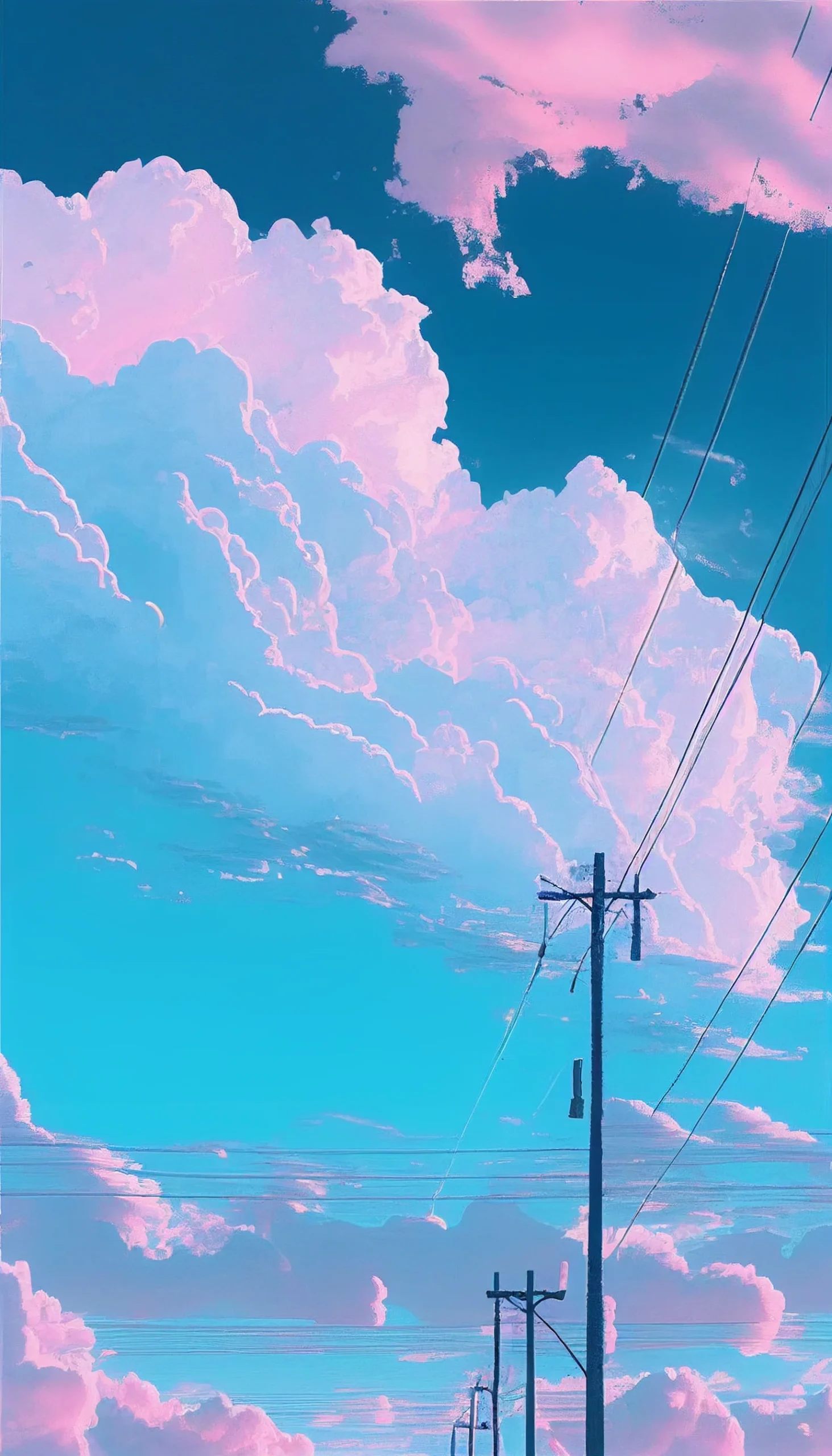
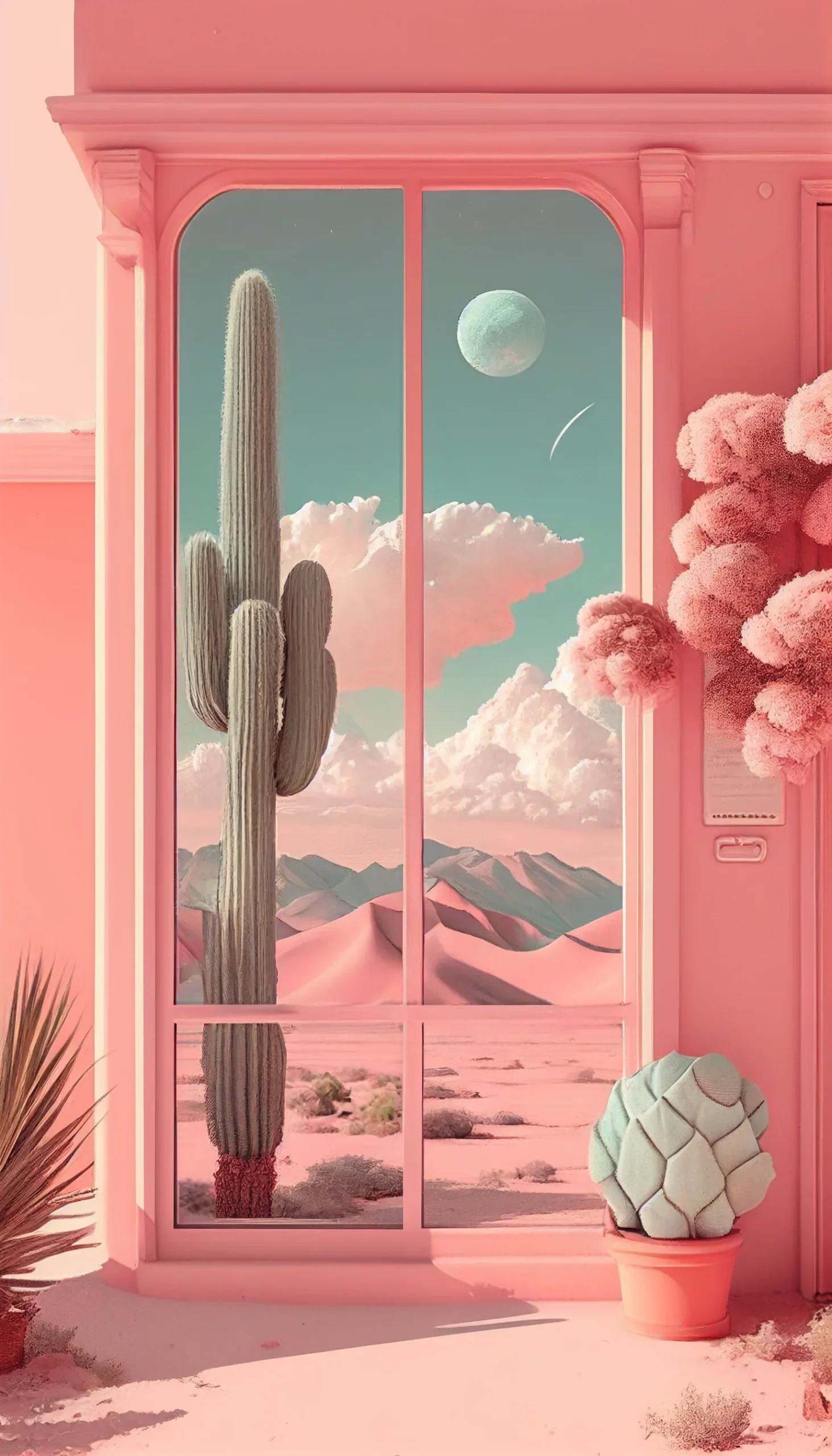
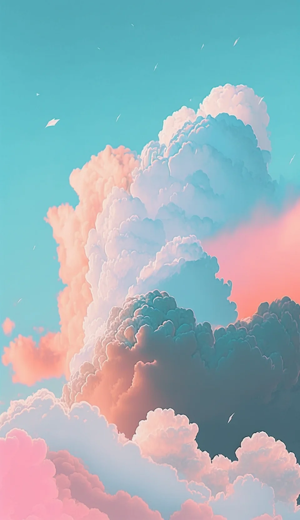
Pink, purple and vintage pastels — 13–18
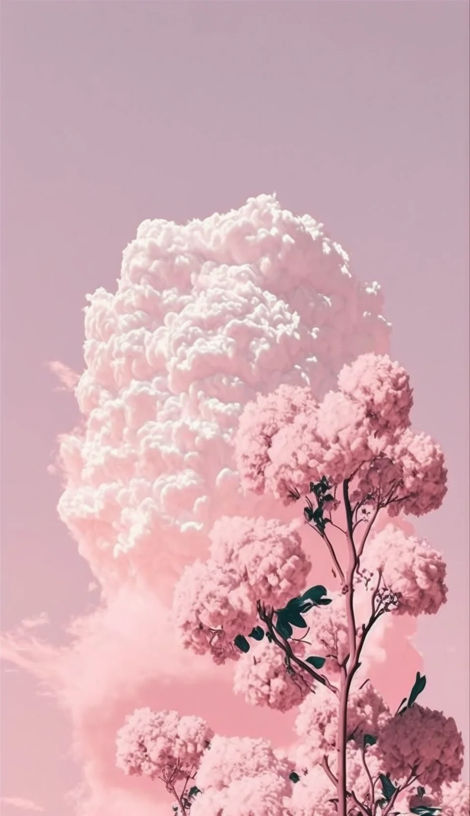

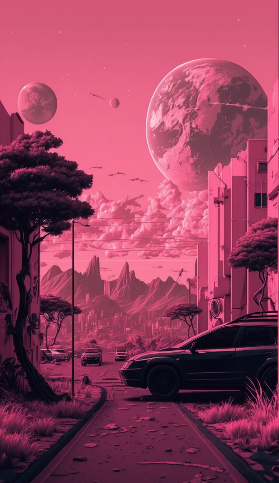
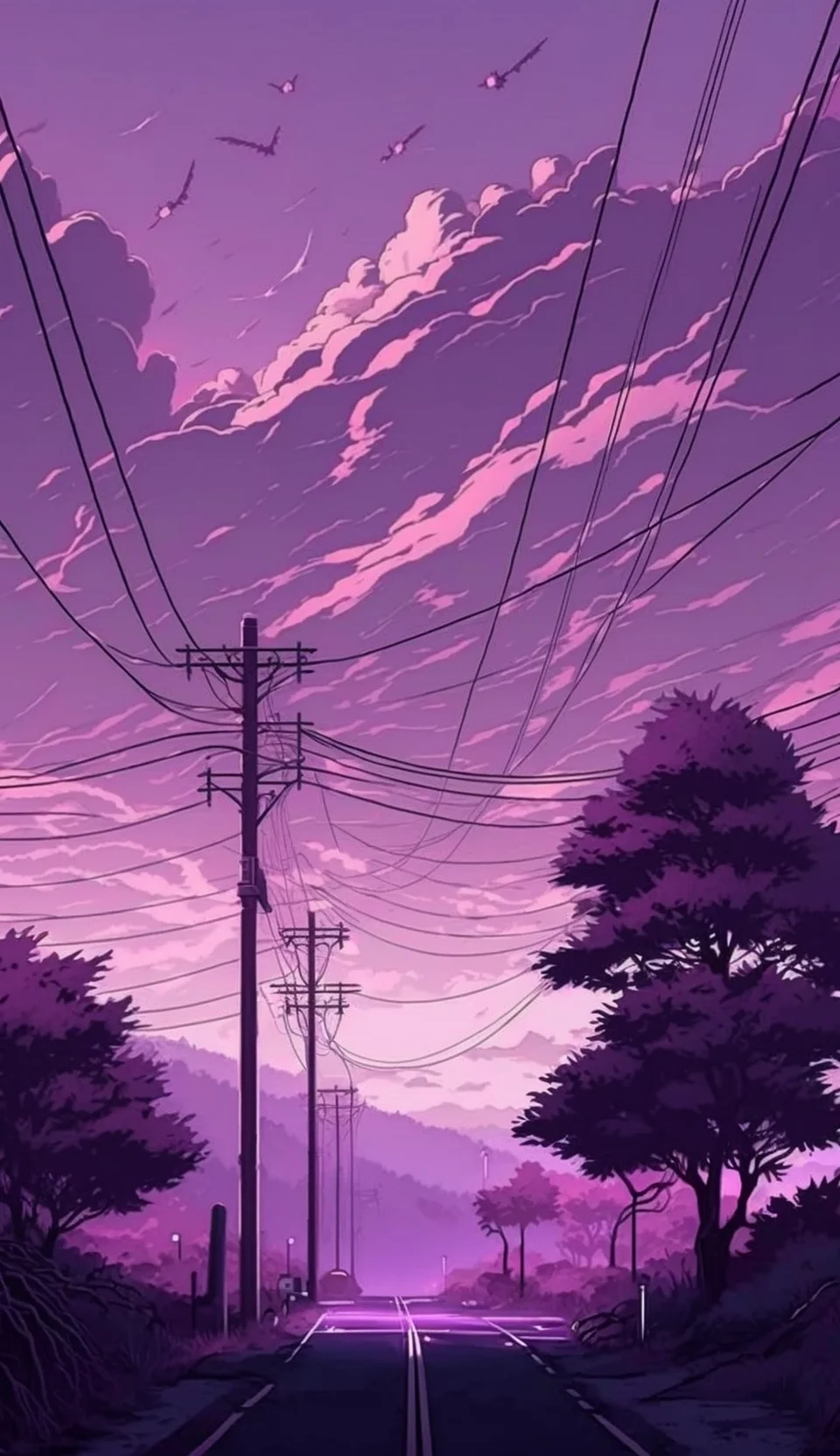
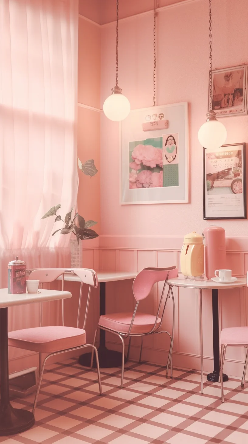
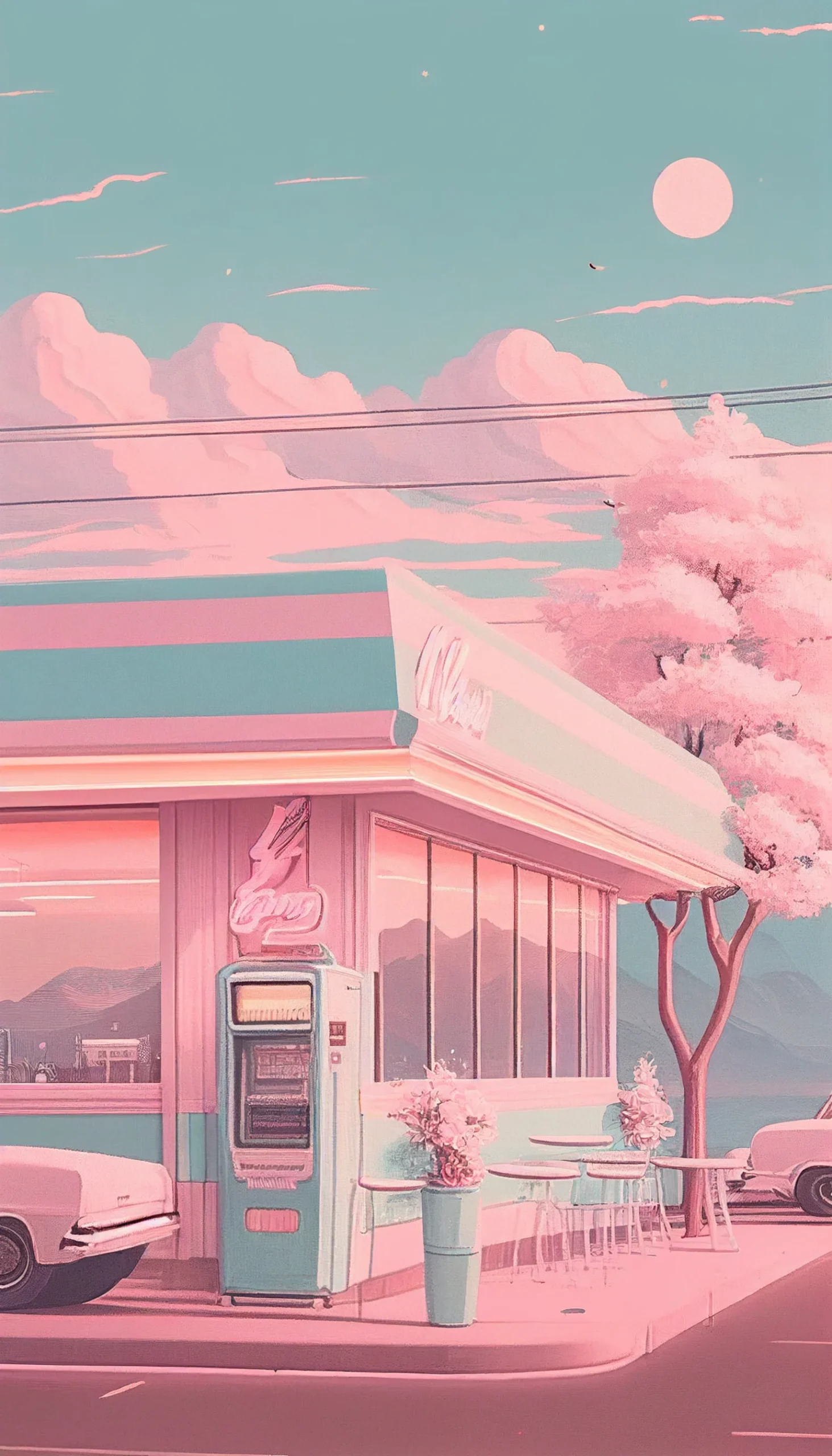
How to save and use a pastel iPhone wallpaper
- Open the full-size image. Tap the wallpaper you want above instead of saving the smaller image shown inside the article.
- Save it to Photos. Touch and hold the full-size image, then choose the option to save it to your photo library.
- Preview the crop. When setting the wallpaper, reposition or scale it so the focal point is not hidden behind the clock, widgets or screen edges.
- Choose Lock Screen, Home Screen or both. Detailed pastel artwork often works best on the Lock Screen; simpler, lower-contrast designs keep Home Screen icons easier to read.
- Check the finished screen. If text or icons disappear into the image, try another crop or choose a quieter wallpaper from the collection.
Choosing a pastel wallpaper for your iPhone
Pastel color alone does not determine whether a wallpaper works well on a phone. Pay attention to where the visual detail sits. A design with open space near the top is usually easier to use as an iPhone Lock Screen because the clock remains readable. For the Home Screen, look for softer contrast and fewer small details behind app icons.
- Blue and muted pastels: a good choice when you want a calm background that does not compete heavily with icons.
- Pink and purple pastels: useful for a brighter, sweeter aesthetic while still staying softer than saturated neon colors.
- Vintage pastels: suit warmer, faded or nostalgic setups and pair naturally with neutral widgets.
- Illustrated or anime-style designs: usually work better on the Lock Screen, where more of the artwork remains visible.
Do a 60-second screen test before keeping one
A pastel wallpaper can look clean in the gallery and still become awkward once iOS places the clock, widgets and icons over it. Test your favorite on the actual screen before deciding. First, lock the phone and check whether the clock is readable without staring at it. Then unlock it and scan the app labels on the busiest Home Screen page. Finally, open Notification Center so you can see whether cards cover the main subject or text in the artwork.
- Check the top third: faces, quotes and small focal details should not sit directly behind the Lock Screen clock.
- Check icon contrast: if several app labels disappear, try a different crop before abandoning the image.
- Check the edges: make sure zooming has not cut off a face, flower, moon or other obvious focal point.
- Check it at normal brightness: very pale wallpapers can feel washed out when the display is bright, while muted designs may become too dim at night.
Fix common pastel wallpaper problems
| Problem | What to try |
|---|---|
| The clock gets lost | Choose an image with quieter space at the top, or reposition the crop so the busiest detail sits lower. |
| App icons look messy | Use the detailed image on the Lock Screen and pair it with a simpler wallpaper from the same color family on the Home Screen. |
| The image looks soft | Open the linked full-size file before saving; do not save a screenshot of the article preview. |
| The crop feels cramped | Reduce zoom where iOS allows it, or choose one of the taller 1463 × 2560 files with more room for repositioning. |
For a cohesive pair, do not try to match every object or motif. Match the temperature instead: dusty blue with lavender, blush with warm cream, or faded purple with cool gray. That keeps the two screens related without making the Home Screen as visually busy as the Lock Screen.
Pastel iPhone wallpaper FAQ
How do I get the highest-resolution version?
Tap the wallpaper first to open its full-size file, then save that version. This avoids relying on the smaller in-page preview.
Will these wallpapers fit every iPhone?
The images are portrait-oriented for phones, but iPhone models use different screen proportions. Preview the crop before applying a wallpaper and leave important details away from the extreme edges.
Should my Lock Screen and Home Screen match?
They do not have to be identical. A useful approach is to choose two images from the same pastel color family: use the more detailed one for the Lock Screen and the simpler one behind your apps.
For more styles, browse the aesthetic iPhone wallpaper collection, explore the broader aesthetic wallpaper collection, or switch to a darker look with the black aesthetic wallpapers.

