
This is the broad summer hub: 29 printable sheets mixing beach scenes, kawaii designs, ice cream, simple seasonal pages and a few more detailed options for older colorists. It is deliberately broader than our beach-only collections.
Choose by detail level. Large, simple shapes work well with crayons or broad markers; pages with smaller scenery are easier with colored pencils. The gallery includes both landscape and portrait designs, so check the print preview before choosing orientation.
Choose the summer collection that fits
| Collection | Best for |
|---|---|
| 24 easy summer pages for preschoolers | Wide sheets, large open shapes and simpler coloring |
| 19 beach coloring pages for kids | Mostly portrait beach scenes with sand, sea and summer activities |
| 22 summer beach pages for adults | A larger mixed set with more scenery and detail |
| 16 tropical beach pages for adults | Wide landscape scenes focused on tropical and realistic beaches |
29 summer coloring pages
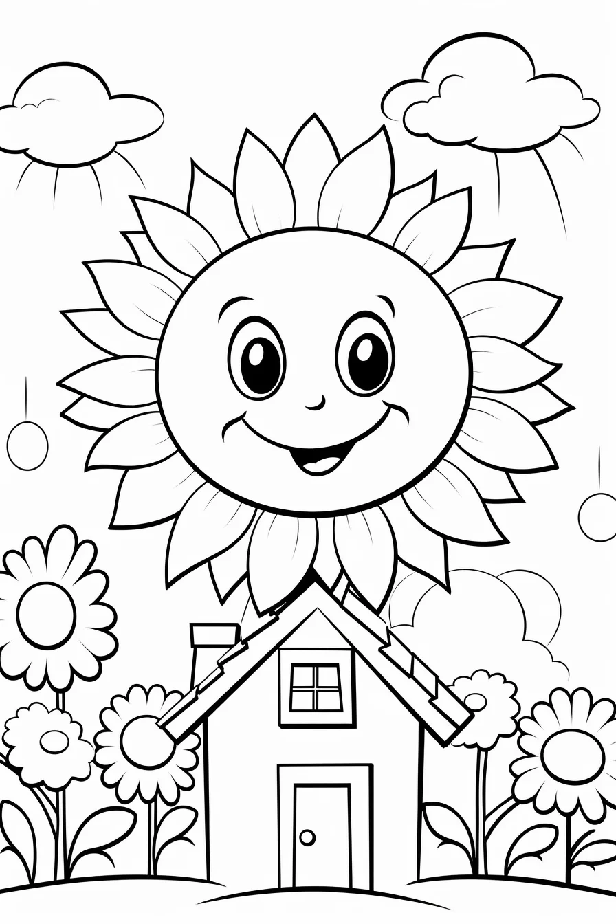
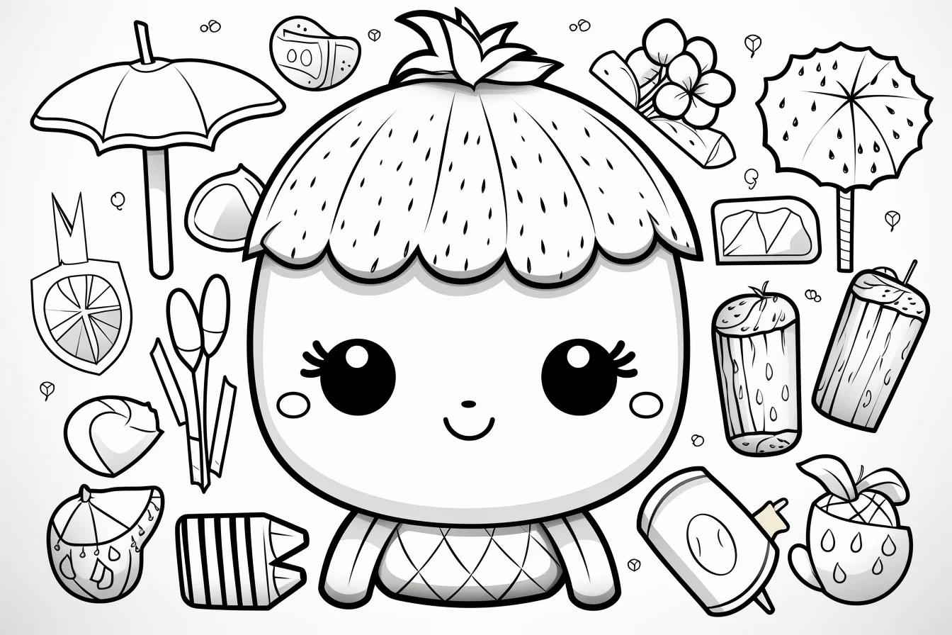
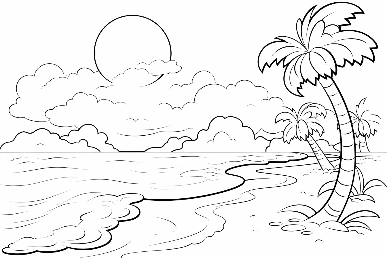
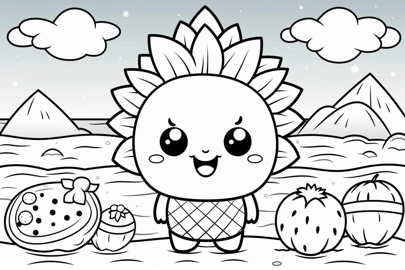
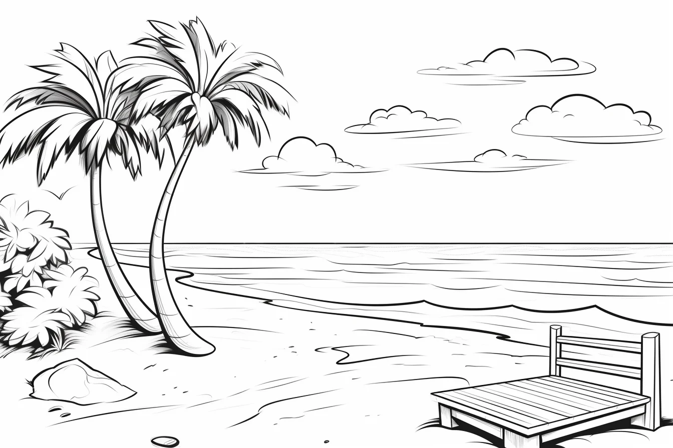
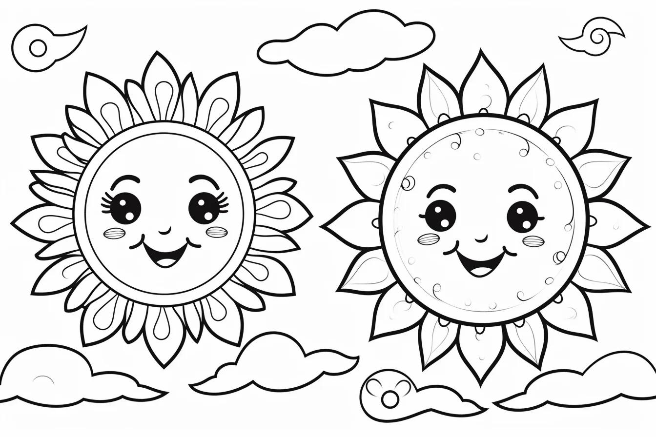
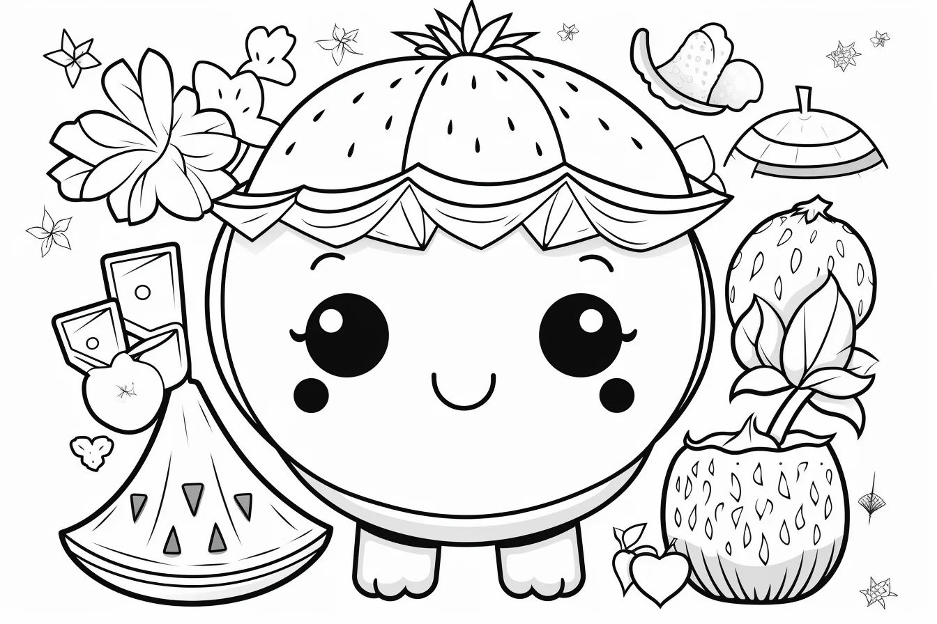
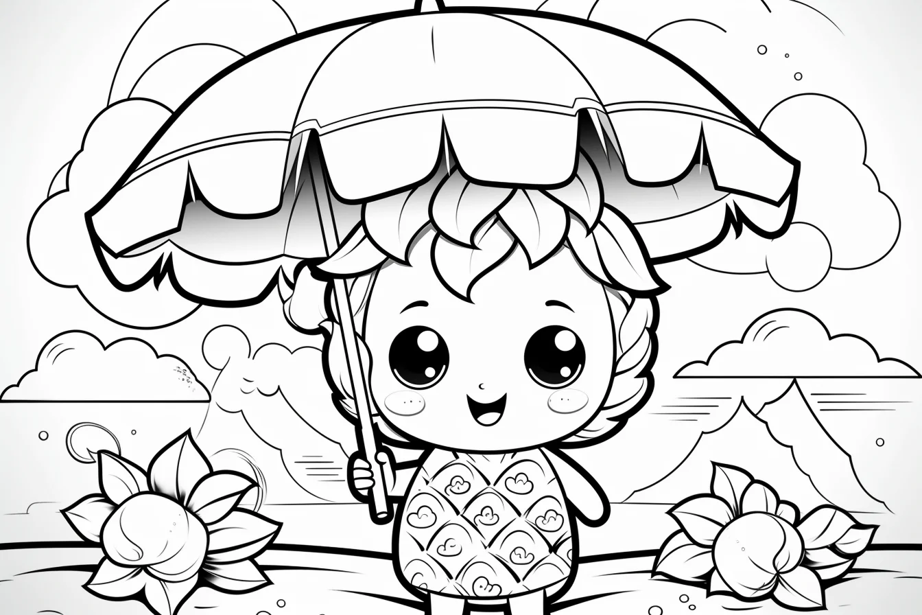
Cute and kawaii summer pages
The cute and kawaii sheets are a good middle ground when a plain beach scene feels too realistic but a preschool page feels too simple. Use a small bright palette and repeat colors across accessories or background objects so the page stays cheerful without becoming visually noisy.
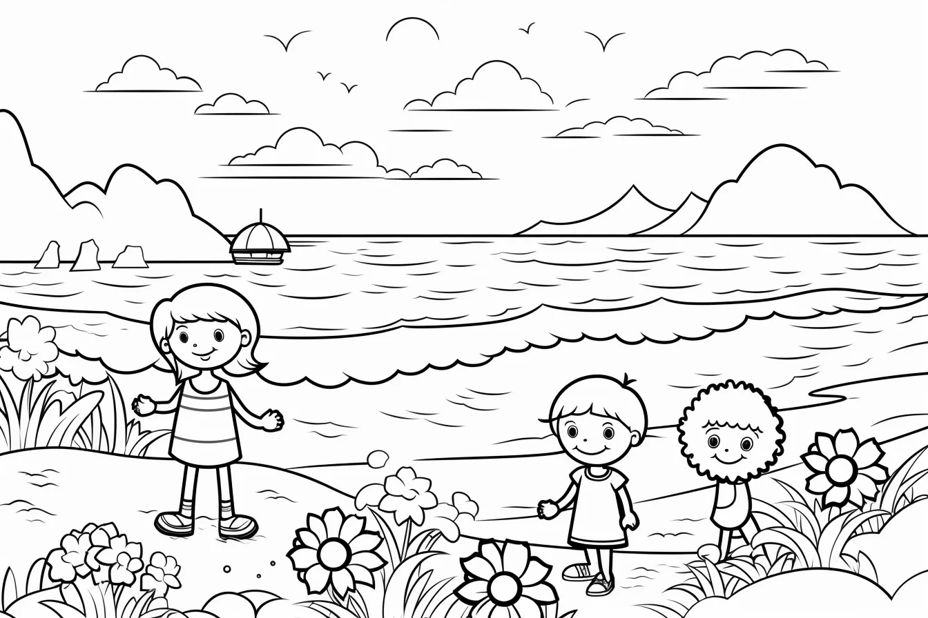
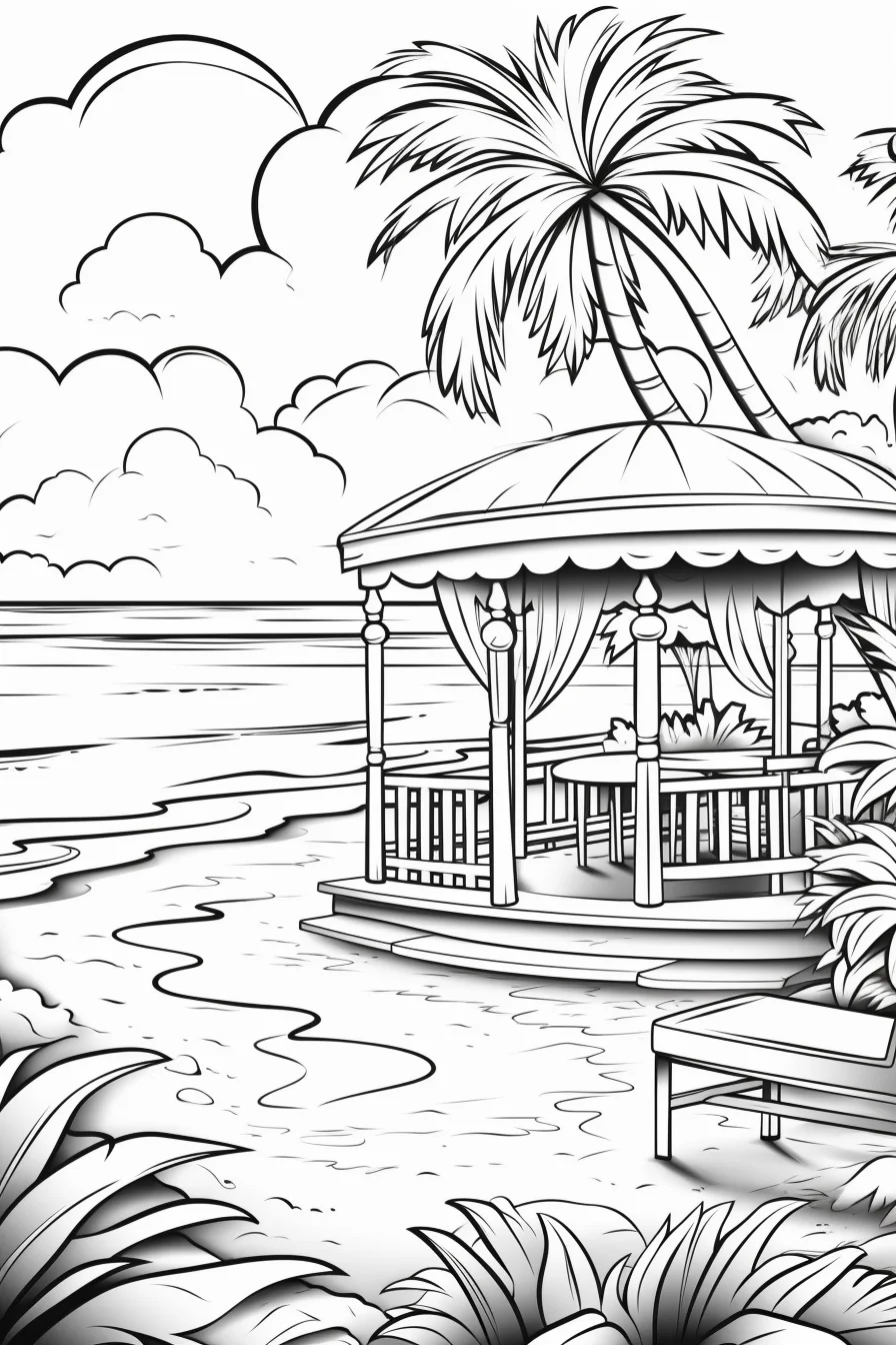
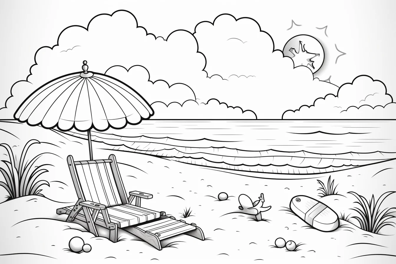
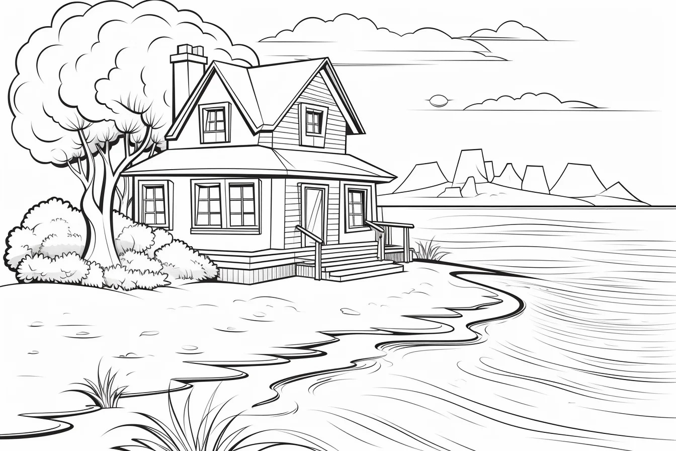
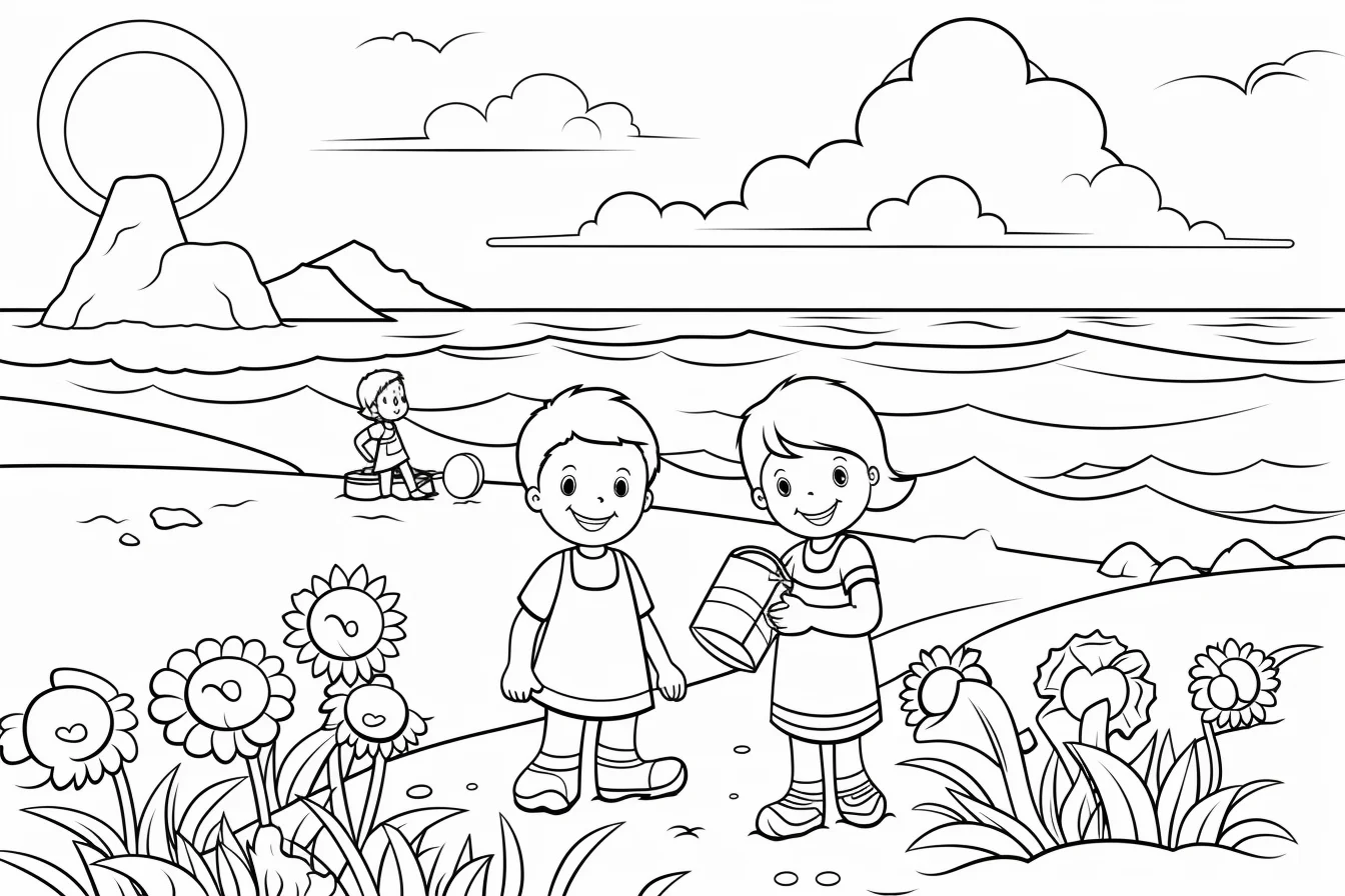
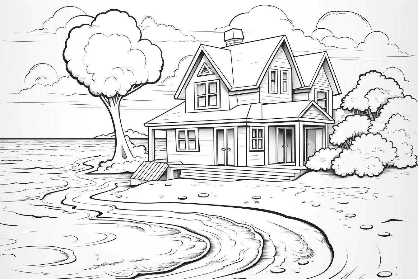

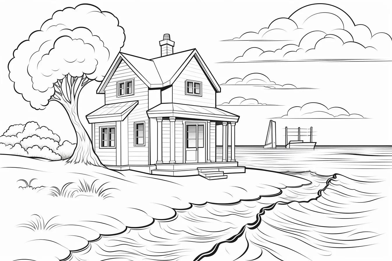
Easy pages do not have to be only for children
A simple summer page can be useful when you want a shorter coloring session regardless of age. The adult-labeled sheets with open areas work well for broad markers or relaxed coloring, while the denser scenery pages are better suited to pencils and slower layering. Choose by detail level rather than by the age label in the filename.

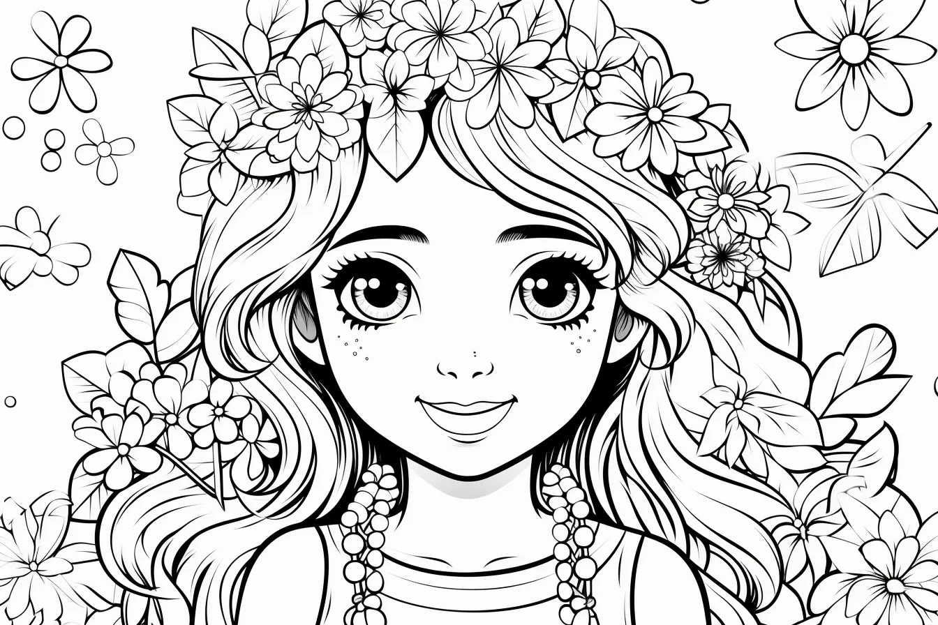
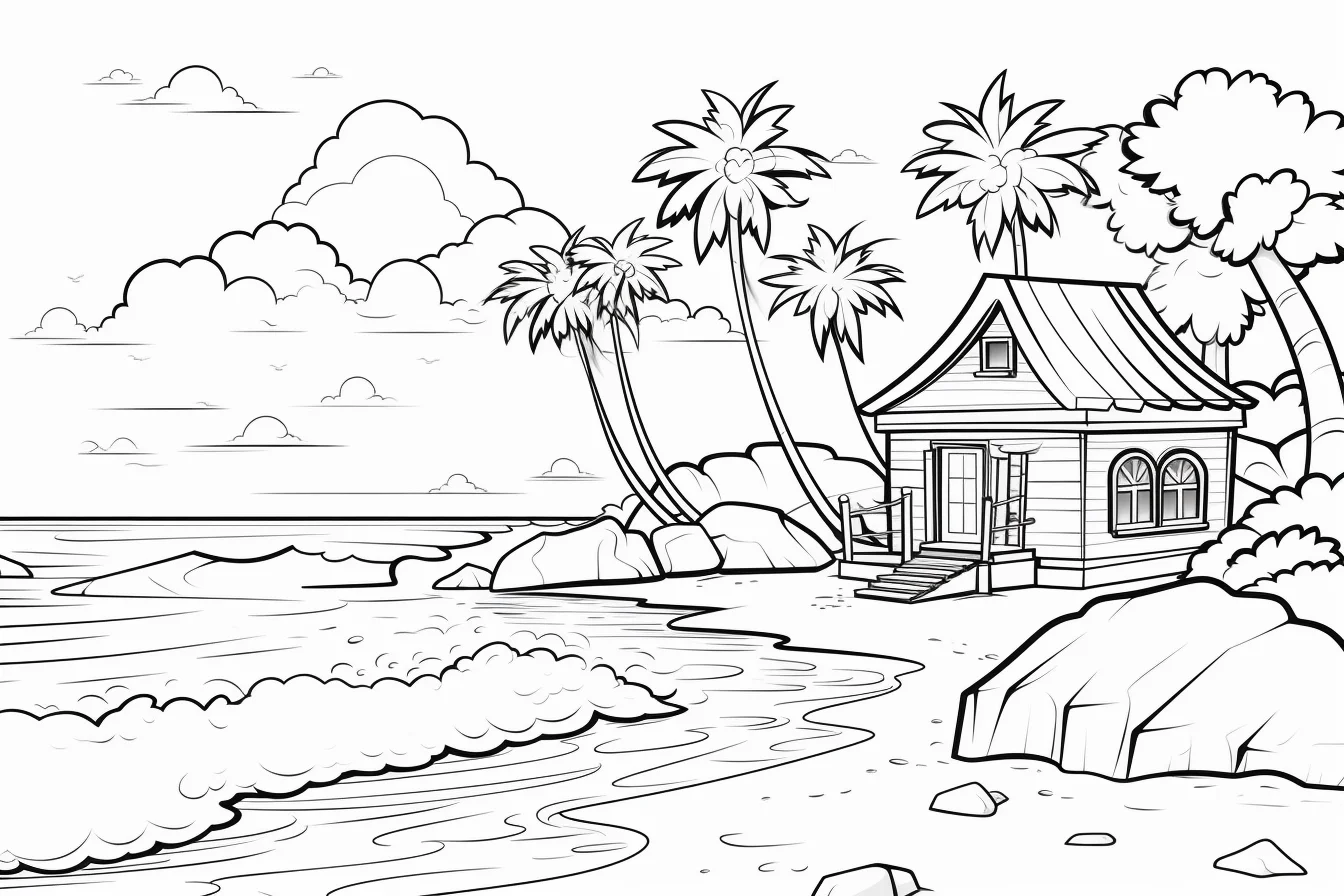
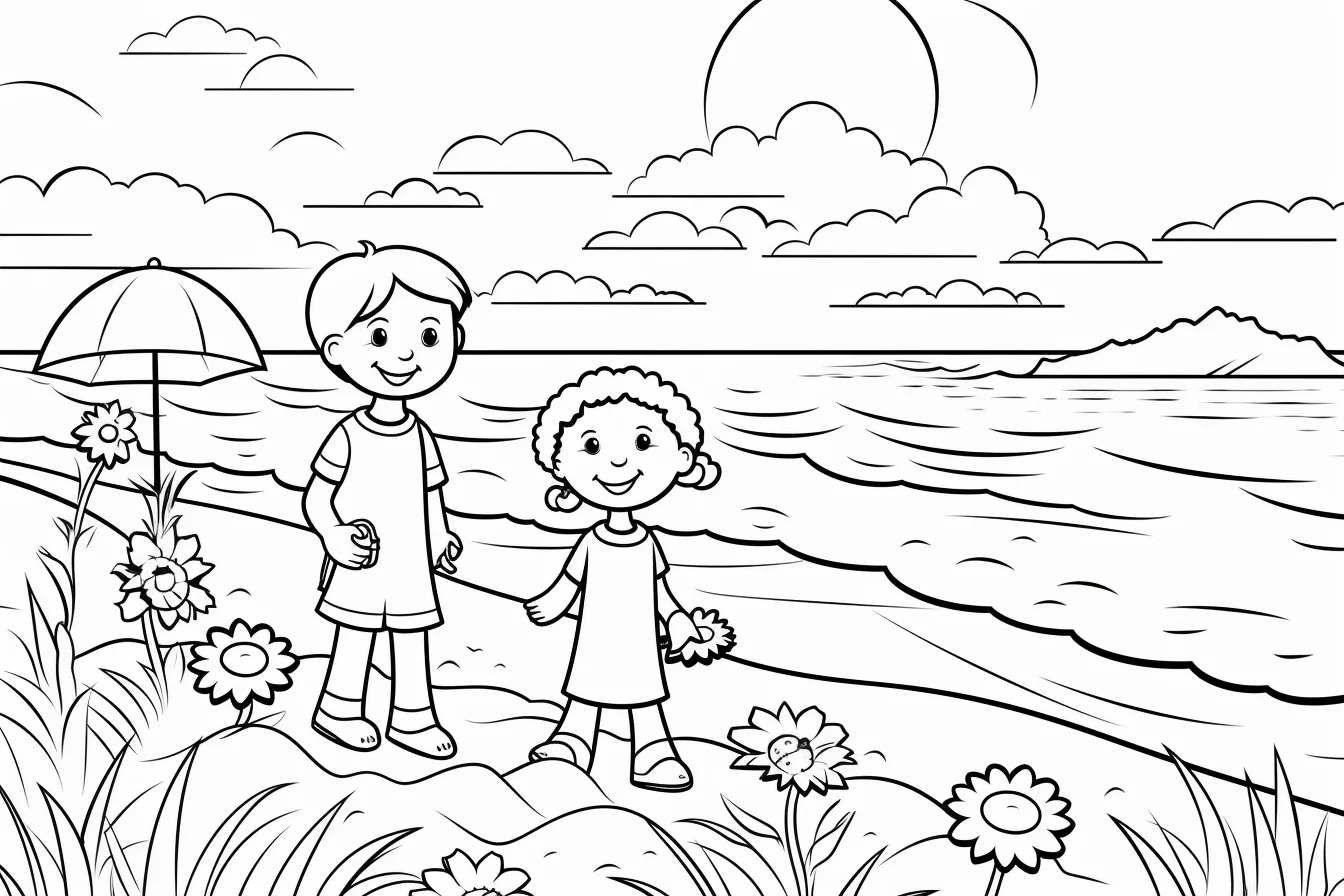
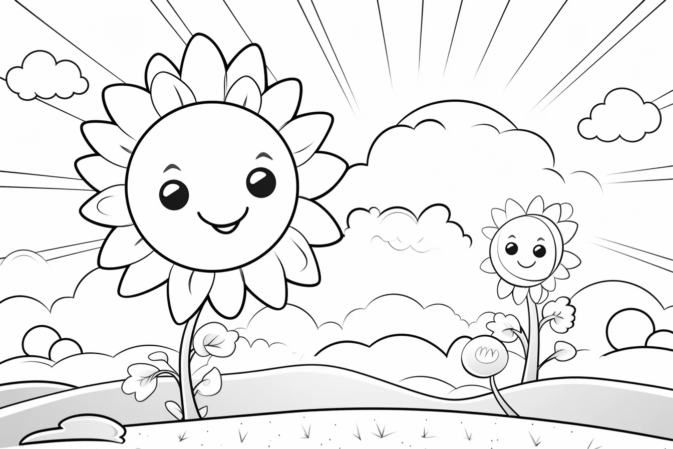
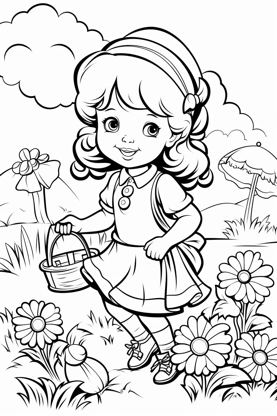
For toddlers, preschoolers and kindergarten
When printing for younger children, prioritize one clear subject, thick outlines and fewer small background pieces. Crayons and washable markers are usually easier than pencils at this stage. If the goal is a classroom activity, print several different sheets and let children choose; the simple choice itself can make the activity more engaging.
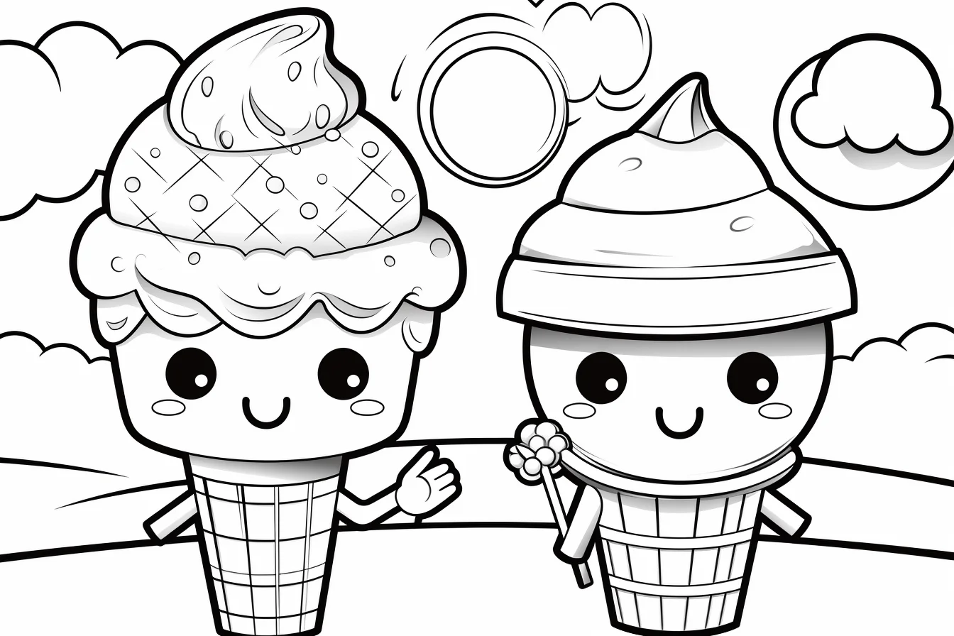
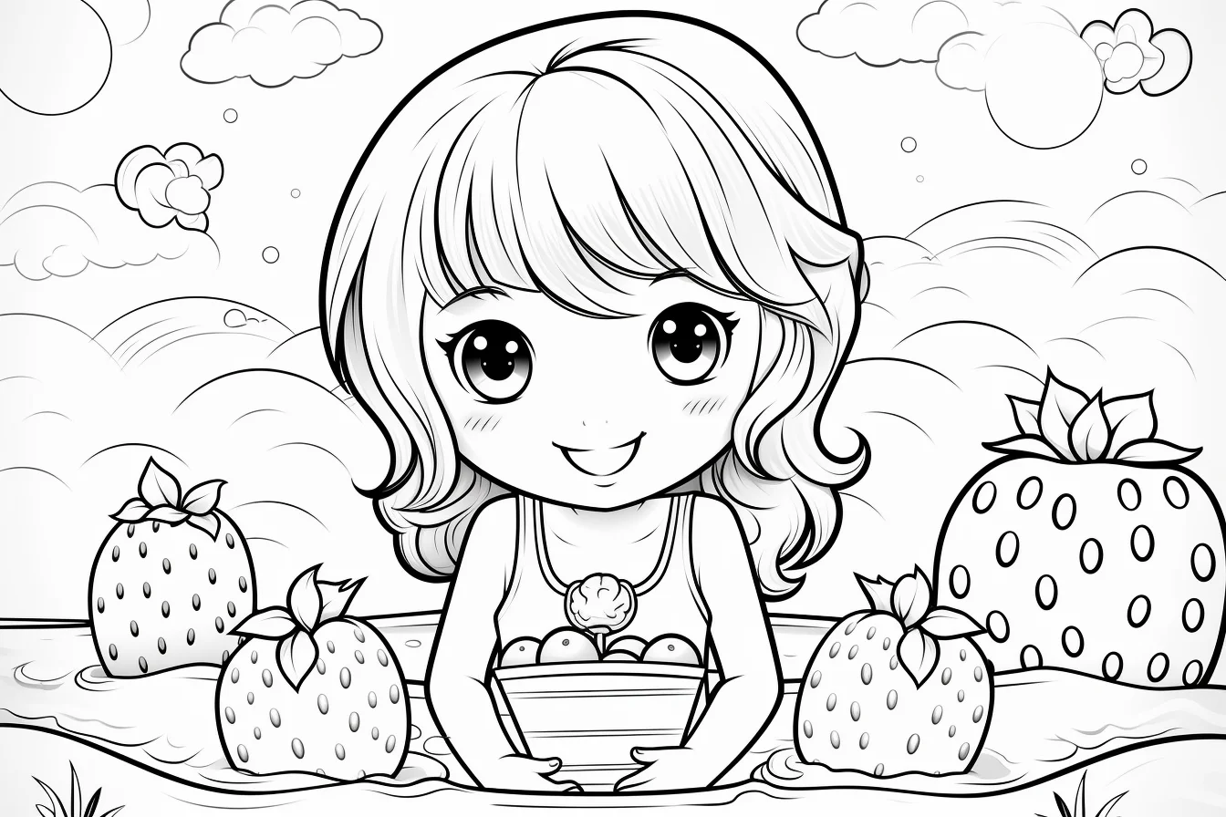
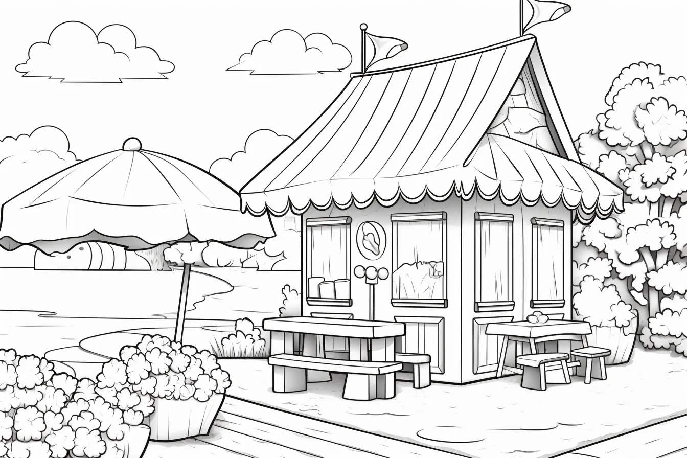
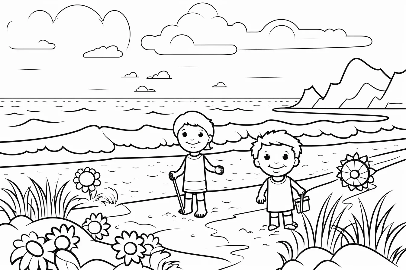
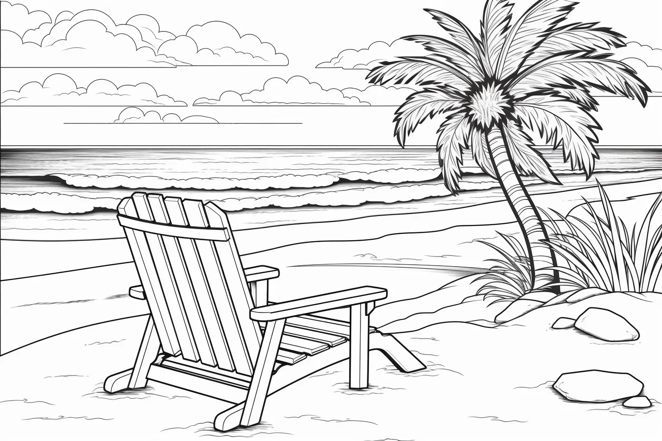
How to use this broad summer gallery
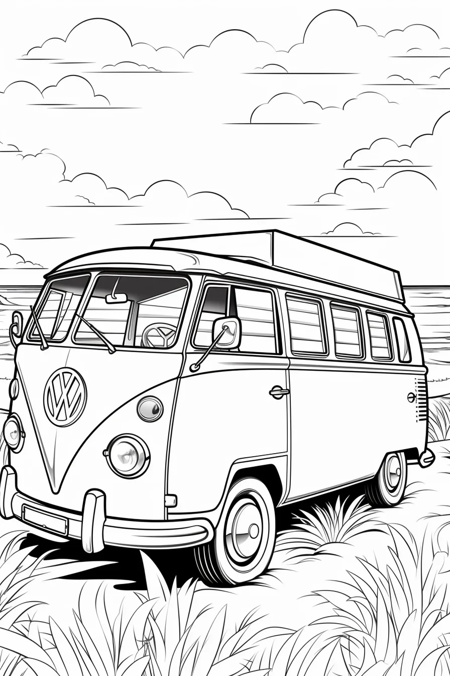
Use this page when you want variety in one place rather than a tightly focused beach or preschool set. Mix an easy page, a character page and a fuller scene when printing several sheets. For landscape images, print in landscape orientation; for the taller portrait files, switch to portrait and use “Fit to page” so the artwork is not cropped.
Pick three pages instead of printing at random
If you want a small summer coloring session, choose three sheets that ask for different kinds of decisions. Start with one page built from large shapes, follow it with a cute or ice-cream design, then finish with a fuller beach scene. That sequence moves from simple coverage to color planning and finally to handling a foreground, background and smaller details.
- Page 1 — easy coverage: choose a sheet with broad open spaces. Use two or three colors and concentrate on filling cleanly to the outline.
- Page 2 — repeated colors: choose a kawaii or object-based design. Pick a small palette before starting and reuse colors in accessories, decorations or repeated shapes.
- Page 3 — complete scene: choose a beach or summertime scene. Decide what belongs to the sky, water, sand and foreground before coloring the small objects.
This works particularly well for mixed-age families or classrooms because everyone can use the same gallery without having to complete the same sheet.
Build a summer scene from back to front
On pages with sky, sea, sand and foreground objects, coloring every shape independently can make the picture feel fragmented. Instead, identify the large layers first. Color the sky lightly, establish the water as a separate band, then give the sand its own value before moving to umbrellas, toys, food or characters. Keeping the largest background areas quieter leaves room for brighter focal objects.
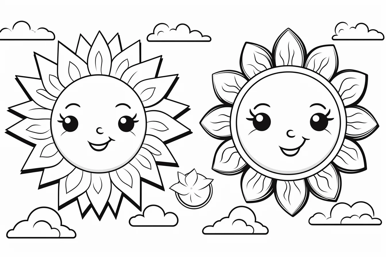
For water, you do not need to fill the whole area with one heavy blue. With pencils, use light horizontal strokes and leave occasional white gaps as highlights. For sand, a pale base plus a slightly darker tone under objects gives more depth than a single dark yellow. If the drawing has a sun or ice cream as the obvious focal point, save one of your strongest colors for it instead of using maximum saturation everywhere.
Match the coloring tool to the page
| Page type | Good starting tool | Why |
|---|---|---|
| Large simple summer shapes | Crayons or broad washable markers | Large areas are faster to cover and do not demand a sharp point. |
| Cute and kawaii designs | Crayons, pencils or regular markers | Medium-size shapes allow both flat bright color and simple shading. |
| Beach scenes with small objects | Colored pencils | A sharper point gives better control around scenery and narrow spaces. |
| Pages with large backgrounds | Colored pencils or crayons | Light layers are easier to keep even across sky, water and sand. |
If markers are used on ordinary printer paper, put a spare sheet underneath. Repeated wet passes can bleed through even when the artwork itself has generous spaces.
When a summer page is not working
| Problem | Try this | Why it helps |
|---|---|---|
| The page looks too busy | Choose three main colors plus one accent. | Repeating a limited palette connects unrelated summer objects. |
| The beach scene looks flat | Keep the background lighter and strengthen the foreground. | Value contrast creates a simple sense of distance. |
| A child keeps crossing small outlines | Switch to a sheet with fewer, larger spaces. | The difficulty should match motor control rather than an age label. |
| Crayon cannot reach tiny details | Leave those details white or finish them with a pencil. | Not every enclosed shape needs to be forced into the same medium. |
| Every object competes for attention | Pick one focal object and make surrounding colors quieter. | A clear focal point makes a scene easier to read. |
| Large sky or sand areas look patchy | Use overlapping light strokes instead of pressing hard. | Several light passes usually produce smoother coverage. |
Four summer palettes to try
- Classic beach: sky blue, turquoise, sandy yellow, coral and white.
- Ice-cream shop: strawberry pink, vanilla cream, mint green, chocolate brown and cherry red.
- Sunset: pale yellow, orange, coral, violet and deep blue.
- Soft tropical: aqua, leaf green, peach, warm yellow and a small amount of magenta.
Treat these as starting points, not rules. The useful part is choosing a palette before the page becomes crowded with unrelated colors. On a detailed sheet, repeat the same accent in several small places rather than introducing a new color for every object.
Simple ways to use the pages with children
A coloring sheet can support more than pencil control without turning into a worksheet. Before coloring, ask the child to find three things that belong at the beach, count repeated objects, or choose which part of the picture should be brightest. Afterward, ask what is happening in the scene or what they would add if there were more space. Those short prompts encourage observation and storytelling while leaving the actual coloring open-ended.
For a group, print several different designs rather than handing everyone the same page. A child who wants large easy shapes can choose one, while another can take a busier scene. This reduces the tendency to compare finished pages as though there were one correct result.
Summer coloring questions
Which summer coloring page should I choose for a preschooler?
Start with a page that has one obvious subject and large enclosed spaces. Ignore the filename if the drawing itself looks too detailed. For an entire collection built around that level, use the preschool summer set linked near the top of this page.
Are the easy pages useful for adults?
Yes. Difficulty and age are different things. A page with large spaces can be useful for a quick session, broad markers, limited hand mobility or simply a preference for uncomplicated designs.
How can I make an easy page more challenging?
Add the difficulty through technique rather than extra outlines. Try a light-to-dark gradient in the sky, two tones in the water, a cast shadow beneath objects, or a repeated decorative pattern inside one large shape.
How should I print the mixed portrait and landscape files?
Open the full-size image and check the preview for each sheet. Match portrait artwork to portrait orientation and wide artwork to landscape, then use “Fit to page” if the printer preview clips an edge.
What should I color first on a beach scene?
Start with the large background zones—usually sky, water and sand—using relatively light pressure. Then color the main subject and finish with small accessories and the darkest accents. This makes it easier to keep the focal point stronger than the background.

