
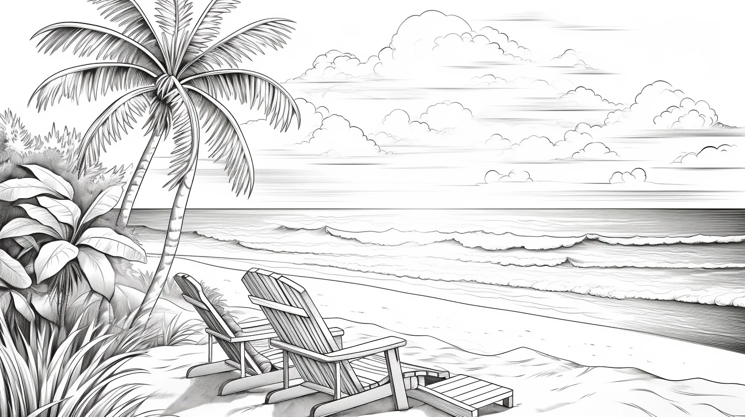
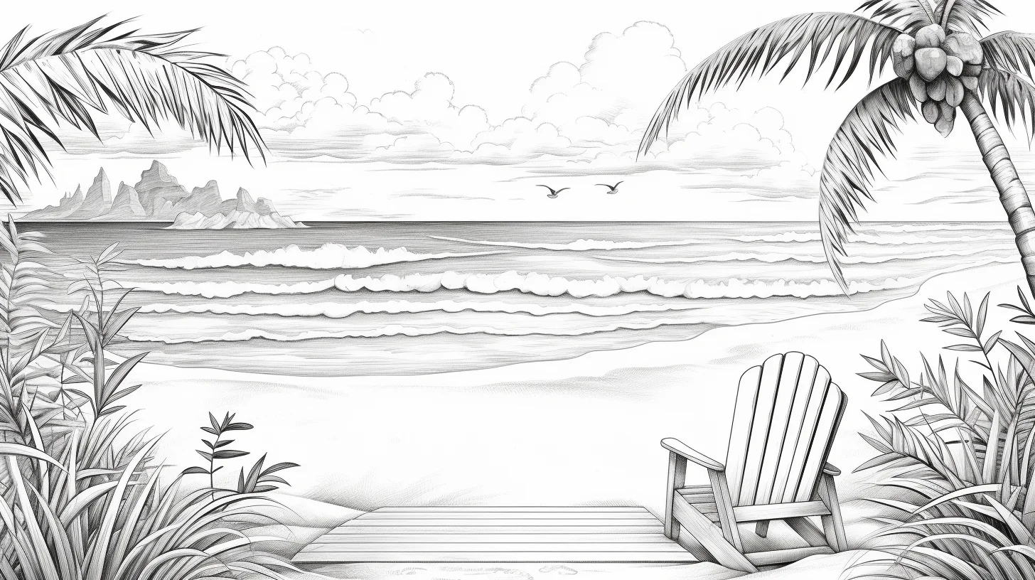
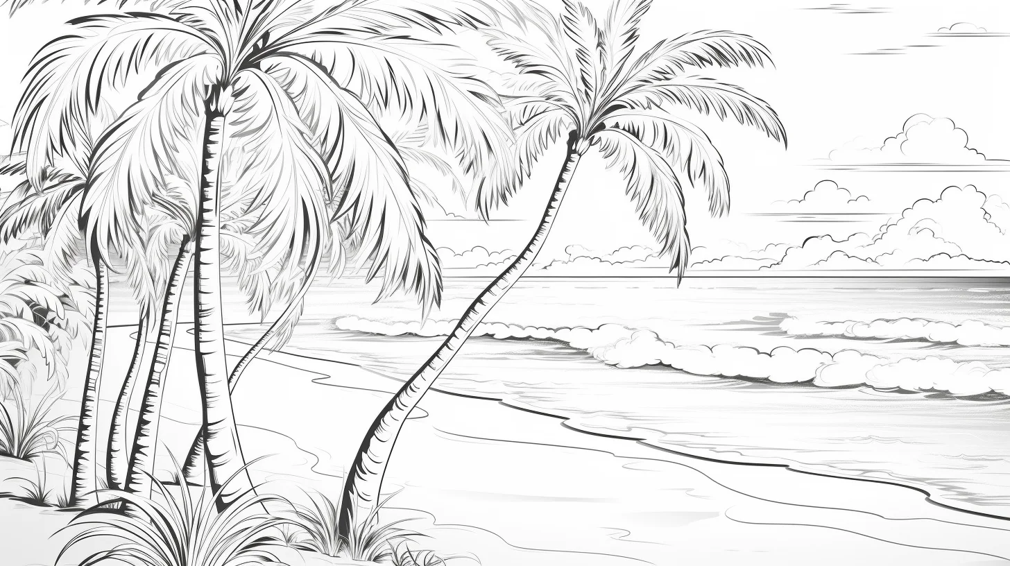
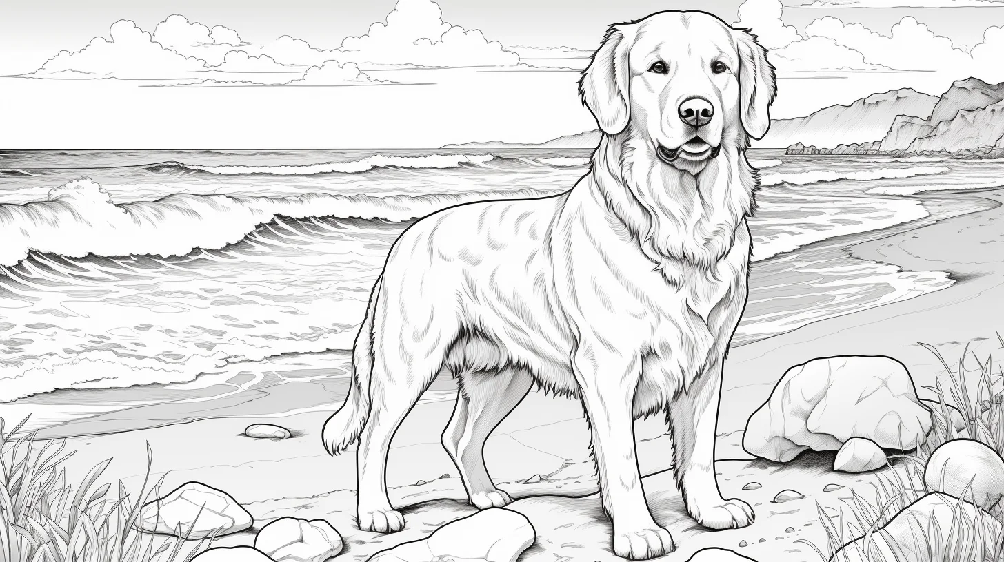
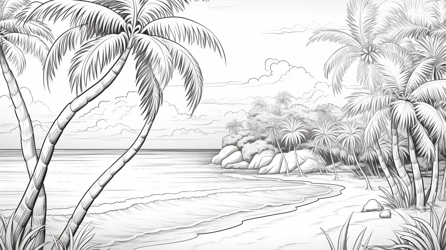
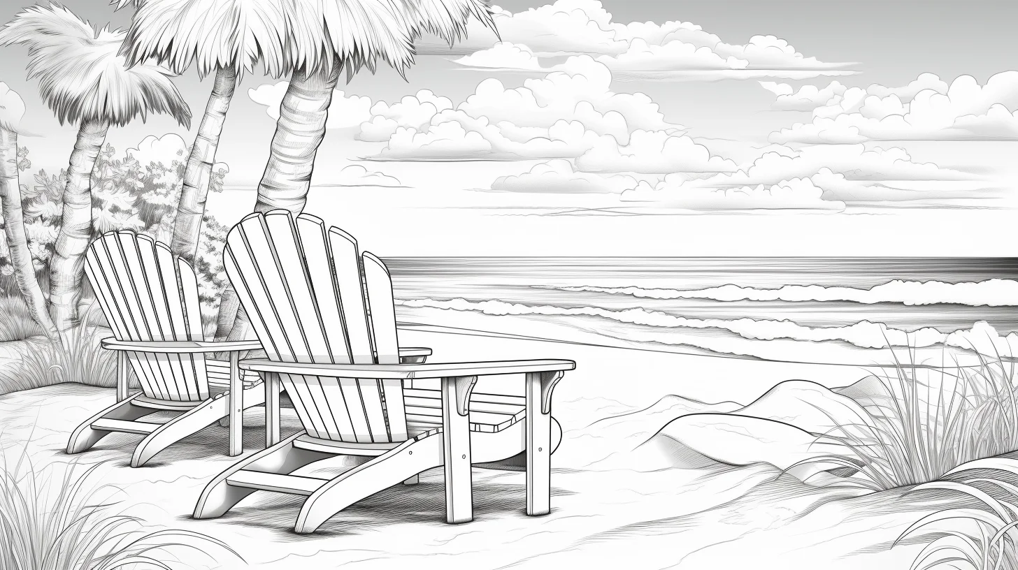
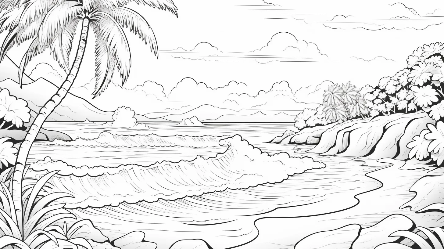
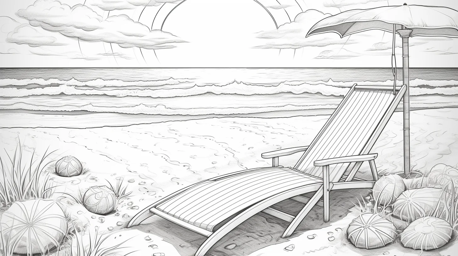
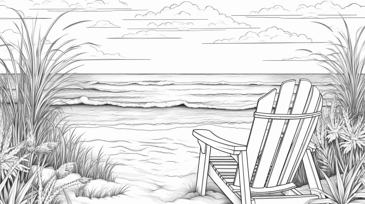
This gallery has 22 summer beach coloring pages for adults, with shorelines, sea views, sand, palms and other warm-weather scenery. These are fuller landscape scenes rather than single-object pages, so they work especially well for practicing depth, atmosphere and controlled color transitions.
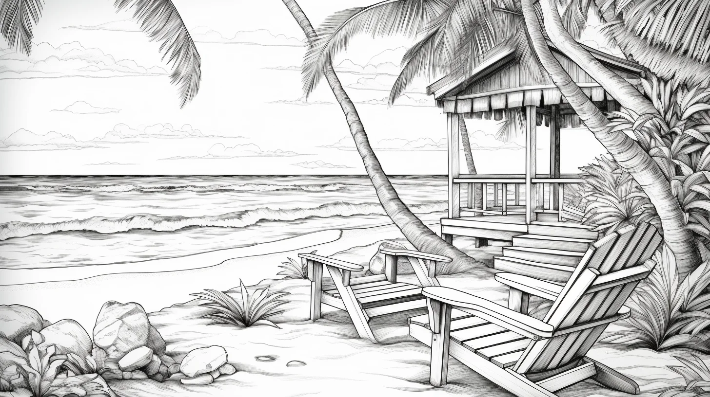
Colored pencils are a good fit for the smaller beach details and for building separate shades in water, sky and sand. Broad markers work well on the larger open areas, but use heavier paper or place a spare sheet underneath if your markers bleed through.
If you want simpler beach pages for younger children, use our beach coloring pages for kids.
Do a 60-second depth test before coloring
Before committing to a palette, use a scrap of the same paper and make three small swatches with one pencil: light pressure, medium pressure and the darkest clean layer you can produce without crushing the paper. You should be able to tell those three values apart at a glance. If they collapse into nearly the same tone, use a softer hand for the first layer rather than reaching immediately for more colors.
- Pick the focal area. Choose one place you want the eye to land first: a palm, umbrella, foreground rocks or another near object. Reserve your sharpest edges and darkest accents for that area.
- Check the horizon. Hold the page at arm’s length. The distant sea and sky should not have stronger contrast than the foreground. If the horizon jumps forward, lighten it before adding more detail.
- Separate the three big zones. Sky, water and sand need to differ in value as well as hue. Three different colors can still look flat if they are equally light or equally dark.
- Match the tool to the detail. If a marker tip is wider than the smallest palm fronds, shells or shoreline gaps, use it only for broad areas and switch to pencil for the tight spaces.
For a quick, low-pressure session, stop after establishing one light sky value, one medium water value and one warmer sand value. The page will already read as a beach scene; texture and shadows can be added only where they improve depth.
22 summer beach coloring pages for adults
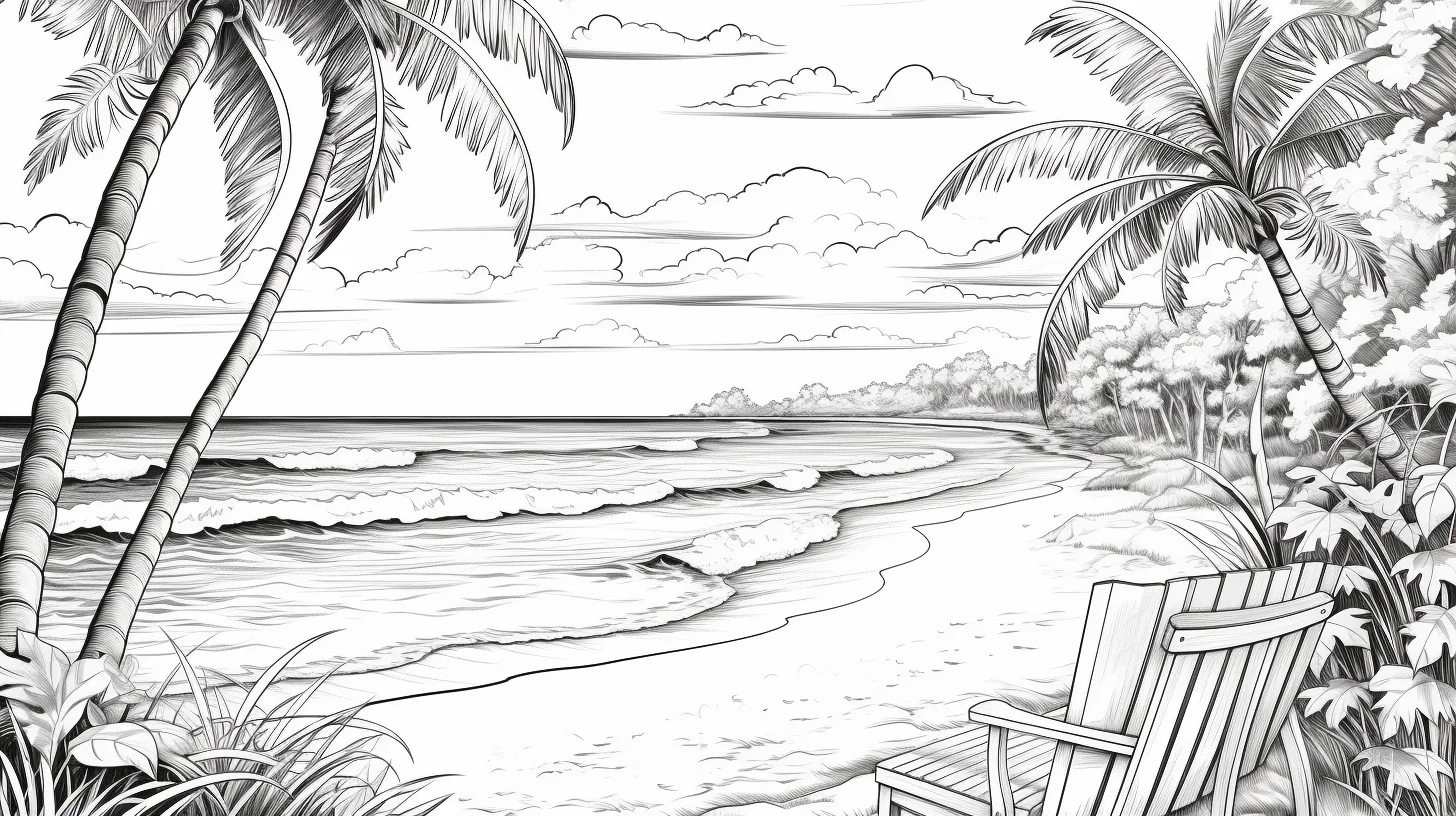
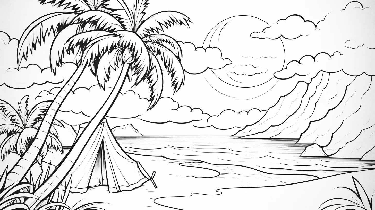
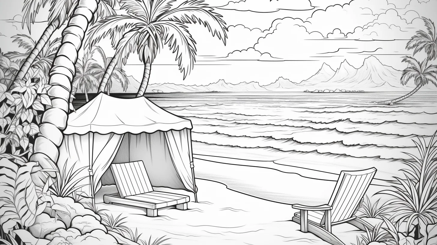
Build the scene from large areas to small ones
For a fuller beach scene, color the sky, water and sand before the small foreground details. Those three large areas establish the palette and make it easier to judge how dark the remaining objects should be. If you start with tiny details first, it is easy to make them so dark that the larger scene has nowhere to go.
Choosing colors for a beach scene
You do not need a large palette. A few blues for water and sky, a warm sand color, two greens for plants and one darker neutral for shadows are enough for most of these pages. Keep the horizon and distant objects lighter if you want the foreground to stand out.
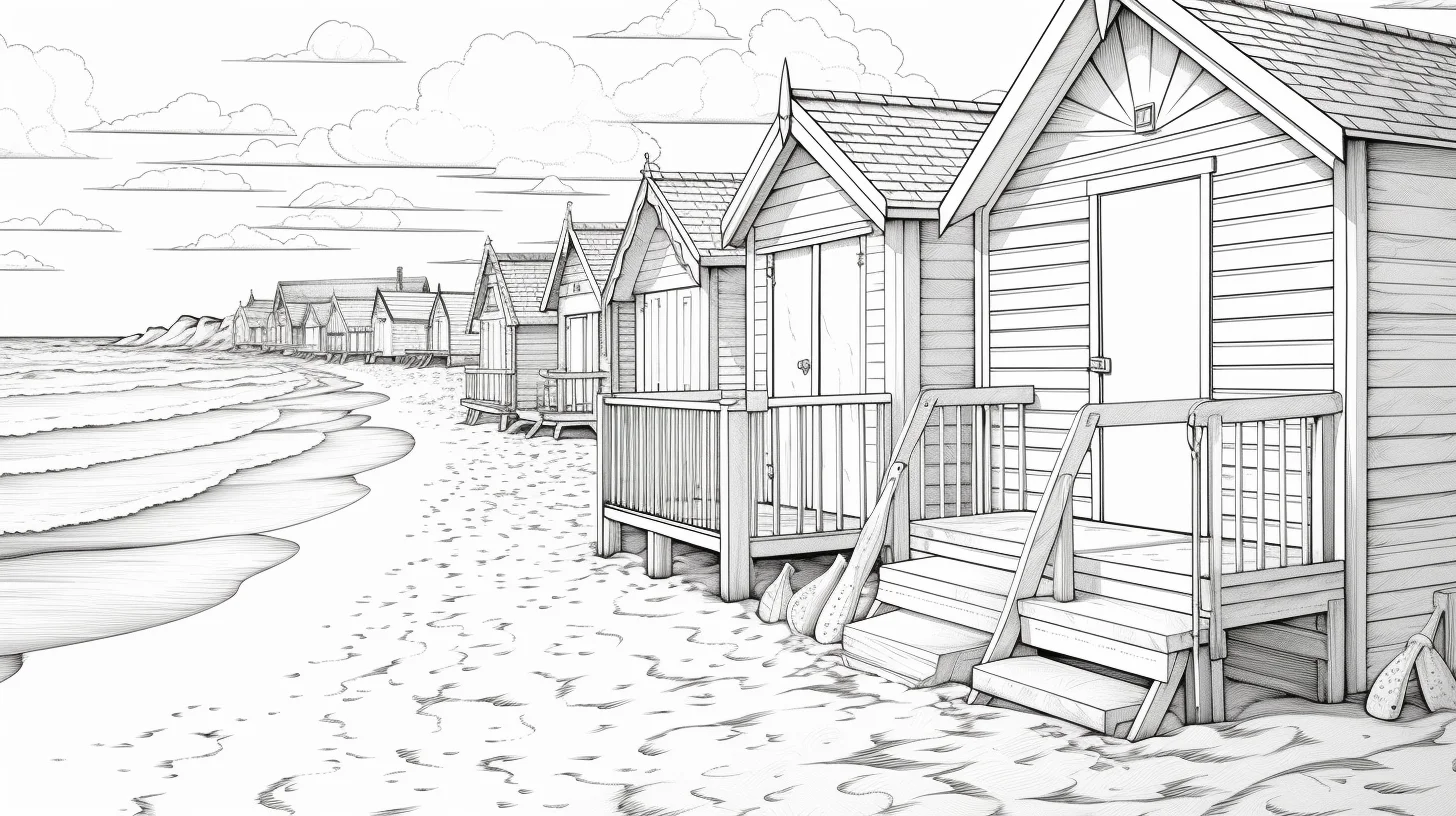
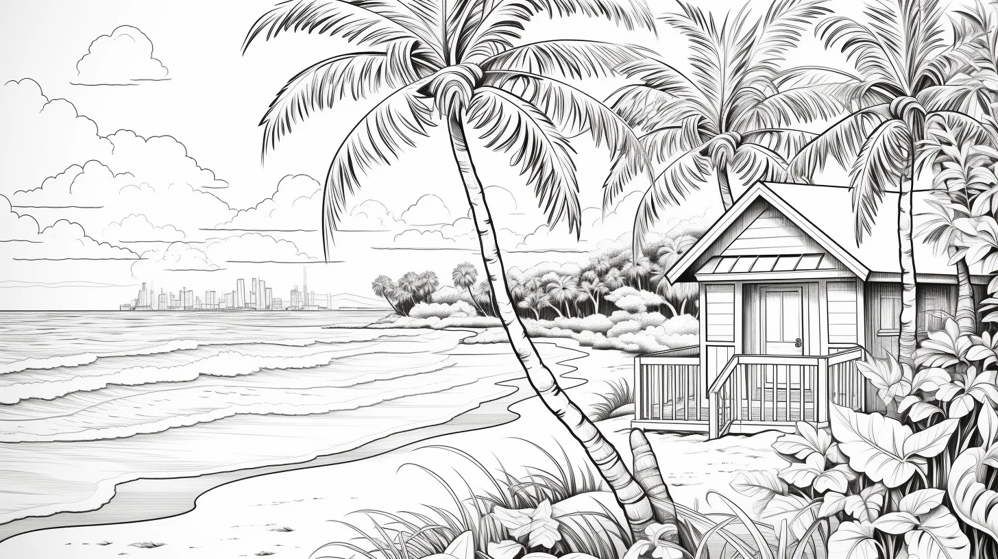
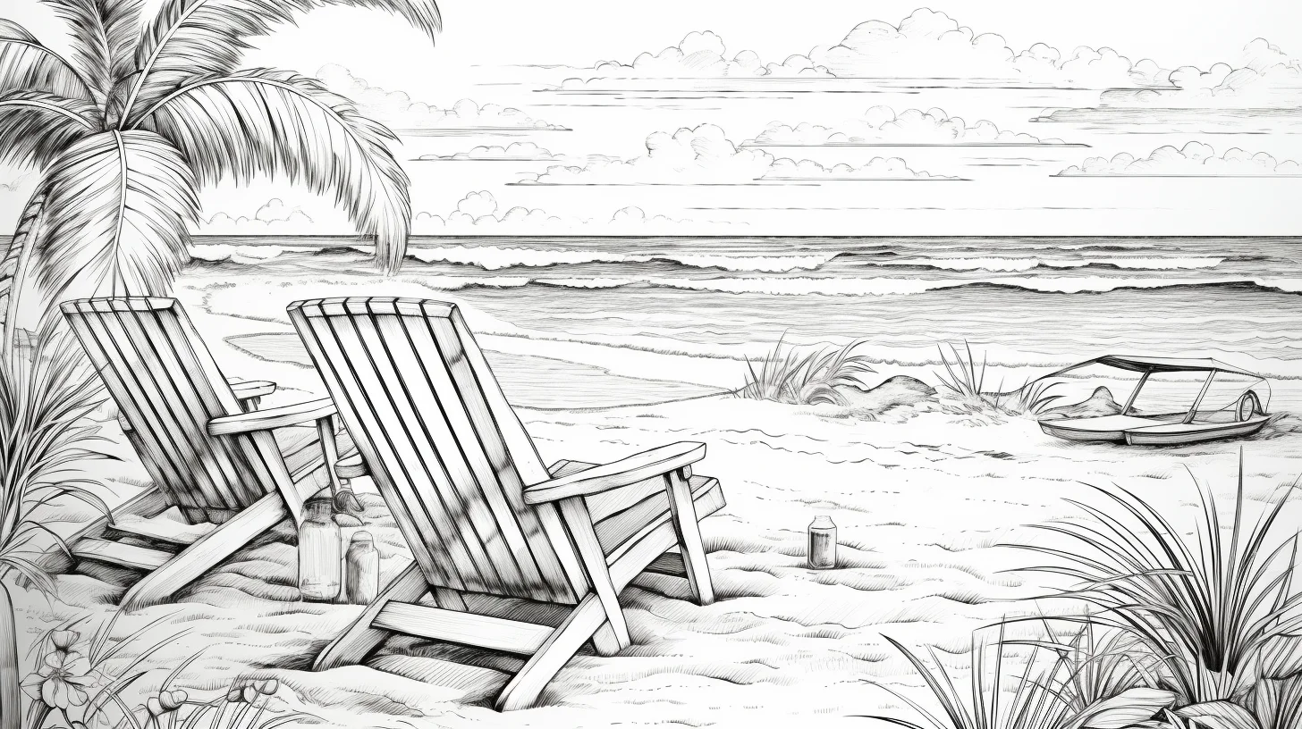
Use contrast to separate water, sky and sand
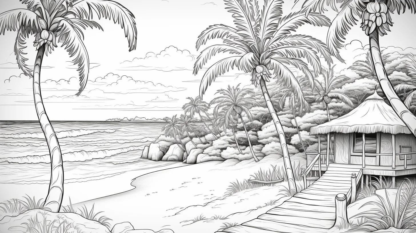
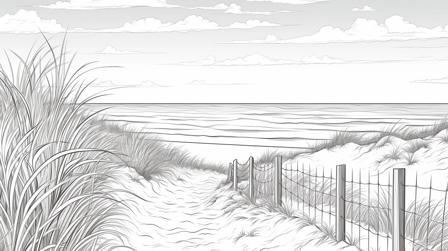
If the sky, water and sand are all similar in value, the whole page can look flat even when the colors are accurate. Make one area noticeably lighter or darker than the others. For example, a pale sky, medium-value sea and warmer darker foreground sand creates depth without needing complicated shading.
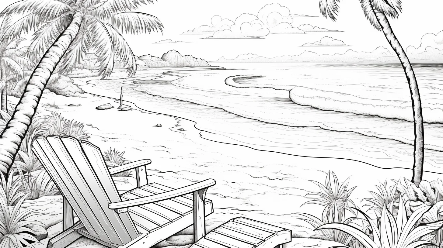
Colored-pencil method for a calmer beach scene
- Lay down a very light base layer in the sky, water and sand.
- Add a second blue or green only where the water needs depth.
- Darken foreground objects last so they naturally come forward.
- Leave a little uncolored paper in bright areas instead of trying to shade every space.
This works especially well on wide beach scenes because it keeps large areas soft while preserving detail around plants, rocks or shoreline elements.
A three-page practice route for better beach scenes
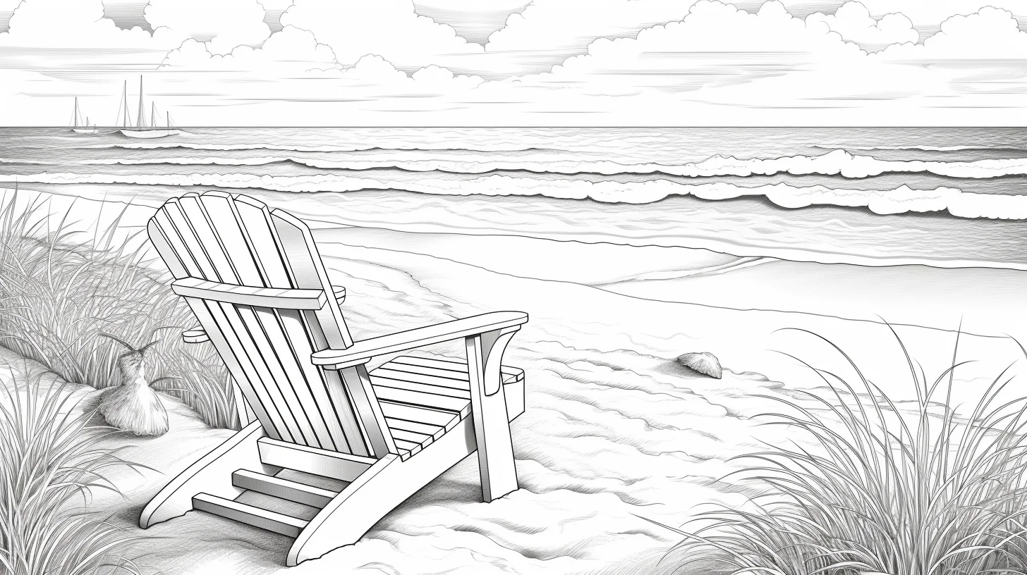
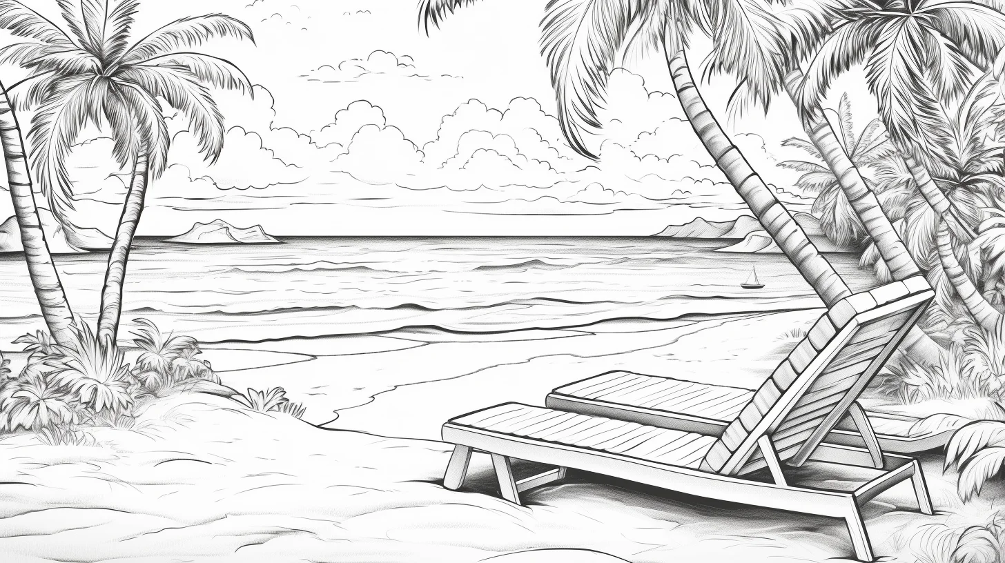
If you want to use these pages as drawing-and-color practice rather than simply finishing one sheet, choose three designs with increasing visual depth. Start with a scene that has large areas of sky, water and sand. On the second page, choose one with plants, rocks or other foreground objects. For the third, pick a busier scene with several overlapping elements. Keep the same basic palette across all three so you can concentrate on control rather than continually choosing new colors.
- Page one — clean separation: make the sky, sea and sand visibly different in both hue and lightness.
- Page two — depth: keep distant areas lighter and reserve your darkest values for the foreground.
- Page three — texture: add directional pencil strokes to water, sand, leaves or wood without covering every area with texture.
Fix the beach scene that is not working
| What you notice | Likely cause | Try this |
|---|---|---|
| The sea and sky merge together | They are too similar in value | Lighten the sky or deepen the water near the foreground; do not rely on changing blue hue alone. |
| The sand looks like one flat yellow block | One color was used at equal pressure everywhere | Add a warmer or darker neutral near footprints, rocks and foreground edges while leaving open sand lighter. |
| The page feels busy | Every object has equal contrast | Choose one focal area and reduce saturation or pressure on secondary details. |
| The water looks striped | Dark bands are too even | Vary the length and spacing of horizontal strokes and leave small gaps of lighter paper between them. |
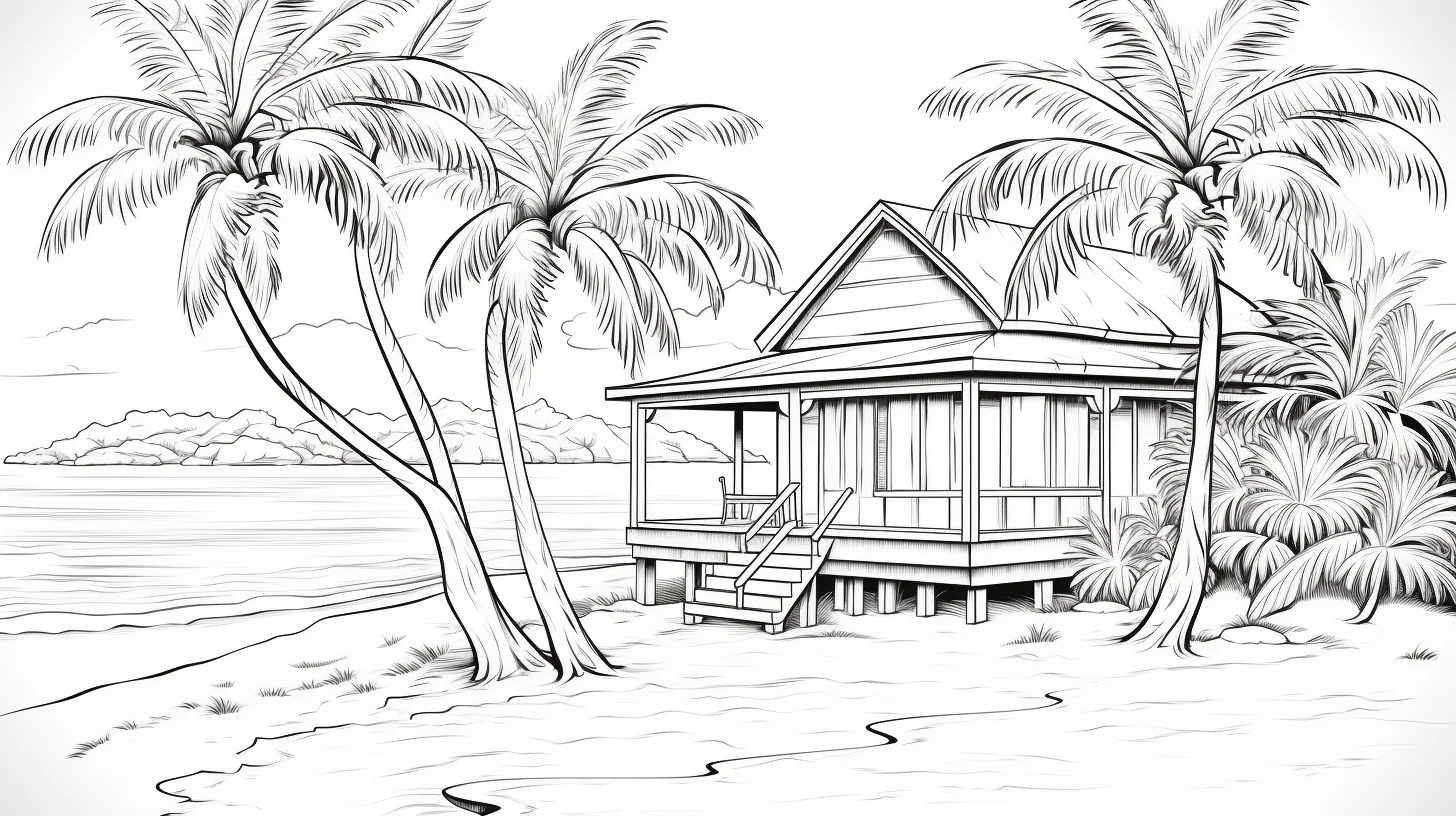
| Palm leaves look heavy | Each leaf was filled as one solid shape | Work from the stem outward with lighter directional strokes and deepen only the base or overlapping edges. |
| The foreground does not come forward | Background and foreground share the same darkest value | Keep the horizon soft and put your strongest dark accents on the nearest objects. |
Four beach palettes that stay coherent
- Clear midday: pale cyan sky, turquoise water, warm beige sand, fresh green foliage and a small amount of coral or red for accents.
- Golden hour: peach and pale yellow sky, muted blue water, ochre sand, olive foliage and deep brown-violet shadows.
- Quiet overcast: blue-gray sky, desaturated teal water, cool beige sand and subdued greens. Keep the contrast gentle except around the focal object.
- Tropical postcard: bright aqua water, creamy sand, saturated leaf green and one vivid accent such as hibiscus pink. Use the brightest colors selectively rather than everywhere.
A useful restraint is to repeat the same two or three colors in several parts of the picture. For example, a warm coral used on a towel can reappear in a flower or tiny accessory. Repetition makes a detailed scene feel planned without requiring dozens of pencils.
Beach coloring questions
How can I make water look more realistic with colored pencils?
Use mostly horizontal strokes, change pressure gradually, and avoid outlining every wave in dark blue. Darker marks usually work best closer to the viewer or beneath overlapping shapes; lighter gaps can suggest reflected light.
Should the horizon be darker?
Usually not. If you want atmospheric depth, keep distant water and sky relatively light and low-contrast. Save sharper edges and darker values for objects nearer the viewer.
How do I color white sand without leaving it completely blank?
Use very light beige, peach, gray or pale lavender in shadow areas and let some paper remain untouched in the brightest areas. White sand is easier to suggest through subtle shadow color than by filling the entire shape.
Are these pages suitable for markers?
Yes, especially the larger open areas, but marker behavior depends on the paper. Print on heavier stock when possible, protect the surface underneath, and test your lightest colors first. Colored pencil is easier for gradual sky and water transitions and for the smaller details.
Choose the summer collection that fits the person coloring
- This 22-page set: best for adults or older colorists who want fuller beach scenes and landscape-format pages.
- Beach coloring pages for kids: better for simpler kid-focused seaside designs.
- Easy summer pages for preschoolers: best when large shapes and quick coloring matter most.
- General summer coloring pages: use this when you want seasonal variety beyond beach scenes.
All of these sheets are wide landscape files. Save the full-size image before printing and use “Fit to page.” For pencils, standard printer paper is usually fine; for alcohol markers or wet media, use heavier paper and test one sheet first.

