
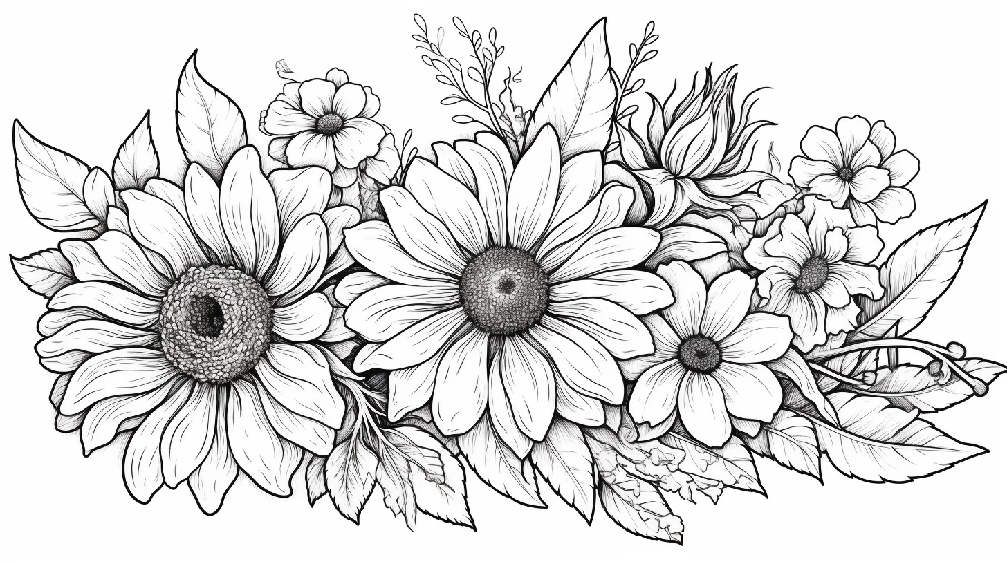
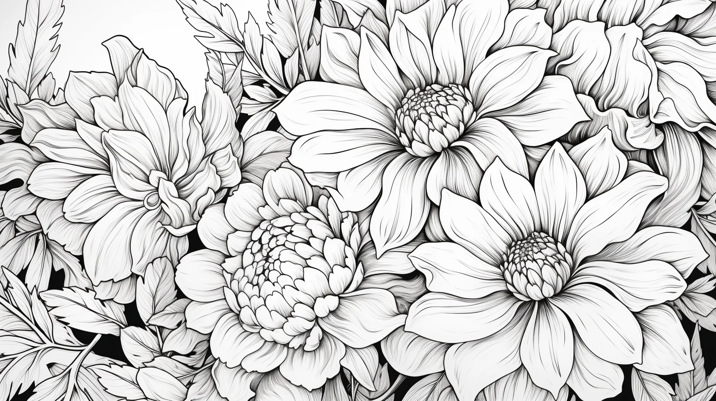
This 20-page collection is the one to use when the flower itself matters. Instead of mixing cats, flower girls and decorative scenes, it stays closer to recognizable floral subjects: daisies, roses, lilies, jasmine, simple flower studies and a few mandala-style designs.
If you want the biggest variety, use the 40-page flower hub. If you mainly care about easy-to-hard progression, use the 20 flower coloring sheets from easy to advanced. This page is for choosing by flower type.
Open full-size flower coloring page 1
Choose by flower type
| Flower/style | What makes it different | Best tool |
|---|---|---|
| Daisies | Large open petals and a clear center | Crayons or pencils |
| Roses | Overlapping petals and deeper folds | Colored pencils |
| Lilies | Long petals, strong center lines and stamens | Colored pencils |
| Jasmine | Smaller repeated blossoms | Fine pencils or markers |
| Mandala flowers | Repeated shapes rather than realistic petal structure | Fine pencils or markers |
Large, open flowers are easiest with crayons or broad markers. Layered petals, narrow leaves and repeated floral patterns are much easier to control with colored pencils.
Open full-size flower coloring page 2
Open full-size flower coloring page 3
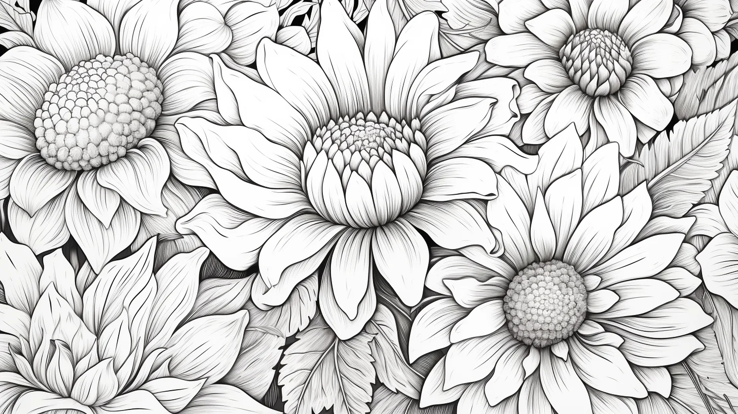
Test the petal before you color the whole flower
Before starting a rose or lily, spend two minutes on the margin of the same paper. Draw three narrow petal shapes. Fill the first with one even light layer; on the second, press harder only at the base and fade toward the tip; on the third, add a second darker layer where one imaginary petal would tuck underneath another. Hold the sheet at arm’s length. If you can still distinguish all three values without seeing harsh bands, that pressure range will work on the printable.
This tiny test also tells you when the paper is saturated. If another pencil layer starts looking waxy or stops getting darker, do not keep pressing. Use the darkest value only in the overlaps and let untouched paper provide the highlight. For white daisies or jasmine, reverse the exercise: leave most of the petal white and test a pale gray, blue, cream or lavender only at the base and overlap.
A simple three-page flower practice
- Start with a daisy or another open flower. Use one light petal color, one darker version of it, and a separate center color. Put the darker shade only where petals meet the center or tuck behind another petal.
- Move to a lily. Practice changing pencil pressure along the length of each petal: strongest near the base and central vein, lighter toward the tip. This teaches a controlled gradient without requiring dozens of colors.
- Finish with a rose. Ignore individual outlines at first and look for overlaps. Shade the tight inner folds and the underside of overlapping petals. Leave exposed petal surfaces lighter. This is the most useful page here for practicing depth.
Read the flower before choosing colors
When the species matters, identify its structure first. A daisy is a disk with petals radiating outward, so shadows belong mainly beside the center and beneath overlaps. A lily has long petals that travel away from a common center, so strokes should follow that direction. A rose is built from nested, overlapping folds; its deepest darks belong inside the tight center and underneath petals that curl over another layer. Following those growth directions makes even an invented palette look more convincing.
For a quick diagnostic, temporarily ignore hue and squint at the page. You should still be able to tell what is in front. If every petal becomes one equally dark mass, lift or soften exposed areas before adding more color. If the flower disappears into its leaves, darken a few overlap shadows on the blossom or mute the surrounding green rather than outlining the entire flower.
Two coloring rules that work across every flower type
First, shade the overlaps rather than every edge. The places where one petal sits behind another naturally need more depth. Darkening those areas makes the flower feel layered without outlining every petal heavily.
Second, repeat colors on purpose. If the page has several blossoms, reusing two or three petal colors usually looks more deliberate than giving every flower a completely different palette.
If the finished flower does not look right
| Problem | Likely cause | Try this |
|---|---|---|
| Petals look flat | The same pressure was used everywhere | Darken only the petal bases and overlaps; keep exposed areas lighter. |
| Rose looks heavily outlined | Every petal edge was traced dark | Erase or soften exposed edges and keep the darkest values inside folds. |
| Lily petals look striped | Long pencil strokes stop abruptly | Use lighter pressure as each stroke travels toward the petal tip. |
| White flowers disappear | Petals and paper have identical values | Add a very pale blue, gray, cream or lavender shadow near overlaps instead of filling the whole petal. |
| Leaves compete with the blossom | Greens are darker and more saturated than the flower | Mute the leaves slightly or reserve your strongest color for the focal blossom. |
| Mandala feels chaotic | Too many unrelated colors were introduced | Choose three to five colors and repeat the same sequence around the design. |
There is no required color scheme. Realistic greens and floral colors work well, but pastel, monochrome and invented palettes are equally usable. To print cleanly, open the individual image rather than printing the article page and use A4 or US Letter with “Fit to page.” For device-specific help, see the Print & Save Help.
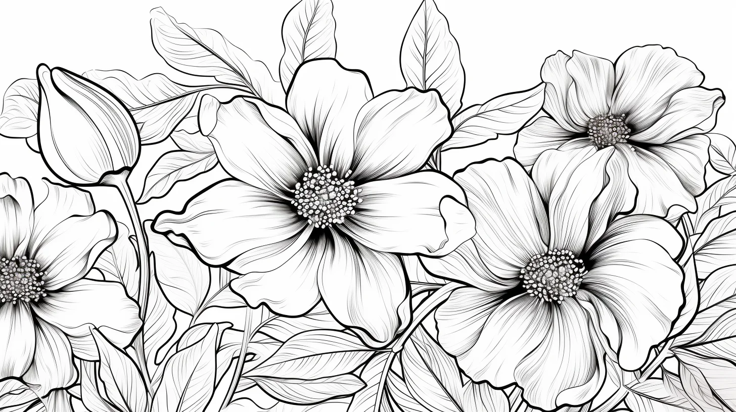
Open full-size flower coloring page 5
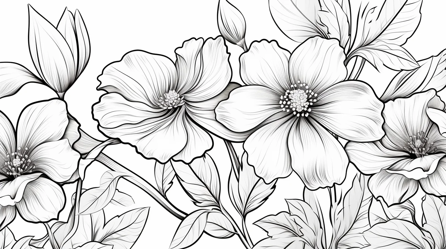
Open full-size flower coloring page 6
Daisy coloring pages
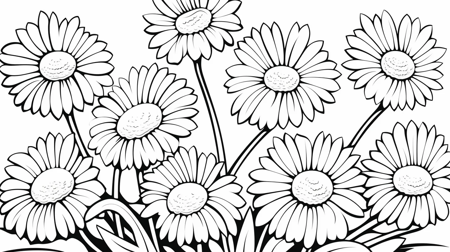
Daisies are the easiest flower type here to shade cleanly. Keep the center darker than the petals, then add a little shadow where each petal meets the center. You can leave the outer half of the petal almost untouched.
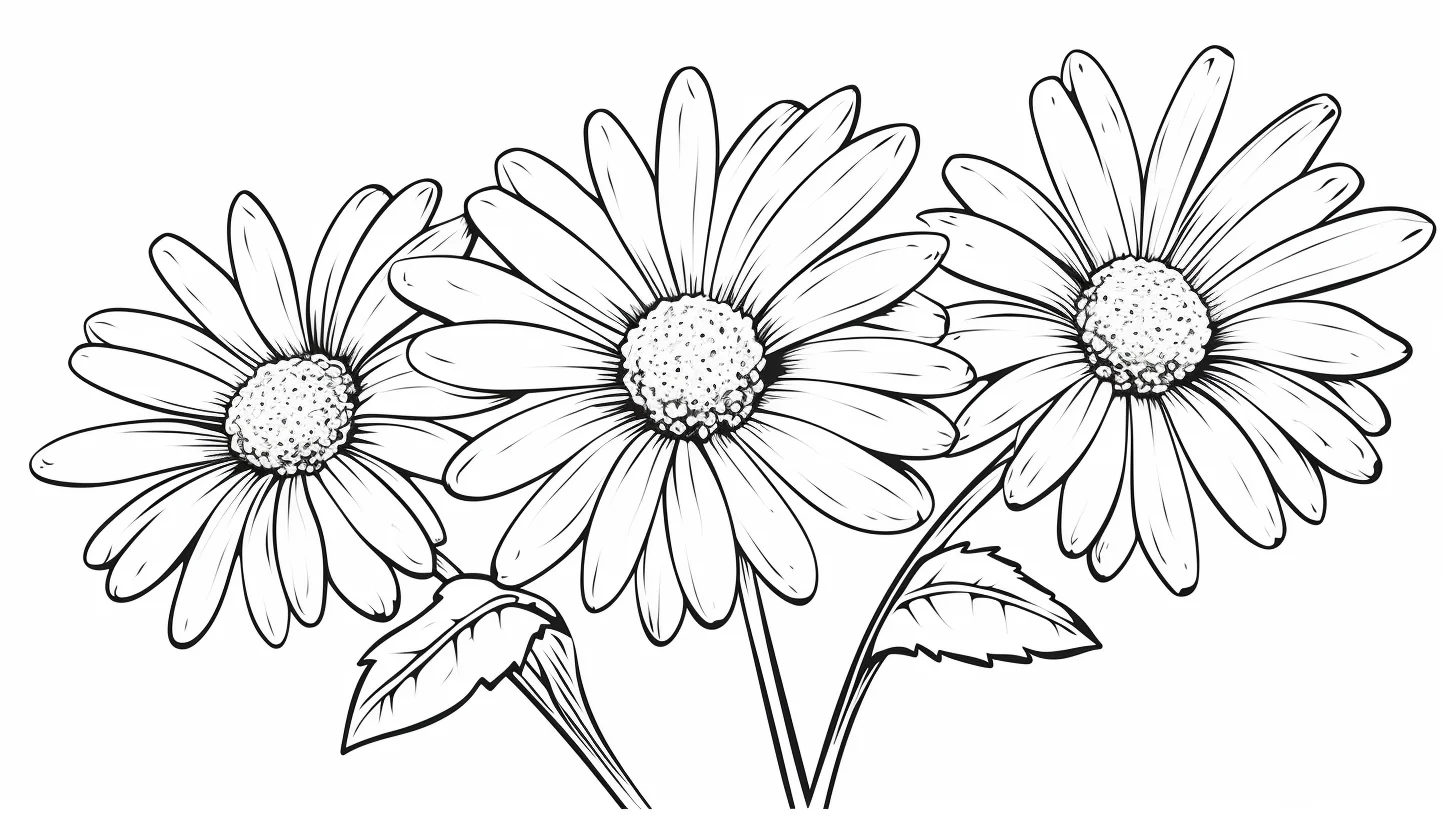
Open full-size daisy coloring page
Jasmine coloring page
Jasmine works differently because the blossoms are smaller. Instead of adding lots of color, use a very light petal tone and let the leaves or background carry more of the contrast.
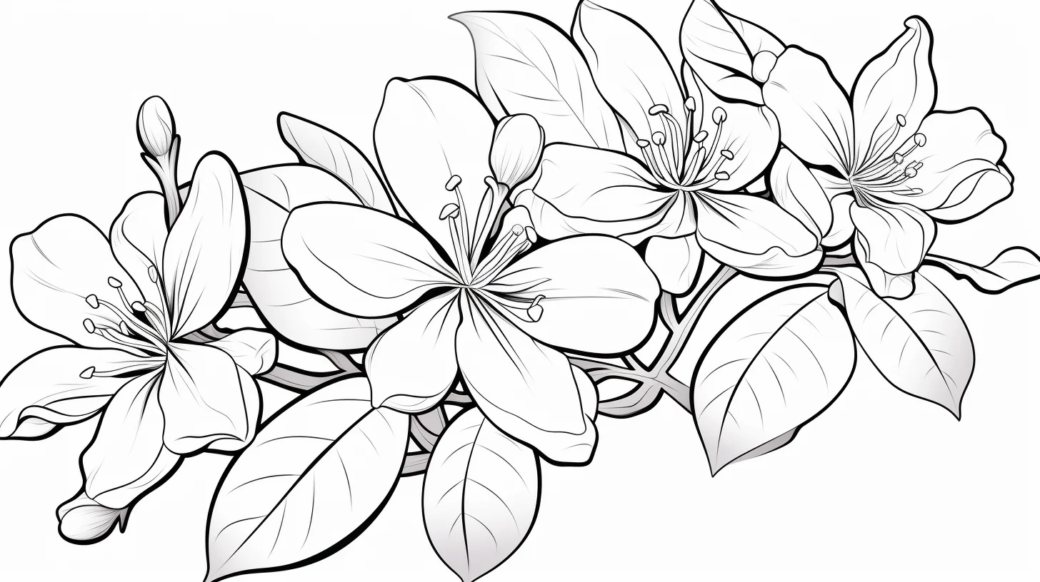
Open full-size jasmine coloring page
Lily coloring pages
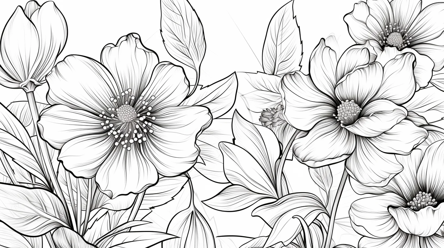
Lilies have longer petals, so the easiest shading direction is from the center outward. Put the strongest color near the base and central lines, then let it fade toward the tips. Keep the stamens distinct so the flower does not turn into one large block of color.
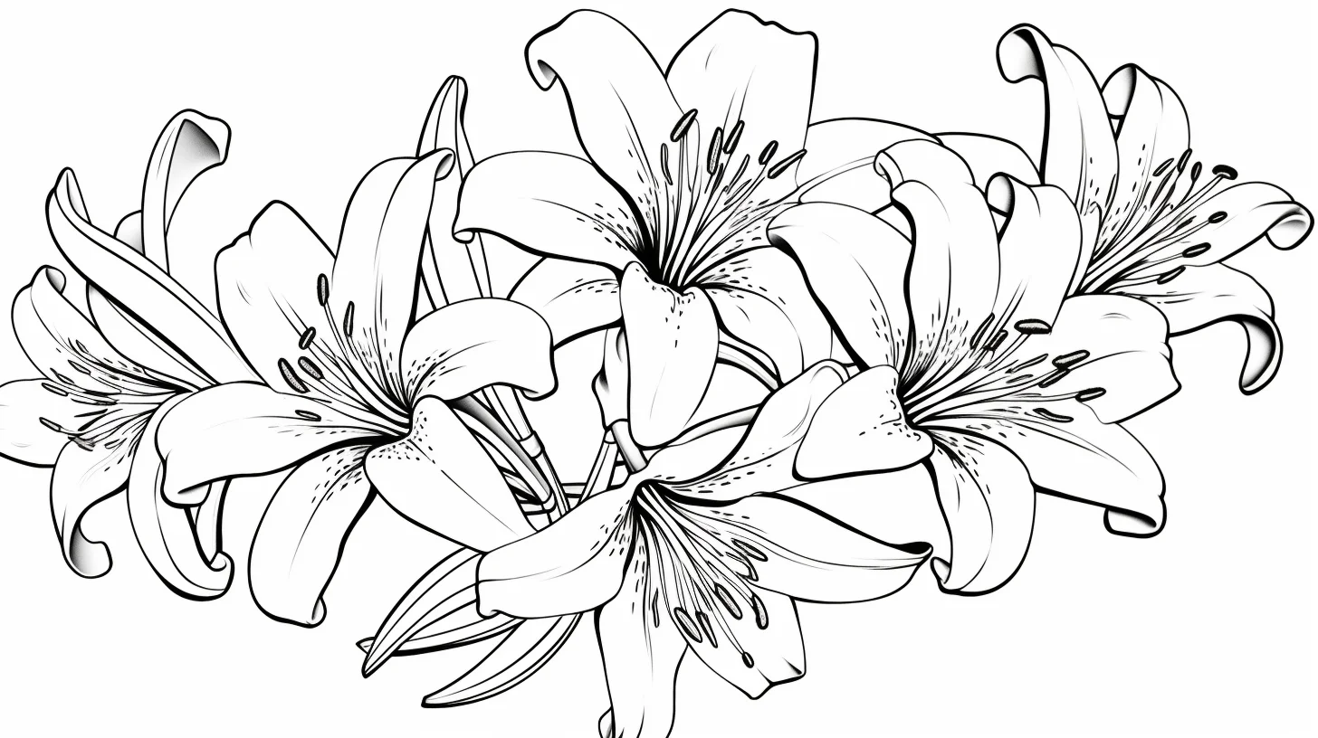
Open full-size lily coloring page 1
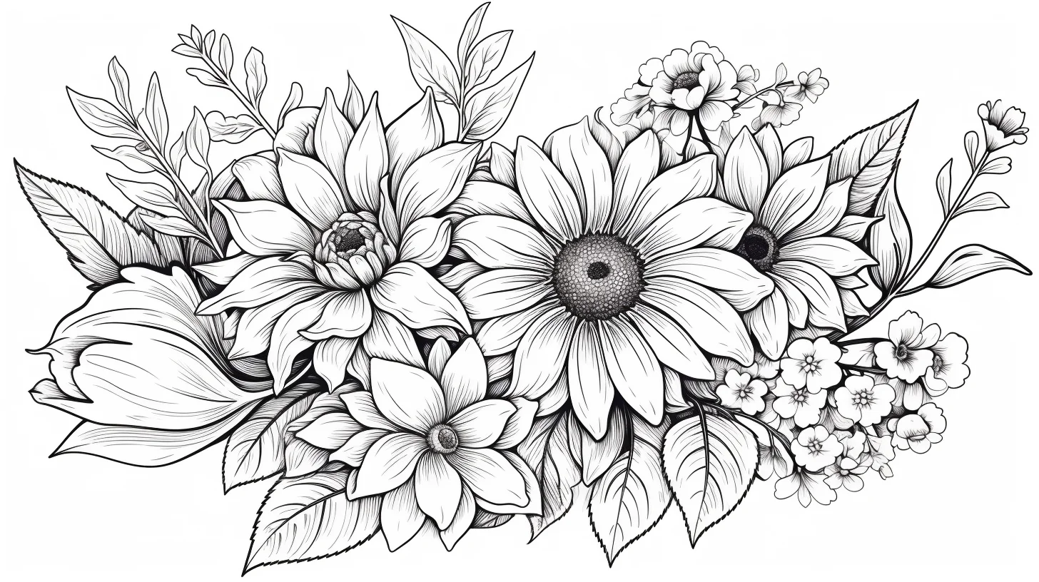
Open full-size flower coloring page 10
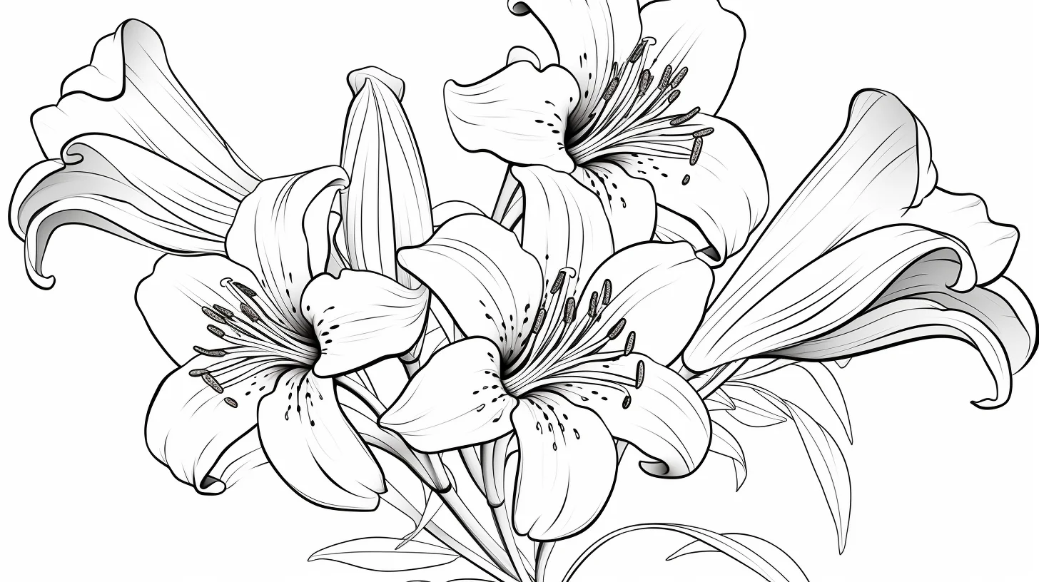
Open full-size lily coloring page 2
Rose coloring pages
Roses are mainly about overlap. Start with a light base, then darken the tight inner folds and the places where one petal tucks behind another. Avoid tracing every petal edge with the darkest color; that tends to make the rose look outlined rather than layered.
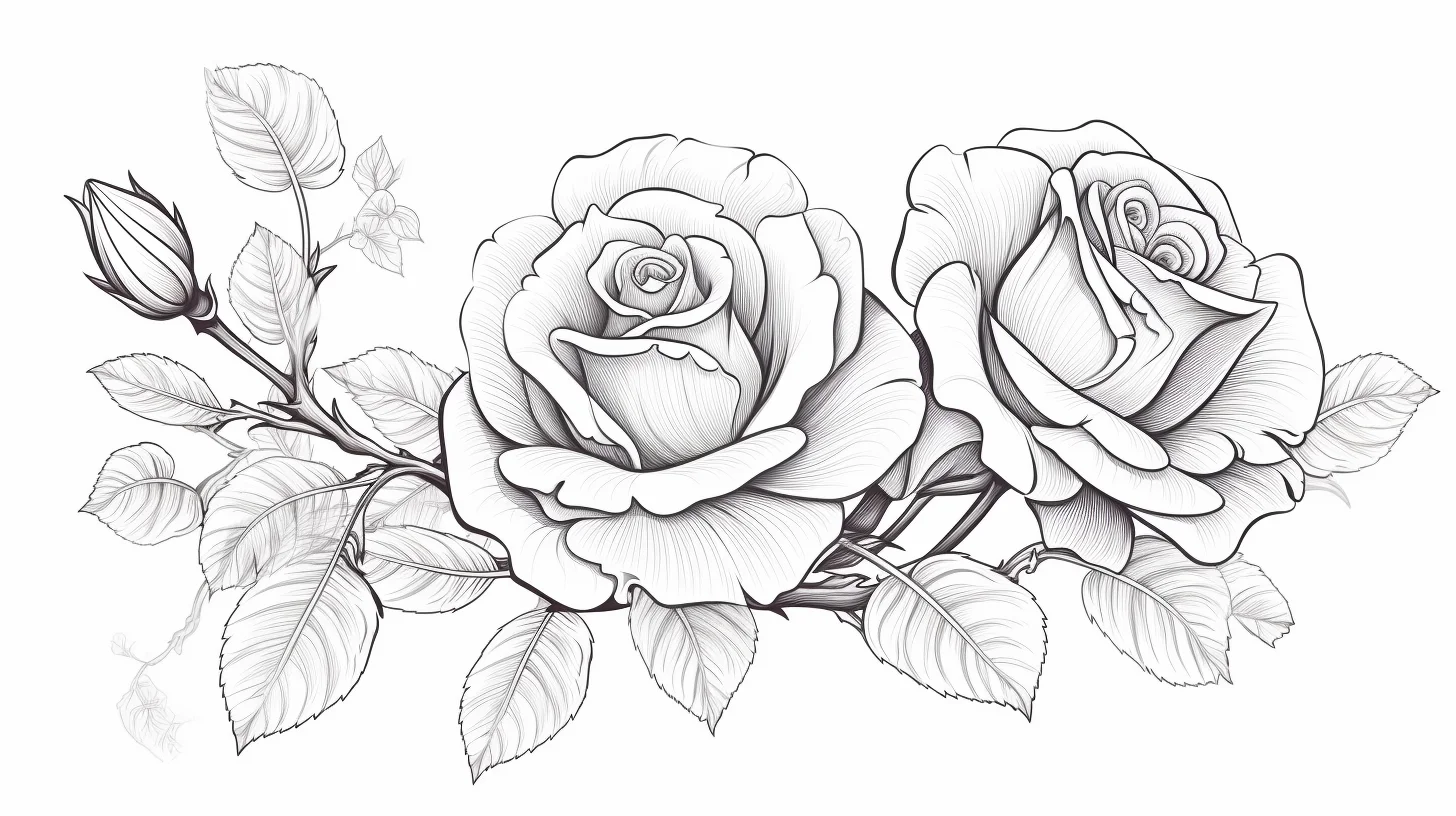
Open full-size rose coloring page 1
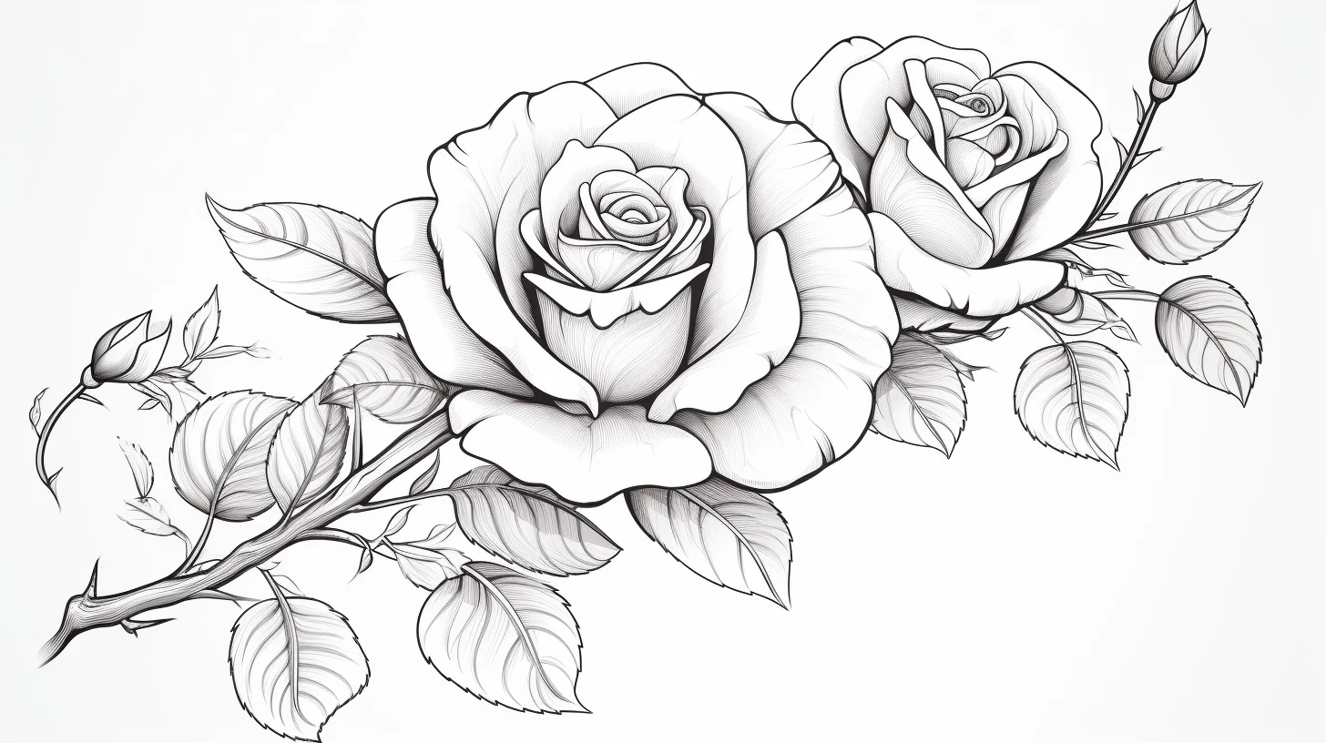
Open full-size rose coloring page 2
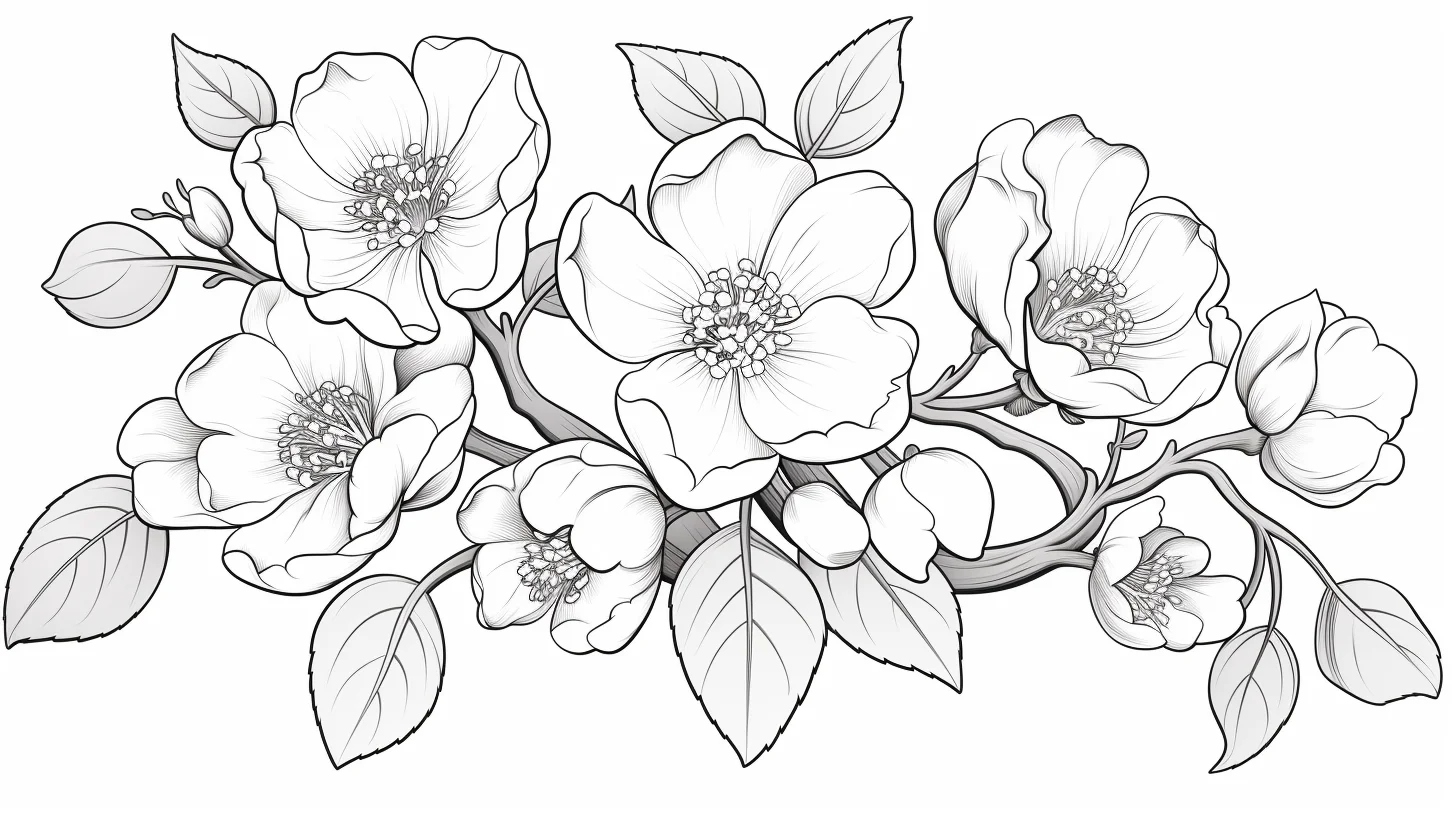
Open full-size flower coloring page 14
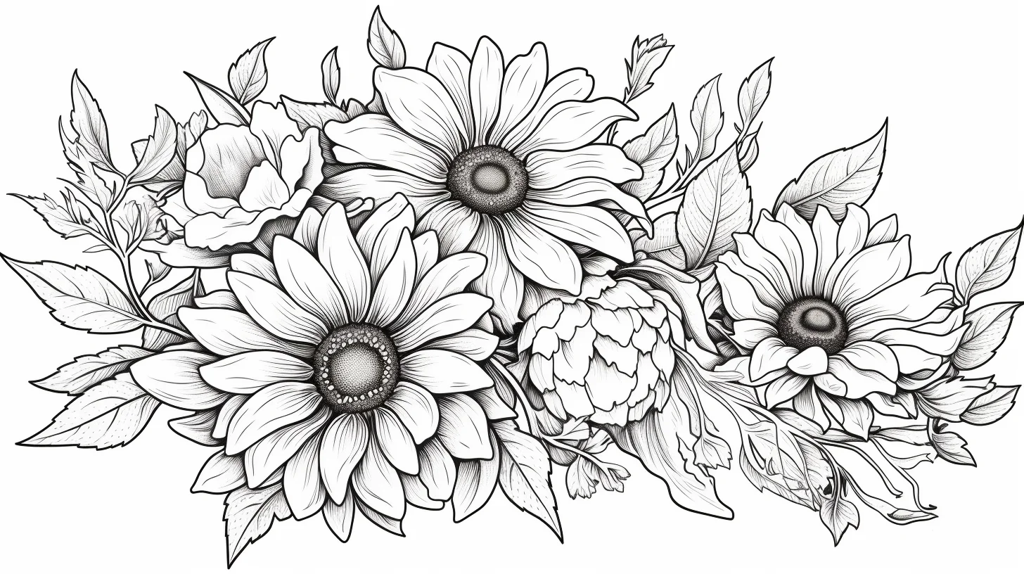
Open full-size flower coloring page 15
Mandala-style flower pages
These are less about identifying a real flower and more about rhythm. Choose three to five colors and repeat them in a pattern from the center outward. That is usually more satisfying than deciding on a brand-new color for every small section.
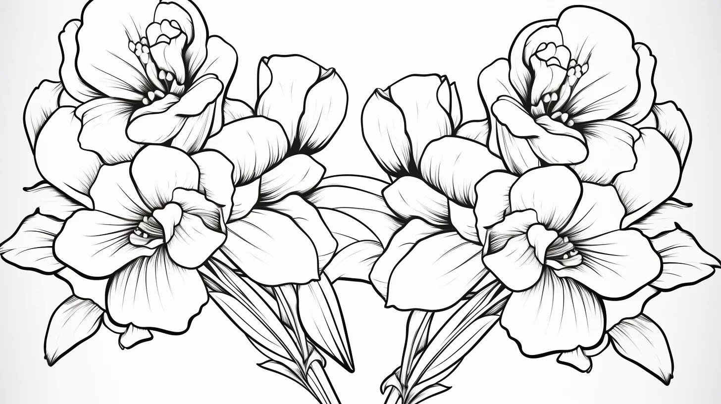
Open full-size mandala flower coloring page
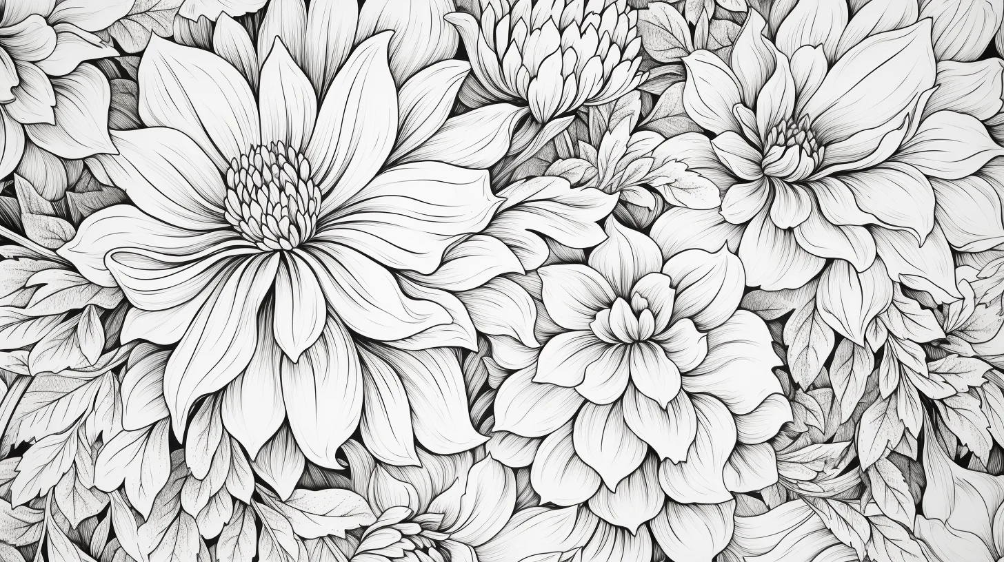
Open full-size flower coloring page 17
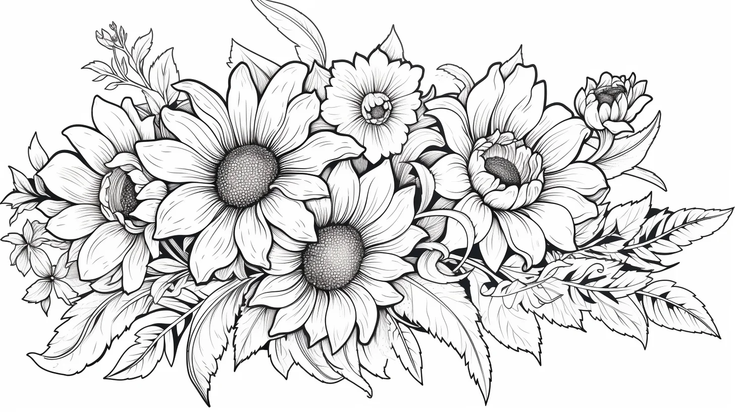
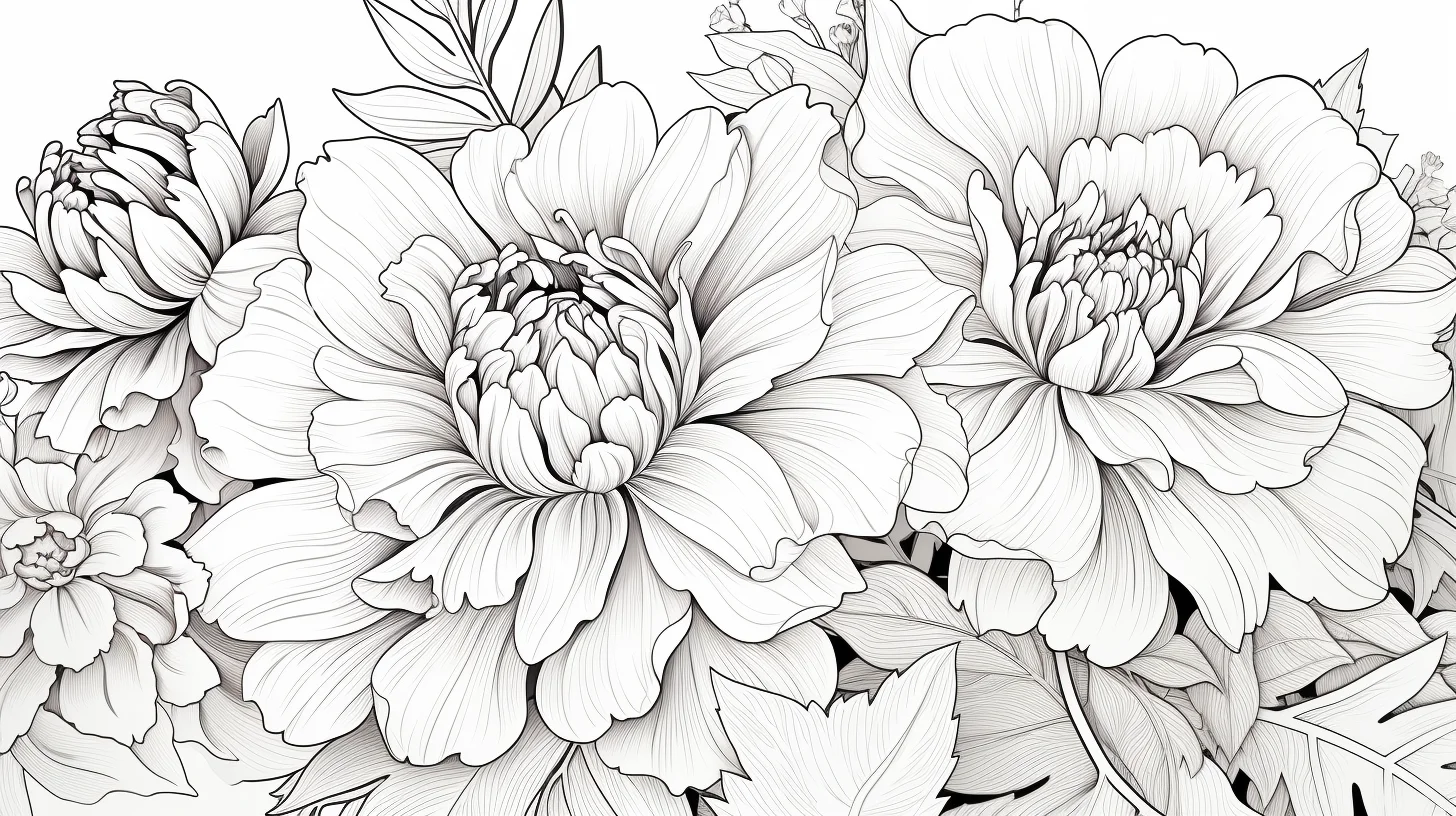
Open full-size flower coloring page 19
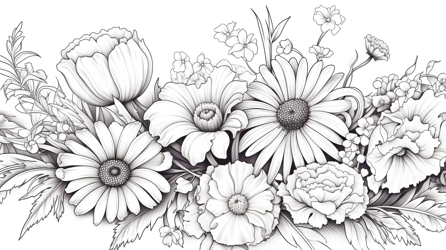
Open full-size flower coloring page 20
Flower-by-type questions
Which flower is easiest to color?
Daisies and other simple open flowers are usually easiest because the petals are broad and clearly separated. Roses and lilies ask for more attention to overlap and depth.
Which pages are best for colored pencils?
Roses, lilies, jasmine and mandala-style designs benefit most from pencils because you can control pressure in narrow petals and repeated details.
Do I need realistic flower colors?
No. Real references are useful if you want botanical-looking colors, but the line art works just as well with monochrome, pastel or invented palettes.
Where should I go for the simplest flower pages?
Use the easy-to-advanced flower sheets or the easy cute flower pages for kids.

