
These 36 baby shark coloring pages are original, generic young-shark drawings rather than branded characters. The collection moves from broad, simple sharks for quick coloring to kawaii designs and fuller underwater scenes. Pick by line density and background detail: large open shapes suit crayons and early colorers, while the last sheets give older kids more decisions about water, plants, fish and depth.
Do this 60-second test before choosing a sheet
Do not choose only by which shark looks cutest. Match the page to the tool and skill you actually want to use. On scrap paper, make one light and one dark patch with the crayon, pencil or marker you plan to use, then compare its tip with the smallest eye, tooth, fin and bubble spaces on the sheet.
- Check the tip size. If the tool is wider than several enclosed details, move toward Sheets 1–10. A broad crayon is not a poor choice; it simply needs broader line art.
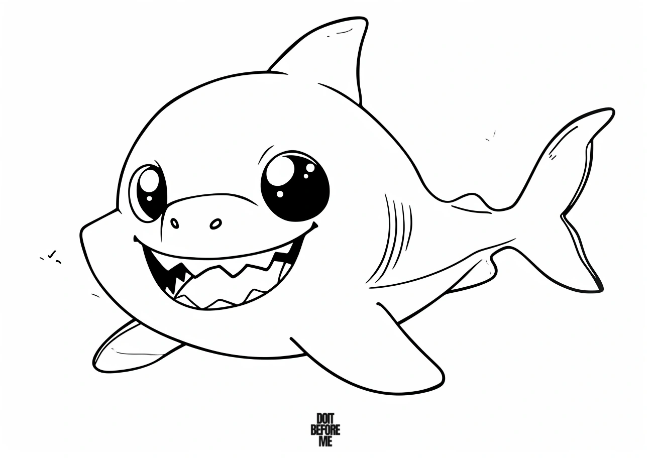
- Check the two-tone body. Make a darker back and lighter belly on the test shark above. If the two areas still read separately from arm’s length, you have enough value contrast without adding extra colors.
- Protect the face first. Before filling a dark body, identify the eyes, mouth and teeth. Leave a small light zone around tiny facial features so they do not disappear into the surrounding color.
- Count background decisions. If you want a five-minute activity, avoid sheets with several fish, plants and bubbles. If the goal is scene practice, choose Sheets 35–36 and deliberately keep the open water quieter than the shark.
For preschoolers: use one body color, leave the belly and teeth uncolored, and choose only one color for the water or bubbles. That gives a clear finish line and keeps the activity about control rather than endurance.
Choose a baby shark page
| If you want… | Start here |
|---|---|
| Easy pages for toddlers or younger kids | Sheets 1–10 |
| Cute or kawaii sharks | Sheets 11–18 |
| General printable baby sharks | Sheets 19–34 |
| Busier underwater scenes | Sheets 35–36 |
Keep the belly lighter than the back
For a natural-looking shark, use blue-gray or cool gray on the back and leave the belly white or very pale. You do not need a complicated gradient. One darker upper-body tone and one lighter underside are enough to give the body shape. On kawaii pages, the same contrast still works even if the shark is pink, turquoise or purple.
Mouths and teeth need less color, not more
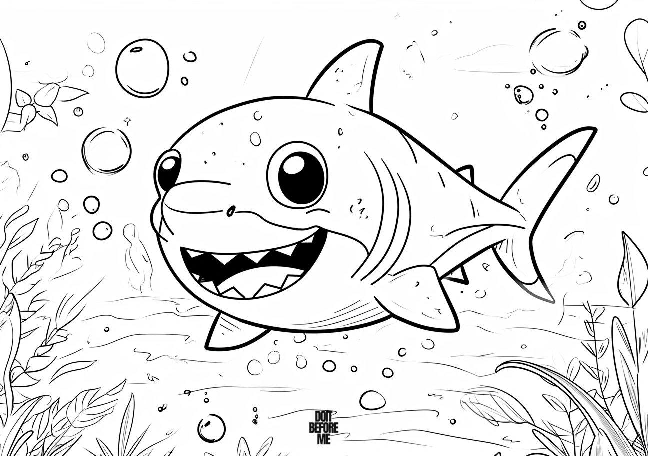
On smiling cartoon sharks, leave the teeth white and keep the mouth interior to one darker accent. Coloring every tooth border heavily can make a friendly shark look visually crowded. If the page has large eyes, keep the area around them lighter so the expression stays readable.
Color the shark before the ocean
Finish the main animal first, then add pale turquoise close to it and deeper blue farther away. That creates separation without relying on a thick black outline. Small fish, bubbles and plants can carry the brighter accents. If the background starts competing with the shark, repeat fewer colors rather than adding more.
A quick coloring order
- Color the back and fins first.
- Leave the belly and teeth light.
- Add mouth and eye details.
- Color small fish or plants next.
- Finish with the water, keeping it lighter around the shark’s outline.
Try three pages as a mini skill progression
If you are using the collection for practice rather than just choosing one picture, pick three sheets with increasing detail. Start with a broad, simple shark from Sheets 1–10 and practice staying inside the large body shapes. Next, choose a kawaii page from Sheets 11–18 and work on keeping the face readable while adding brighter accents. Finish with Sheet 35 or 36 and practice separating the shark from a complete underwater background.
Fix the most common baby-shark coloring problems
| If this happens… | Try this | Why it helps |
|---|---|---|
| The shark looks flat | Make the back one step darker than the belly. | The value change suggests a rounded body without complicated shading. |
| The face disappears | Keep the area around the eyes lighter and use the darkest color only for pupils and mouth details. | Small facial features need contrast more than extra color. |
| The teeth look messy | Leave the teeth white and color the mouth around them instead. | It avoids having to trace every tiny tooth edge. |
| The ocean competes with the shark | Use a paler blue beside the body and save darker water for the page edges. | The shark keeps a clear silhouette. |
| Crayon coverage looks patchy | Use several light passes in the same direction instead of one hard pass. | Layering fills white gaps without crushing the paper texture. |
| Markers streak across a large body | Work in small adjoining sections while the ink is still wet. | Wet edges blend more evenly than dried overlapping strokes. |
Three easy color plans
Ocean: blue-gray back, very pale blue belly, turquoise water and a small coral accent. Soft kawaii: lavender or pink shark, cream belly, pale aqua water and peach details. High contrast: dark teal back, white belly, light cyan water and yellow-orange fish. You can reuse one plan across several sheets and change only the accent color; that is often more coherent than choosing a new color for every object.
Practice smooth shark skin without making it look striped
A shark body is a useful place to practice even coverage because most of these drawings have broad, uninterrupted shapes. With colored pencil, start with light pressure and small overlapping strokes instead of tracing repeatedly along the outline. Add the second layer mainly across the back, top of the head and upper fins; let the belly stay close to the paper color. If you want a softer transition, overlap the dark and light zones with the lighter pencil rather than adding a third shade.
With crayons, turn the crayon slightly sideways for the first layer so the broad edge covers more paper, then use the point only around the eyes, mouth and fin edges. With markers, divide a large shark mentally into the head, middle and tail and finish each area while its edge is still wet. This reduces the dark bands that appear when a marker stroke dries before the next one overlaps it.
Make an underwater scene look deeper with only three values
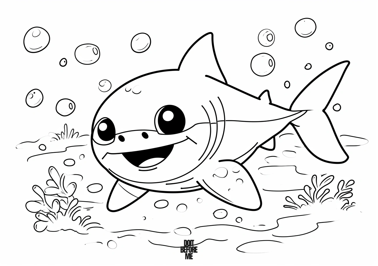
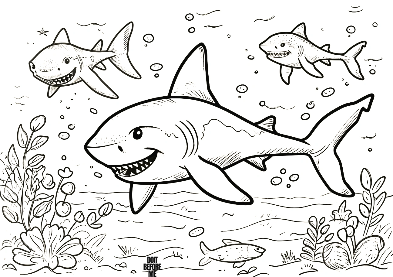
On Sheets 35–36, decide what should read first before coloring the background. Keep the shark as the strongest contrast, use a middle value for nearby plants and fish, and reserve the palest value for open water around the shark. You do not need to fill every patch of water. Leaving some white or very pale space around the body can make the animal clearer and the finished page less heavy.
Printing
These sheets are landscape-oriented, so landscape mode is the sensible starting point on A4 or US Letter paper. Open the full-size image and use “Fit to page.” If you want a smaller collection specifically for preschoolers, use the easy baby-shark gallery. For other underwater subjects, see the orca pages, octopus pages or the sea animal hub.
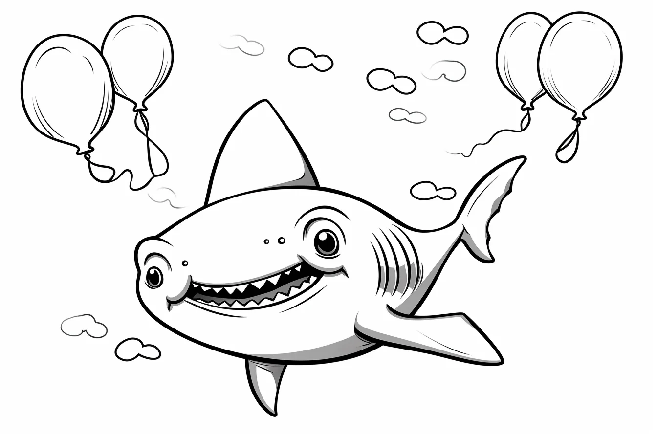
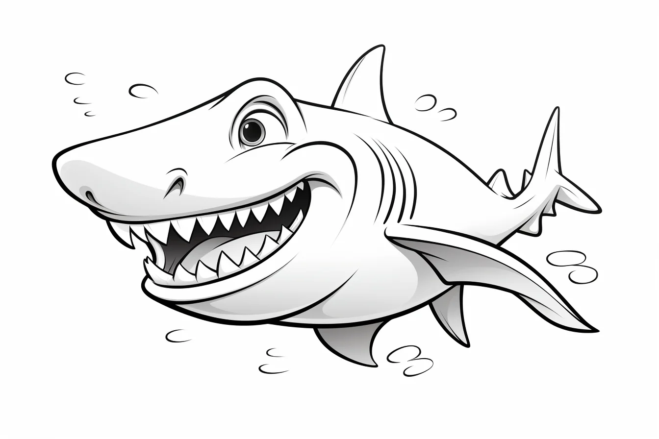
Easy baby shark pages — Sheets 1–10
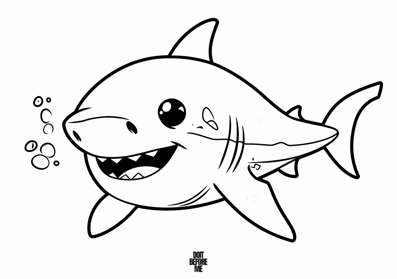
These are the quickest sheets: large sharks, broad bodies and comparatively little background detail. They are the safest choices for crayons and younger children.

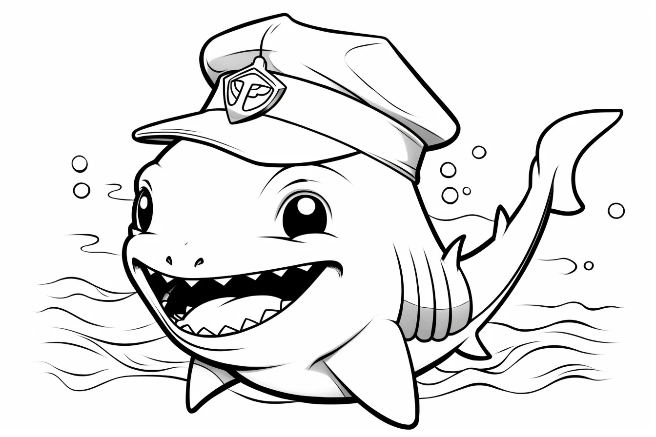
Cute and kawaii baby sharks — Sheets 11–18
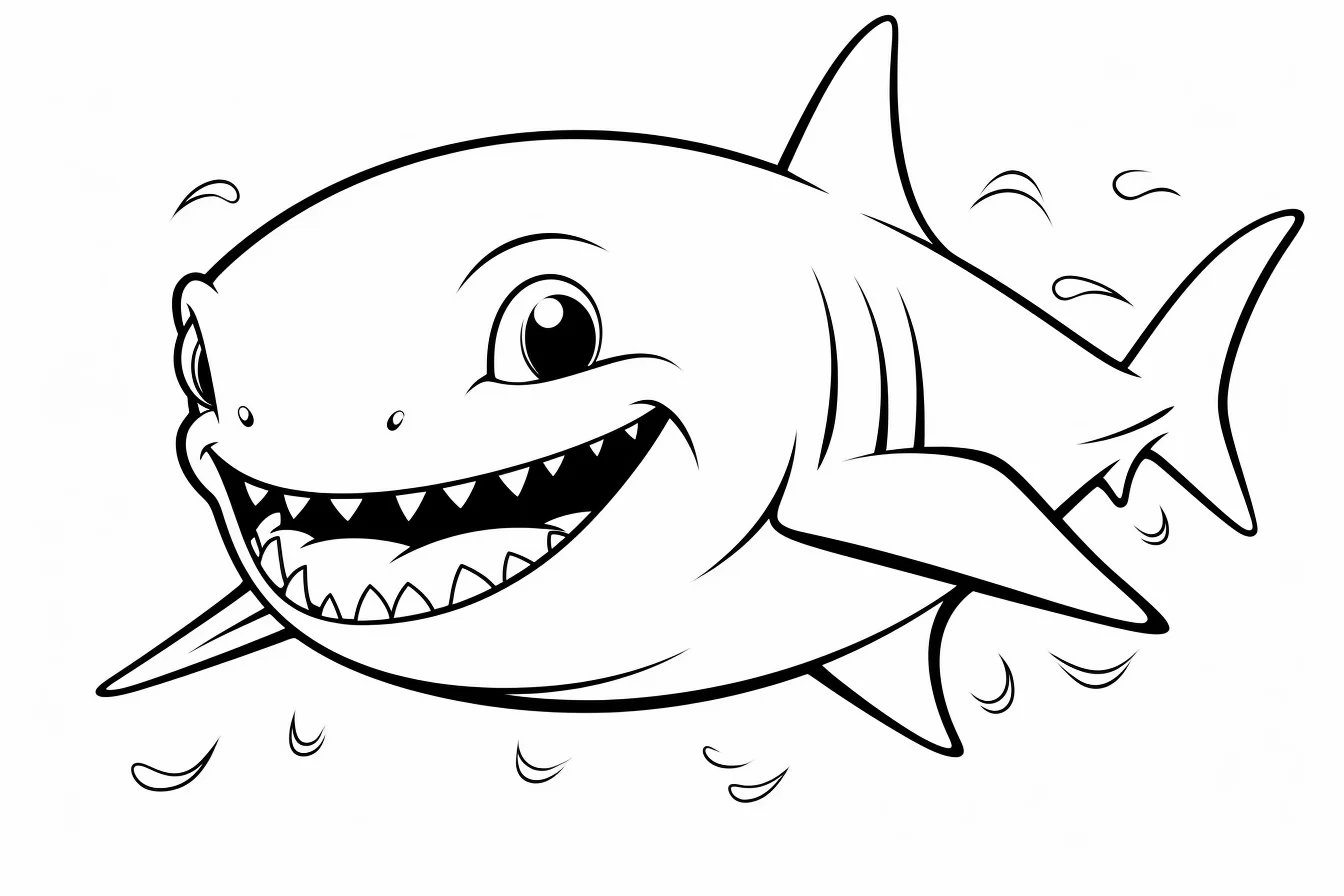
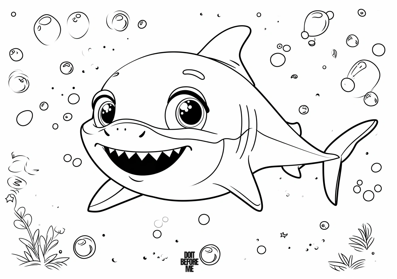
This group is more playful than realistic. Keep the shark itself simple and use the smaller fish, bubbles and plants for brighter accent colors.
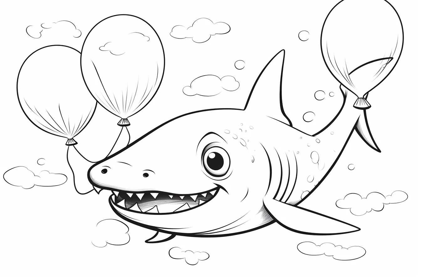
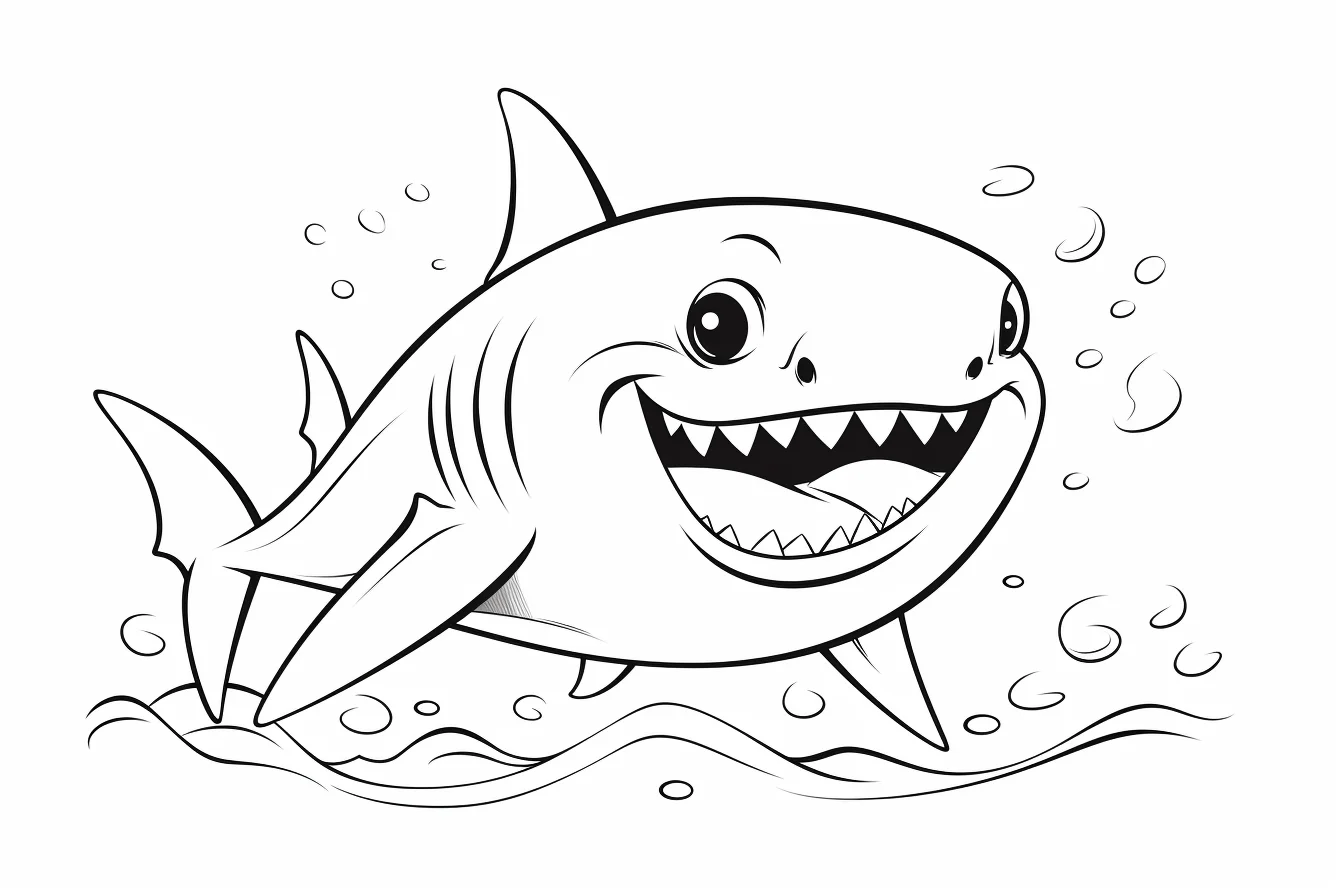
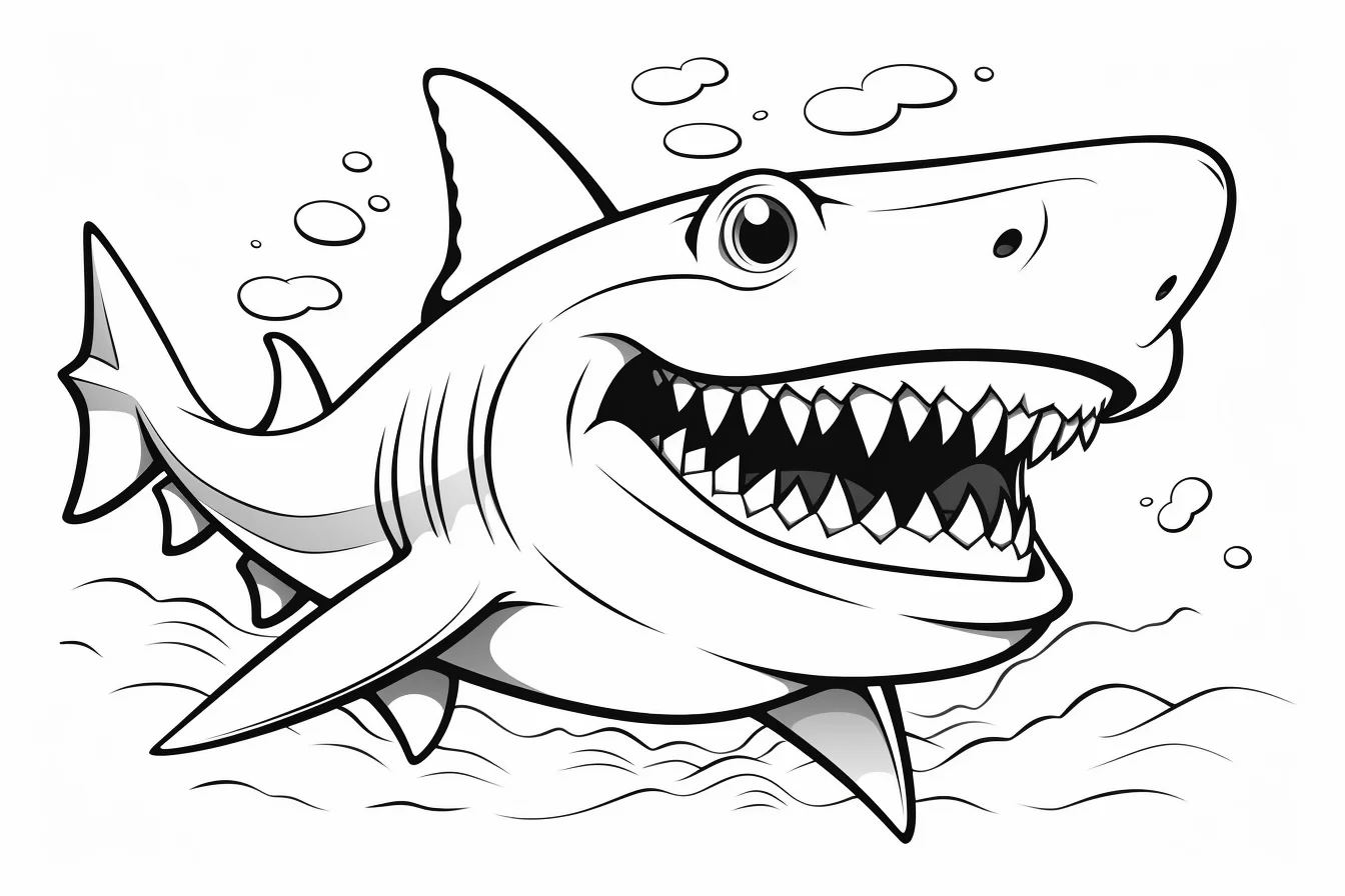
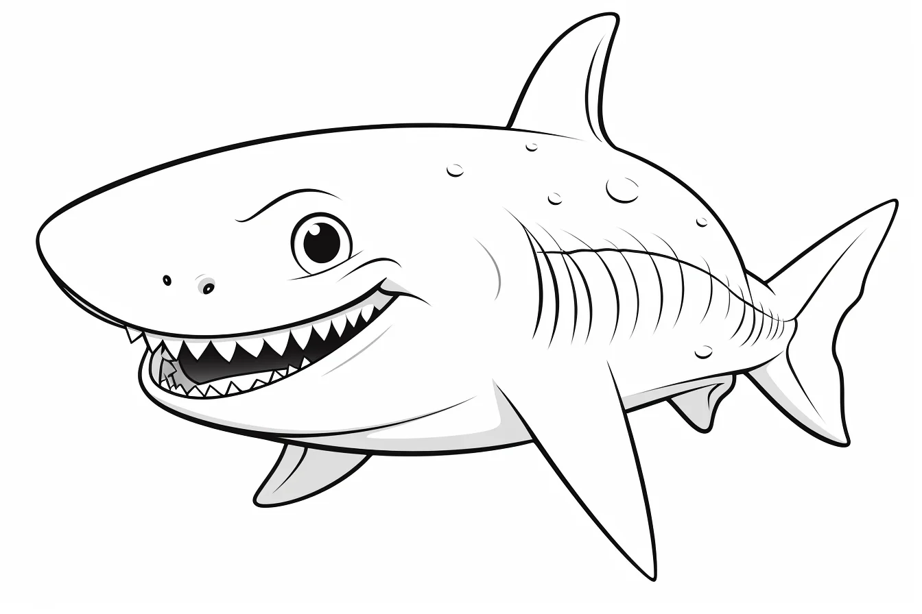
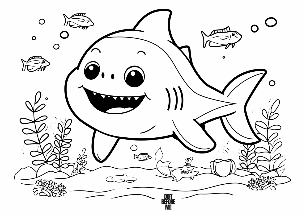
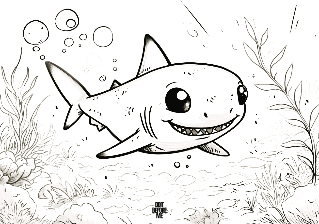
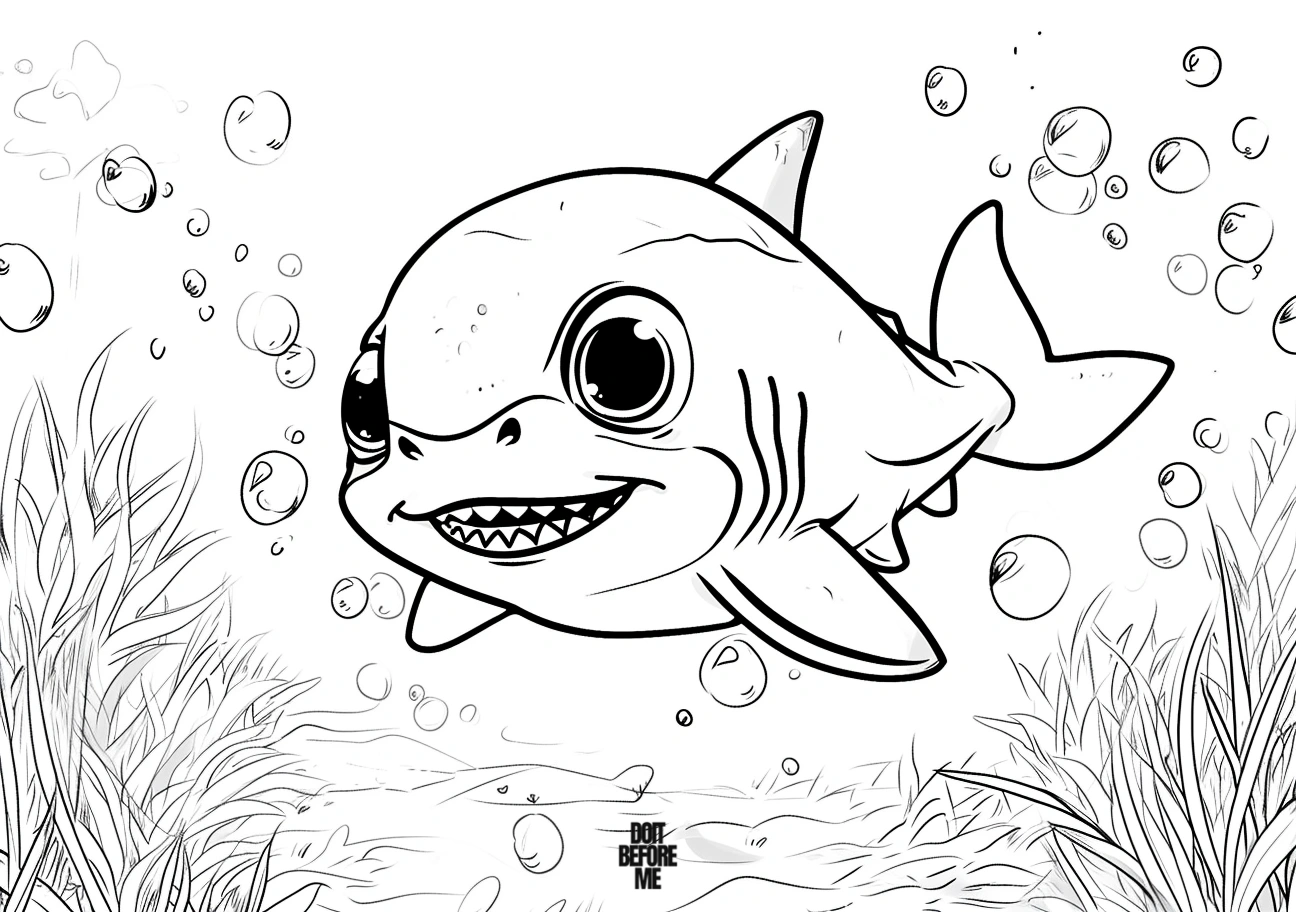
General printable baby sharks — Sheets 19–34
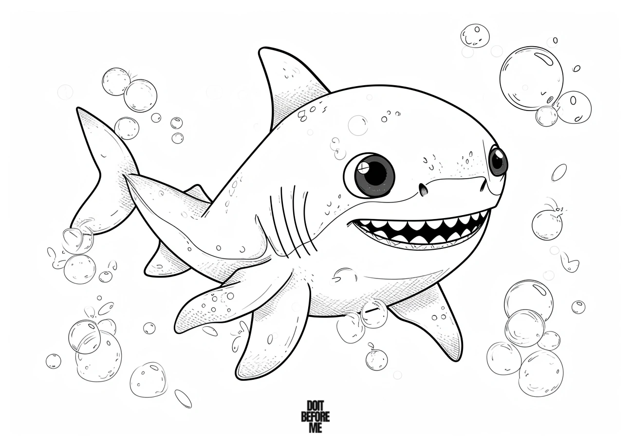
These are the flexible middle-ground sheets. Use them when you do not specifically need a toddler page or a kawaii scene.
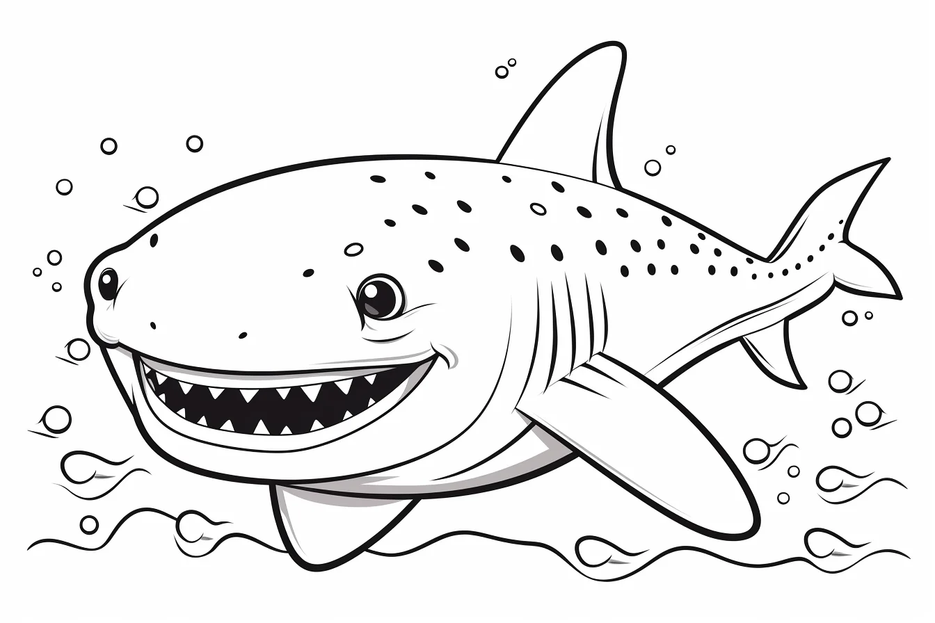
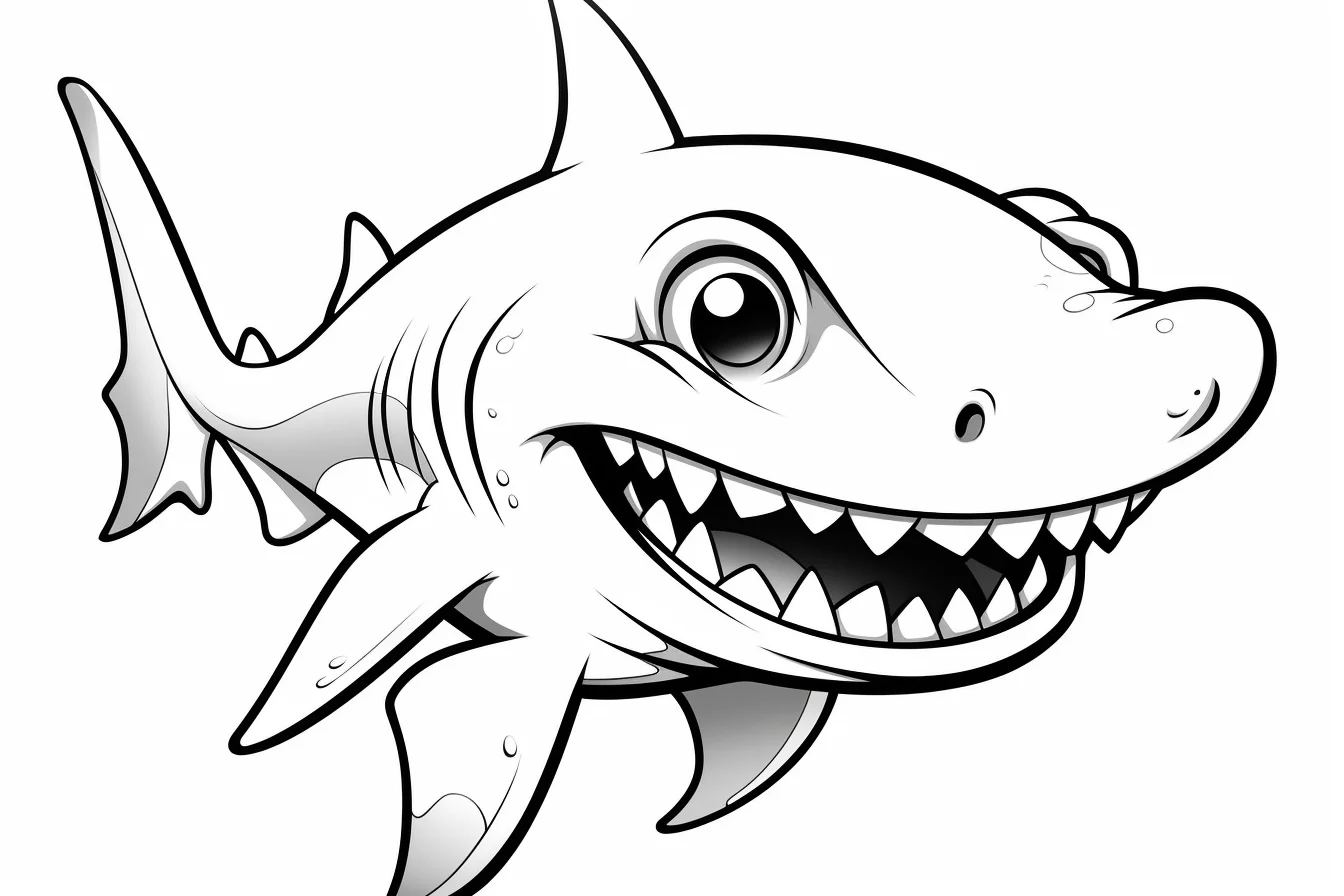
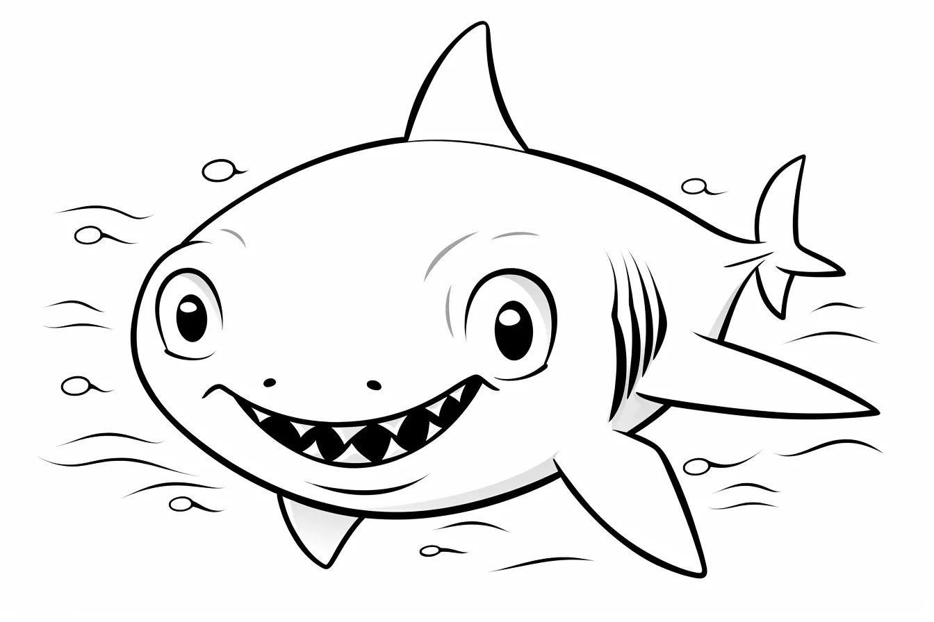
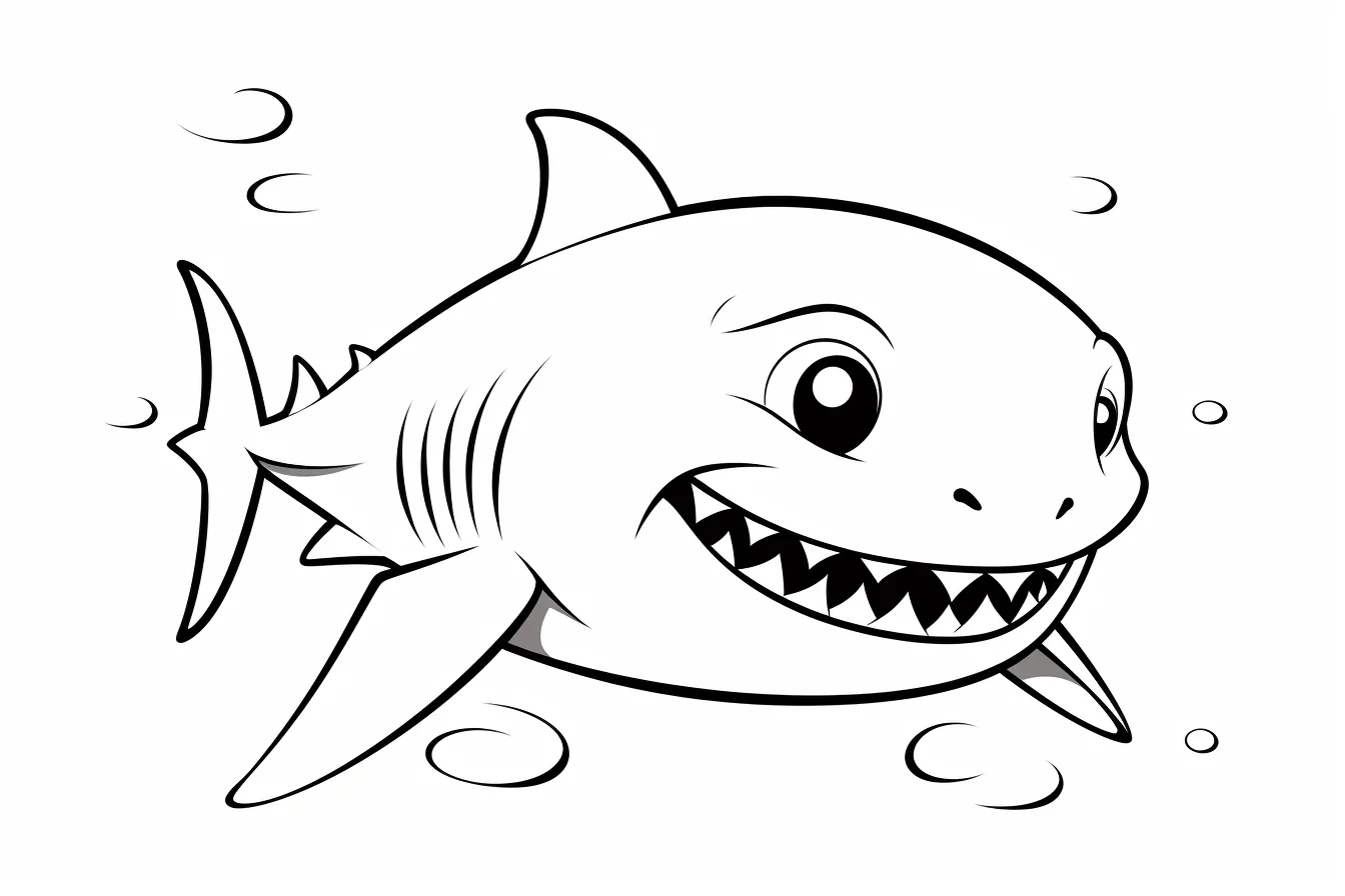
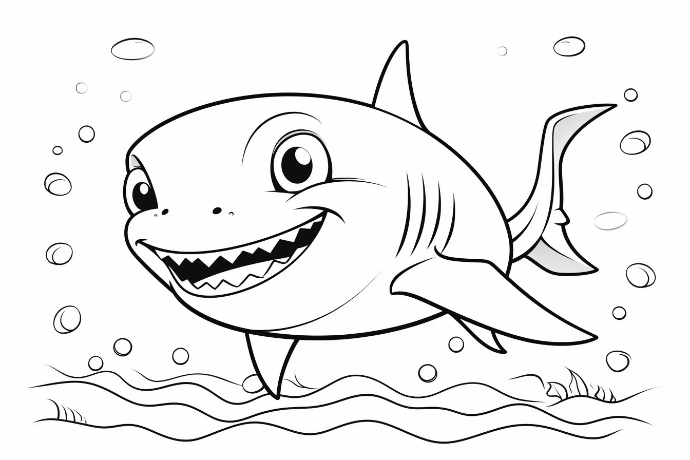
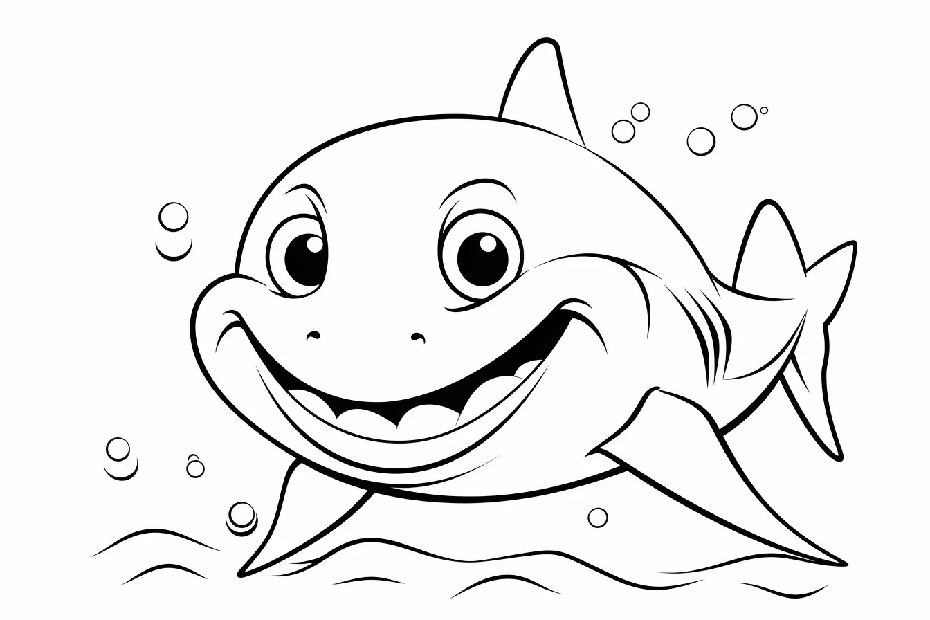

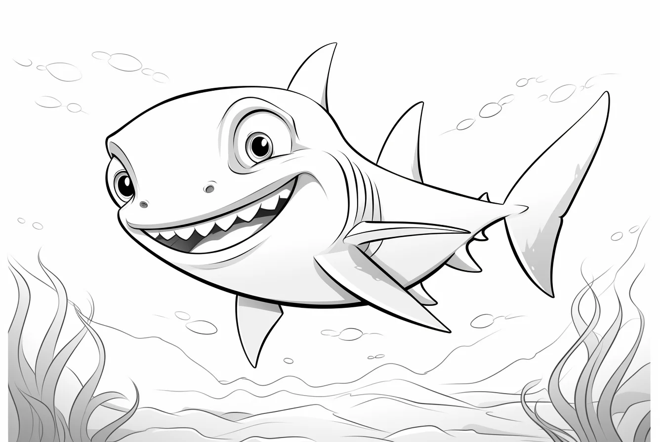
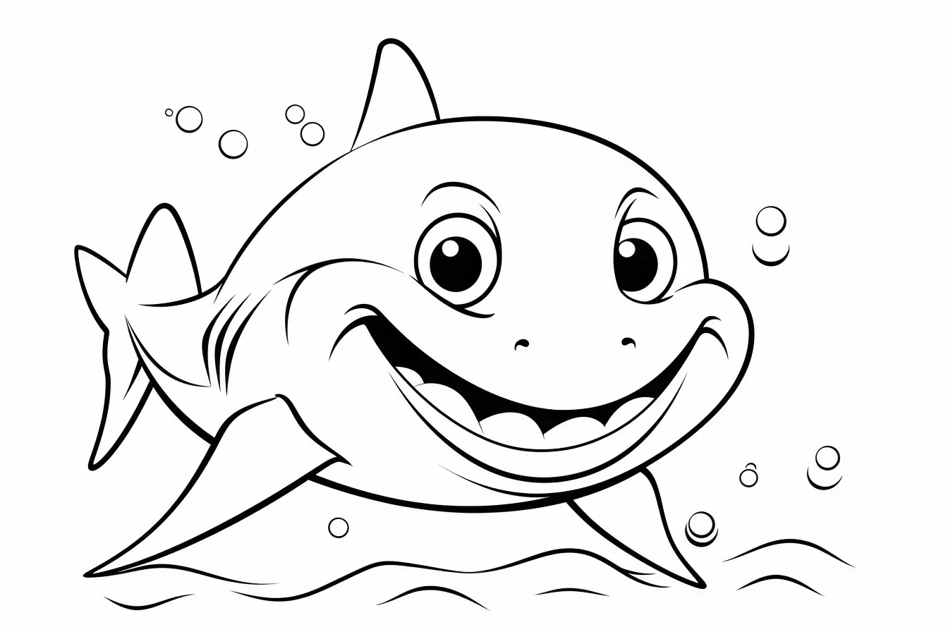
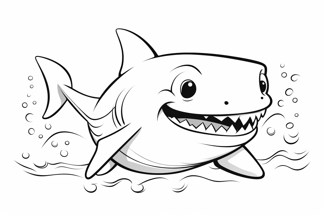
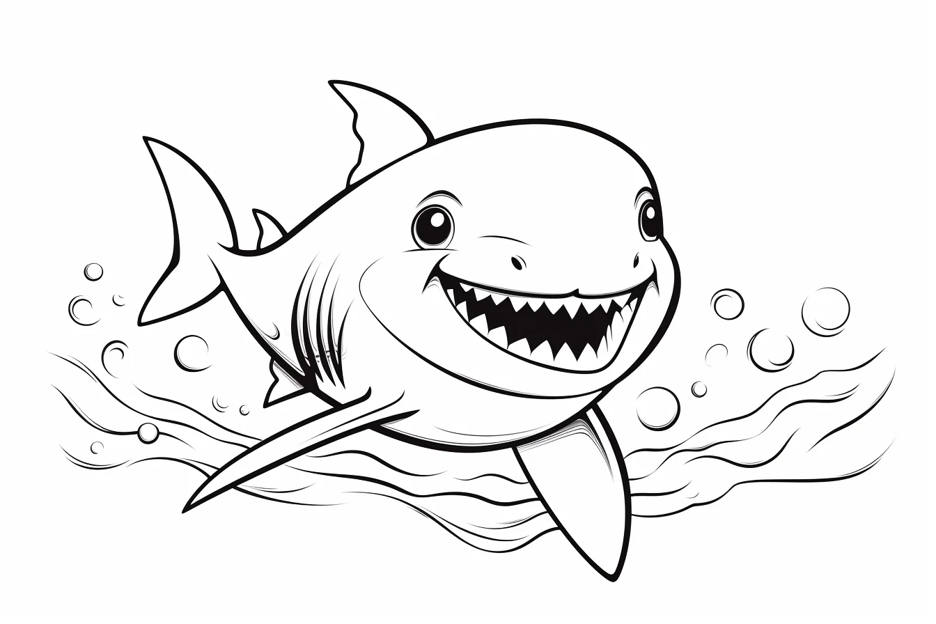
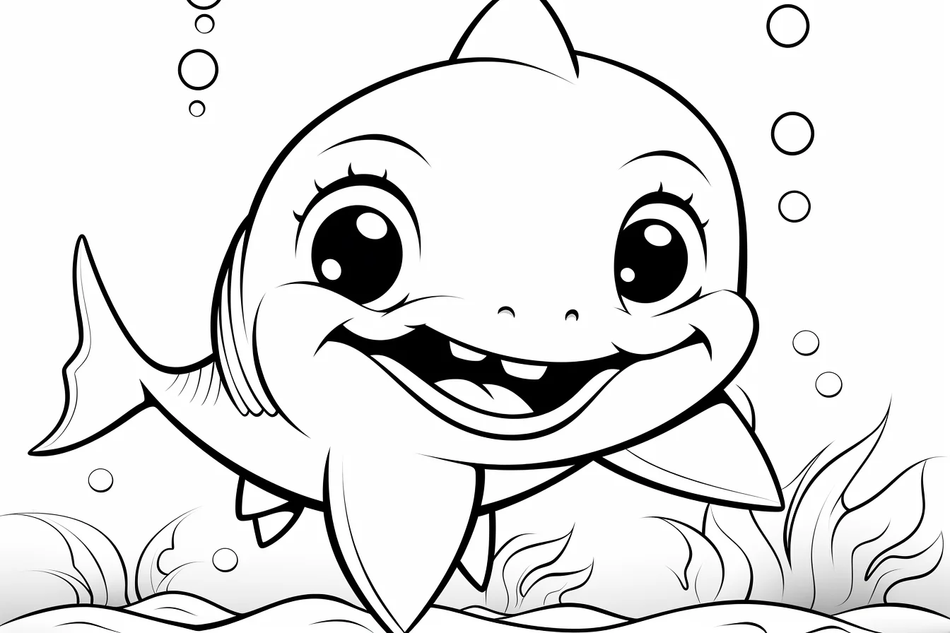
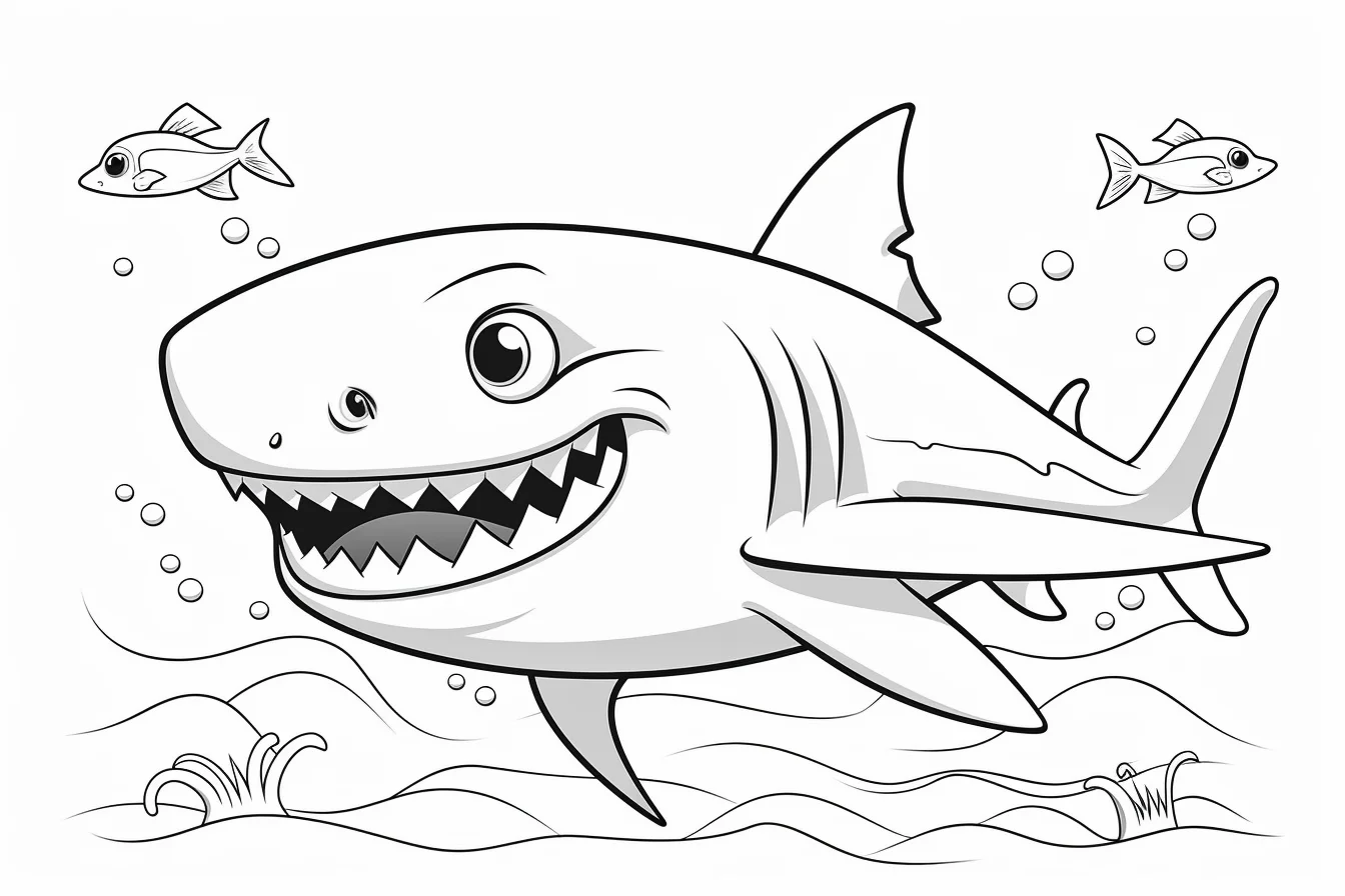
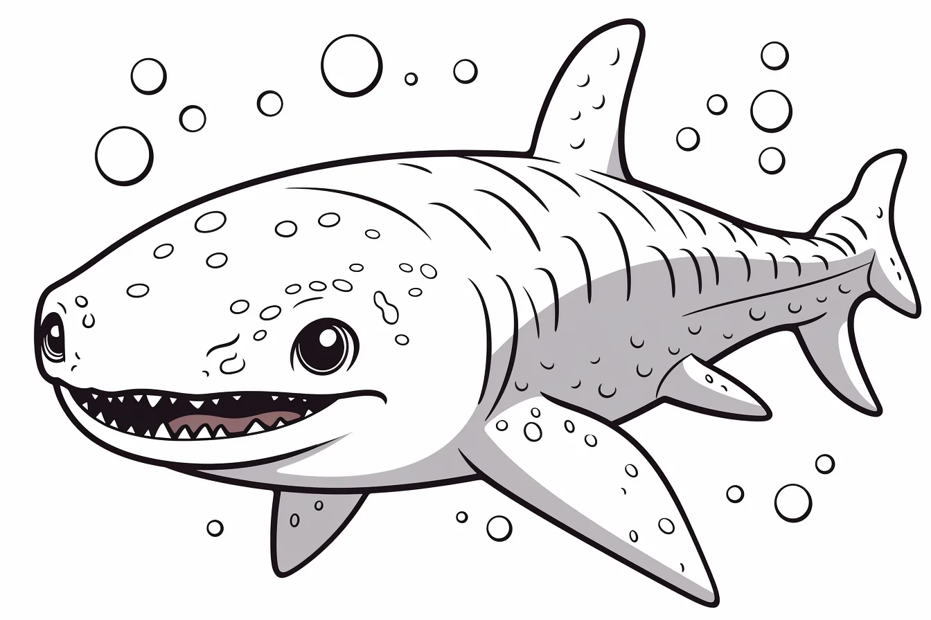
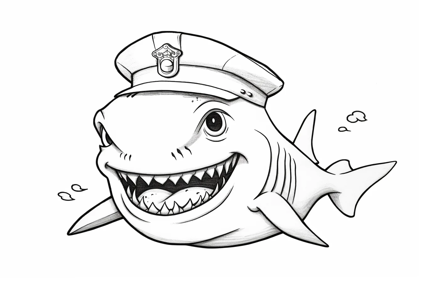
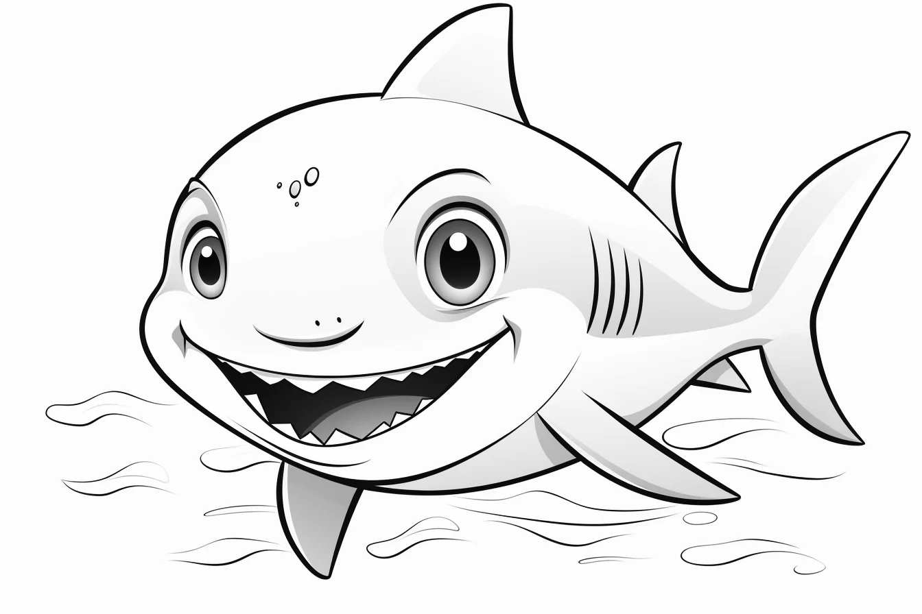
Busier underwater scenes — Sheets 35–36
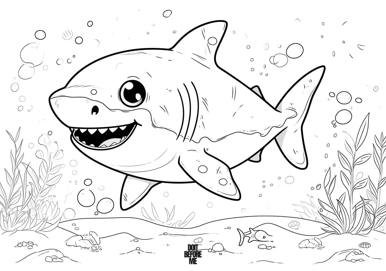
These last two ask for more background decisions. Color the sharks first, then use a limited set of water and plant colors so the scene does not overpower them.
Quick baby-shark questions
Which pages are best for toddlers?
Start with Sheets 1–4. They use larger shapes and simpler scenes than the pages near the bottom.
Does a shark have to be gray?
No. Blue-gray with a pale belly is an easy natural option, but the cute pages work well in turquoise, purple, pink or other fantasy colors.
How do I keep the water from swallowing the shark?
Keep the water lighter immediately around the body, then deepen the blue farther away. That creates separation without adding a heavy outline.

