
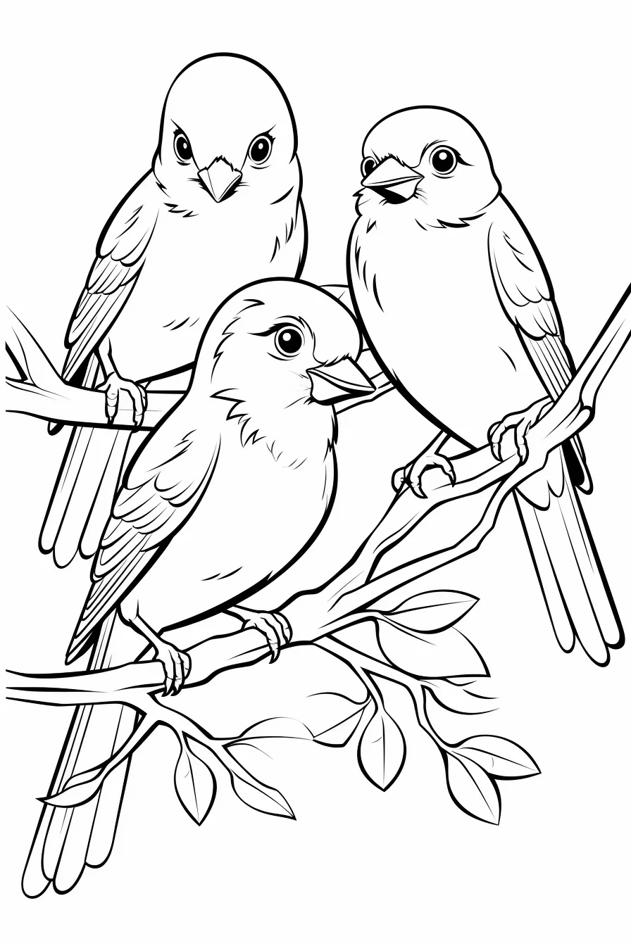
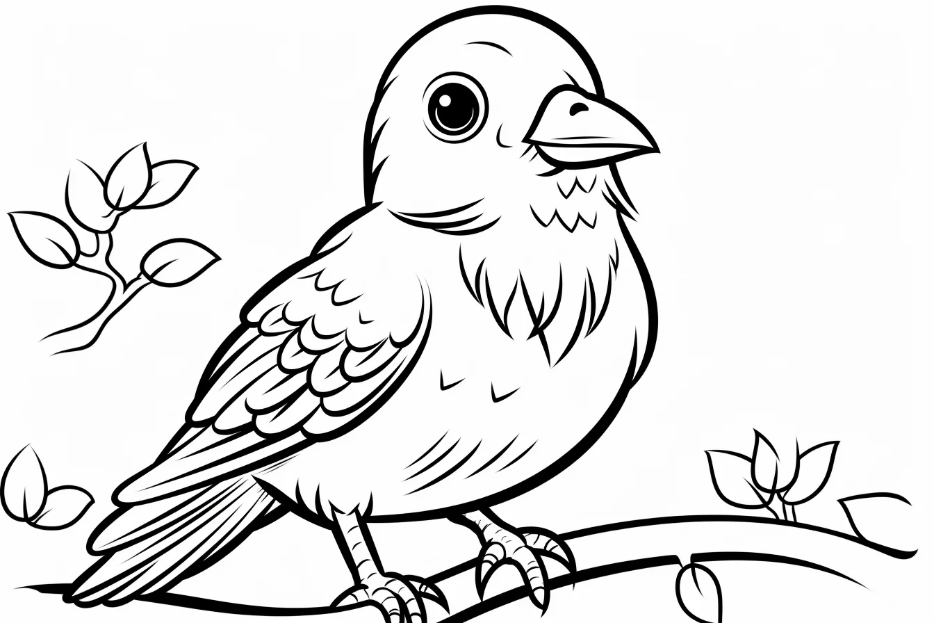
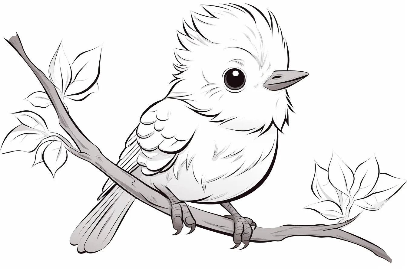
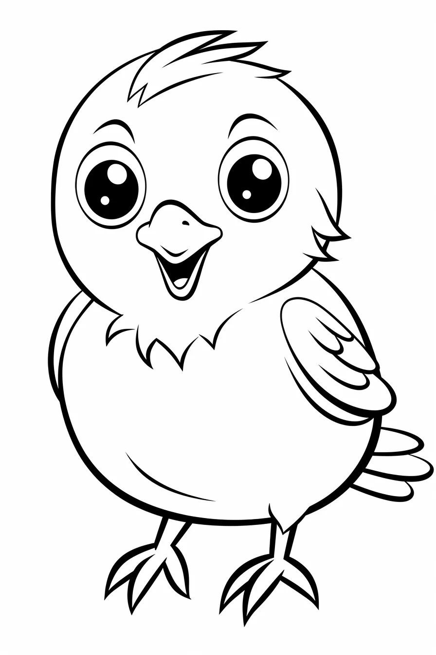
This gallery has 32 bird coloring pages, from very simple baby birds to flying birds, bird families and a few more detailed designs. Most sheets are wide landscape images, with a smaller number of portrait pages.
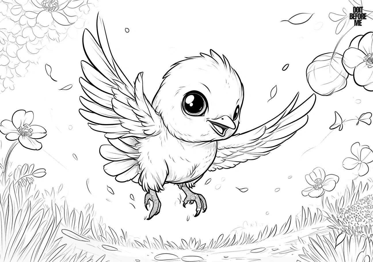
For a quick activity, choose one of the single-bird designs with a plain background. Pages with nests, plants, families or more scenery take longer and are easier with colored pencils. Crayons work well on the larger open shapes.
Save the individual image you want and print it with “Fit to page.” Use landscape orientation for the wide sheets and portrait orientation for the taller pages. If the preview crops the artwork, see our Print & Save Help guide.
Choose this gallery when you want more than one cute bird
This is the broader bird collection: it includes flying poses, nests, family-style pages and nature details in addition to simple baby birds. If you only want uncomplicated kawaii birds, the 24 easy bird coloring pages are faster to browse.
- Quick activity: choose a single bird on a clean background.
- More storytelling: use a nest, family or nature scene.
- Longer coloring session: pick the adult-oriented or more detailed pages with smaller shapes.
32 bird coloring pages
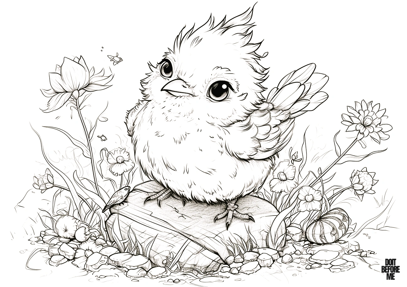
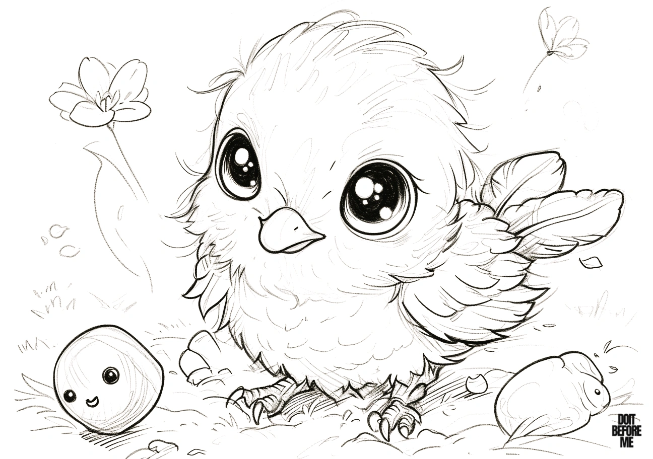
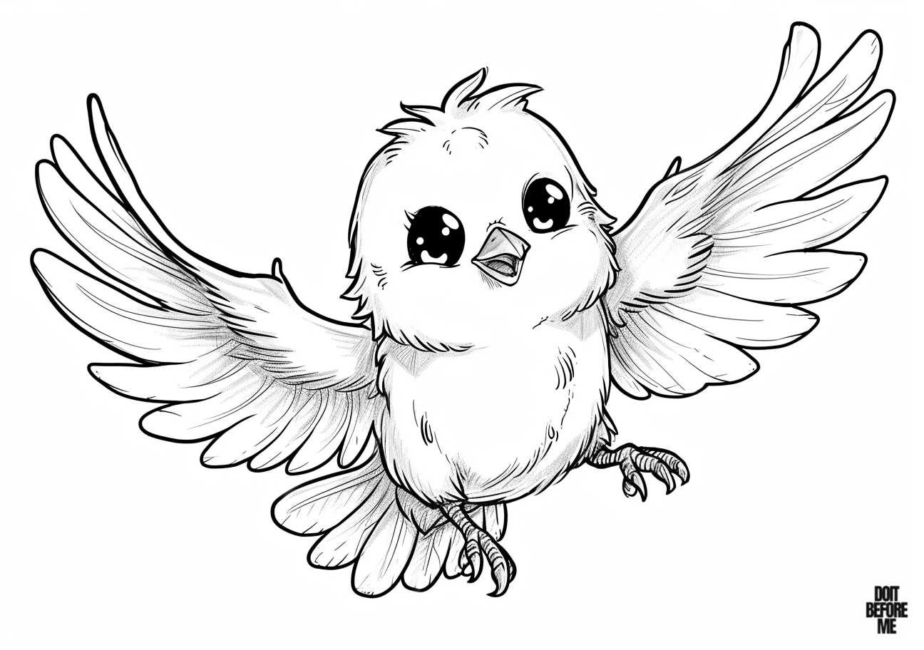
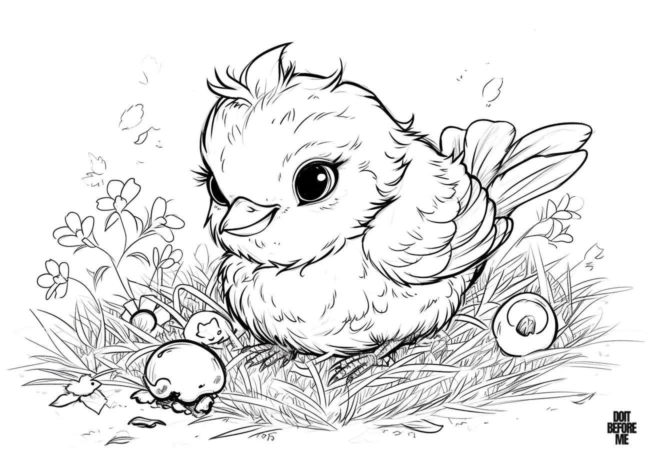
Flying and nest group: color the bird before the surroundings so it stays the focal point. On the flying pages, a darker wing value helps show movement; on the nest page, keep the nest in quieter browns or tans so it does not compete with the bird.
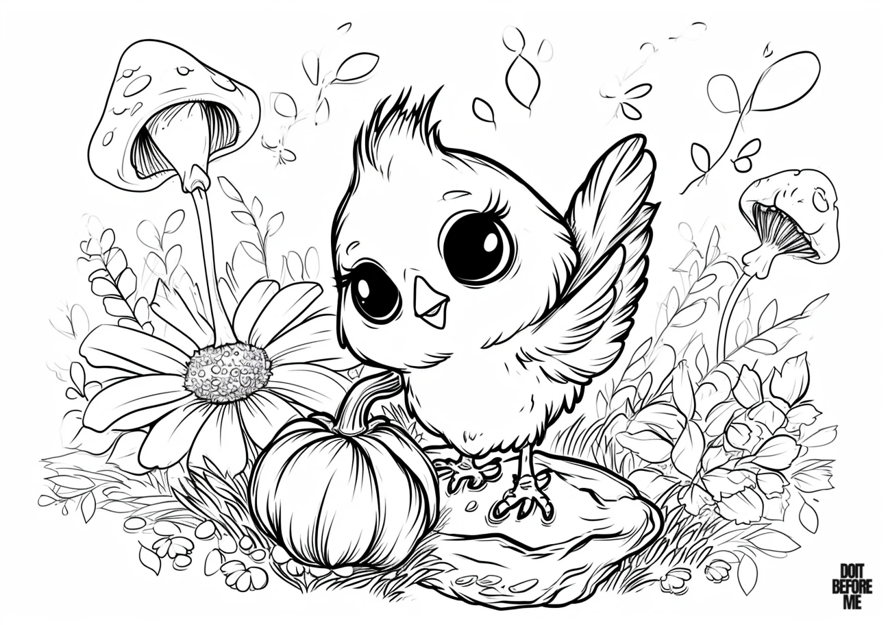
Nature-detail page: choose the bird palette first, then use the mushroom, flower and pumpkin as smaller accent areas. Keeping the background details slightly less saturated helps the bird remain the main subject instead of getting lost in the scene.
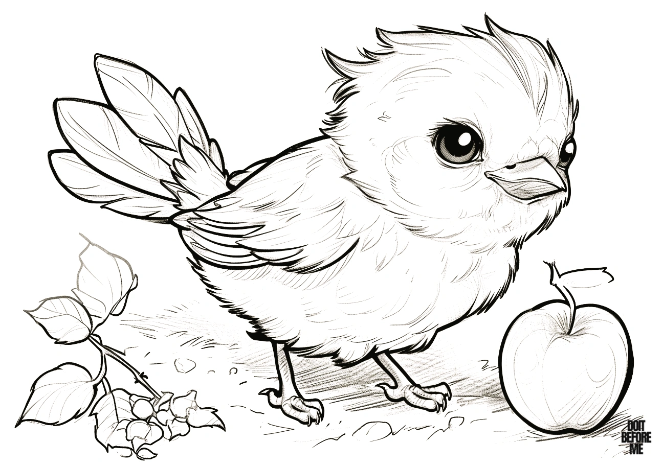
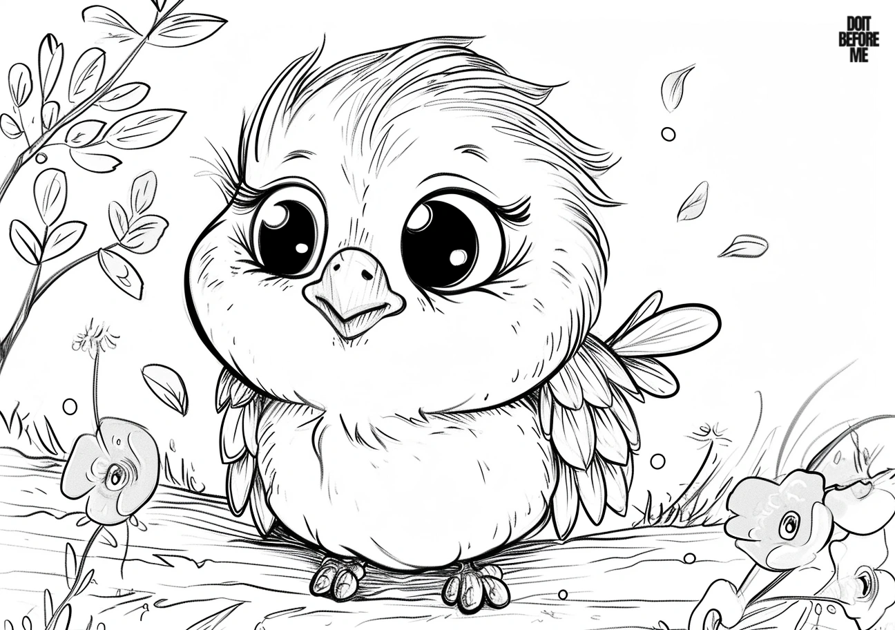
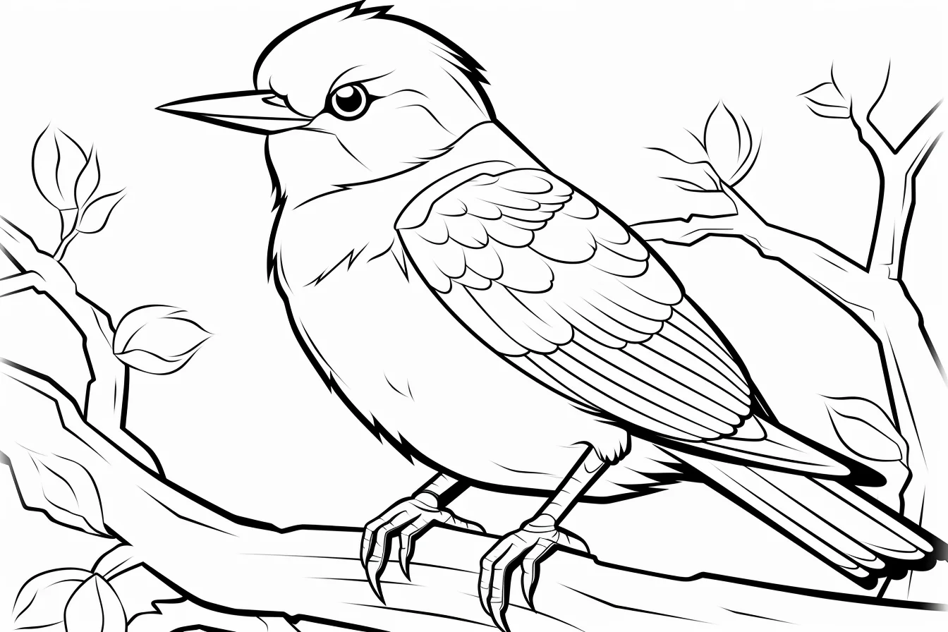
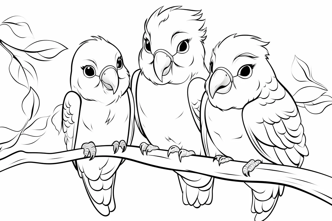
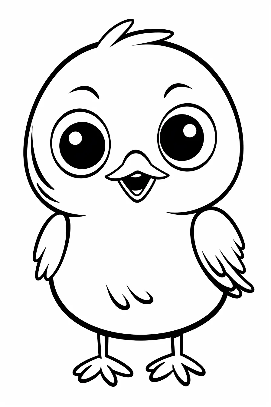
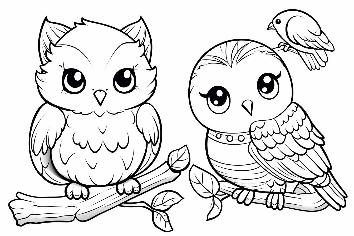
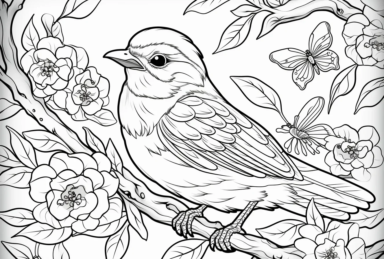
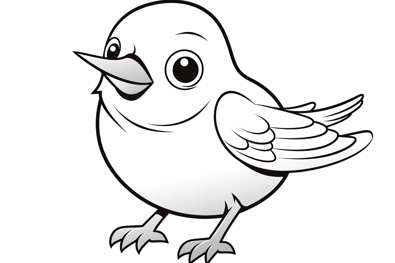
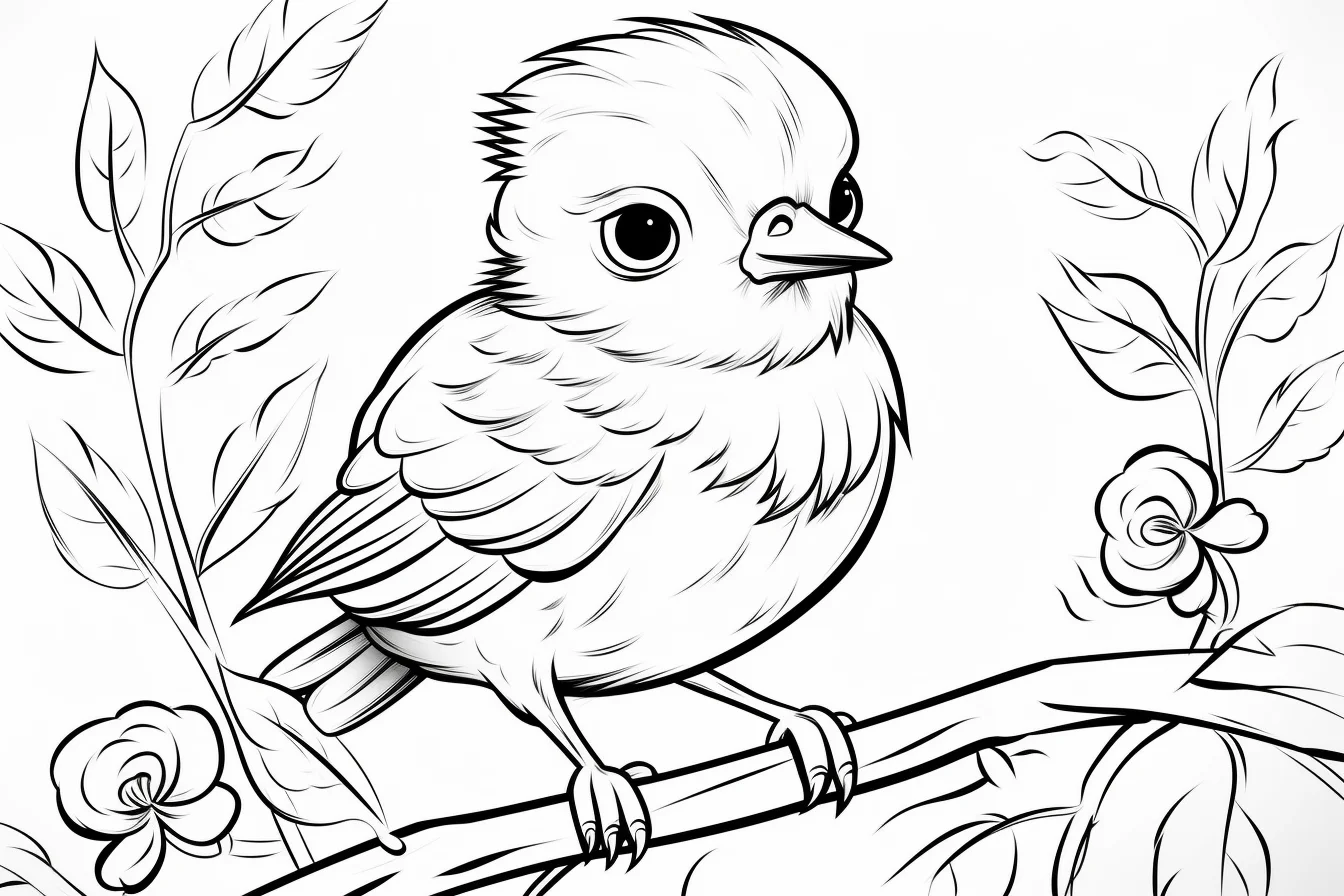
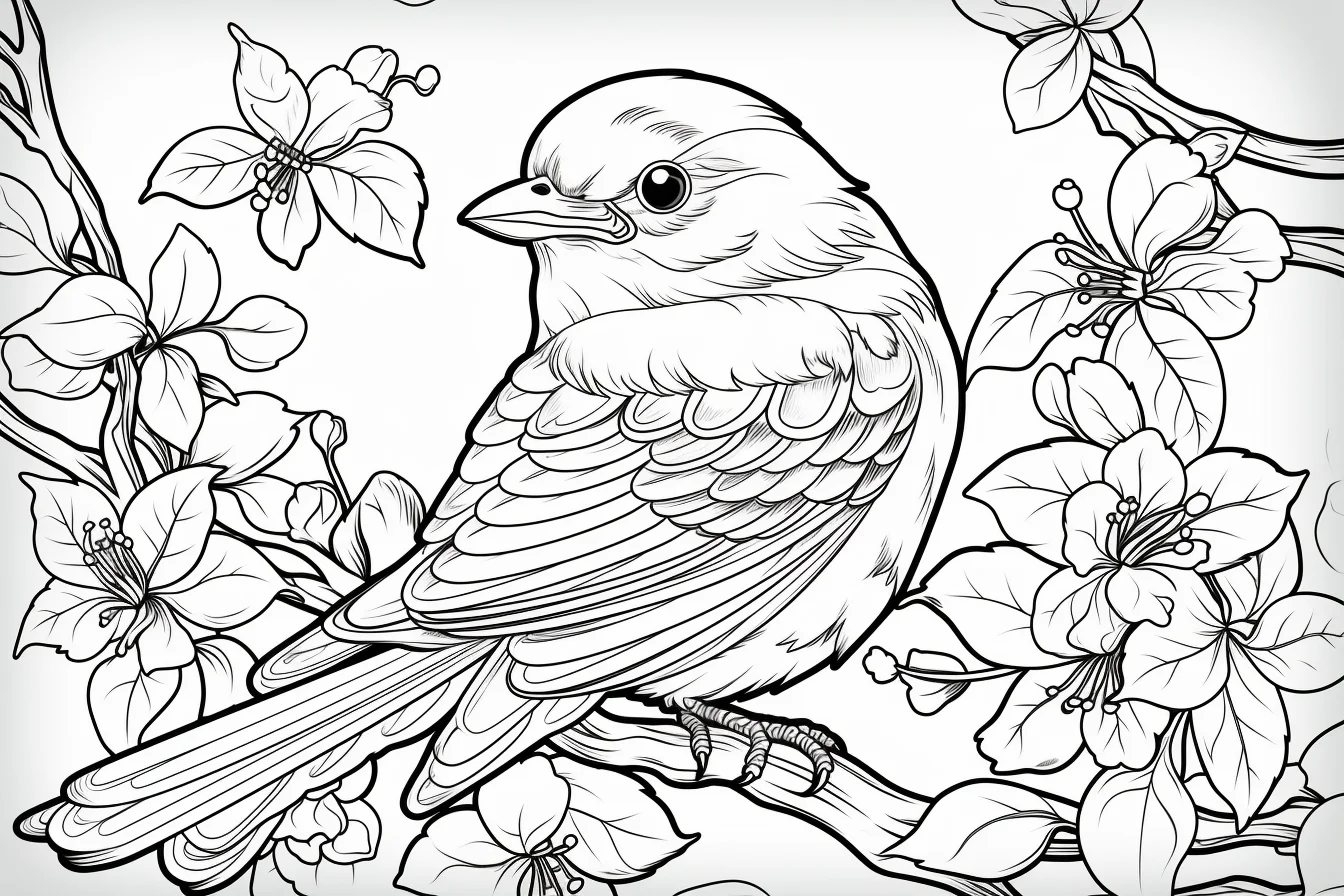
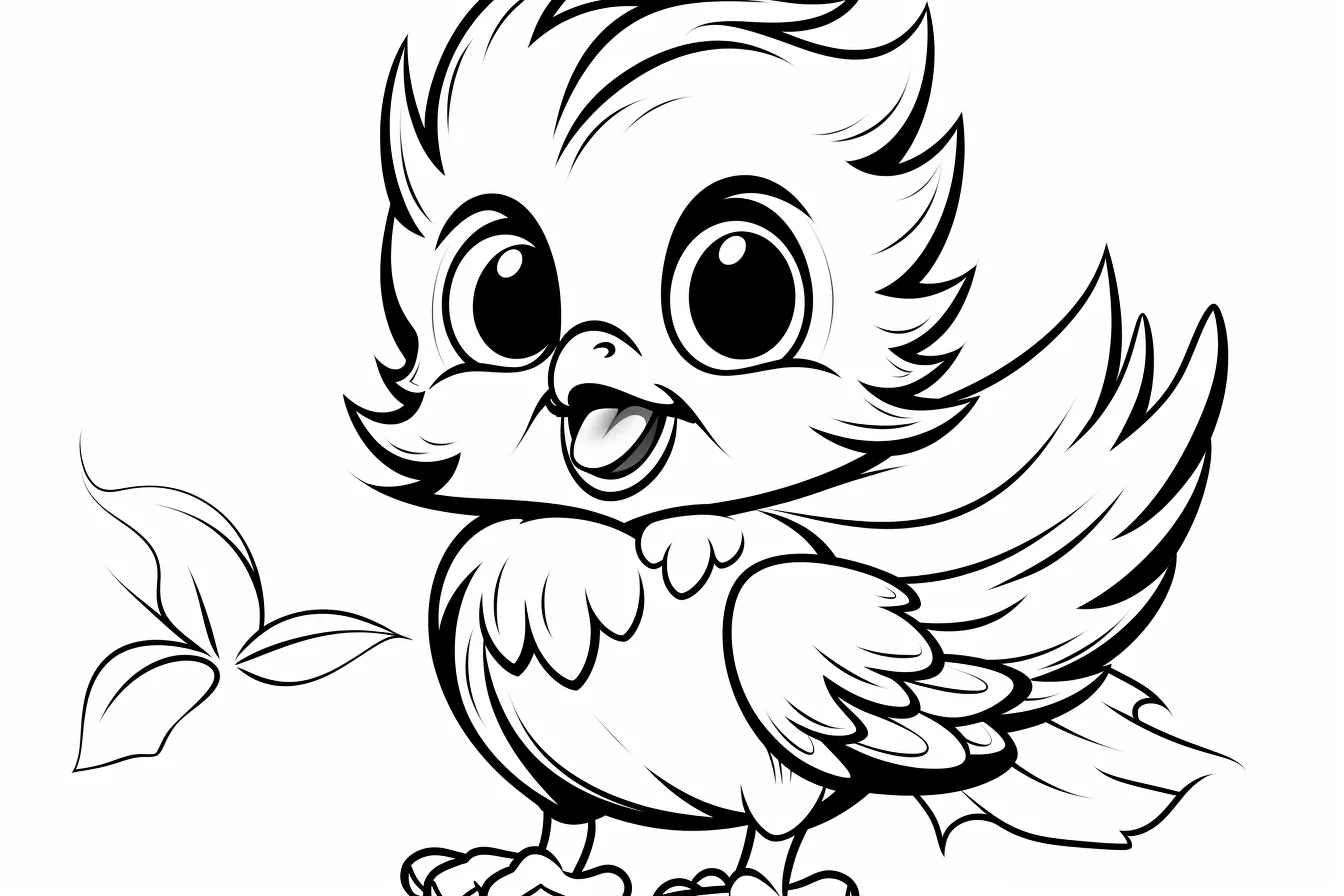
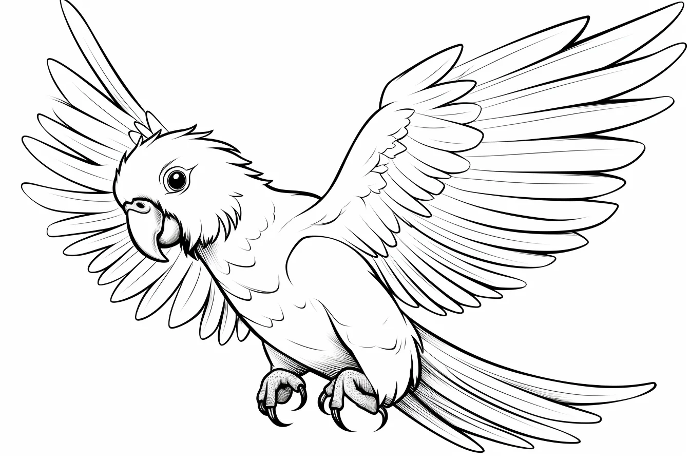
Flying-bird section: use a lighter sky or leave the background mostly white if the wings already contain a lot of detail. A busy sky behind a detailed bird can make both harder to read.
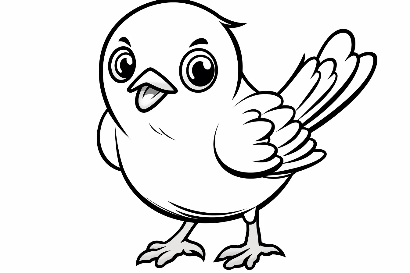
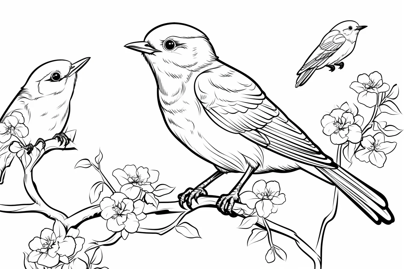
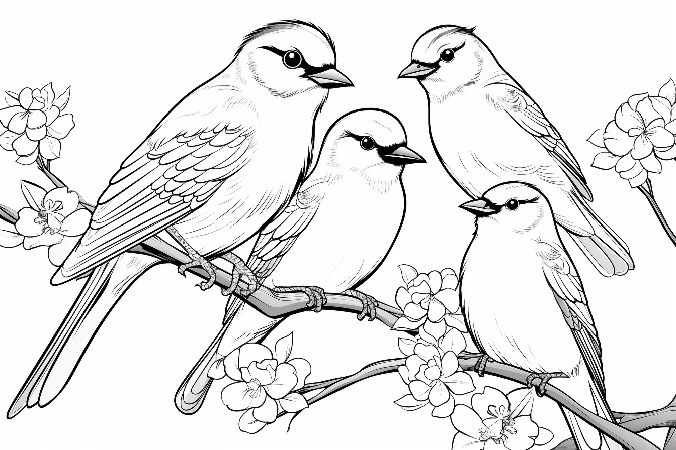
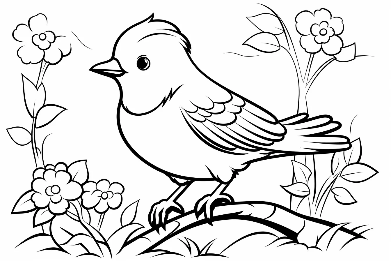
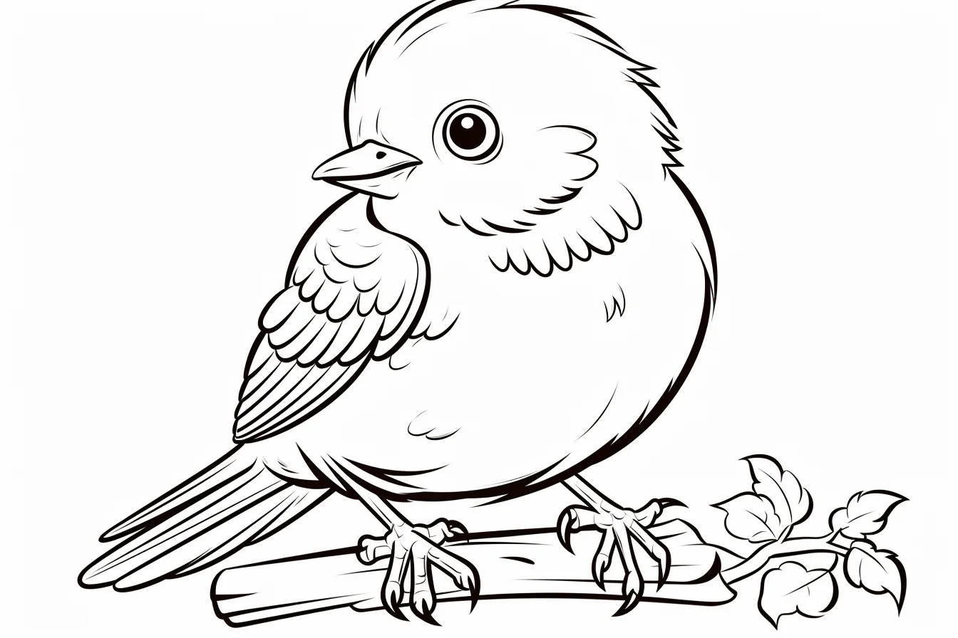
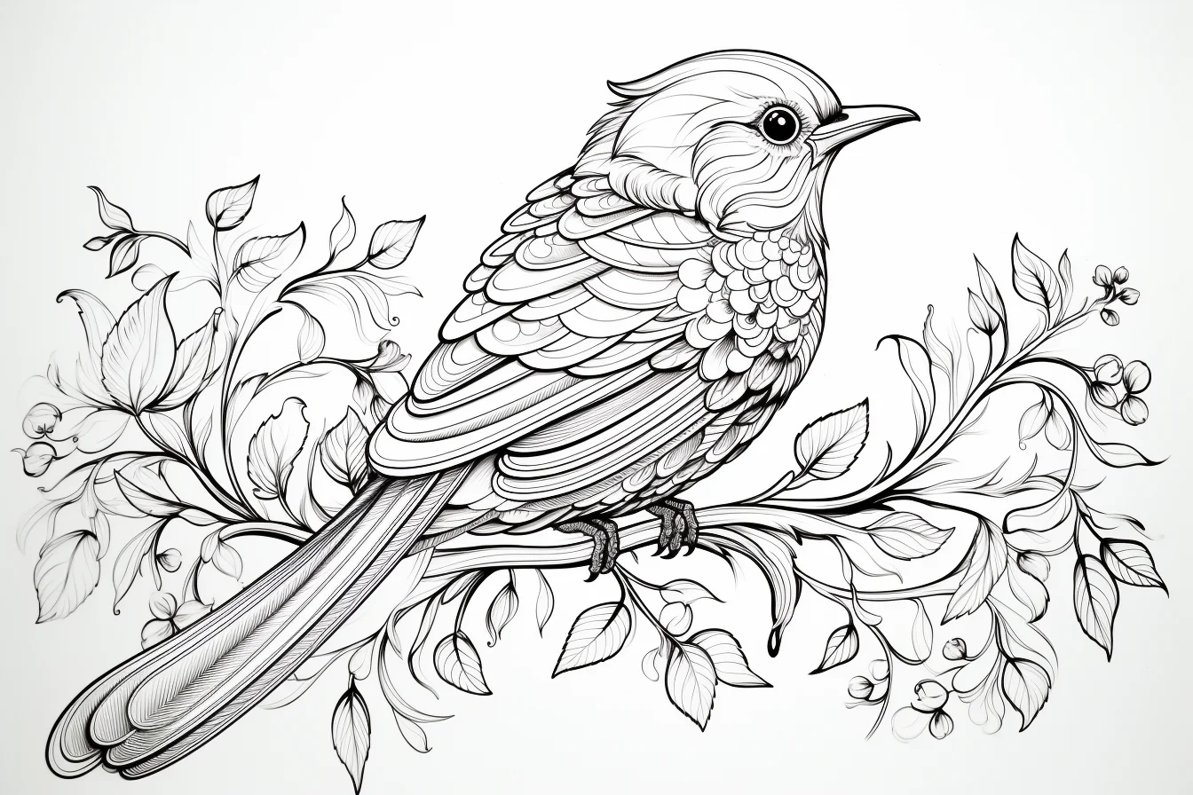
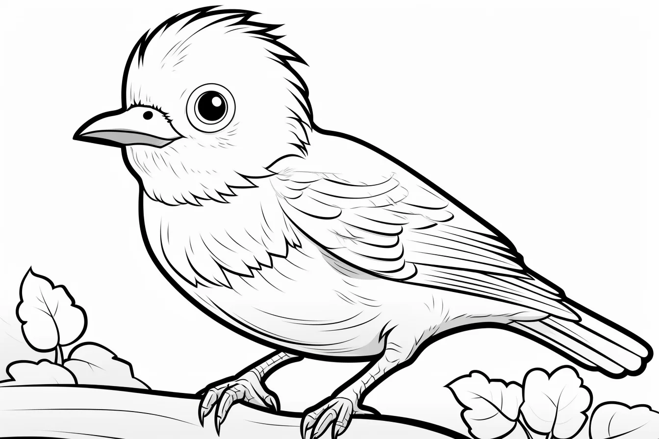
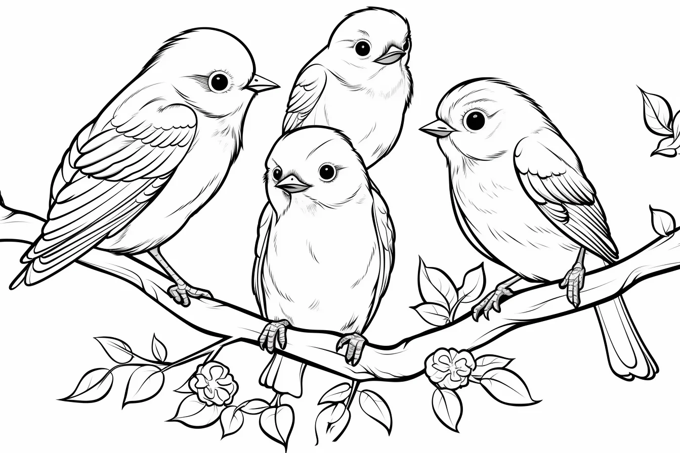
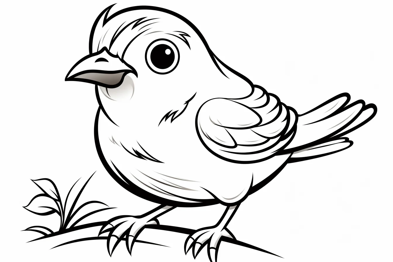
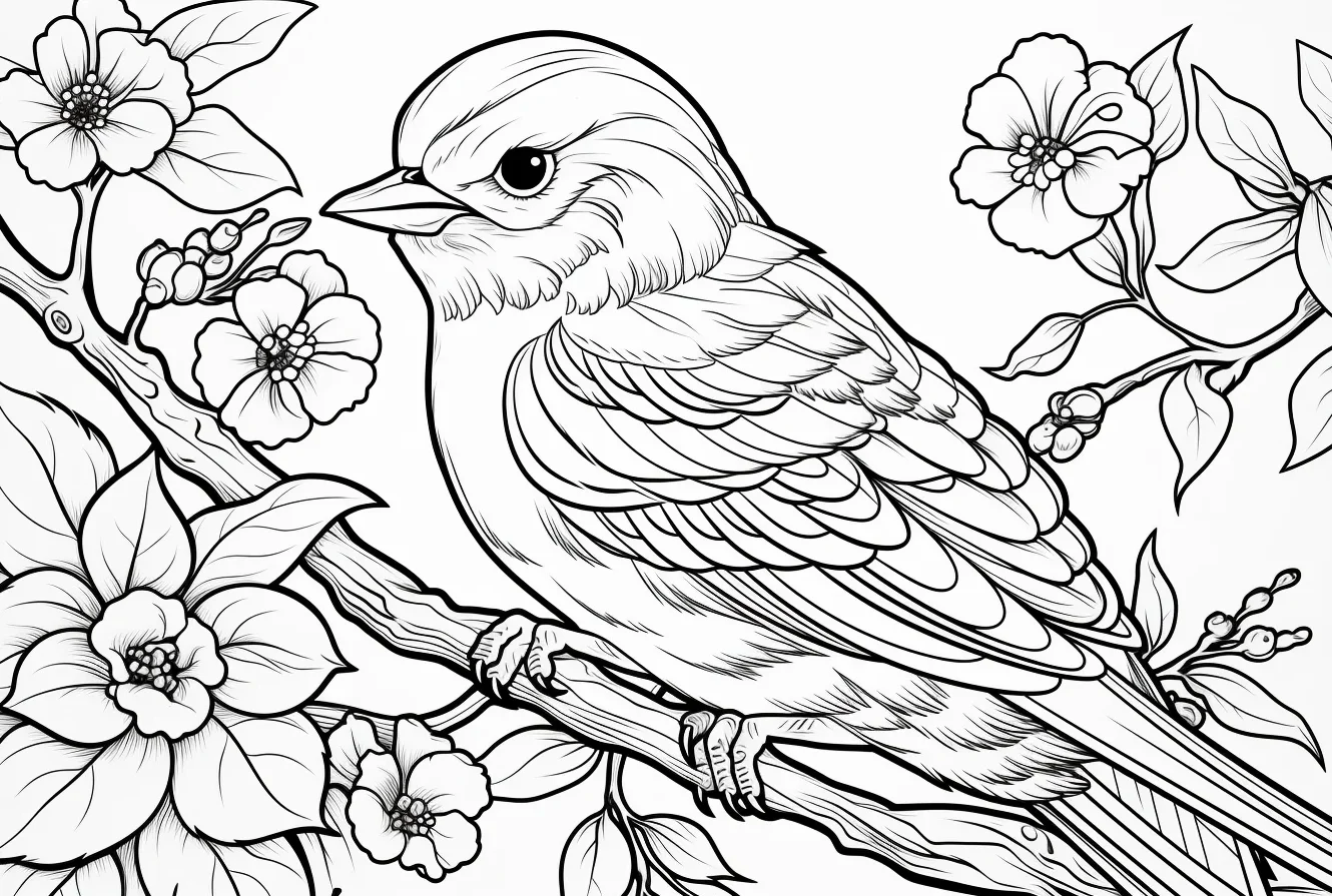
Run a 60-second wing-and-background test first
Before committing to a detailed sheet, make three small swatches on scrap paper with the tool you plan to use: light pressure, normal pressure and two light layers. Then compare those values with the smallest spaces on the page—the eye, feet and narrow gaps between wing feathers. If a crayon tip is wider than those spaces, use it for the chest and broad wing areas but switch to a sharpened colored pencil for the face, feet and feather separations.
Next, decide where the strongest contrast belongs. On a flying-bird page, keep the top of the wing lighter and darken one overlapping or underside section; if every feather alternates light and dark, the wing can look striped rather than layered. On a family or nest page, squint at the sheet from arm’s length. If the scenery and birds merge into one gray mass, keep the background one value step quieter or leave selected areas white.
For younger children, stop after two decisions: one main bird color and one contrasting beak or wing color. A page does not need a finished sky, nest and every leaf to count as complete. This is especially useful when attention or hand control runs out before the printed detail does.
Use pencils when feather detail becomes the point
On the adult-oriented sheets, work in larger feather groups first and add only selected dark edges afterward. The goal is to suggest feather texture without turning every line into a separate coloring decision. For more specific birds, continue with the parrot coloring pages or the owl collection.
A simple method for coloring feathers
Start by ignoring the individual feather lines. Decide on the bird’s main color and fill the body lightly, leaving a little white paper where you want the brightest areas. Then look for the larger feather groups: the wing, tail, chest and head. Darken the lower edge of only some groups rather than tracing every feather. This keeps the bird soft and dimensional instead of striped.
- Base: cover the bird with light, even pressure.
- Shape: add a darker version of the same color beneath the wing, under the belly and where tail feathers overlap.
- Texture: make a few short pencil strokes in the direction the feathers grow. Leave plenty of the base layer visible.
- Focus: finish the eye and beak with slightly stronger contrast so the face stays readable.
For fluffy baby birds, use fewer hard edges. Small curved strokes around the chest and cheeks suggest down more convincingly than outlining lots of tiny feathers.
Try three pages as a bird-coloring practice set
| Practice page | What to concentrate on | Keep it simple by |
|---|---|---|
| Single baby bird | Smooth coverage and a clear face | Using two body values plus one beak color |
| Flying bird | Wing separation and direction | Darkening overlapping feathers rather than every feather |
| Bird family or nature scene | Keeping several subjects readable | Repeating a small palette and making the background quieter |
Using related colors across all three pages makes it easier to notice improvement. You can concentrate on pressure, edges and contrast instead of inventing a completely new palette each time.
How to keep a bird visible in a busy scene
Color the bird first and postpone the leaves, nest, flowers or sky. Once the bird is finished, compare its lightest and darkest areas. If it already has strong contrast, keep the surrounding scenery softer. If the bird is pale, give the area immediately behind it a slightly darker value. You do not need to fill every piece of background: leaving some paper white can make a detailed page easier to read.
On family pages, avoid making every bird equally bright. One bird can carry the strongest accent color while the others use related, quieter variations. This creates a focal point without requiring realistic species colors.
Fix common bird-coloring problems
| Problem | What usually helps |
|---|---|
| The bird looks flat | Darken beneath the wing, belly and overlapping tail feathers instead of outlining the whole bird. |
| Feathers look too busy | Return to larger color groups. Emphasize only a few feather edges and let the printed lines provide the rest of the detail. |
| The eye disappears | Keep the area immediately around the eye relatively clean and add the darkest facial accents near the end. |
| Several birds blend together | Change either value or temperature between neighboring birds: for example, pale yellow beside a deeper blue rather than two similar mid-tone colors. |
| The background competes with the bird | Reduce saturation, pressure or detail in the scenery. The background does not need the same intensity as the subject. |
| Crayon cannot reach small feather spaces | Use the crayon for broad body areas and switch to a sharpened colored pencil for eyes, feet and narrow feather sections. |
Bird coloring questions
Do I need to use realistic bird colors?
No. A convincing bird depends more on readable shapes and consistent light than on matching a real species. Pink, teal or purple can work perfectly well. If you want the page to feel more natural, limit yourself to two or three related body colors and use the brightest color as a small accent.
How can I make a flying bird look less flat?
Use value changes where forms overlap. Darken the underside of the nearer wing or the feathers tucked behind another layer, while keeping the upper surfaces lighter. That separation does more for the sense of flight than adding lots of different colors.
Which pages are easiest for younger colorers?
Choose a single bird with large open body shapes and little scenery. Pages with nests, several birds or many plants require more decisions and finer control. The separate easy bird collection is the better starting point when simplicity is the main requirement.
What colors work well for a bird family?
Pick one shared color and vary the accent. For example, each bird might use a soft blue somewhere, while the chest or wing accents change between yellow, green and coral. The repeated color makes the group feel connected without making every bird identical.

