
The pose matters more than the costume on a ballerina page. The simplest of these 28 sheets show one dancer with a clean silhouette; the harder pages add flowers, layered skirts and more realistic body positions where small mistakes in color can hide the line work.
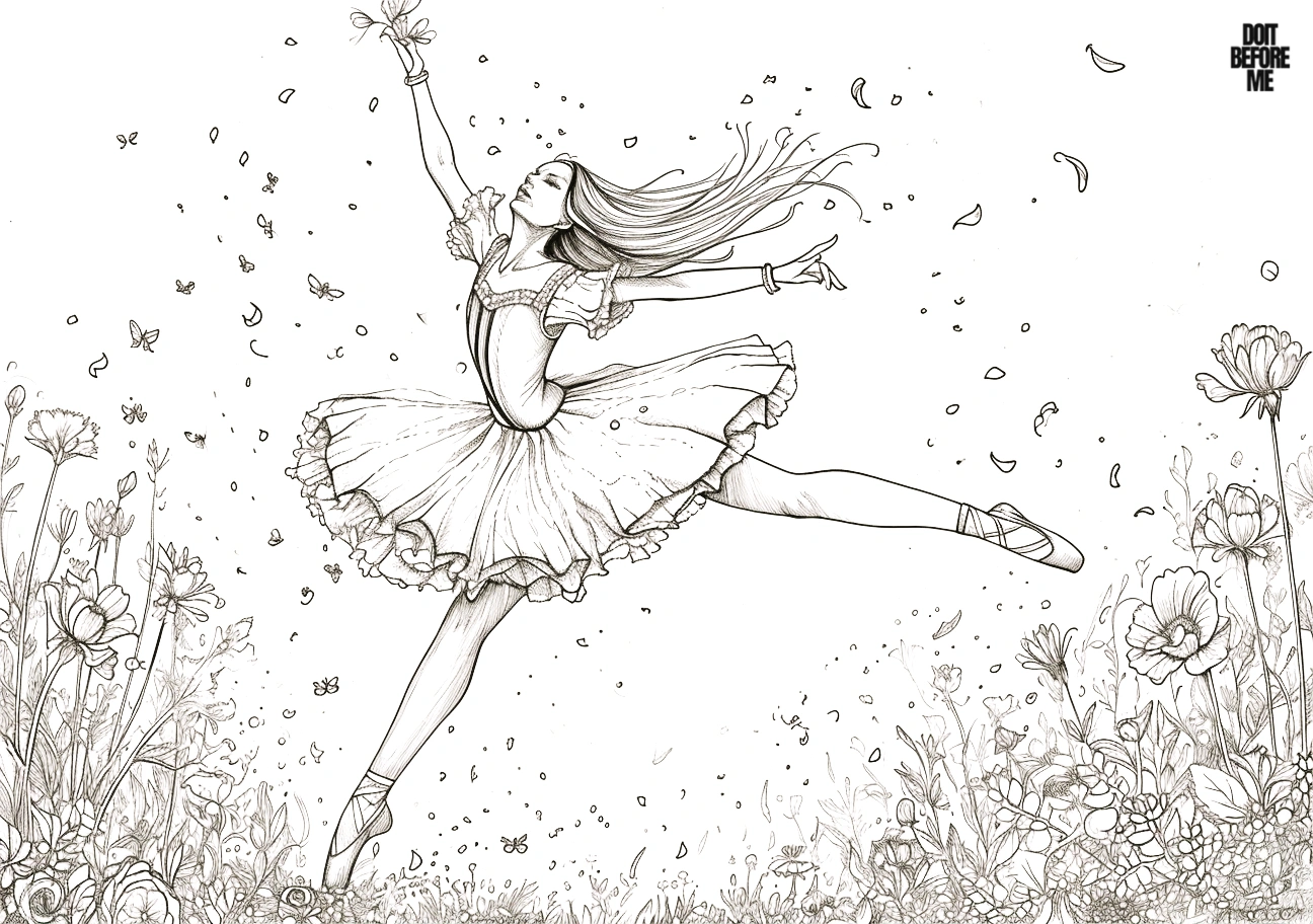
Do a two-minute pose-and-tutu test first
Before coloring a detailed dancer, use a scrap of the same printer paper to test the values you plan to use. Make three small swatches with your costume color: light pressure, normal pressure and two layered passes. Next to them, make one narrow shadow swatch in the color you plan to use beneath the tutu folds. The fold shadow should be clearly darker than the main skirt at arm’s length, but it should not look like a black outline.
Then look at the printable and choose three places to protect before you start: the face, the outer edge of the arms or legs, and the lightest part of the tutu. If those areas remain visually separate, the pose will still read after the background is colored. On a white tutu, reverse the test: leave the paper untouched for the lightest value and compare two very pale gray, blue-gray or lavender shadows beside it.
Quick diagnostic: squint at the page from about an arm’s length away. If the legs disappear into the skirt, darken only the skirt edge behind them. If an arm disappears into flowers or scenery, lower the background contrast around that arm instead of outlining the body more heavily. If the tutu reads as one flat shape, add shadows only where fabric layers overlap.
Start with the largest part of the costume first. Pale pink, blue, cream and lilac are easy ballet palettes, but stronger colors work just as well if you keep the tights, shoes or background quieter. On realistic pages, a little shading under folds and along the inside of the legs is enough—you do not need to render every muscle or fabric crease.
Use different tools for different pages
- Crayons: simple dancers with plain backgrounds.
- Colored pencils: realistic poses, layered skirts and flower details.
- Fine-tip markers: small accessories and costume patterns, used after the large areas are finished.
Open the full-size image before printing and use A4 or Letter paper with “fit to page.” If you want to study the poses rather than color them, the gesture drawing and figure reference pages are more useful.
Choose a ballerina page by difficulty
If the page is for a short activity, choose a dancer with a large skirt, open background and fewer tiny costume details. These broad areas are easier for crayons and younger children to control. Pages with flowers, layered tutus, hair detail or more realistic poses take longer and work better with colored pencils.
- Easy: one dancer, large costume shapes, little or no background.
- Medium: more folds, accessories, flowers or decorative borders.
- Detailed: realistic anatomy, layered fabric and smaller background elements.
Three ballet color palettes that stay coherent
You do not need dozens of colors. A small palette makes the costume easier to read and leaves room for the pose to remain the focus.
- Classic rehearsal: blush pink, cream, warm gray and a small amount of burgundy.
- Cool stage: pale blue, lilac, navy and silver-gray.
- Storybook ballet: peach, mint, soft yellow and violet.
Use the strongest color on one important area—the bodice, skirt, ribbon or flowers—rather than making every part equally saturated.
How to color a tutu without flattening the folds
- Lay down the lightest costume color first. Keep the center of broad fabric areas lighter.
- Find the overlaps. Add a slightly darker version of the same color where one layer passes behind another.
- Darken narrow fold valleys. A few controlled shadows create more volume than outlining every crease.
- Keep highlights quiet. Leaving small areas of paper showing can suggest satin or tulle without drawing extra texture.
For a white tutu, use very pale cool gray, blue-gray or lavender only in the shadow areas. The untouched paper then reads as illuminated white fabric instead of unfinished space.
A simple ballet activity for kids
Choose one easy dancer and limit the supplies to five colors. Use one color for the main costume, one darker version for folds, one for hair, one for shoes or ribbons and one for the background accents. The restriction makes the activity easier to finish and teaches color repetition without requiring color theory.
28 ballerina coloring pages
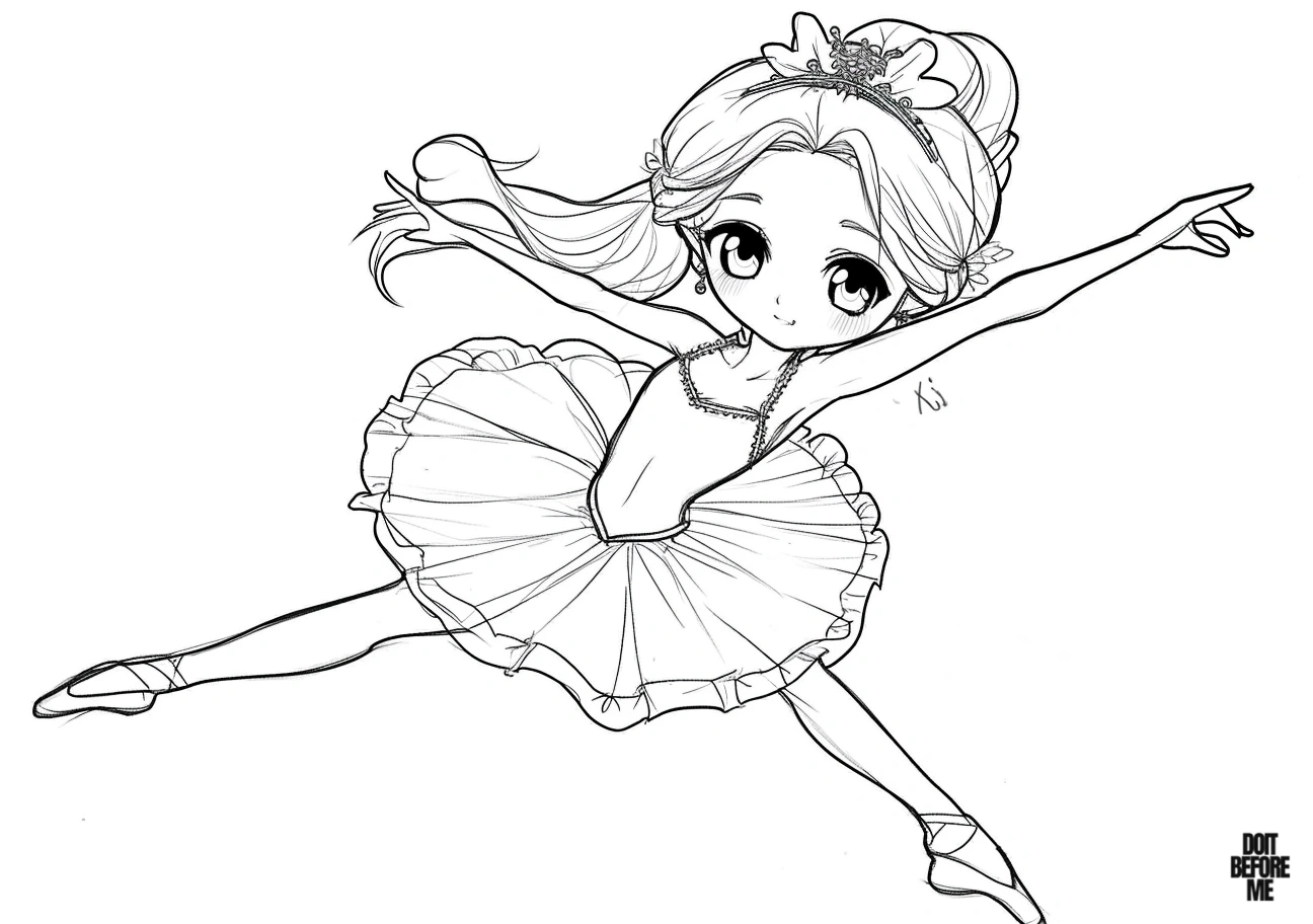
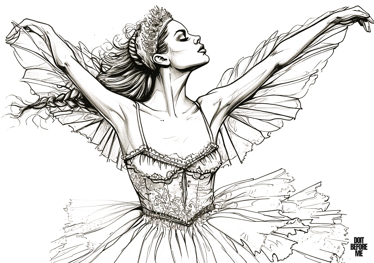
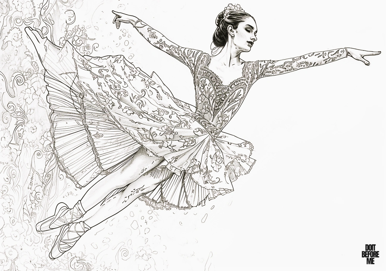
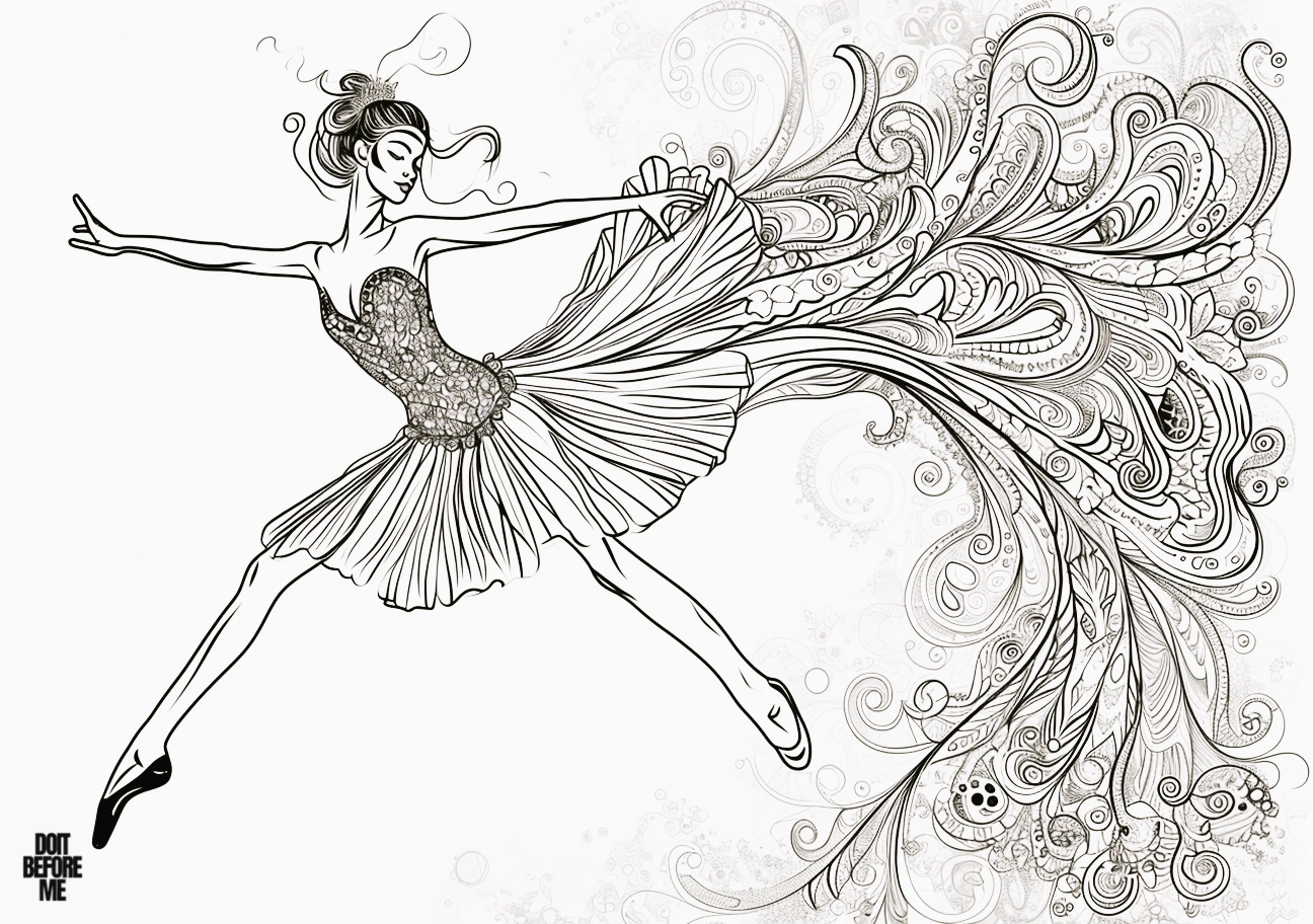
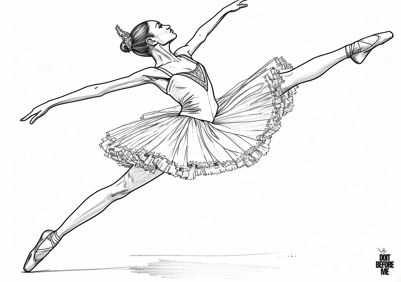
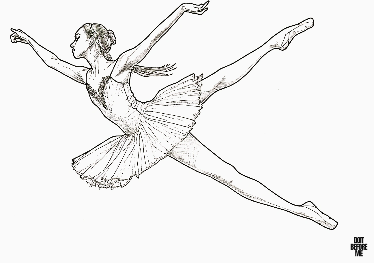
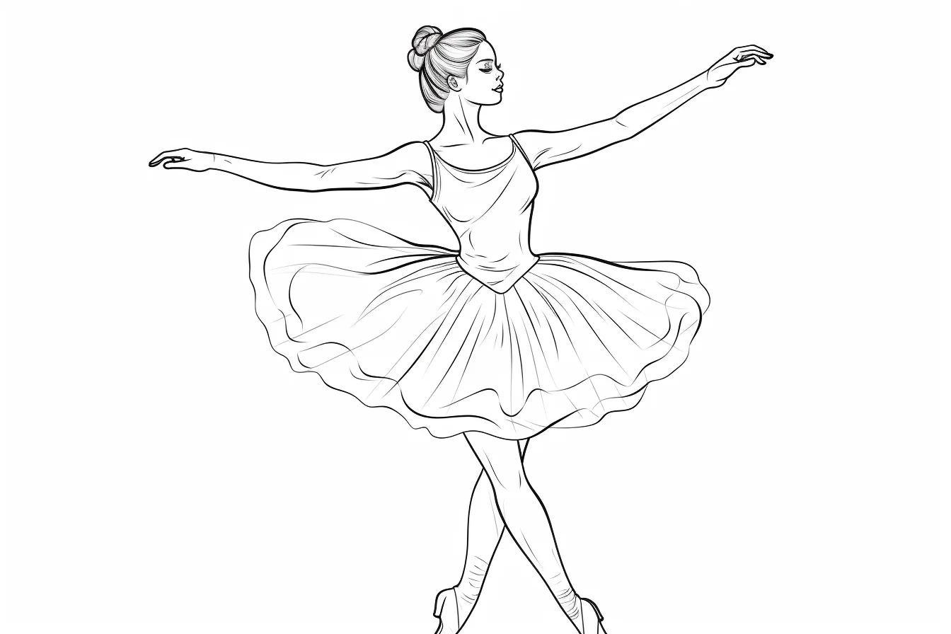
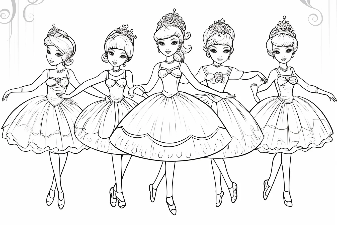
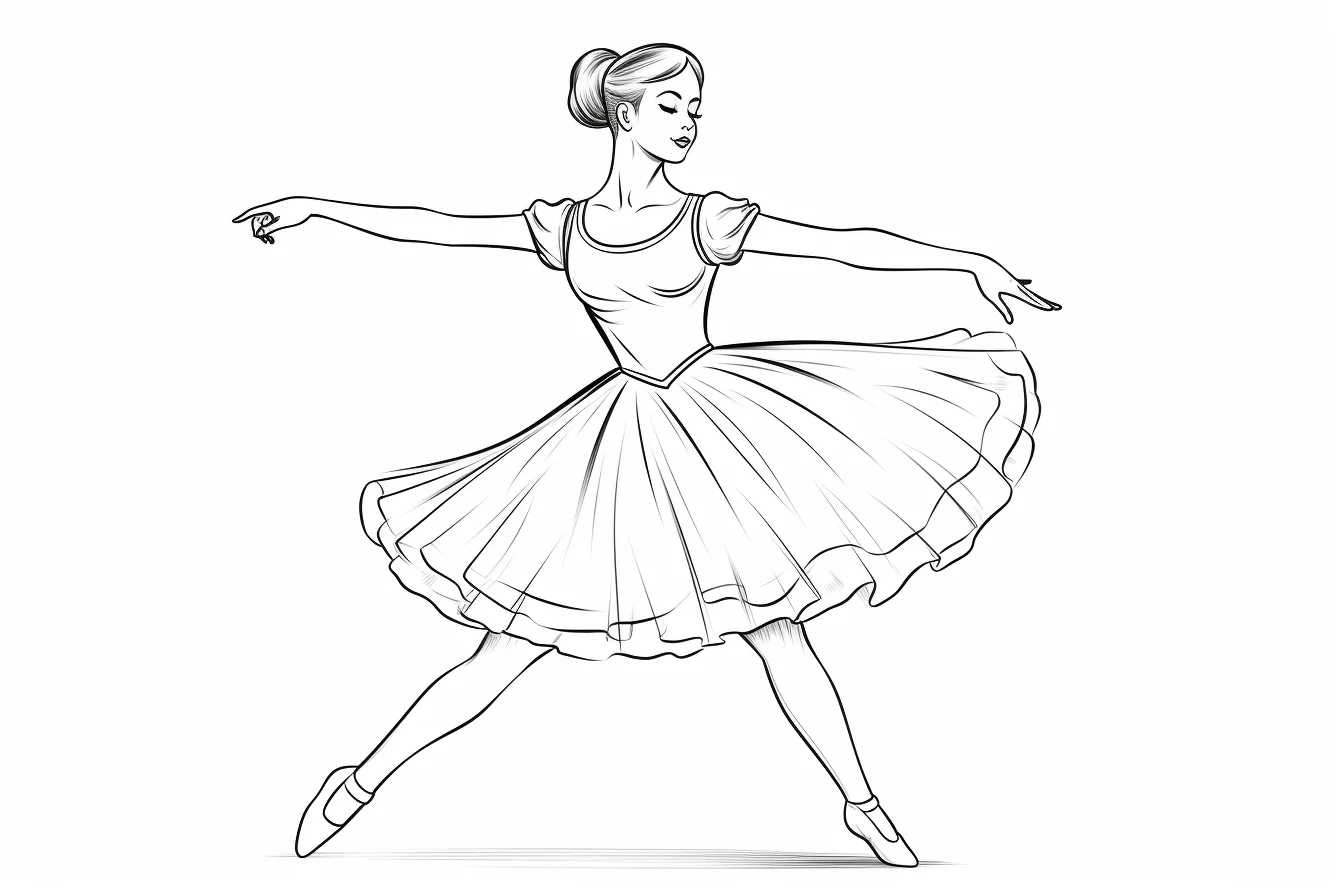
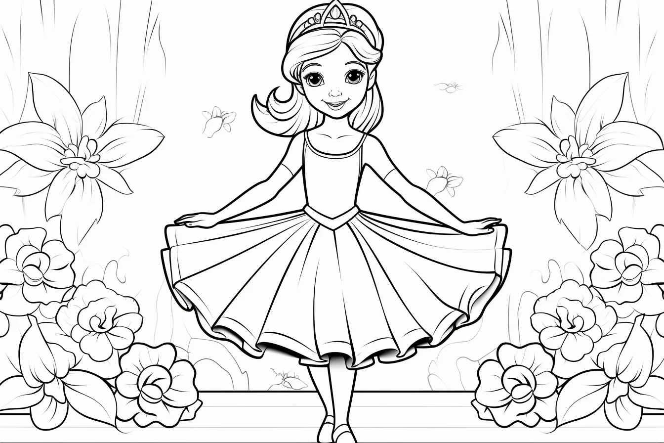
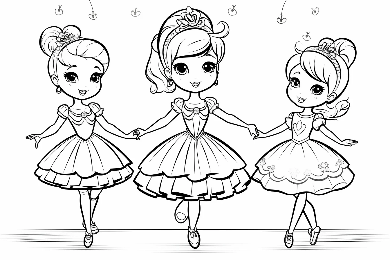
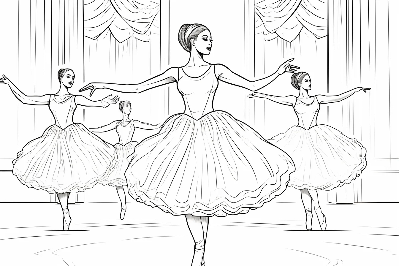
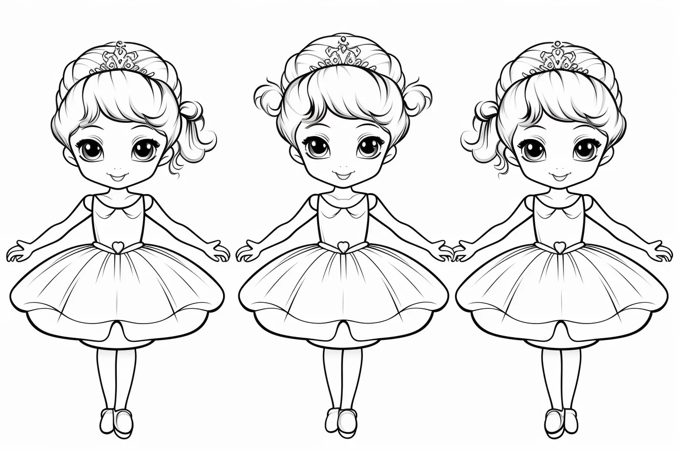
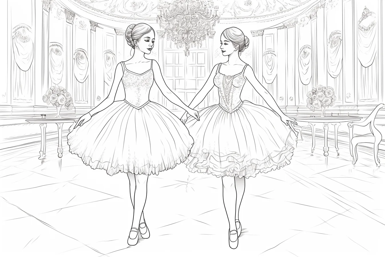
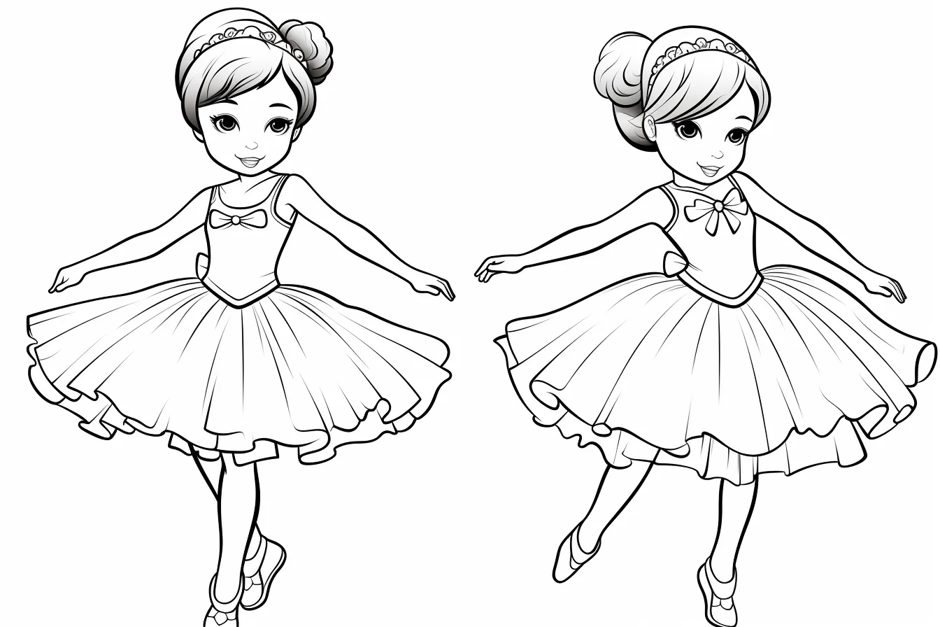
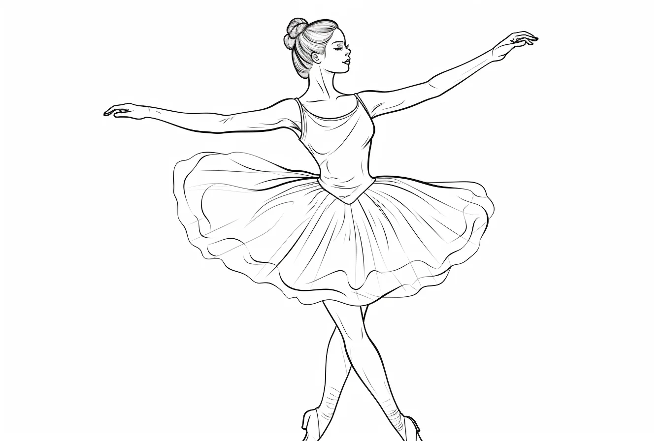
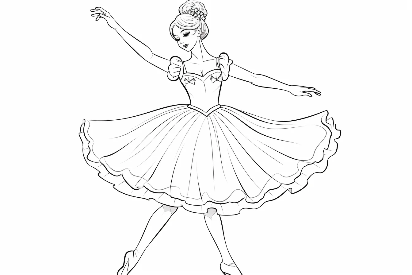
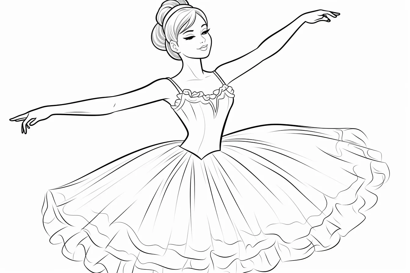
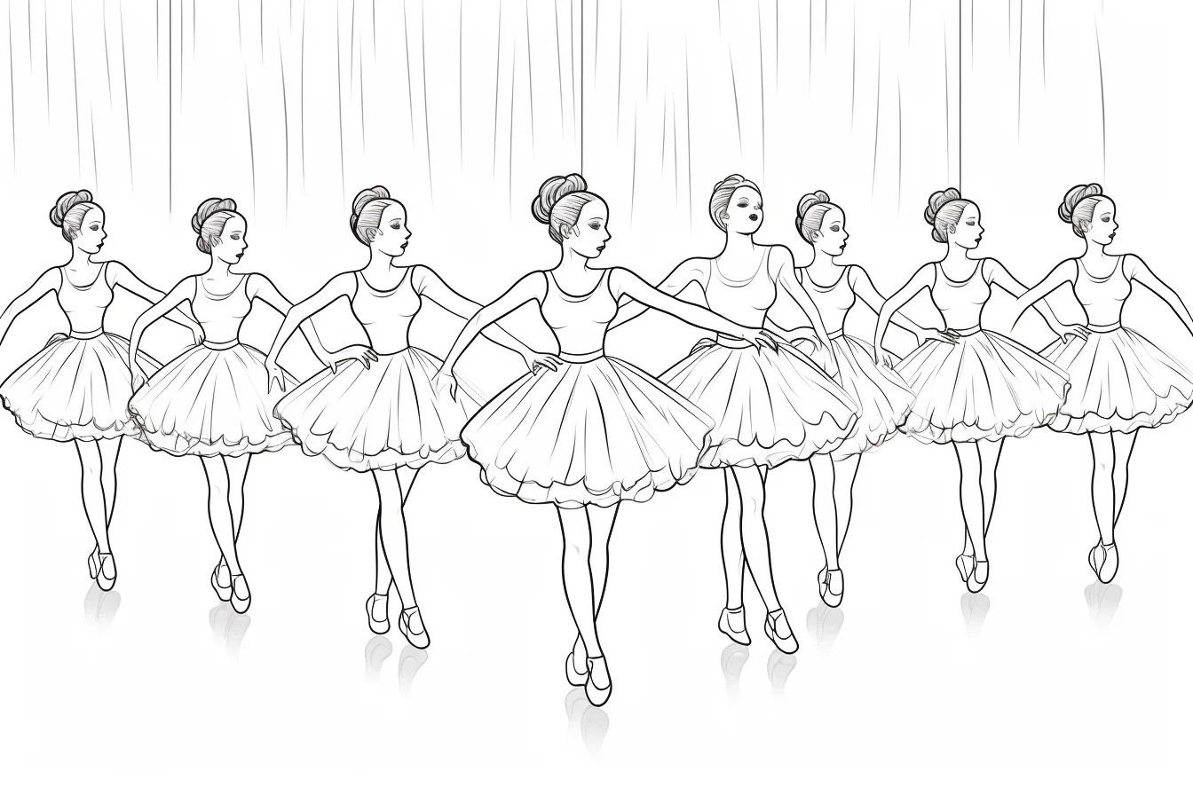
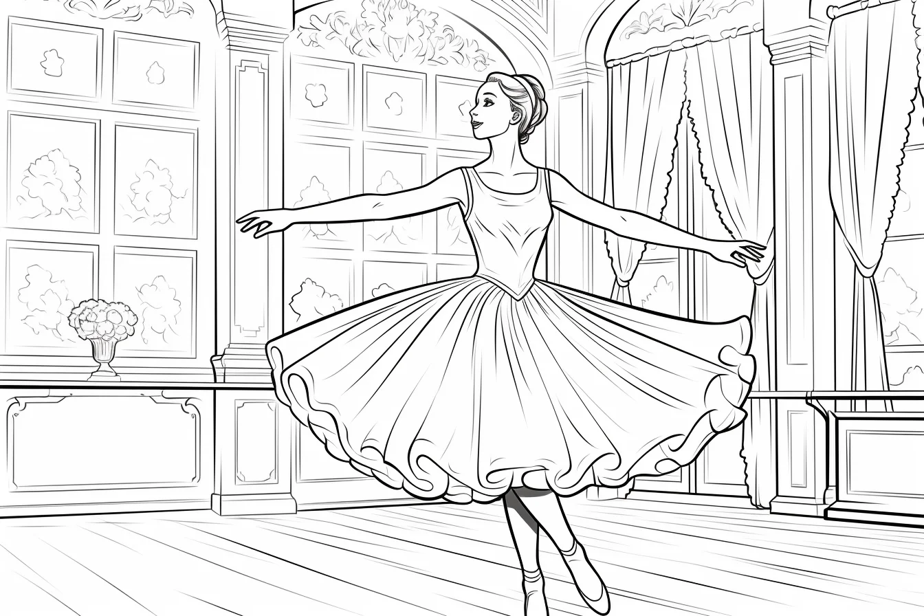
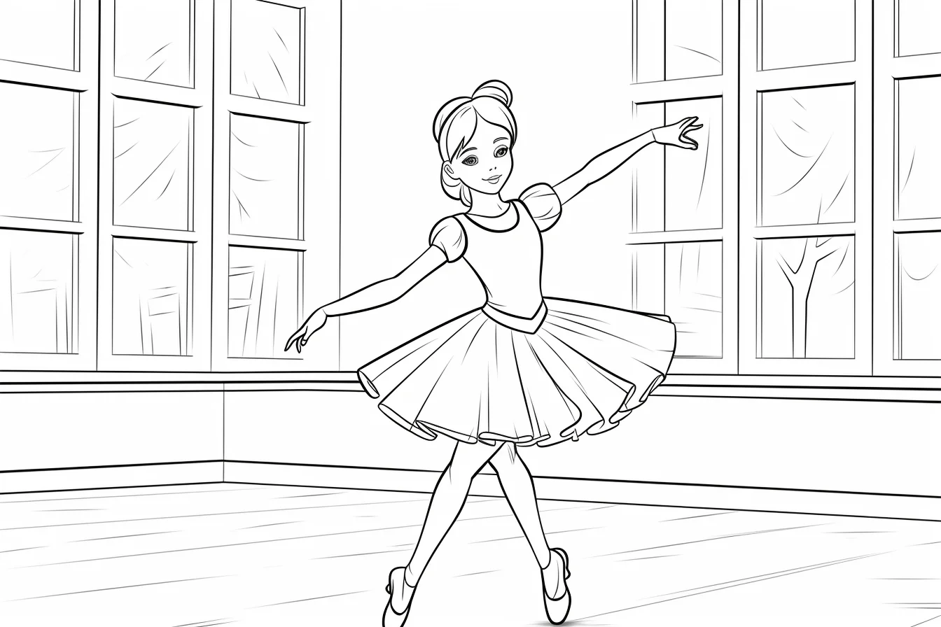
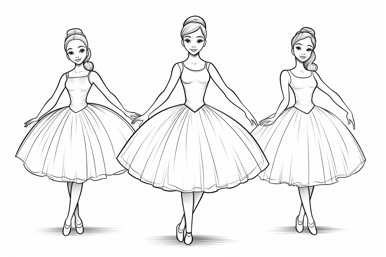
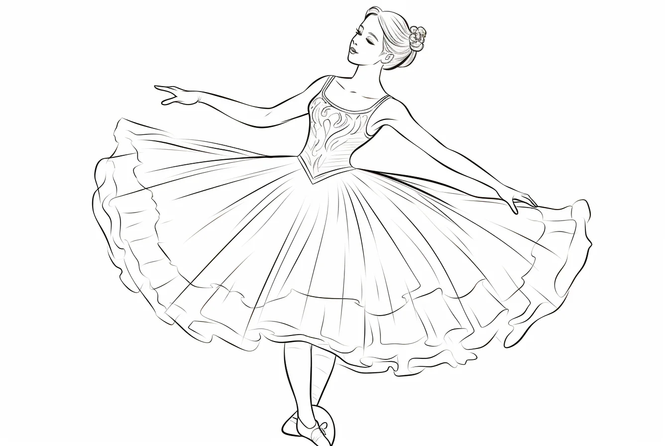
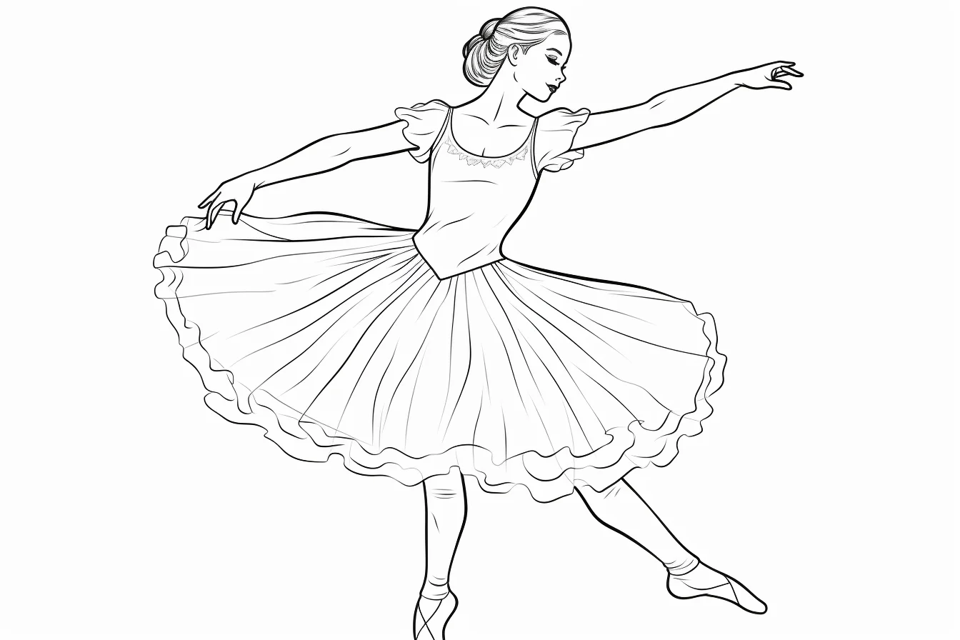
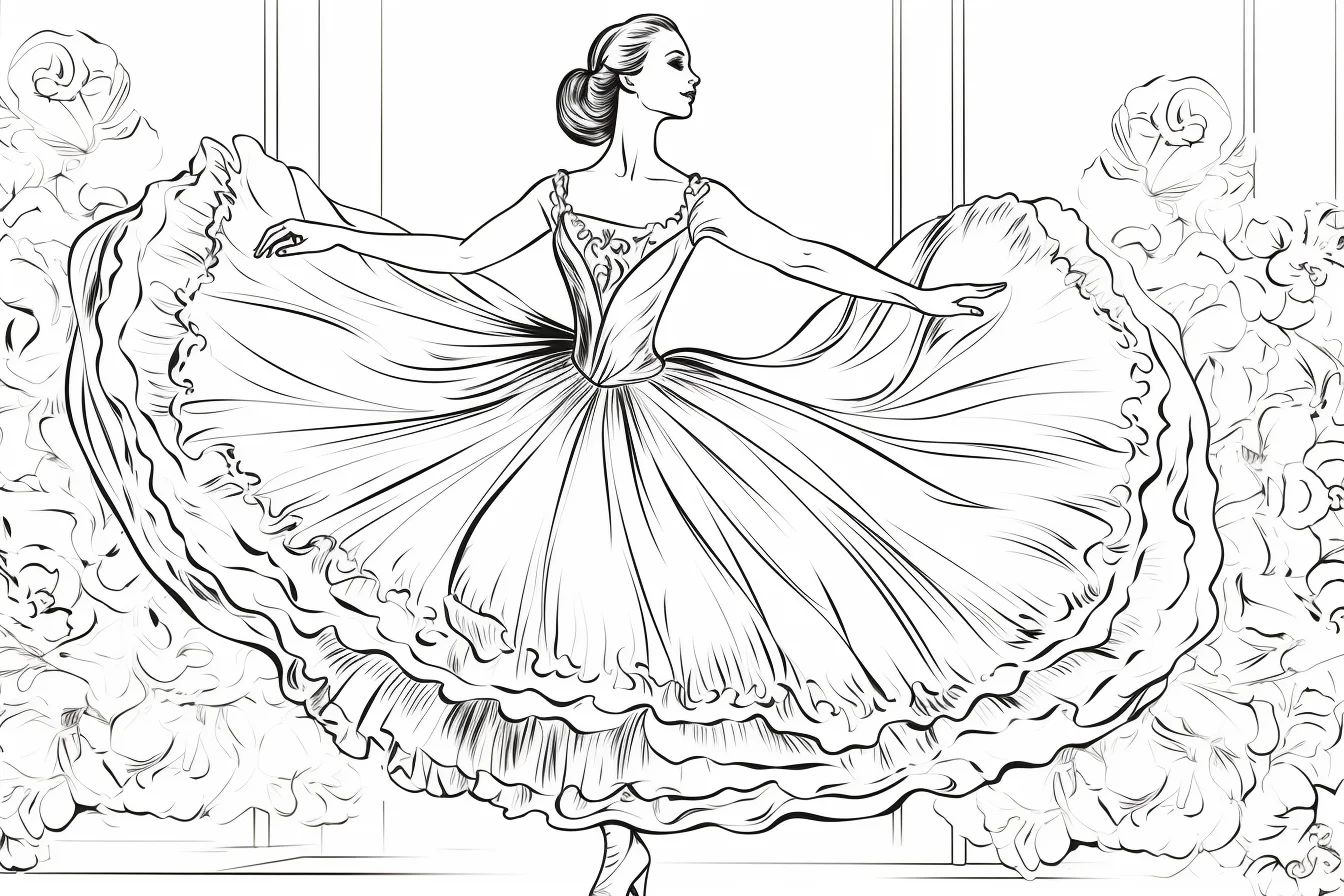
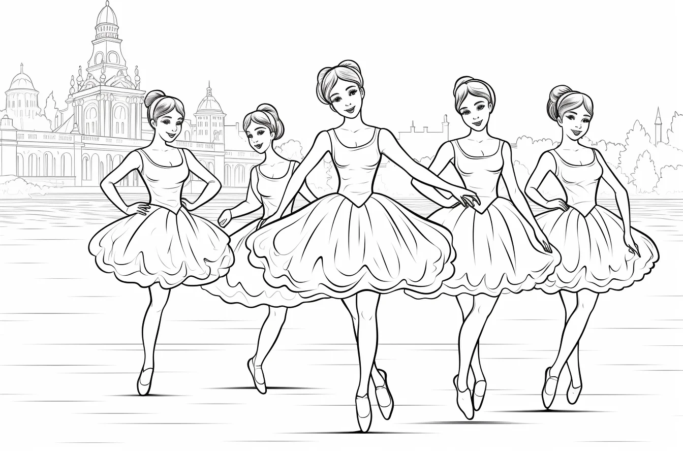
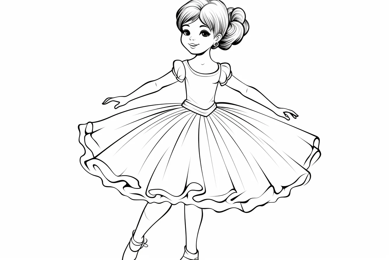
When the page has a lot of white costume fabric, do not leave it completely untouched. A very light gray, blue or pink shadow under folds can keep the dress looking white while still giving it shape.
Make the dancer stand out from the background
If both the dancer and background use similar light colors, the silhouette can disappear. Keep one side quieter. With a pale costume, use a slightly deeper background accent; with a dark costume, leave more white space around the figure. You do not need to fill the entire background.
For flower-heavy pages, repeat two or three costume colors in a few petals instead of giving every flower a new color. That ties the page together without making the background compete with the ballerina.
Five common coloring problems and quick fixes
- The tutu looks flat: add a darker value only beneath overlapping layers and inside a few folds.
- The pose is hard to read: reduce background contrast around the arms and legs so the silhouette stays clear.
- Skin looks patchy: use lighter pressure and build color gradually instead of pressing hard on the first pass.
- Everything is pink: keep pink as the dominant color but introduce a quiet neutral such as cream, gray or brown.
- Small details are getting messy: finish large shapes first, then switch to a sharpened pencil or fine-tip marker.
Printing and paper tips
Open the full-size image before printing. Standard A4 or US Letter paper is fine for crayons and pencils. If you plan to use markers, slightly heavier paper is more forgiving and placing scrap paper underneath helps protect the table from bleed-through. Use your printer’s “fit to page” option if the outer lines are being cropped.
For more general help with sizing and print settings, use the coloring-page printing guide. If the dancer poses are what interest you most, the gesture drawing guide explains how to study movement rather than color it.
Ballerina coloring page questions
Which ballerina pages are easiest for preschoolers?
Choose pages with one large dancer, broad costume areas and minimal background detail. Large shapes are easier to fill with crayons and are less frustrating than realistic hands, flowers or layered fabric.
What colors are ballet shoes?
Pink and neutral tones are traditional choices in many ballet images, but a coloring page does not need to follow stage conventions. Matching the shoes to the costume or using a contrasting accent can work just as well.
How can I make a white ballet dress look finished?
Leave most of the paper white and add a very pale cool shadow beneath folds, overlapping fabric and the underside of the skirt. The contrast is what makes the untouched areas read as white fabric.
Are colored pencils or markers better for detailed ballerina pages?
Colored pencils give more control over soft shading, skin and layered fabric. Markers are faster for clean flat areas but are less forgiving in tiny details and may bleed through thin printer paper.
More printable coloring pages
If you want another costume-focused collection, try the princess coloring pages. For decorative pages with flowers and flowing shapes, browse the flower coloring pages.

