
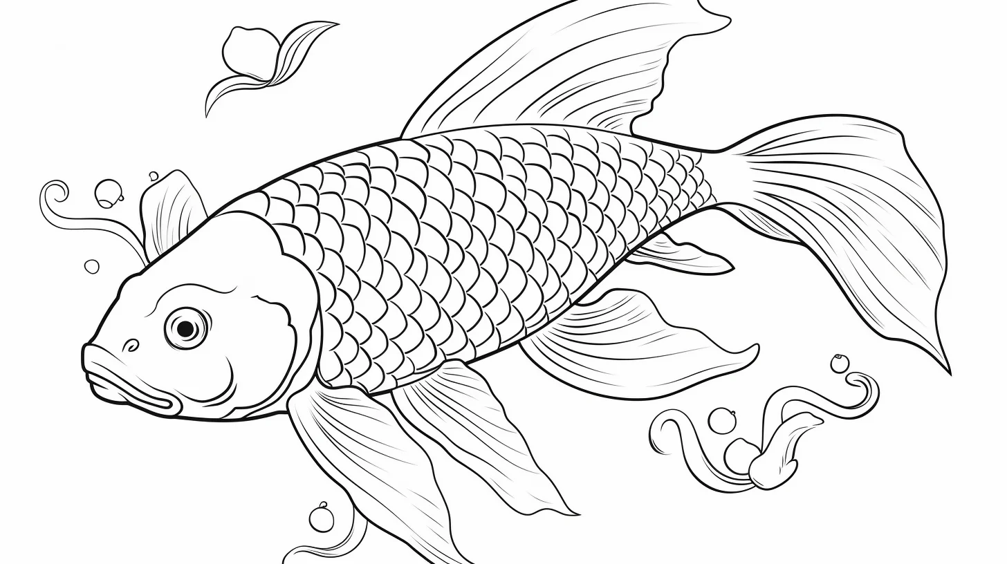
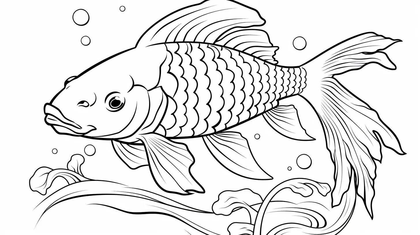
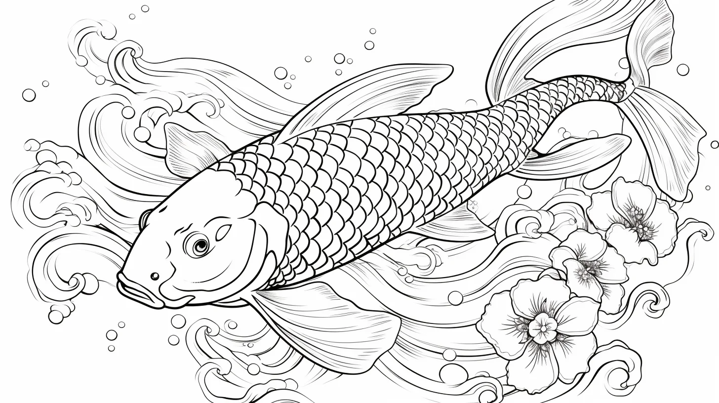
Koi are one of the easiest fish to make visually interesting without using many colors. A mostly white body with a few orange, red, black or yellow patches already reads as koi, and the markings do not need to be symmetrical. That makes these 19 sheets useful for both quick coloring and slower pattern work.
The collection runs from simpler child-friendly pages into Japanese-style designs and then more realistic adult sheets. If you want a fast page, start near the top. If you want scales, finer fins or a more natural finish, move toward the last group.
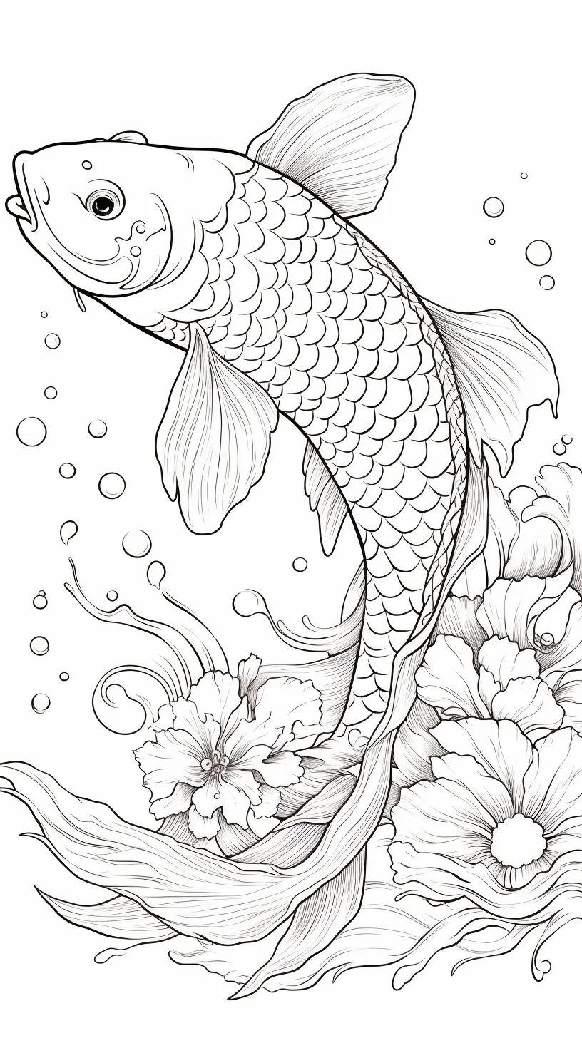
Do this 60-second koi test before you start
Pick three pencils or markers you expect to use and make a tiny test on scrap paper. First, check whether your tool tip can fit inside the smallest fin rays and markings without covering the linework. If it cannot, use that tool only for broad body patches and water, then switch to a sharper pencil for the fins, eyes and narrow markings.
- Protect the white: point to the areas you intend to leave as bare paper before adding any color. On a white-bodied koi, those untouched areas are part of the palette, not unfinished space.
- Test three values: make a light, middle and dark swatch. If the three look almost identical from arm’s length, lighten the first or deepen the third before working on the fish.
- Check the patch edges: draw one irregular orange or red shape on scrap paper. Avoid making every edge equally round; a mix of broad curves and small interruptions looks more natural.
- Separate fish from water: compare your planned water color with the fish’s dominant value. If they merge, keep the water lighter beside the body and let it deepen farther away.
For younger children, reduce the test to two decisions: choose one bright patch color and leave several large white areas untouched. That is enough to make the fish read clearly as koi without turning the activity into a precision exercise.
Choose a koi page by difficulty
| If you want… | Start here |
|---|---|
| Easy or child-friendly koi | Sheets 1–5 |
| Kawaii/simple koi | Sheets 6–9 |
| Japanese-style or general koi | Sheets 10–14 |
| Realistic or slower-detail pages | Sheets 15–19 |
Plan the white areas before adding color
The easiest way to muddy a koi is to color the whole body first and then try to add patches on top. Instead, decide which areas will stay white. Add the orange, red, black or yellow markings around those spaces, then use a very light gray or pale blue only where you want a little body shadow.
Keep the fins lighter than the strongest body patches. A pale wash or very soft pencil layer is enough; the fin lines already create texture. If the page includes water, color the fish first and keep the water one or two values lighter near the body so the outline stays clear.
A simple koi-coloring order
- Leave the future white patches untouched.
- Add the largest orange, red or yellow markings.
- Place black accents sparingly around smaller patches, eyes or markings.
- Keep fins pale and translucent-looking.
- Color the water last, using softer blues or blue-greens so it does not compete with the fish.
Printing
Open the full-size image before printing and use A4 or US Letter paper with “Fit to page.” Most sheets are landscape, but a few are portrait, so follow the preview rather than forcing one orientation for the whole set. For more aquatic pages, see the orca coloring pages, octopus coloring pages and sea animal coloring pages.
Match the page to your paper and coloring tool
Before printing several copies, print one sheet and test the tool you actually plan to use. The line art may look roomy on a screen but feel much tighter once it is reduced to A4 or Letter size. If a marker tip covers a fin ray or a small scale section in one stroke, save that marker for broad water areas and body patches. Use a sharpened colored pencil for the narrow details instead.
- Crayons: choose Sheets 1–5 and concentrate on the large body markings rather than individual scales.
- Markers: use simpler sheets, place scrap paper underneath, and color isolated red/orange patches before adjacent areas so wet edges do not feather together.
- Colored pencils: use the realistic group when you want translucent fins, layered water and softer patch edges.
Do one more check before committing to a detailed page: color a small red or orange patch, wait a minute, then add a pale gray shadow beside it. If the gray drags pigment into the white body, reverse the order on the final sheet—place the pale body shadows first, then add the saturated koi markings. This simple test is especially useful with soft pencils and inexpensive printer paper, where colors can smear more easily.
Easy koi pages — Sheets 1–5
The first group keeps the shapes relatively open. These are the best choices for crayons, younger colorers or anyone who wants to finish a fish without working through lots of scales and water detail.
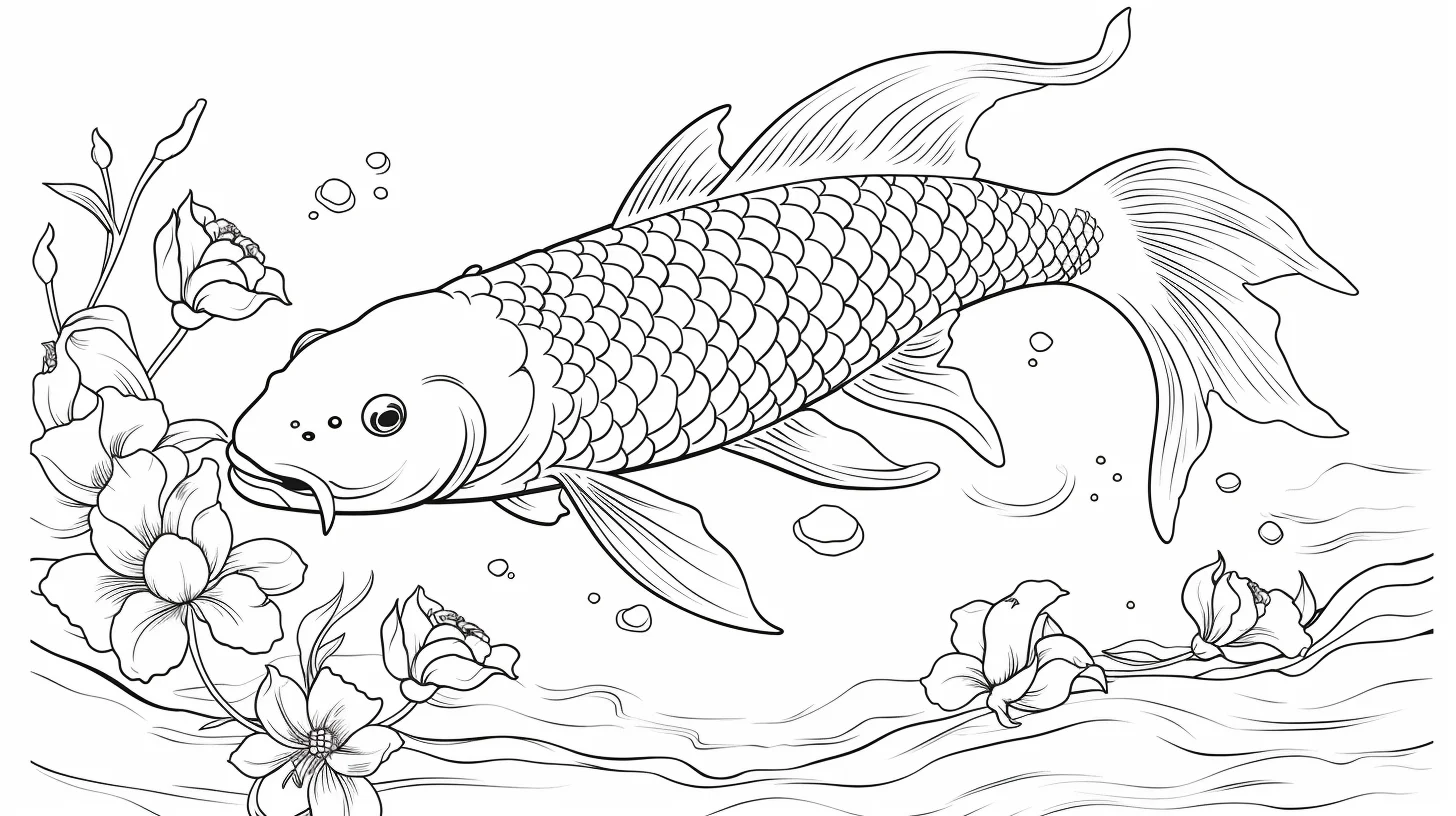
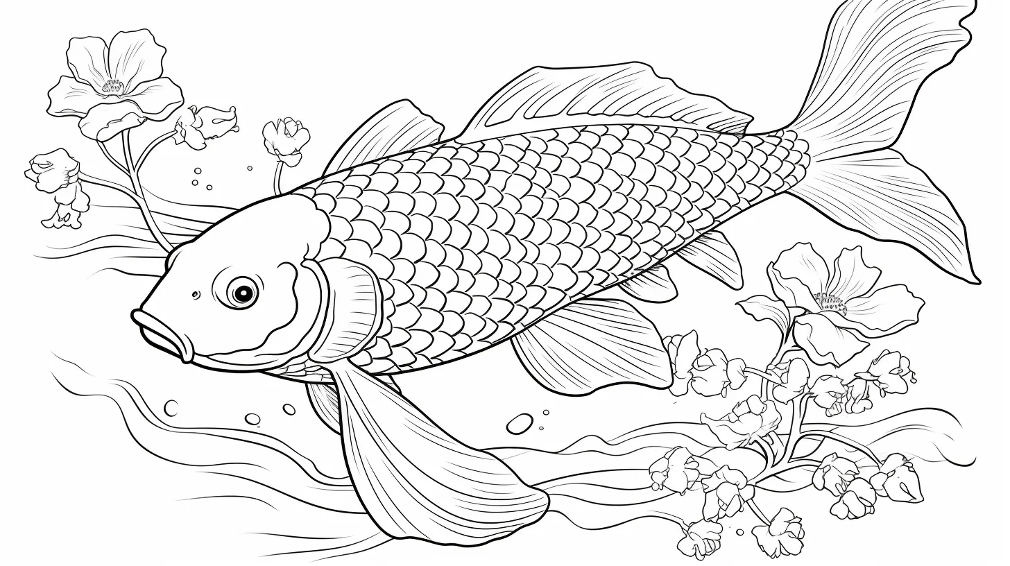
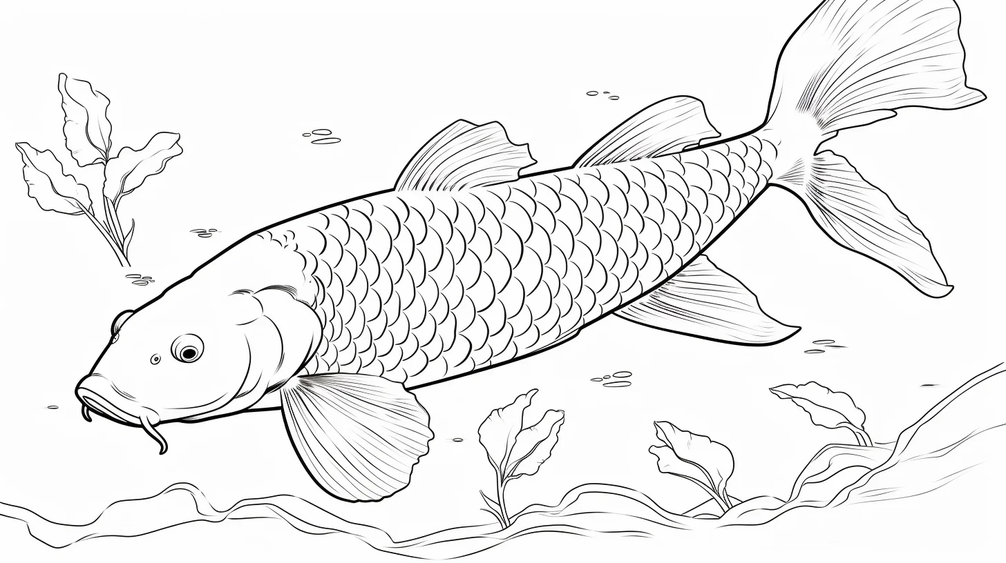
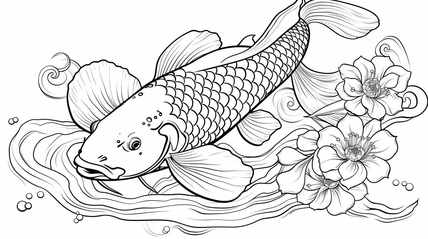
Kawaii and simple koi — Sheets 6–9
These are the pages to use when you want a softer cartoon look. You can still use recognizable koi patches, but bright fantasy colors work particularly well here because the proportions are already stylized.
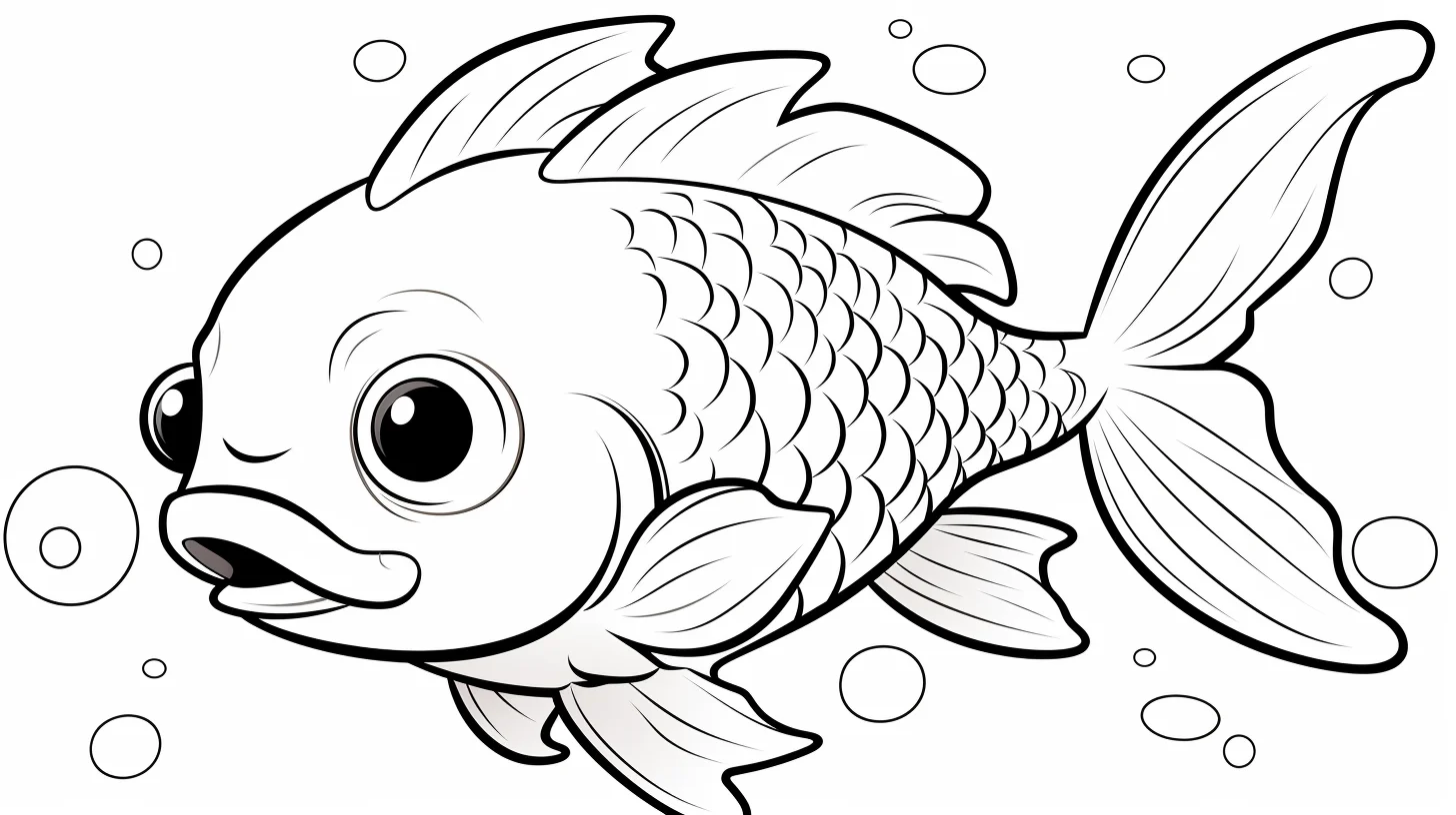
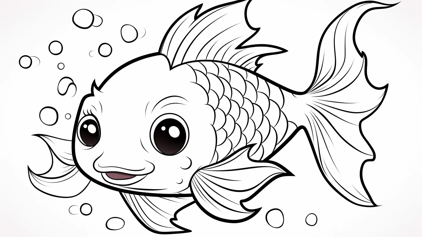
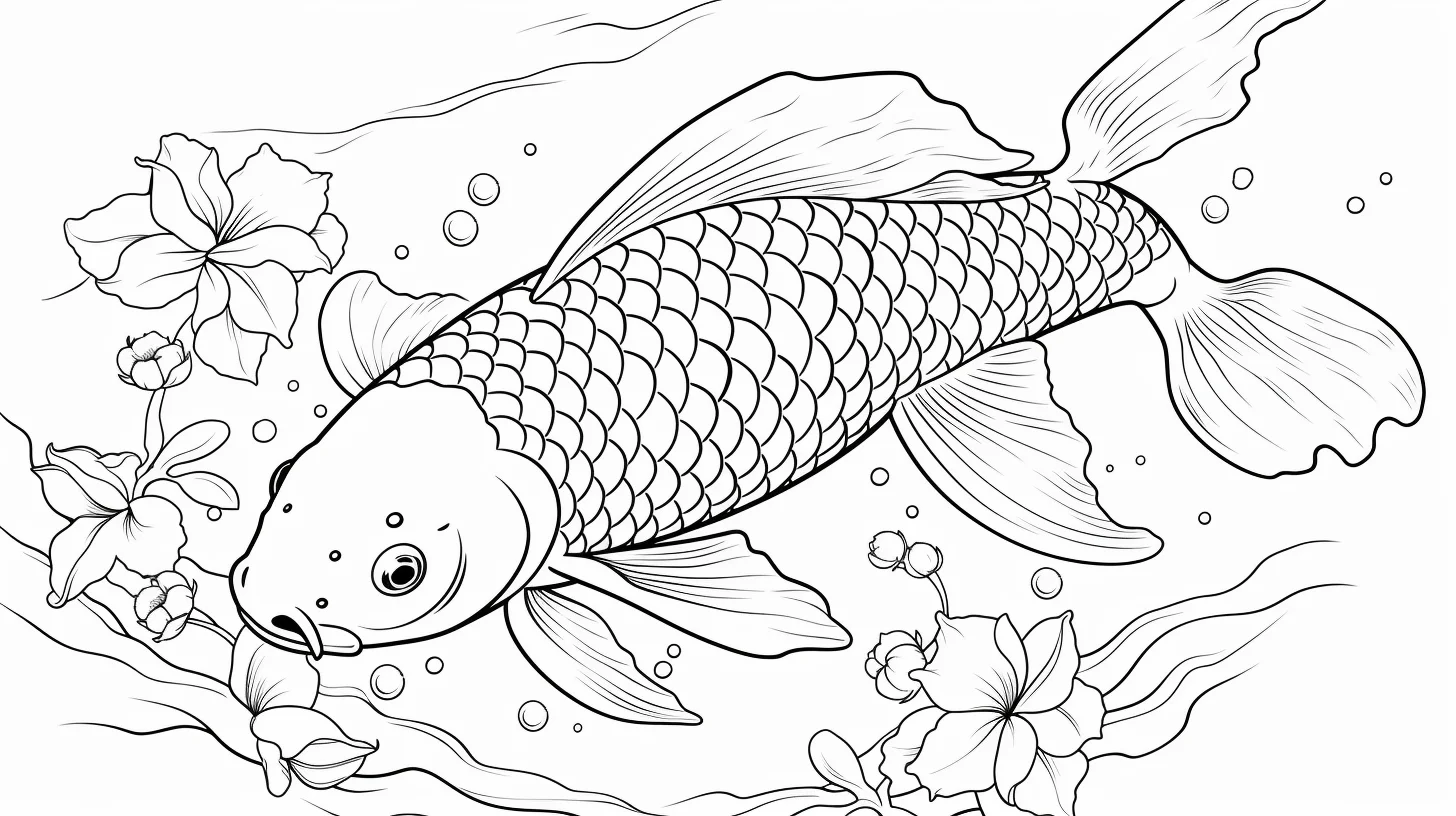
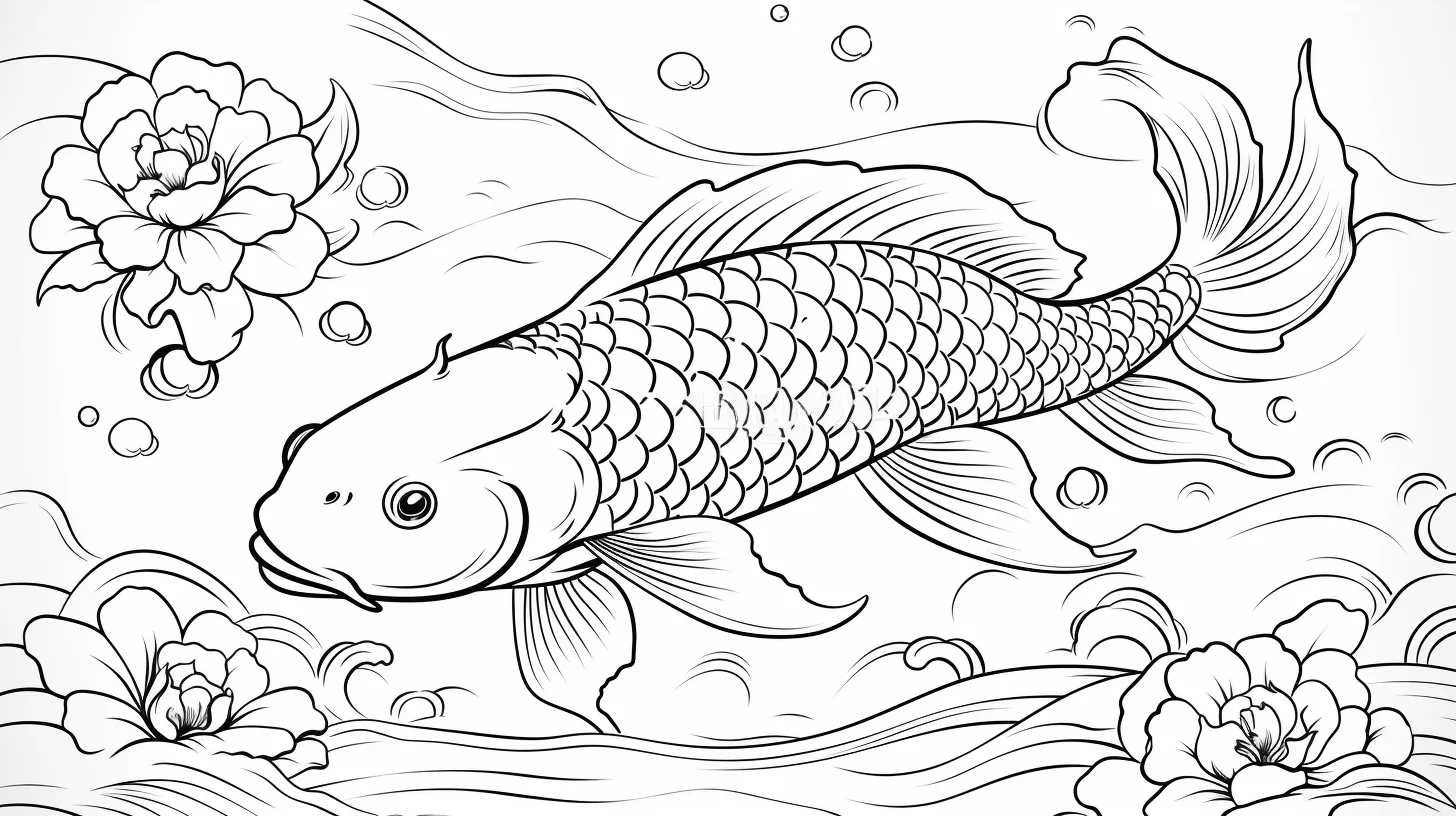
Japanese-style and general koi — Sheets 10–14
This middle group is a good place to use a restrained palette: white, vermilion or orange, black and one water color. Repeating those colors across the fish keeps a decorative page from becoming visually noisy.
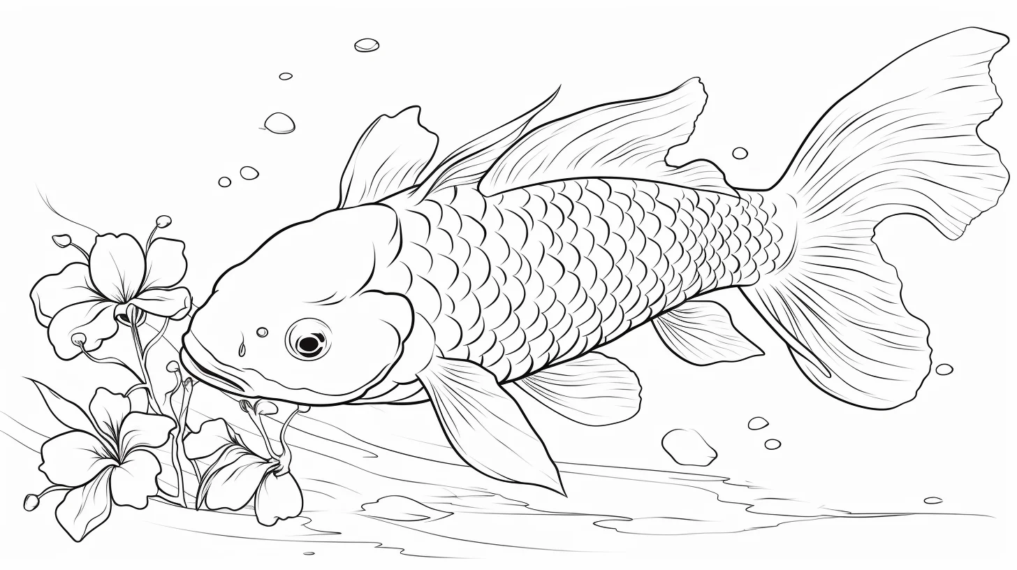
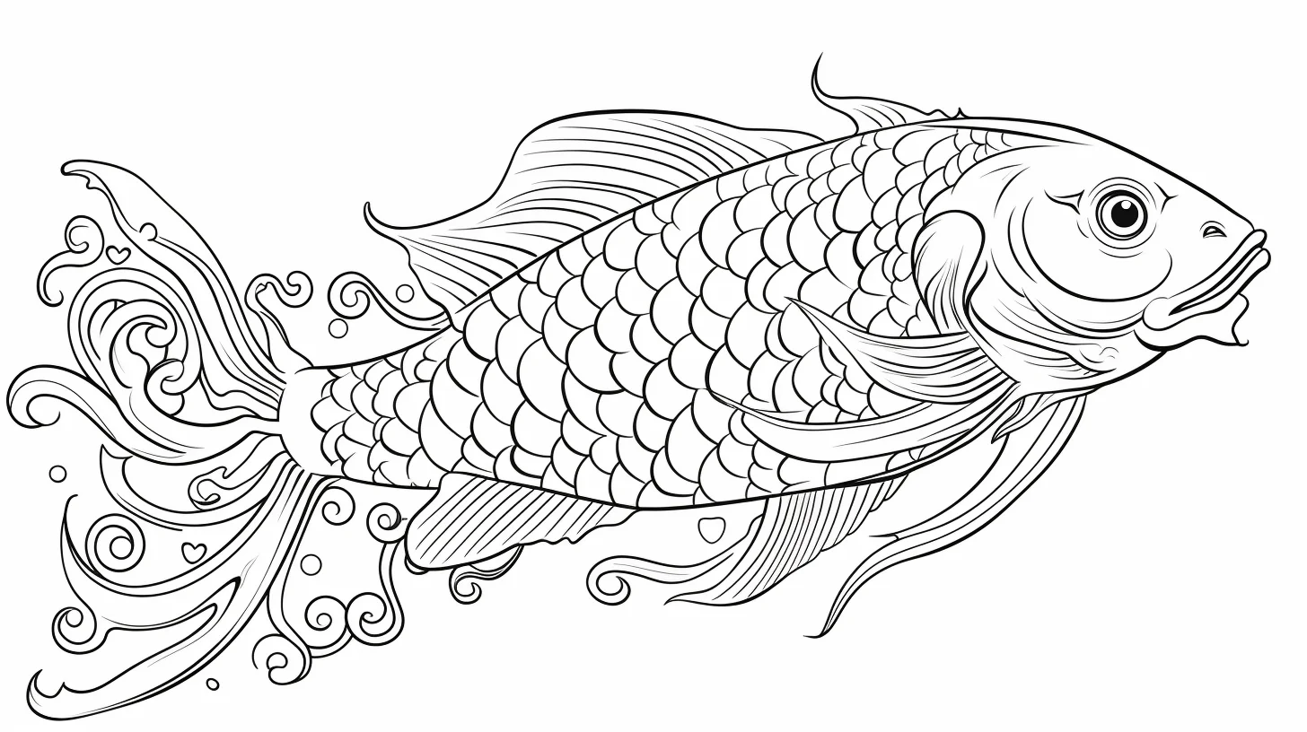
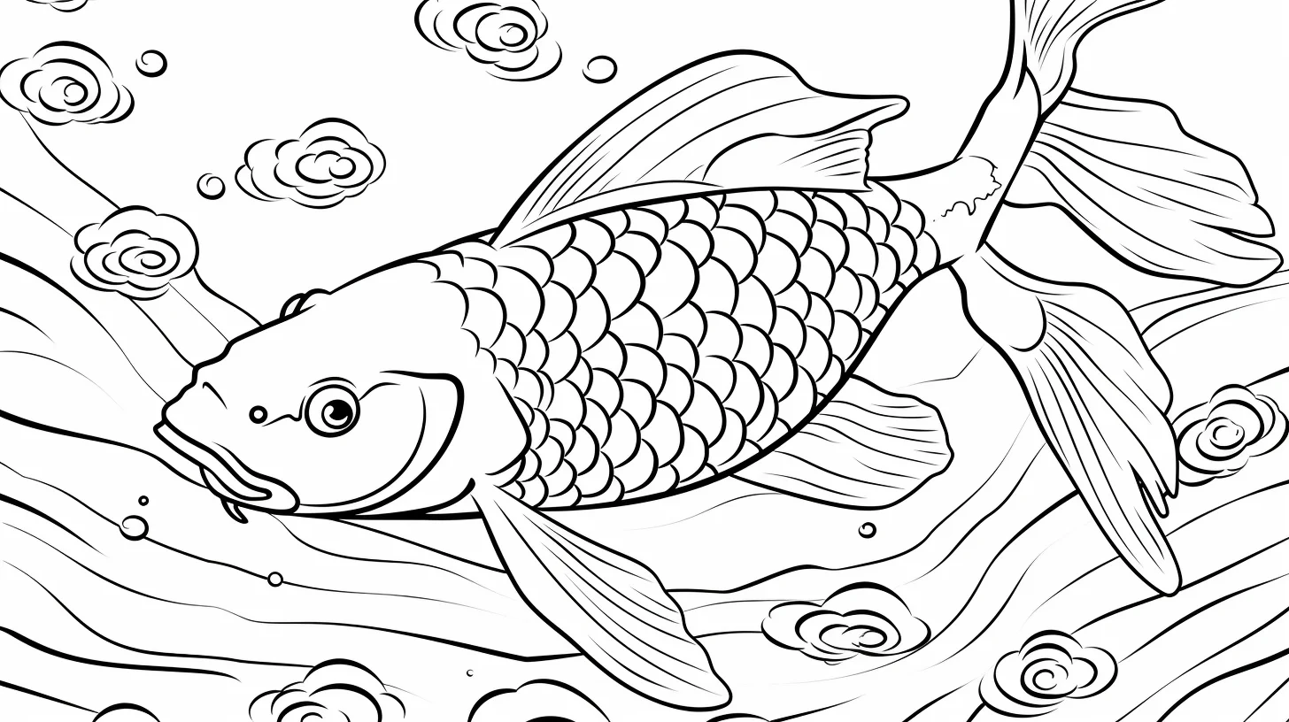
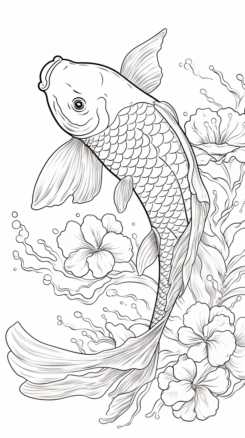
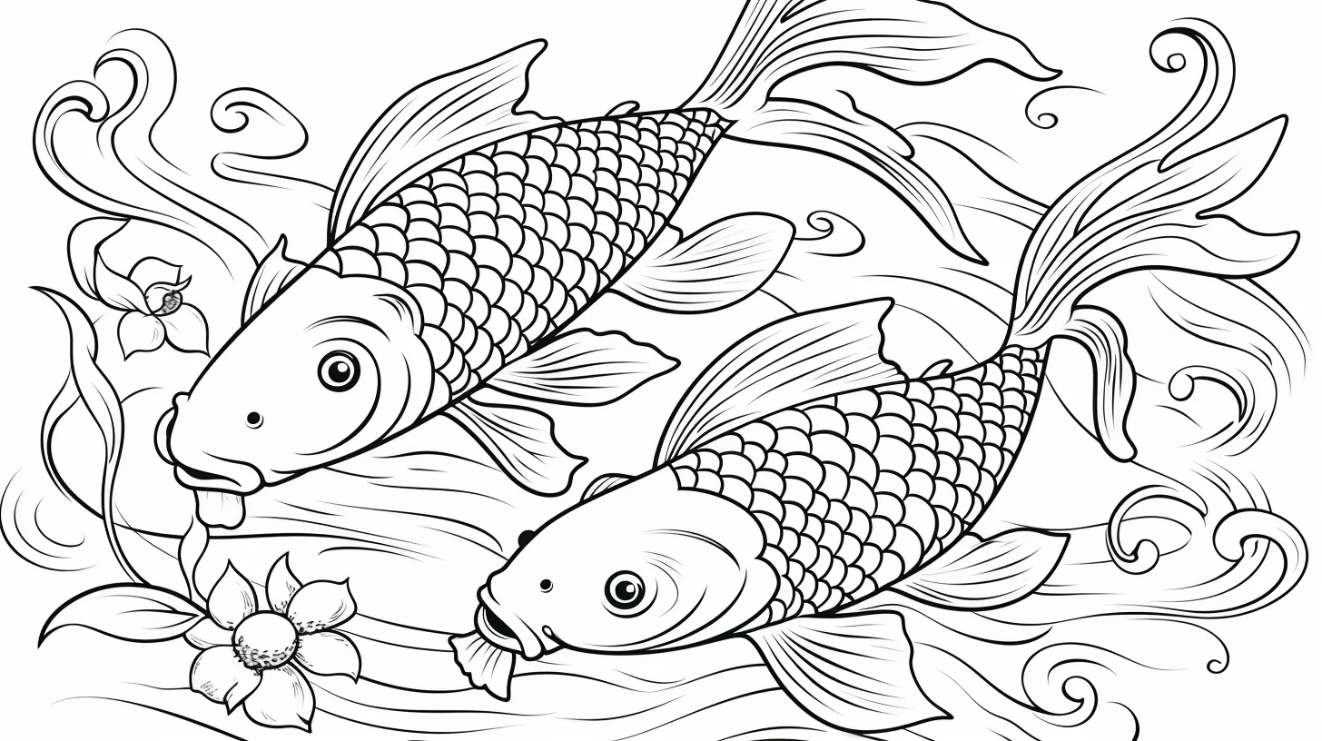
Realistic and adult koi — Sheets 15–19
Use colored pencils on this final group if you want the fins, scales and body patches to stay distinct. Work lightly at first; the strongest red, orange and black areas should be accents rather than a heavy layer over the whole fish.
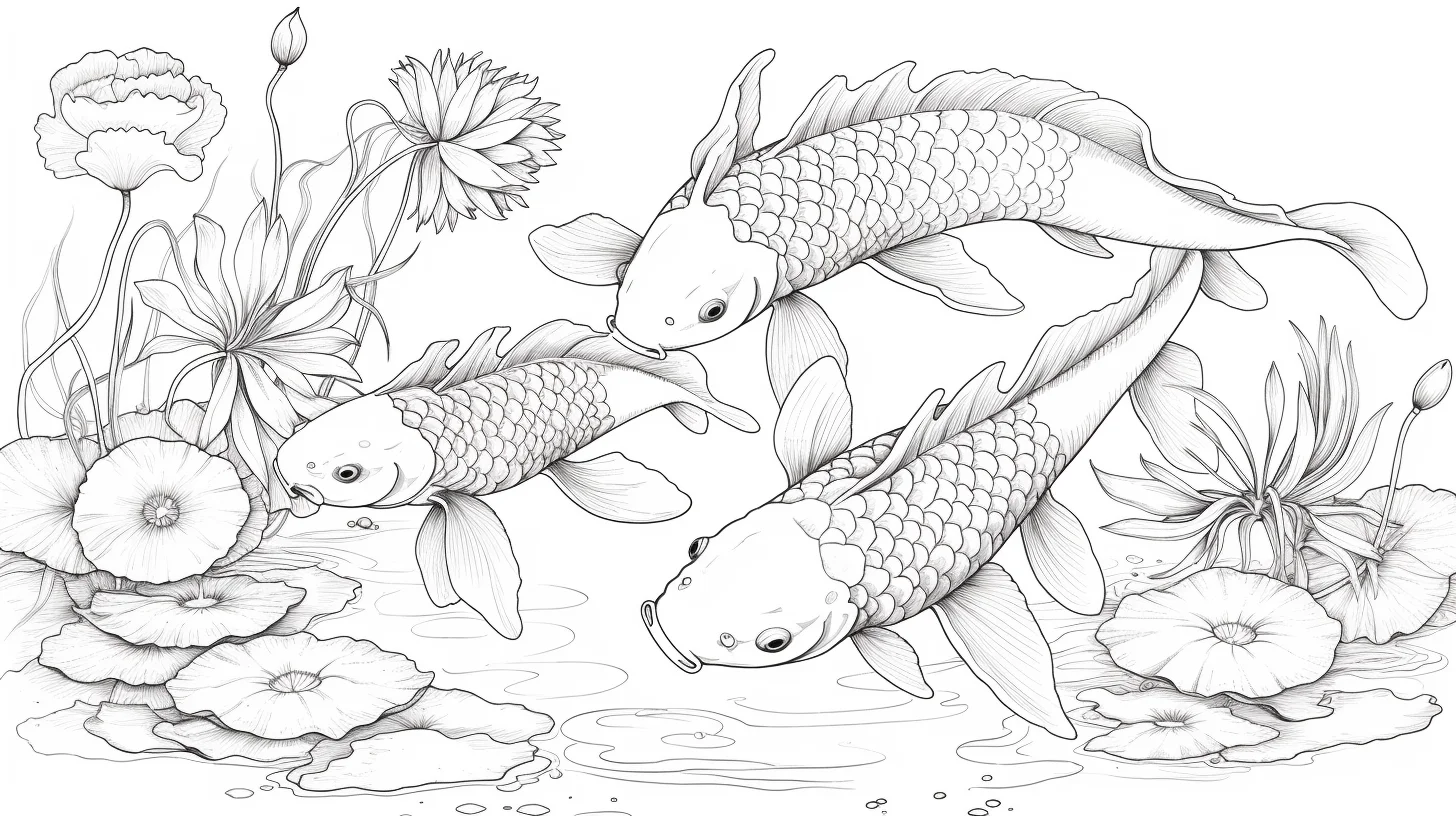
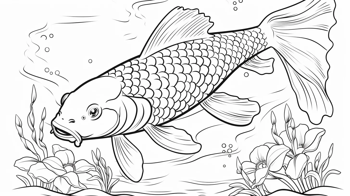
Practice koi markings without overworking the page
If you want to improve rather than simply finish a sheet, use three different pages as a short practice set. On the first, concentrate only on placing clean patches while preserving white paper. On the second, add gentle body shading beneath the markings. On the third, practice separating the fish from the water with value and temperature instead of outlining everything more heavily.
| Practice sheet | Main skill | What to ignore |
|---|---|---|
| 1 | Clean, irregular color patches | Scale-by-scale shading |
| 2 | Body volume and pale fins | Detailed water effects |
| 3 | Fish-versus-water contrast | Adding extra colors just to fill space |
Make the fish look rounded, not flat
Treat the koi as one curved form before thinking about individual scales. Keep the center or upper-facing part of the body lighter and gradually deepen the value toward the lower edge, underside and places where fins overlap the body. Then place the koi markings over that value plan. On a white koi, use only a faint cool gray or pale blue for the shadow; leaving most of the paper untouched keeps the body looking white.
For scales, resist tracing every arc with a dark pencil. A few darker scale edges near the shadow side can suggest the whole texture. Fins usually read better with strokes that follow the rays from the base outward, fading as they approach the edge.
Common koi-coloring problems and fixes
| If this happens… | Likely cause | Try this |
|---|---|---|
| The white koi looks gray | Shadow was applied across the entire body | Keep most paper white and confine pale shadow to the underside and overlaps |
| Red and orange patches look pasted on | Every patch has the same hard edge and value | Vary patch size and let a few edges soften slightly with the body shading |
| Scales overpower the fish | Every scale was outlined equally | Emphasize only selected scales in shadow areas |
| The fins look heavy | They received the same saturation as the body | Use lighter pressure and leave small areas of paper showing |
| The fish disappears into blue water | Fish and background have similar values | Lighten the water beside the body or deepen it farther away |
| The page feels too busy | Fish, water and background all have strong detail | Choose one focal area and simplify the surrounding water |
Choose tools by the kind of finish you want
Crayons suit sheets 1–5 because the shapes are open and forgiving. Markers produce crisp, saturated koi patches on simpler pages, but test them on spare paper and place another sheet underneath if bleed-through is possible. Colored pencils are the most flexible choice for sheets 15–19 because light pressure can preserve white areas while several thin layers build body shading, scales and translucent fins.
For a mixed-media approach, use marker only for the strongest red, orange or black patches and pencil for shadows and transitions. That keeps the markings vivid without forcing you to shade delicate fins with a broad marker tip.
Three useful koi palettes
- High contrast: white paper, vermilion red, orange and small black accents, with cool blue water.
- Warm pond: cream, golden yellow, orange and deep brown-black, with muted blue-green water.
- Fantasy koi: turquoise, violet and coral on the kawaii sheets, while keeping one repeated color across both fish so the pair still feels coordinated.
Whichever palette you choose, reserve the darkest color for a small percentage of the fish. Large black areas can quickly dominate delicate fins and patterned bodies.
Quick koi-coloring questions
Do koi need to be orange and white?
No. Orange, red, white, black and yellow are useful reference colors, but the markings are flexible and fantasy palettes work well on the simpler sheets.
Should I color every scale separately?
Usually not. Lay down the body color first, then darken only selected scale edges or shadow areas. Coloring every scale as an isolated shape can make the fish look too busy.
What tool works best for the realistic pages?
Colored pencils give the most control over patch edges, fins and scale detail. Markers are better on the simpler sheets with broad open areas.

