
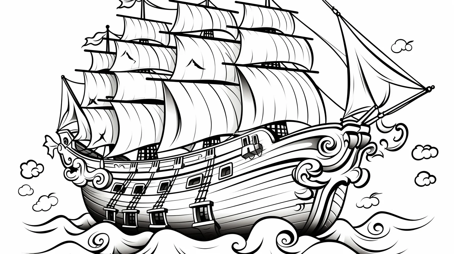
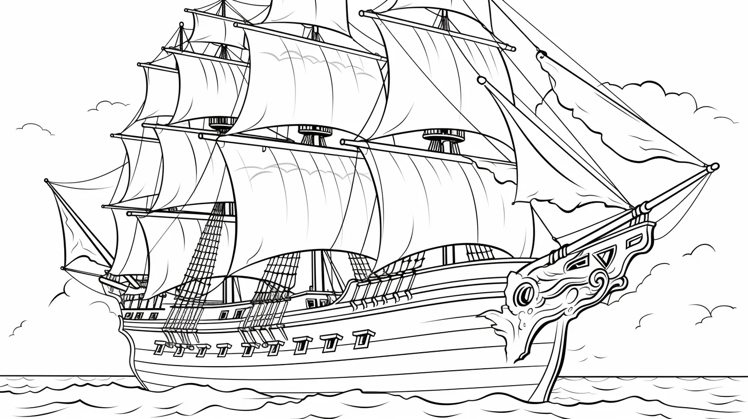
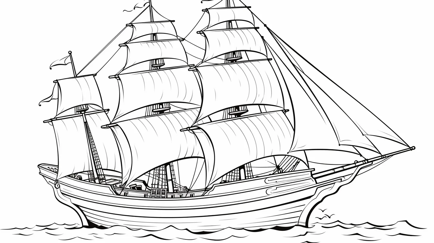
A pirate ship can be a very quick coloring page or a surprisingly slow one. The difference is not the size of the ship; it is the amount of rigging, deck detail, crew clothing and background scenery packed around it. This collection has 44 sheets, so I have arranged them from the easiest kid-friendly ships through crew scenes and more involved vessels rather than leaving them in upload order.
Where should you start?
| If you want… | Go to | Best tools |
|---|---|---|
| A quick ship with larger spaces | Sheets 1–8 | Crayons or broad pencils |
| Pirates, hats and crew details | Sheets 9–15 | Colored pencils |
| More rigging and smaller sections | Sheets 16–23 | Sharp pencils or fine-tip markers |
| A broader mix of ship printables | Sheets 24–44 | Choose by the amount of detail |
How to color a wooden pirate ship without making it flat
Do not fill the entire hull with one brown. A lighter brown across the broad planks, a darker brown below the deck line and around windows, and a small amount of near-black in the deepest gaps is enough to suggest wood and shadow. Keep the sails lighter than the hull so the silhouette stays readable.
The sea should support the ship rather than compete with it. Pale blue-green immediately beside the hull and darker water farther away creates separation quickly. If you want a stormier scene, darken the sky or sea before making the ship itself darker.
- Color the largest hull sections first.
- Do the sails and flags next.
- Add the sea and sky around the ship.
- Save ropes, railings, windows and tiny clothing details for last.
Most sheets are landscape, but a few are portrait-oriented. Open the original image first, match the printer orientation to the file, then use Fit to page on A4 or US Letter. For another fantasy-at-sea theme, try the mermaid coloring pages. For a wider mixed collection, use the easy coloring pages for kids.
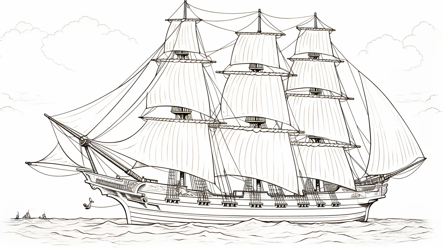
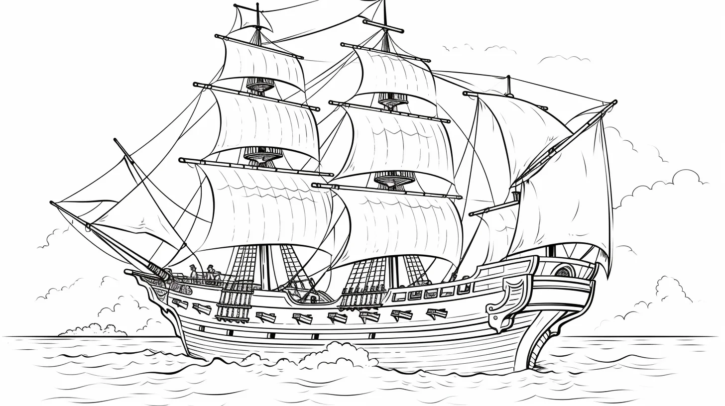
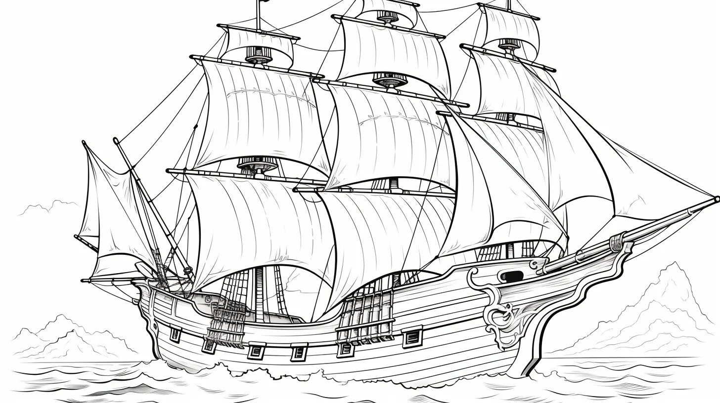
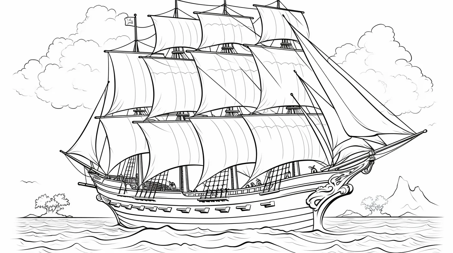
Easy pirate ships — Sheets 1–8
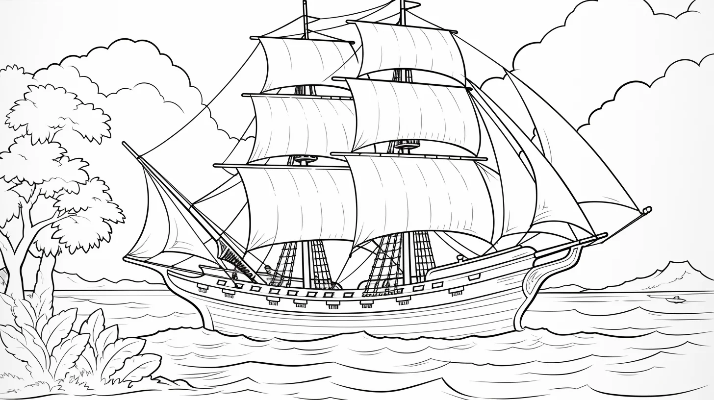
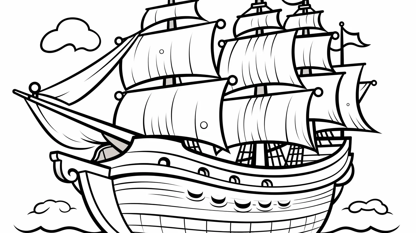
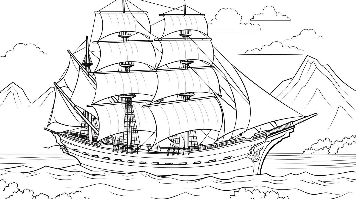
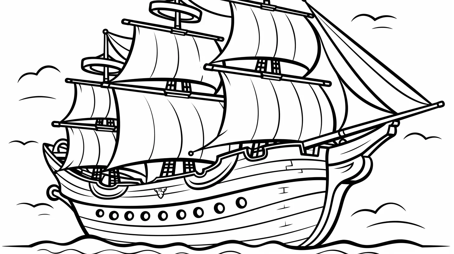
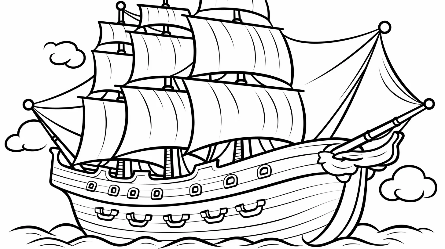
These are the quickest starting points: simpler hulls, kid-oriented sheets and less emphasis on tiny rigging. If a child wants to add more detail, draw waves, clouds or a small island around the ship rather than starting with one of the busiest pages.
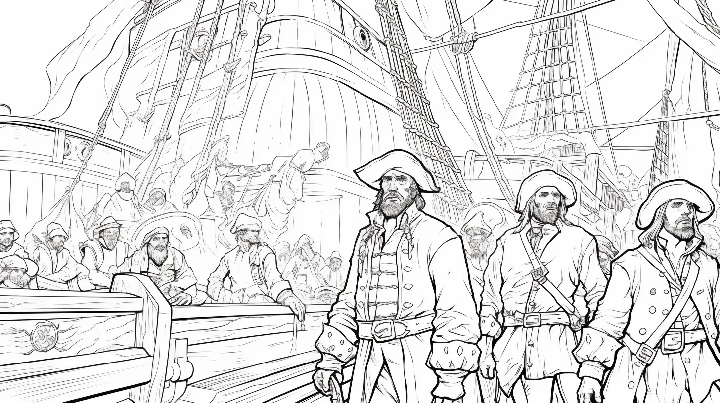
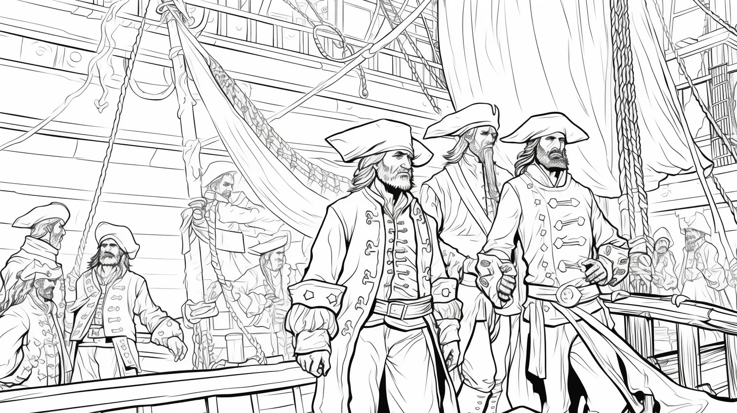
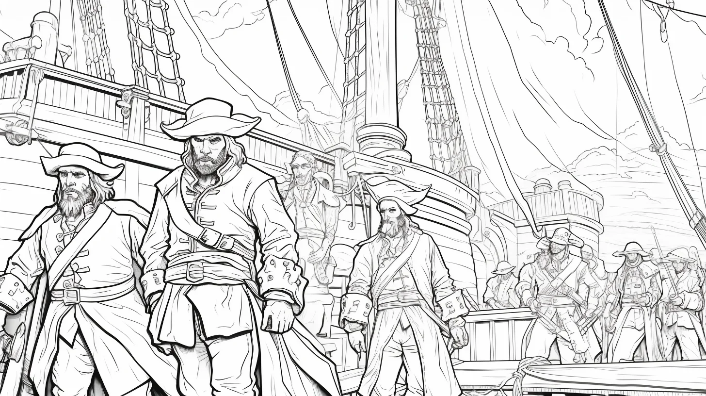
Pirate crew scenes — Sheets 9–15
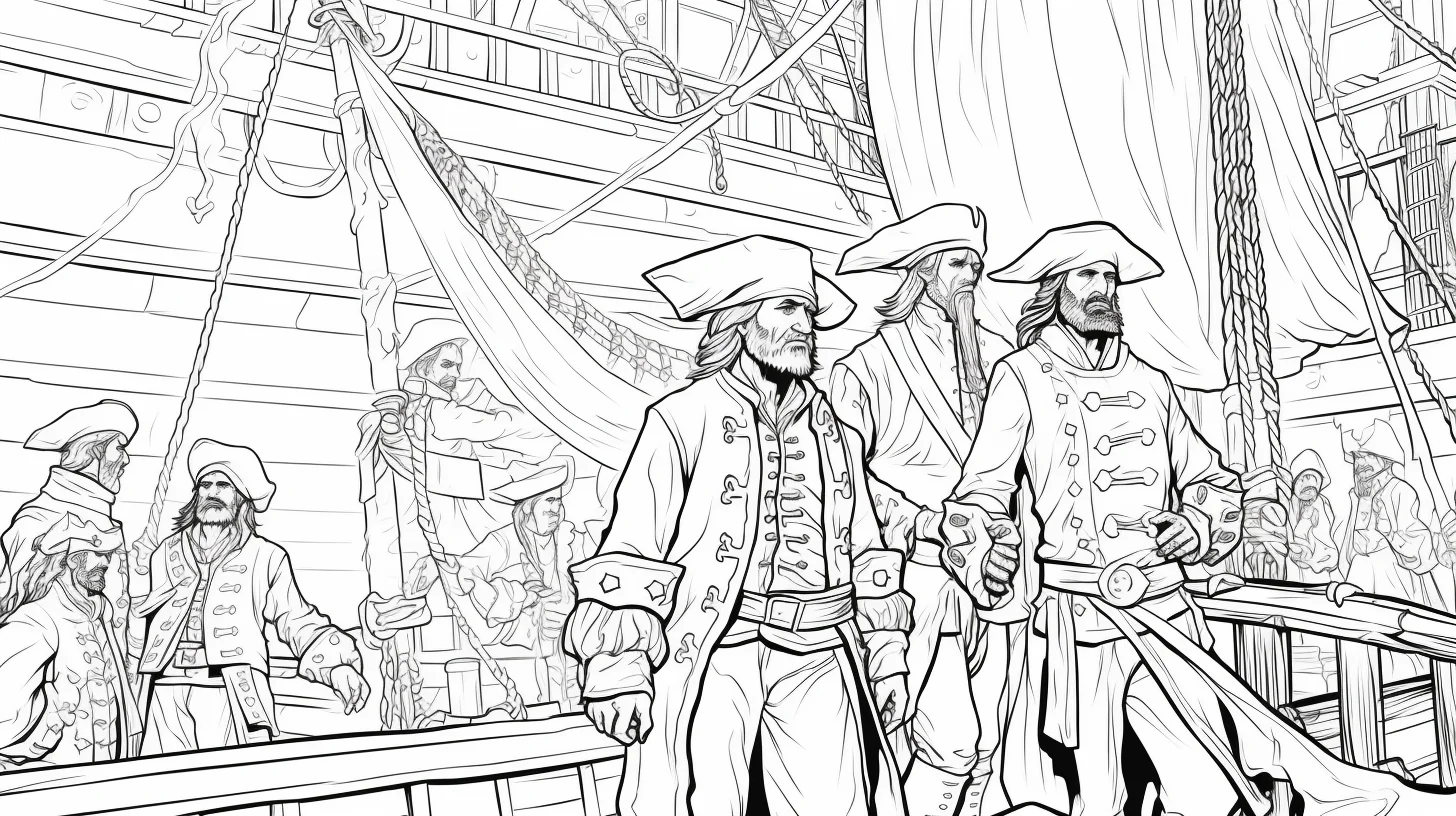
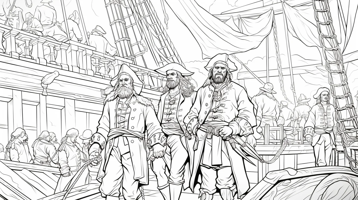
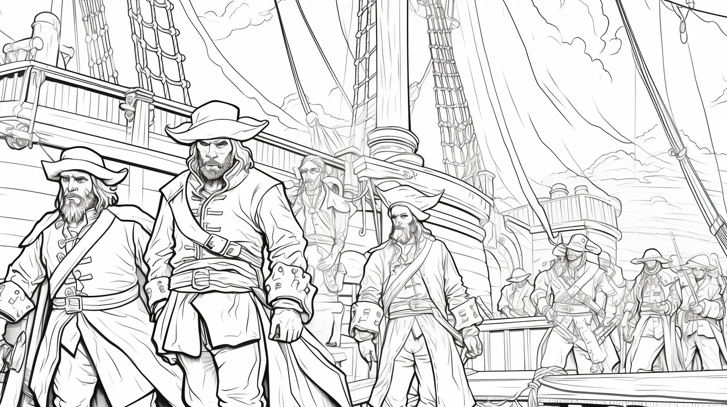
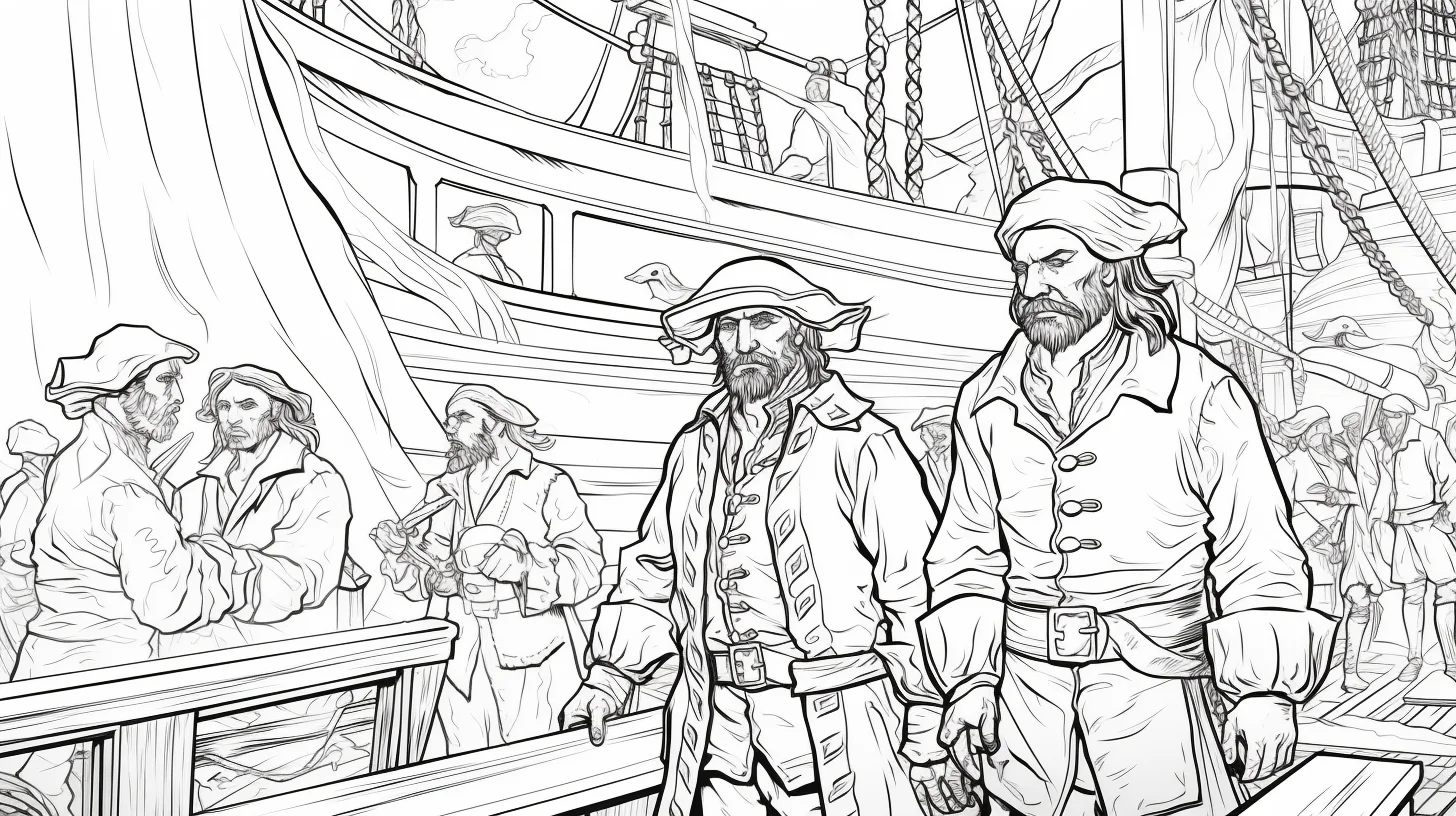
These pages add people, hats, clothing and deck details. Choose the crew colors before the sea: repeating one accent color across two or three pirates helps a busy scene feel connected without making every outfit identical.
Detailed and adult pirate ships — Sheets 16–23
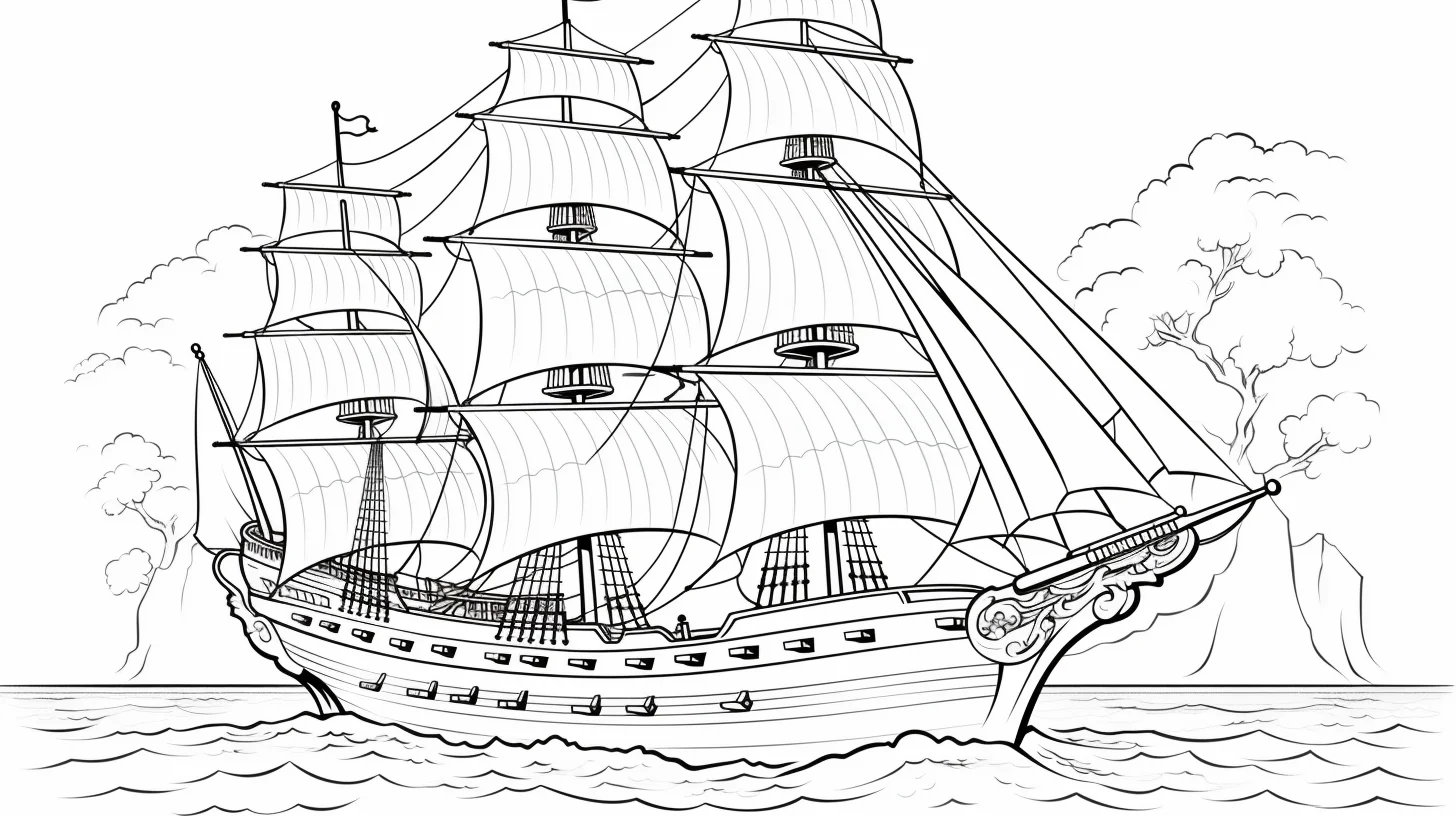
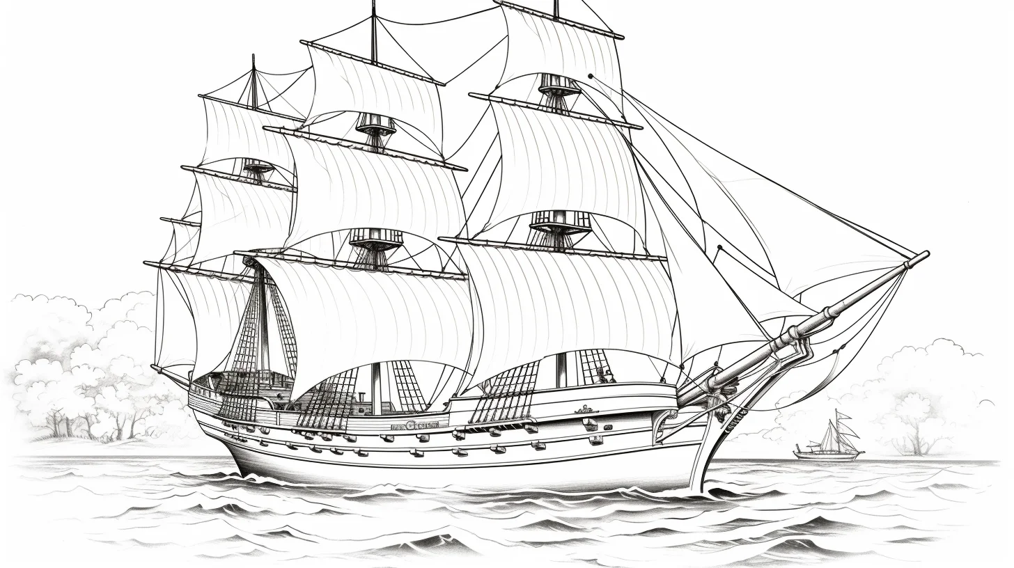
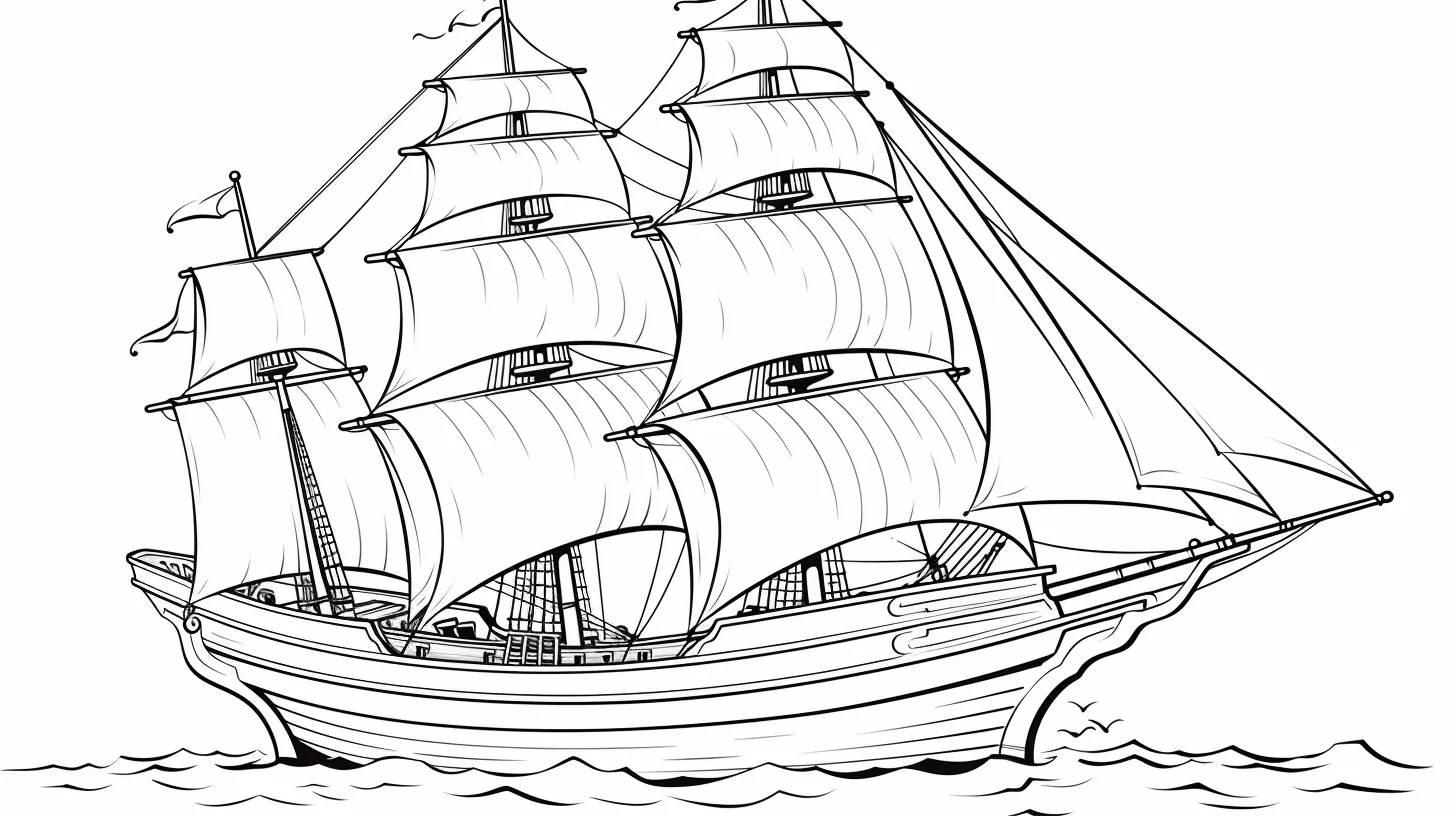
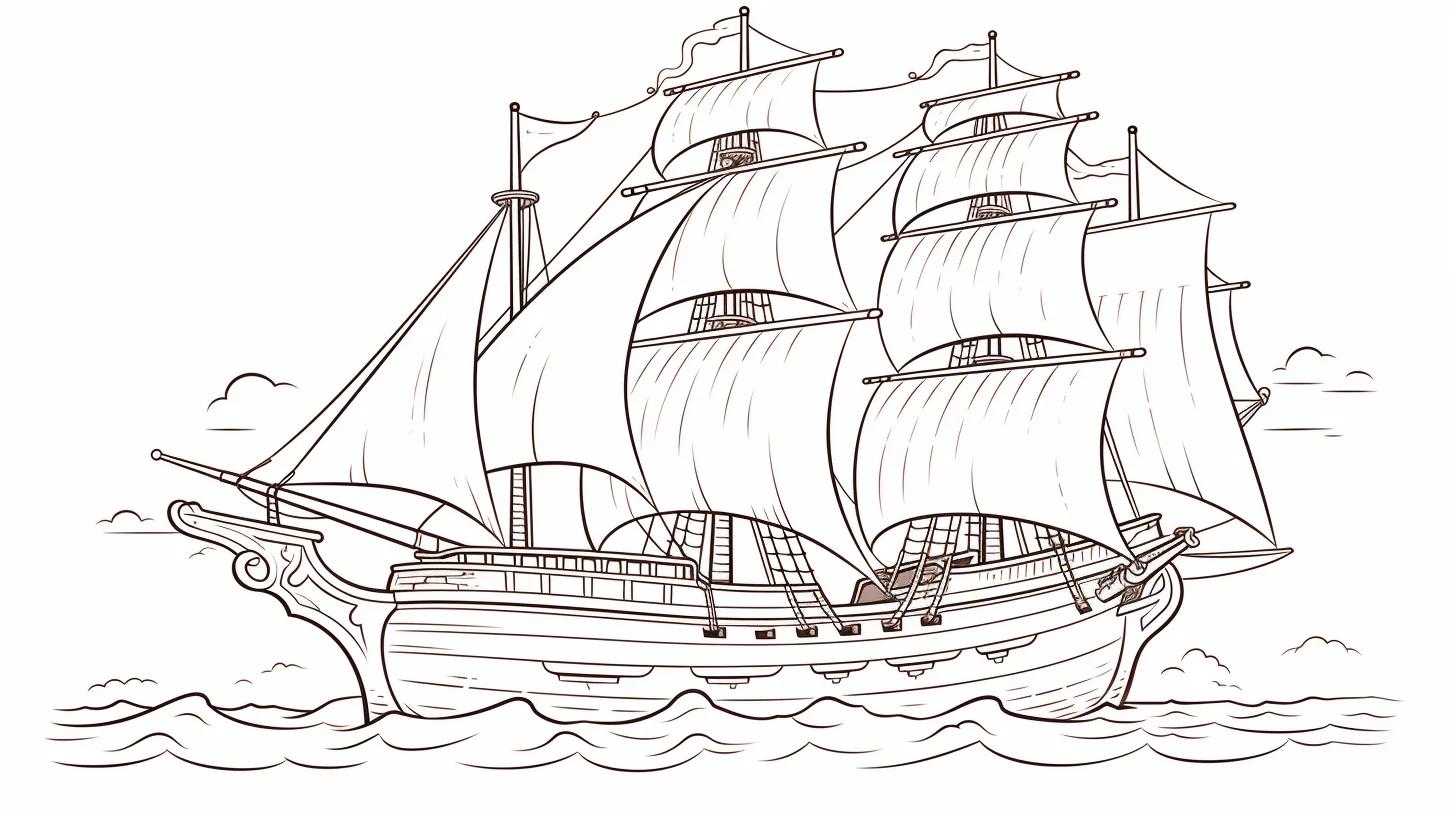
Use pencils here rather than broad markers. Work from the large hull and sails toward the rigging; if you color the thin ropes first, they are easy to cover accidentally while filling the larger areas.
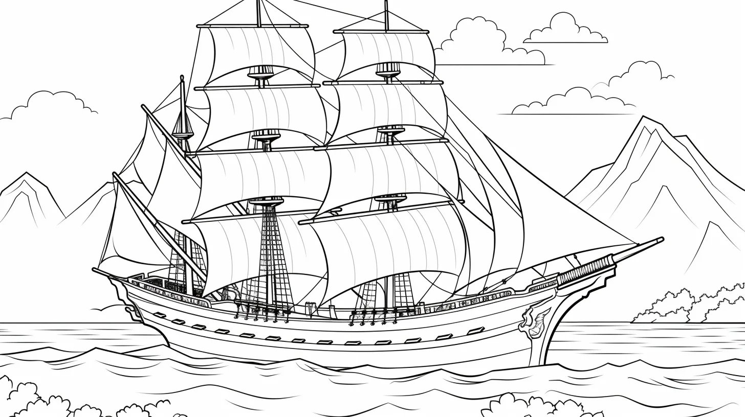
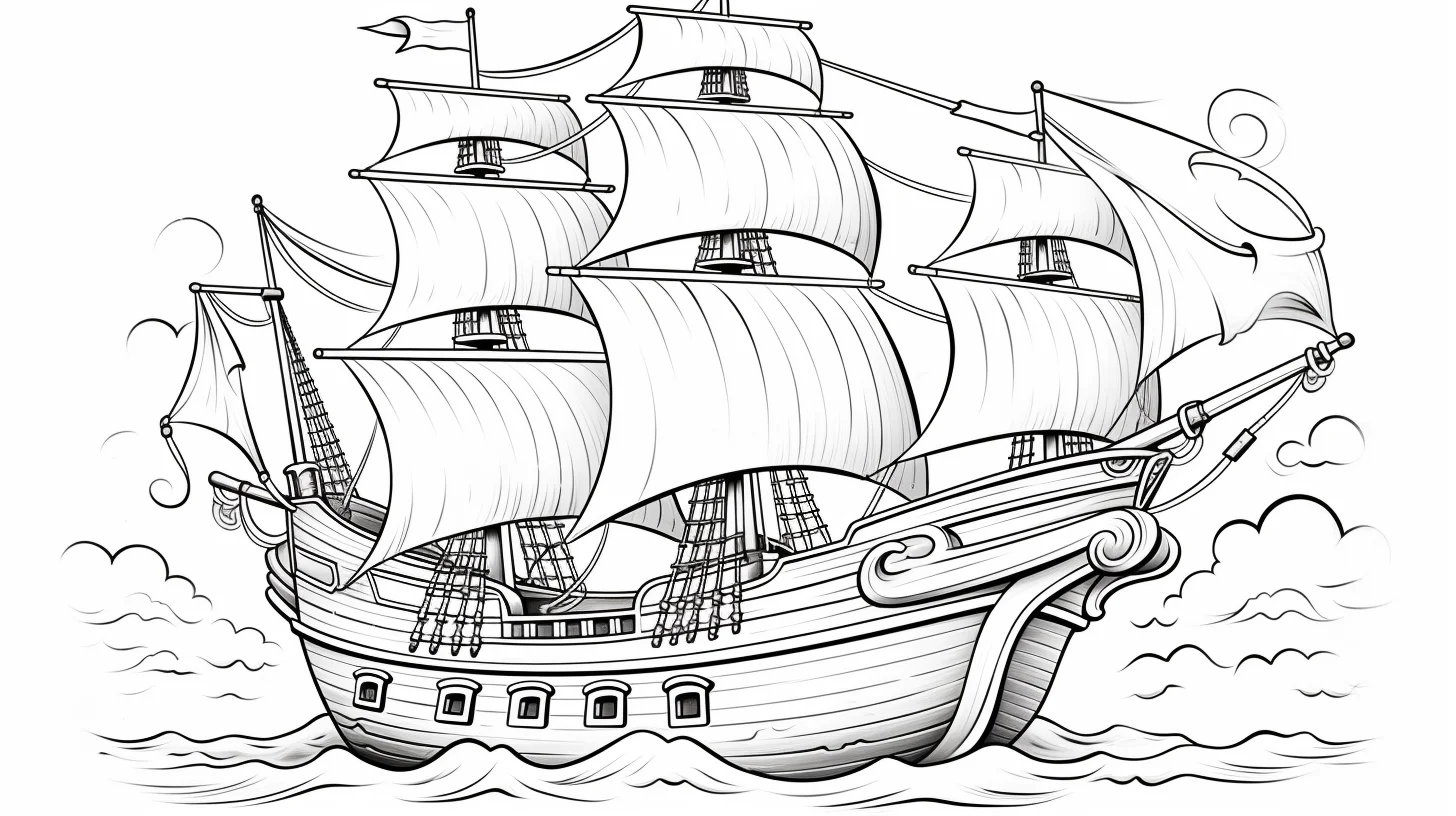
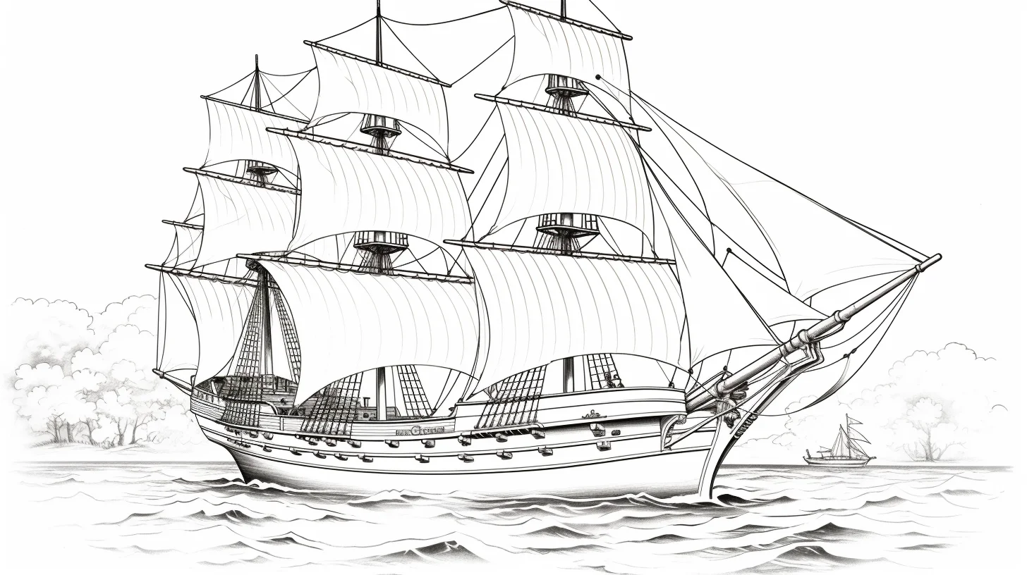
More pirate ship printables — Sheets 24–44
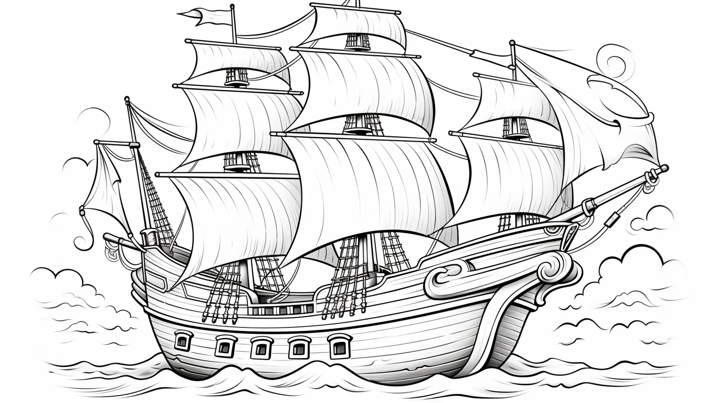
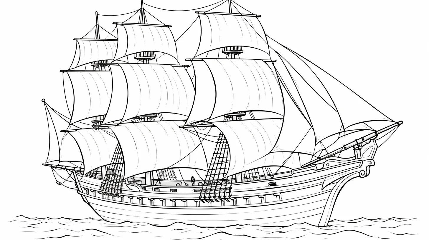
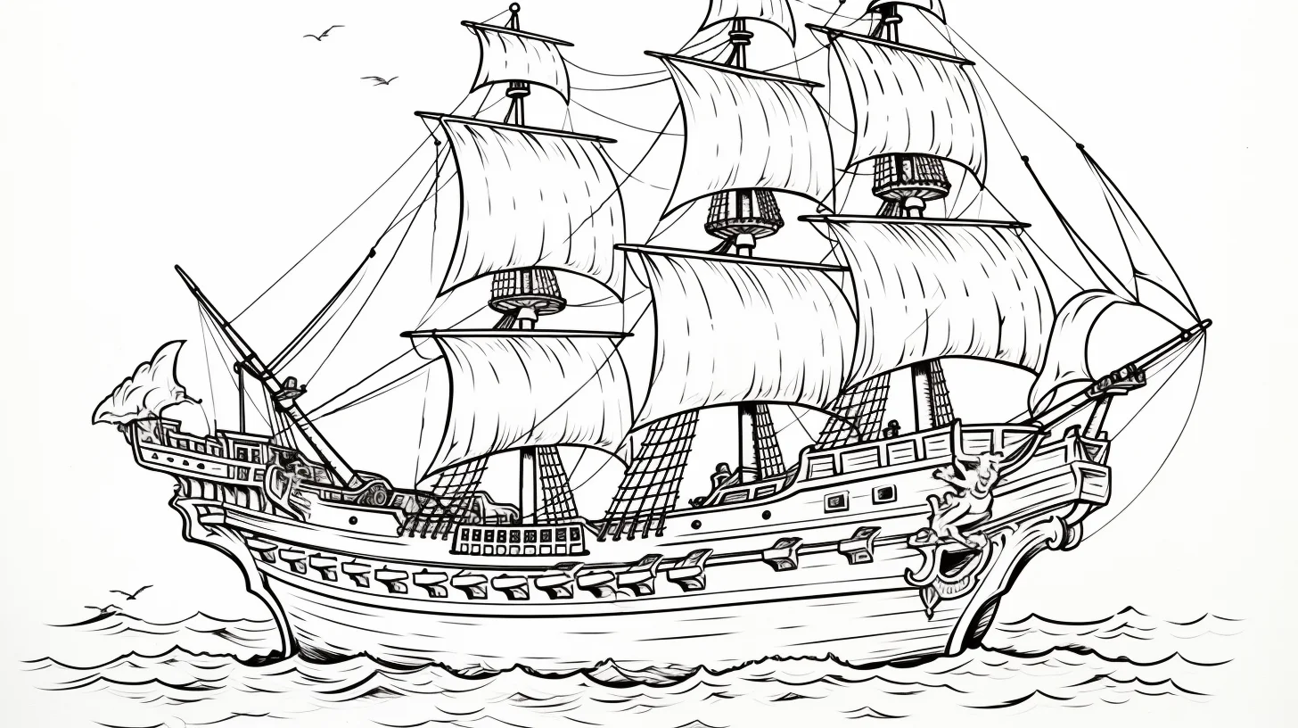
This final group is the broader mix. Some pages are very clean; others add more sail, sea or deck detail. Pick from the preview rather than assuming a later sheet is automatically harder.
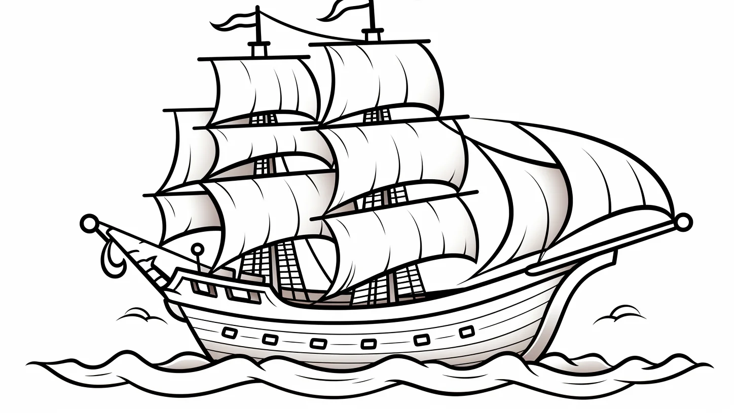
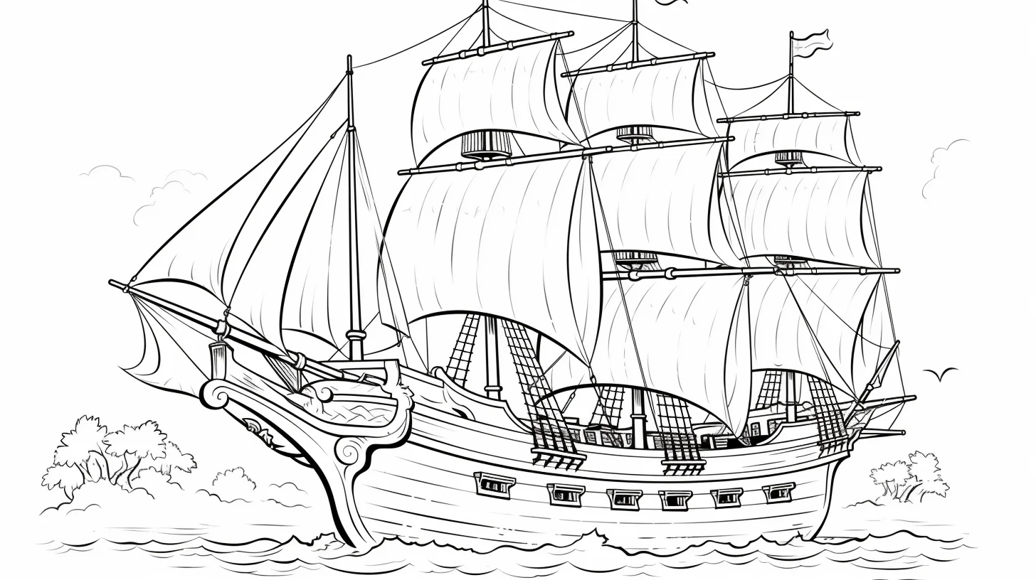
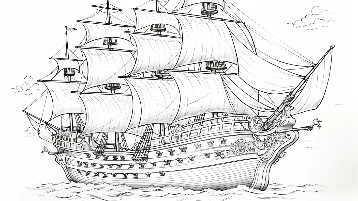
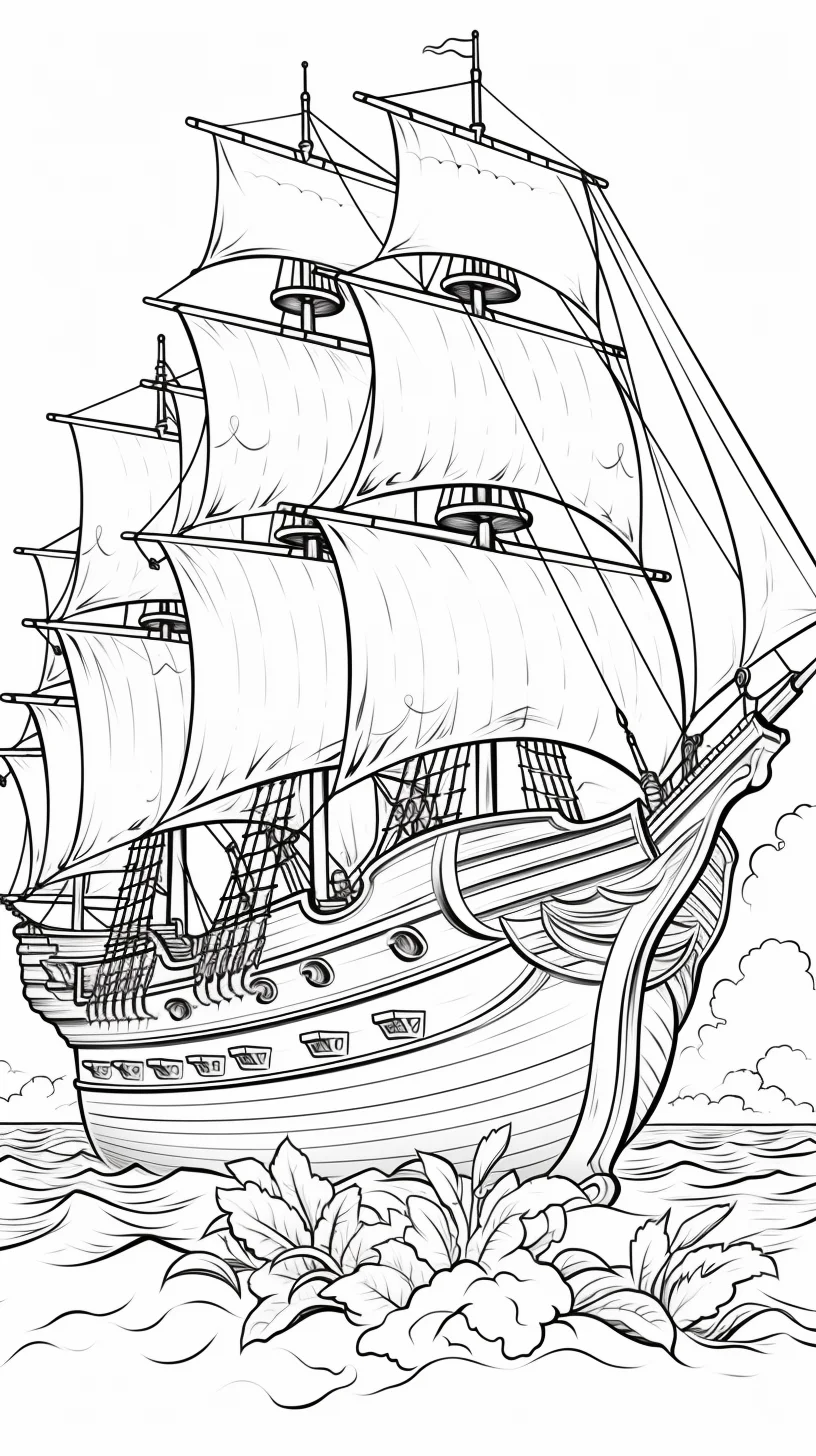
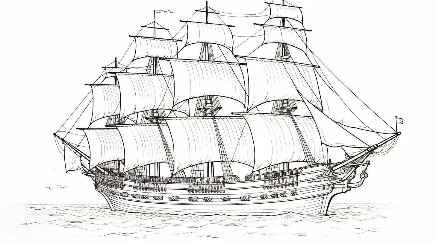
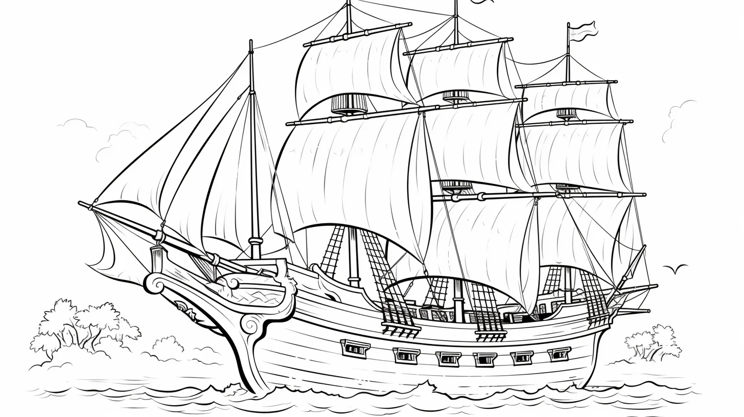
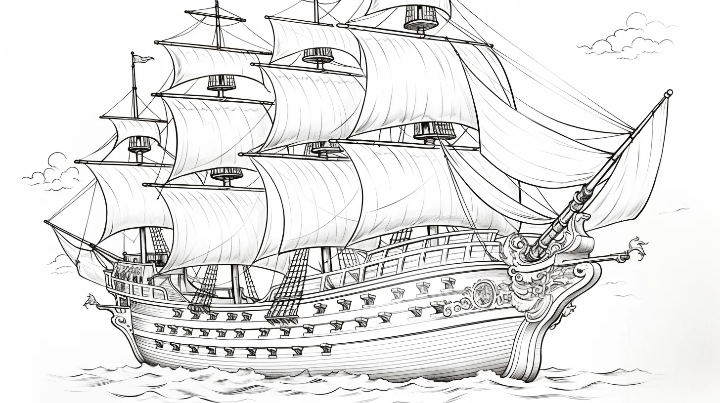
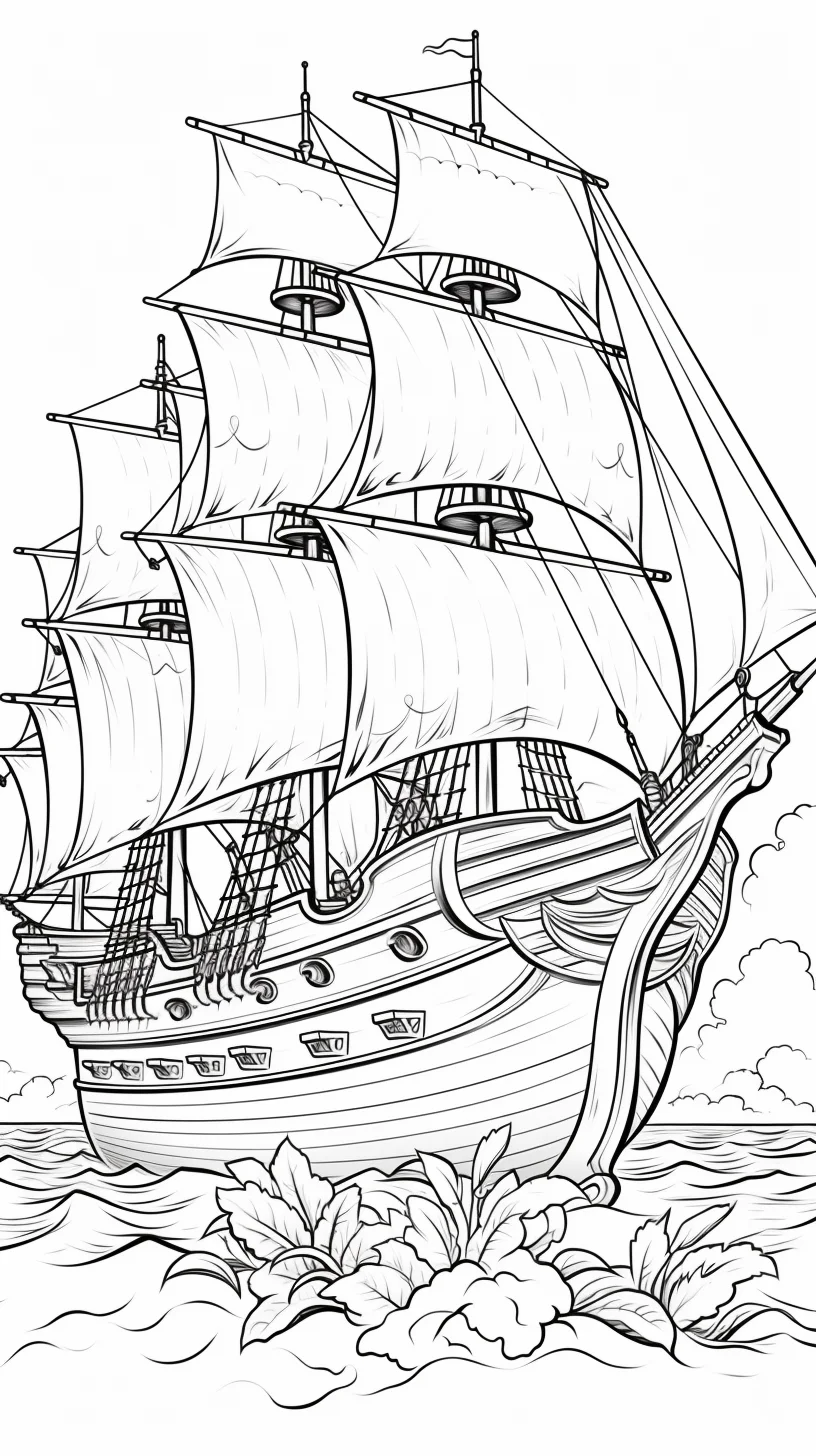
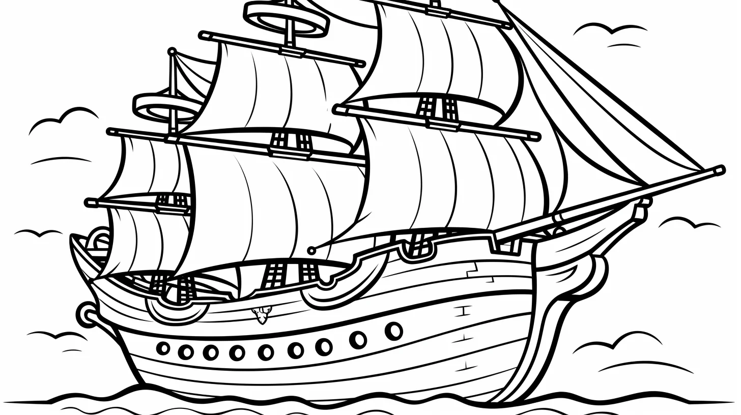
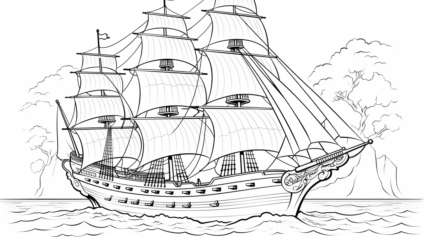
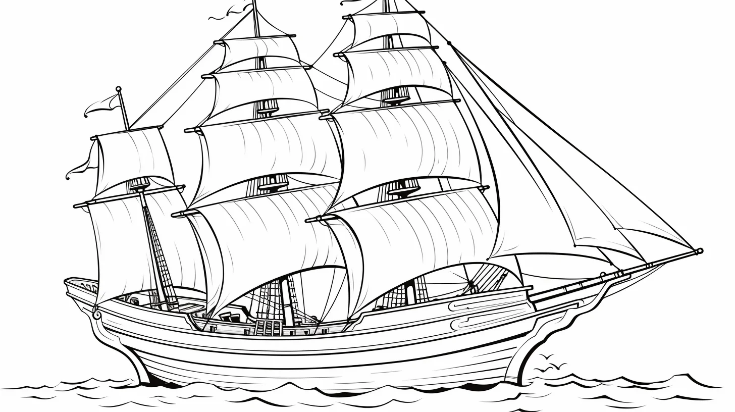
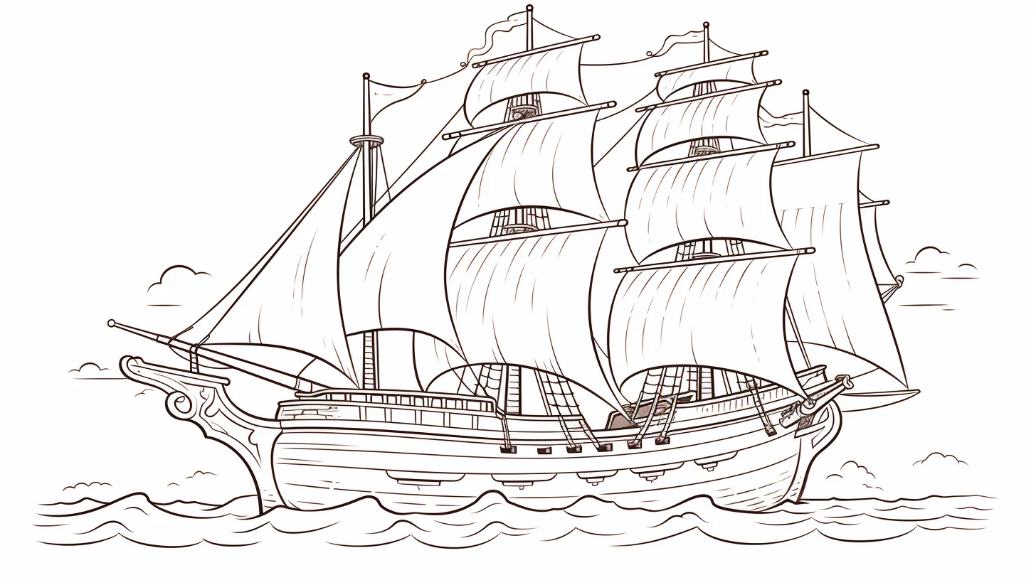
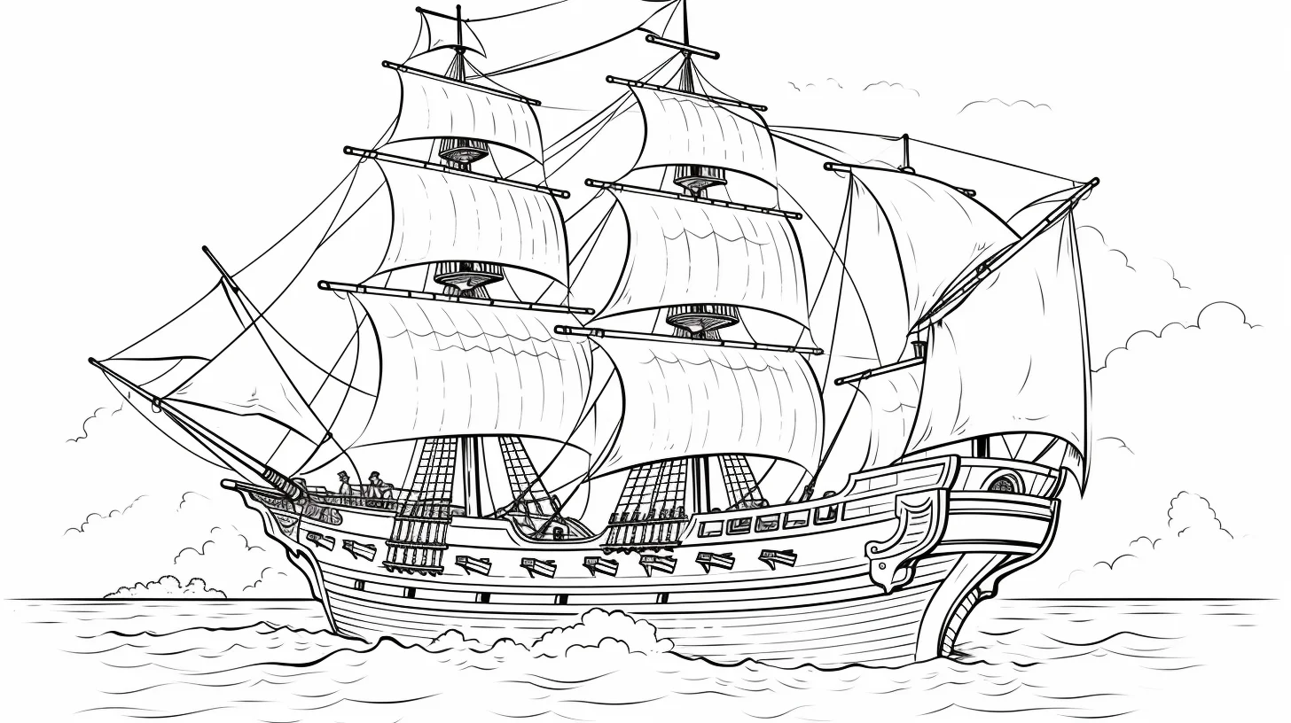
One last detail: rigging
Save ropes, railings and tiny flag details for the end. A sharp pencil or fine-tip marker can follow those lines after the large hull, sails, sea and sky are finished; doing them first makes them much easier to cover accidentally.
For a simple next activity, ask the child to add one thing the ship might be heading toward—a lighthouse, an island, a storm cloud or open sea. It extends the page without turning the coloring sheet into a separate craft project.
A three-page pirate ship practice route
- Start with silhouette and contrast. Pick one of Sheets 1–8. Use a light sail, medium-value hull and darker flag or windows. The goal is to make the ship readable from across the room before adding texture.
- Practice wood and water. Move to a sheet with more hull planks. Lay down one light brown across the hull, add a deeper brown below overhangs and around openings, then build the sea from lighter water beside the ship to darker bands farther away.
- Finish with rigging and atmosphere. Choose a detailed vessel from Sheets 16–23. Complete the broad shapes first, then sharpen a pencil for ropes, railings and mast details. Add a pale horizon or darker storm sky only after the ship itself reads clearly.
Using related colors across all three pages makes the improvement easier to judge. Instead of inventing a completely new palette each time, you can concentrate on cleaner edges, stronger depth and increasingly fine detail.
Make sails, wood and water look like different materials
The easiest way to separate surfaces is not to use more colors, but to change how you apply them. Keep sails relatively smooth and pale. On wooden planks, use slightly uneven strokes that follow the length of the boards. For water, let strokes run mostly sideways, even when the waves curve. Those three stroke directions create texture before you add any extra detail.
For white sails, avoid leaving the entire area untouched. A very light gray, beige or pale blue along the lower edge and beside folds can suggest shade while the center remains white. If the ship has several sails, repeat the same shadow color so they belong to one vessel.
Fix common pirate ship coloring problems
| Problem | What usually fixes it |
|---|---|
| The brown hull looks like one solid block | Keep the main plank area lighter, then darken beneath the deck, around windows and where sections overlap instead of outlining every plank equally. |
| White sails disappear into the page | Add a faint cool or warm shadow along folds and edges while preserving plenty of untouched white paper. |
| Rigging becomes messy | Finish the large areas first and use a freshly sharpened pencil for ropes. Do not repeatedly trace a line just to make it darker. |
| The sea competes with the ship | Reduce contrast immediately around the hull. Save your darkest blue or green for selected waves farther away. |
| The scene has many colors but still feels flat | Choose a light direction and darken the undersides of sails, deck edges and hull consistently rather than adding more hues. |
| Markers bleed through small deck details | Use markers only on broad areas, place scrap paper underneath, and switch to colored pencil around ropes, faces and railings. |
Turn one printable into a simple storytelling activity
Before coloring, decide three things: where the ship is going, what the weather is doing and what the crew is looking for. Those choices can guide the page without requiring extra materials. A treasure voyage might use warm sunset colors and an island on the horizon; a storm scene can use cooler water, darker clouds and brighter sails for contrast.
For younger children, keep the extension small: add a sun, three clouds or an island. Older children can draw a horizon, treasure-map symbol, lighthouse or distant second ship. The original printable stays the focal point while the blank background becomes part of the story.
Pirate ship coloring questions
What colors work well for a classic pirate ship?
A useful starting palette is warm brown for the hull, cream or off-white for sails, dark gray for metal and rigging accents, and one stronger color such as deep red for flags or clothing. It feels nautical without requiring every object to have a different color.
How can I color black pirate sails without losing the line art?
Use dark gray as the main fill and reserve true black for folds, edges and the deepest shadow. That keeps printed outlines visible and gives you room to make the sail darker where needed.
Which pages are easiest for younger kids?
Start with Sheets 1–8 because they emphasize larger ship shapes and fewer tiny ropes. Crayons or broader colored pencils are more forgiving there than fine-tip tools.
Which pages are better for adults or detailed coloring?
Sheets 16–23 contain more rigging and smaller sections. Sharp colored pencils give better control than broad markers, particularly around ropes, railings and deck details.
How should I print the portrait sheets in this collection?
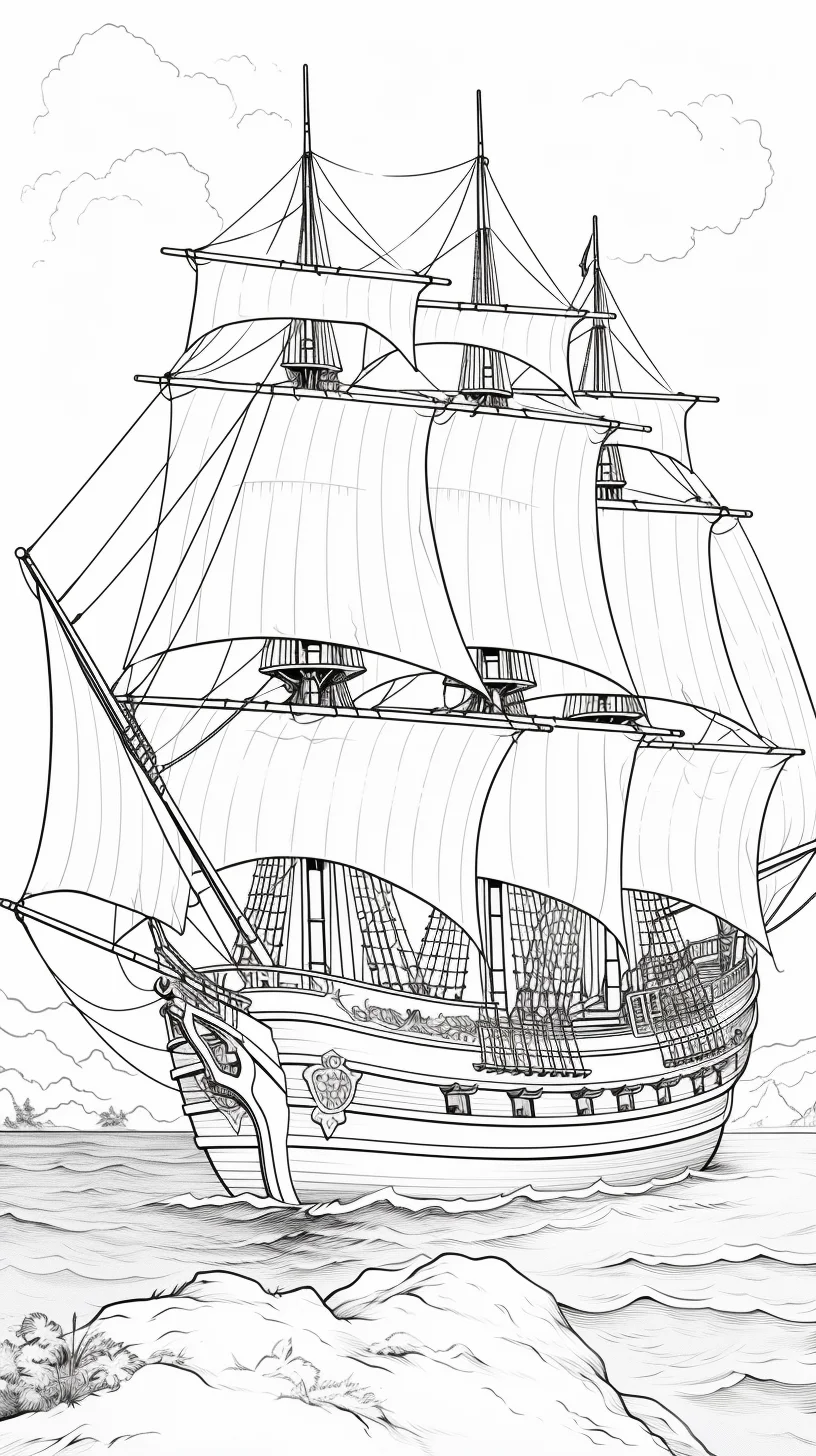
Open the full-size image first and check its orientation. Most of the collection is landscape, but the portrait files should be printed in portrait mode with Fit to page selected so the mast and hull are not cropped.

