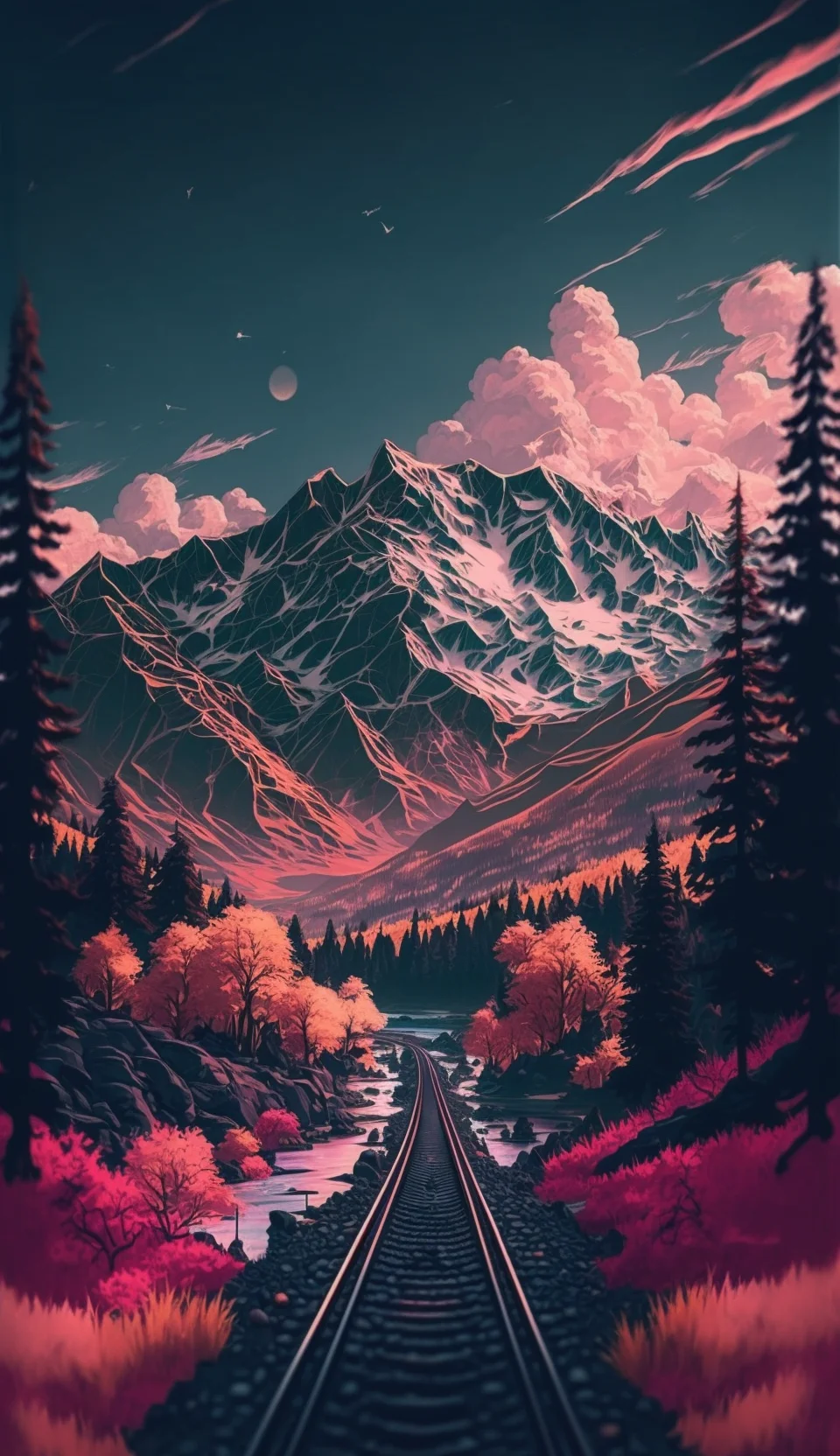
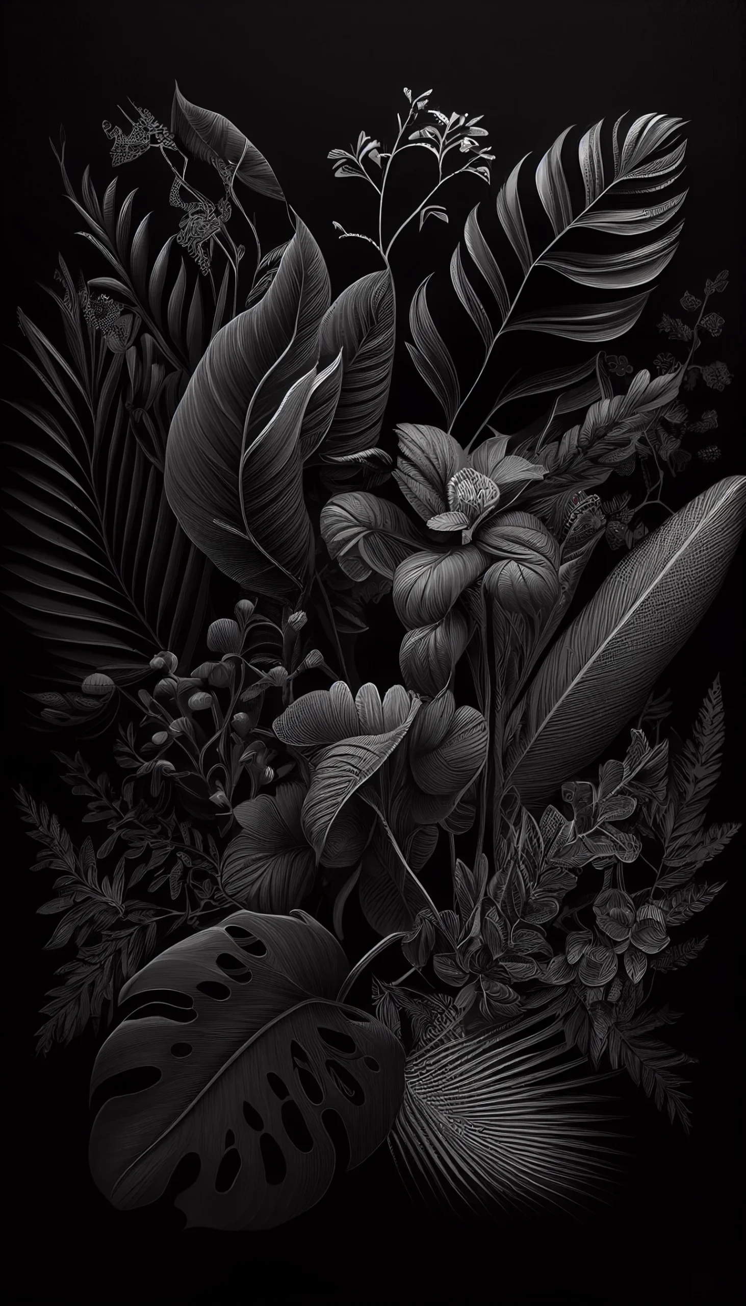
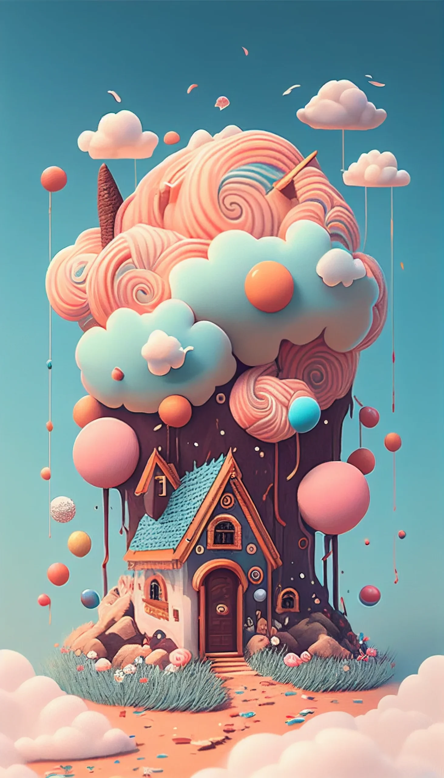
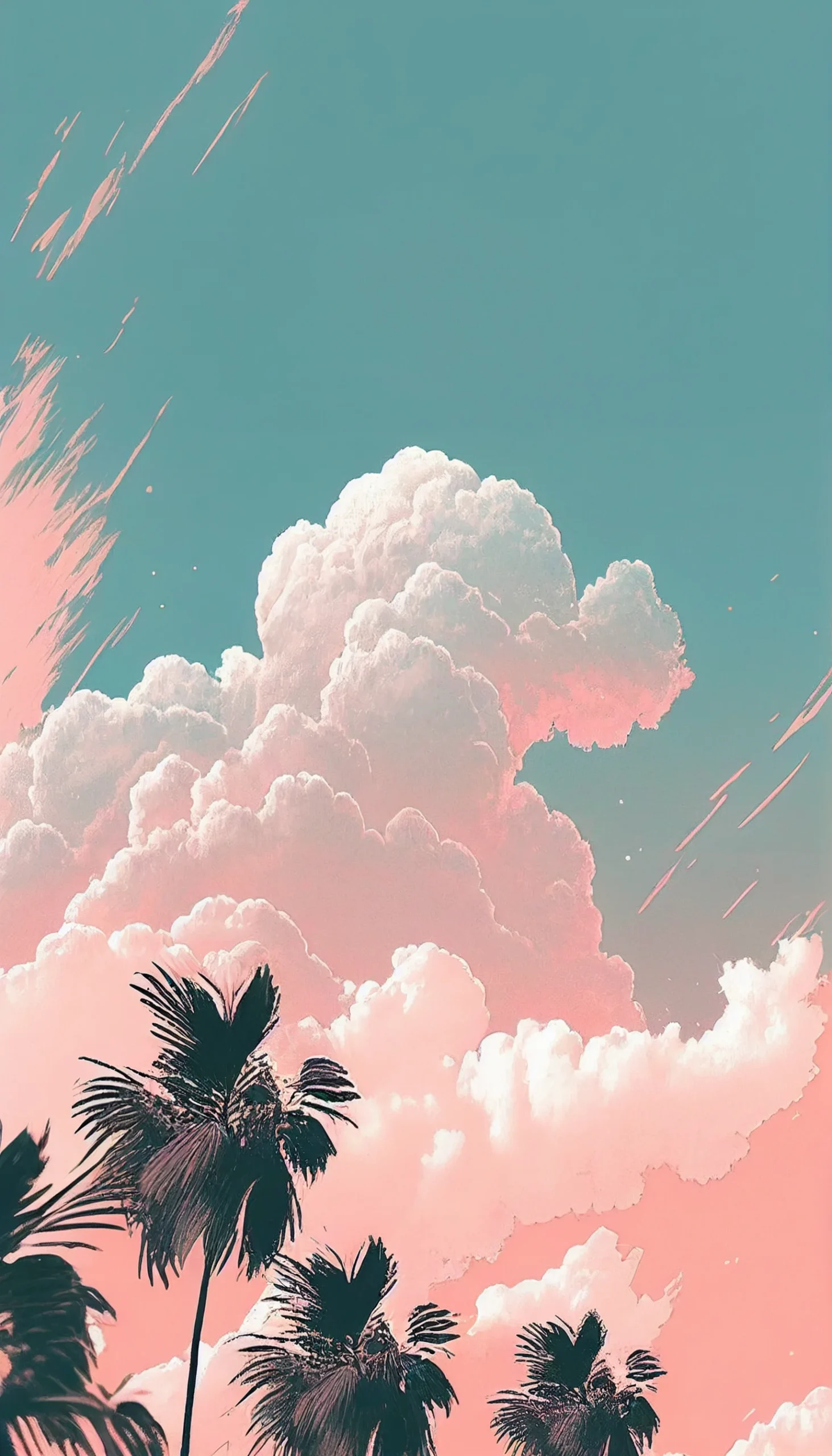
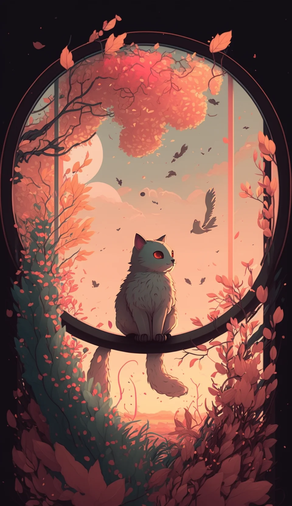
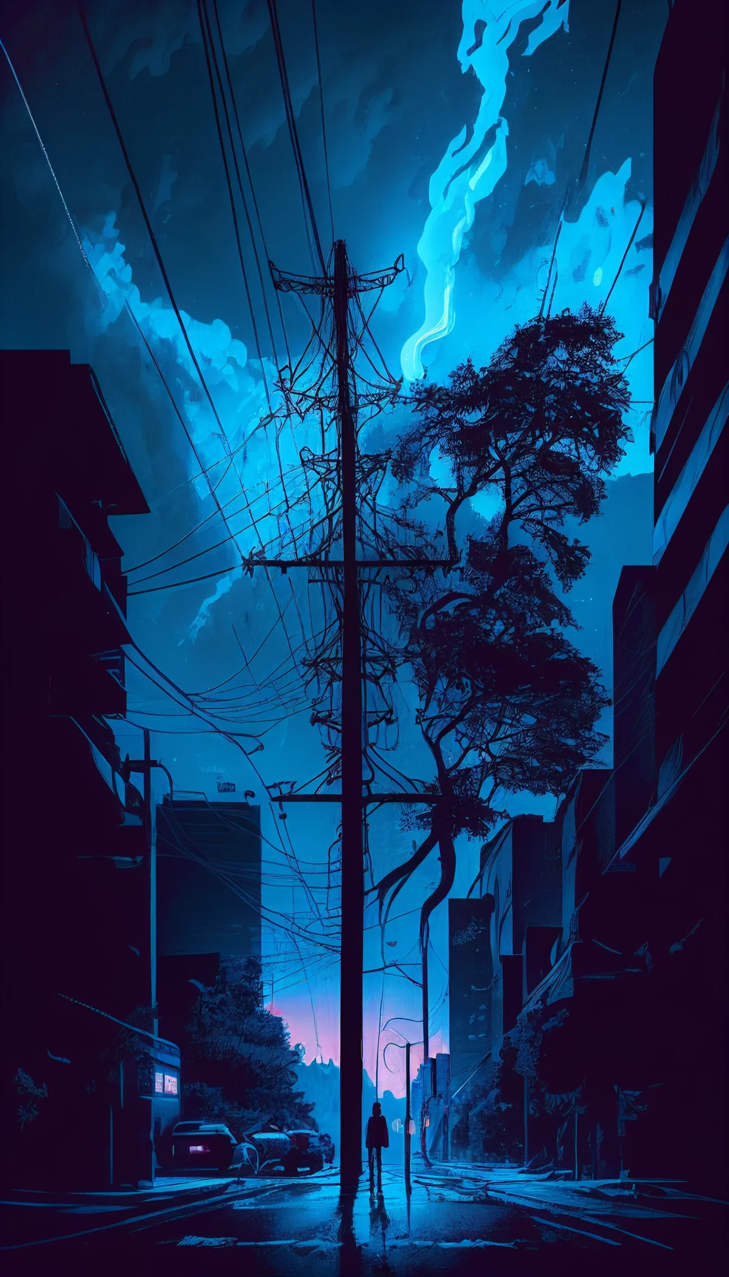
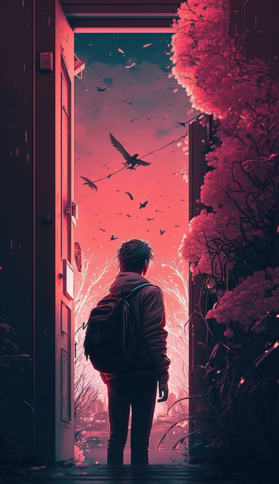
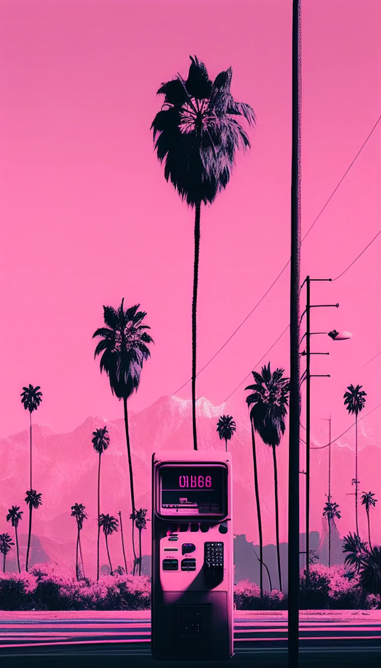
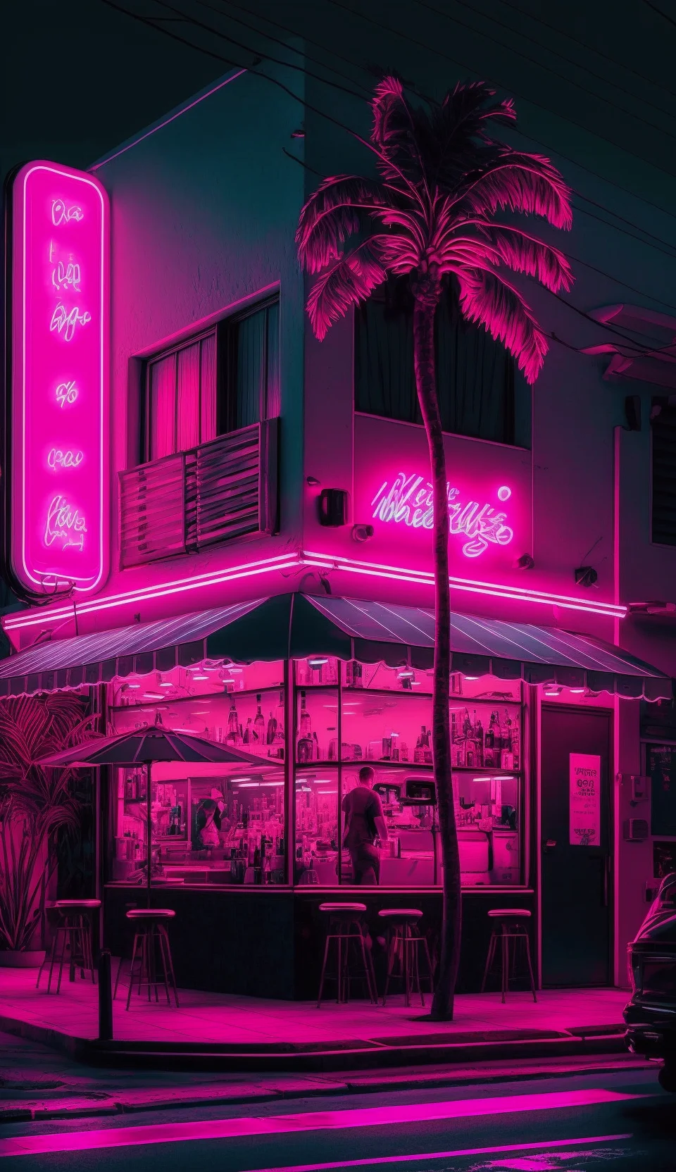
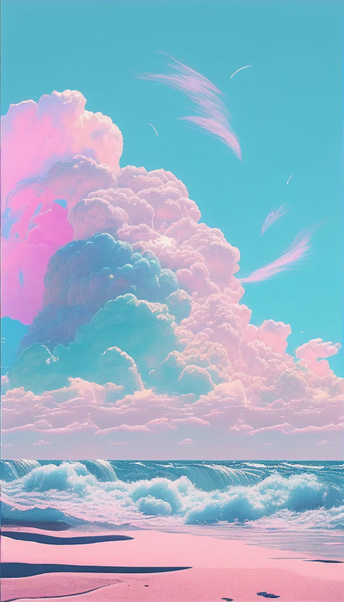
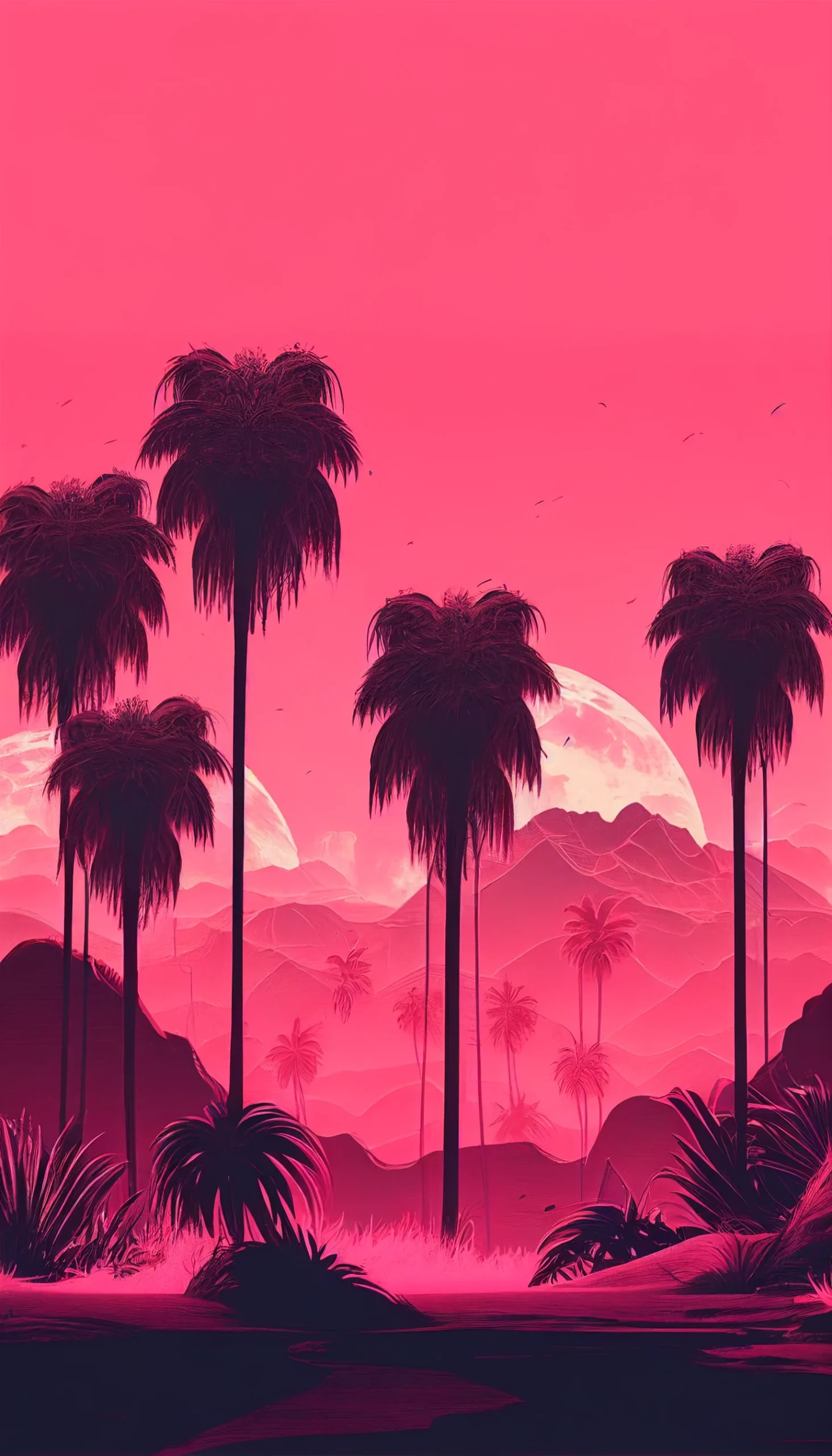
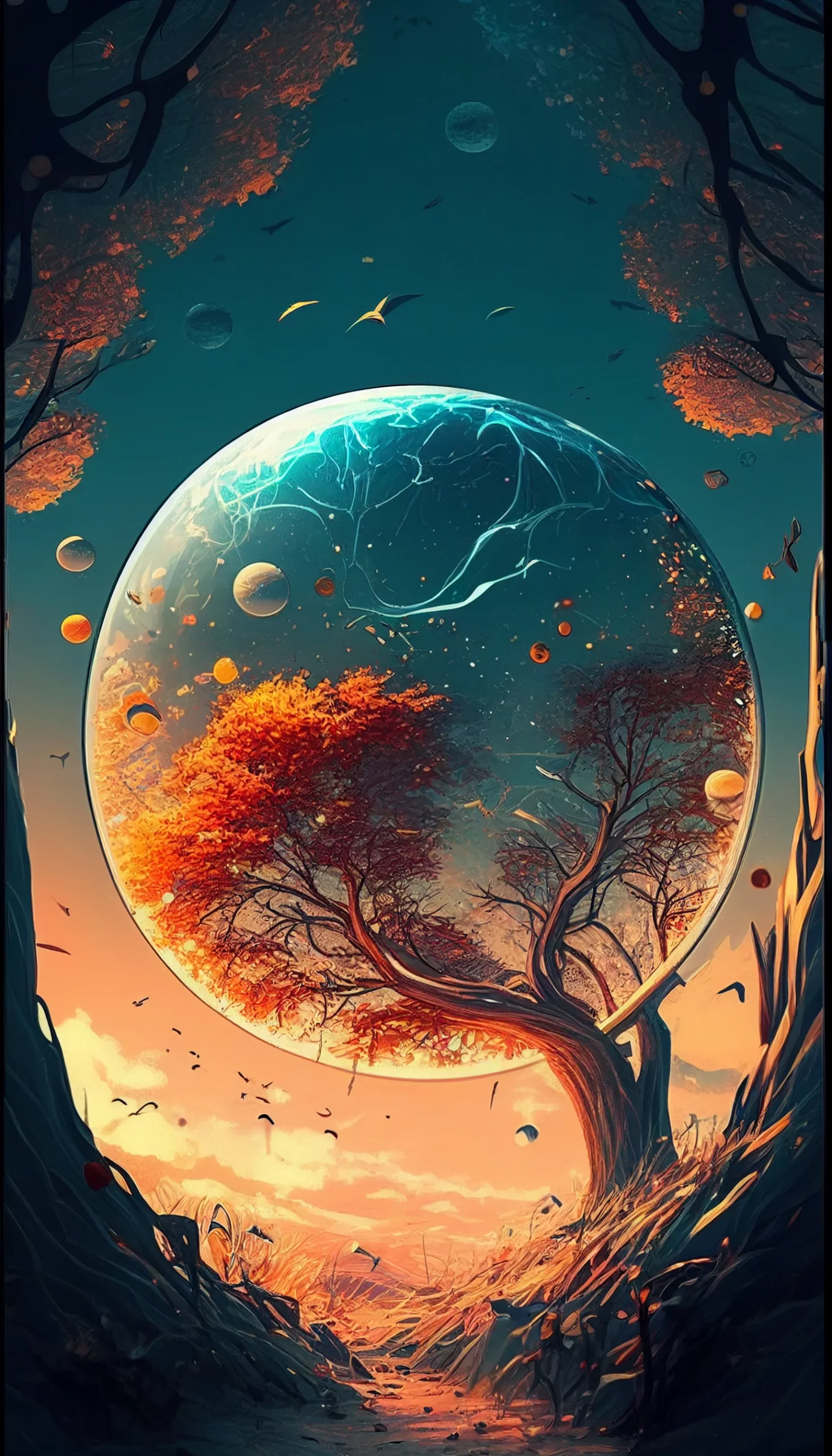
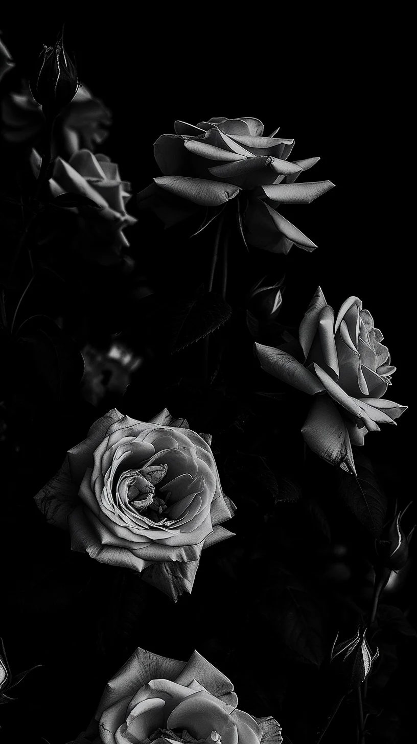
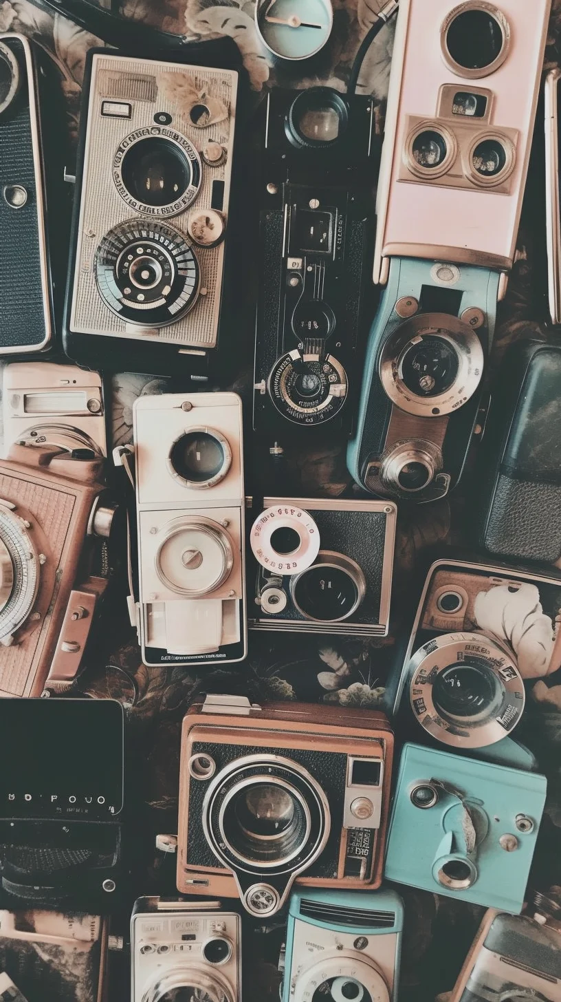
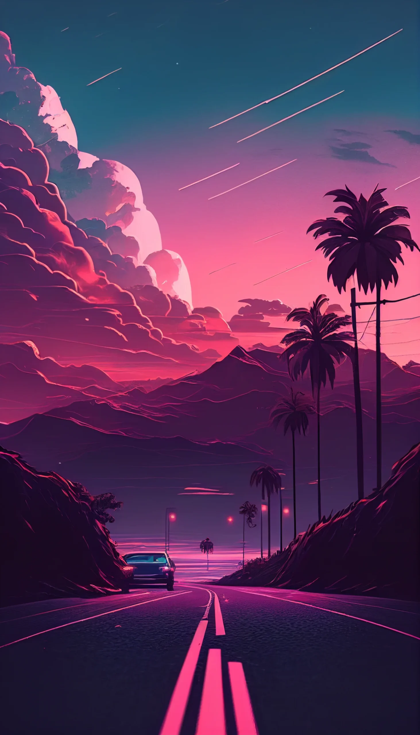
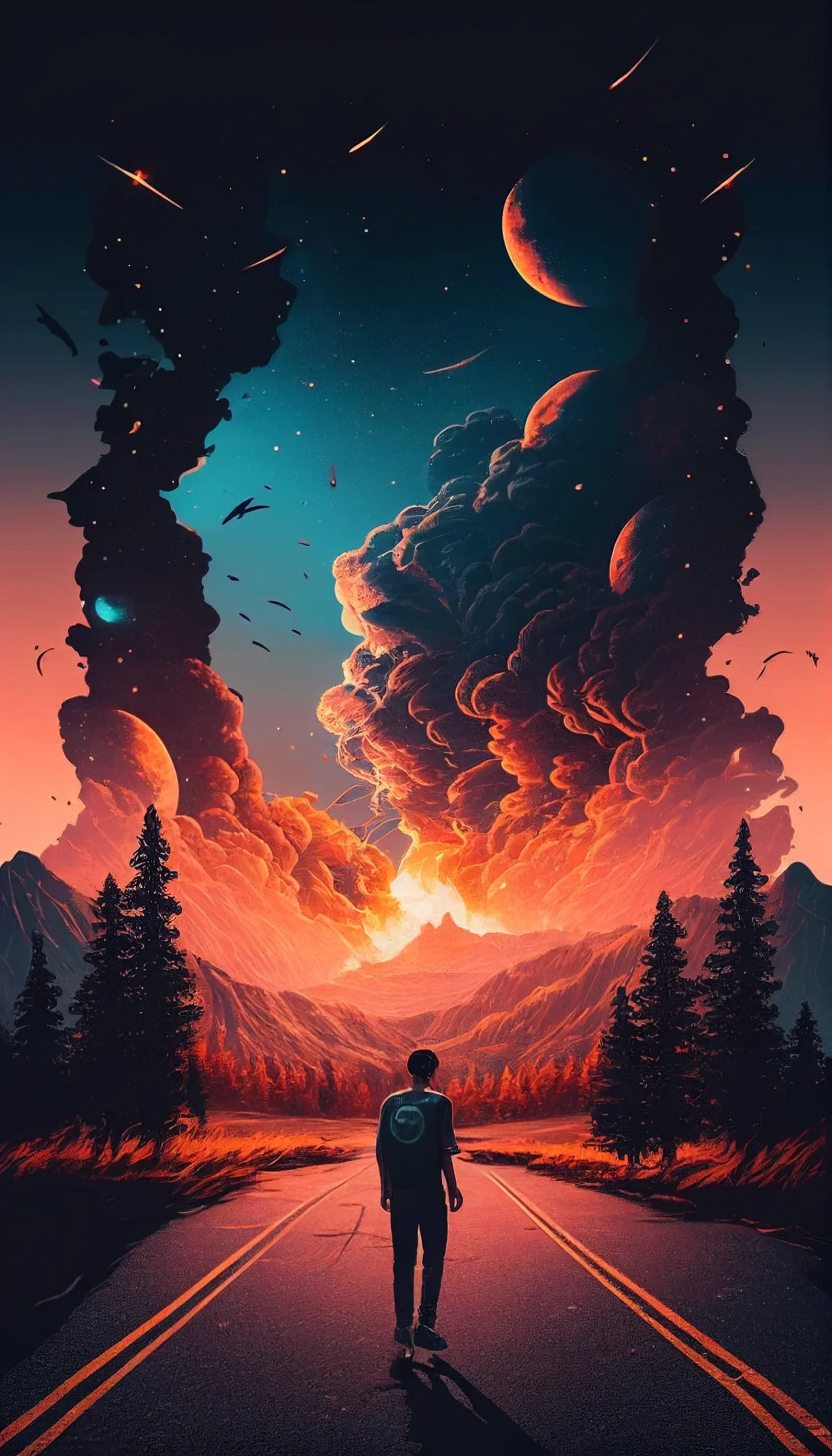
These 20 wallpapers cover several different looks rather than one narrow “aesthetic” style: dark minimal backgrounds, black-and-white designs, warm rose-gold and pink tones, pastels, blue gradients, retro textures and a few brighter neon options.
The practical difference is contrast. A busy image can look great on the Lock Screen, where there are fewer icons competing with it. For the Home Screen, flatter backgrounds and quieter mid-tones usually make app labels and widgets easier to read. If you want both screens to feel related, use two wallpapers from the same color family rather than the exact same image twice.
Choose by contrast, not by trend name
- Dark and minimal: best when you want icons to stand out.
- Pastel and rose-gold: softer backgrounds that pair well with light widgets.
- Retro and grainy: more texture, but still usable if the center of the image stays relatively calm.
- Neon: strongest on the Lock Screen or with a sparse Home Screen.
The files are portrait-oriented and vary in resolution, so check the crop preview before setting one. Keep faces, text and other focal details away from the very top and bottom edges if you do not want them trimmed on a different iPhone size.
For more focused sets, browse the black aesthetic, pastel, winter and dark vintage collections.
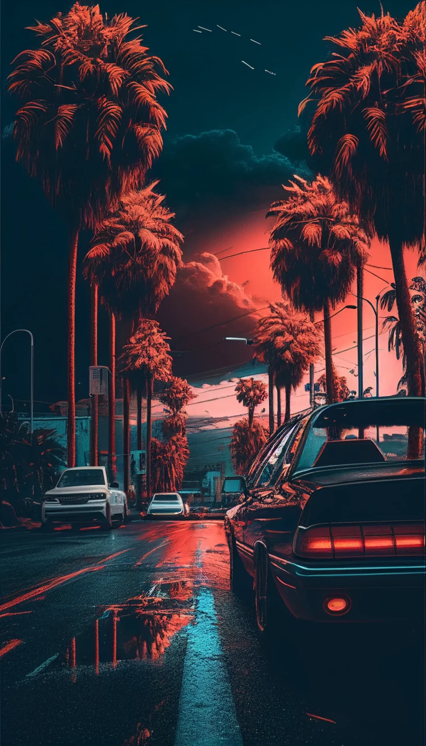
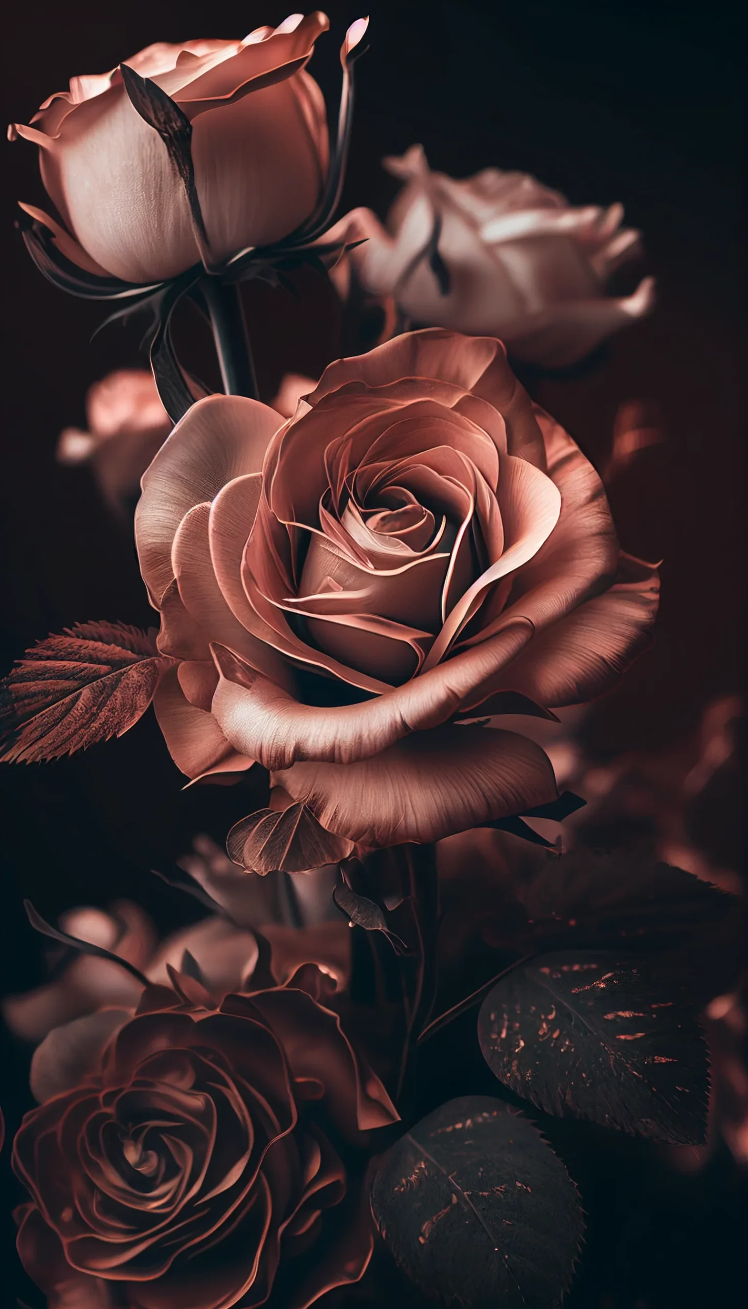
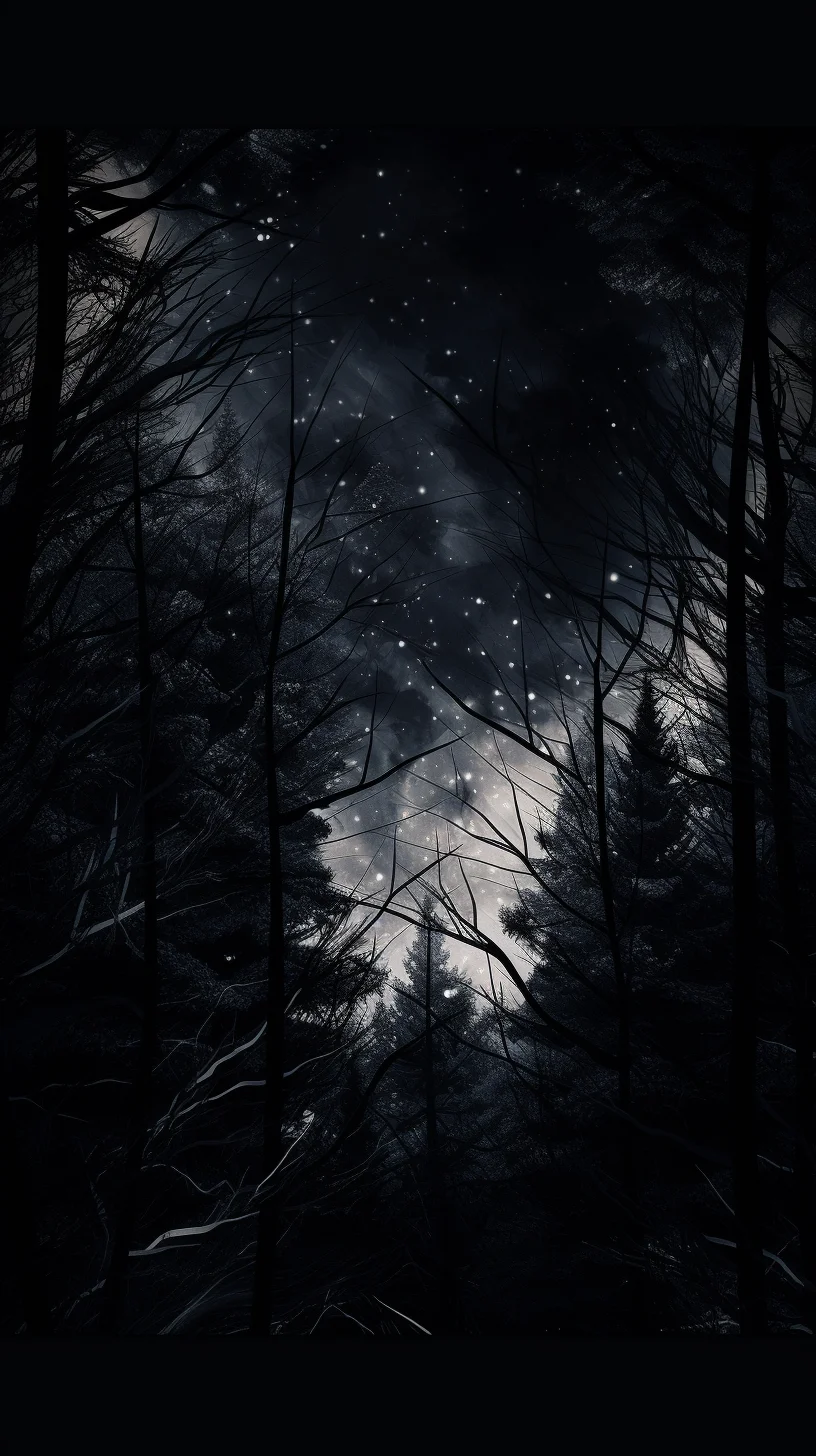
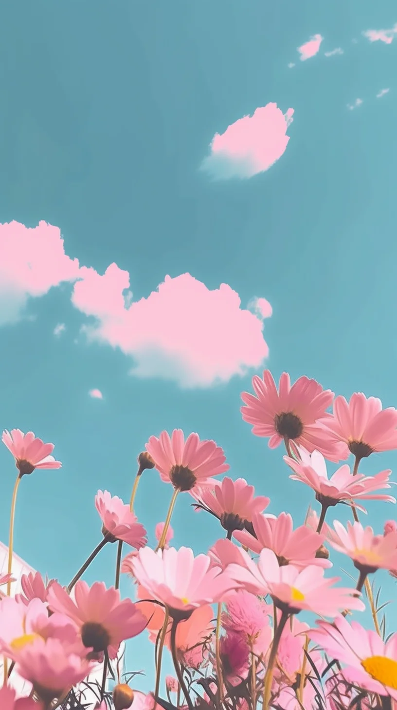
Make the Lock Screen and Home Screen do different jobs
A strong focal image is usually easier to live with on the Lock Screen. On the Home Screen, look for empty space behind the areas where you keep icons and widgets. If text becomes hard to read, the wallpaper is probably too busy rather than “too bright.”
Save the full-size file before judging the crop
Open the image at full size, save it to your device, then use the wallpaper controls built into your current iOS version to position it. Apple changes the exact menus over time, so rely on the crop preview rather than a fixed sequence of taps. If an important detail is being cut off, choose another image instead of forcing the crop.
Small choices that improve readability
- Keep high-detail textures away from dense icon areas.
- Use dark or mid-tone backgrounds behind white widget text.
- Reserve neon highlights for one part of the image rather than the whole screen.
- For a matched pair, use the same palette with different levels of contrast.