
If you want a drawing that looks more difficult than it actually was, pick a subject where one strong idea does most of the work: sharp contrast, clean symmetry, convincing overlap or a simple silhouette. An eye, tulip or butterfly can give you that payoff much faster than a full-body figure. Click or tap any image below to open the full-size tutorial.
Jump to: best beginner payoff · facial features · finished-looking studies · bigger challenges · finishing tricks
Want the safest choices? Start with Tutorial 1 for contrast, Tutorial 2 for clean overlapping shapes, or Tutorial 3 for symmetry and pattern.
Best beginner payoff — Tutorials 1–3
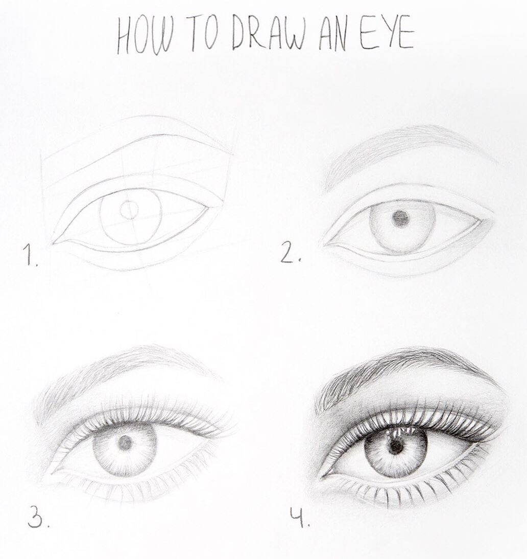
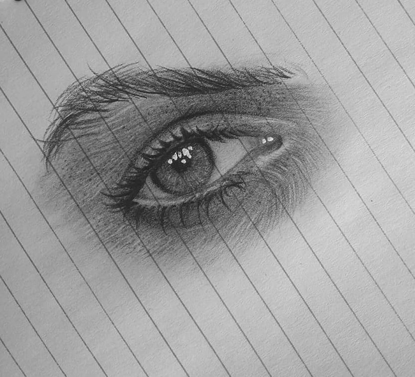
The eye is the safest place to start. It is compact, has obvious dark and light areas, and one clean highlight in the iris can make a simple sketch look surprisingly finished.
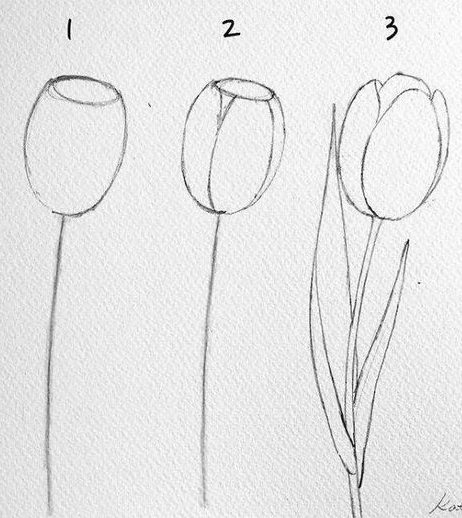
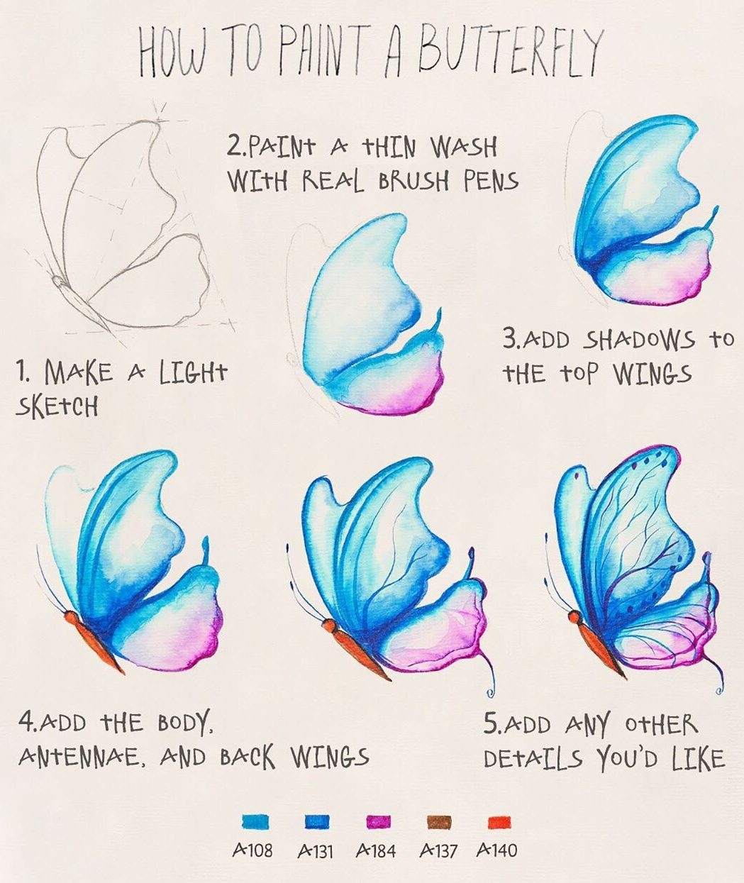
The tulip gets its effect from overlapping petals; the butterfly gets it from symmetry and pattern. Neither needs dense rendering to feel complete, which is exactly why they belong at the top of this page.
Facial features — Tutorials 4–7
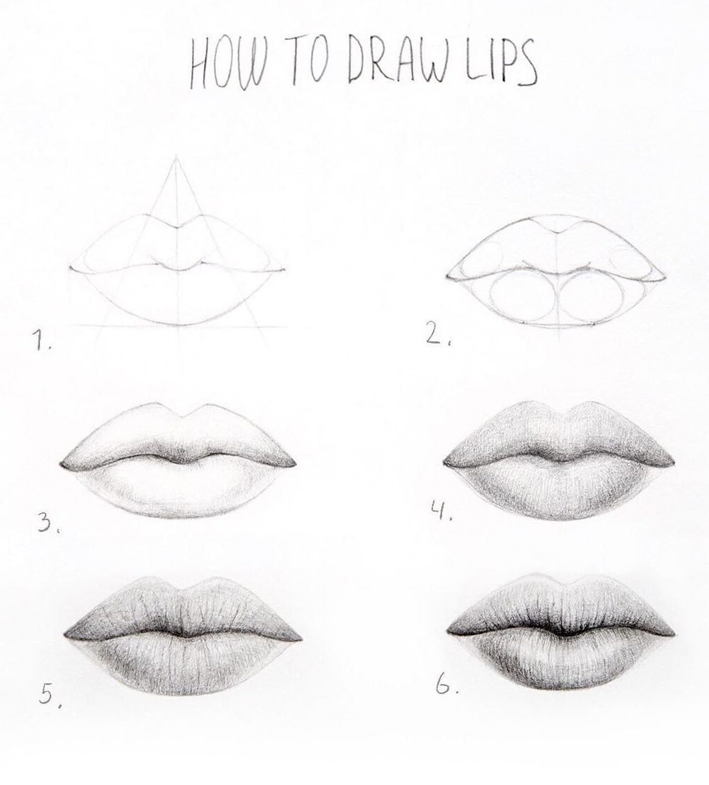
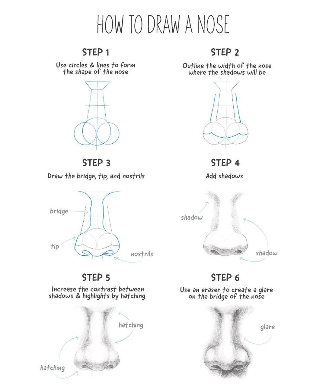
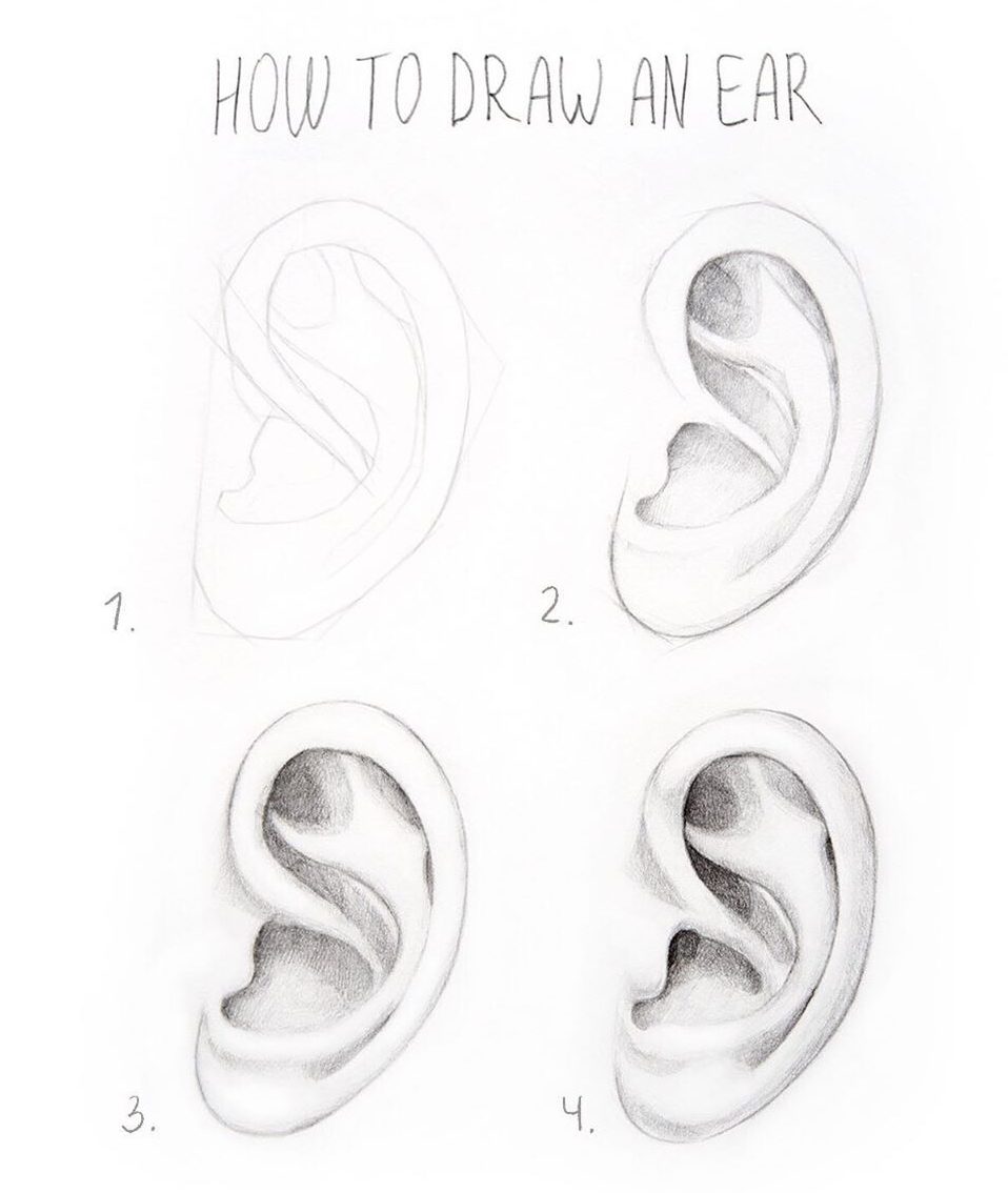
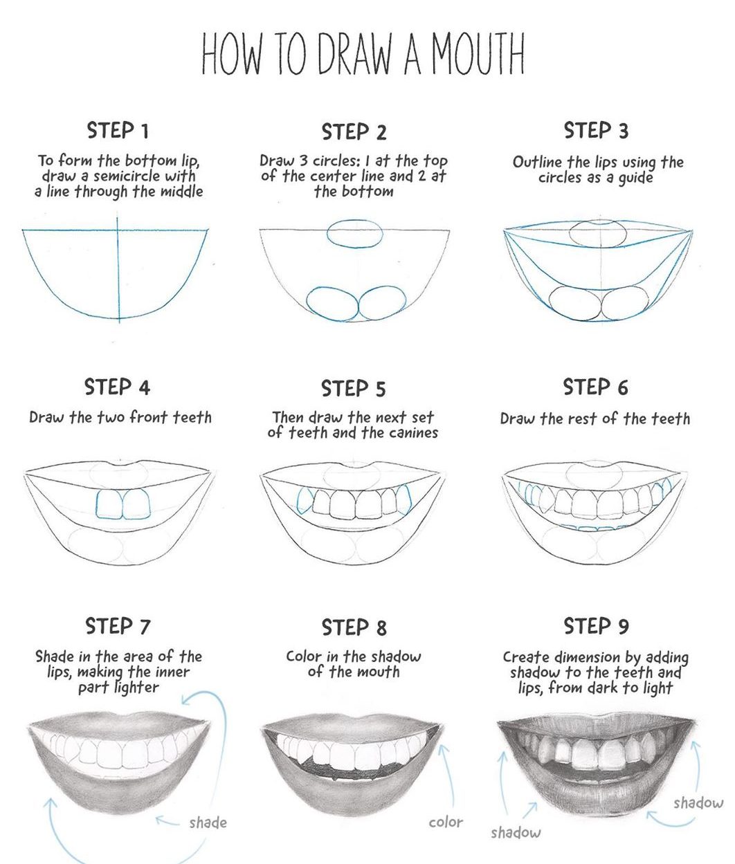
These look advanced when the value pattern is right, not when every crease is drawn. Get the lip shadow, nose plane or darker inner ear working first. Small texture can wait.
More finished-looking studies — Tutorials 8–11
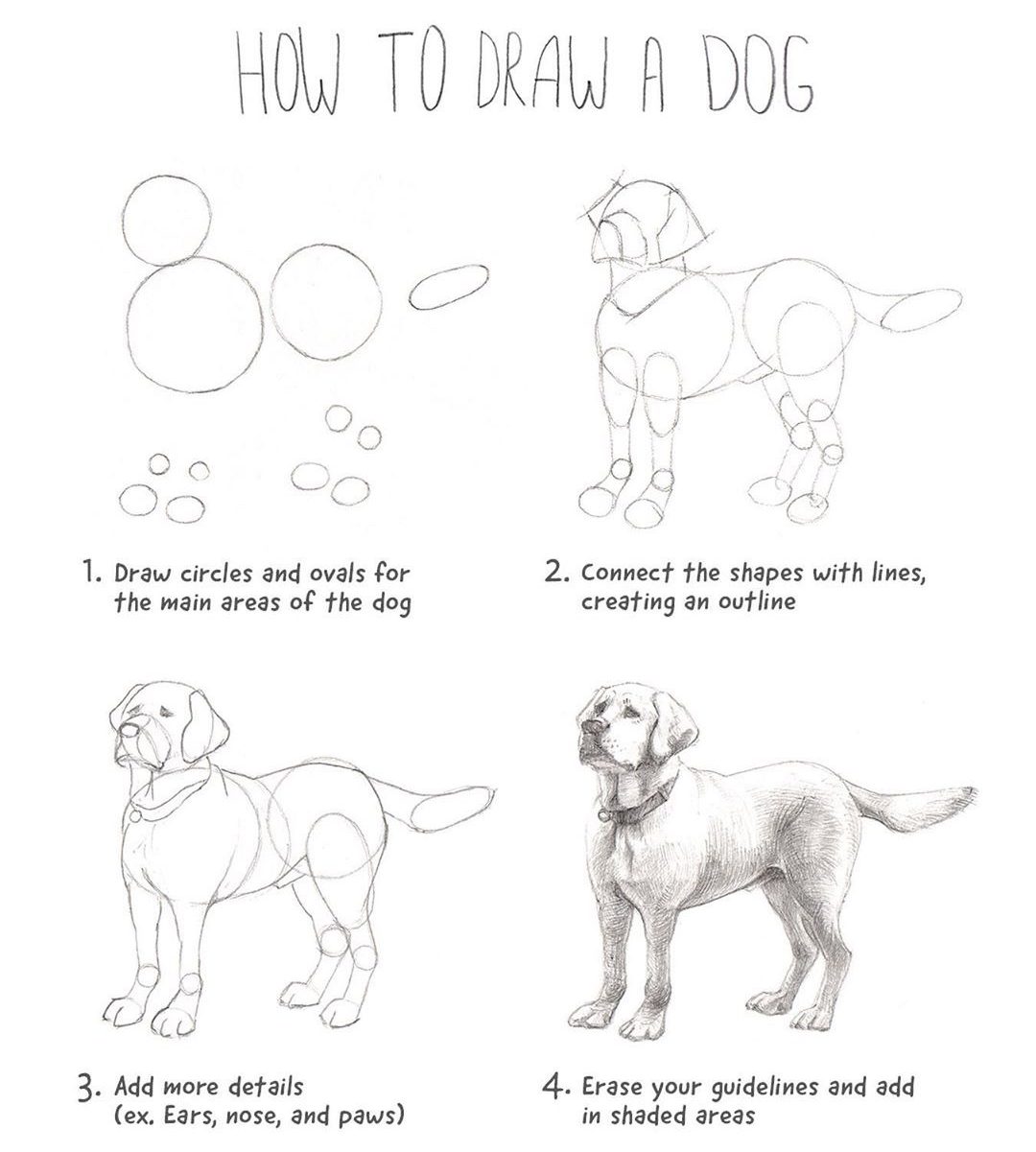
With an animal, the silhouette matters more than the fur. Check the head angle, body length and leg placement before adding texture.
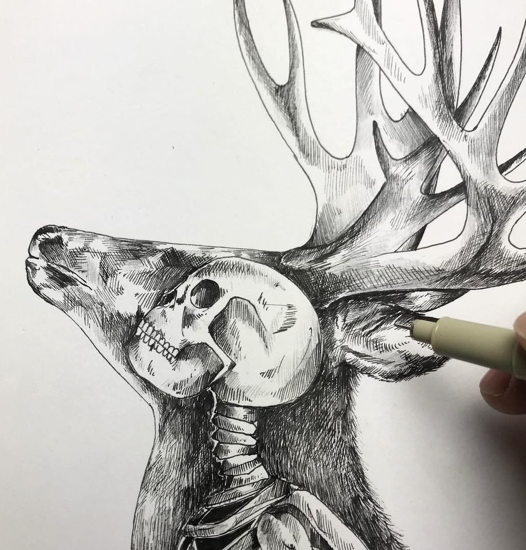
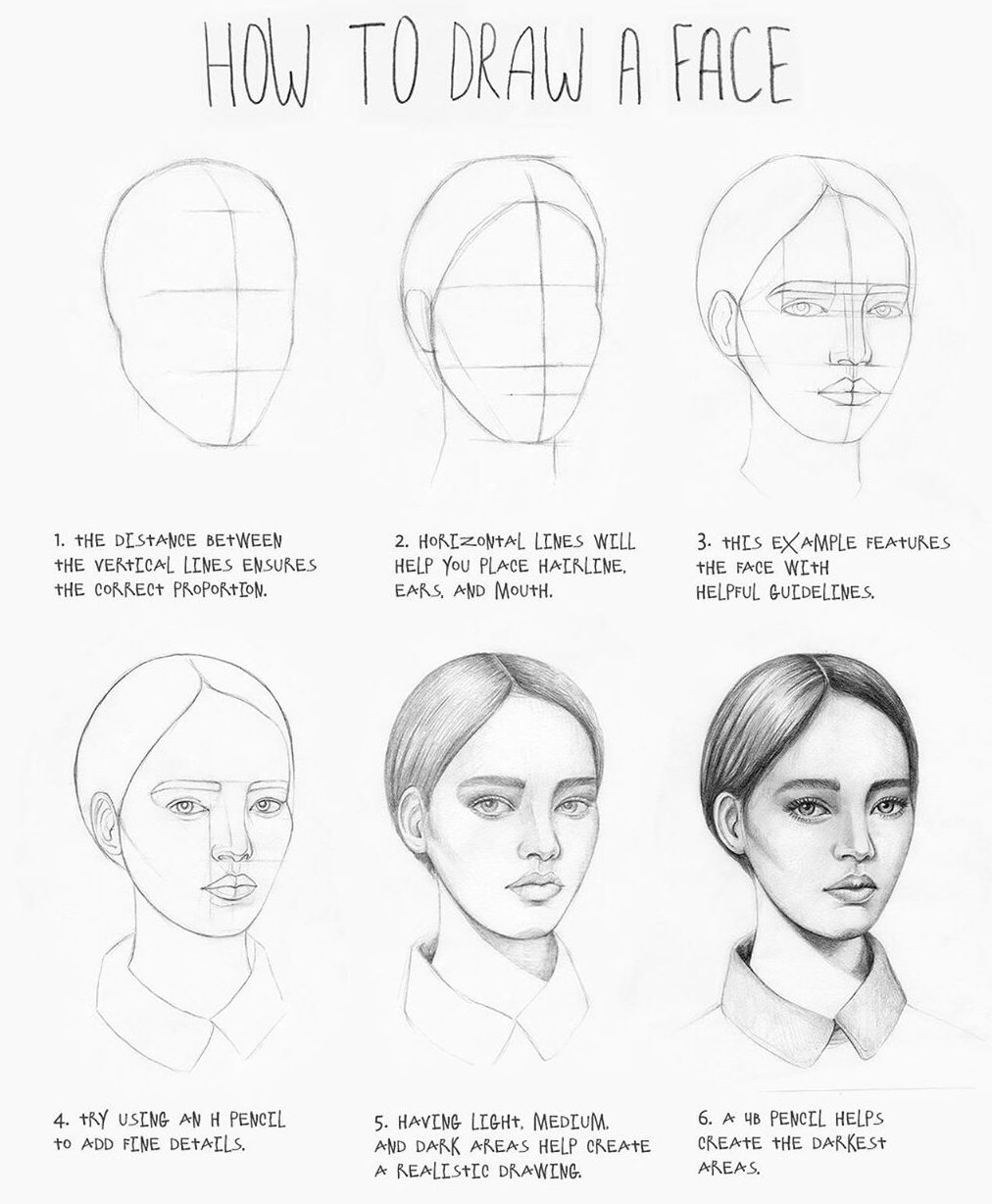
Tutorial 9 gets its polish from controlled darks and soft midtones. Tutorial 10 proves the opposite point: clean repeated line shapes can look finished without much shading at all. The full face asks for more proportion control, so leave it until the individual features feel comfortable.
Bigger challenges — Tutorials 12–14
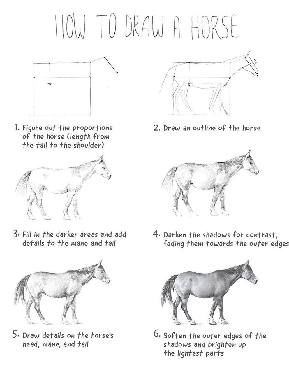
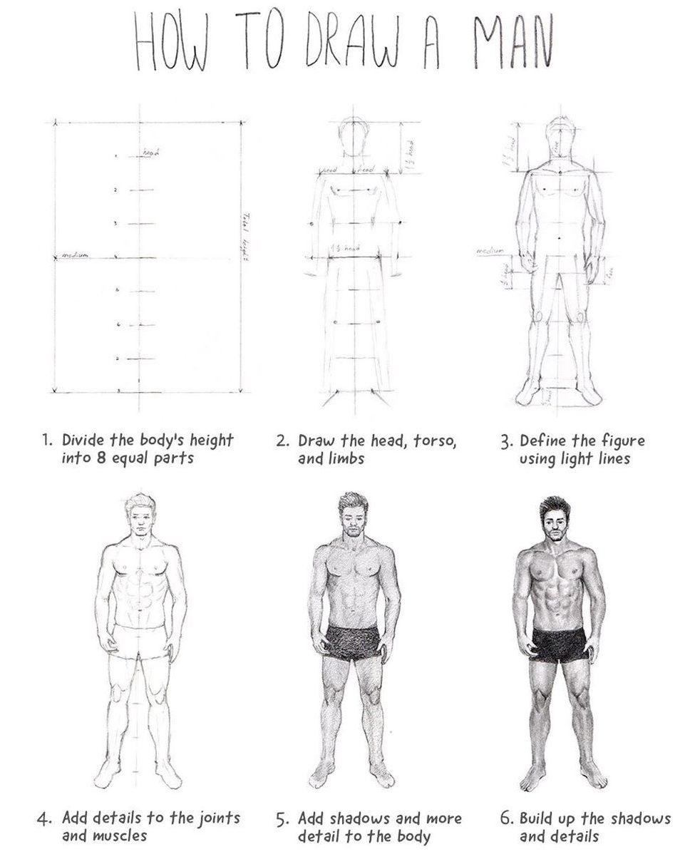
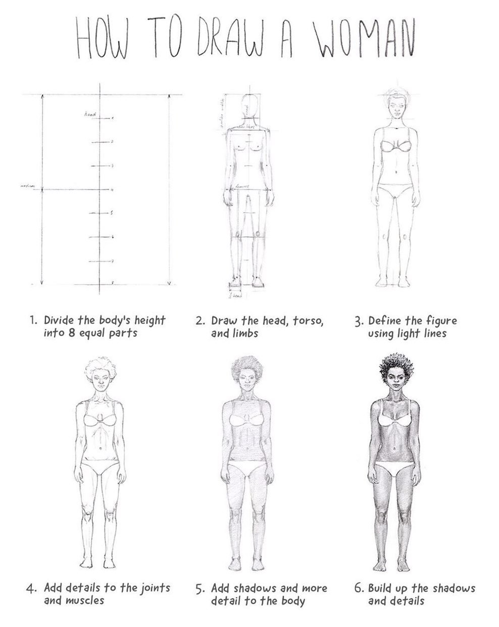
These are included as stretch options, not because a horse or full figure is genuinely a quick beginner drawing. Keep the first pass simple: head, ribcage, pelvis, limb direction and overall silhouette. If that structure works, the later detail has something solid to sit on.
What makes a simple drawing look finished
- Use one real dark. A drawing made entirely of pale gray lines often looks unfinished. One controlled dark area gives the eye somewhere to land.
- Protect a few highlights. White paper can do more work than an eraser if you leave the brightest areas alone from the start.
- Repeat shapes with variation. Petals, butterfly markings, ribs or strands of hair look richer when they repeat without becoming identical.
- Let some edges disappear. You do not need to outline every form all the way around. A few lost edges can make shading feel much more natural.
- Stop before the page gets noisy. One clear focal point usually looks more deliberate than detail everywhere.
Before you add detail, check these three things
- Silhouette: if you filled the drawing in solid black, would the subject still read?
- Proportion: are the biggest shapes the right size relative to each other?
- Value pattern: can you identify a clear light area, middle area and dark area?
If one of those is weak, fix it before adding eyelashes, fur, wrinkles or texture. Detail can polish a drawing, but it cannot rescue a structure that never worked.
A better way to practice these
- First pass: copy only the large shapes and proportions.
- Second pass: add the value pattern or line rhythm that makes the reference work.
- Third pass: draw it again from memory at a smaller size.
The third pass is the useful one. It shows whether you actually understood the drawing or only followed it line by line.
Use the page that matches what you want next
If you want more quick visual references, go to the easy cool drawing ideas. If you want a broader list of subjects, use easy things to draw when you are bored. If you want proper step-by-step lessons, move to the beginner drawing tutorials. And if you want a drawing where structure matters more than surface detail, try the one-point perspective guide.
Using these references
This is a legacy tutorial gallery, and the original creator or reuse licence is not documented for every image. Use the references for drawing practice and study; do not assume the source artwork itself is cleared for commercial republication.
Questions about making simple drawings look better
What is the easiest drawing here that still looks impressive?
The eye and tulip are the safest starting points. Both are compact, recognizable and easy to improve with a small amount of shading.
Do I need blending tools?
No. You can build smooth values with an ordinary pencil by layering lightly. A tissue or blending stump can soften graphite, but it will not fix weak proportions.
Why does my drawing look flat?
Usually because the values are too similar or the overlaps are unclear. Pick one light direction and make the tucked-under areas noticeably darker.
Should I add lots of detail at the end?
Only where it helps the focal point. Detail everywhere tends to flatten the hierarchy of the drawing instead of making it look more advanced.


The eye looks SO GOOD whoever drew it!!!!!!! Thanks for teaching me how to draw!!!!!
Very nice. I love it. Many thanks.
i love these things thank you have a good/nice day
hola como te yamas