
Explore 26 printable cat coloring pages, from cute kawaii faces and cats in bows, hats or scarves to flower-filled designs. The collection includes 14 portrait images and 12 landscape images, so you can choose a layout that suits your paper and coloring style.
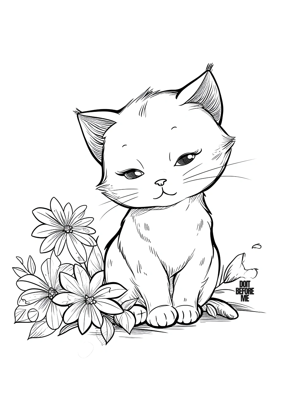
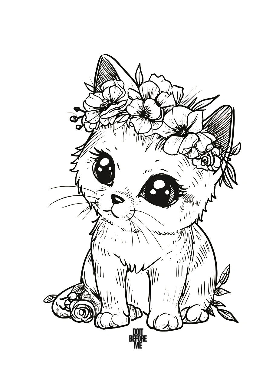
Start here: this flower-cat sheet is a good test page because it combines a clear face, open fur areas and smaller decorative shapes.
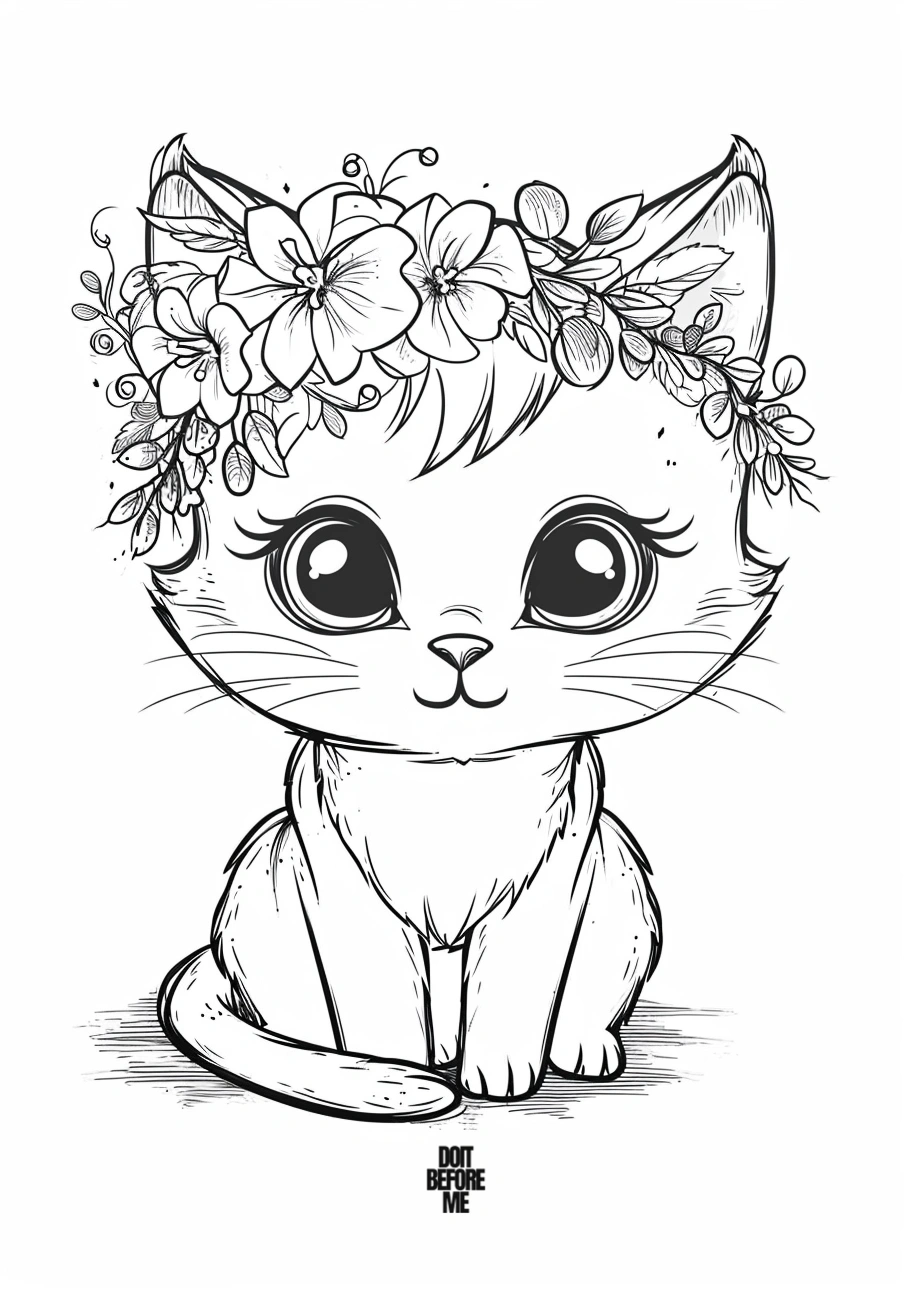
Pick a cat page by mood
| If you want… | Look for |
|---|---|
| A simple page | One large cat with a plain background |
| A kawaii look | Big eyes, rounded faces and simplified paws |
| More decoration | Flowers, bows, hats or scarves |
| A wider composition | The landscape-format cat sheets near the end; print them in landscape orientation |
How to print a cat coloring page
- Tap or click the design you want to open its full-size image, then save that image to your device.
- Open the saved image in your print dialog. Choose A4 or US Letter paper, and select portrait for tall pages or landscape for wide pages.
- Choose fit to printable area (or a similar setting), keep the aspect ratio, and check the preview so the ears, paws and page edges are not cropped.
- Print one design at a time. If fine lines appear faint in the preview, try a higher print-quality setting or a slightly smaller scale rather than stretching the image.
For troubleshooting, see our step-by-step coloring page printing guide.
Crayons are easiest on the simpler pages. Colored pencils are better for fur, flowers and smaller accessories. If you use markers on standard copy paper, place another sheet underneath to catch bleed-through.
For a broader mix of kittens, kawaii and more realistic designs, see our 15 cat coloring pages.
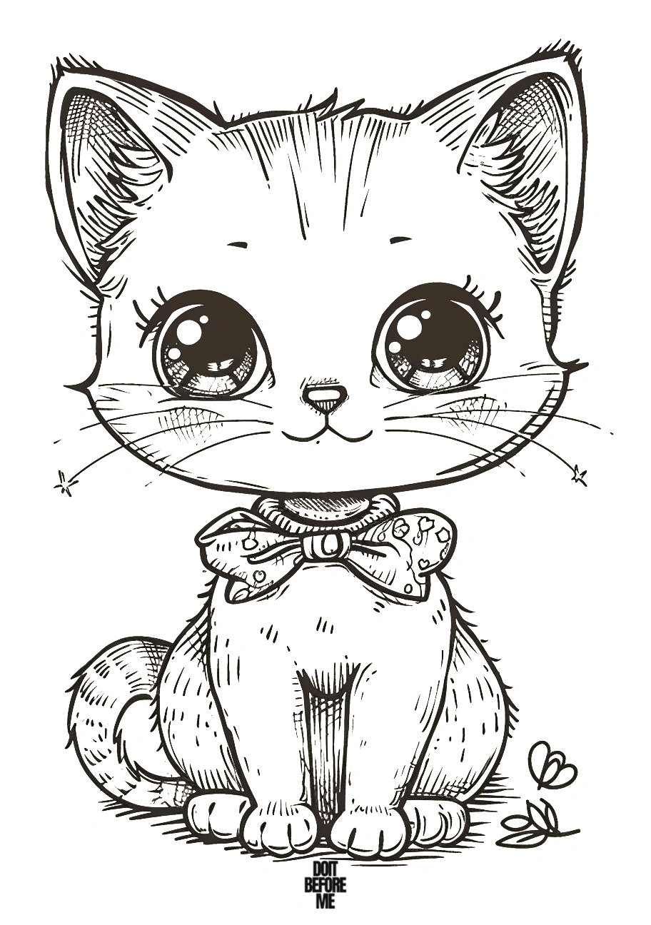
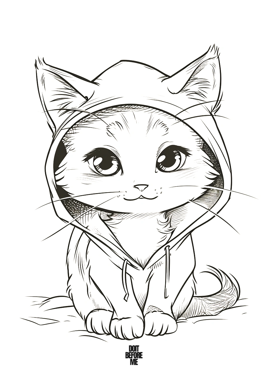
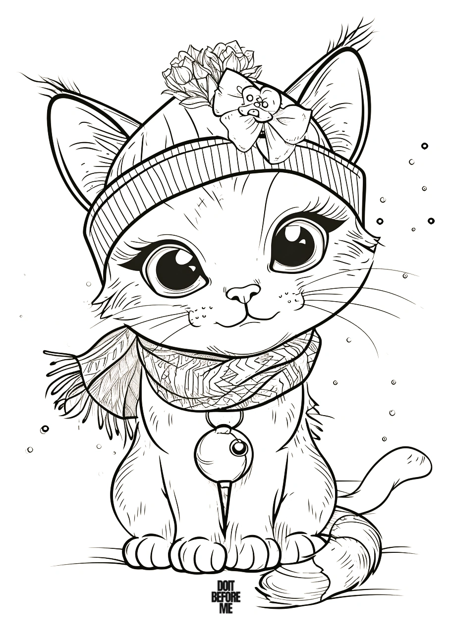
Portrait cat coloring pages: flowers, outfits and kawaii details
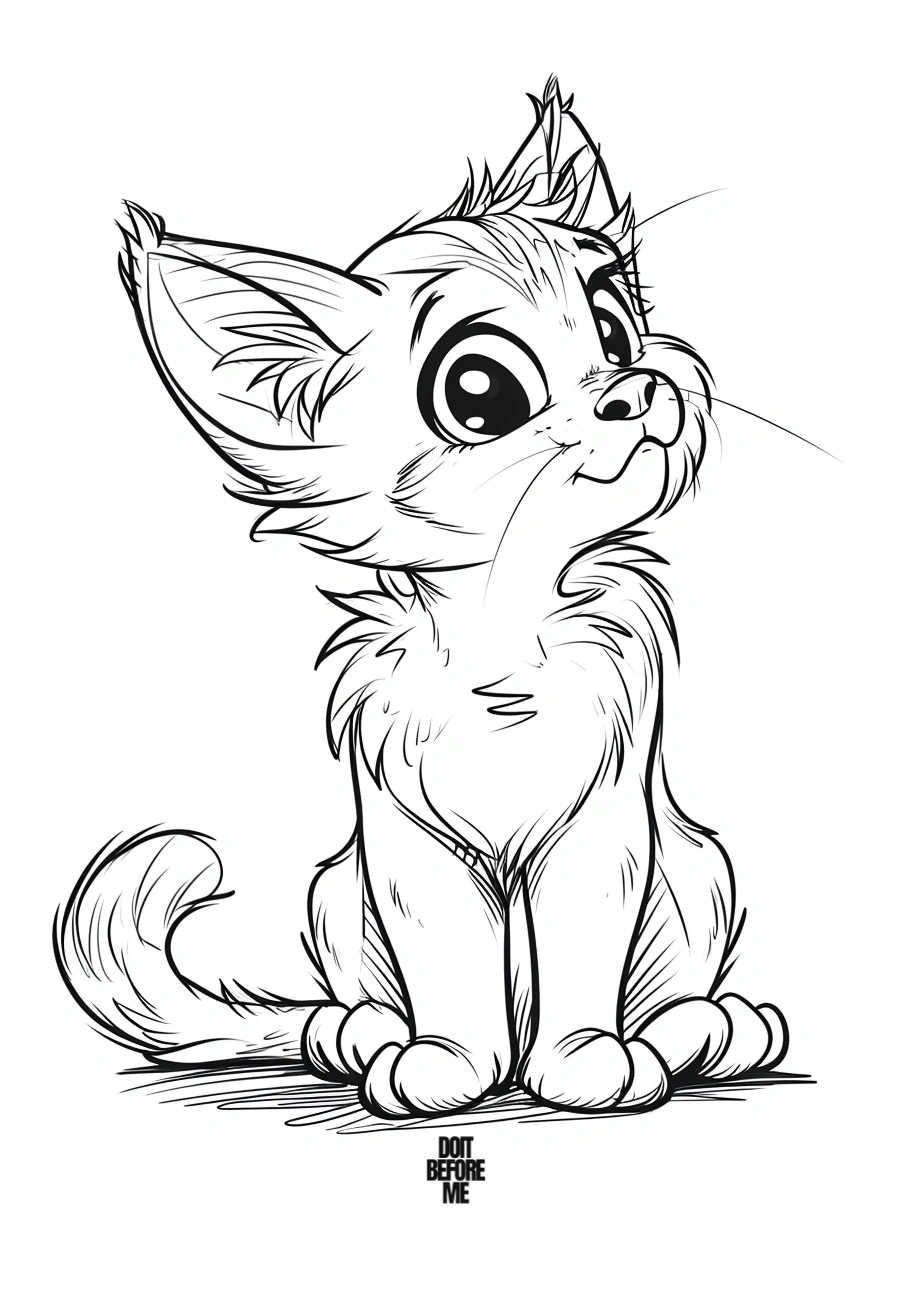
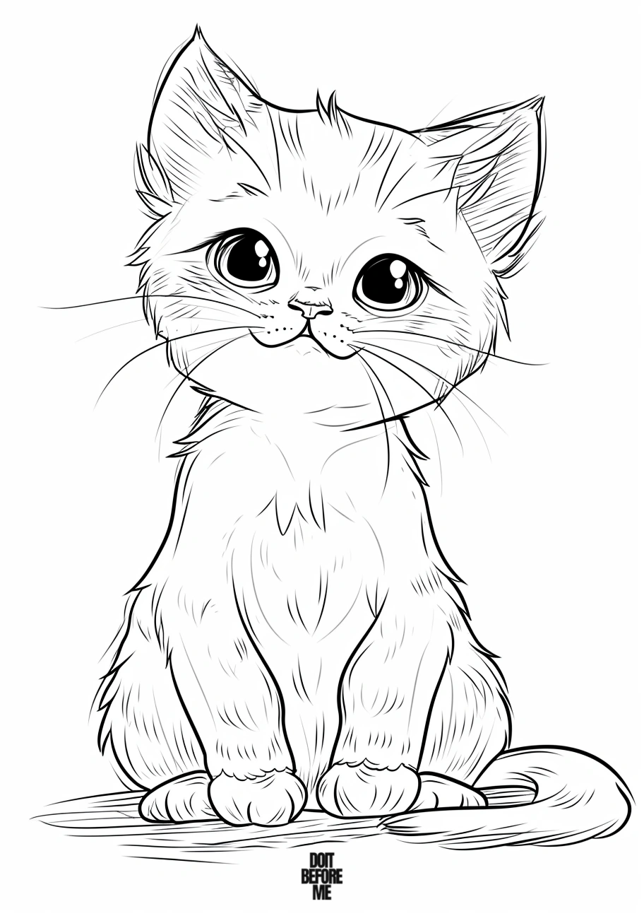
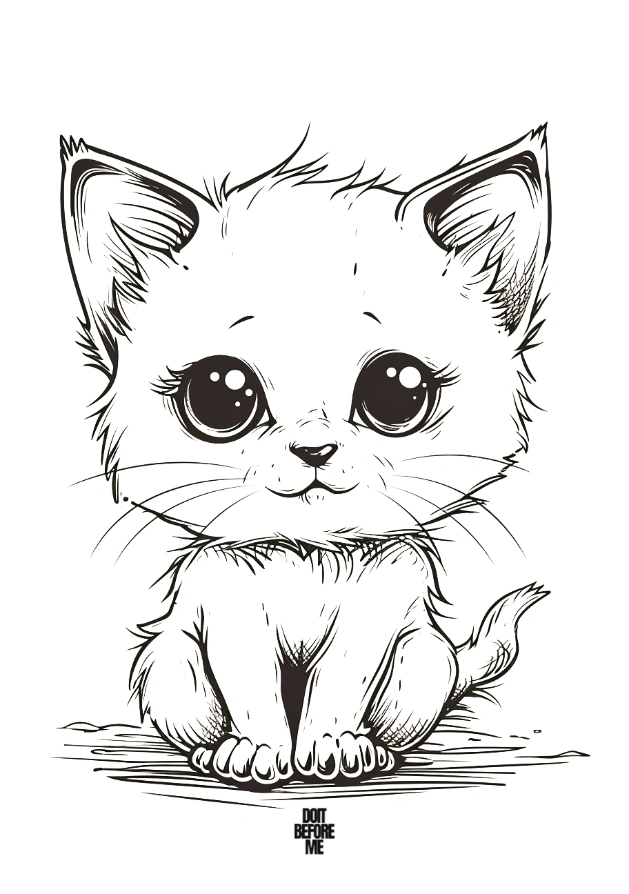
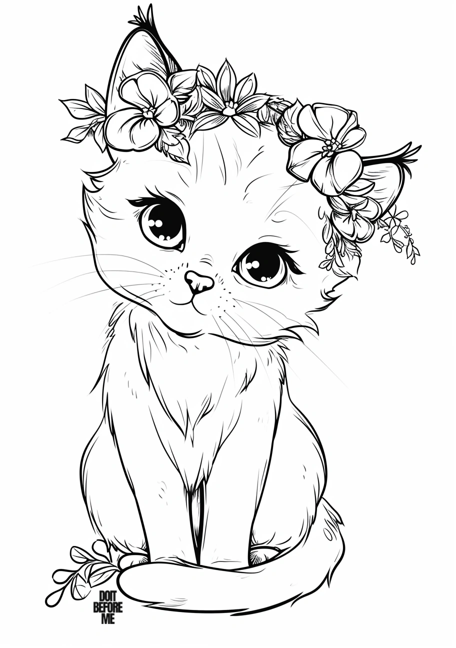
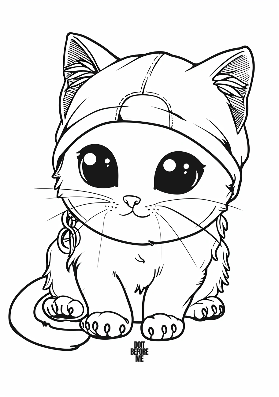
12 landscape cat coloring pages
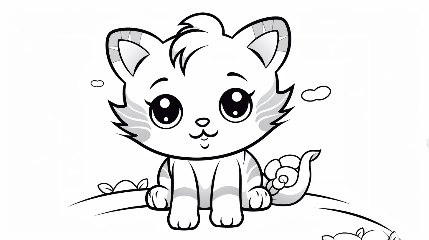
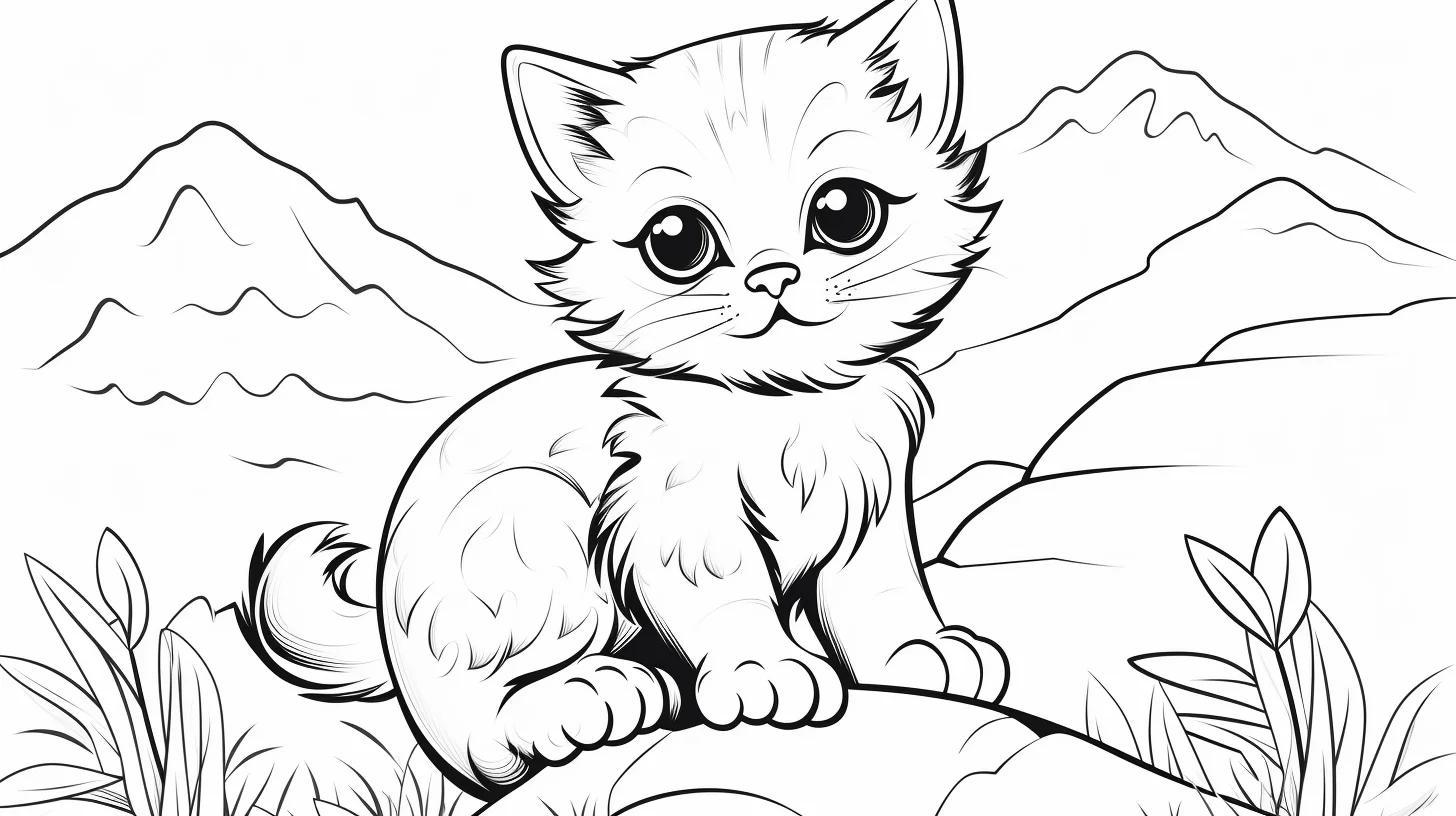
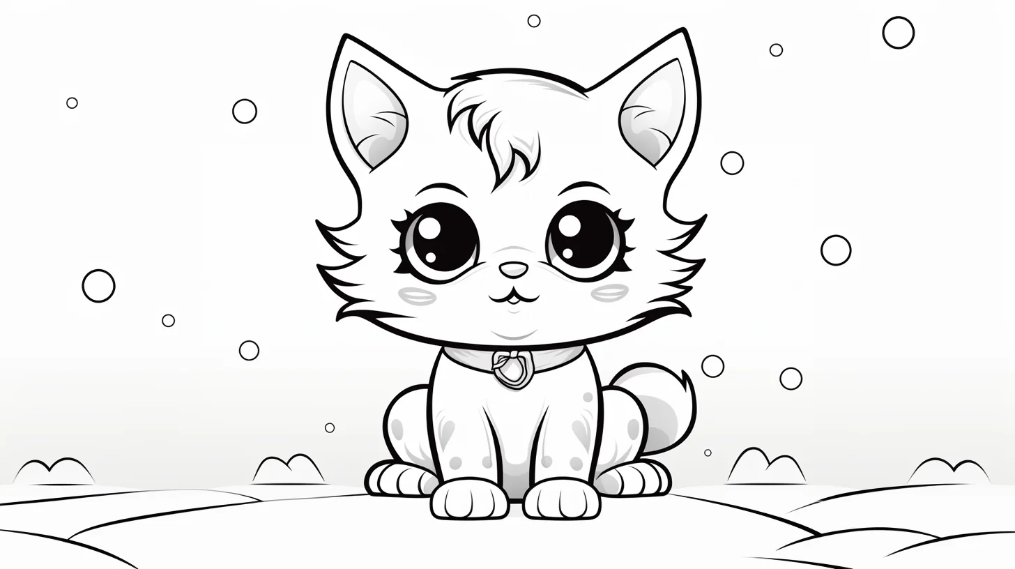
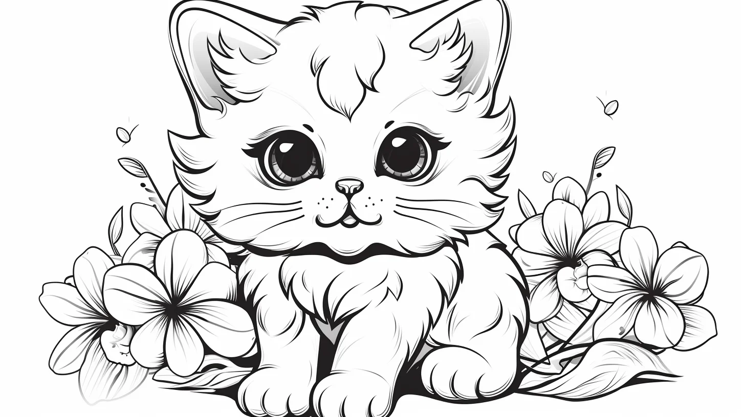
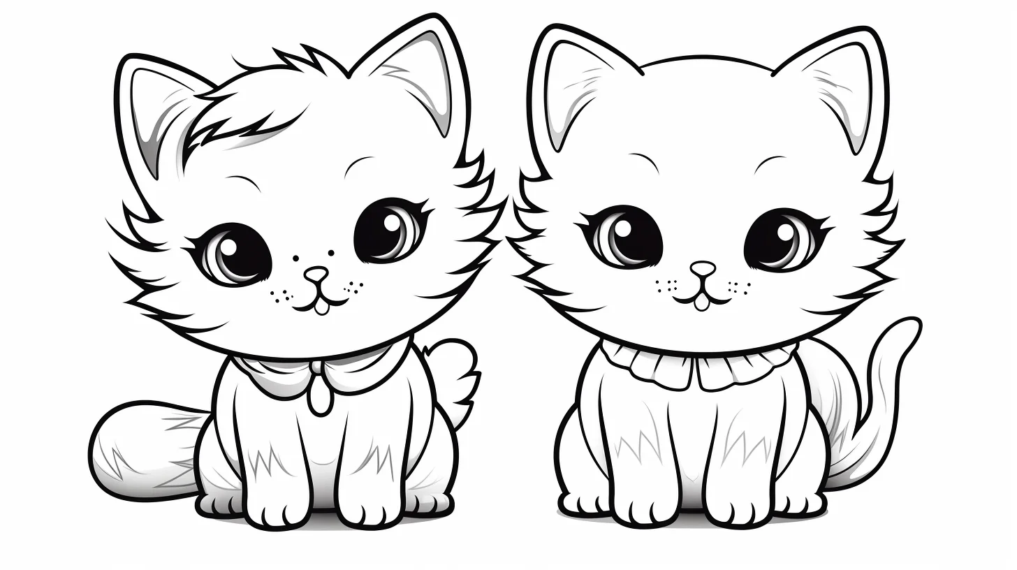
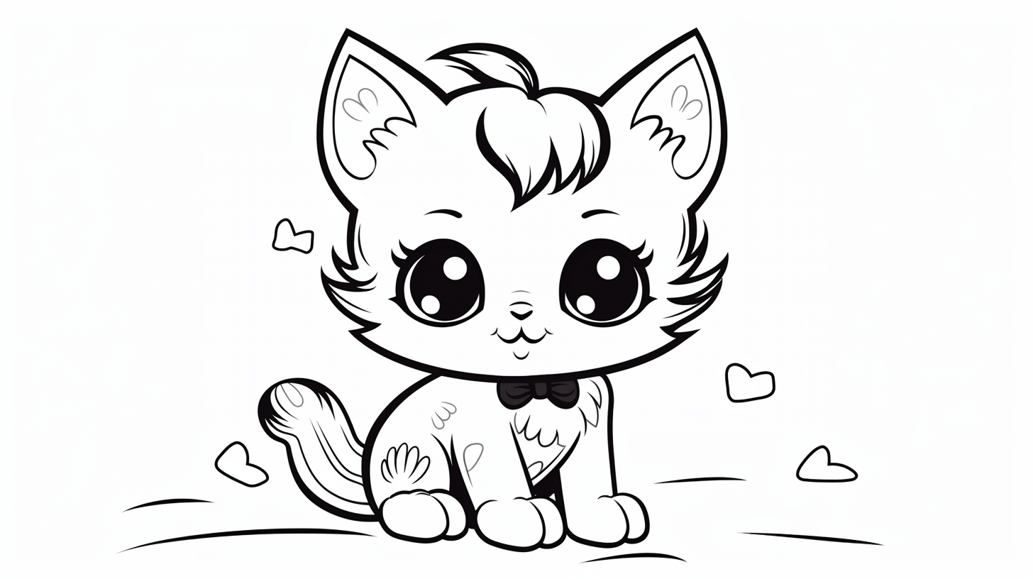
These 12 wide-format sheets offer a different composition from the portrait designs above. Select landscape orientation when printing so the complete drawing fits the paper. For more horizontal designs, browse our landscape cat coloring pages.
Coloring ideas for wide-format cat sheets
Landscape orientation changes the composition, but does not automatically make the printed coloring area larger. If a sheet has open space, try adding a few simple flowers, clouds or paw prints. Keep the added details lighter than the cat’s face so the main character stays easy to see.
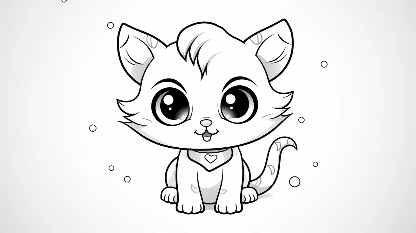
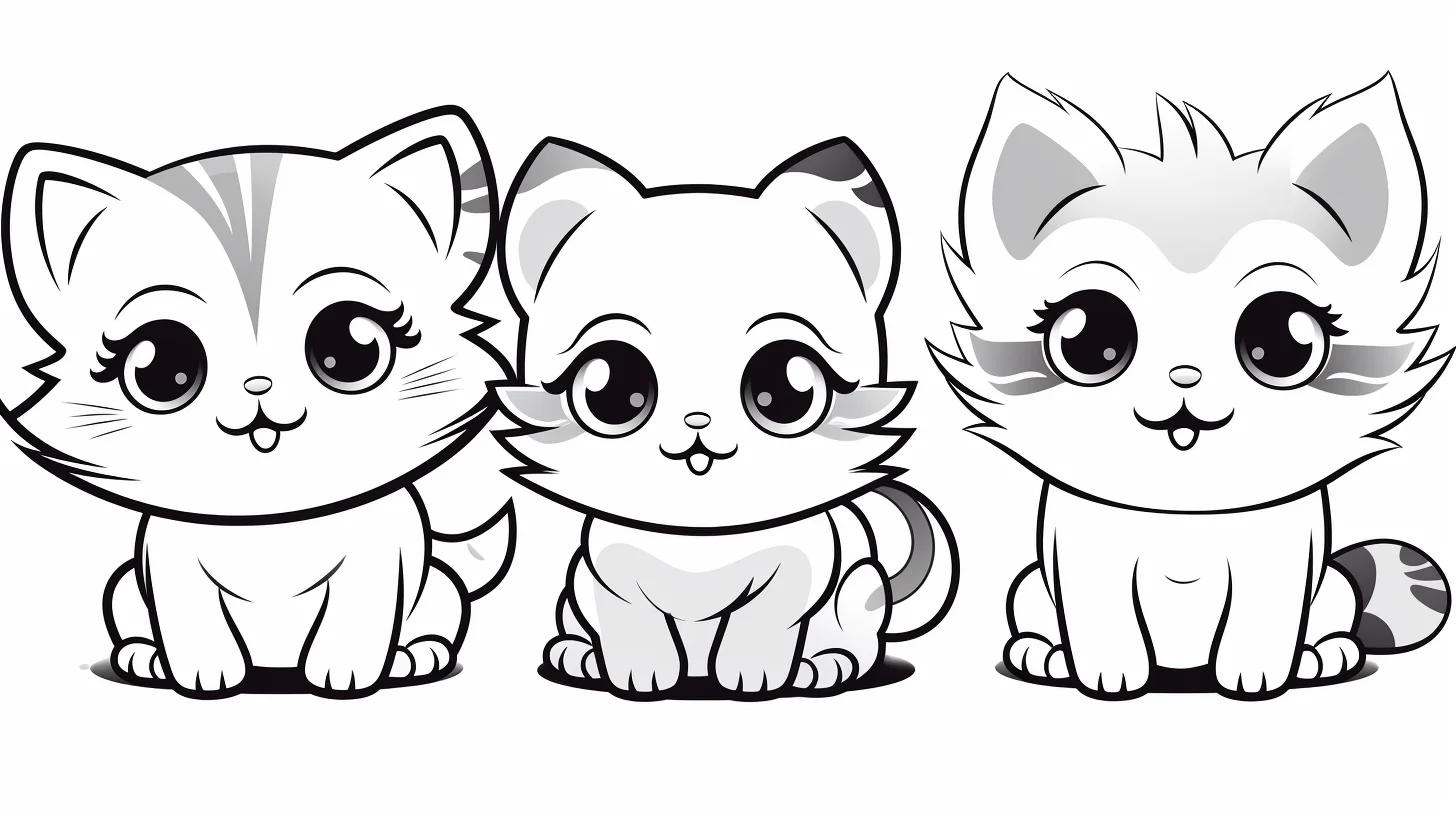
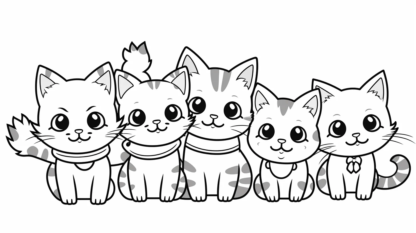
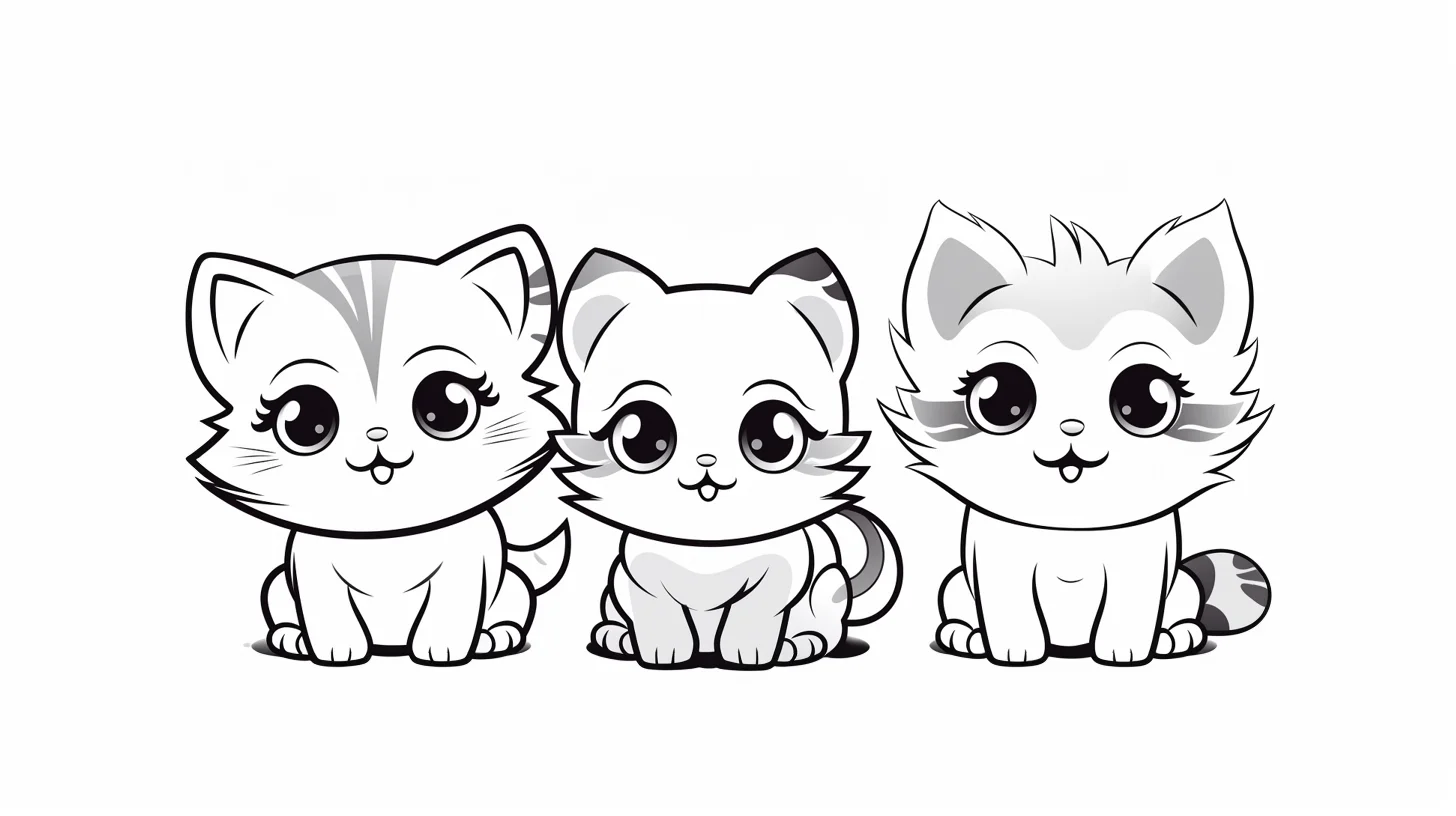
Which cat collection should you choose?
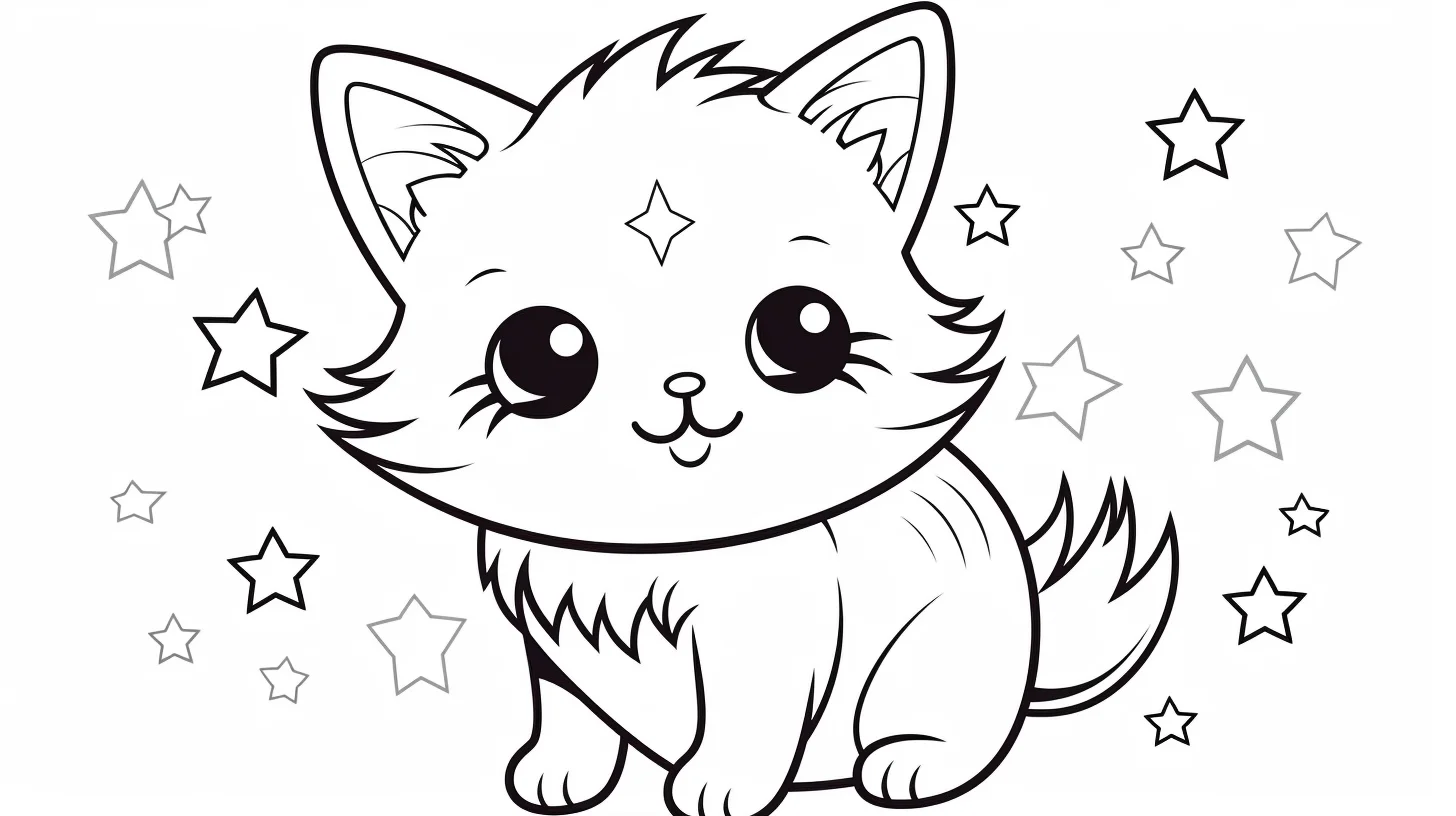
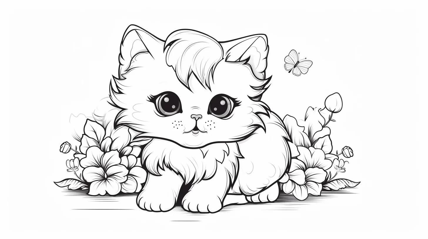
- This page: best for decorative cats with flowers, clothes, hats, scarves and kawaii details.
- Main cat collection: better for a broad mix of kittens, kawaii and realistic cats.
- Realistic kittens: better when fur, whiskers and natural proportions are the priority.
- Kawaii cats: use this when you specifically want anime-like faces and simplified cute styling.
Color the cat first, then build the decoration around it
On the flower, bow, hat and scarf pages, it is easy for the accessories to become louder than the cat. Start with the face and body before choosing accessory colors. Give the cat one main fur color and, if you want markings, one secondary tone. Then borrow one of those colors for a flower center, bow stripe or clothing detail. That small repetition ties the page together without forcing every object into the same palette.
For a white cat, do not fill the entire body with gray. Leave most of the paper untouched and place pale gray, beige or blue-gray only beneath the chin, inside the legs, below the tail and where clothing overlaps the fur. Those few shadows keep a white cat looking white while still showing its shape.
Do a 90-second face, fur and accessory check
Before coloring a full sheet, test the three parts that most often make these decorated cats look muddy: the face, the fur edge and one accessory. On scrap paper, make a light, medium and dark swatch with the tool you plan to use. Your medium value should still leave the printed linework easy to see; if it does not, use less pressure or a lighter color.
- Protect the face first. Decide where the darkest value belongs before filling the fur. On most kawaii sheets, keep it for the pupils, upper eye line and one or two tiny features. If the cheeks, inner ears and nose are equally dark, the expression loses its hierarchy.
- Test the fur edge. Add five to ten short strokes beside a cheek, chest or tail edge, following the direction the fur would grow. If the strokes turn into a solid dark border, lighten your pressure and space them farther apart.
- Check the accessory against the fur. Put your planned bow, flower, hat or scarf color beside the fur swatch. If both are similar in value, either lighten the fur or deepen the accessory so the shapes remain separate.
- Look from arm’s length. The eyes and cat silhouette should read before individual petals or clothing details. If the flowers grab attention first, keep their darkest shade one step lighter than the cat’s focal details.
For preschoolers: skip the value test. Pick one crayon for the cat and one contrasting crayon for flowers or clothing, leave the eyes uncolored until the end, and use the broadest open shapes first. That keeps the activity about control and recognition rather than shading technique.
A three-page practice sequence
- Start with a plain kawaii cat. Limit yourself to three main colors. Concentrate on staying inside the larger shapes and keeping the eyes as the darkest focal point.
- Move to a cat with one accessory. Use the fur palette again, then introduce one accent color for a bow, hat, scarf or hoodie. Repeat that accent once in a small detail.
- Finish with a flower-heavy page. Color the cat completely before the flowers. Choose two or three flower colors and repeat them rather than inventing a new color for every petal.
This progression is useful because each page adds one decision at a time: first the character, then an accessory, then a decorative background.
Make kawaii faces readable
Large eyes look cleaner when the darkest values are concentrated around the pupil and upper lash line. Leave a tiny white highlight if the drawing provides space for it. Keep blush, inner ears and nose lighter than the eyes so the expression remains easy to read. If the face begins to look crowded, stop adding detail around the eyes rather than trying to fix it with darker outlines.
For fur, short pencil strokes work best around cheeks, ears and the edge of the tail. You do not need to cover the whole body with hair marks. A smooth base with a few directional strokes usually suggests softness more clearly than filling every open area with texture.
Fix common problems on decorated cat pages
| Problem | What to change |
|---|---|
| The flowers overpower the cat | Lower their contrast. Use lighter versions of the flower colors and keep the darkest values on the cat’s eyes or outline details. |
| The page has too many unrelated colors | Choose three main colors and repeat them across flowers, clothing and accessories. |
| White fur looks flat | Add small shadows only where forms overlap instead of coloring the entire body gray. |
| Black fur hides the linework | Use dark gray, brown-black or navy for the first layer and reserve true black for the deepest shadows. |
| The face looks muddy | Keep blush and inner-ear colors light and save the darkest pencil or marker for eyes, nostrils and tiny accents. |
| Markers bleed through small flowers | Use colored pencils for narrow petals and accessory details, or place scrap paper beneath the sheet before using markers. |
Four small palette ideas
- Soft garden: cream fur, sage green leaves, dusty pink flowers and warm brown details.
- Cool kawaii: pale gray cat, lavender accessories, soft blue flowers and charcoal eyes.
- Warm autumn: ginger fur, muted red scarf, ochre flowers and dark brown accents.
- High contrast: black-and-white cat, one bright accessory color and mostly pale surrounding flowers.
These are starting points, not rules. If you want to test a combination before committing, make three tiny color swatches in the margin of scrap paper and place them next to one another. Colors that look good separately can compete once they share a page.
Questions about these cute cat coloring pages
Which pages are easiest for younger colorers?
Choose a cat with one large body, fewer flowers and a plain background. Broad crayons or pencils are easier to control in those open sections than fine markers.
How can I make a cat look fluffy without drawing every hair?
Use a smooth light base, then add short strokes only around the cheeks, chest, ear edges and tail. Change the direction of the strokes to follow the body rather than scattering them randomly.
Should the accessories match the cat?
They do not need to match, but repeating one fur or eye color in a small accessory detail makes the design feel intentional. If the cat is neutral gray or cream, the hat, scarf or flowers can carry the strongest color.

