
Minimalist drawing is not about making a picture empty. It is about deciding what deserves to stay. A clean silhouette, one good curve or a small symbol can carry the whole page if the extra lines are not competing with it. Click or tap any reference below to open the full-size image.
Jump to: small symbols · faces & hands · waves & nature · simplifying a drawing · tattoo inspiration
Want one exercise instead of browsing? Draw Idea 4 once as shown, redraw it with one line removed, then redraw it a third time at half the size. If the idea still reads, you found a line you did not need.
Small minimalist symbols — Ideas 1–7
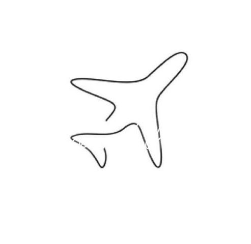
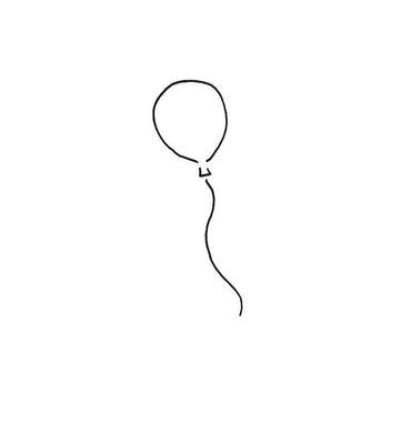
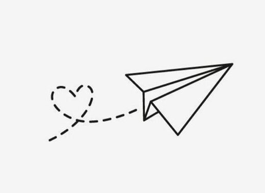
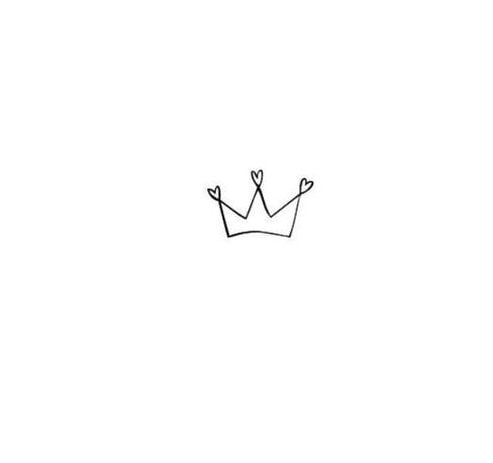
Small symbols work because the viewer already knows what the object is. You can remove a surprising amount of detail from an airplane, heart or crown before it stops reading clearly.
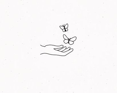
Minimalism starts with information hierarchy
Before removing lines, decide which information is carrying the drawing. A minimalist symbol usually depends on one or two things: the outer silhouette, one internal break, a directional curve, or a familiar proportion. Everything else is negotiable.
Try reading the subject in this order:
- Identity: what makes this object immediately recognizable?
- Direction: what angle, curve or gesture gives it movement?
- Balance: where does the visual weight sit on the page?
- Accent: is there one small mark that completes the idea?
The airplane can survive without panel lines because the wings and fuselage already identify it. A butterfly can lose internal wing texture but usually needs bilateral structure. A crown can be reduced to a base and a few peaks. Minimalism works when you remove low-value information while protecting high-value information.
Use a deletion test instead of guessing what to simplify
Draw the subject once, then erase or cover one line at a time. After each removal, ask whether the image still reads instantly. If nothing important changed, that line was probably redundant. If the identity, gesture or balance weakened, put it back.
This is more reliable than trying to invent a “minimalist version” from scratch. You are editing information rather than decorating emptiness.
Faces, hands and human forms — Ideas 8–12
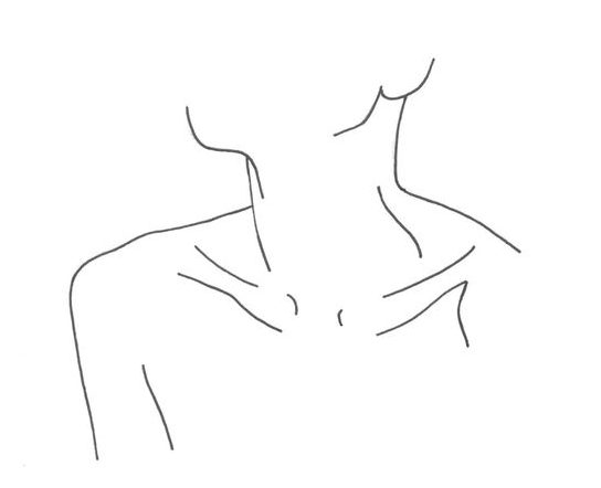
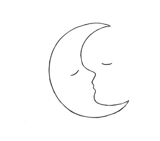
With faces and hands, the temptation is to explain too much. Keep the line that establishes the gesture and remove the line that merely repeats information. If the jaw already turns clearly, you may not need to outline every cheek and hair edge.
Let some contours disappear
A closed outline explains everything. Minimalist line art often becomes more interesting when part of the contour is implied instead. The viewer’s eye completes the missing edge.
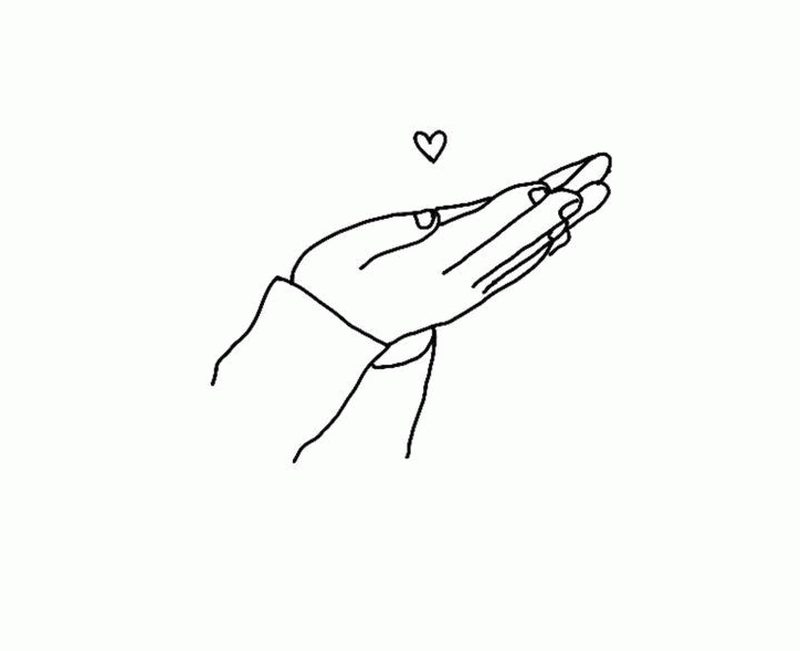
On a face, you may need the forehead-to-nose profile and the jaw turn but not a full oval around the skull. On a hand, the outer finger rhythm and thumb angle may carry more information than every knuckle crease. The blank gap is not a mistake; it is part of the construction.
A useful test is to stop the line where the form changes role. Let the jaw disappear before the neck, break the wrist before the forearm, or leave a cheek open where the hair already explains the boundary. If the drawing still reads, the missing section is doing useful work as negative space.
Watch the endpoints of your lines
In a dense drawing, a line can end almost anywhere because other marks absorb the transition. In minimalist work, every endpoint is exposed. A line that simply stops in an arbitrary place can feel accidental.
- End at a structural change: corner, joint, overlap or change of plane.
- End into open space deliberately: taper or soften the mark instead of chopping it off.
- Use overlap to hide an endpoint: one line can disappear behind another form.
- Avoid repeated little corrections: three hesitant marks usually weaken a simple contour more than one slightly imperfect committed line.
Gesture matters more when there are fewer lines
A minimalist neck-and-shoulder drawing may contain only a handful of marks, which means each curve carries more responsibility. Before tracing anatomy, find the main directional sweep: the tilt of the head, the shoulder slope, the bend of the wrist or the relationship between two hands.
If the gesture is right, the drawing can survive aggressive simplification. If the gesture is stiff, removing detail only exposes the stiffness more clearly.
Waves and simple movement — Ideas 13–15
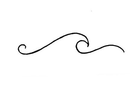
Waves are useful minimalist studies because the drawing depends on rhythm more than detail. One confident curve can say more than ten nervous ones.
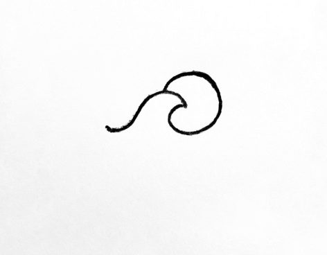
Rhythm is the subject in a wave drawing
With a wave, there may be almost no object detail to hide behind. The spacing and change of curves become the content. Avoid making every crest identical. Let one curve lead, another answer it, and a smaller one taper the movement away.
The same principle works in hair, wings, plant stems and abstract line art: repetition feels intentional when the shapes share a family but vary in length, angle or spacing.
Negative space is not leftover paper
Before drawing, look at the empty page as a shape you are about to divide. A tiny symbol in the center creates a very different feeling from the same symbol near an edge with a large open field beside it.
Three simple composition choices are especially useful:
- Centered and quiet: good when the symbol itself is the whole idea.
- Off-center with breathing room: creates direction and a more editorial feel.
- Cropped by the edge: makes a simple face, hand or wave feel larger and more immediate without adding detail.
Do not automatically fill a blank corner because it feels empty. If that emptiness is balancing the subject, adding another icon, star or decorative line can weaken the piece.
Use scale before adding detail
If a drawing feels too plain, your first instinct may be to add texture. Try changing its scale instead. Make the main form larger, crop part of it, or reduce the secondary mark dramatically. Contrast in size often creates more visual interest than extra decoration.
This is one reason minimalist work can feel polished with very little information: the composition is doing work that detail would otherwise have to do.
How to make a drawing feel minimalist instead of unfinished
Minimalism is selective, not incomplete. A finished minimalist drawing still needs a clear visual decision. The difference is that the decision is carried by fewer marks.
1. Write the idea in a few words
Before simplifying, name what matters: “two hands touching,” “a butterfly seen from above,” “a quiet profile,” “one rising wave.” If you cannot state the idea simply, you will have trouble deciding which lines deserve to stay.
2. Find the recognition anchors
Choose two or three features that make the subject recognizable. For a hand, that may be the thumb angle, finger rhythm and wrist. For a butterfly, it may be the wing silhouette, center body and symmetry. Protect those anchors while you remove secondary information.
3. Draw the largest relationship first
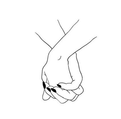
Place the overall silhouette, main gesture or relationship between forms before any small detail. In the holding-hands reference, the relationship between the two hands matters more than individual fingernails or knuckles.
4. Remove duplicated explanation
If a silhouette already explains the wing, you may not need a second line running just inside it. If hair already closes the side of a face, the cheek contour can often disappear. Keep lines that add new information; question lines that merely repeat what the viewer already knows.
5. Add one kind of emphasis
Choose a single finishing device instead of several at once: one darker contour, one filled black shape, one tiny shadow, or one accent mark. A small dark area can anchor the entire piece; five different emphasis tricks usually make it busier rather than stronger.
6. Stop before the drawing explains itself twice
Ask four questions: Is the subject recognizable? Is the gesture or mood clear? Does the empty space feel intentional? Is there a clear focal relationship? If yes, the drawing may already be finished. Add another line only if it contributes information that is genuinely missing.
A ten-minute simplification exercise
- 3 minutes: draw a simple object normally.
- 3 minutes: redraw it with half as many lines.
- 2 minutes: redraw it again as a tiny symbol.
- 2 minutes: compare the three and circle the version that stays clearest at a glance.
This works with almost anything: a shoe, cup, butterfly, hand, flower or face. The goal is not to reward the version with the fewest marks. Choose the version that preserves the most meaning with the least unnecessary information.
Line quality matters more when there is nowhere to hide
In a detailed sketch, a slightly awkward line can disappear among texture and shading. In minimalist work, that same line may be half the drawing. Use your whole hand or forearm for longer curves, rehearse the motion just above the page, then commit.
- Long structural curves: draw them in one or two motions rather than stitching together many short marks.
- Small accents: keep them quiet; they should not become darker than the main form unless they are the focal point.
- Corrections: redraw the piece instead of endlessly thickening a bad line. A heavy repair often attracts more attention than the original mistake.
- Line weight: use variation to clarify overlap or emphasis, not as decoration on every edge.
Try one black shape before adding more lines
If the drawing needs more visual weight, test a small filled area: the center of a butterfly, one shadow under a chin, a dark sleeve, a pupil or a simple background dot. A single black shape can create hierarchy and contrast without making the drawing busier.
Keep the dark area subordinate to the main idea. If the viewer notices the black shape before the subject, it is probably too large or too isolated.
Five reasons a minimalist drawing feels weak
- It is sparse but has no focal decision. Choose one dominant shape, curve or relationship.
- Every line has equal importance. Vary length, weight or placement so the eye knows where to start.
- The empty space is accidental. Reposition or crop the subject instead of automatically centering it.
- Too much was removed. Restore one recognition anchor rather than adding general detail everywhere.
- The line quality is hesitant. Redraw the piece larger and use longer, more committed movements.
Minimalist drawing vs. one-line drawing
They overlap, but they are not the same thing. A minimalist drawing can use several separate marks, shading or small filled shapes. A one-line drawing is built around the specific constraint of a continuous path. Minimalism is about what you remove; one-line drawing is about how the line travels.
How to turn a photo into minimalist line art
Choose a clear photo with one main subject. Do not trace every visible edge. Make three passes:
- Structure pass: mark only the outer silhouette and the two or three largest internal divisions.
- Recognition pass: add the few features that make this particular subject identifiable—a nose angle, leaf shape, wing split, hand gesture or roofline.
- Reduction pass: remove any line that repeats information already carried by another edge or by the negative space.
Then move the reference away and redraw the simplified version from memory. The second drawing is useful because memory naturally discards low-priority information. Compare what you remembered with what you intentionally kept.
A five-day minimalist drawing practice
- Day 1 — symbols: pick three familiar objects and reduce each to its recognition anchors.
- Day 2 — contour gaps: draw a face or hand while deliberately leaving several edges open.
- Day 3 — composition: draw the same subject centered, off-center and cropped. Do not change the subject itself.
- Day 4 — line hierarchy: redraw one piece using only light, normal and dark line weight.
- Day 5 — photo reduction: simplify one real photo into a finished minimalist drawing, then redraw it once from memory.
Keep all five days together. Progress should look like clearer decisions, stronger spacing and fewer unnecessary marks—not simply fewer marks.
If you are using these as tattoo inspiration
Keep the idea simple enough to read at the size you actually want. Very fine details that look clear on a screen may blur together when reduced. Use these references as inspiration rather than copying an undocumented design directly, and have the final artwork redrawn for you by the tattoo artist who will execute it.
Which minimalist idea should you try first?
If you want the easiest possible start, use the heart or the balloon. For cleaner line control, try the butterfly. If you want a human subject without committing to a full portrait, use the face or the holding-hands drawing. For rhythm and movement, the wave study is the best choice.
Minimalist drawing questions
How many lines should a minimalist drawing have?
There is no useful fixed number. Stop when removing another line would make the subject harder to read or change the idea you wanted to keep.
Should minimalist drawings be perfectly clean?
No. Slight irregularity often gives a simple drawing more character. Clean composition matters more than mechanically perfect curves.
Can I use shading in minimalist art?
Yes, but use it selectively. One small shadow or filled shape can add structure without turning the piece into a fully rendered drawing.
What is the easiest subject for minimalist practice?
Choose something with a strong silhouette: a heart, butterfly, wave, crown, airplane or simple face profile. Familiar shapes survive simplification well.
More simple drawing practice
For continuous-line exercises, use the one-line drawing page. For broader quick ideas, browse easy cool drawing ideas. If you want prompts that push the concept further, try the creative drawing exercises.

