
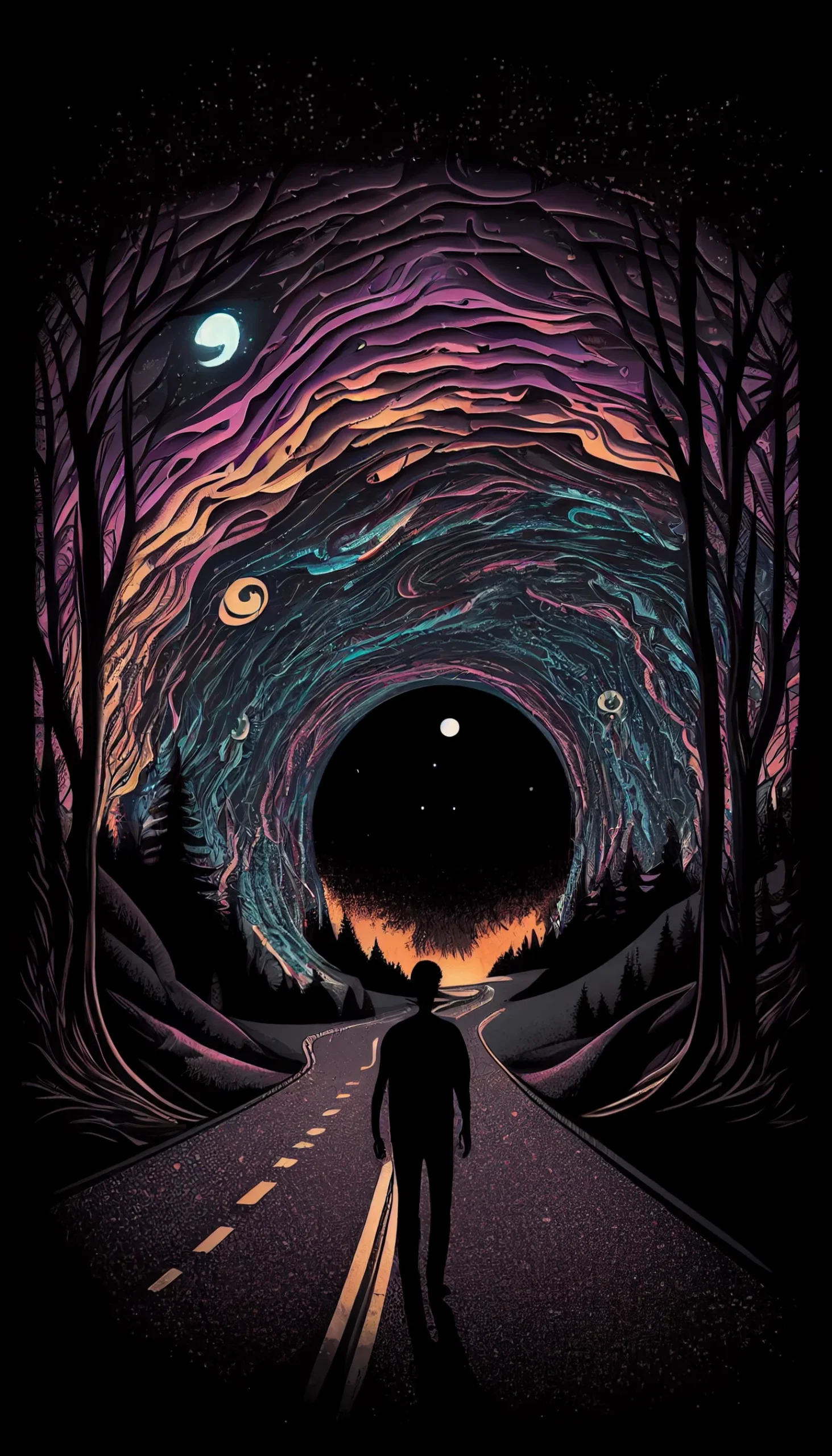
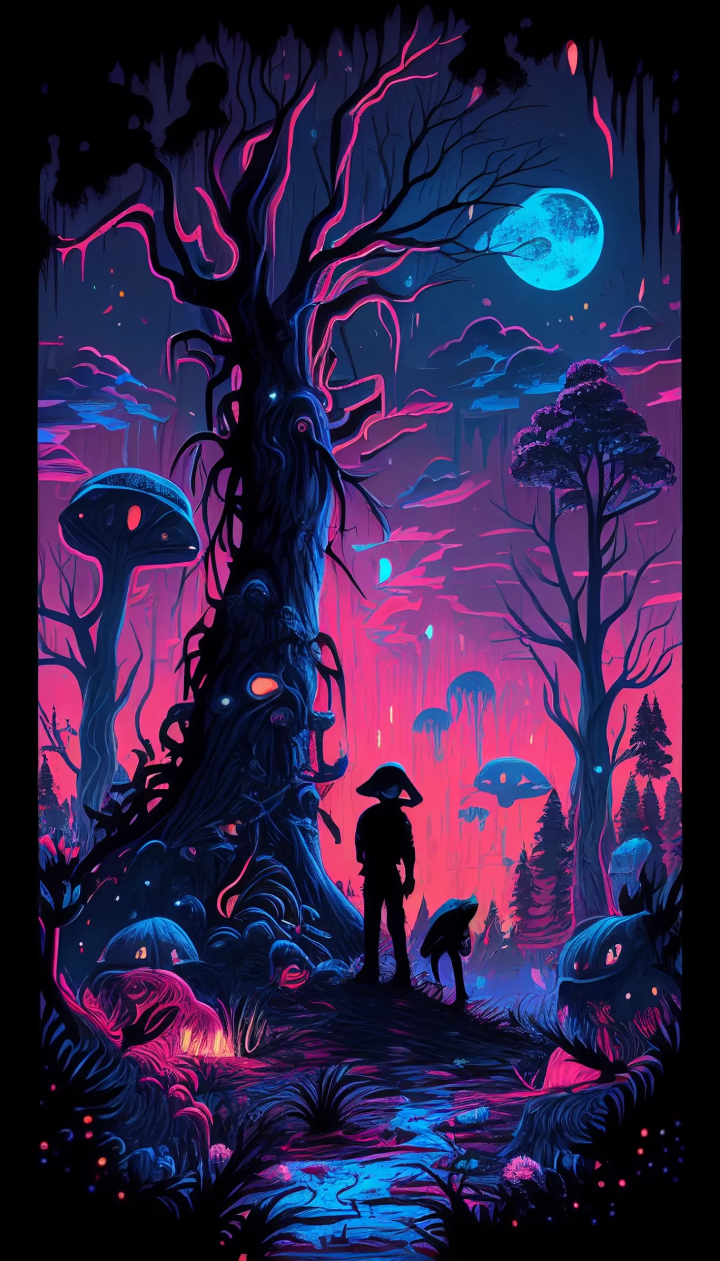
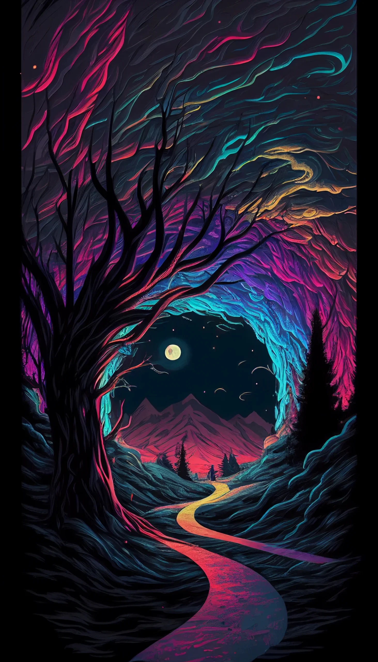
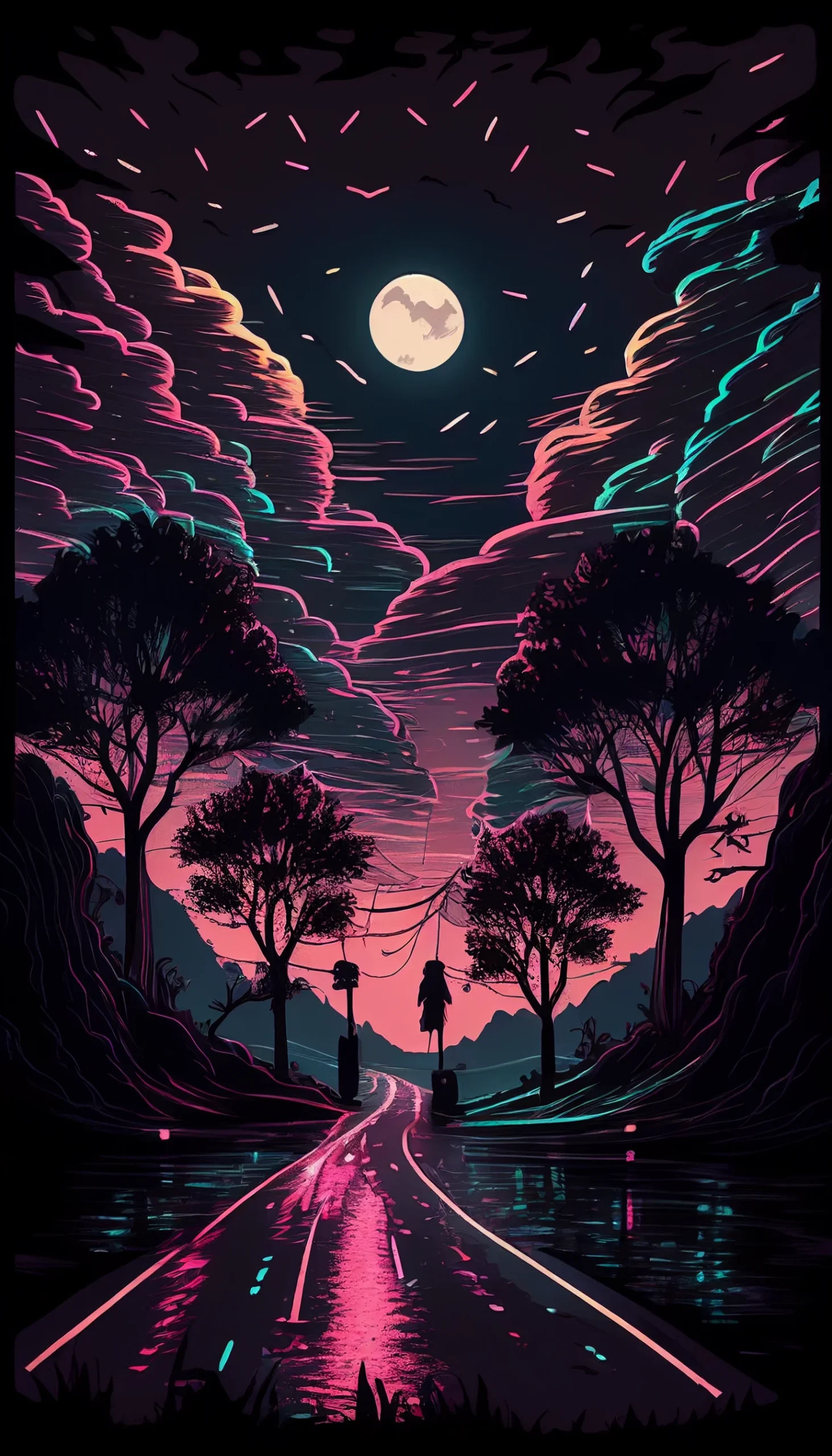
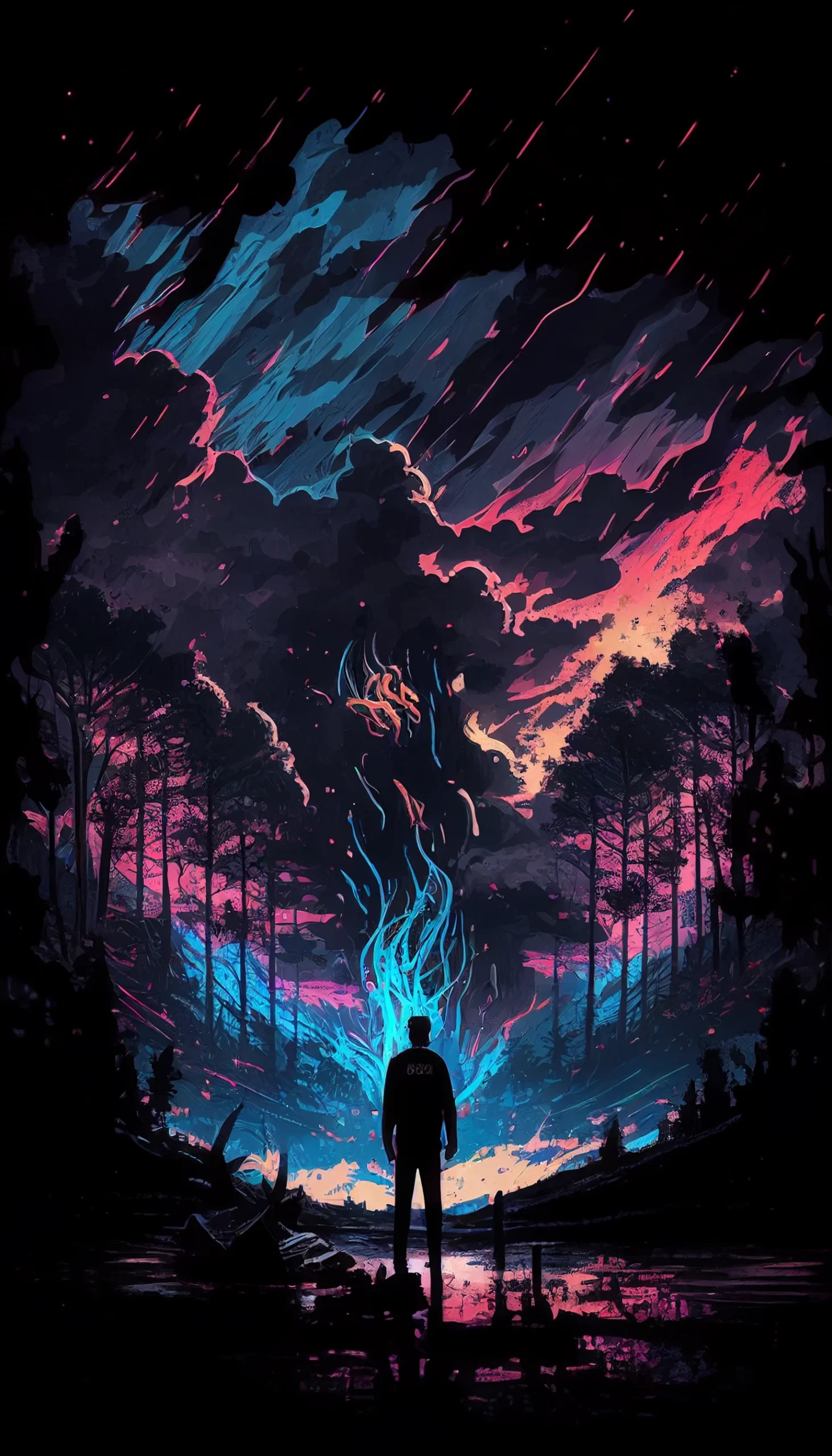
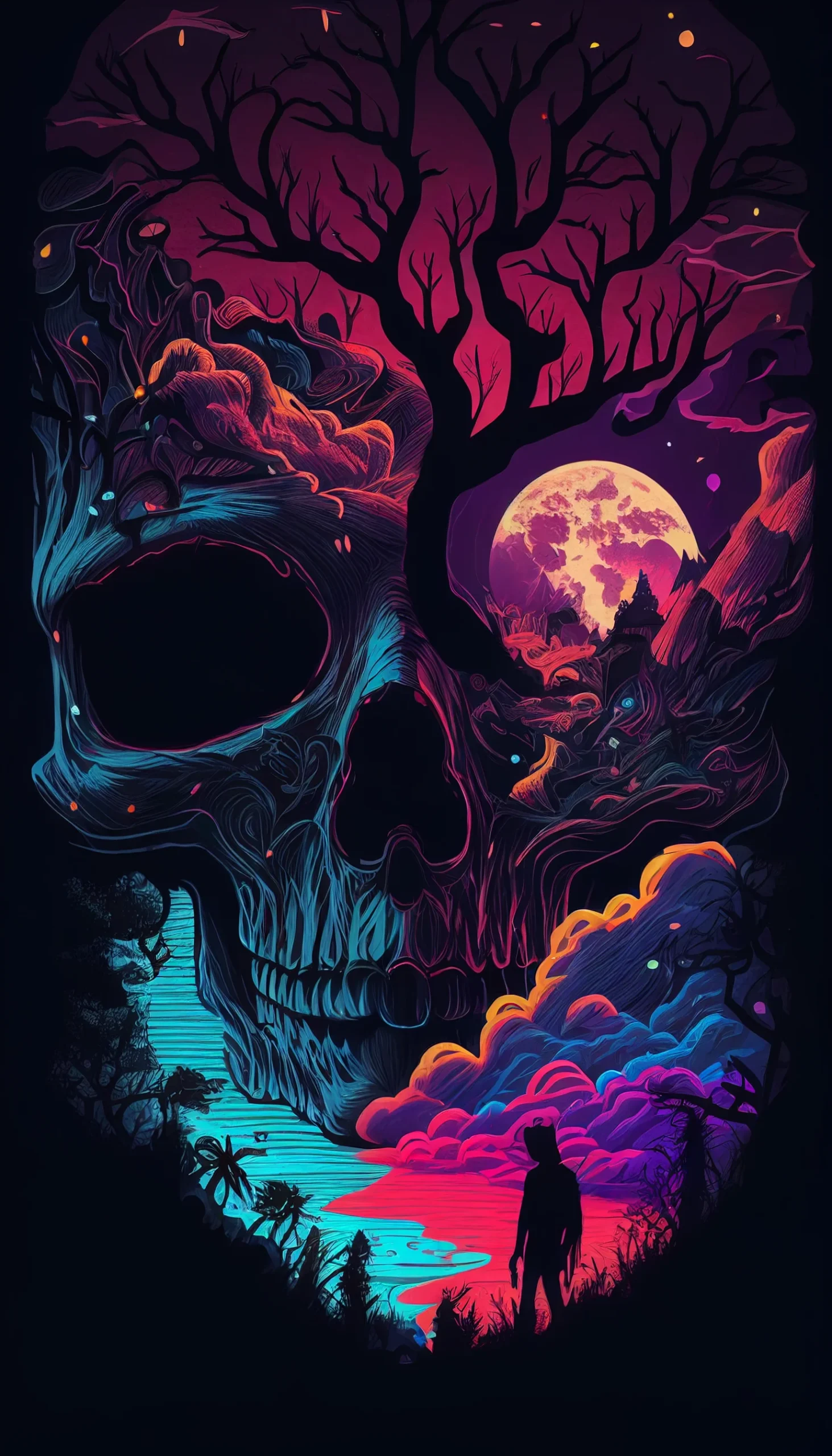
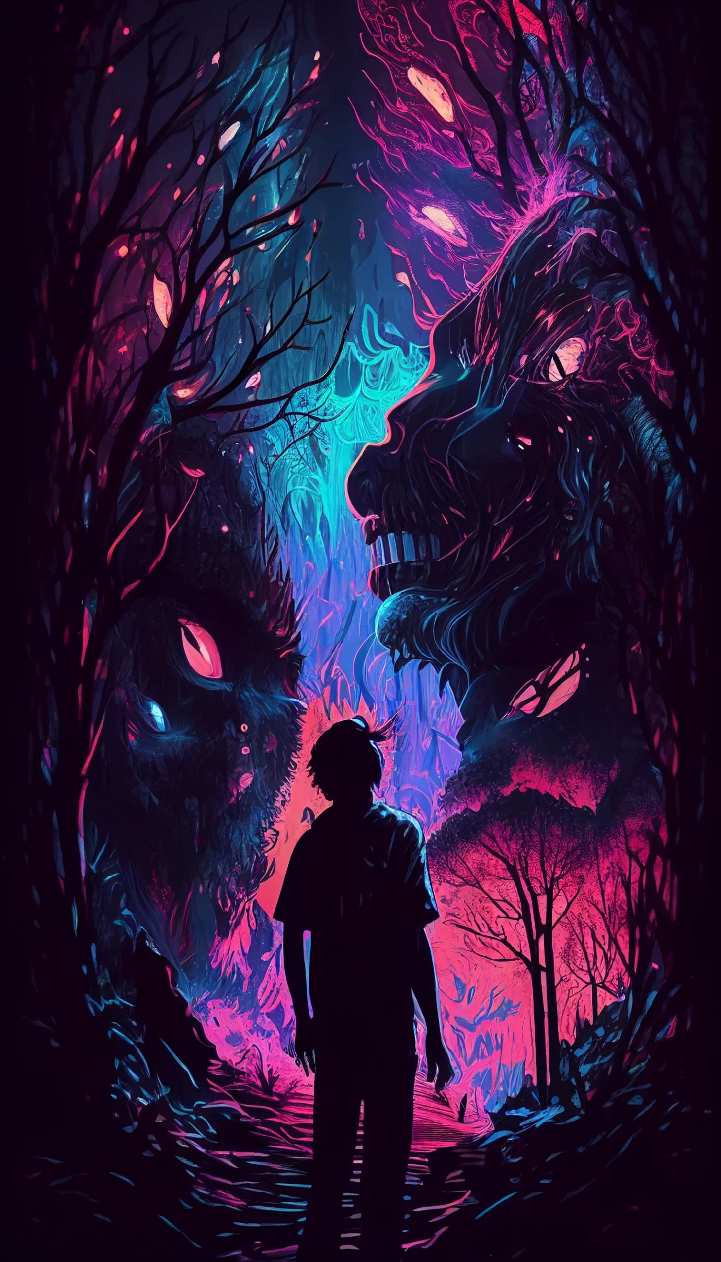
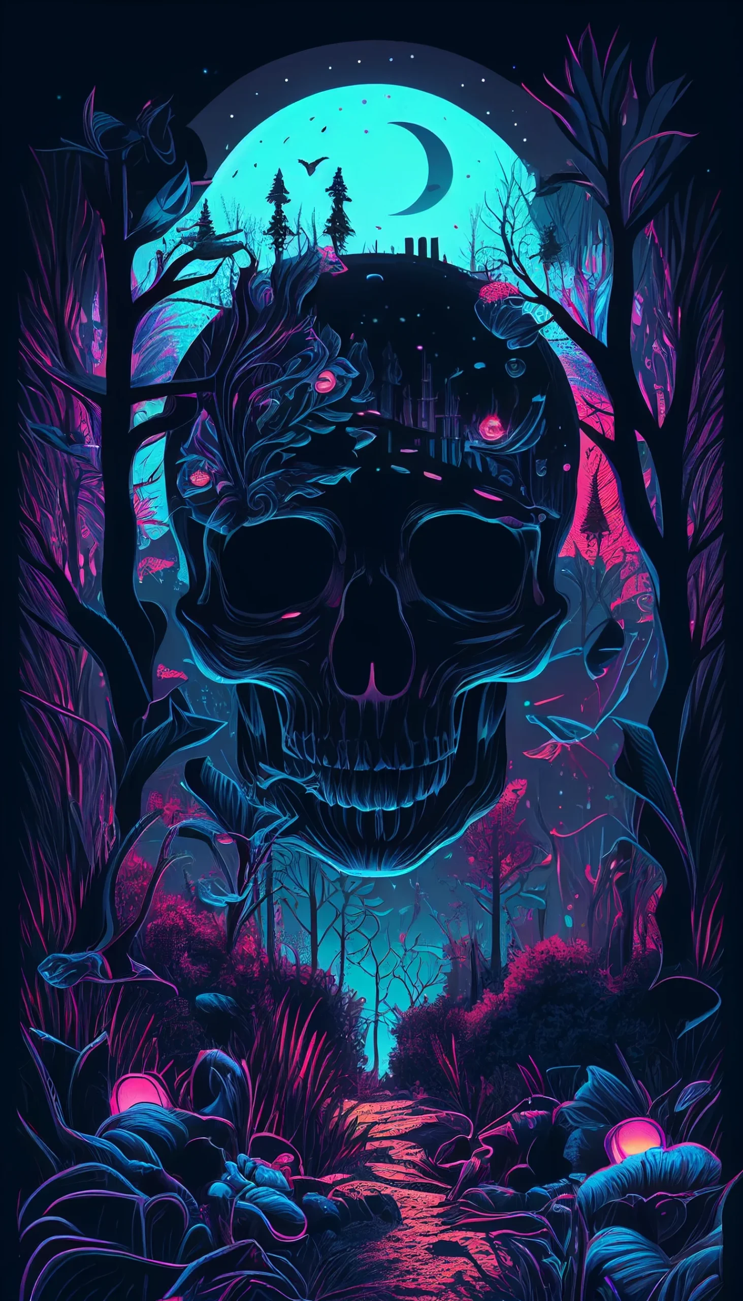
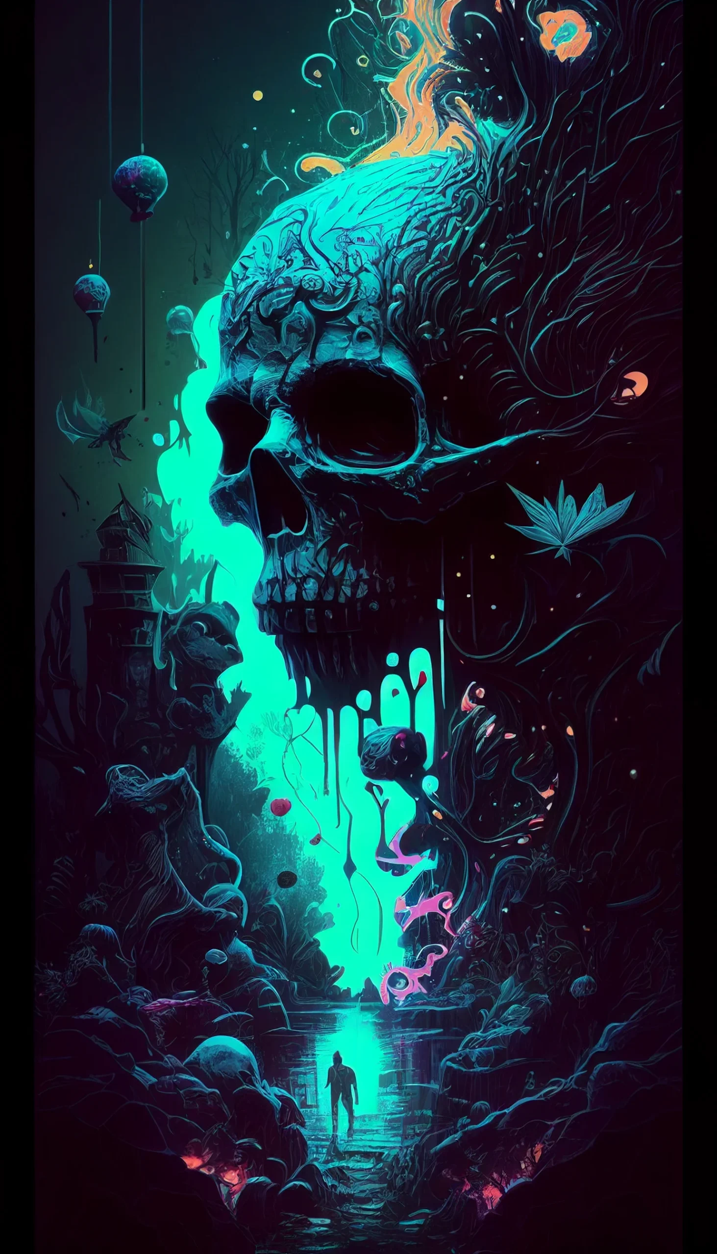
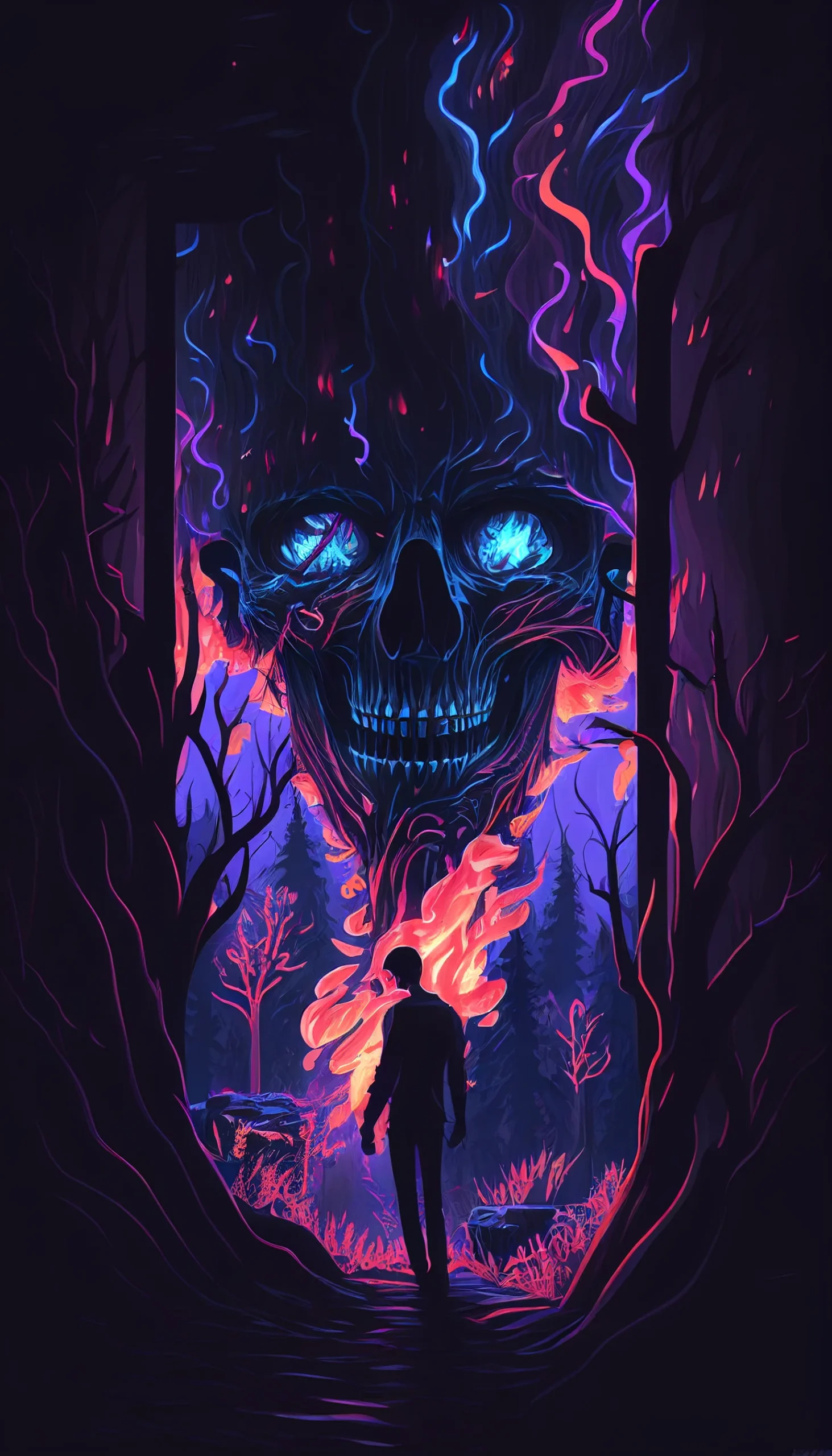
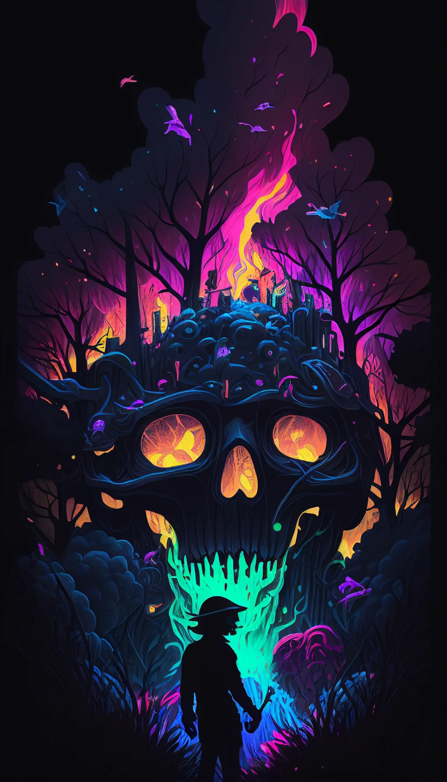
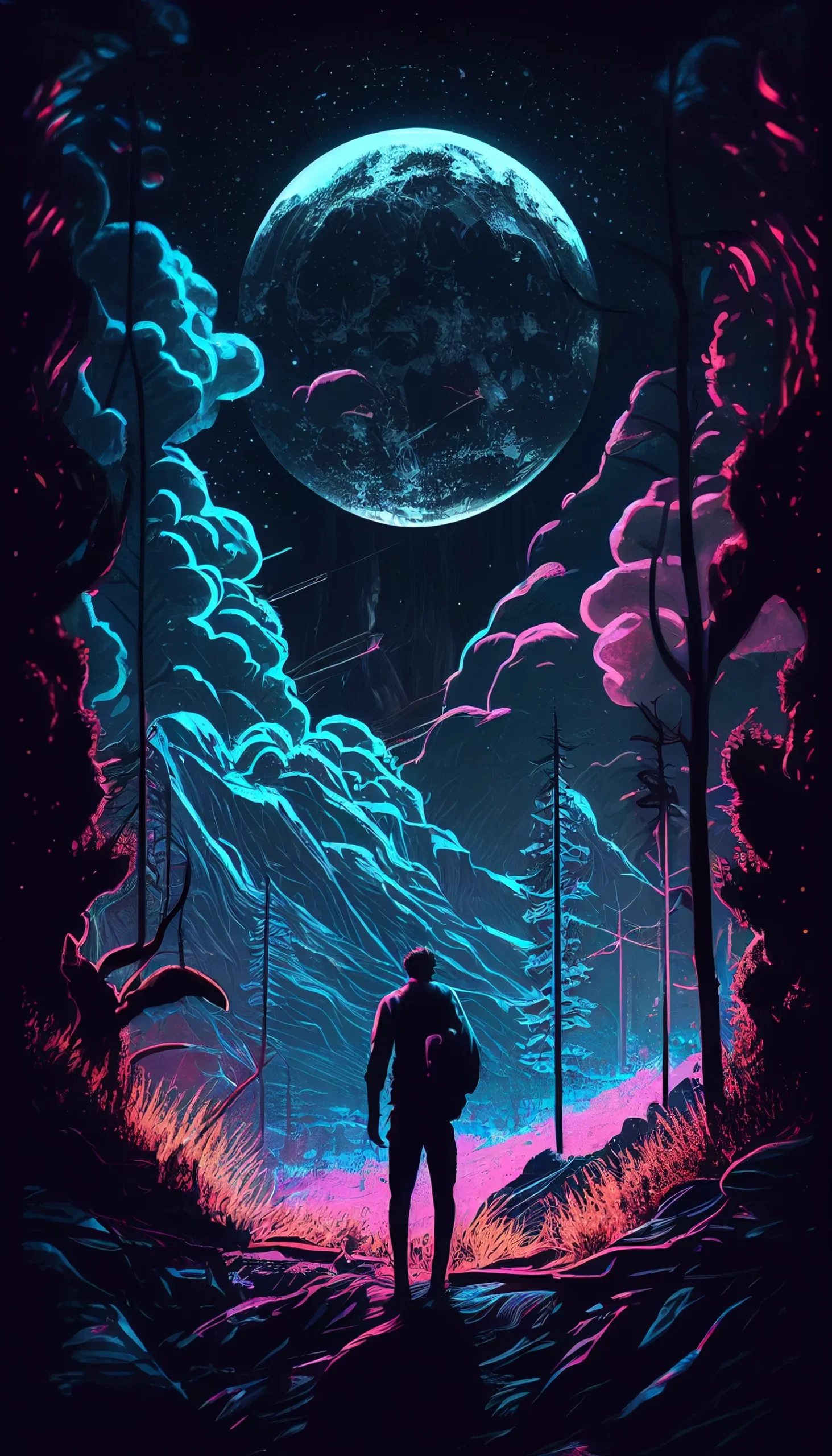
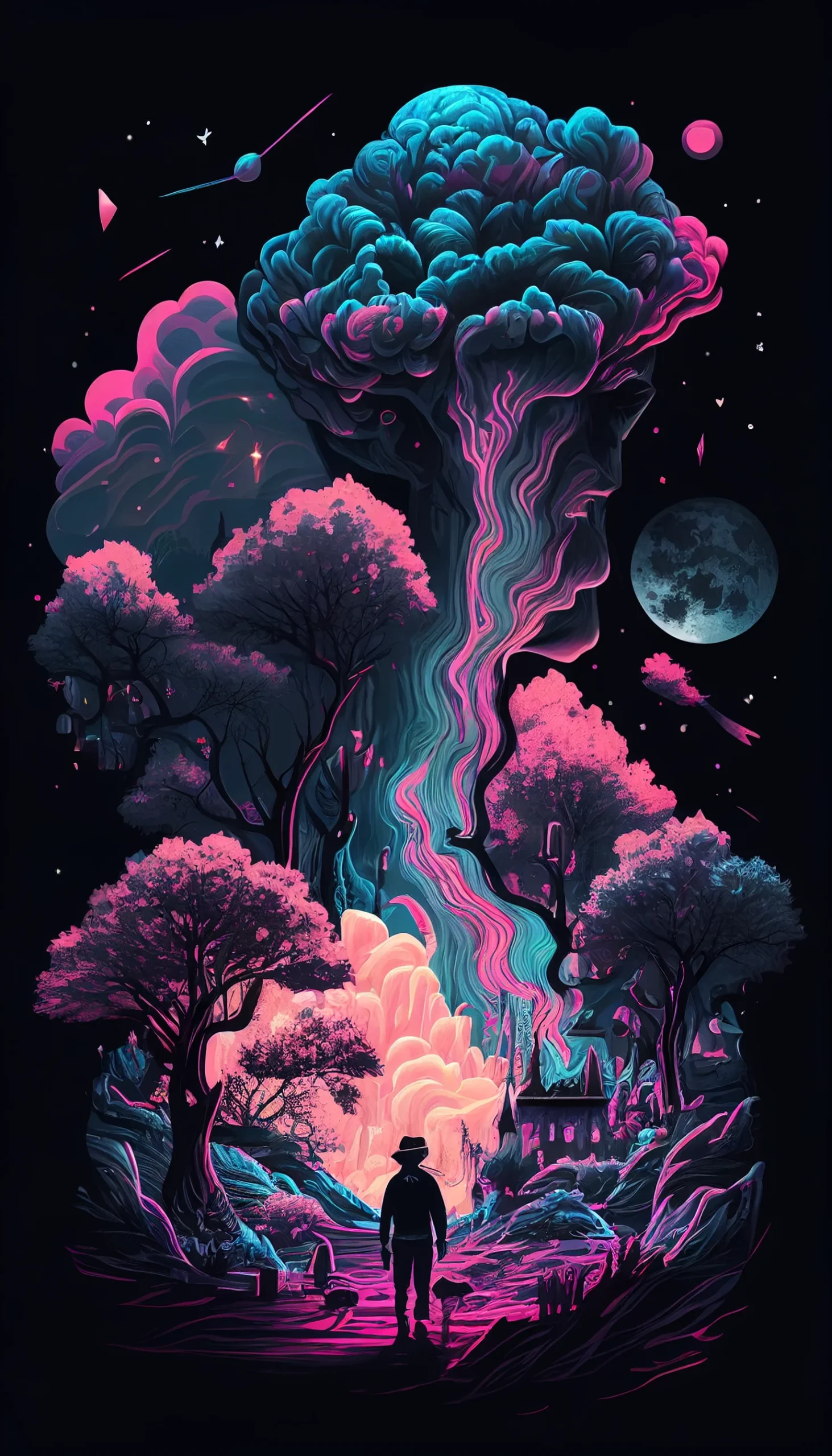
All 20 files here are 1463 × 2560 portrait wallpapers. The set is dark, but not uniformly black: some images use red or glitch accents, some lean photographic, and others use broken-heart or abstract motifs.
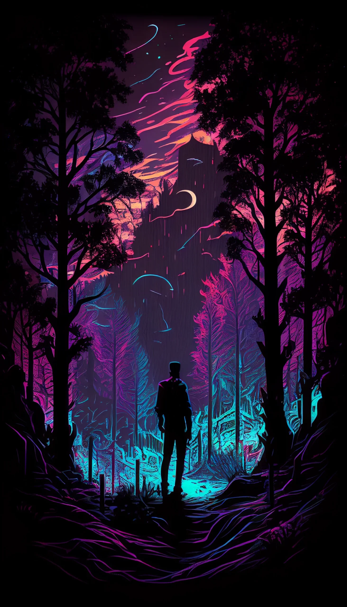
If you want a Lock Screen, start with an image that has a relatively quiet upper third so the clock is not sitting on top of the main detail. Brighter glitch designs can look excellent when the screen is empty but become difficult to read once notifications, widgets and app labels are added.
These are high-resolution phone wallpapers, not native 4K desktop files. For adjacent styles, browse the dark vintage, black iPhone and broader aesthetic wallpaper pages.
Run a 60-second dark-wallpaper test
- Set the image temporarily. Do not judge it only from the gallery. Your phone may crop the 1463 × 2560 file around the notch, camera area or screen edges.
- Wake the Lock Screen with the clock visible. Check whether the brightest red, white or glitch detail sits behind the time. If it does, reposition the crop before choosing another image.
- Open your busiest Home Screen page. Look at app labels and folders. If familiar icons suddenly take longer to find, the wallpaper is too visually active for that screen.
- Lower brightness to your normal evening level. Dark photographs can lose important detail, while saturated red accents may remain unusually prominent.
- Let one notification appear. Make sure the notification card does not cover the image’s face, heart, symbol or other focal point.
If a design passes the Lock Screen test but fails behind icons, keep it as a Lock Screen and pair it with a quieter dark Home Screen. There is no advantage in forcing one image to do both jobs.
Match the design to the screen
| Wallpaper style | Usually best for | Check before keeping it |
|---|---|---|
| Mostly black with one focal detail | Home or Lock Screen | The focal point stays clear of clock, widgets and dock. |
| Red or glitch-heavy design | Lock Screen | Bright accents do not compete with notification text. |
| Dark photography | Lock Screen | The subject remains visible at reduced brightness. |
| Broken-heart or centered symbol | Lock Screen | The symbol is not hidden by the clock or notification stack. |
| Low-detail dark texture | Home Screen | App labels remain readable across the entire icon grid. |
Fix the crop instead of over-zooming
Start with the image centered and move it only enough to protect the main subject. Heavy zooming can make a sharp source look softer and can push secondary details off-screen. If your phone’s aspect ratio forces a crop, decide what matters most: a face, symbol or bright glitch accent should survive; empty edge detail can be sacrificed.
If the clock disappears into the image: move the brightest area lower or sideways. If icons feel lost: use that design only on the Lock Screen. If the wallpaper looks nearly black at night: choose a version with clearer midtone detail rather than increasing screen brightness just to see the artwork. If red accents feel overpowering: test the image for a full minute at your usual brightness; saturated red can dominate more on a phone than in a browser preview.
Compare three favorites without guessing
Save three candidates and test each with the same screen layout. Give one point for a clean clock area, one for readable icons or notifications, and one for a crop that keeps the main subject intact. Keep the wallpaper that scores three out of three. If two tie, choose the quieter one for the Home Screen and the more dramatic one for the Lock Screen.
20 trippy dark aesthetic phone wallpapers
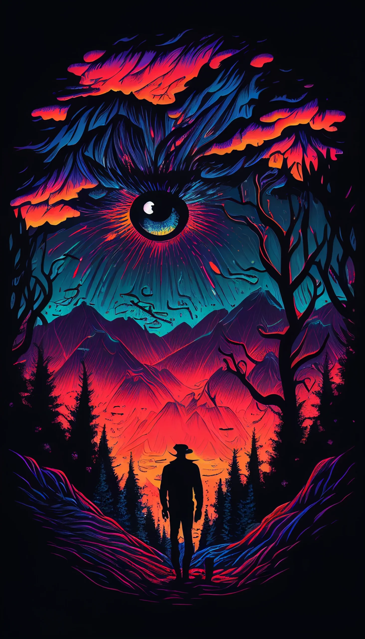
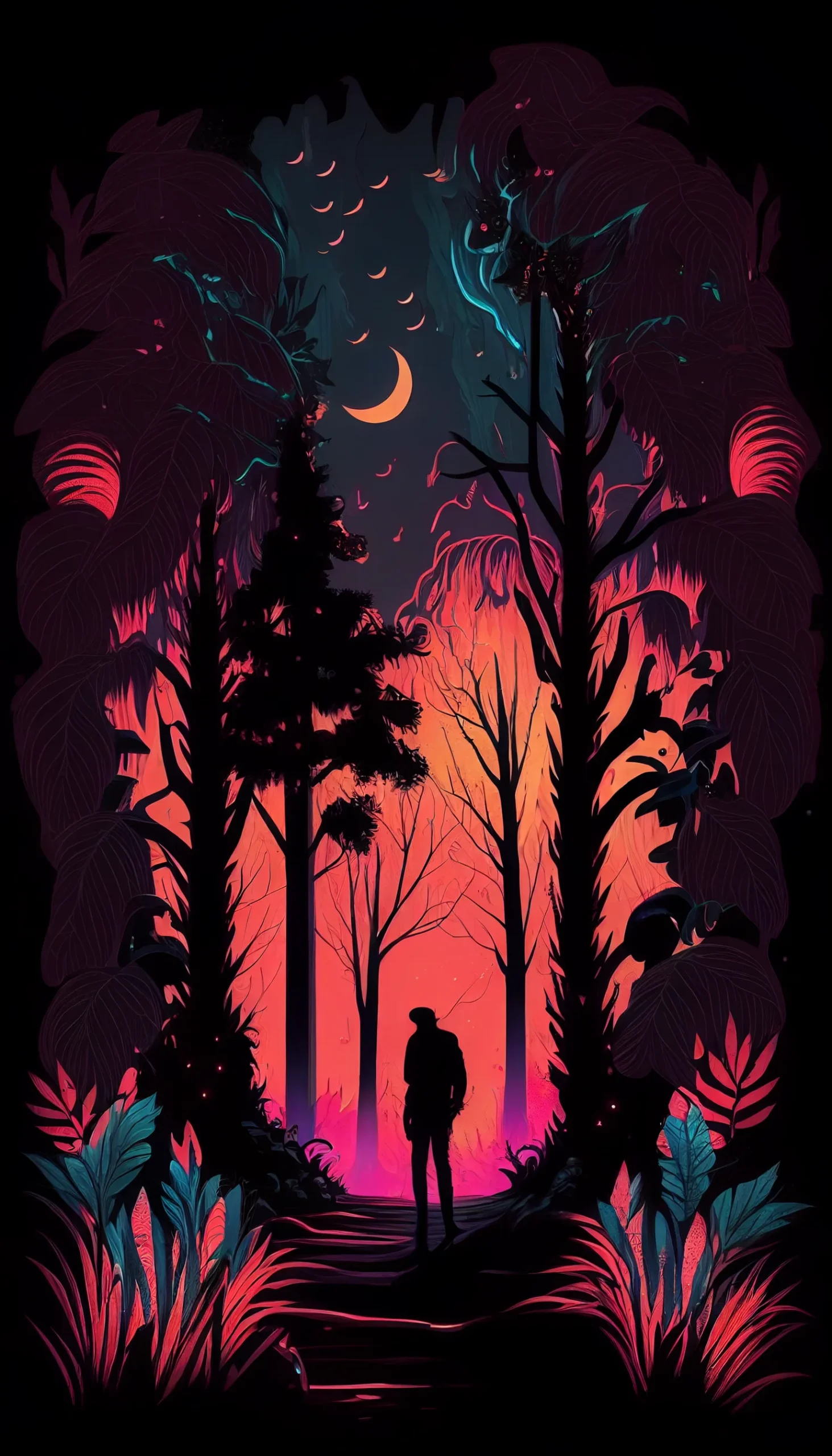
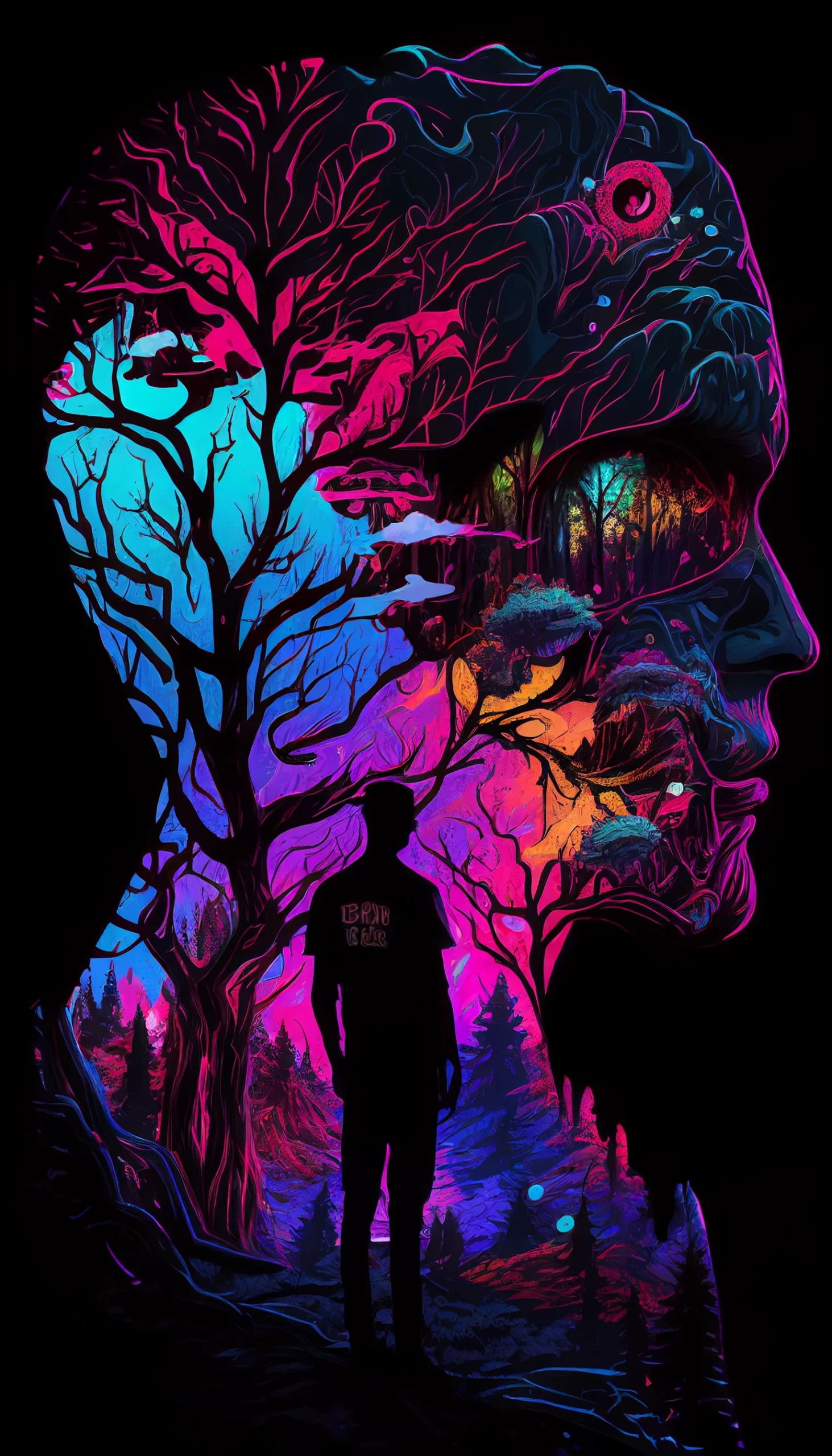
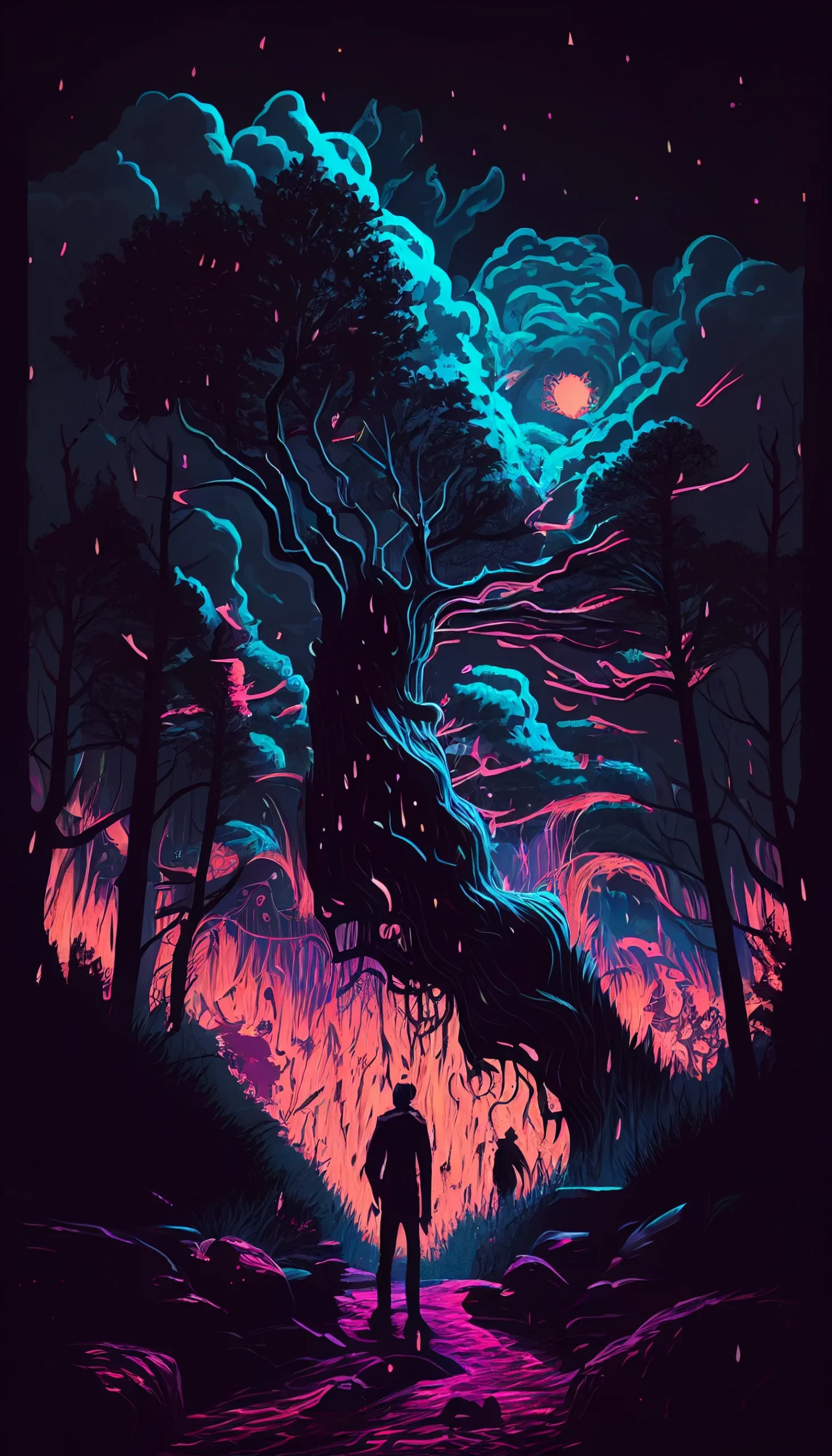
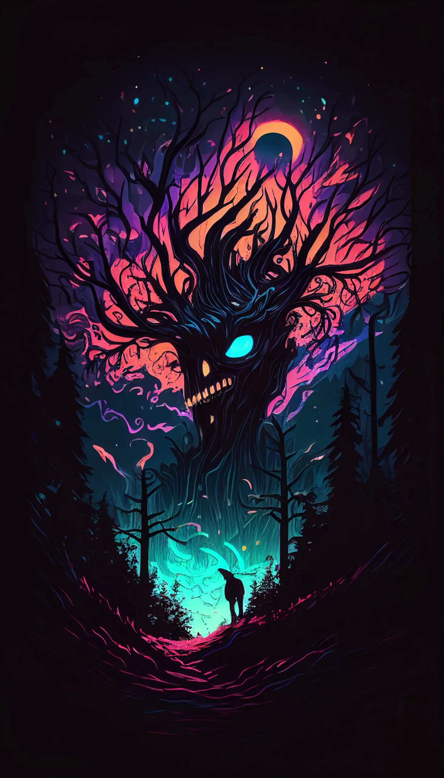
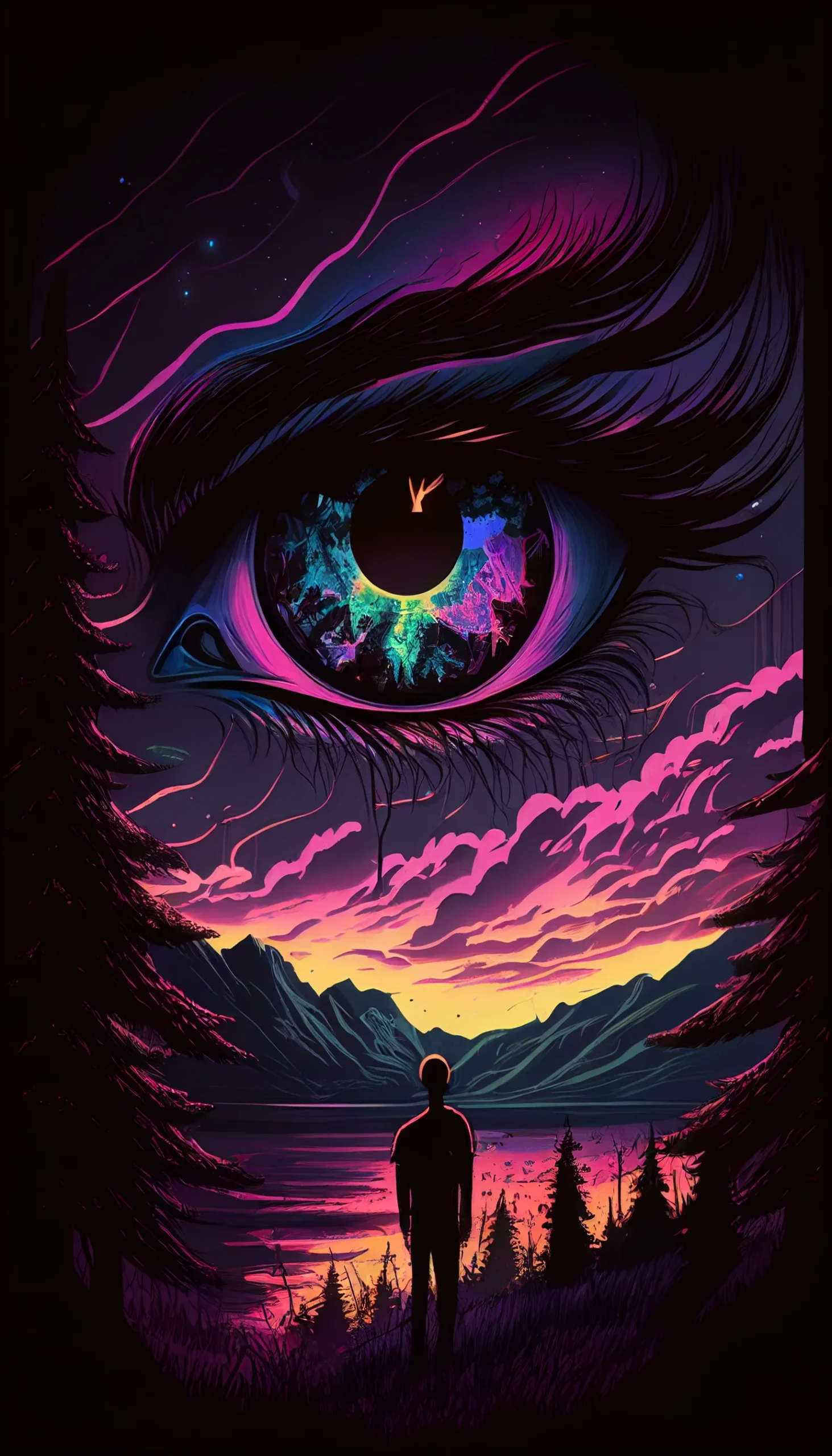
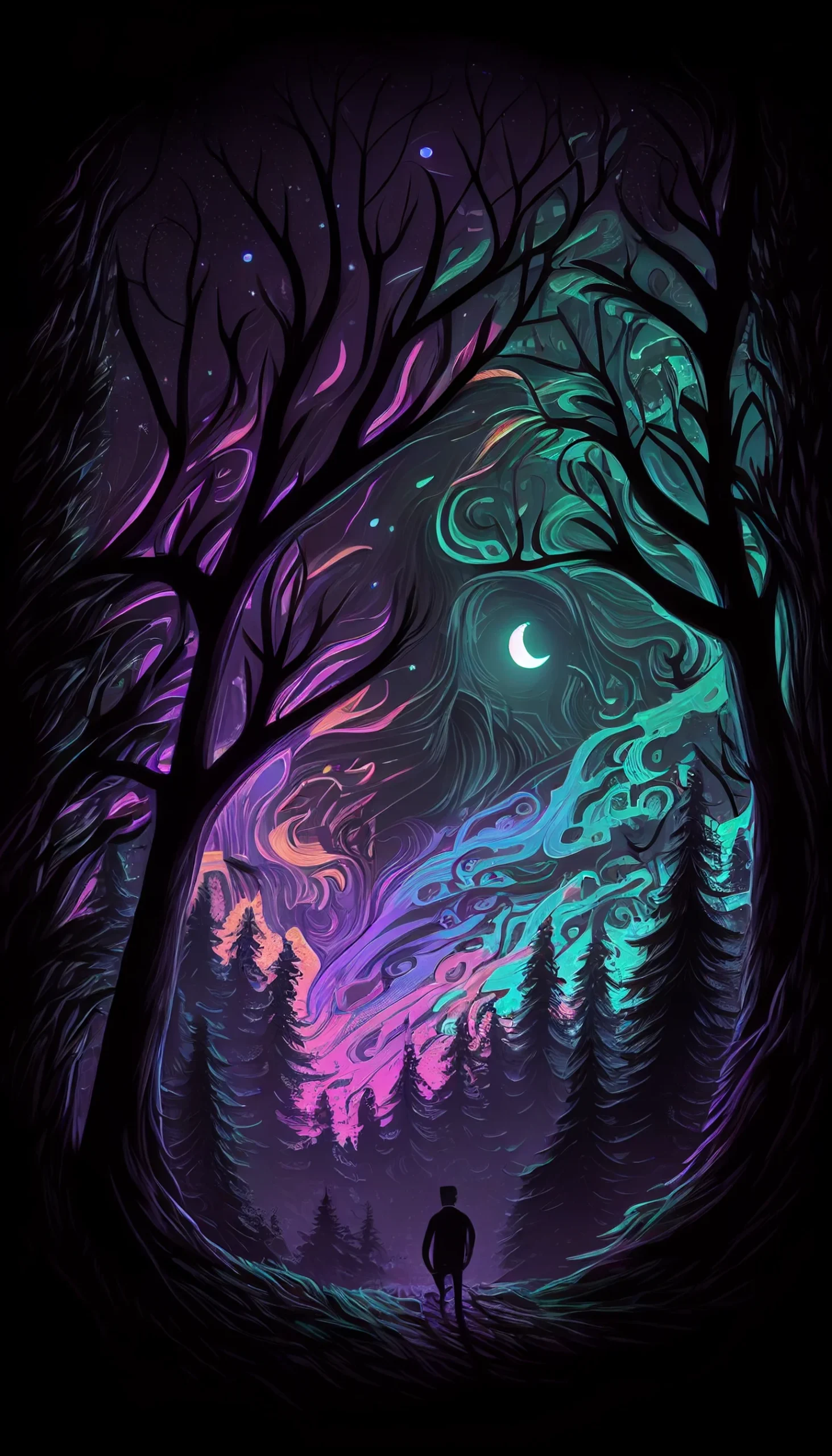
Choosing a readable lock screen
These dark designs work best when the clock and notification area sit over relatively uncluttered portions of the image. If a focal detail is covered, reposition the crop slightly rather than zooming heavily; that preserves more of the 1463×2560 artwork.

