
This gallery contains 26 retro bedroom concepts, ranging from 1970s- and 1980s-inspired rooms to vintage, boho, dark and modern-retro combinations. The easiest way to use it is not to copy an entire room, but to decide which decade or mood you actually want and then borrow a few repeatable elements.
Choose the retro direction before you shop
| Style | Useful starting point |
|---|---|
| 1970s-inspired | Warm browns, oranges, textured fabrics, rounded forms and earthy patterns |
| 1980s-inspired | Stronger contrast, graphic shapes, brighter accents and bolder decorative pieces |
| Vintage/cozy | Muted colors, second-hand furniture, warm lamps and layered textiles |
| Modern retro | Contemporary bed and storage with one or two unmistakably retro colors, shapes or accessories |
Start with the bed, storage and lighting you need in daily life. Then add the retro layer through color, a bedside table, lamp, rug, artwork or textile. That is usually easier to live with than turning every object into a period reference.
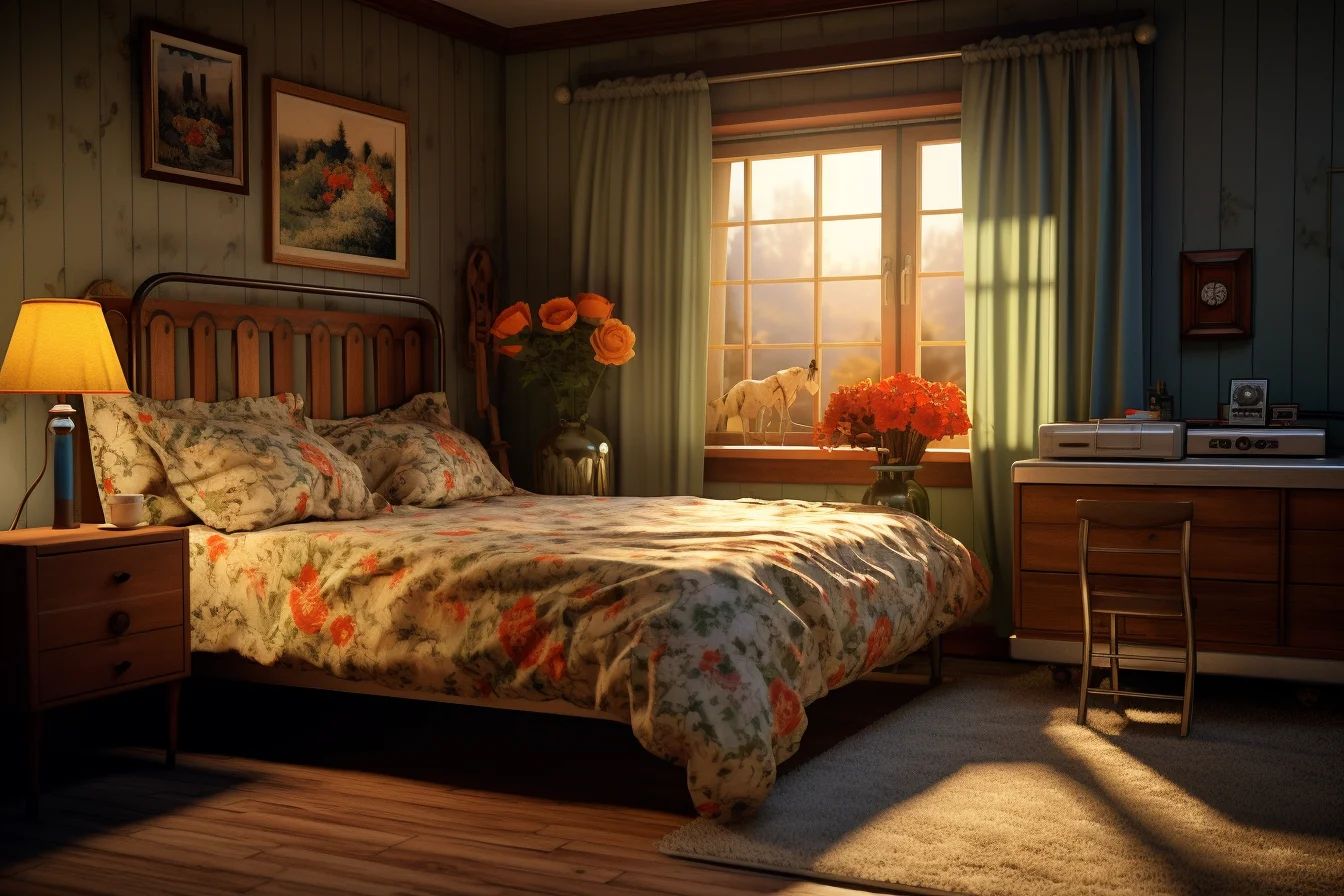
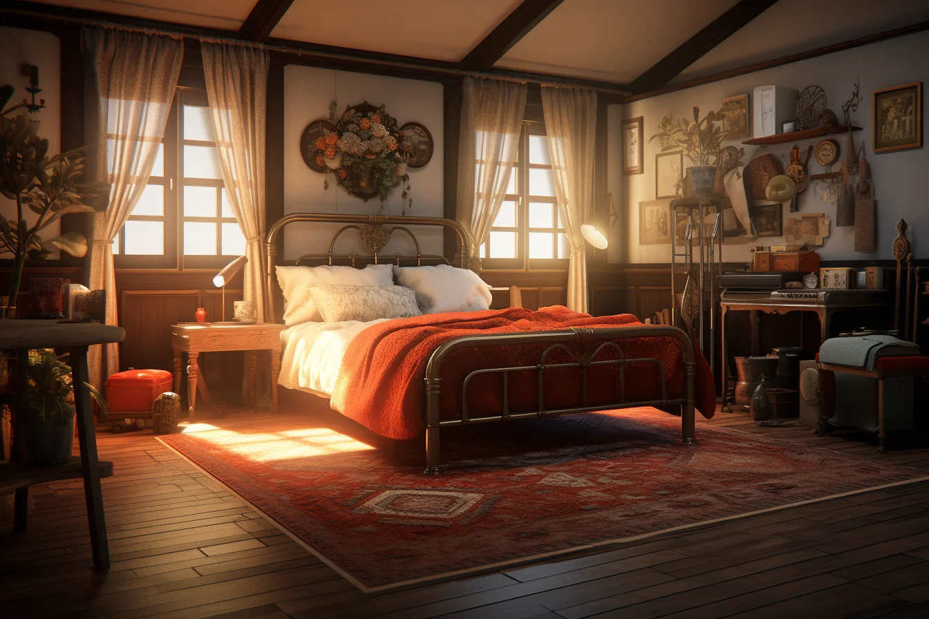
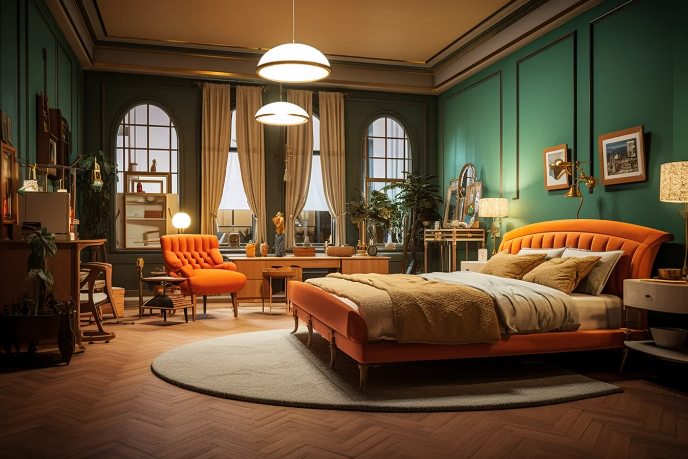
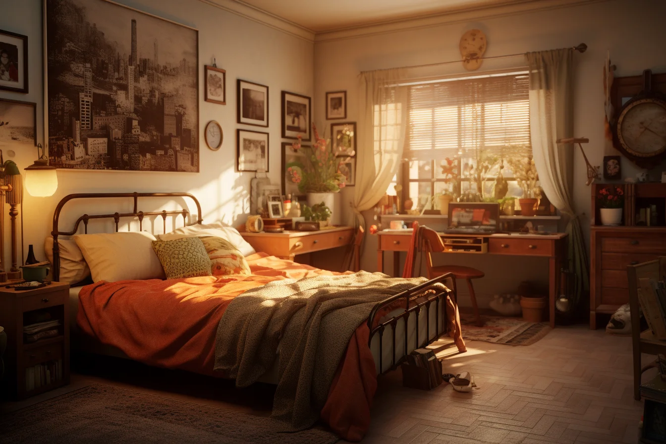
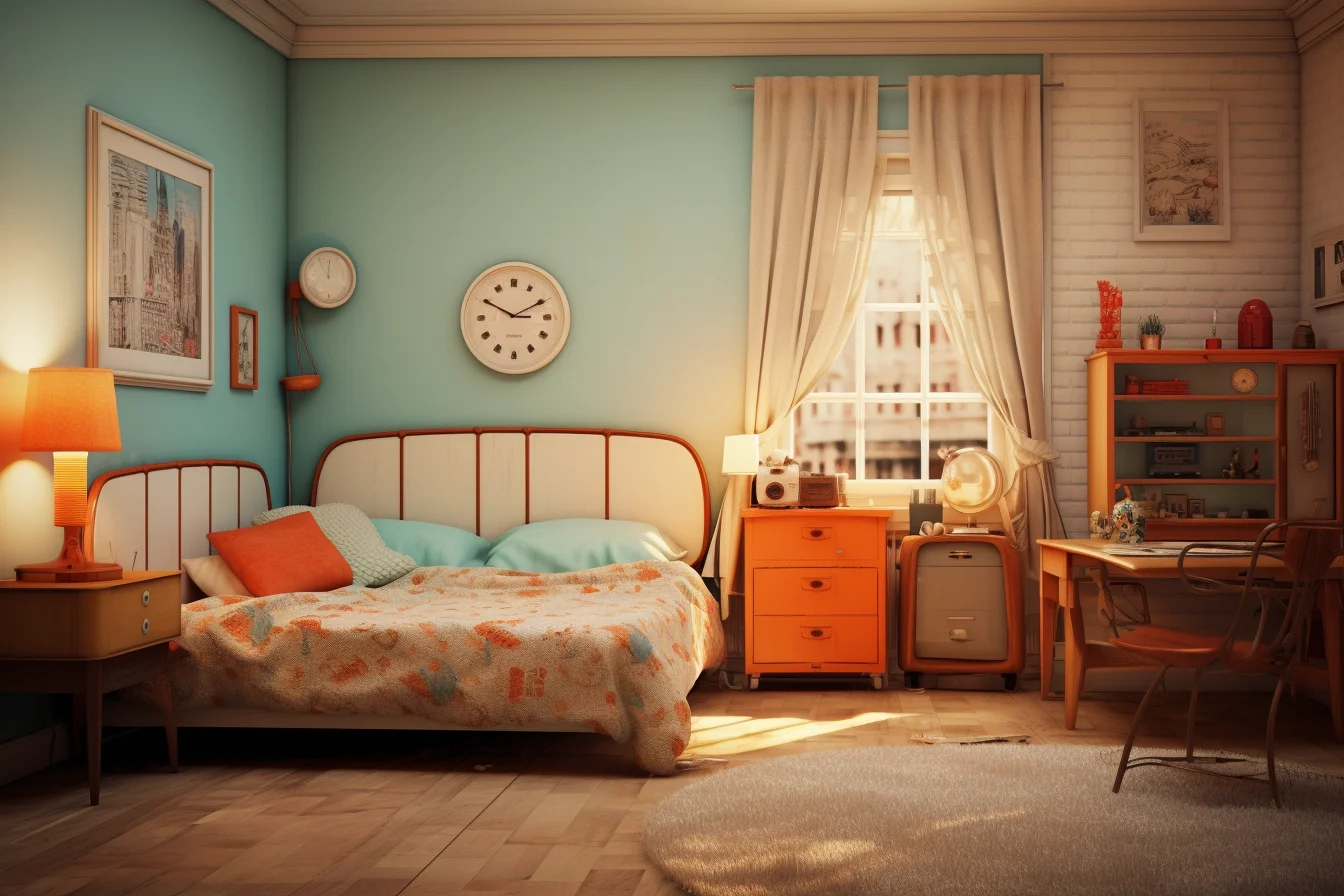
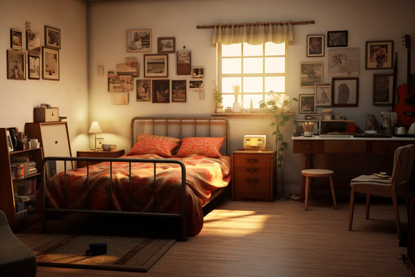
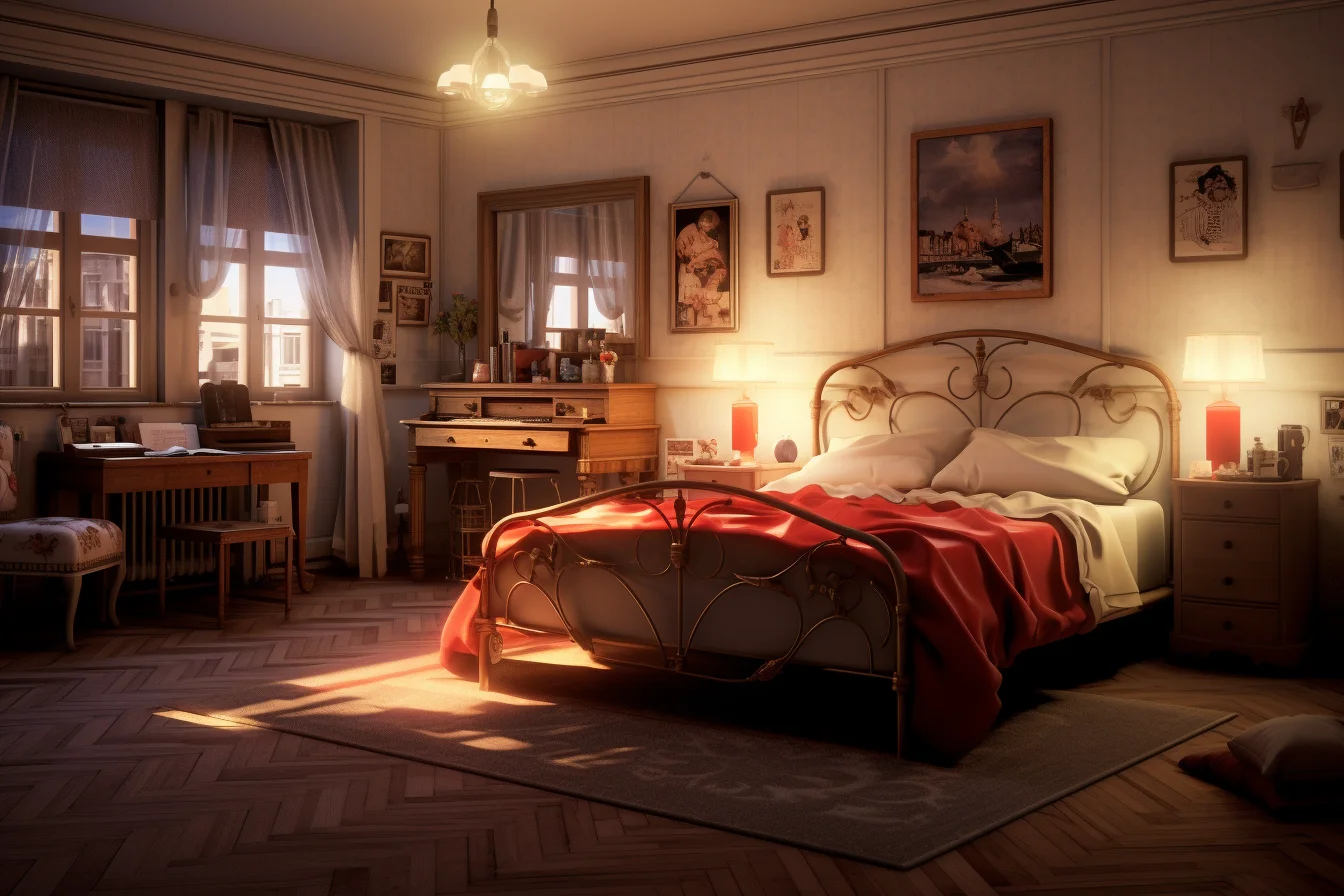
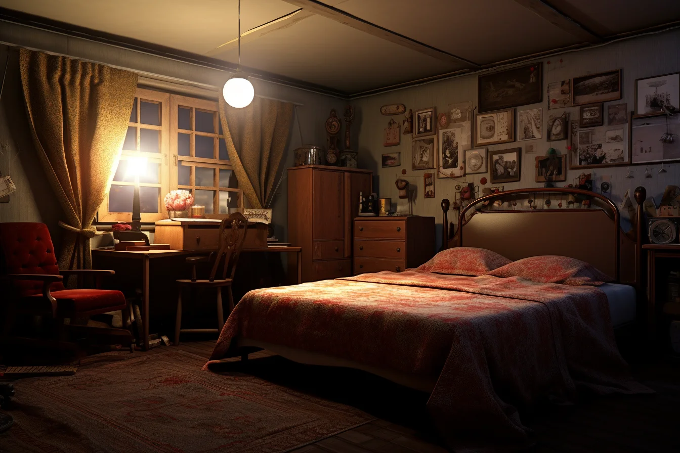
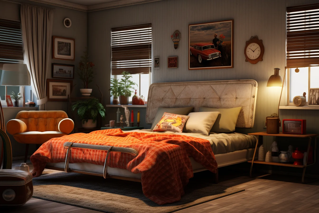
70s and 80s references do not need the same palette
If you like the warmer 1970s concepts, use earthy tones and texture as the main signal. If you prefer the 1980s-inspired rooms, let graphic contrast or one brighter accent do more of the work. Mixing every decade-specific cue at once can make the room look like a prop set rather than a personal bedroom.
A simple way to keep it coherent is to choose one decade for the dominant color story, then borrow only one secondary feature from another era.
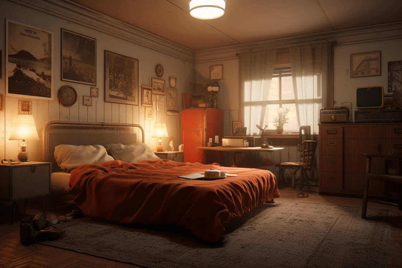
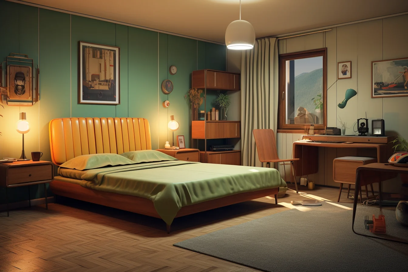
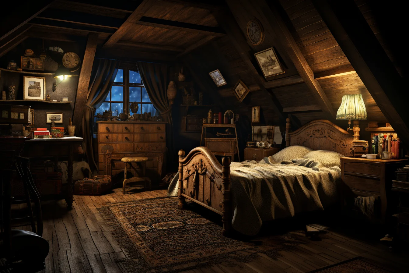
Vintage, boho and dark retro need different levels of restraint
A vintage or boho-retro bedroom can handle more layered textiles, warm lamps and mixed second-hand pieces because variation is part of the appeal. A dark retro room needs more restraint: keep the bedding or walls dark if you like, but preserve lighter areas around the bed and storage so the room does not become visually flat.
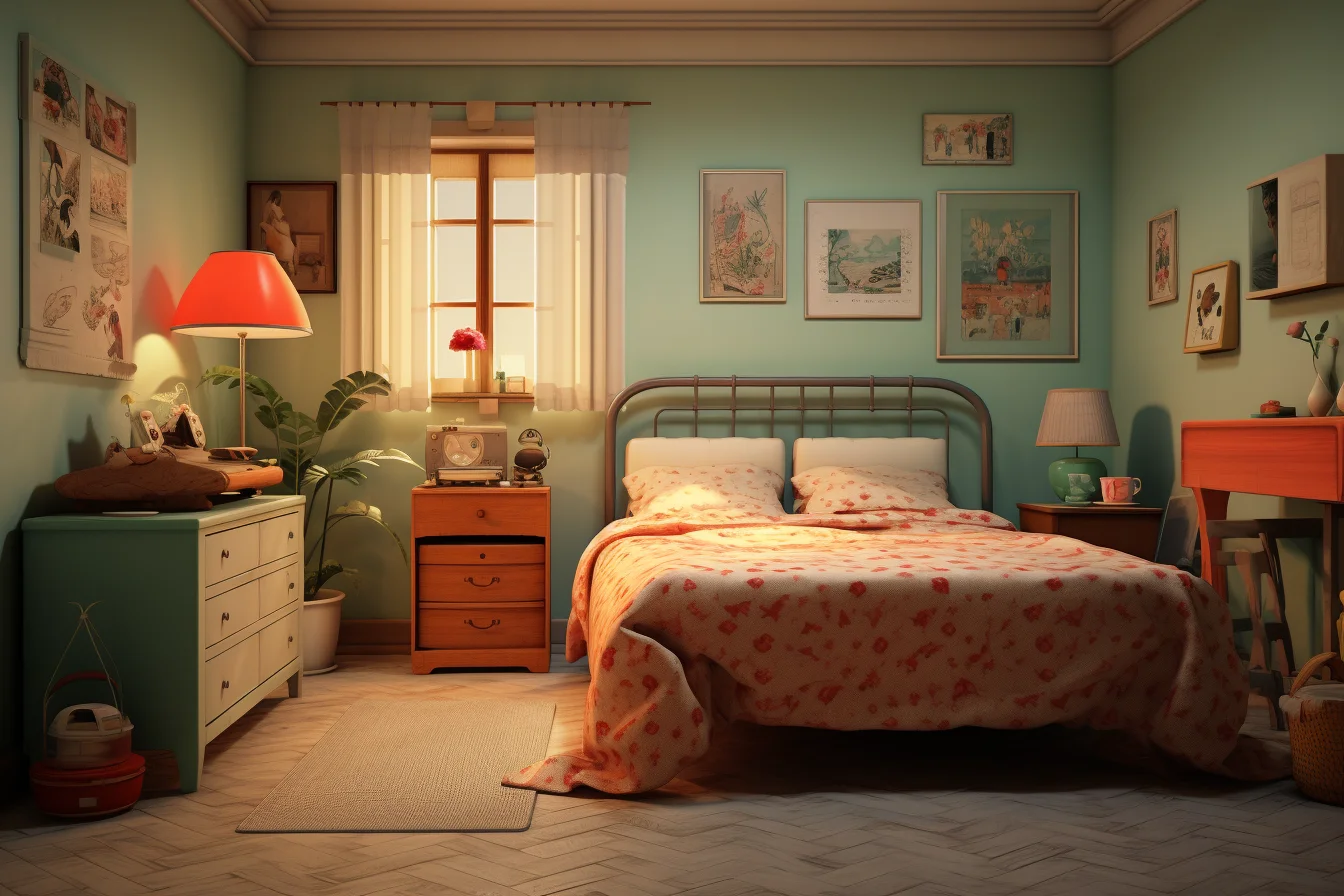
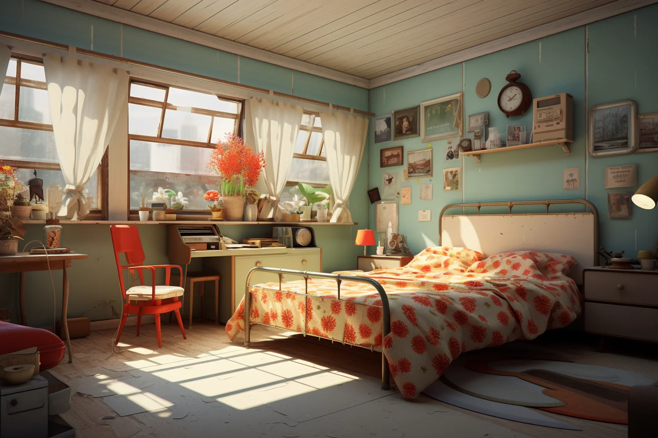
Modern retro works best when the room still functions like a modern bedroom
Keep the mattress, wardrobe, charging points and task lighting practical. Then introduce the retro character through one or two high-impact choices—a curved bedside table, a patterned rug, a colored lamp, framed graphics or a distinctive headboard. This keeps the style readable without sacrificing storage or comfort.
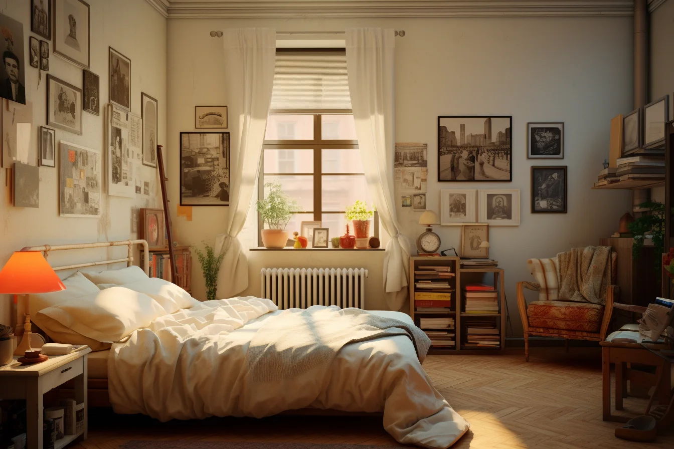
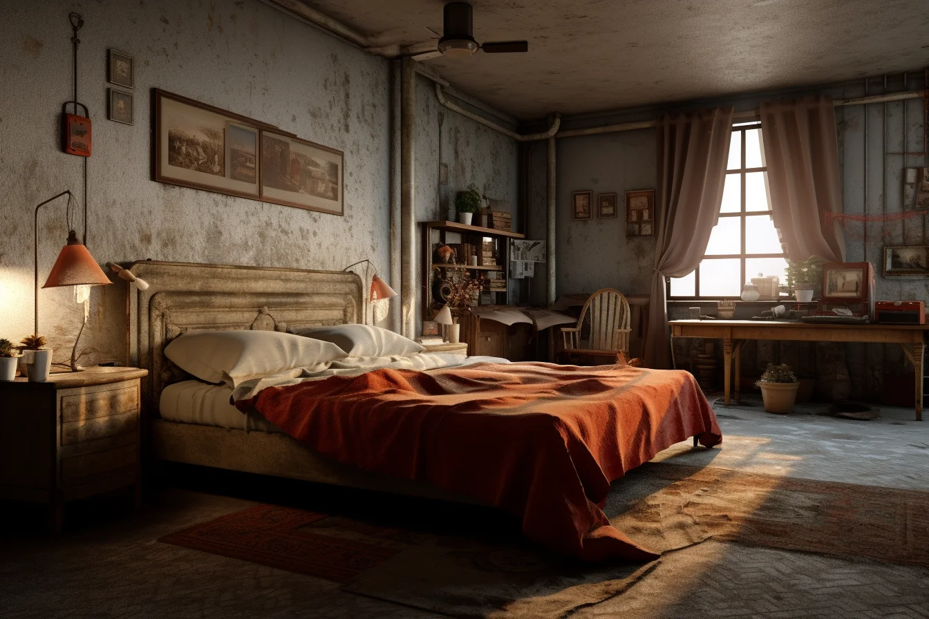
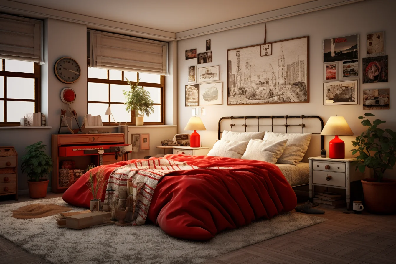
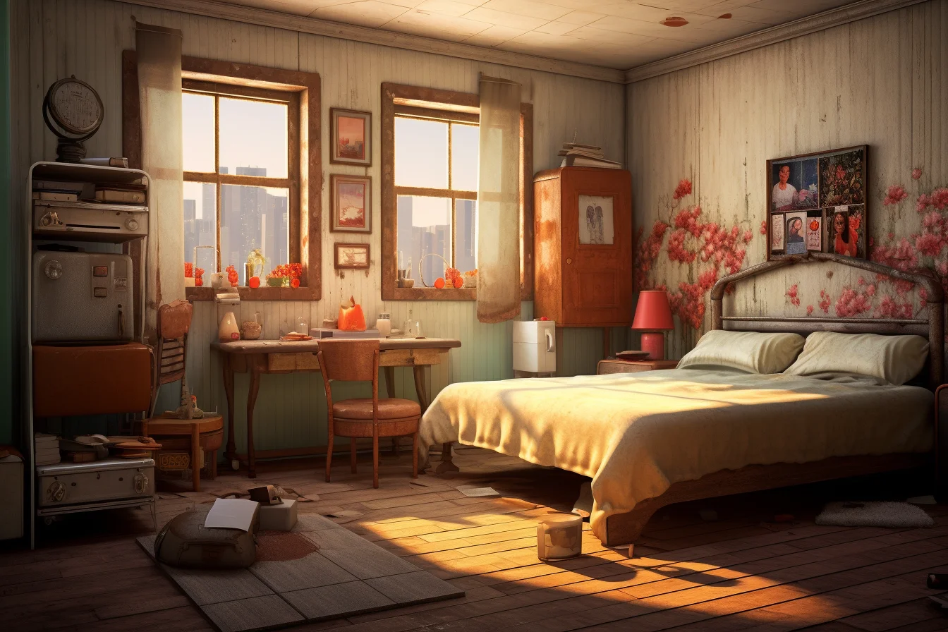
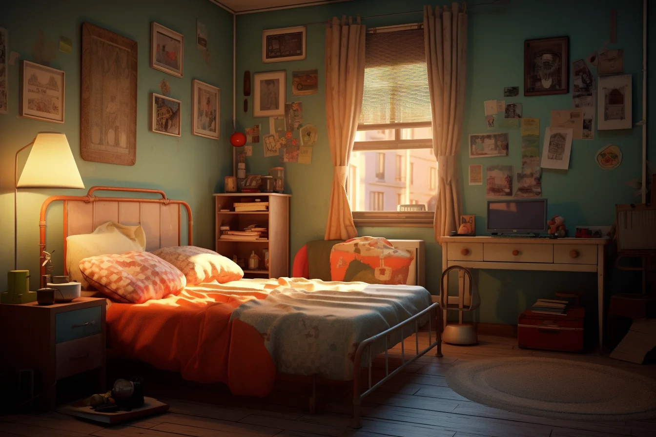
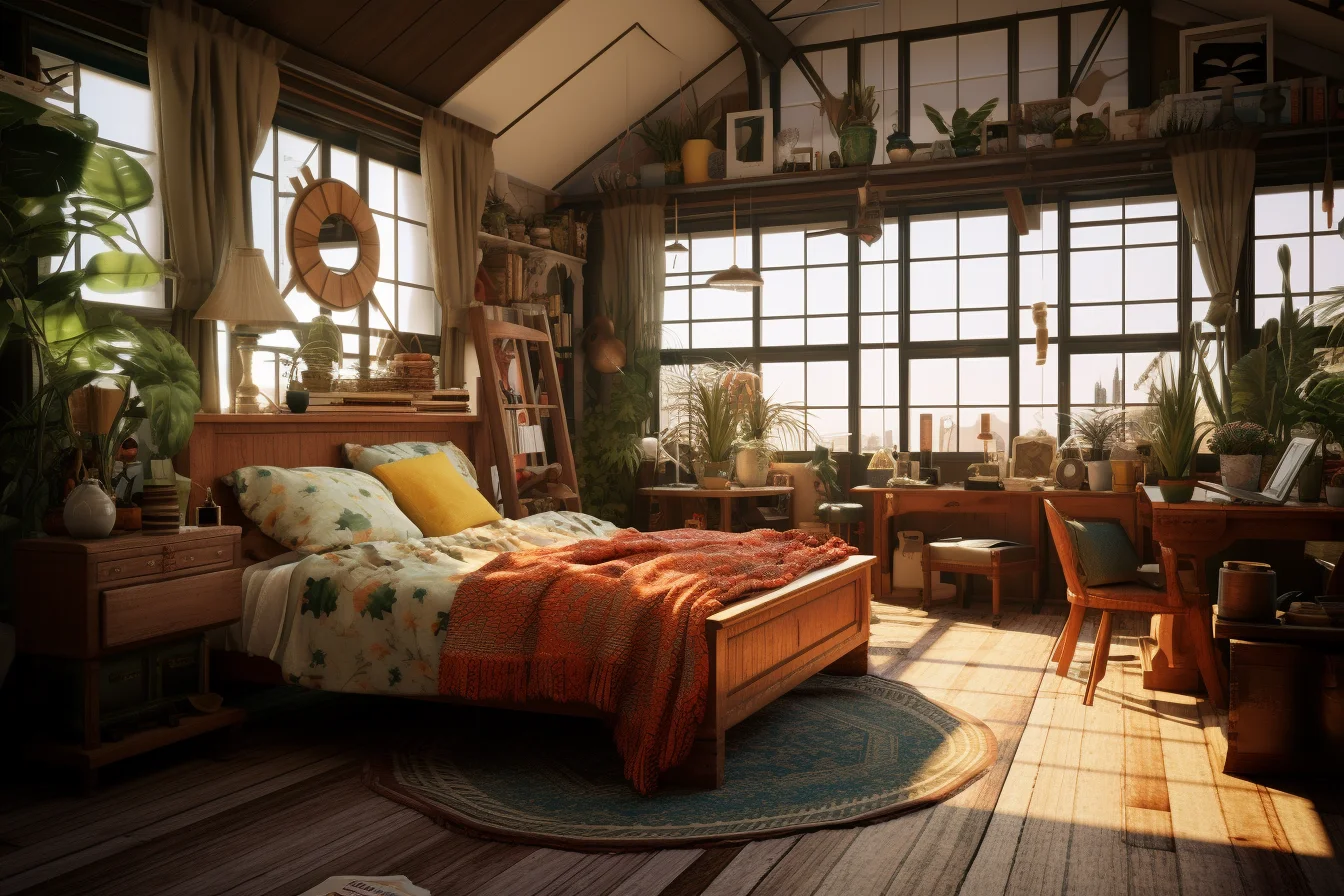
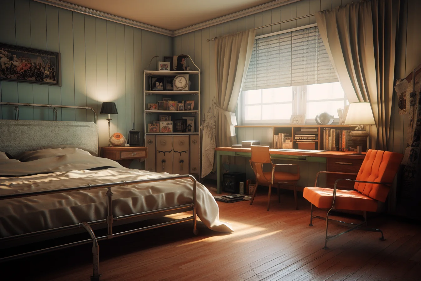
Spend first on furniture you will actually keep
If you are buying specifically for the look, a bedside table, dresser, lamp or chair is a safer retro investment than a heavily themed bed frame. Smaller pieces are easier to move, resell or combine with a different style later. You can push the decade harder with bedding and artwork because those are inexpensive to change.
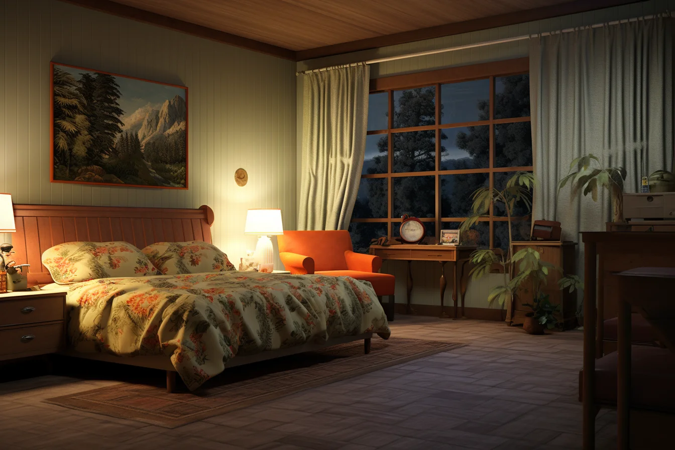
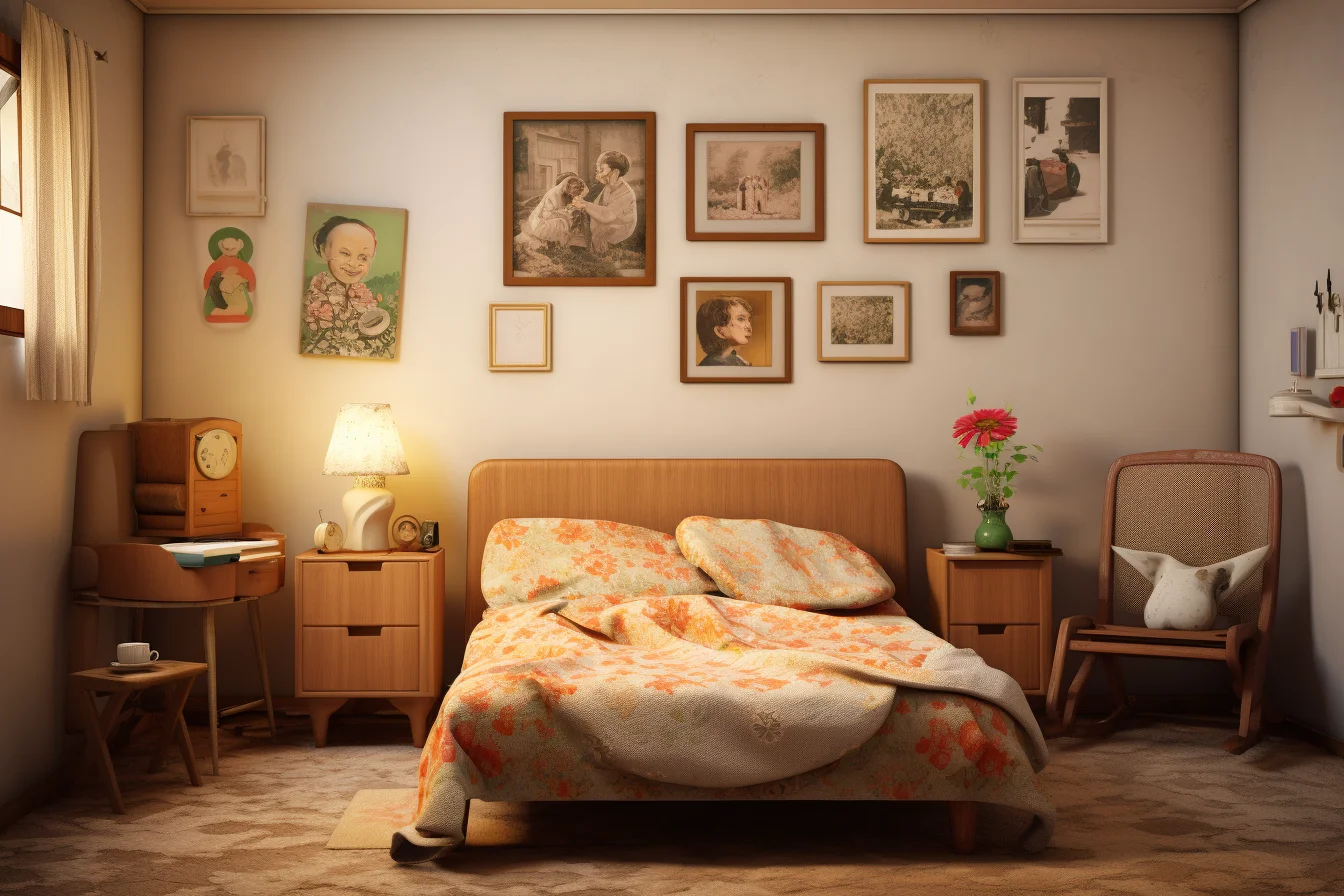
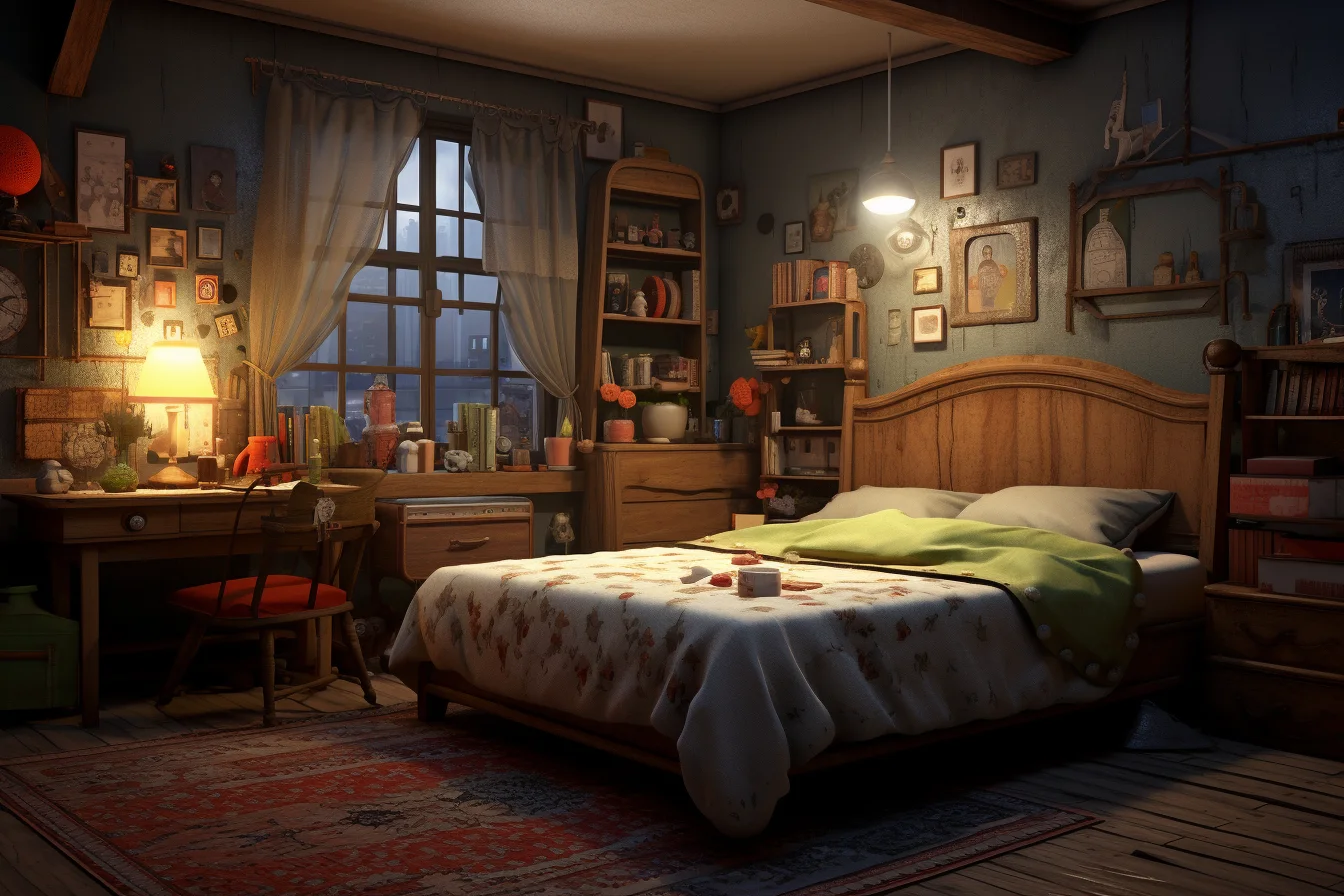
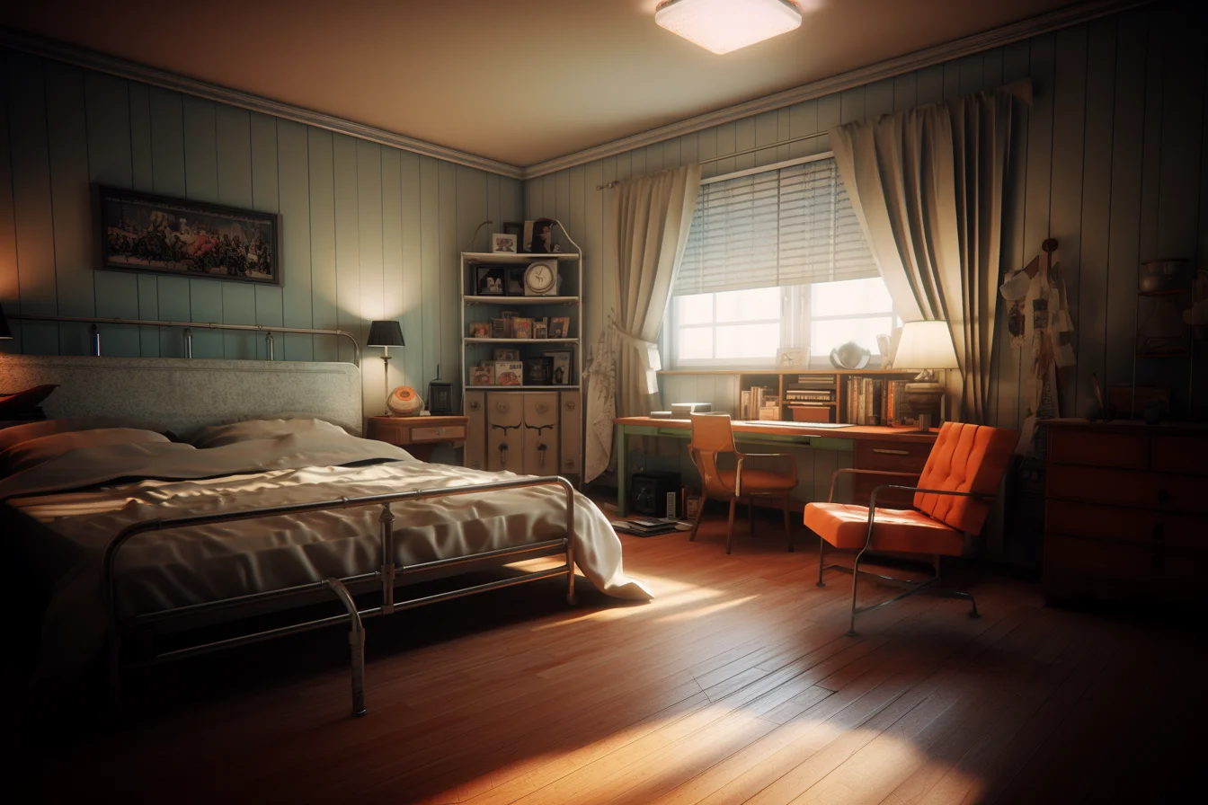
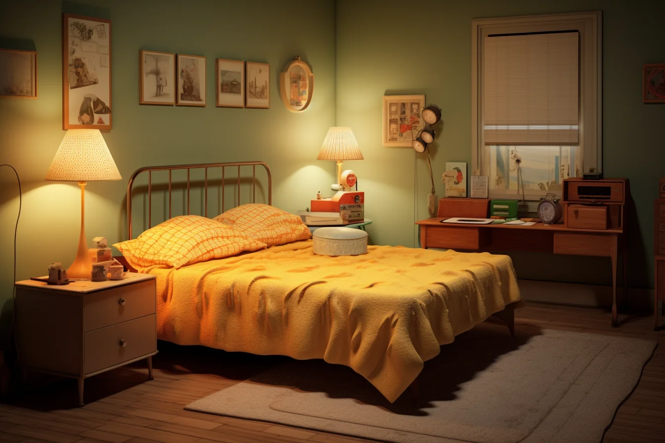
Build a retro bedroom without turning it into a costume set
The most reliable approach is to separate the room into permanent, semi-permanent and easy-to-change decisions. That lets the retro character feel deliberate without making every future update expensive.
- Start with the room’s constraints. Measure the bed wall, wardrobe clearance, outlets and walking routes before buying vintage furniture. Older dressers and nightstands can be deeper or wider than contemporary equivalents.
- Choose one era as the lead. Pick 1970s warmth, 1980s graphics, softer vintage or modern retro. Use other decades only as supporting references.
- Set a three-color palette. Give one color most of the visual area, a second color a supporting role and save the strongest accent for smaller pieces.
- Add one unmistakable retro shape. A mushroom-style lamp, rounded nightstand, curved headboard or geometric rug can establish the direction without themed decor everywhere.
- Layer texture after color. Corduroy-like upholstery, shaggy or flatwoven rugs, timber, chrome and patterned textiles should reinforce the chosen era rather than compete with it.
- Edit before adding more. If the room already reads as retro from across the doorway, another themed accessory probably is not necessary.
Three retro palettes that are easier to live with
| Direction | Main colors | Material cue | Best approach |
|---|---|---|---|
| Warm 70s | Cream, tobacco brown, burnt orange | Warm timber and tactile fabric | Let orange act as an accent rather than covering every surface |
| Graphic 80s | Off-white, black, one saturated accent | Gloss, metal or bold geometric textile | Keep the background quieter so the graphic elements remain readable |
| Soft vintage | Dusty green, muted rose, warm neutral | Aged-looking timber and layered fabric | Mix pieces by color and proportion instead of trying to match a complete set |
Always compare samples in the actual bedroom. Warm bulbs can deepen brown and orange dramatically, while strong daylight can make a muted vintage palette look much paler than it did in a shop.
Diagnose a retro room that does not feel right
| Problem | Likely cause | First fix |
|---|---|---|
| It looks like a themed set | Too many obvious period references | Remove the smallest themed accessories and keep the strongest one or two pieces |
| The colors feel chaotic | Every retro color has equal importance | Choose one dominant neutral or earthy tone and reduce the number of accents |
| Second-hand furniture looks random | Nothing repeats across the room | Connect pieces through hardware, wood tone, lamp finish or textile color |
| A 70s room feels muddy | Brown, orange and dark timber have similar visual weight | Add cream bedding, a lighter wall or another clearly pale surface |
| An 80s room feels harsh | Too much hard contrast and gloss | Add a larger soft textile or warm neutral area |
| The room feels crowded | Statement furniture occupies too much floor area | Keep one substantial vintage piece and simplify the furniture around it |
Buying vintage furniture: check function before patina
Second-hand furniture can give a retro bedroom character that new themed pieces struggle to reproduce, but inspect it as furniture first. Check whether drawers run properly, legs are stable, doors close, hardware is secure and the dimensions actually work beside your bed or wardrobe. Ask about obvious odors, moisture damage or repairs when buying remotely.
You do not need every piece to be genuinely old. Combining one older dresser or bedside table with a modern bed and storage can make the room easier to maintain. If you prefer a more layered, textile-heavy direction, the boho bedroom ideas page takes that approach further; for a calmer contemporary contrast, compare the Scandinavian bedroom ideas.
Retro bedroom questions
How do I mix 70s and 80s decor?
Give one decade control of the palette and let the other contribute a single shape, graphic or material. For example, keep a warm 70s brown-and-cream base and introduce one sharper 80s lamp or print rather than splitting the room equally between both decades.
Can a small bedroom handle retro furniture?
Yes, but measure carefully. One distinctive bedside table, lamp or compact dresser usually works better than several bulky vintage-style pieces. Preserve the walking route and usable storage before adding decorative furniture.
How can I make a retro bedroom look modern?
Keep the functional backbone contemporary: simple bedding, practical storage, good charging access and uncluttered surfaces. Then use retro color, lighting, furniture silhouettes or artwork as the visible layer.
What is the cheapest way to change the look?
Start with bedding, a lamp shade or lamp, framed graphics and one repeated accent color. Those changes can establish a decade more efficiently than replacing the bed or wardrobe.
A simple retro-bedroom checklist
- Choose one dominant era or mood before mixing references.
- Keep the bed, storage and lighting practical first.
- Repeat two or three colors instead of using every “retro” color at once.
- Use textiles and artwork for the easiest low-cost changes.
- Leave some plain surfaces so patterned pieces have room to stand out.
- For a small bedroom, choose one statement item rather than several bulky vintage-style pieces.
The most convincing retro bedrooms look collected rather than staged. If a room already has a strong rug, lamp or headboard, let that piece lead the rest of the palette instead of adding more decorations simply because they fit the theme.

