
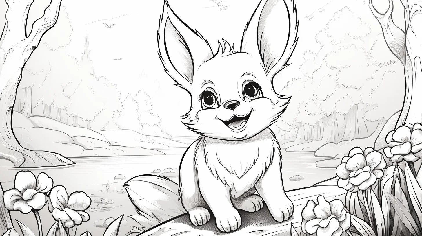
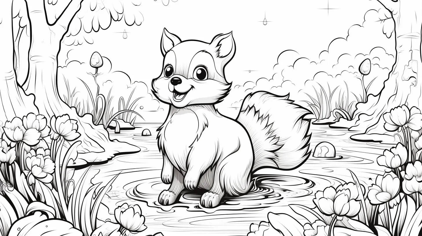
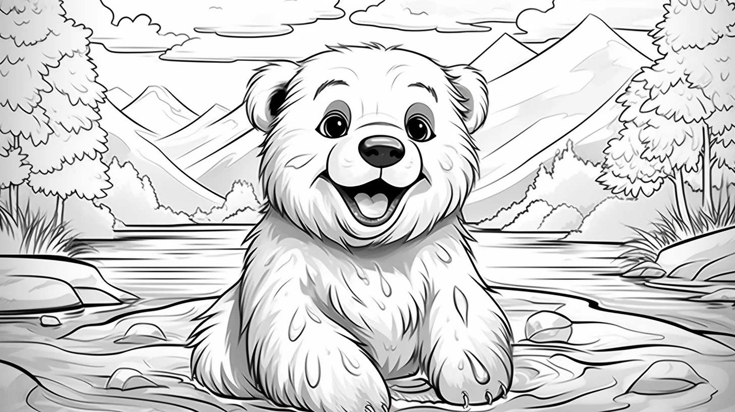
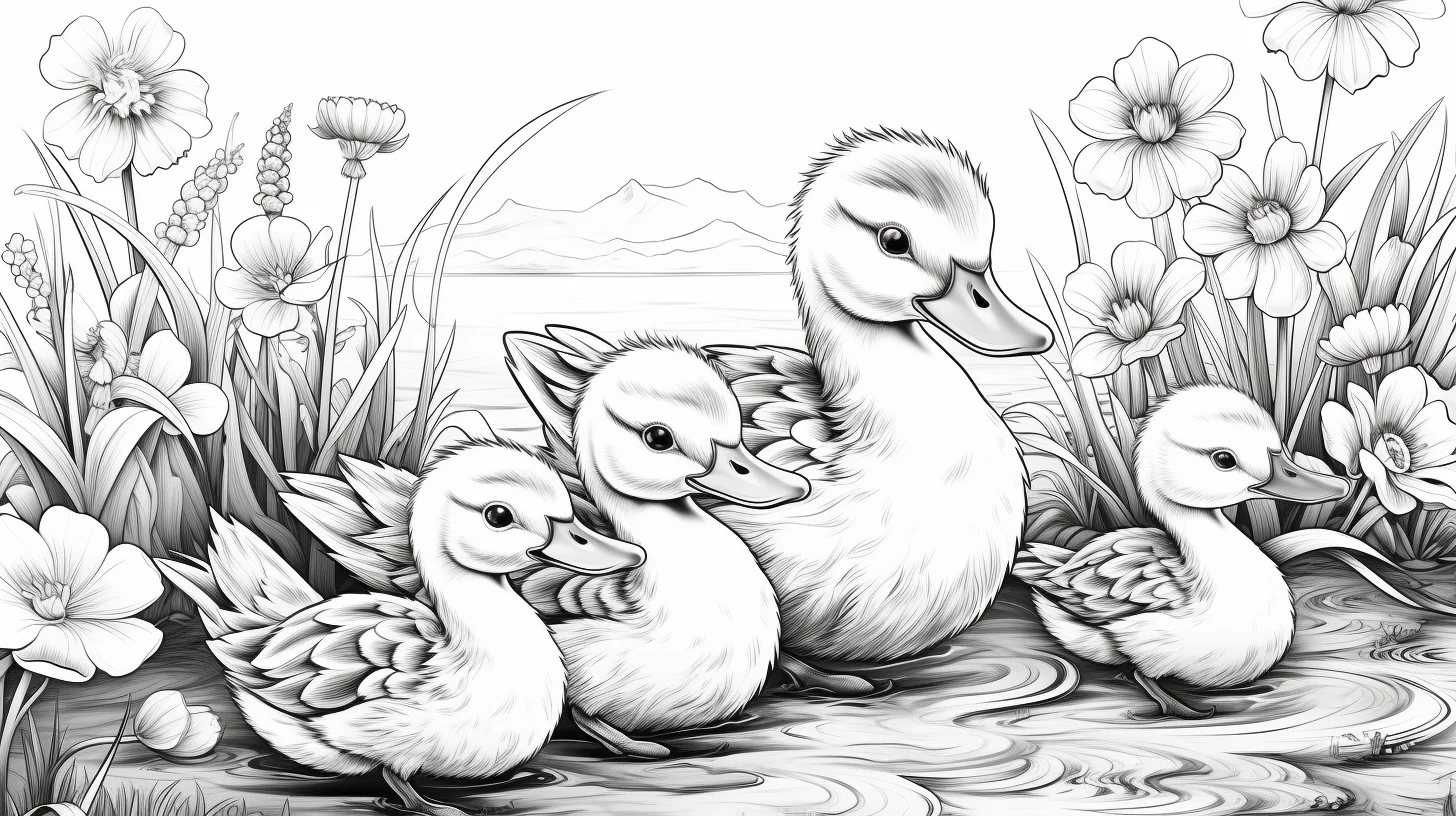
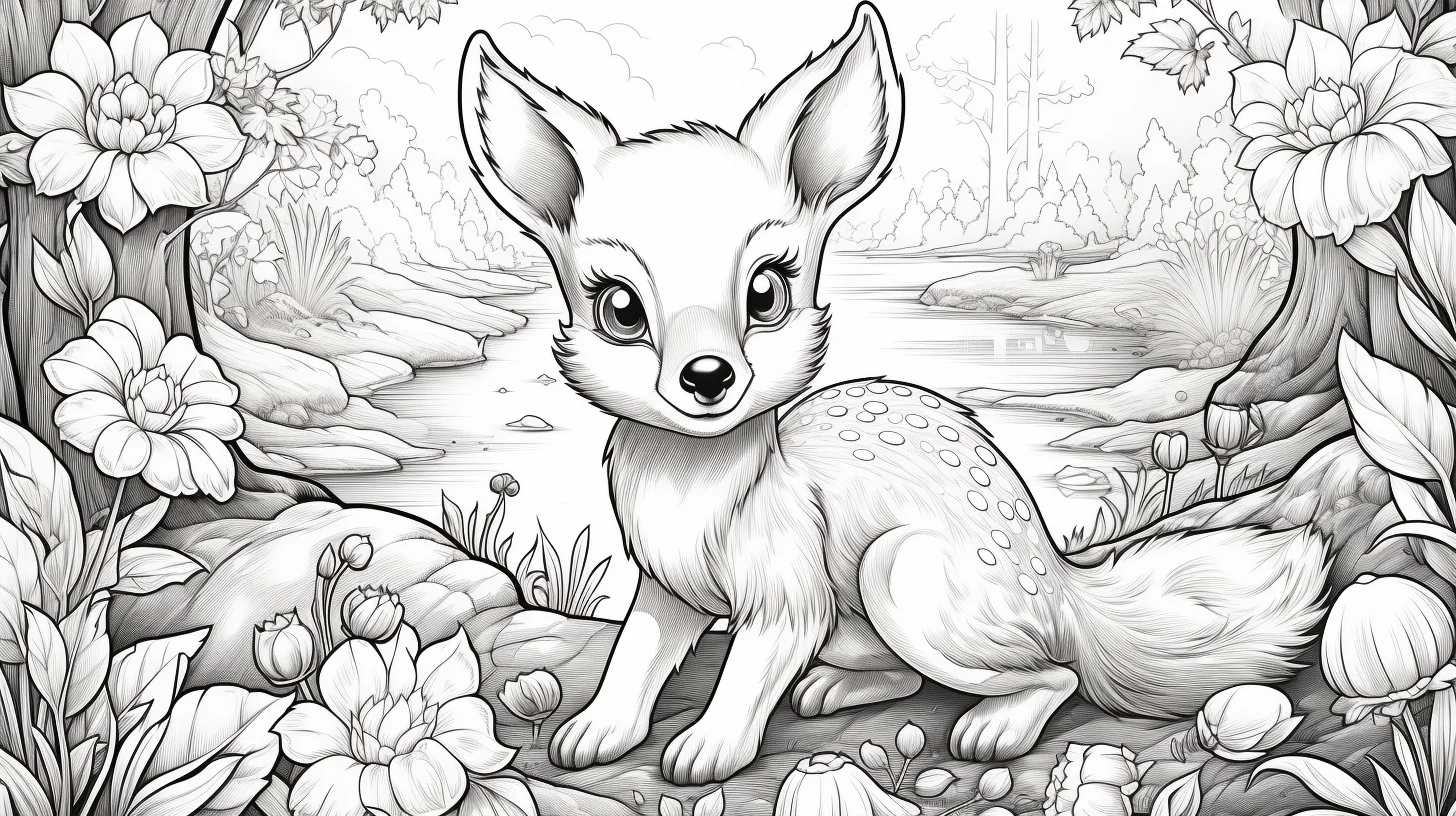
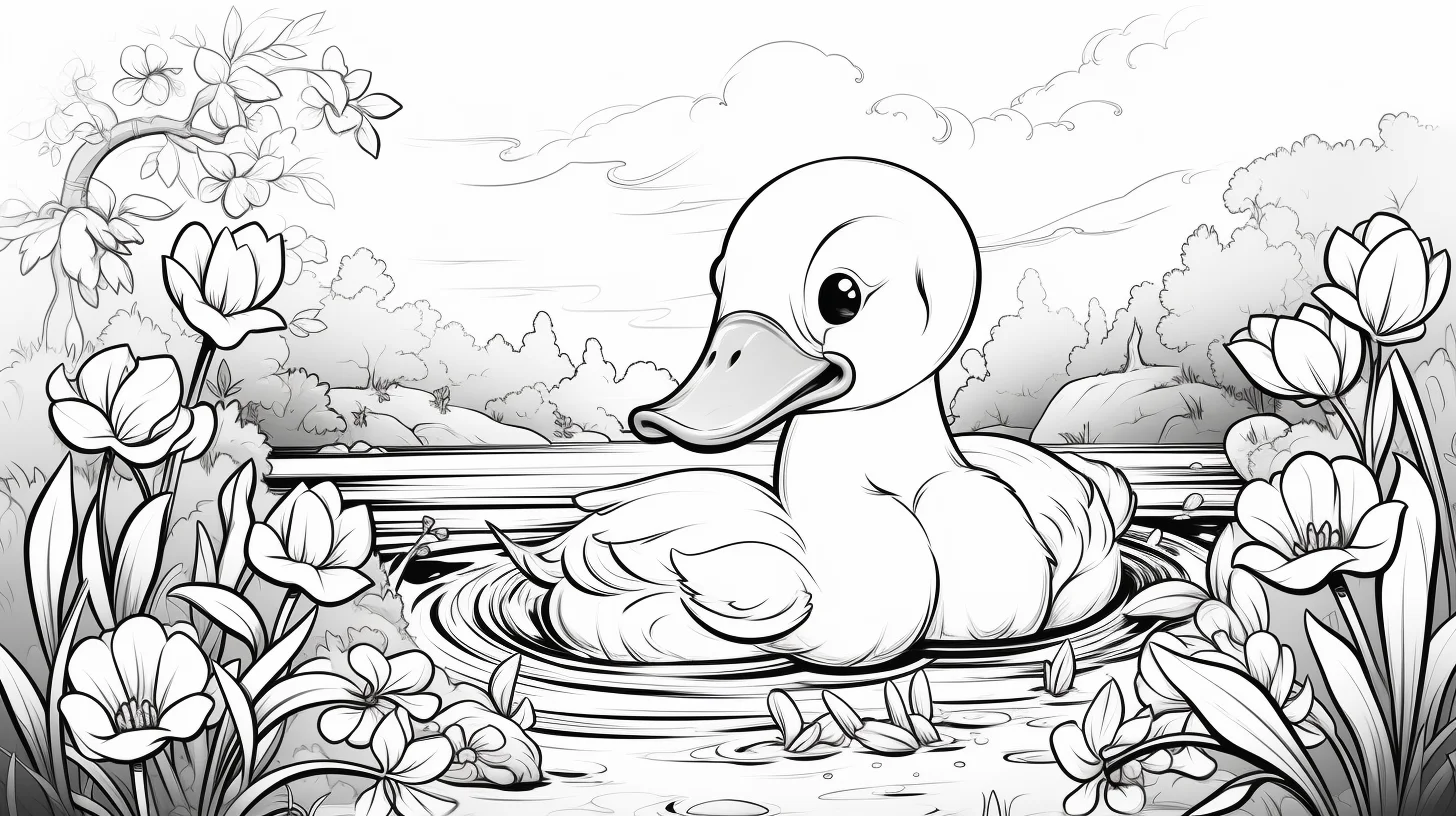
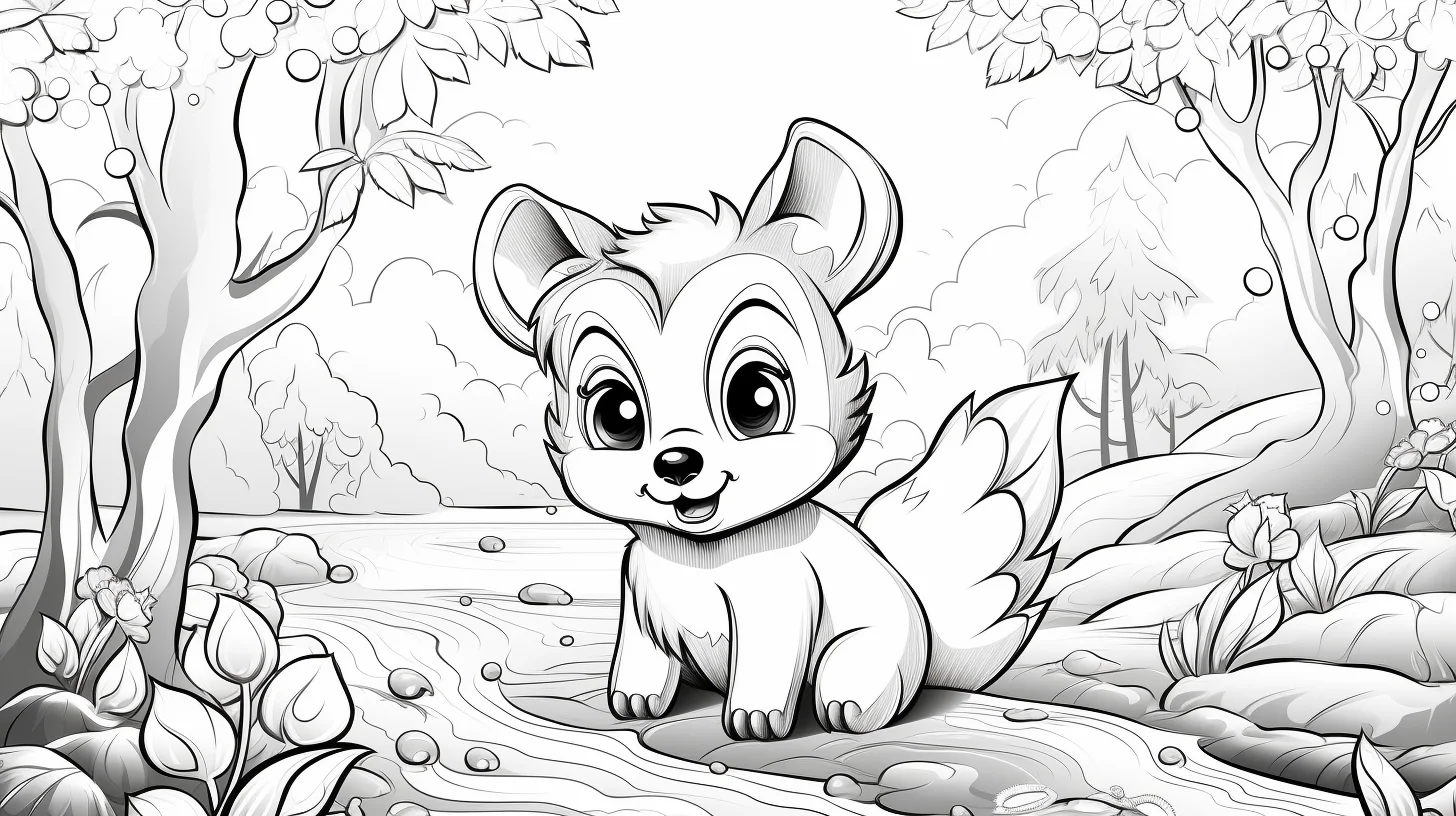
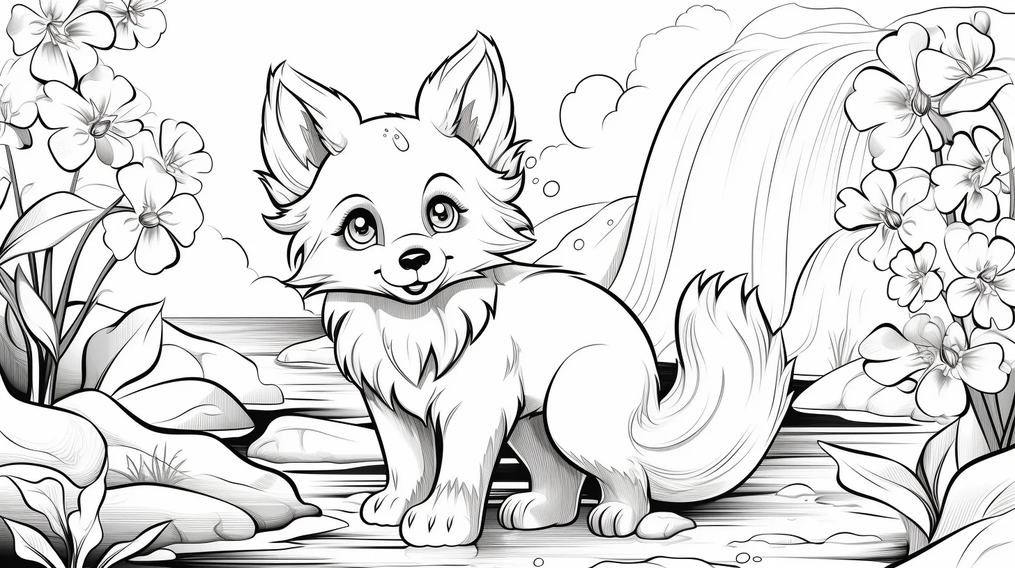
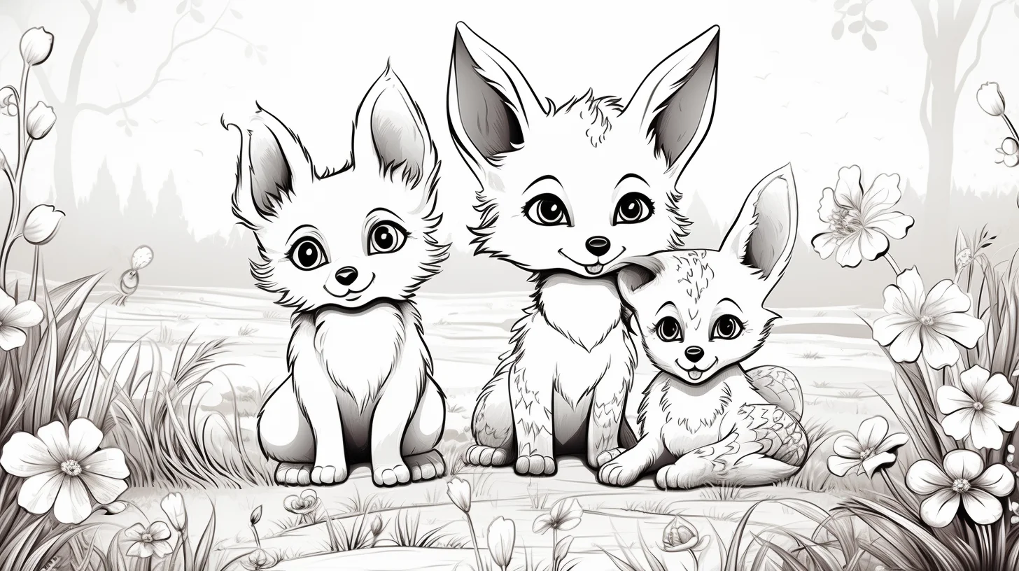
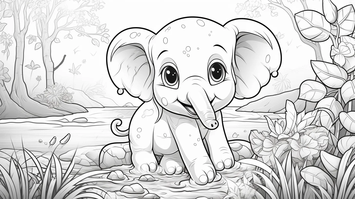
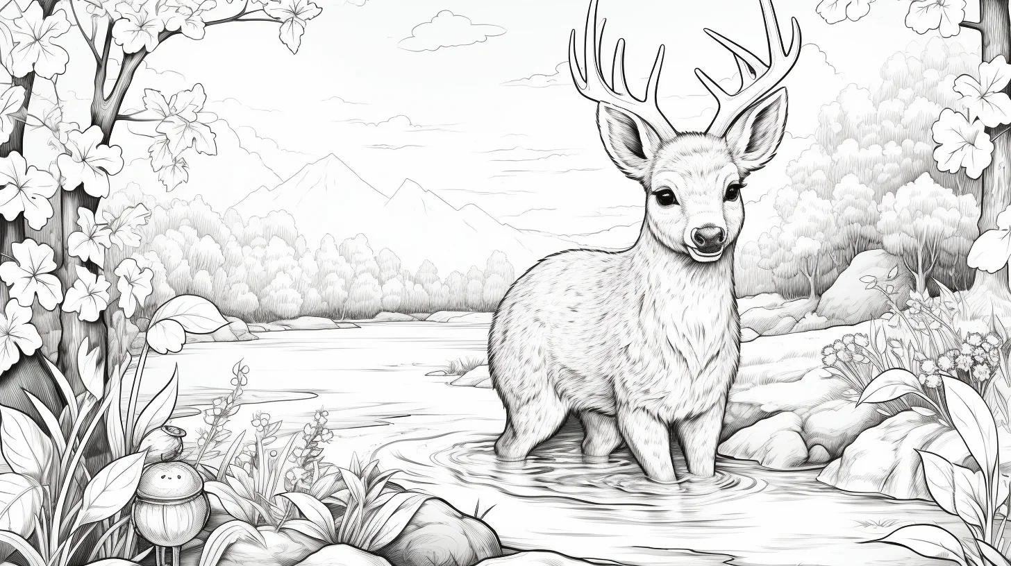
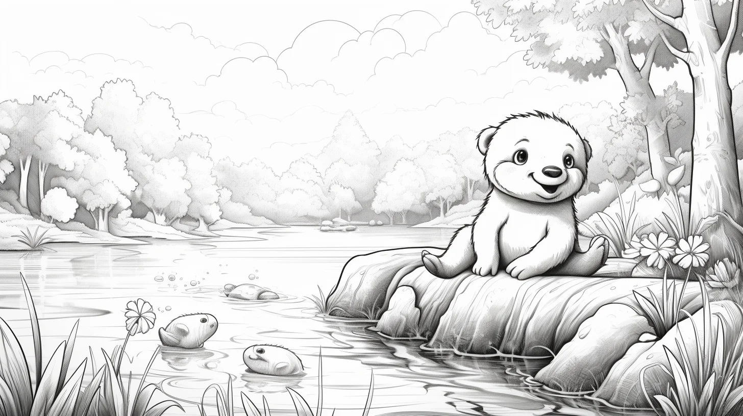
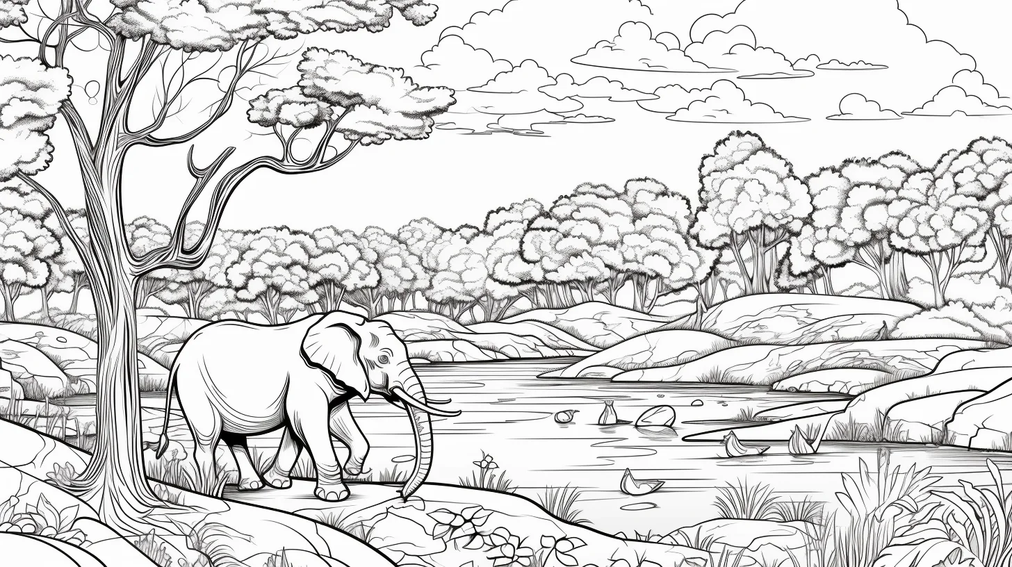
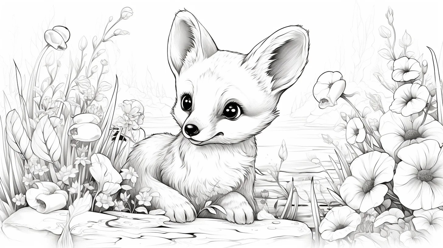
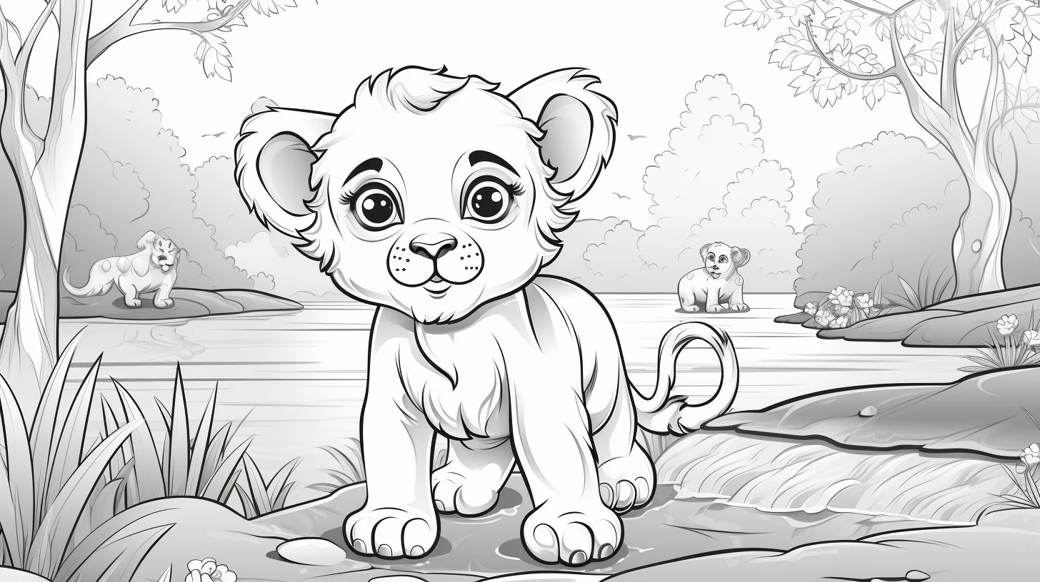
This is the most scene-heavy animal collection on the site. The 20 pages are wide, landscape-style drawings where the surroundings matter almost as much as the animal: trees, water, grass, rocks, plants and other habitat details fill much more of the page than they do in our simpler animal sets.
Choose this collection when you want a longer coloring session or when a single animal floating on a white background feels too basic. If you are printing for a younger child who mainly wants one large animal to color, the cute animal coloring pages will probably be a better fit.
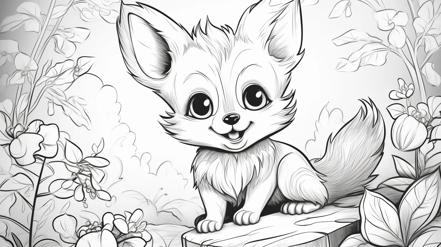
Before you print, check the background density
| If the scene has… | Expect… | Best tool |
|---|---|---|
| One animal and broad sky/ground | A shorter habitat page | Crayons or pencils |
| Trees, grass and a few rocks | A medium-length session | Colored pencils |
| Water, plants, branches and foreground detail | A slower page with many small decisions | Pencils or fine markers |
Do not assume every leaf, pebble or blade of grass needs its own color. On a dense page, repeating the same two or three greens and leaving some small areas white often makes the scene look cleaner.
These pages work best when you color the scene in layers
- Start with the animal. Pick the main fur, feather or skin colors first so the subject stays visually separate from the background.
- Move to the largest habitat areas. Fill broad sections such as sky, water, grass or soil before working on individual leaves and rocks.
- Add the small details last. Darken shadows, bark, plants and texture only after the larger color blocks are established.
That order prevents the page from becoming a patchwork of tiny colored sections with no clear focal point. Colored pencils are especially useful because they let you keep trees, fur, water and foreground details distinct without covering the line work.
Use the habitat to make the animal stand out
You do not need realistic colors for every leaf and stone. If the animal is warm brown or orange, cooler greens and blues around it can create useful contrast. If the animal is gray or dark, a lighter sky or ground can stop the outline from disappearing into the background.
For water scenes, two or three blue or blue-green shades are usually enough. For woodland pages, vary the greens instead of filling every plant with exactly the same color. The goal is not botanical accuracy; it is making the scene readable and enjoyable to finish.
Printing the landscape pages
Open the full-size file before saving. These drawings are wide, so use landscape orientation on A4 or US Letter paper and select “fit to page.” Check the print preview before you commit—otherwise a printer can crop the edge of a tree, tail or background element even when the animal itself looks centered.
If you want a mixed set with less emphasis on backgrounds, use the zoo and wild animal collection. Tap or click any habitat scene below to open the original file.
A 10-minute test before committing to a detailed habitat page
Dense scenery is much easier when you decide the visual hierarchy before filling every shape. Pick one page and spend the first ten minutes on only four jobs:
- Circle the focal animal with your eyes, not a pen. Decide which edge of the animal needs the strongest light-dark contrast.
- Choose four color families. One for the animal, one for vegetation, one for sky or water, and one earth/rock family is enough to start.
- Test pressure in a corner. Make a light, medium and dark swatch with the same pencil. If all three look nearly identical, reduce pressure before working on fur or distant trees.
- Color one background patch behind the animal. Step back from the page. If the silhouette is still clear, continue; if it disappears, lighten or cool that background area before coloring the rest.
This small test catches the two mistakes that are hardest to repair later: a background that competes with the animal and a palette with no room left for darker accents.
Match the coloring method to the part of the habitat
| Area | Useful method | What to avoid |
|---|---|---|
| Fur or feathers | Light base layer, then a few directional strokes | Texturing every millimeter equally |
| Grass and leaves | Repeat 2–3 related greens; darken only selected clusters | Giving every leaf a unique color |
| Water | Longer strokes that follow the waterline; leave narrow light gaps | Random circular scribbling that reads like fur |
| Rocks and soil | Use value changes more than extra colors | Heavy outlines around every stone |
| Sky and distant scenery | Lighter pressure and lower contrast | Making distant details darker than the animal |
When the page starts feeling crowded, stop adding colors. Repeat colors you have already used and change only pressure or value. A limited palette is not a shortcut here; it is what keeps a detailed habitat readable.
Diagnose the scene before adding more color
| If the page looks… | Likely cause | Try this |
|---|---|---|
| Flat | Animal and habitat have similar values | Darken one area behind the animal or keep the nearest background lighter. |
| Busy | Every small shape has a different color | Repeat a limited palette across leaves, rocks and ground. |
| Muddy | Too many layers or heavy pressure | Use lighter pencil pressure and build only the focal areas. |
| Hard to read | Foreground and background have equal contrast | Keep distant scenery softer and reserve the darkest marks for the animal and nearby details. |
| Unfinished | Large sky, water or ground areas were left until last | Block in the biggest habitat shapes early, then return to texture. |
A three-page habitat practice method
- Page one: limit the palette. Pick one animal color family, two greens or earth tones, one sky/water family and one accent. The aim is a readable scene, not maximum variety.
- Page two: practice depth. Color the foreground with stronger contrast, the middle ground with moderate contrast and the far background more lightly. This is especially useful in forest and jungle scenes.
- Page three: practice texture selectively. Add short directional strokes to fur, bark, grass or feathers, but leave broad sky and water areas smoother. Texture works better when it has somewhere quiet to contrast against.
If you are coloring with a child, split the job by layers rather than objects: one person can establish the large habitat areas while the other works on the animal. It keeps a detailed scene manageable without turning every leaf into a separate task.
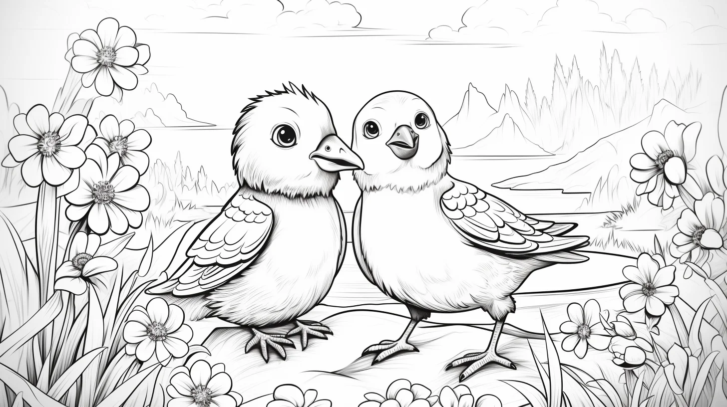
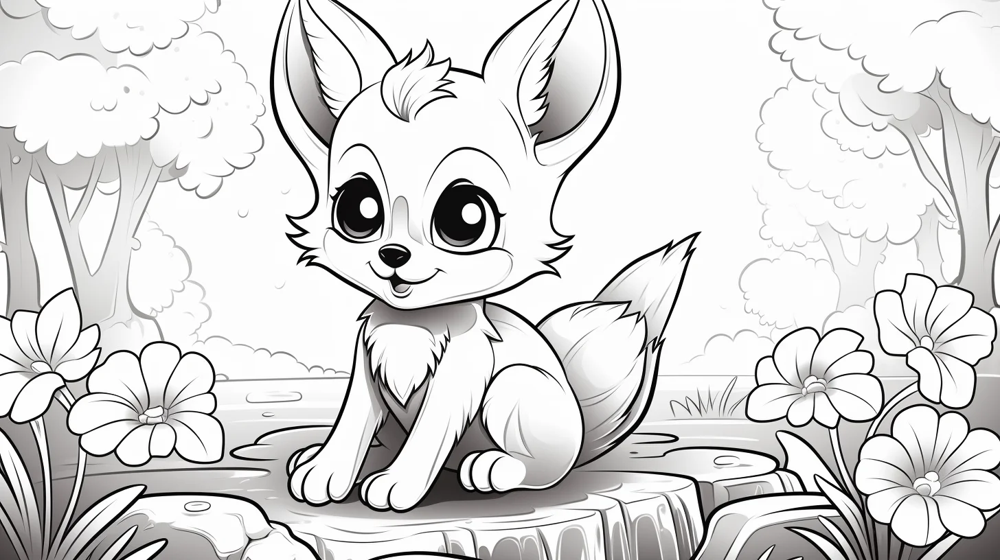
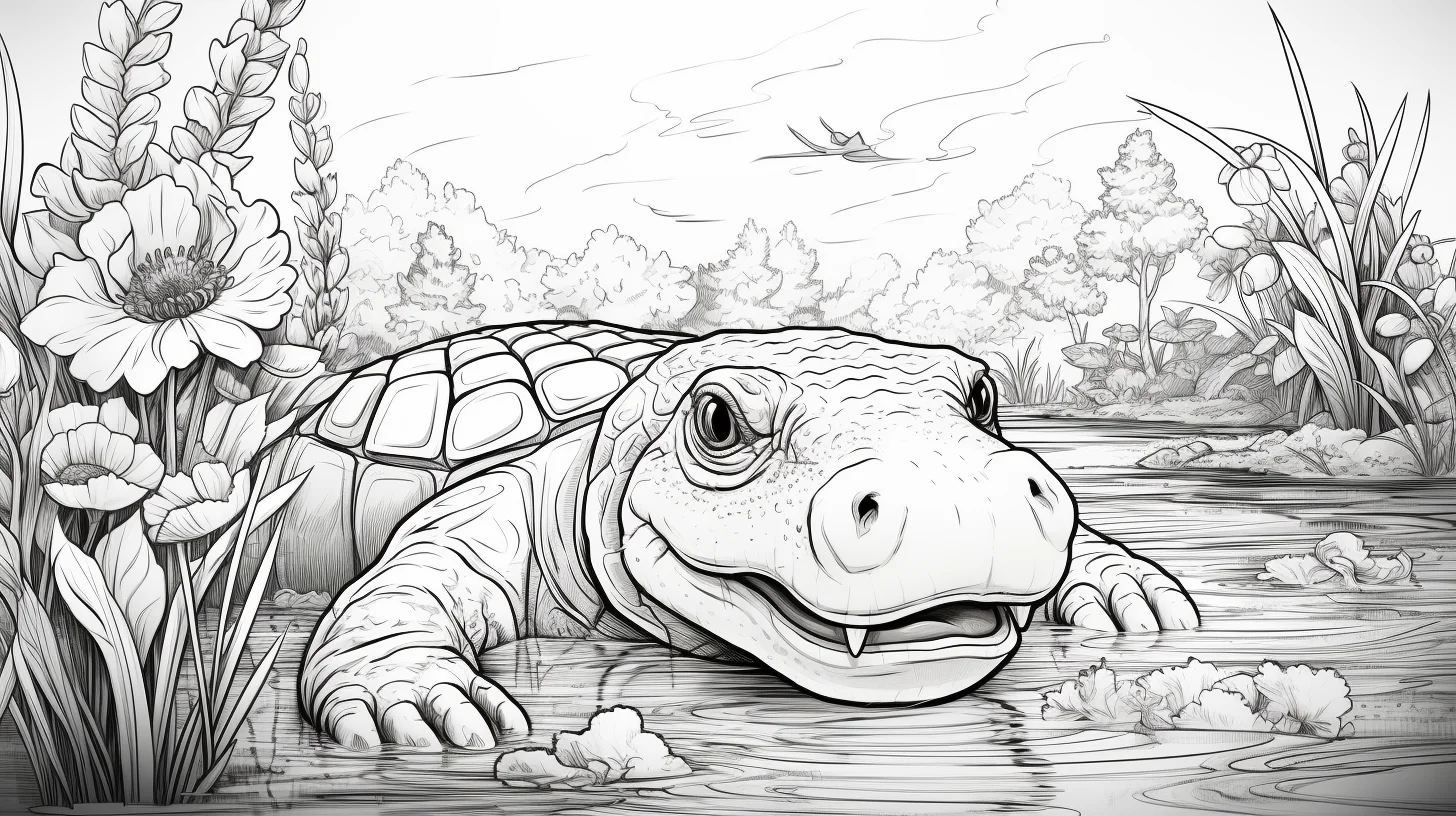

Animal habitat coloring questions
Should I color the animal or the background first?
Usually the animal. Once its main colors are established, it is easier to choose background colors that create contrast instead of blending into the subject.
How do I keep a forest scene from becoming one big green area?
Use a warm green for some plants and a cooler or lighter green for others. You can also leave a few small background shapes white. Variation matters more than using lots of different colors.
What if I want realistic animals but not detailed scenery?
Use the realistic animal coloring pages. That collection focuses more on fur, feathers, markings and anatomy than on the environment.
Are these good for younger kids?
They can be, but choose the scenes with fewer small background sections. For a simpler start, the preschool animal pages or cute animal pages are easier.
More animal coloring pages
For the broadest mix of farm, zoo and jungle animals, use the main animal coloring hub. For young wildlife specifically, try the baby wild animal pages.

