
This gallery contains 20 dragon coloring pages ranging from cute baby dragons to more detailed fantasy and realistic designs. Most sheets are landscape-oriented, so they usually print best in landscape mode.
Choose the dragon collection that fits
| Collection | Best for |
|---|---|
| This 20-page landscape set | A wide-format mix of cute, realistic and detailed dragons. |
| 26 portrait dragon pages | Vertical cute, fire-breathing, baby and realistic dragons. |
| 31 square dragon pages | 1024 × 1024 fantasy designs that work well when you prefer a centered square composition. |
| 33 baby dragon pages | Flying, sleeping, chubby and kawaii baby dragons with more simple options. |
| 23 realistic dragon pages | Detailed portraits, battle scenes, riders, castles and advanced fantasy designs. |
Choose by difficulty inside this 20-page set
| Sheets | What you will find | Best tools |
|---|---|---|
| 1–6 | Cute and easy dragons with larger sections | Crayons or broad pencils |
| 7–9 | Baby dragons with softer, simpler shapes | Crayons or colored pencils |
| 10–13 | General fantasy dragon printables | Colored pencils |
| 14–20 | Adult, hard and realistic designs | Sharp pencils or fine-tip markers |
Do a 90-second scale-and-wing test first
Before coloring a full dragon, use a scrap of the same paper to test the exact pencils or markers you plan to use. Make three small swatches of the body color: light pressure, medium pressure and the darkest layer you can build cleanly. The middle value should still be light enough that black outlines remain crisp.
- Test one scale row. Fill it with the middle value, then darken only the lower edge of two or three scales. If every scale starts looking individually outlined, reduce the contrast.
- Test the wing membrane. Put the body color beside a lighter or darker version intended for the membrane. You should be able to distinguish membrane from wing bone at arm’s length; if not, widen the value gap.
- Protect the face. Compare your darkest body value with the pupil, nostril and mouth line. If those features disappear, keep the head one step lighter and save the darkest accents for the facial details.
- Check pale dragons differently. For white, cream or very light dragons, leave most paper untouched and test a cool gray, pale blue or muted violet only beneath the jaw, belly, wing folds and overlapping limbs.
Now squint at the test. The dragon’s large forms should read before the individual scales. If the scales or wing lines dominate first, lighten the texture rather than adding more detail. This quick check is especially useful before Sheets 14–20, where dense linework makes over-darkening difficult to undo.
A simple way to color wings and scales
Choose the body color first. Then decide whether the wings should be a lighter version of that color or a contrasting second color. Keeping the wing membrane different from the wing bones makes even a simple dragon easier to read.
On detailed dragons, do not give every scale a separate color. Use one base color across a larger area, then darken a few rows or edges. Save the smallest horns, claws and scale accents for last.
- Lay down the main body color.
- Add a second tone to the belly, wing membranes or larger scales.
- Darken the underside of the neck, body and tail for depth.
- Add horns, claws, eyes and tiny decorative details last.
How to print
All 20 sheets in this collection are landscape-oriented. Click or tap the dragon to open the original full-size file, save it, then print in landscape mode using Fit to page. Check the preview so wing tips and tails are not clipped.
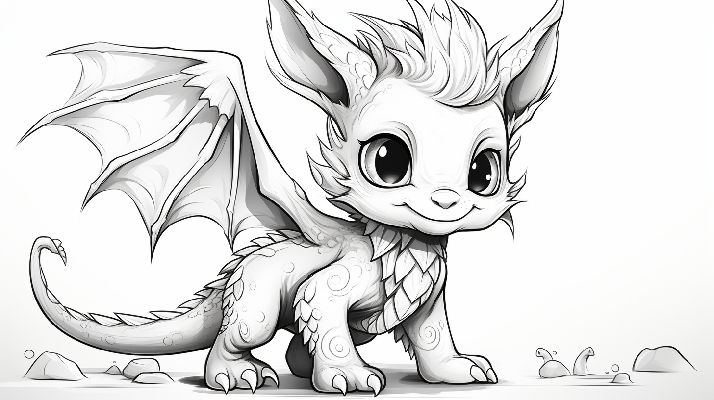
Cute and easy dragons — Sheets 1–6
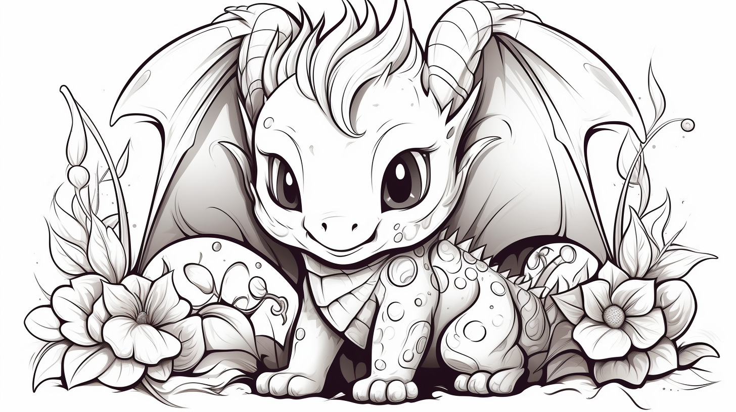
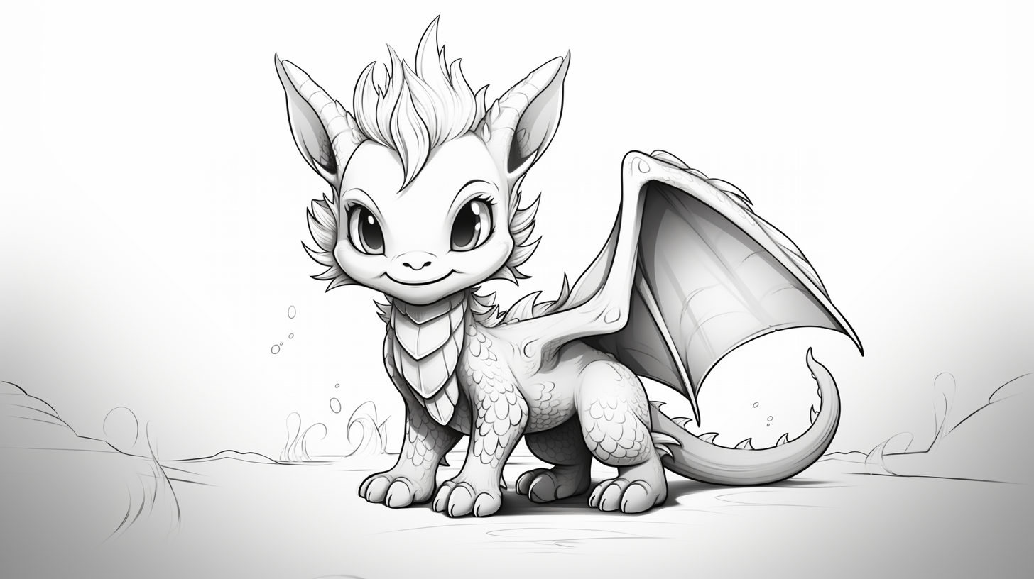
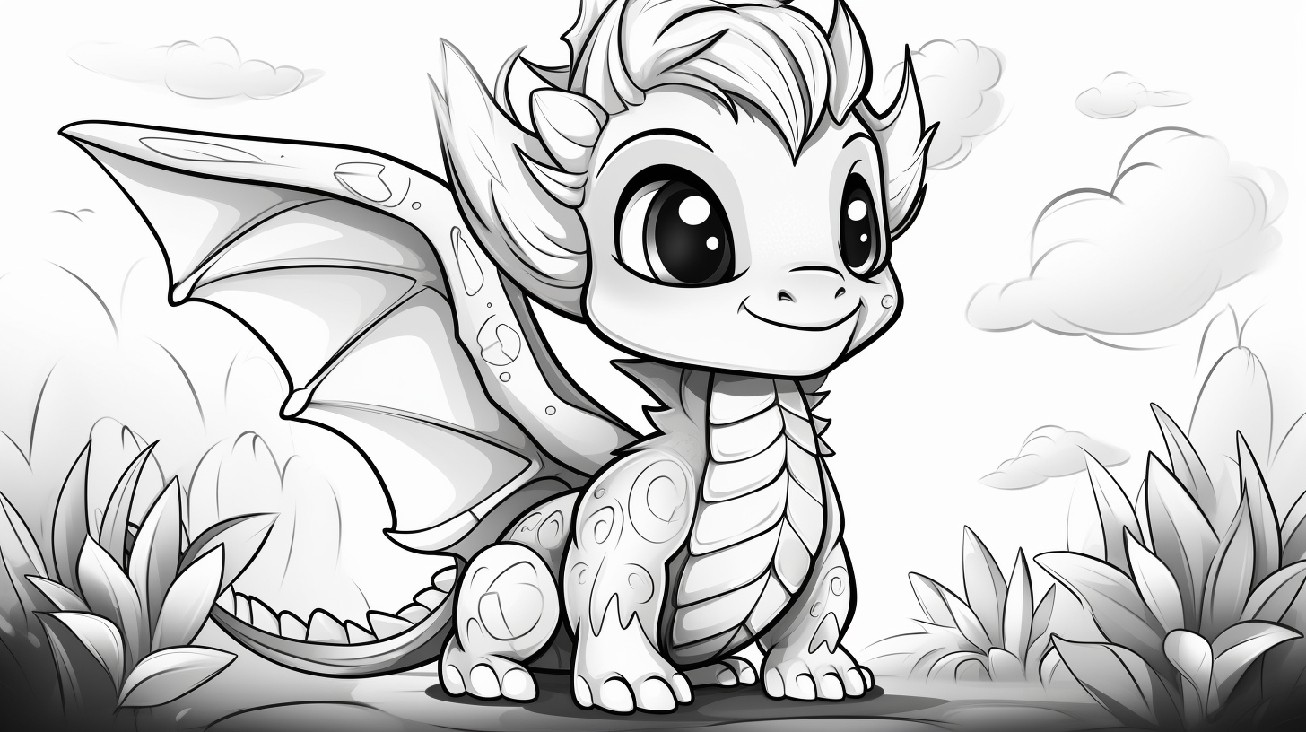
These are the quickest pages in this landscape set. Keep the body to one or two main colors and use the horns, belly or wings as accents instead of trying to make every small feature different.
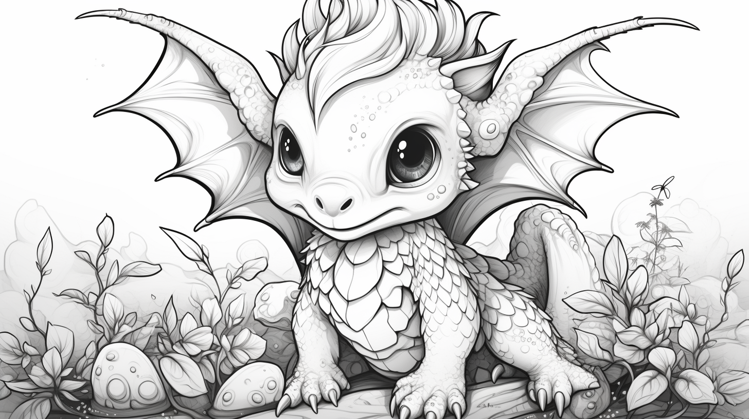
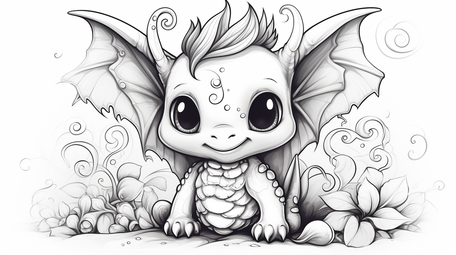
Baby dragons — Sheets 7–9
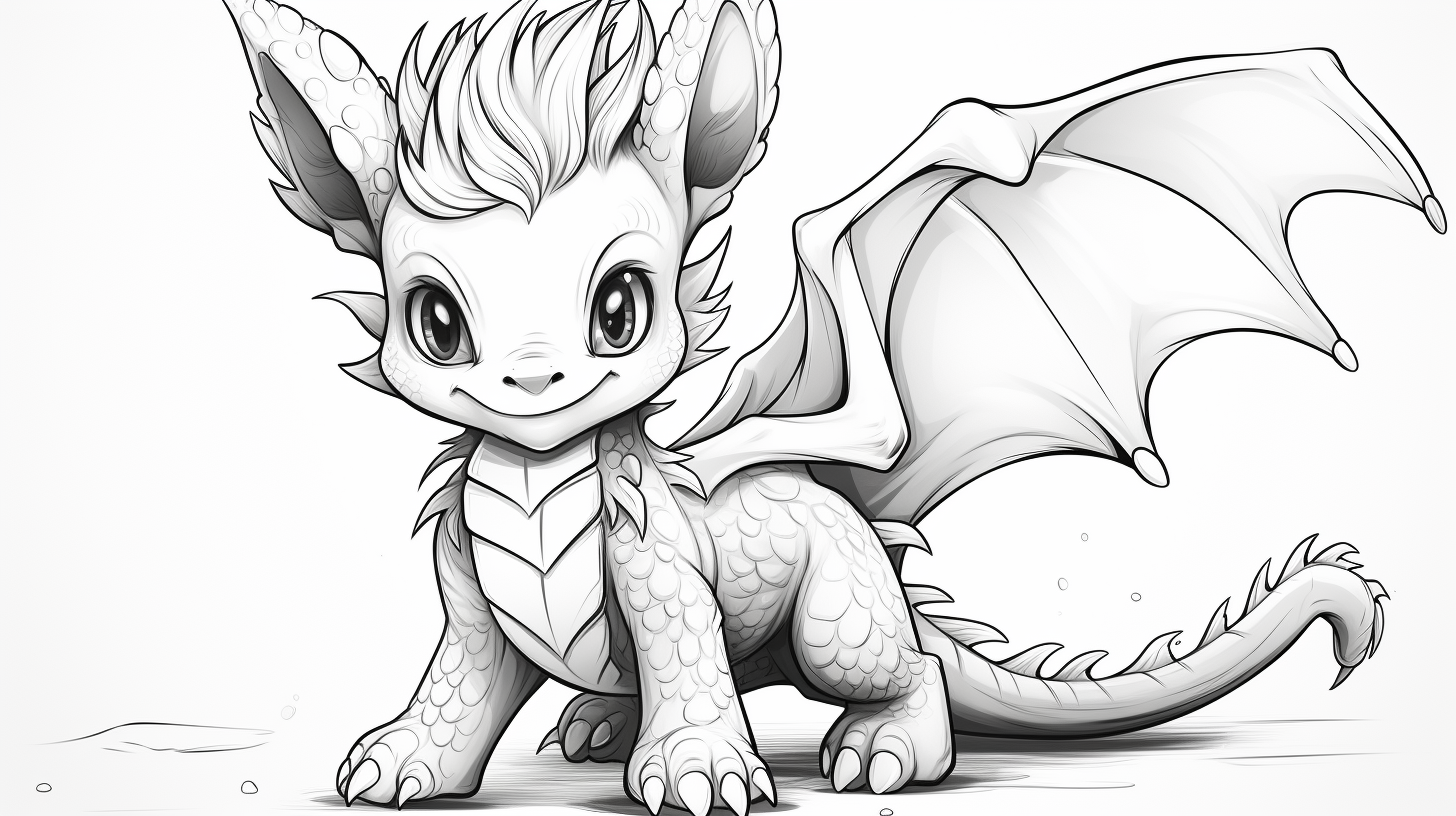
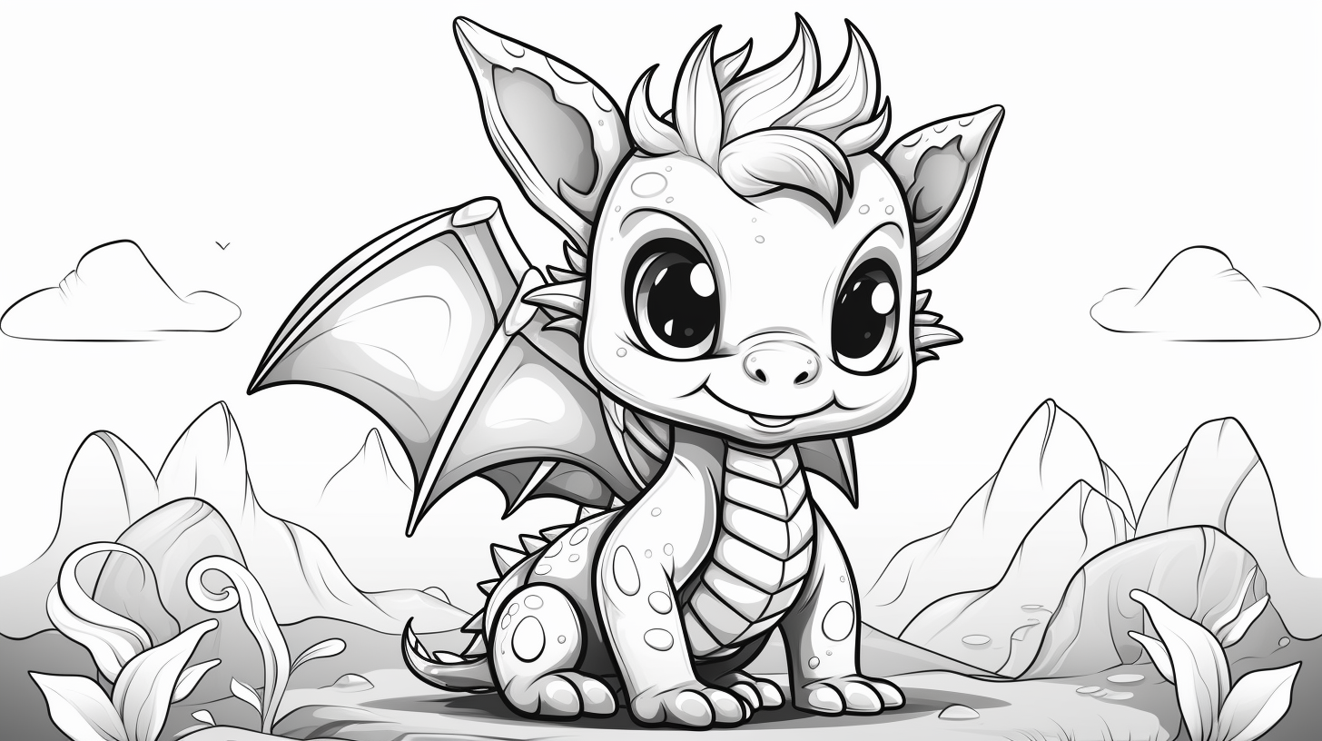
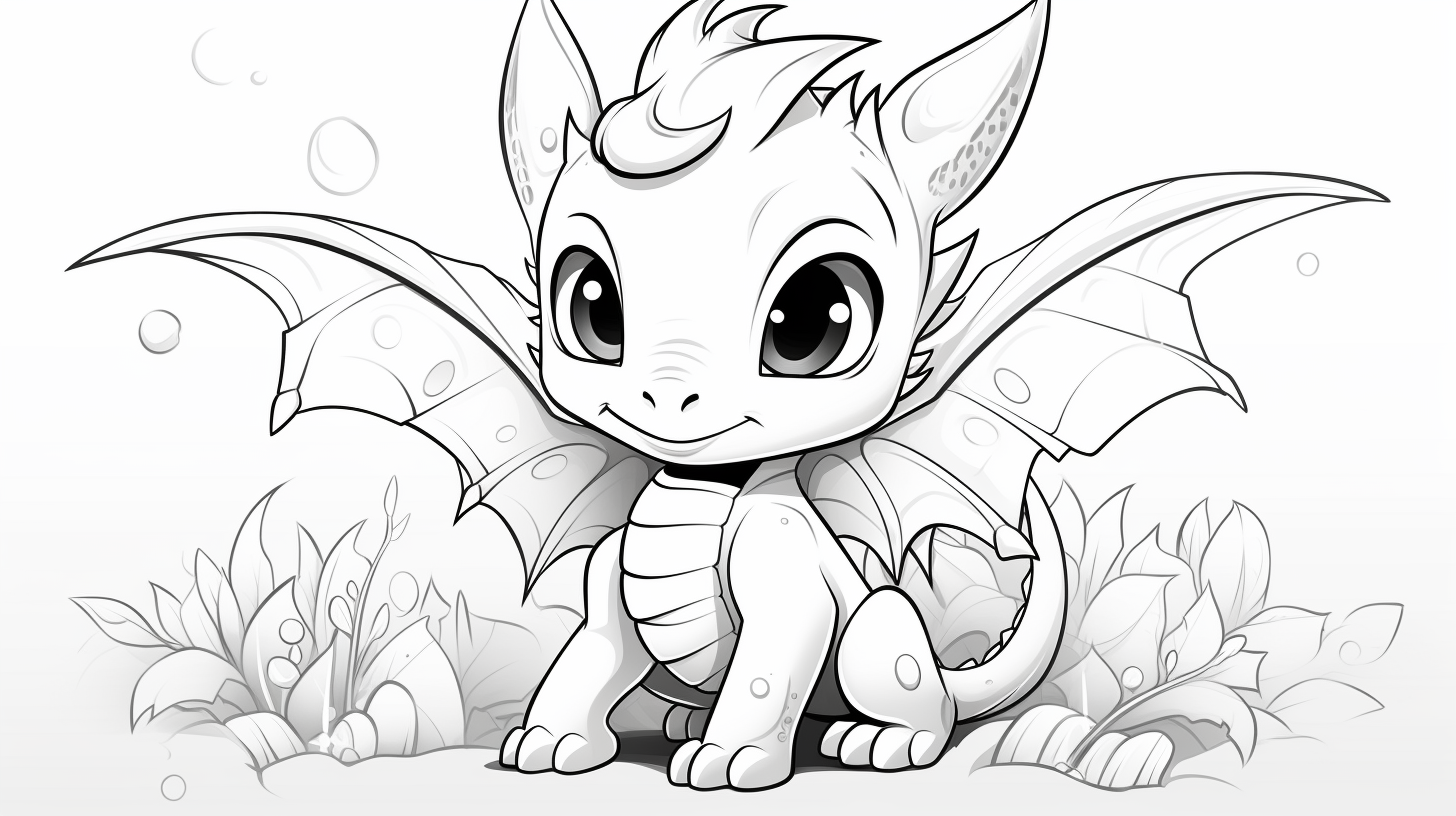
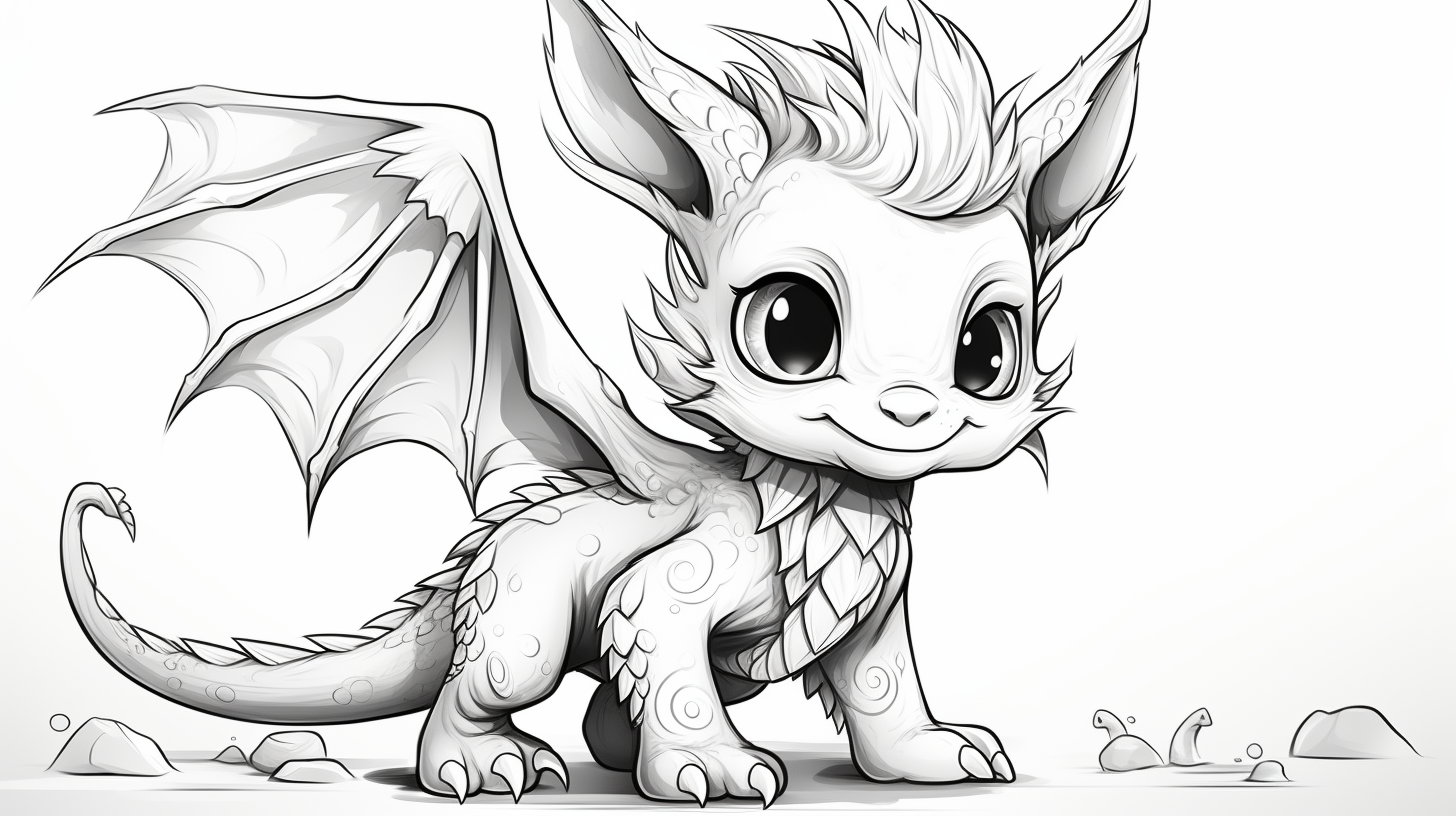
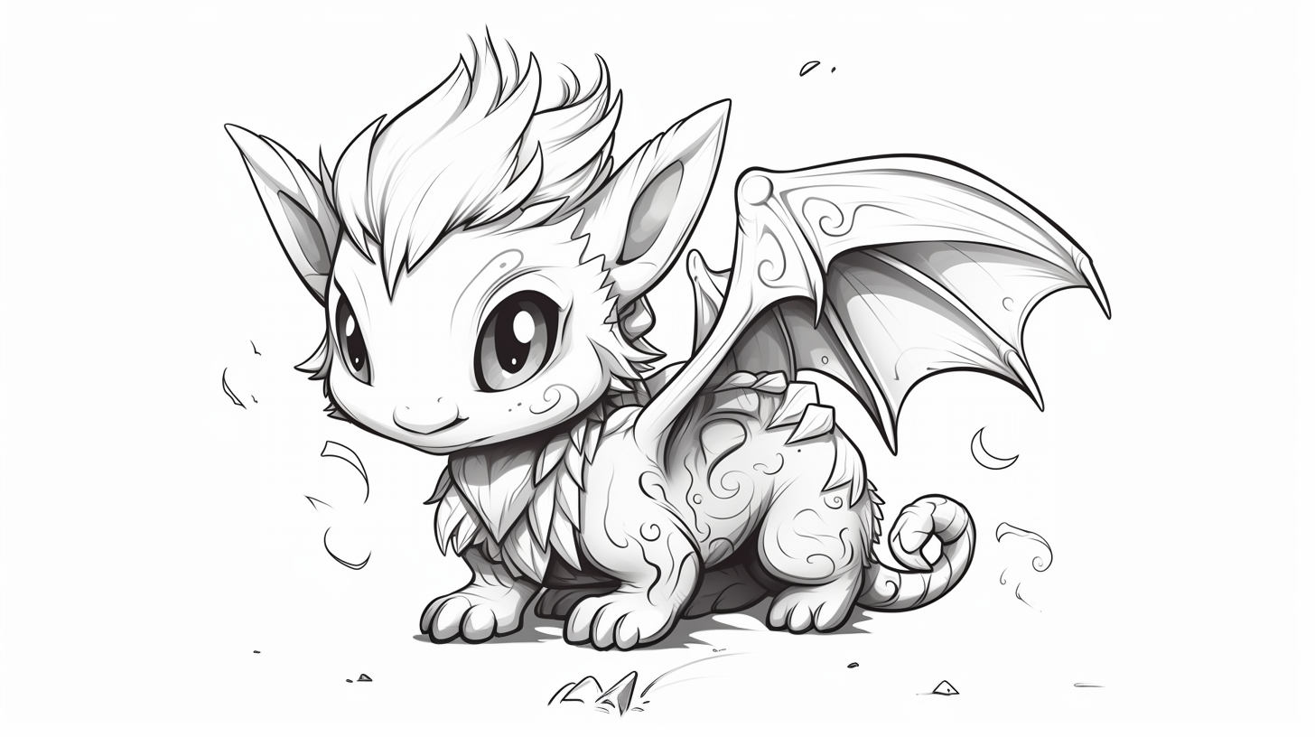
Baby dragons work well with softer color transitions. A pale body with slightly darker wings, horns or belly scales keeps the page gentle without making it look unfinished.
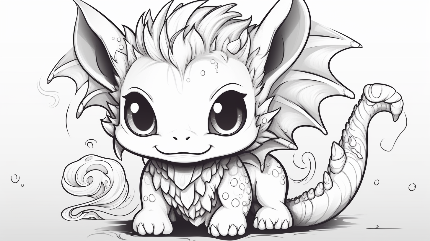
General fantasy dragons — Sheets 10–13
These pages are a good middle ground when you want more character than the easy sheets but not the dense linework of the realistic set. Use one dominant body color and reserve the strongest contrast for wings, eyes or horns.
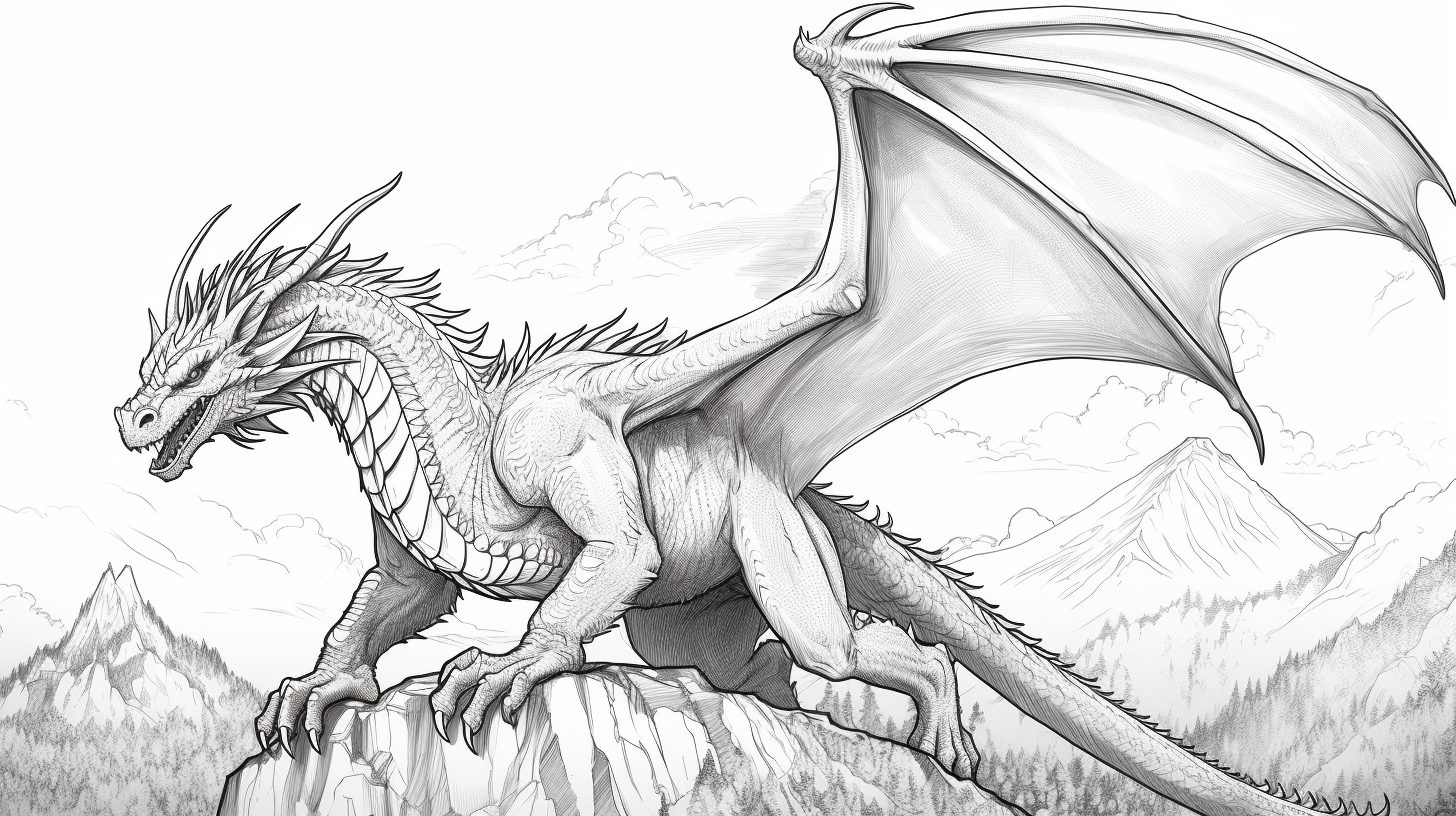
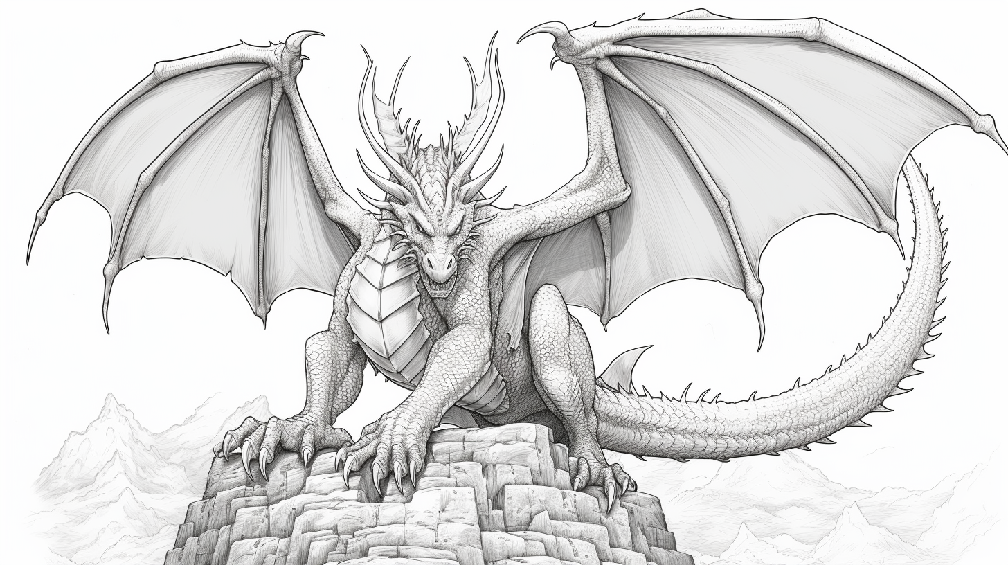
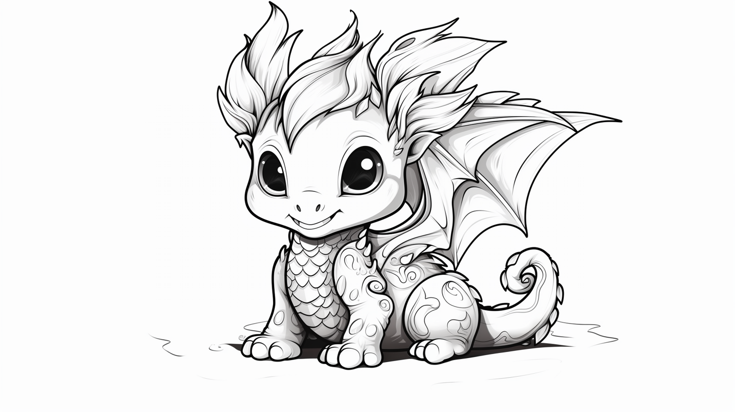
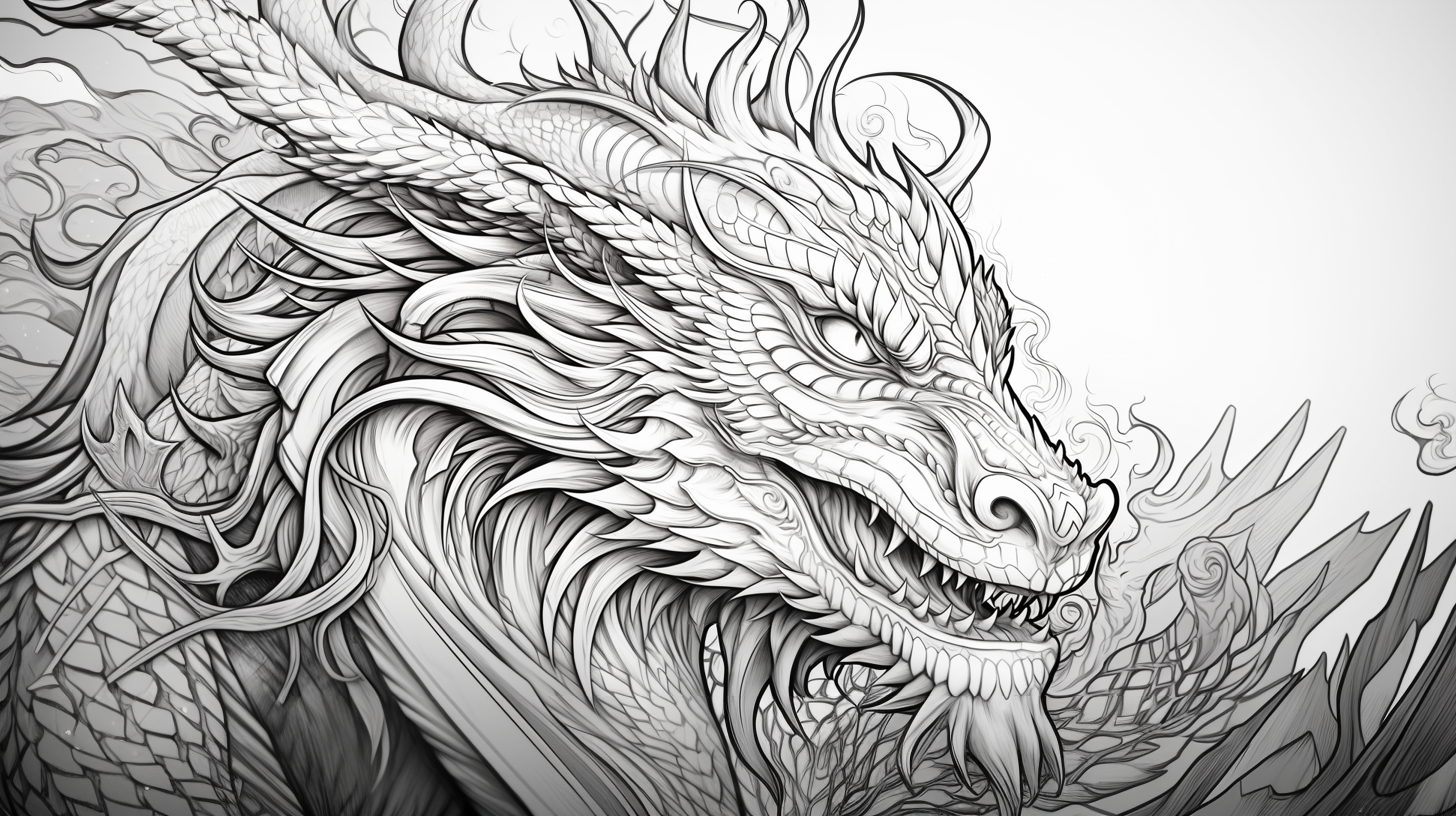
Detailed and realistic dragons — Sheets 14–20
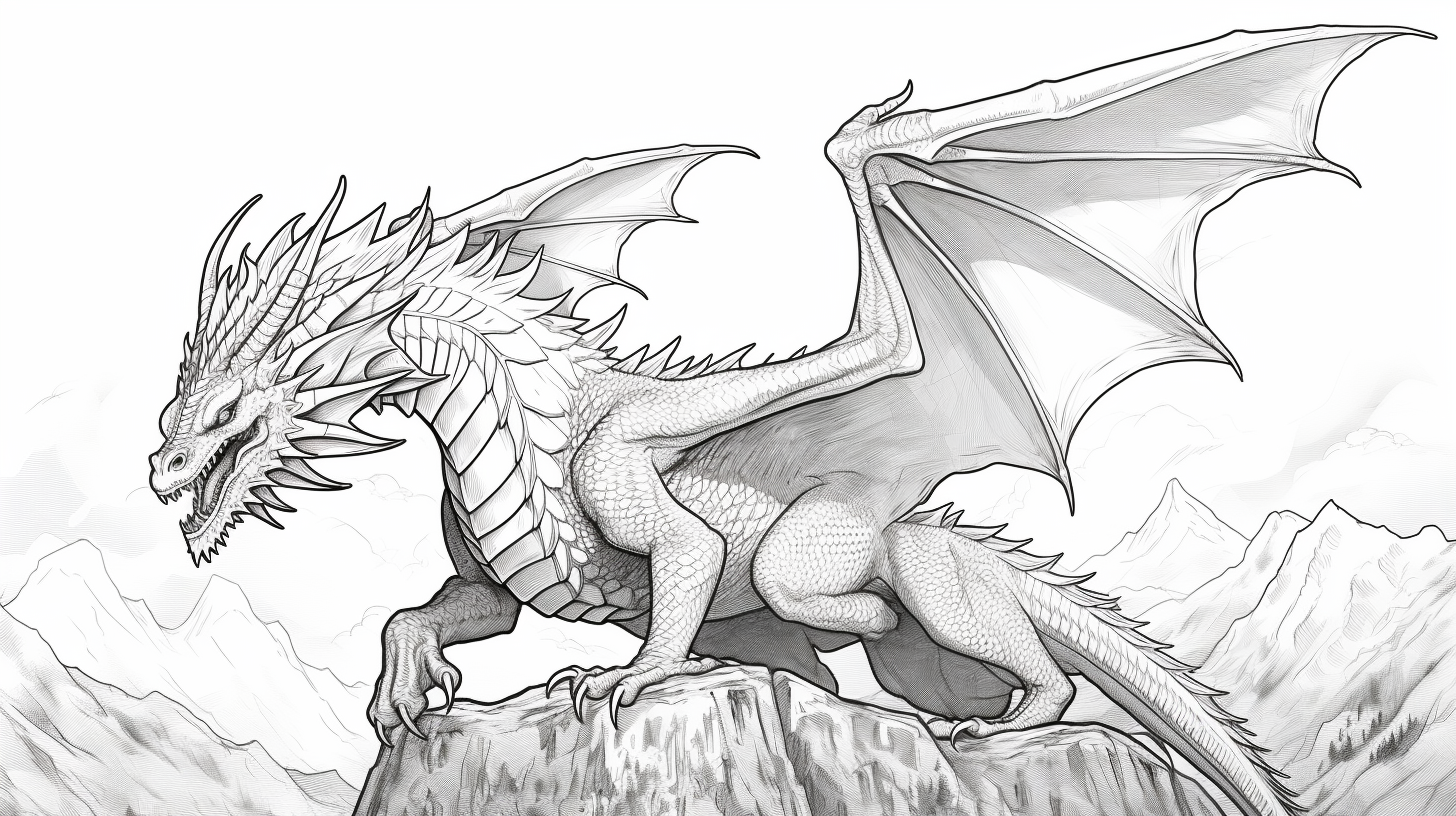
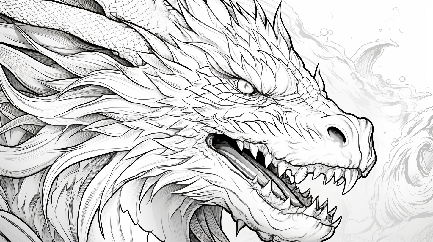
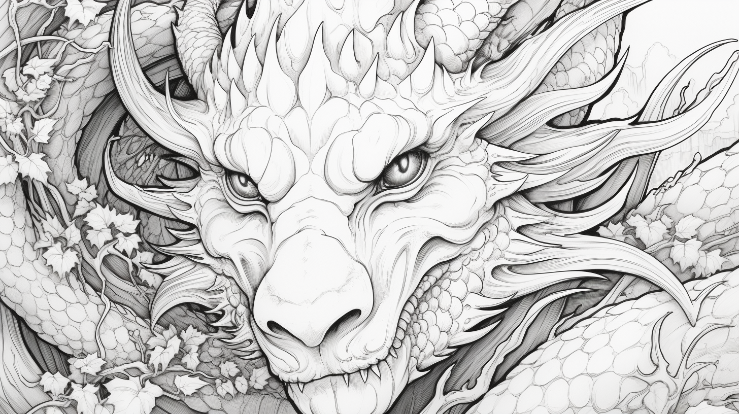
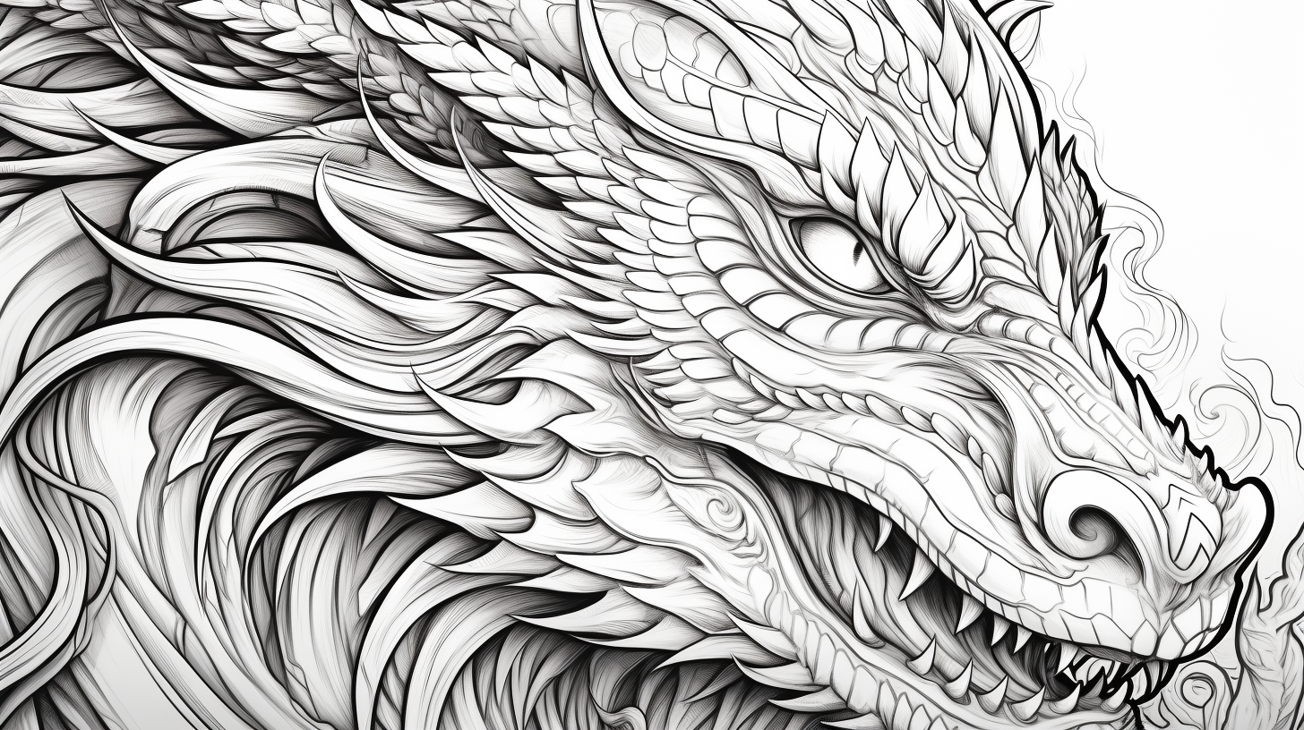
These sheets have the most small sections. Work in larger color families rather than coloring each scale independently; that keeps the dragon readable and makes the details feel intentional instead of noisy.
Build depth without coloring every scale separately
A dragon becomes easier to read when you treat its body as a few large surfaces first. Pick a base color, then decide where the light is coming from. Keep the top of the snout, shoulders and upper tail a little lighter; darken beneath the jaw, belly, folded wings and lower tail. Only after that should you emphasize individual scales. On a detailed sheet, darkening every scale equally can turn the body into a grid and hide the dragon’s overall shape.
For scales, try a three-pass method: fill the whole area lightly, add a darker tone along selected lower edges, then use the lightest pencil to soften the transition. You do not need to shade every scale. A few darker clusters around joints and overlapping areas usually create more depth than dozens of isolated outlines.
A three-sheet dragon practice challenge
- Sheet 1: control the palette. Choose an easy dragon and use one body color, one lighter or darker variation, and one accent for horns, belly or wings.
- Sheet 2: separate materials. Use a middle-difficulty page. Make wing membranes smoother than scales and keep horns or claws more neutral so the surfaces feel different.
- Sheet 3: add directional light. Choose one of the detailed dragons. Decide that the light comes from the upper left or upper right and keep that decision consistent across the head, wings and tail.
Repeating the same basic palette across all three pages makes the progression easier to see: the challenge comes from control, texture and shading rather than constantly inventing new colors.
Fix common dragon-coloring problems
| If this happens | Try this |
|---|---|
| The scales look noisy | Stop outlining each one. Shade groups of scales as one larger surface and emphasize only selected edges. |
| Wings blend into the body | Use a lighter or darker membrane color while keeping the wing bones related to the body color. |
| Black shadows look too harsh | Use a deeper version of the body color first. Reserve black or very dark gray for the smallest creases. |
| The face loses expression | Keep the eye area clear until late in the process. Add the darkest accents around the pupil, nostril and mouth only after the surrounding colors are established. |
| Fine markers bleed across scales | Switch to a sharp colored pencil for narrow sections, or test the marker on spare paper before committing to the smallest details. |
Dragon coloring questions
Which colors make a dragon look more realistic?
Muted greens, browns, slate blues and earthy reds can feel natural, but realism depends more on consistent light and shadow than on a particular hue. Even a purple dragon can look dimensional when its highlights and shadows follow the same light direction.
How do I color fire without making it a solid orange shape?
Leave the hottest central area pale yellow or nearly white, move outward through yellow and orange, and place the deepest red near the outer edge. The counterintuitive part is keeping the center lighter, not darker.
Should I use markers or colored pencils for the detailed pages?
Colored pencils offer more control over scales, claws and facial details. Markers are useful for larger base areas, but combining them works well: marker for broad wing or body sections, pencil for texture and shading after the marker is fully dry.
What if I want a simpler dragon collection?
The baby dragon collection has more designs built around softer shapes and simpler choices. For a denser challenge, use the realistic dragon collection.

