
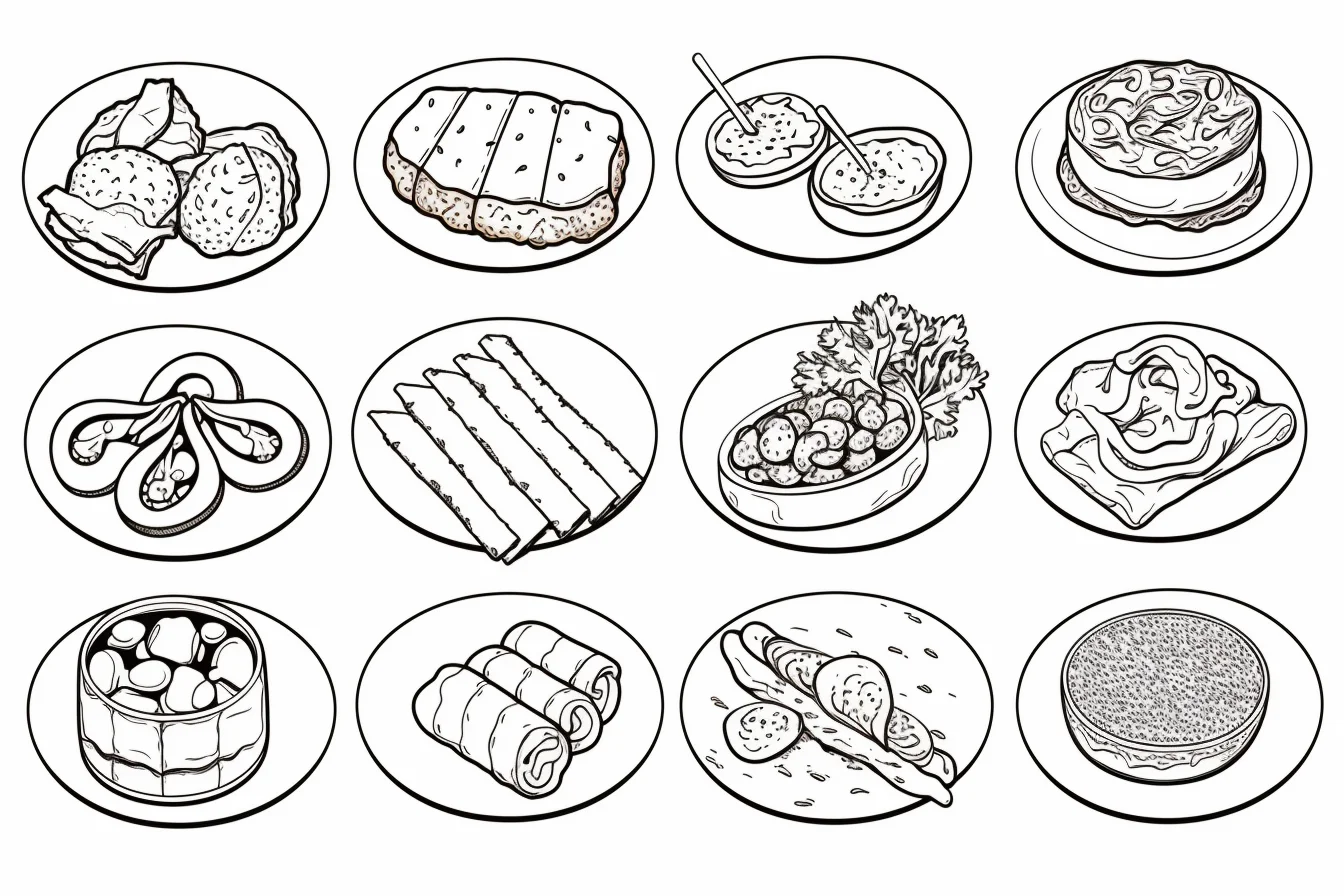
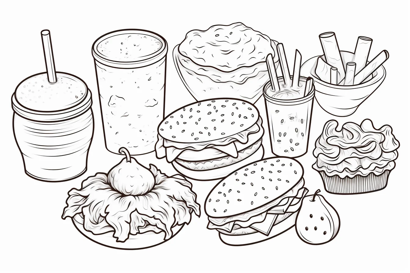
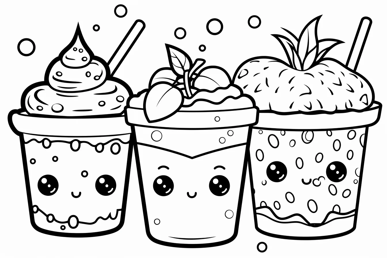
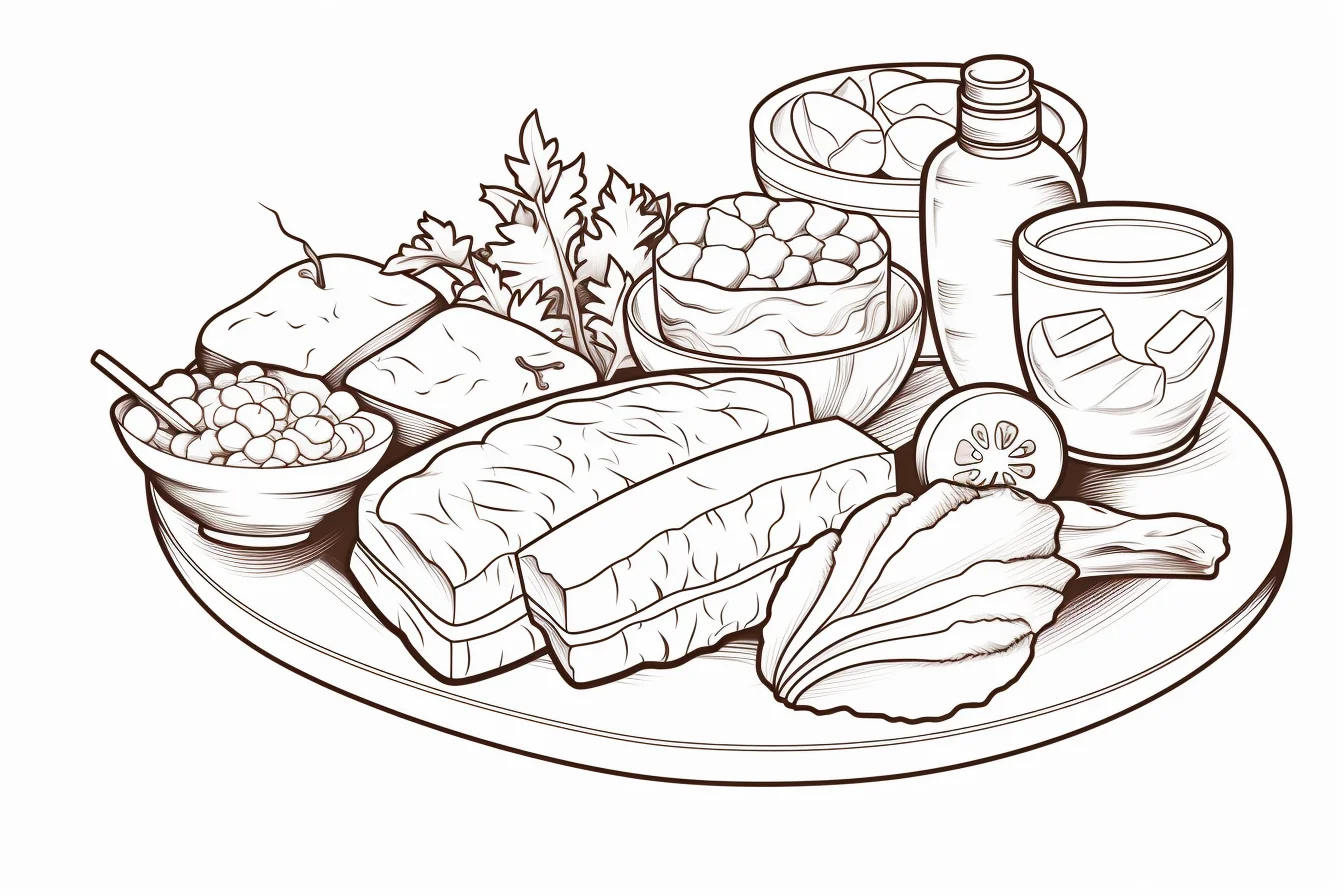
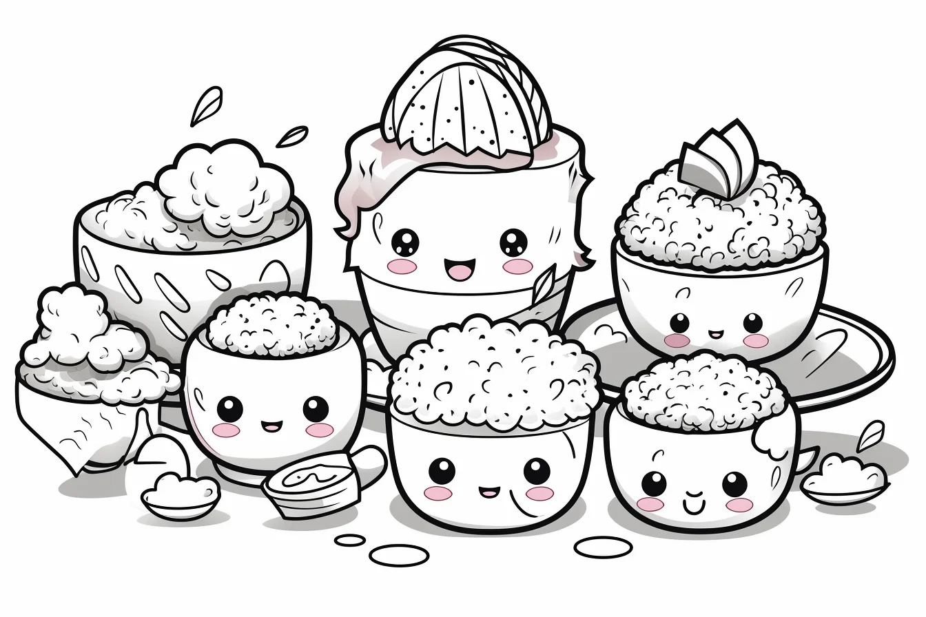
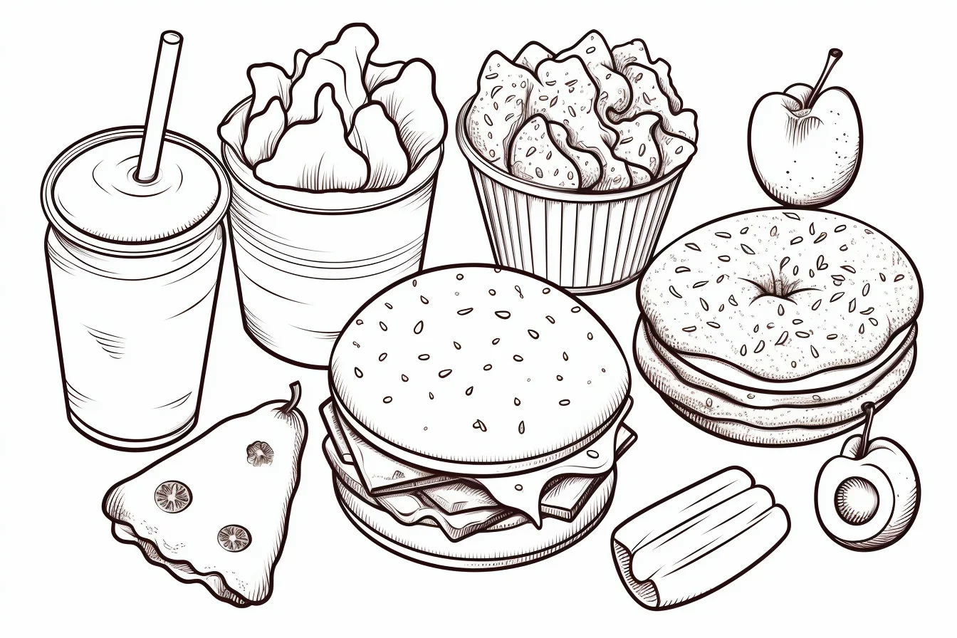
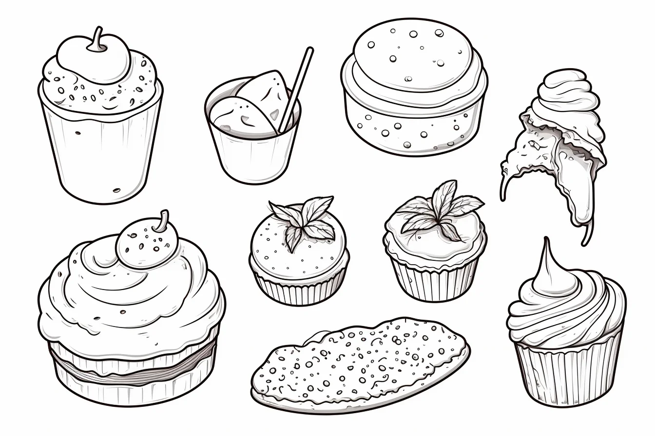
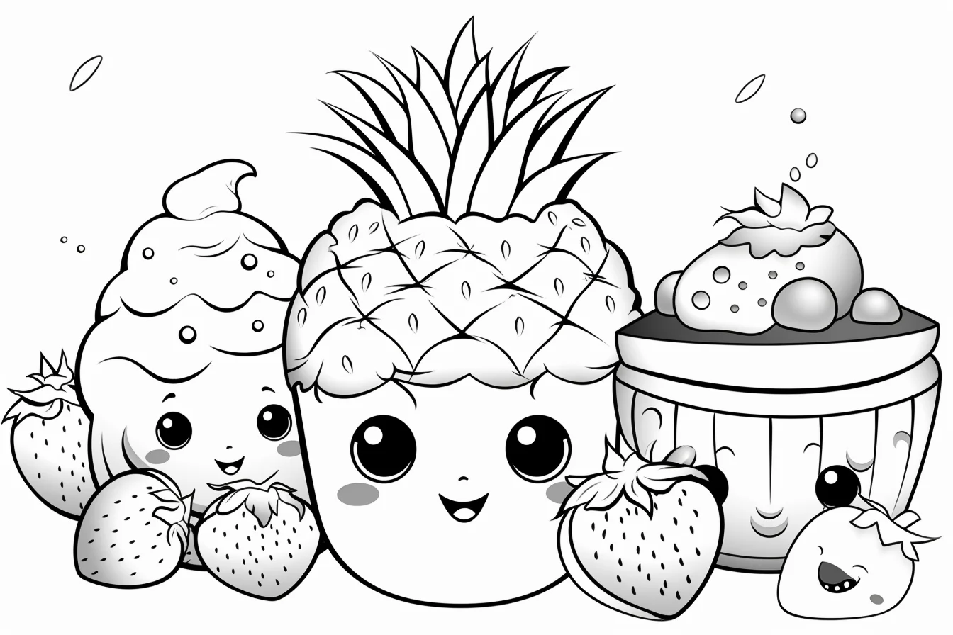
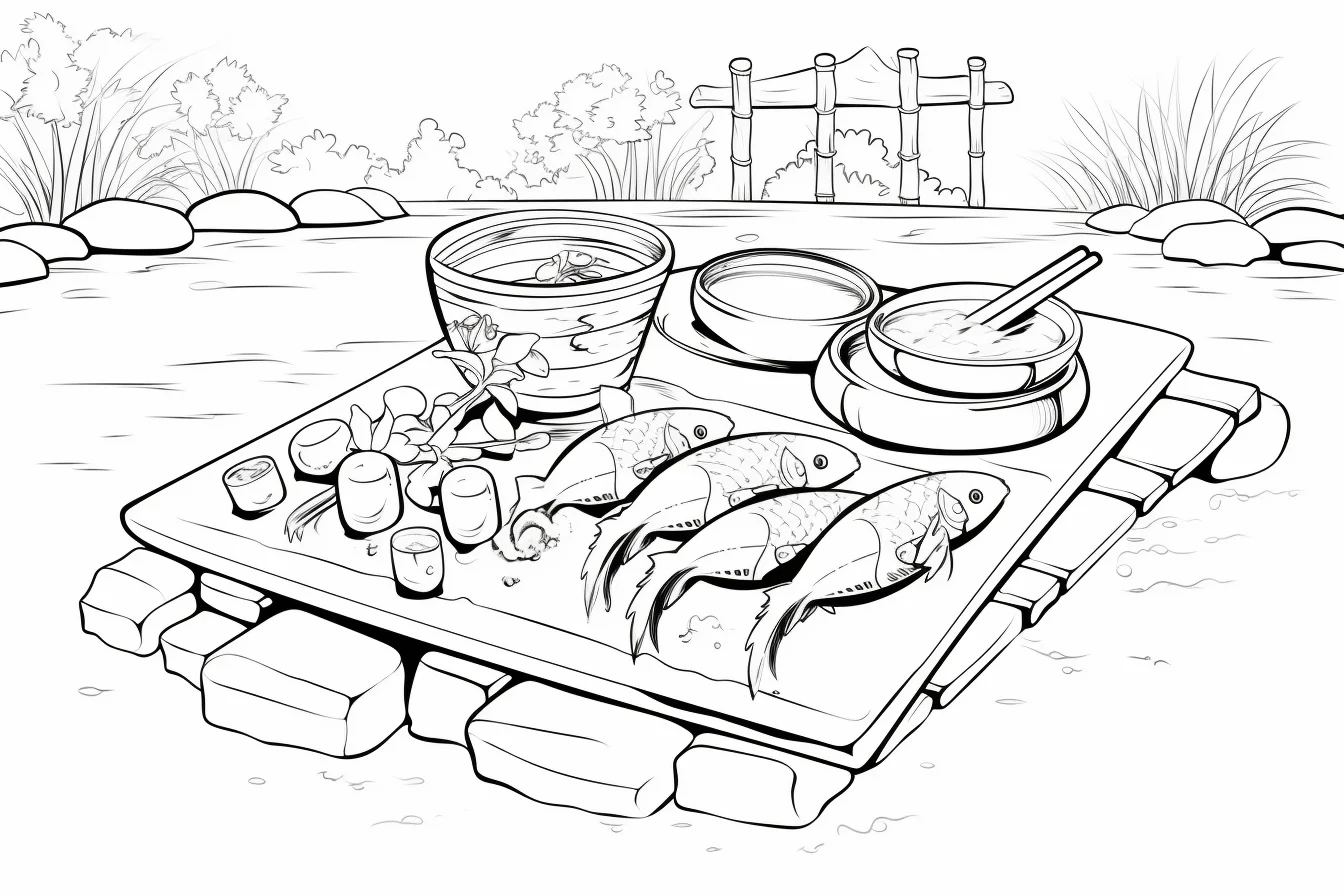
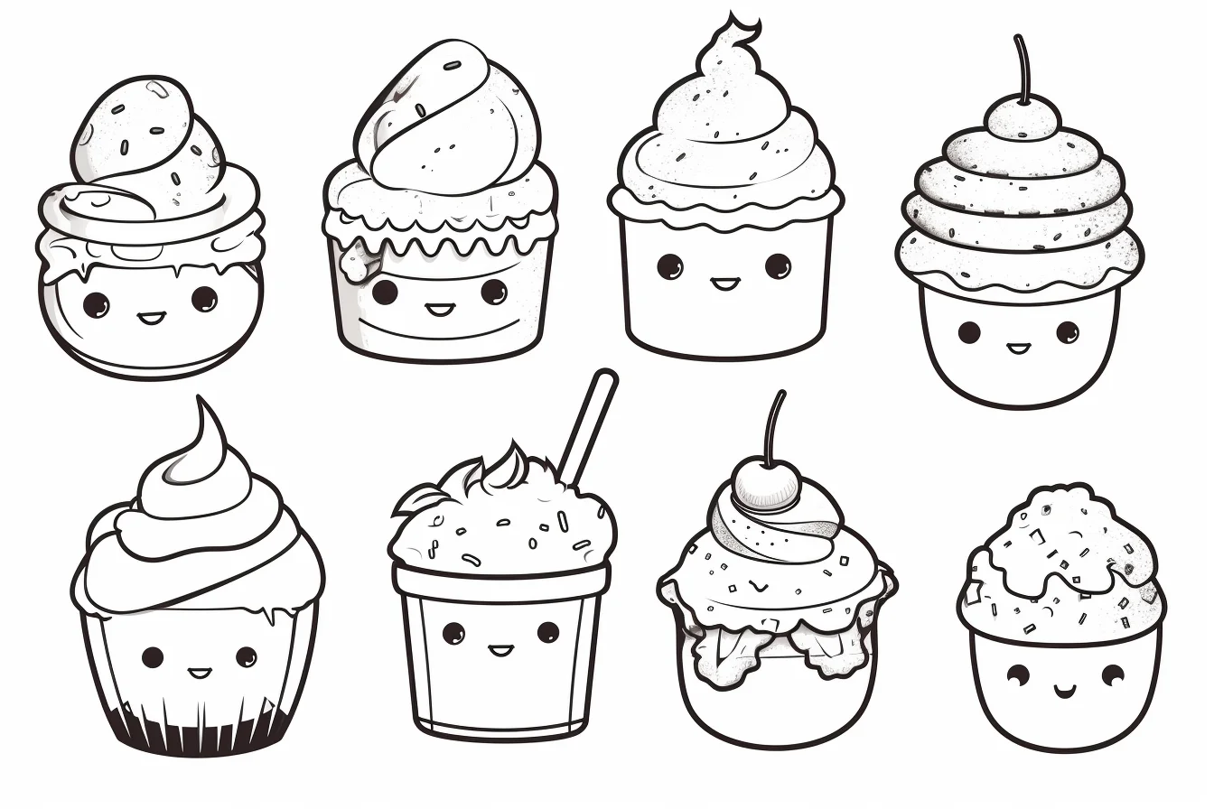
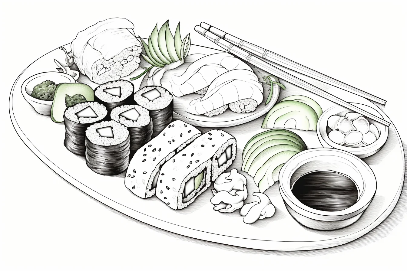
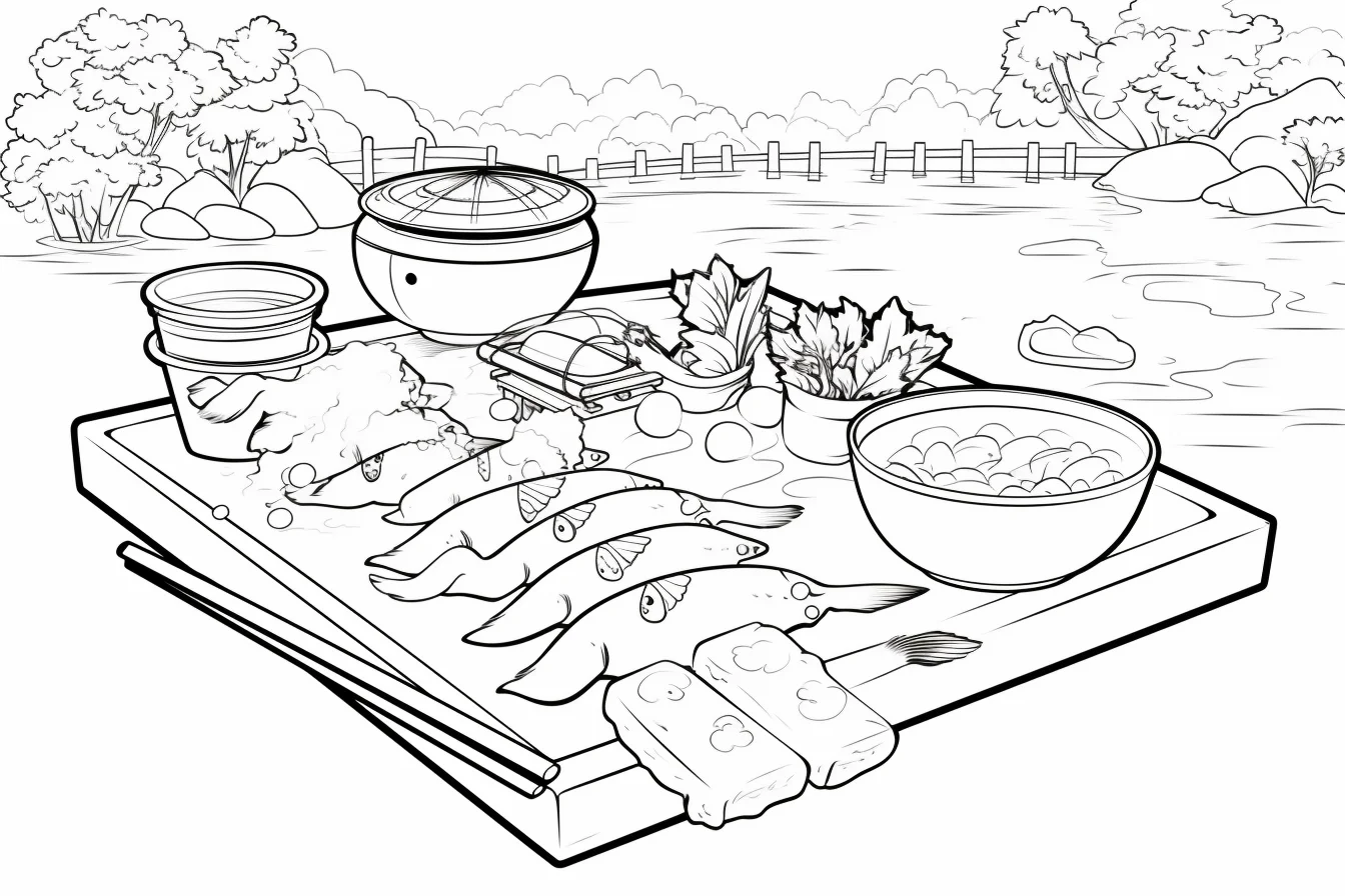
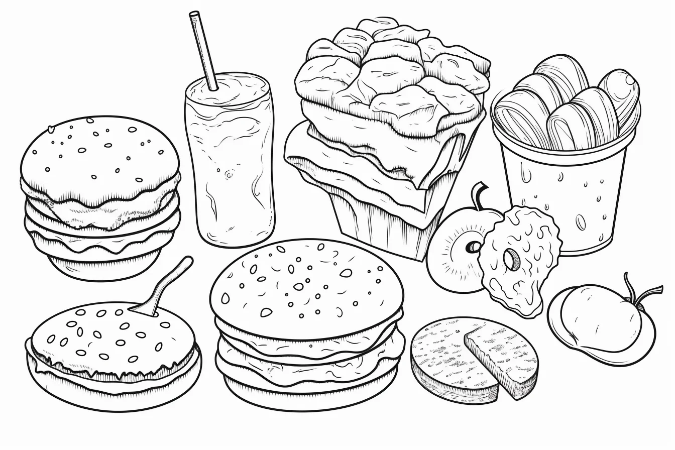
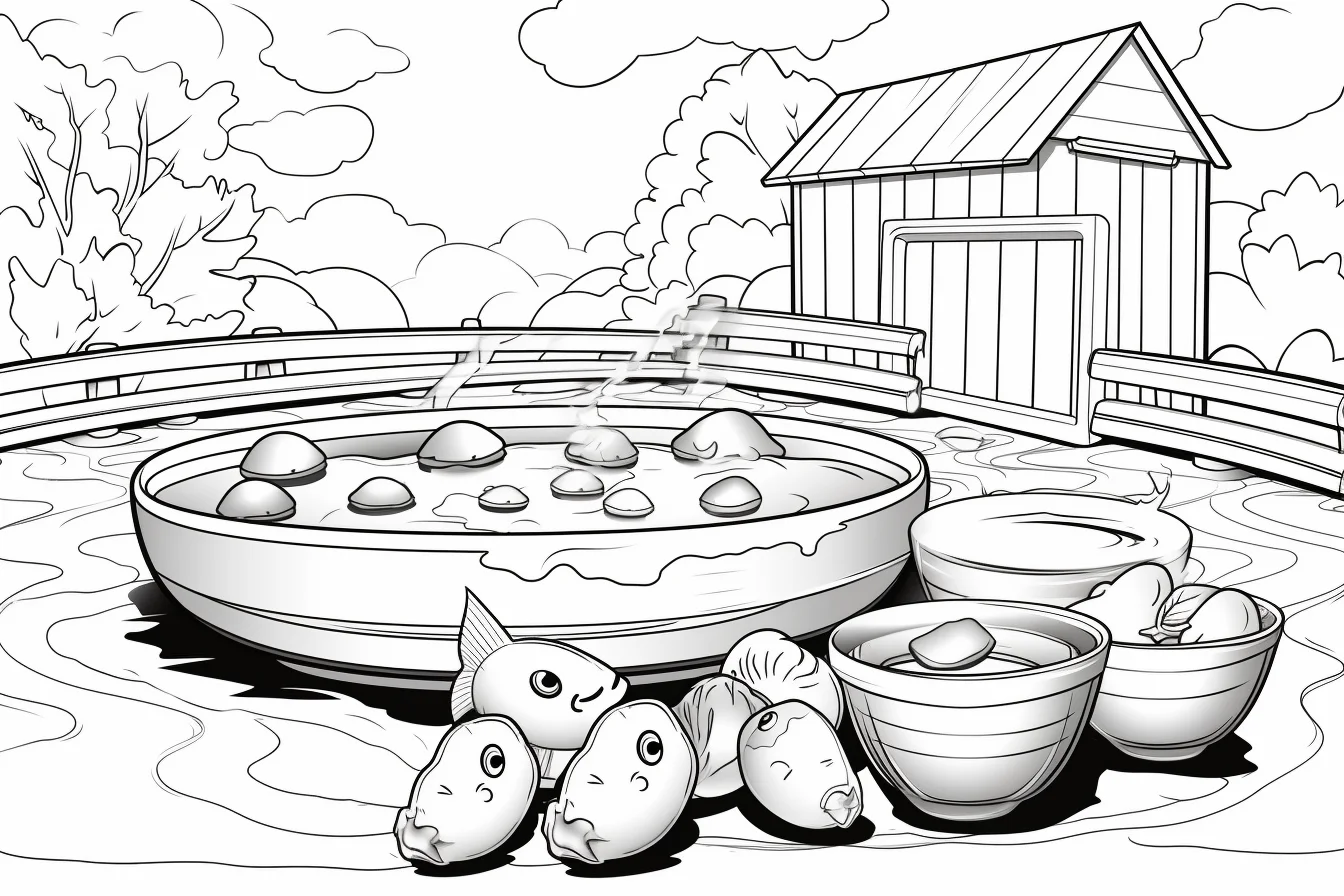
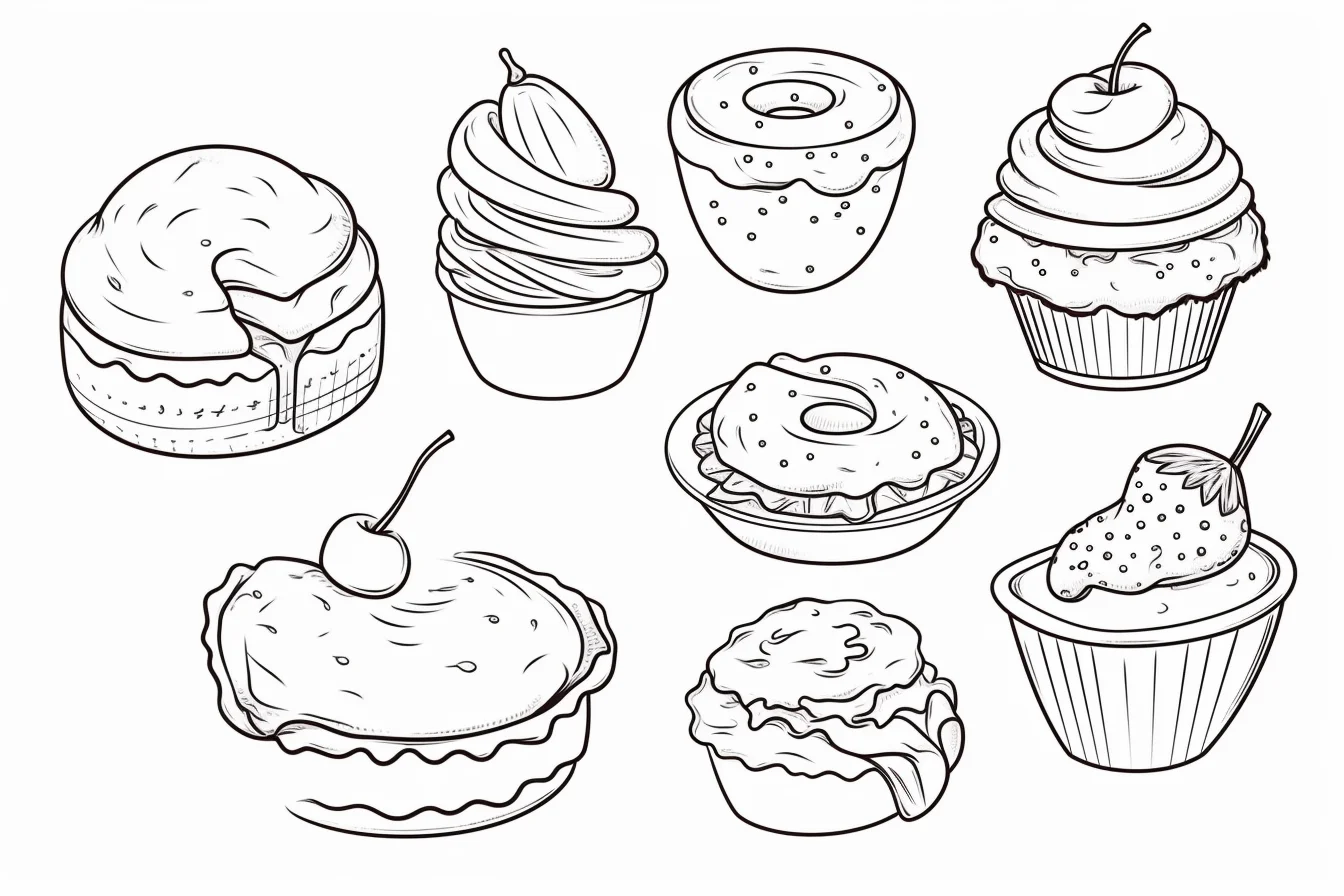
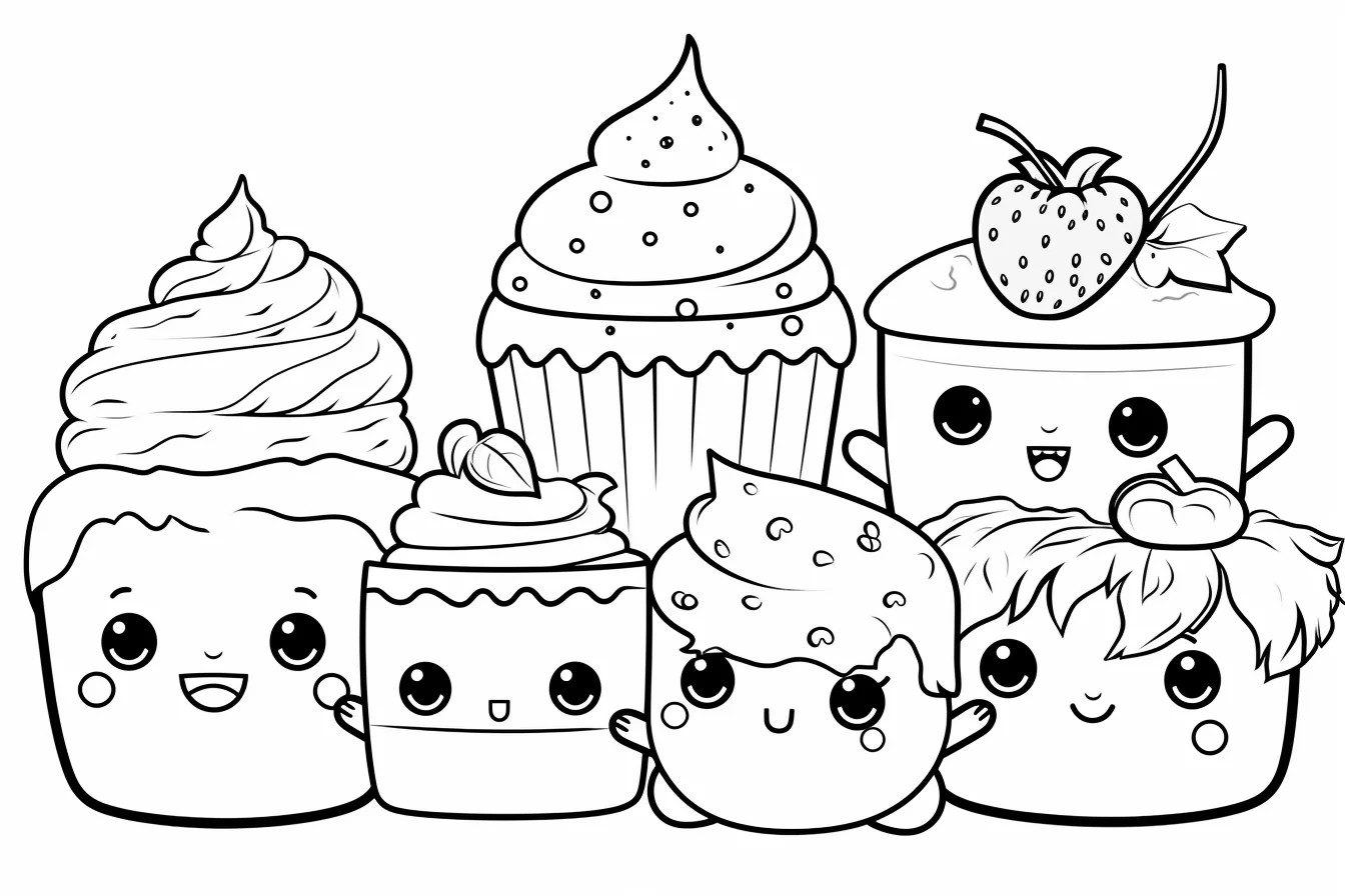
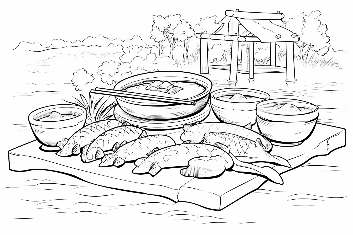
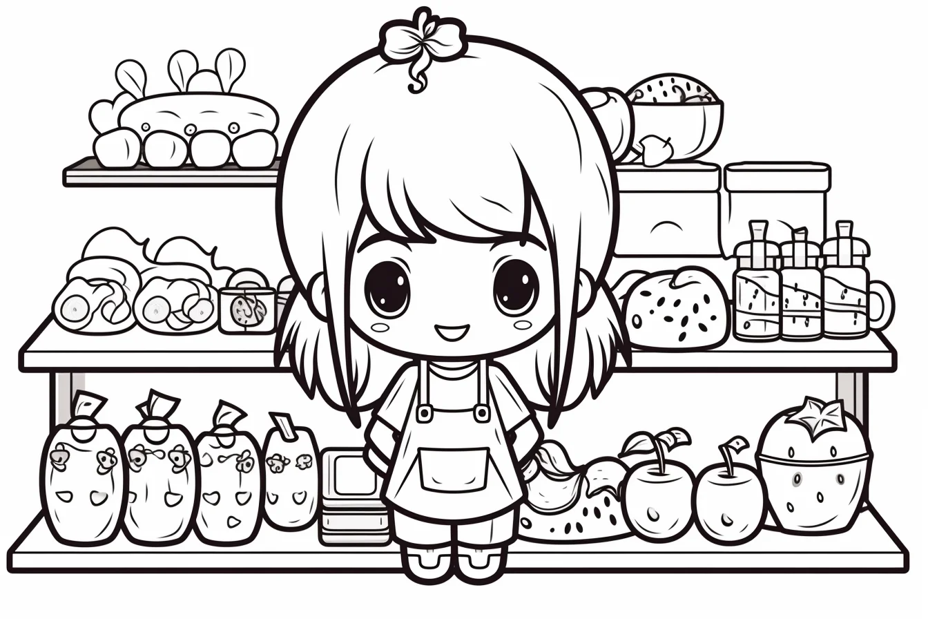
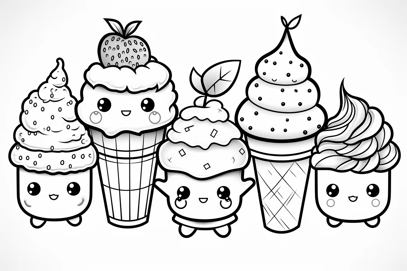
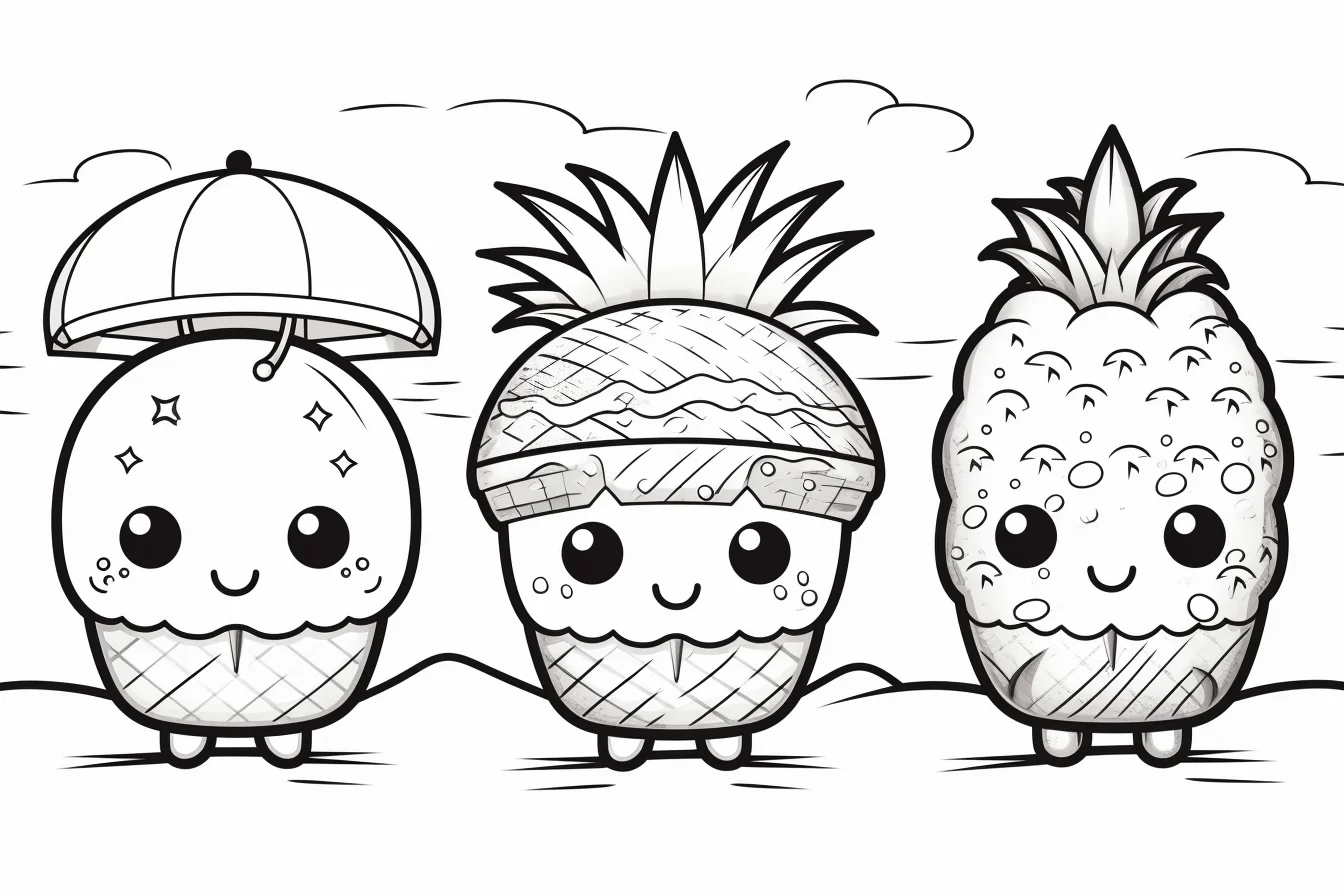
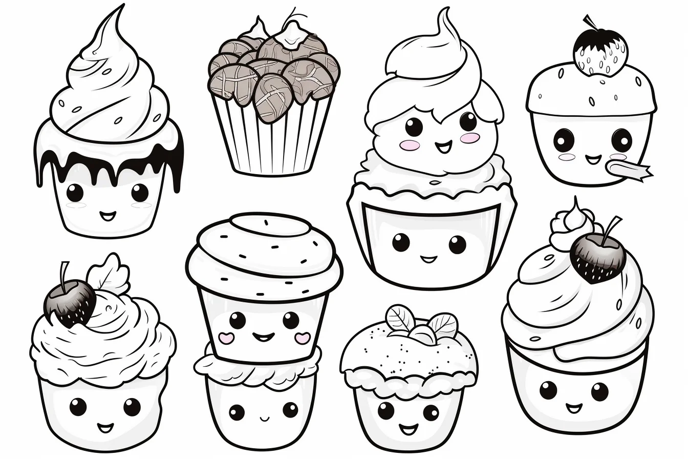
This gallery contains 26 food coloring pages with kawaii desserts, cakes, donuts, ice cream, simple meals and cute food characters. Some sheets have large open areas that are quick to color; others use smaller details and suit colored pencils or fine-tip markers better.
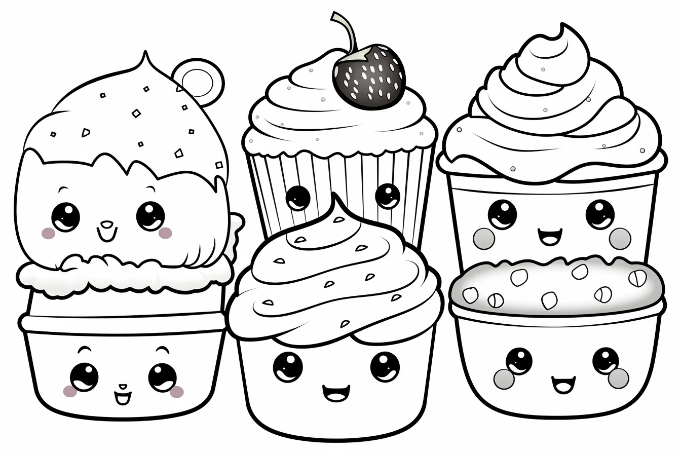
How to save and print a food coloring page
- Choose the design you want below.
- Click or tap the image to open the original full-size file.
- Save that file, then print the saved image rather than the whole article page.
- Use Fit to page in the print preview so the outer lines are not clipped.
Most of these sheets are landscape-oriented, so check the preview before printing. If the design looks cramped in portrait mode, switch the printer to landscape.
Choose by detail level
- Quick and easy: pick the sheets with one large dessert, donut, drink or character and plenty of open white space.
- Kawaii: choose the foods with faces, rounded shapes and simple decorative details.
- More detailed: the fuller meal and dessert scenes are better if you want more small areas to shade.
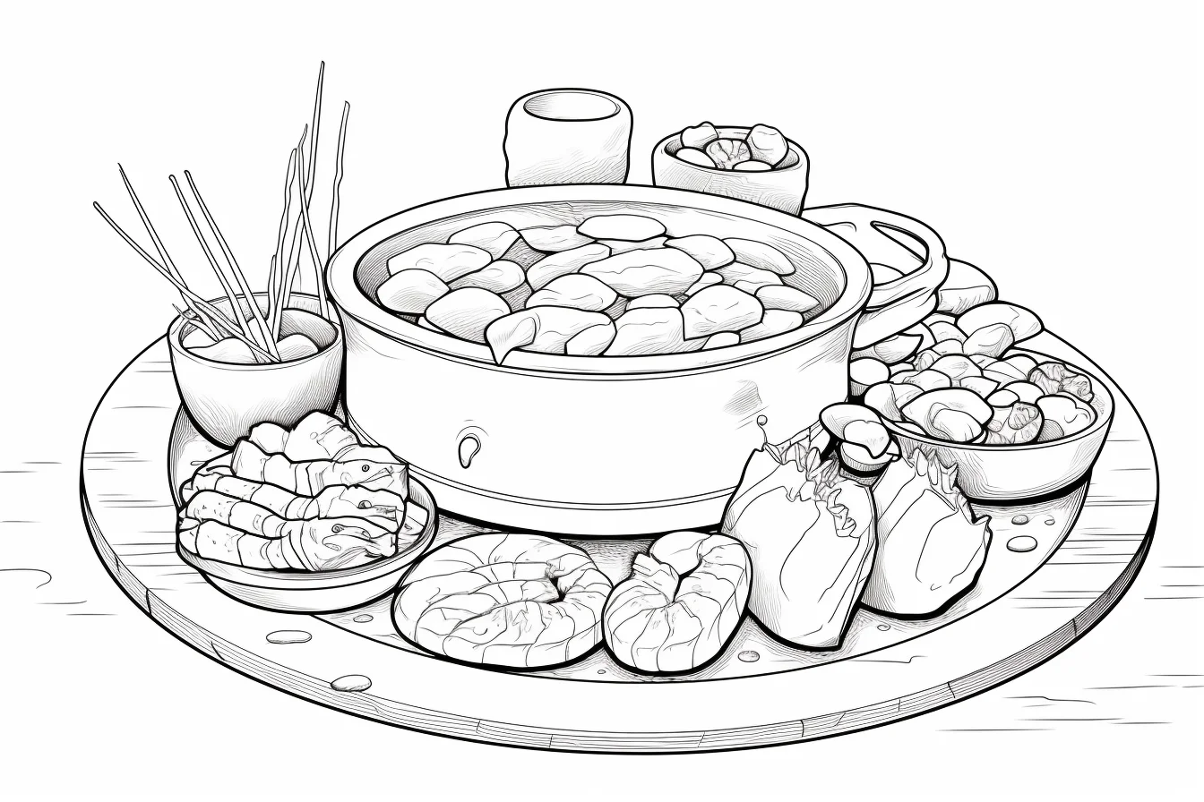
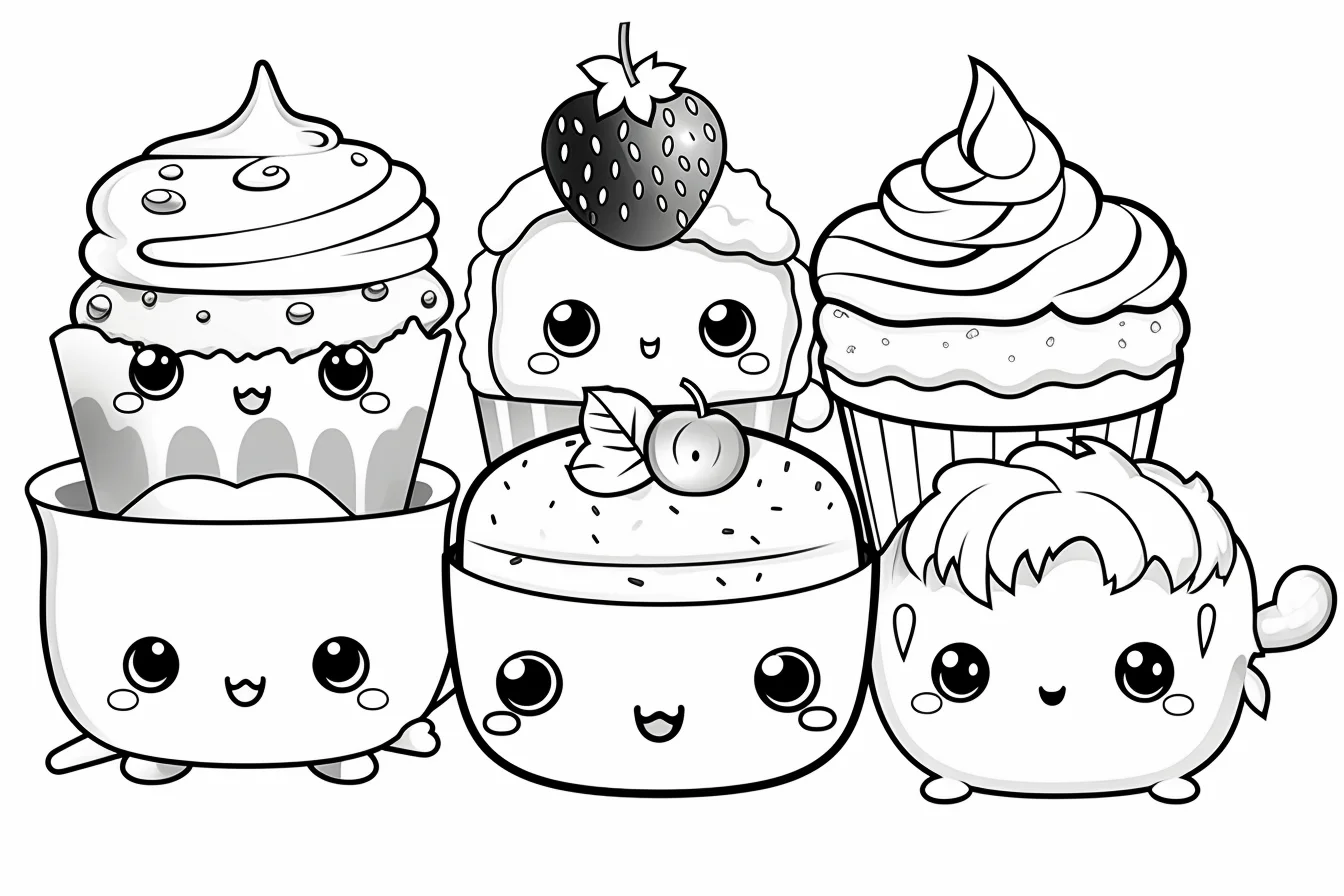
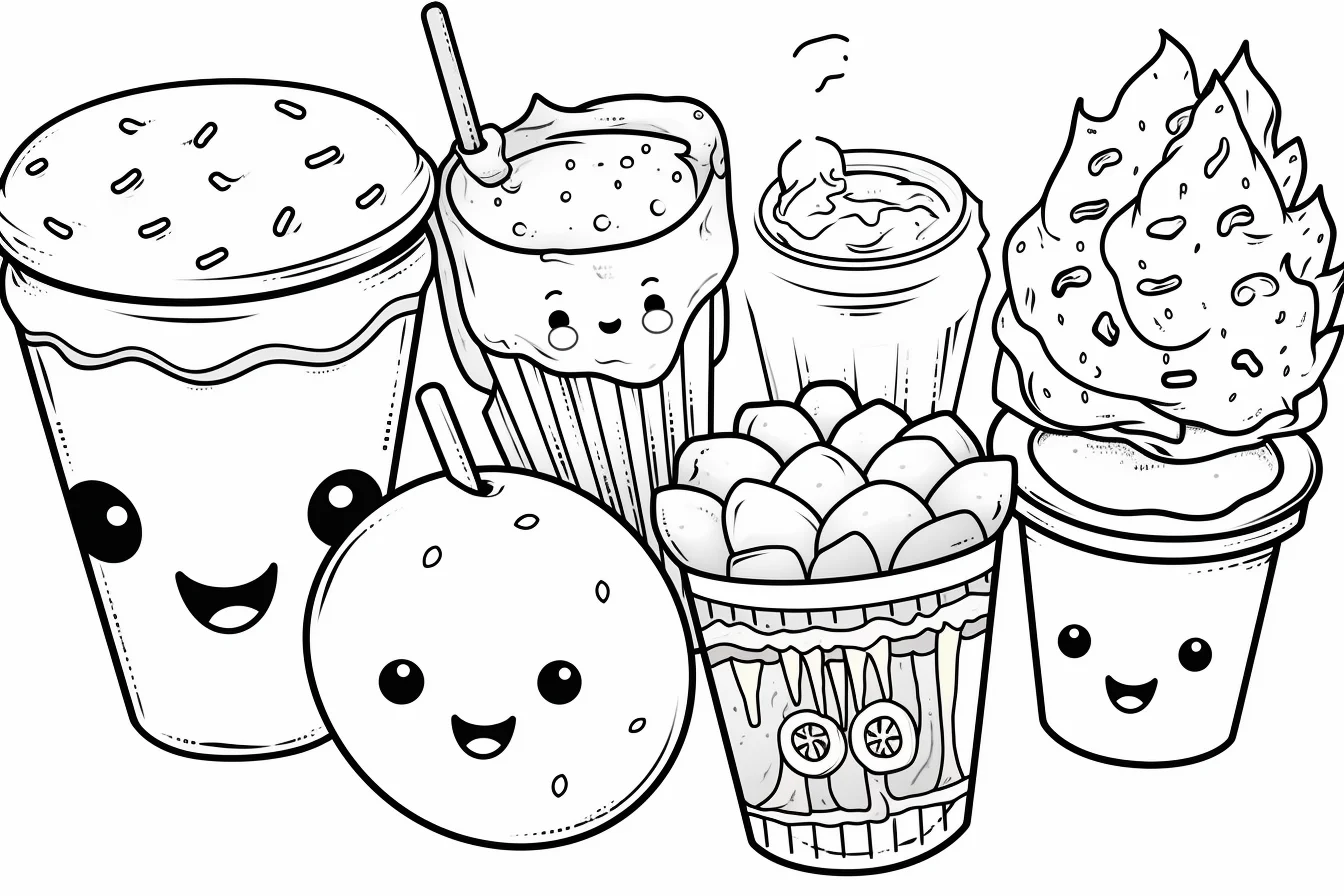
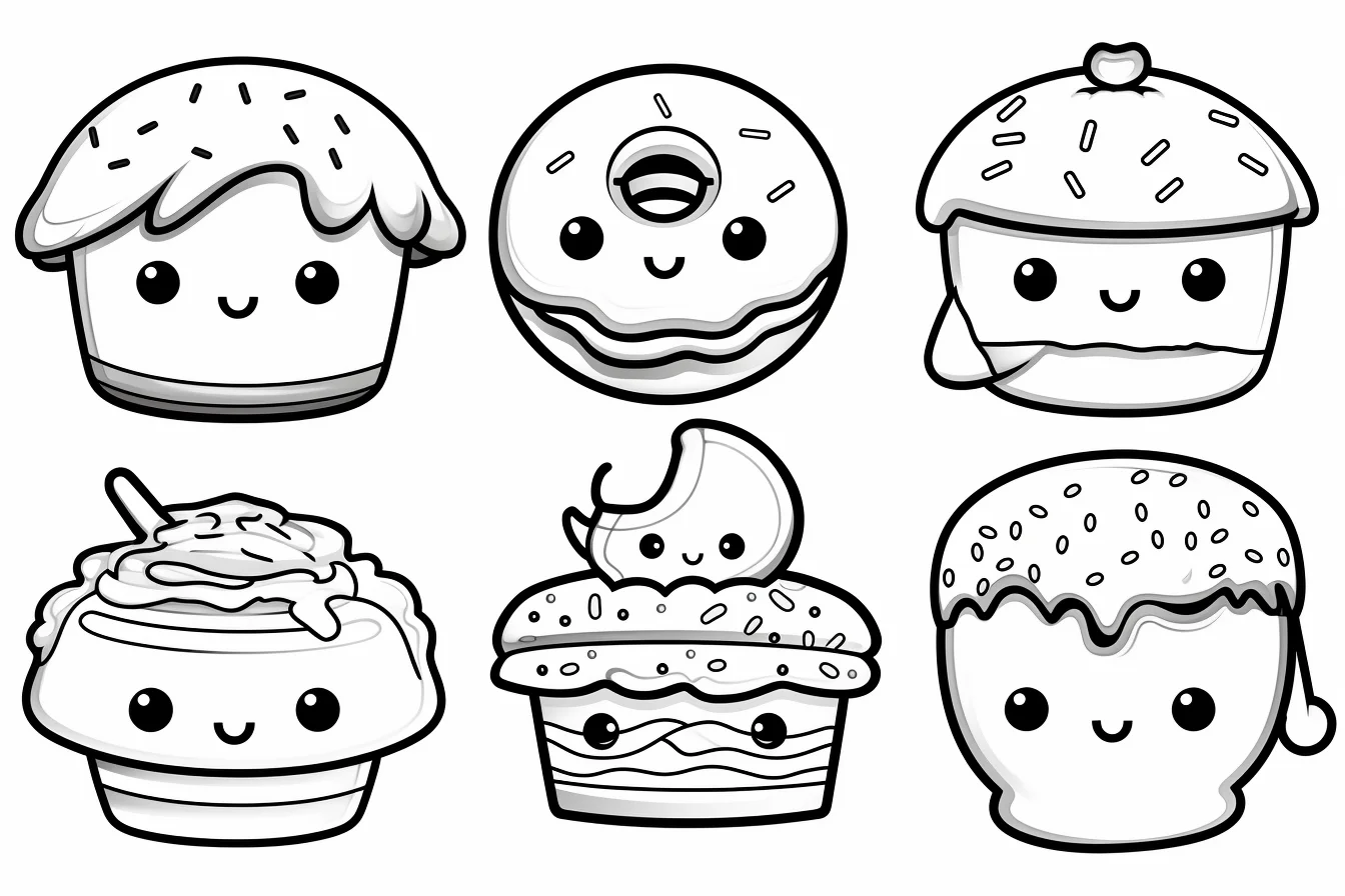
If you are printing several sheets for a classroom, party or quiet activity, choose a mix of simple and detailed designs instead of printing the entire gallery. That gives different ages and skill levels a useful choice without wasting paper.
How to make food coloring pages look better
Food pages are deceptively useful for practicing color because the shapes are familiar: you already know roughly how icing, fruit, bread, chocolate and glass should behave. Instead of filling every shape with one flat color, pick three values before you start: a light base, a middle color and a darker version for edges and overlaps.
Do a two-minute frosting test first
Use a scrap of the same printer paper and draw three small rounded shapes. Color the first with one light layer, the second with two layers, and the third with three layers or firmer pressure. Now leave a thin white strip across the top of each shape and add your darkest value only along the lower edge. Hold the paper at arm’s length. The middle swatch should still look like the same food color, while the highlight and lower shadow should remain visible. If the middle swatch already looks nearly as dark as the shadow, reduce your starting pressure on the actual page.
For white frosting, whipped cream or vanilla ice cream, reverse the test: leave most of the shape as bare paper and try only a narrow pale gray, cream, pink or blue shadow underneath an overlap. If the whole swatch reads gray or blue from a distance, the shadow is too wide. This quick calibration is especially useful with markers and soft pencils because the printed paper can take color more strongly than expected.
Match the shadow to the food’s form
Do not shade every food with the same dark outline. On a donut, deepen the inner hole and lower curve; on a cupcake, put the strongest shadow where frosting meets cake; on a scoop of ice cream, use a curved lower shadow rather than a straight band. For glossy candy or drinks, keep one clean highlight instead of blending across the entire surface. Before adding the background, squint at the page: if the main food no longer separates from its wrapper, plate or neighboring dessert, darken just one shared edge rather than recoloring the whole object.
- Color the largest food first. Give the main cake, donut, drink or meal the strongest color family so the eye has somewhere to land.
- Keep faces readable. On kawaii designs, leave a little light space around eyes and mouths. Very dark surrounding colors can swallow the expression.
- Shade where forms touch. Darken beneath frosting, under toppings, beside stacked foods and along the lower edge of round shapes. That small shadow usually creates more depth than covering the whole object with extra layers.
- Save tiny decorations for last. Sprinkles, cherries and small accessories are easier to coordinate after the main palette is established.
A three-page practice method
If you are using these sheets to practice rather than simply pass time, do not start with the busiest page. Use three different designs and change only one skill at a time.
- Page 1 — clean fills: choose a simple character with large spaces. Concentrate on even pressure and staying just inside the outline.
- Page 2 — light and shadow: choose a cake, donut or rounded dessert. Keep the upper-left area lighter and deepen the lower-right edges consistently.
- Page 3 — palette control: choose a fuller meal or dessert scene and limit yourself to five main colors. Repeating those colors across separate objects makes a busy page feel intentional.
Color ideas that work especially well on cute foods
You do not need realistic colors. In fact, kawaii food often reads better when the palette is deliberately simplified. A strawberry-and-cream set can use red, pale pink, cream, leaf green and chocolate brown. A bakery palette can use warm tan, caramel, cream, berry red and muted green. For a cooler candy look, try lavender, pale blue, pink, lemon yellow and a dark plum for the smallest accents.
When two foods touch, avoid giving both nearly identical values. A pale cupcake wrapper beside pale frosting can merge into one shape; darkening either the wrapper or the frosting edge restores the separation without adding another color.
Fix common coloring problems
| Problem | What usually causes it | Quick fix |
|---|---|---|
| The food looks flat | One color at one pressure everywhere | Add a darker band beneath toppings and along lower edges. |
| Kawaii faces disappear | Dark color packed tightly around the features | Keep the face area lighter and reserve the darkest value for eyes or outlines. |
| Too many colors compete | Every small item gets a new hue | Choose four or five main colors and repeat them throughout the page. |
| Crayon fill looks patchy | Heavy pressure from the first stroke | Build two or three lighter layers with small overlapping strokes. |
| Marker areas look streaky | Repeatedly going back over half-dry sections | Work across one enclosed shape while the ink is still wet and test the marker on spare paper first. |
| White frosting looks unfinished | Every white area is left completely untouched | Add a very pale gray, blue, pink or cream shadow only along one edge. |
Colored pencils, crayons or markers?
Crayons suit the large, simple pages because broad shapes fill quickly. Colored pencils are the easiest choice for the detailed desserts because pressure can be layered gradually around toppings and small decorations. Markers give kawaii foods a clean, saturated look, but put scrap paper behind the sheet if you are using a printed page and test for bleed-through before committing to a large area.
Food coloring page FAQs
Which pages are easiest for younger kids?
Start with a single large food or character with broad enclosed areas and few toppings. The pages with many small desserts or meal components demand more hand control and are better saved for later.
How can I color white foods such as cream or frosting?
Let the paper provide most of the white. Add a narrow pale shadow where the frosting curves under itself or meets another object. This keeps it visibly white while giving it shape.
Do food coloring pages need realistic colors?
No. Realistic brown bread and red strawberries work, but these kawaii designs also suit invented palettes. What matters more is value contrast: neighboring shapes should not all be equally light or equally dark.
How do I make a busy food page look cohesive?
Limit the palette and repeat colors. For example, use the same pink on frosting, a drink straw and a small decoration rather than introducing three unrelated colors. Repetition ties separate objects together.
More printable collections
If you want a broader mix of simple designs, browse the easy coloring pages. For more animal-heavy kawaii designs, try the kawaii coloring collection. If you have trouble saving or printing a sheet, use our print and download help.

