
All 22 wallpapers here are 1664 × 2432 portrait files. The gallery is mostly dark and high-contrast, with gaming, futuristic and graphic designs rather than one specific game or franchise.
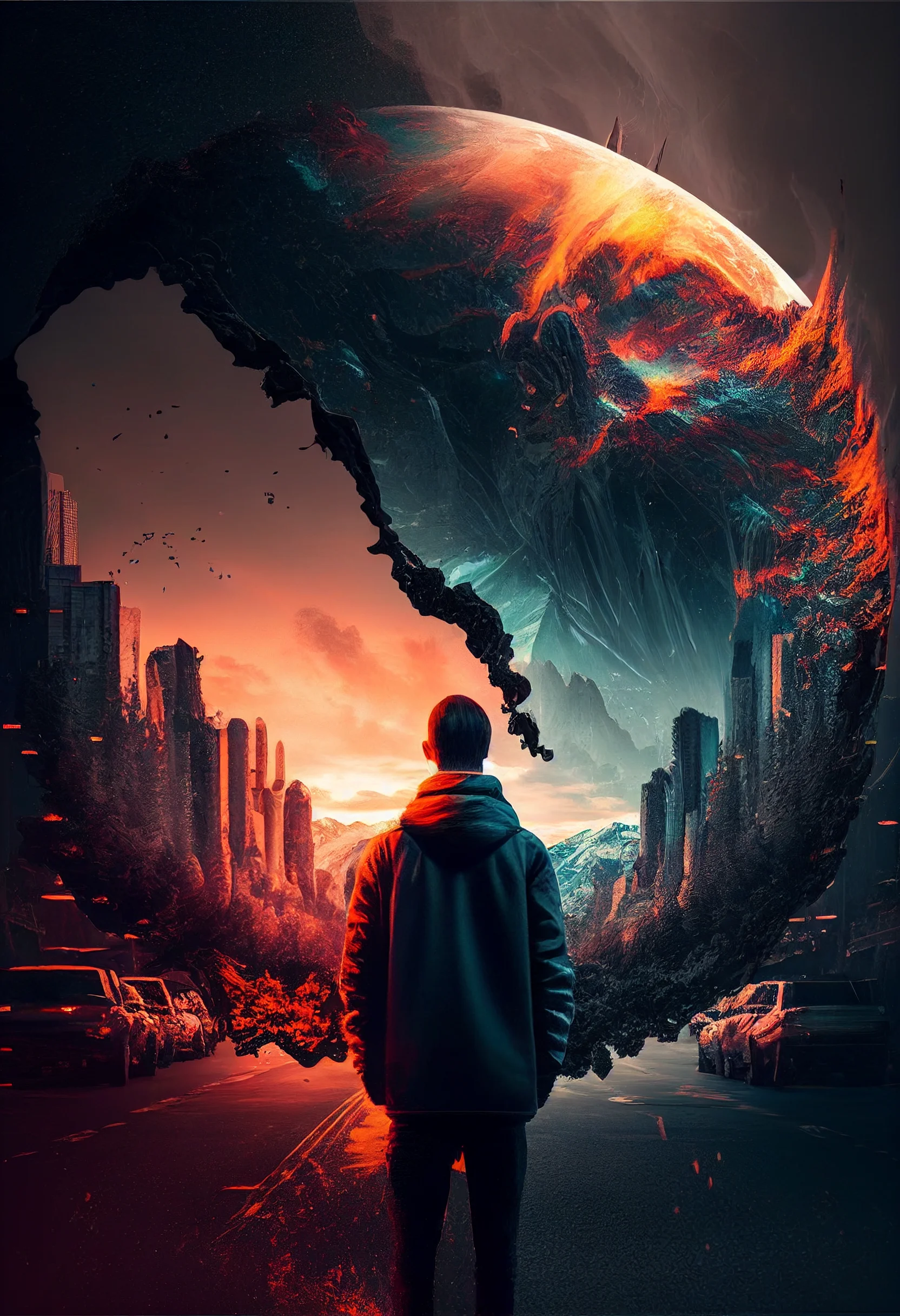
For a Home Screen, I would start with the simpler dark images so app labels remain readable. The brighter, more detailed designs are better on a Lock Screen, where they do not have to sit behind a full icon grid. Despite several old filenames, these are not native 4K or 8K files.
Open the full-size image before saving it and check the crop on your own screen. For adjacent styles, browse the black aesthetic, dark vintage and broader aesthetic wallpaper pages.
Do a 60-second screen test before keeping a wallpaper
- Set it temporarily rather than judging the gallery preview. Phone screens crop portrait files differently, especially around notches, camera cutouts and taller aspect ratios.
- Check the Lock Screen with the clock visible. The brightest face, logo or neon detail should not sit directly behind the time. If it does, reposition the crop before abandoning the image.
- Check the Home Screen with your normal icons. Look at app labels, folders and widgets rather than the artwork itself. If you have to search for familiar icons, the background is too busy for that screen.
- Open the notification shade. A wallpaper that looks clean when empty can become visually crowded once notifications cover its main subject.
A useful setup is to put the more detailed gaming artwork on the Lock Screen and a darker, quieter image on the Home Screen. You still get the dramatic artwork when you wake the phone without sacrificing everyday icon readability.
Choose by composition, not by how dramatic the preview looks
| Wallpaper trait | Usually works best for | What to check |
|---|---|---|
| Dark center with detail near the edges | Home Screen | Icon labels stay readable across several rows. |
| Bright central subject | Lock Screen | The clock does not cover the face, logo or focal point. |
| Neon highlights on black | Either screen | Highlights do not sit directly beneath white text or widgets. |
| Detail across the whole frame | Lock Screen | The crop still makes sense after notifications appear. |
Fix the most common wallpaper problems
The image looks soft: make sure you saved the original file rather than a browser preview or screenshot. These files are 1664 × 2432, so enlarging a cropped screenshot can throw away useful detail.
The subject is cut off: reduce zoom while positioning the wallpaper. If your phone forces a crop, prioritize the face or main graphic and allow less important edge detail to leave the frame.
App icons disappear: move that design to the Lock Screen or use a quieter wallpaper behind the icon grid. Dark alone does not guarantee readability; scattered bright highlights can be more distracting than a lighter but uniform background.
The clock is hard to read: shift the focal point lower or sideways. If that ruins the composition, choose another image rather than forcing a crop that removes the reason you liked it.
A simple way to compare three favorites
Save three candidates and use each one for about a minute with the same Home Screen page open. Check only three things: can you read app labels immediately, does the main subject survive the crop, and does your eye go to the wallpaper before the app you are trying to open? Keep the design that passes all three. This is more reliable than choosing the most impressive full-screen image in the gallery.
Free cool gaming phone wallpapers
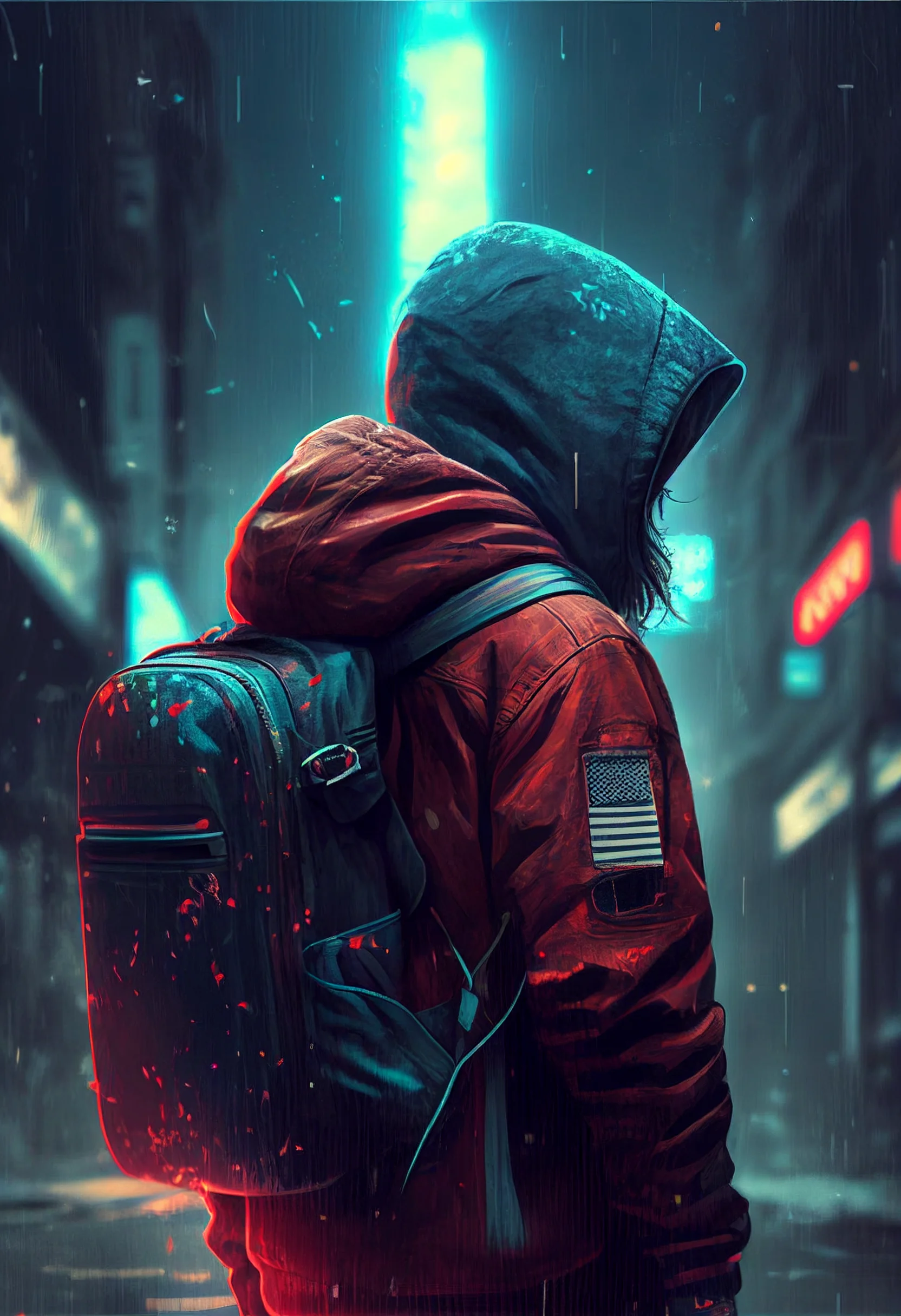
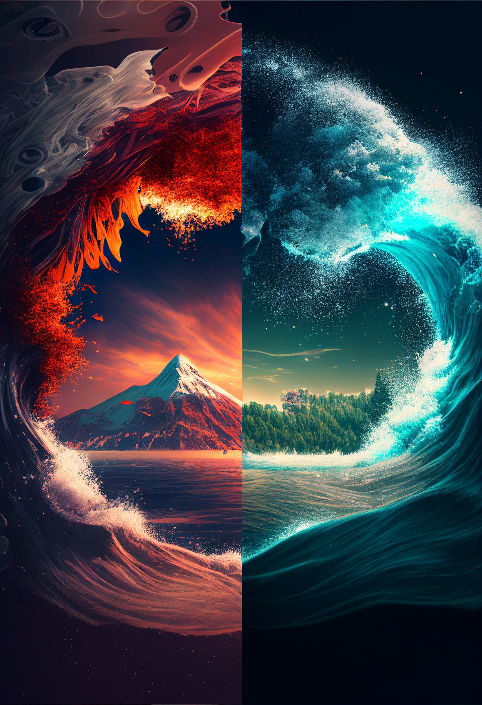
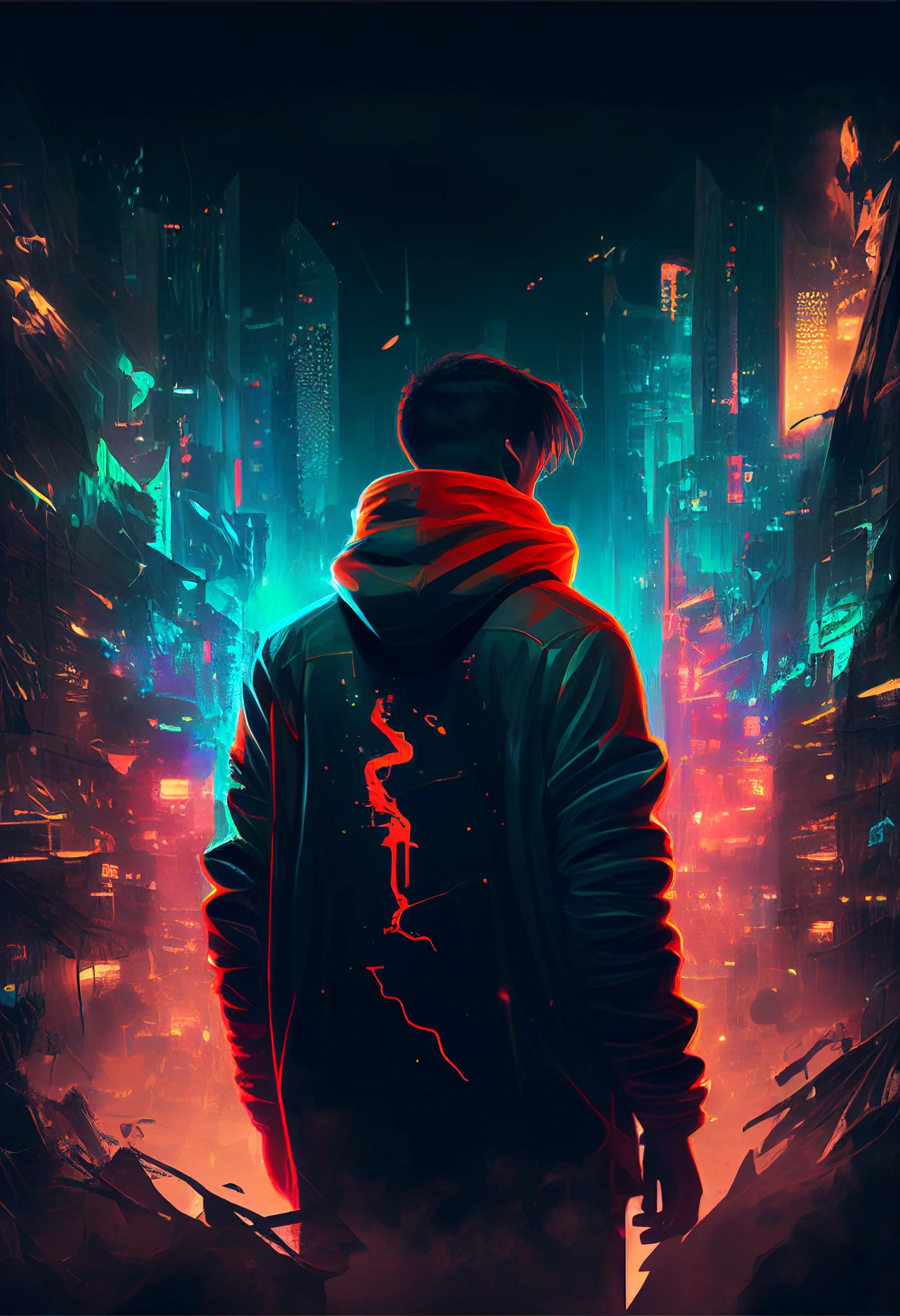
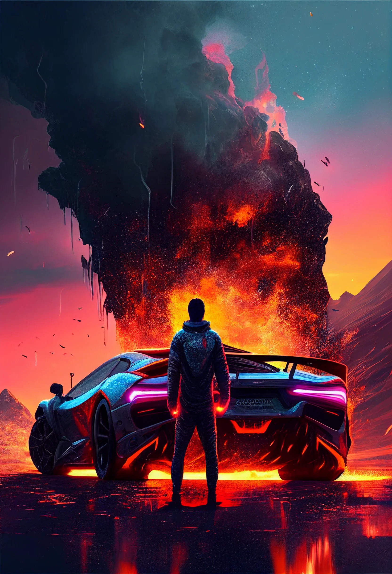
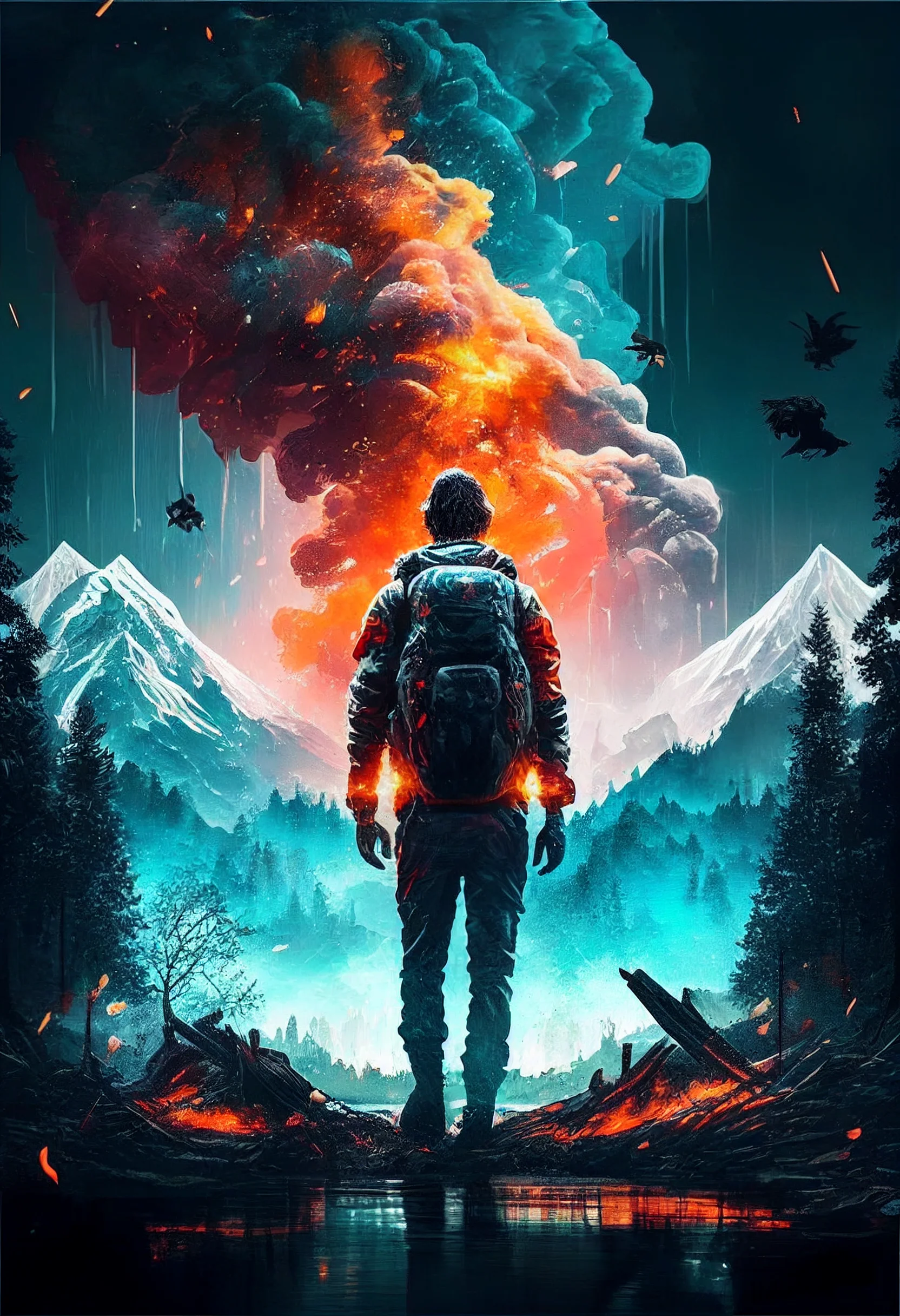
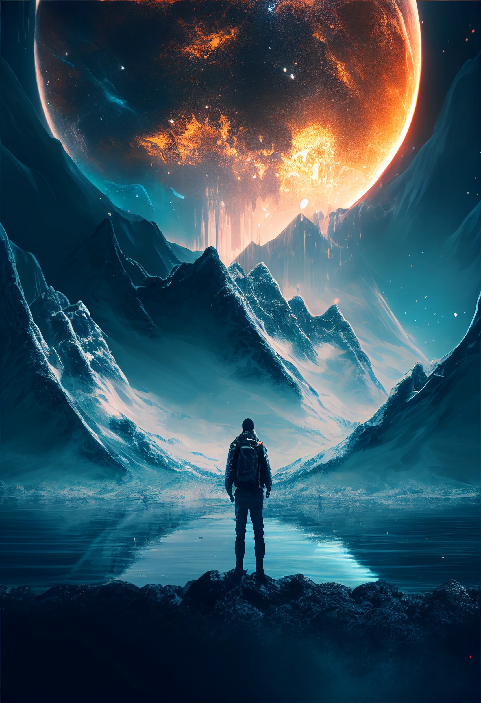

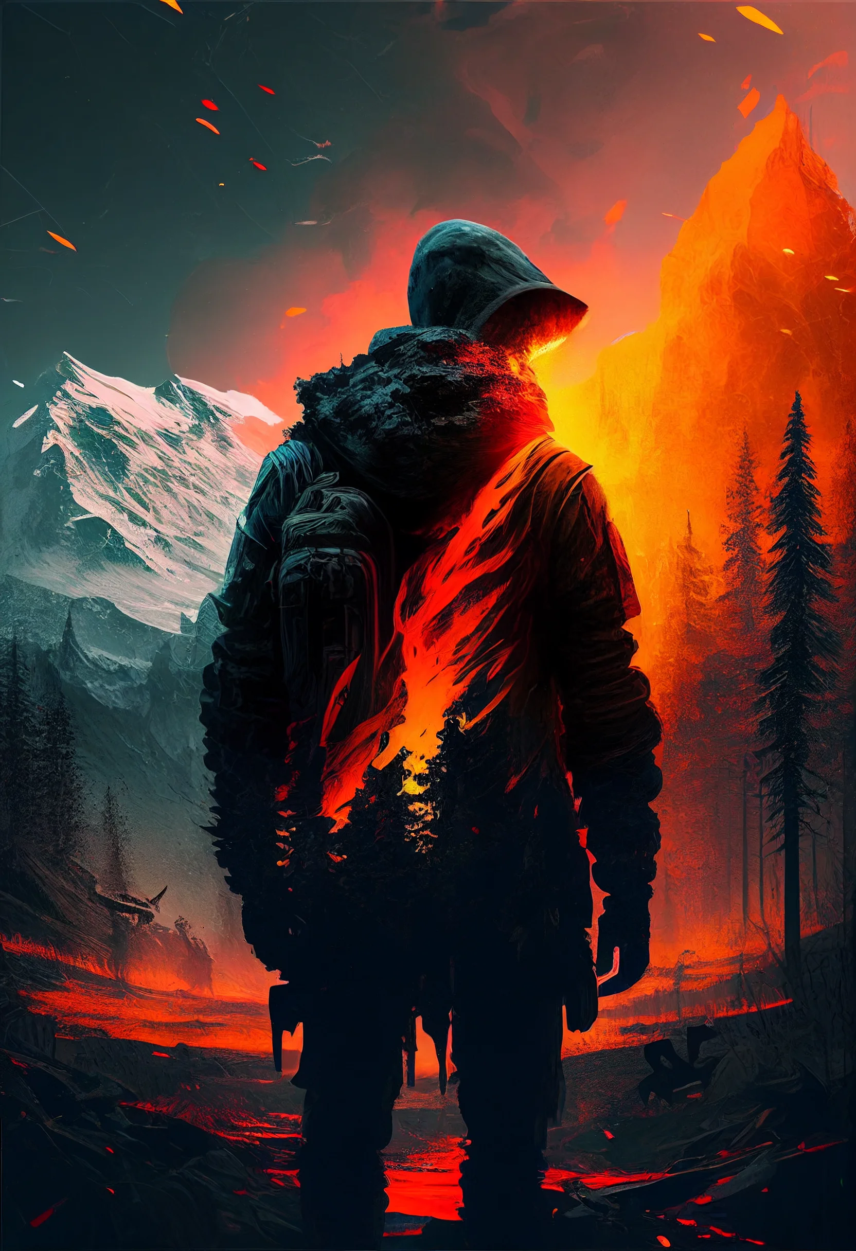
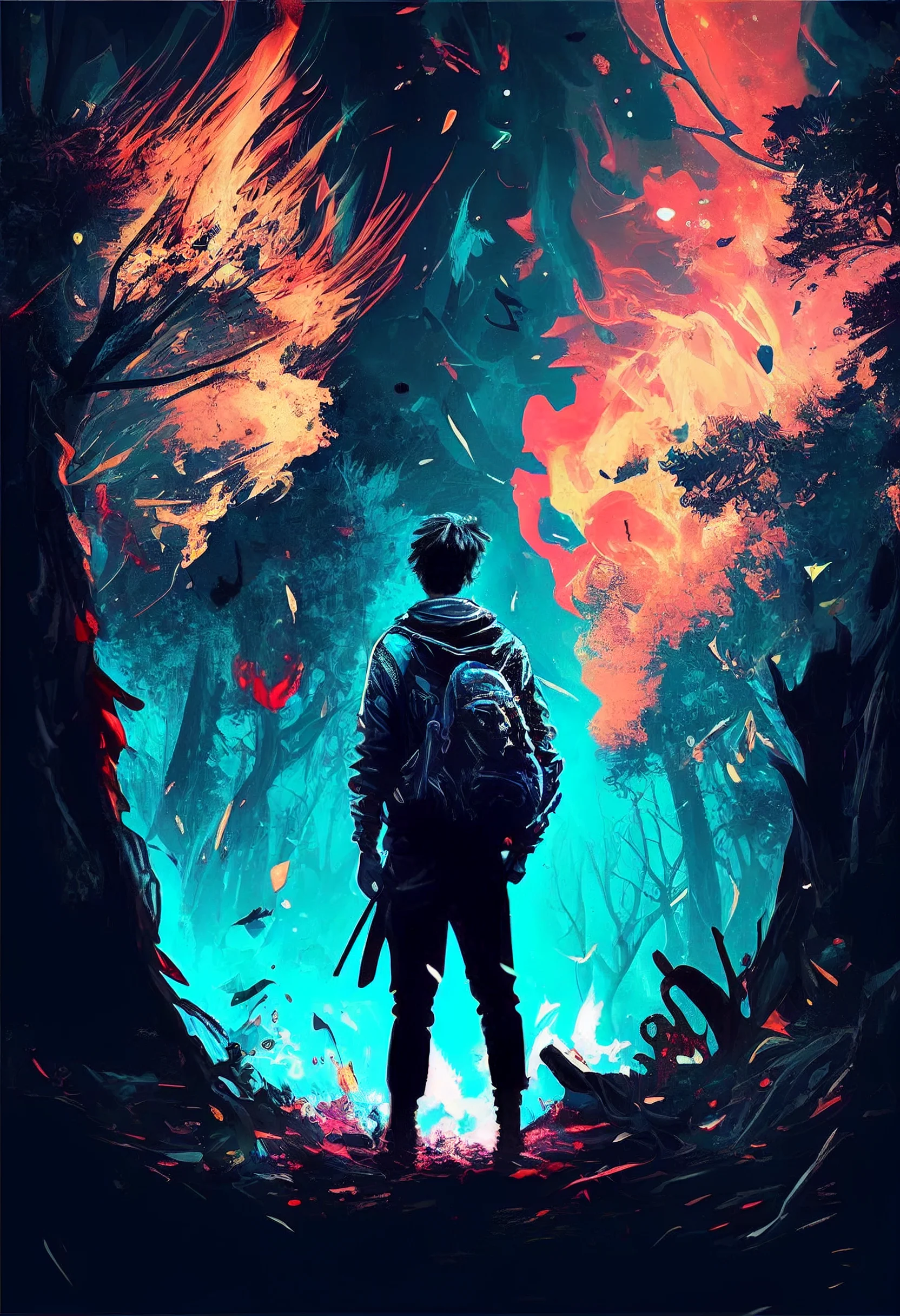
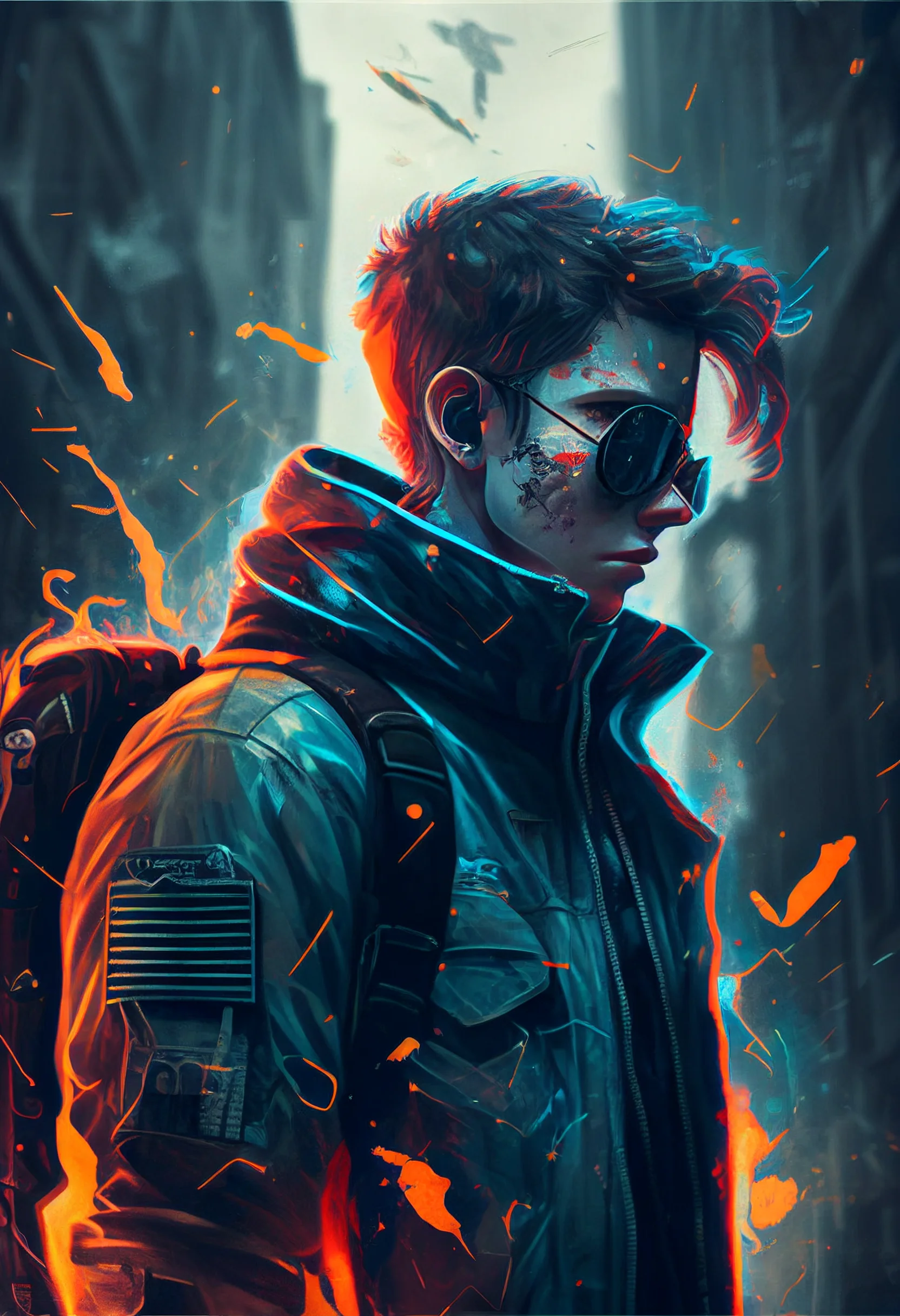
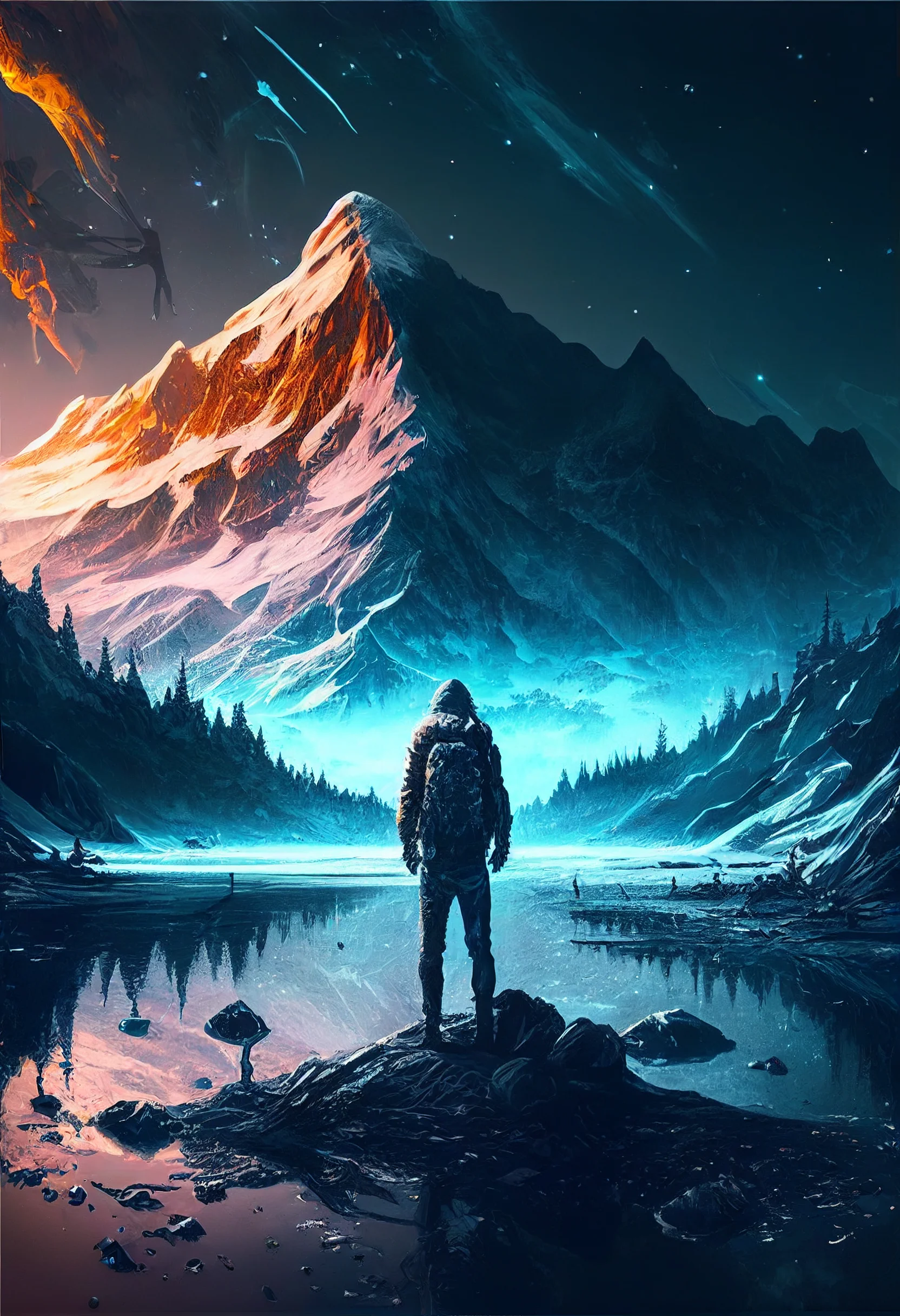

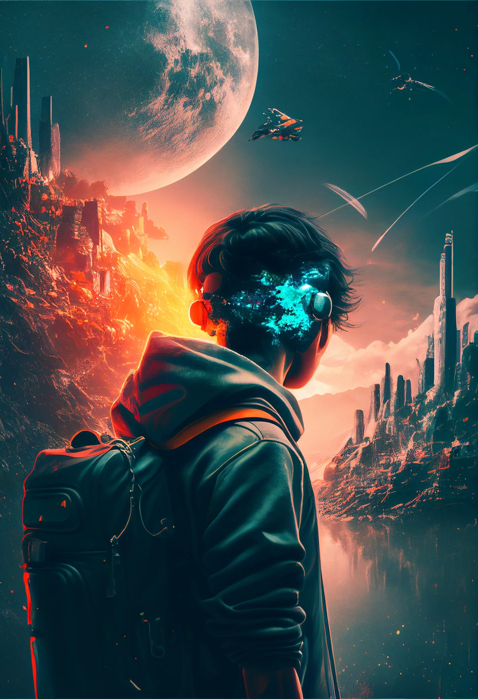
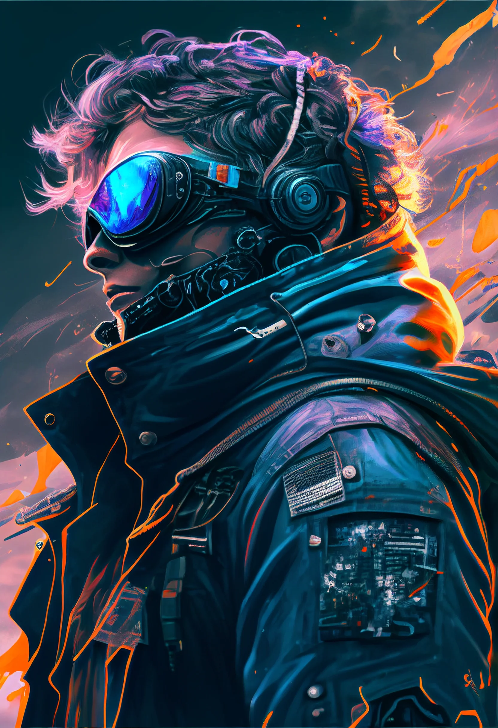
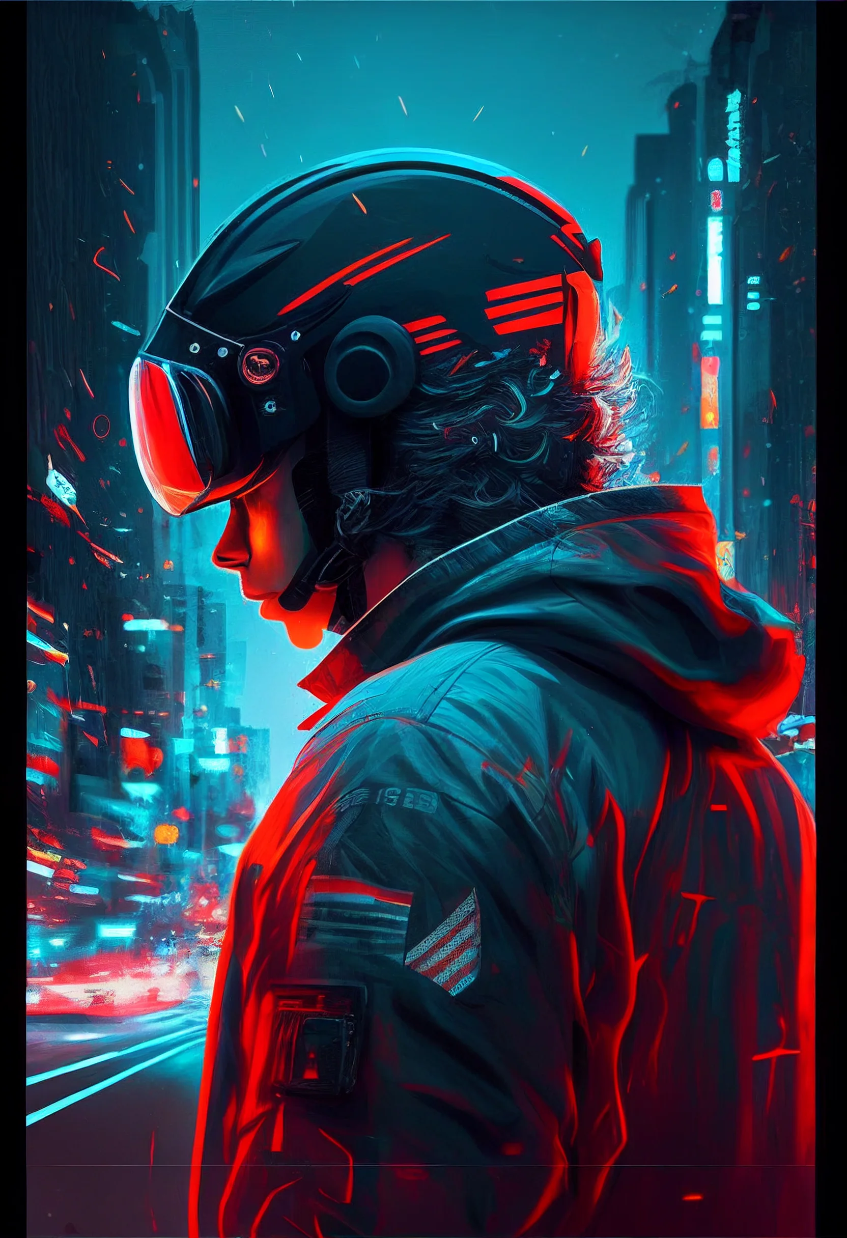
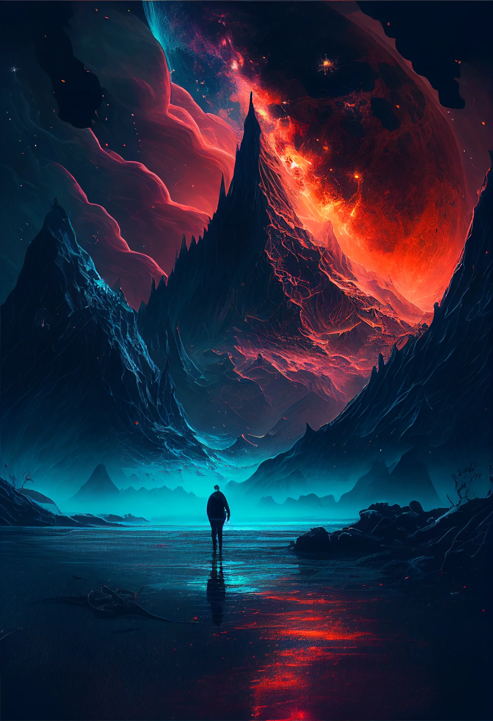
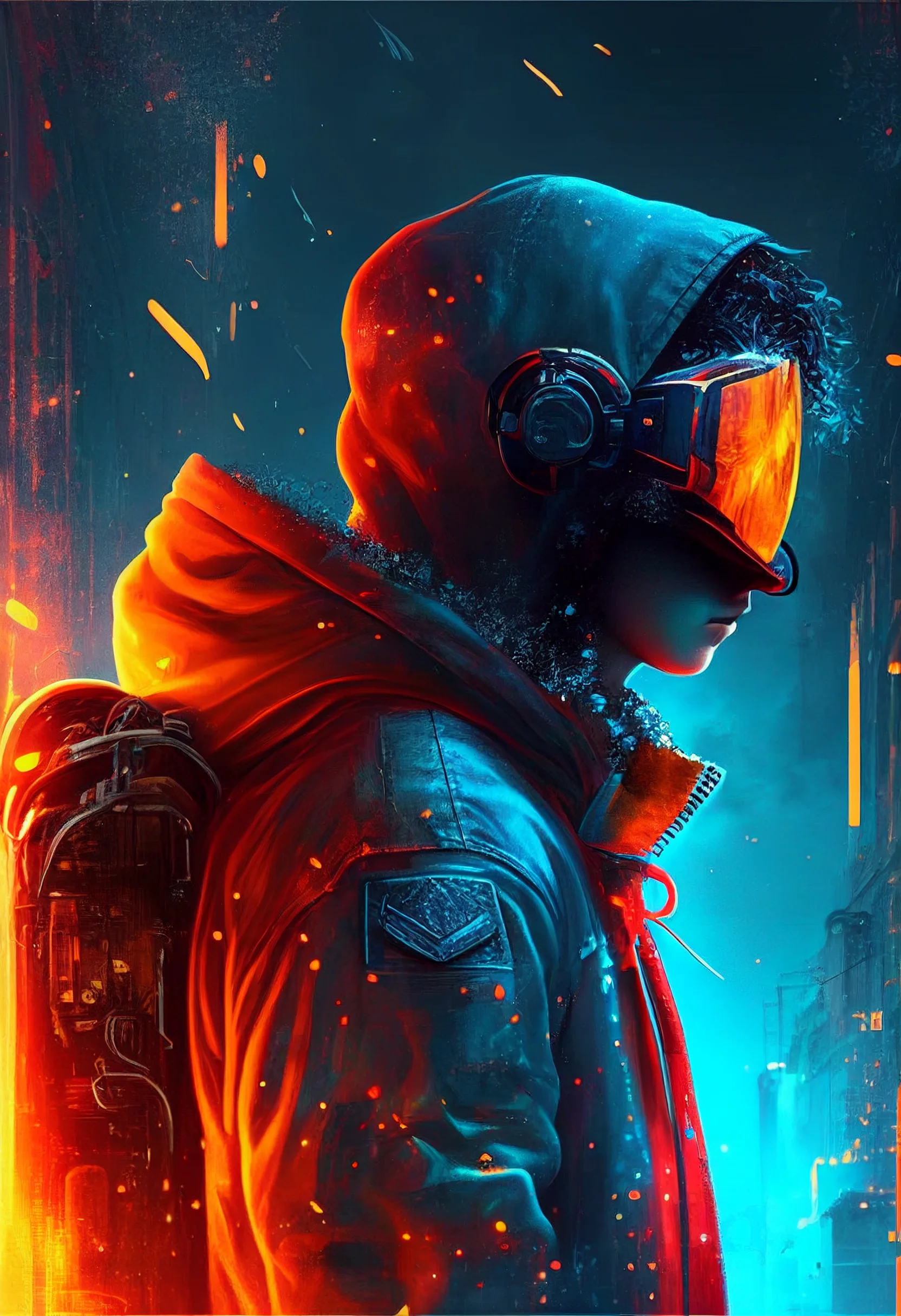
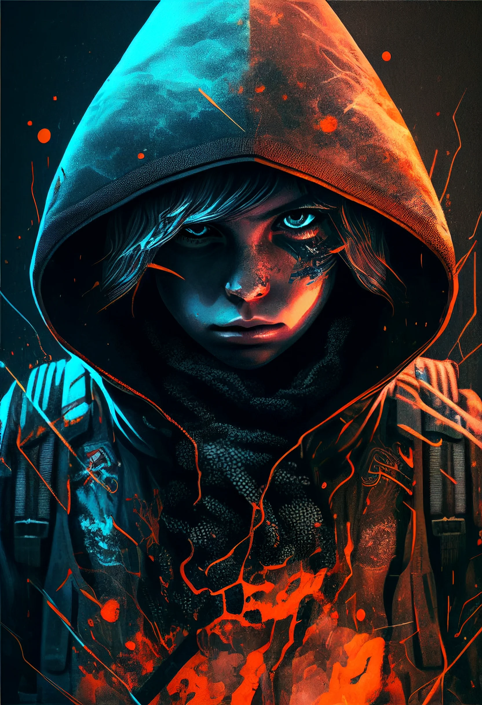
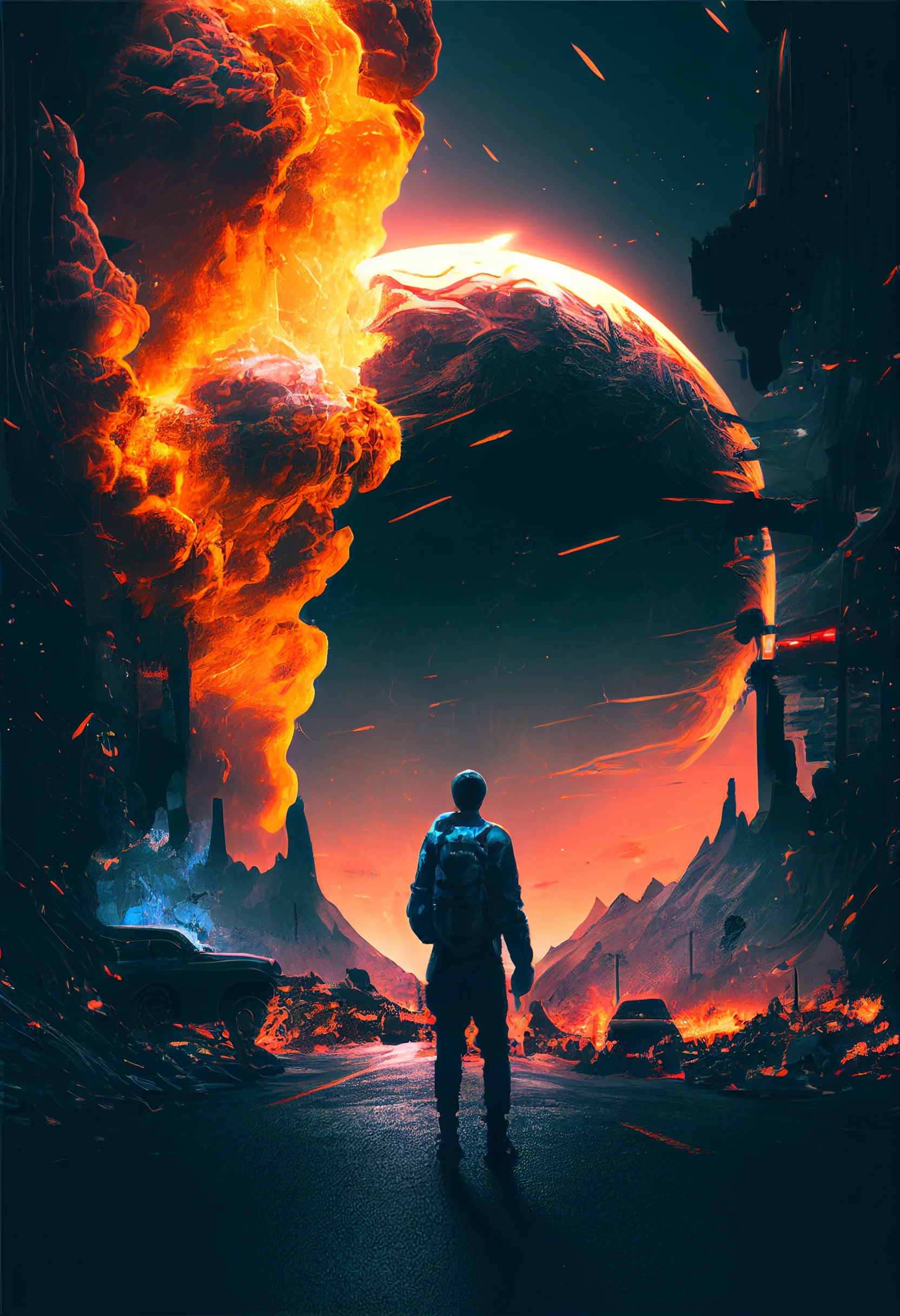
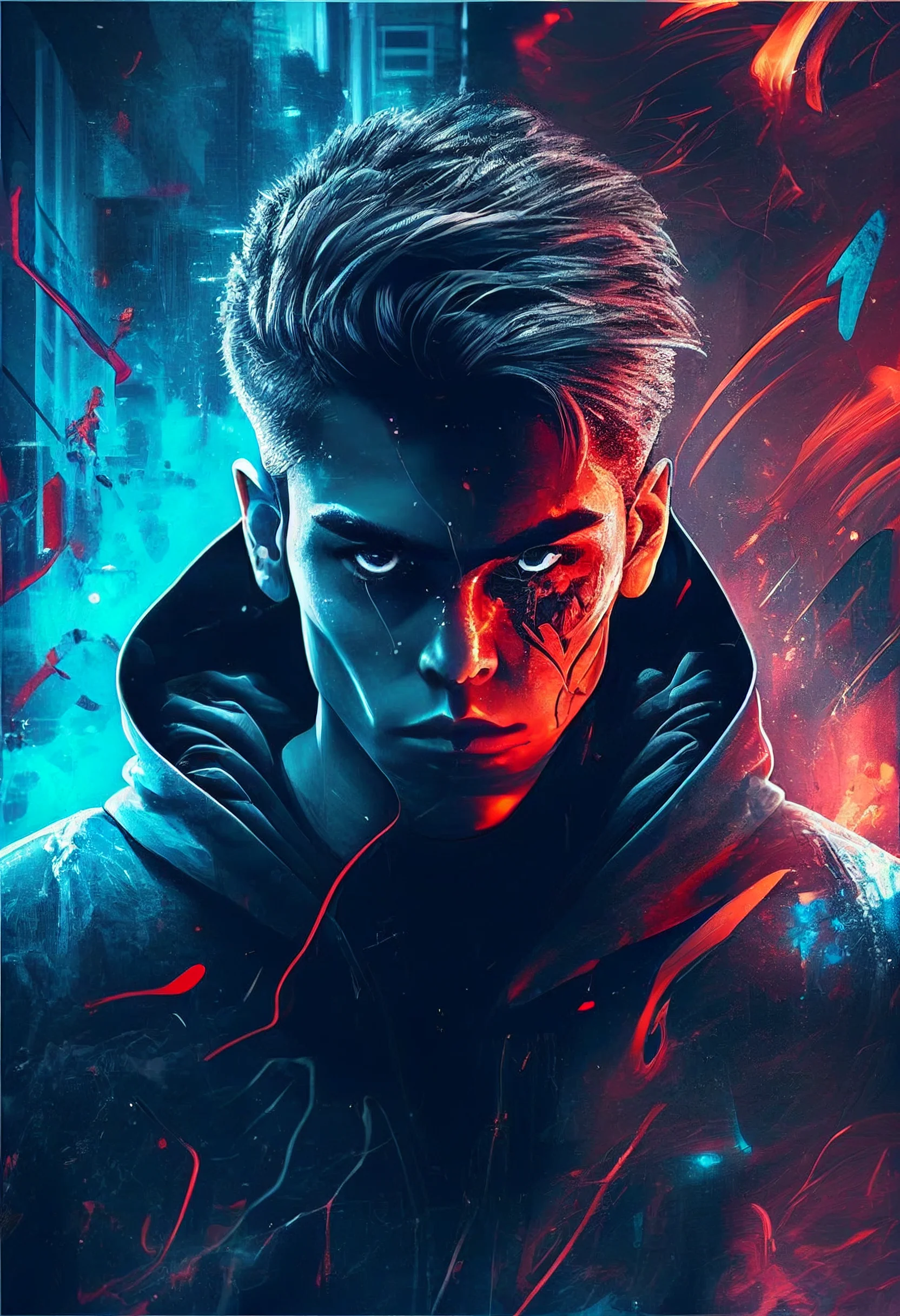

Crop tip: keep the brightest focal point away from the clock and notification area. On these darker wallpapers, a small bright detail can pull more attention than a large dark shape.


Cool I liked it