
The narwhal pages fall into two very different styles. Some keep the whale fairly simple, with a rounded body, long tusk and open water around it. Others lean into the “sea unicorn” idea with kawaii faces and fantasy details. There are 23 sheets altogether.
For a natural look, keep the body in cool gray-blue tones and leave the belly lighter. For the cartoon pages, pastels and rainbow colors work better than trying to force a realistic palette onto a fantasy design.

Use the water to separate the whale from the page
Color the narwhal first, then keep the water immediately around it lighter than the outer background. That small contrast helps the body stay visible even when the page has only simple outlines. On the fantasy pages, the tusk is a good place for the strongest accent color.
For printing, save the image you want and use A4 or Letter paper with “fit to page.” The gallery files are landscape-oriented at 1456 × 816 pixels, so landscape paper orientation usually uses the sheet more efficiently than portrait. Check the print preview before committing, especially if your printer adds wide margins. For more underwater themes, see the orca pages and octopus pages.
Choose a narwhal page by difficulty
If you are printing for a younger child, start with a page that has one large narwhal, a broad tusk and plenty of open water. Bigger enclosed spaces are easier to fill with crayons without constant edge corrections. Older children can move to the kawaii and fantasy designs with smaller decorative areas, while confident colorists can use the busier scenes to practice background depth.
- Quick and easy: one large narwhal, little background detail and broad coloring areas.
- Cute and playful: rounded kawaii faces, sea-unicorn details and brighter palettes.
- More involved: pages with bubbles, waves, stars or several small areas that reward pencils or fine markers.
Three narwhal color palettes that work
You do not need dozens of colors. Pick a small palette before you begin so the whale stays separate from the water.
- Arctic: blue-gray body, pale belly, icy blue water and a muted lavender or pink tusk accent.
- Sea unicorn: pale aqua body, coral-pink details, lavender tusk and soft turquoise water.
- Night ocean: medium blue narwhal against deeper navy water, with pale bubbles and a bright tusk as the focal accent.
Whichever palette you choose, avoid making the narwhal and the surrounding water exactly the same value. If both are medium blue, the silhouette can disappear even when the individual colors look attractive.
23 narwhal coloring pages

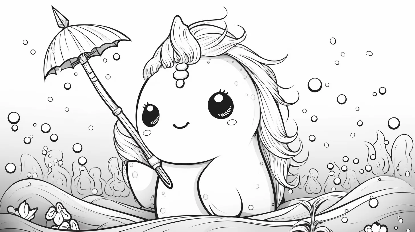
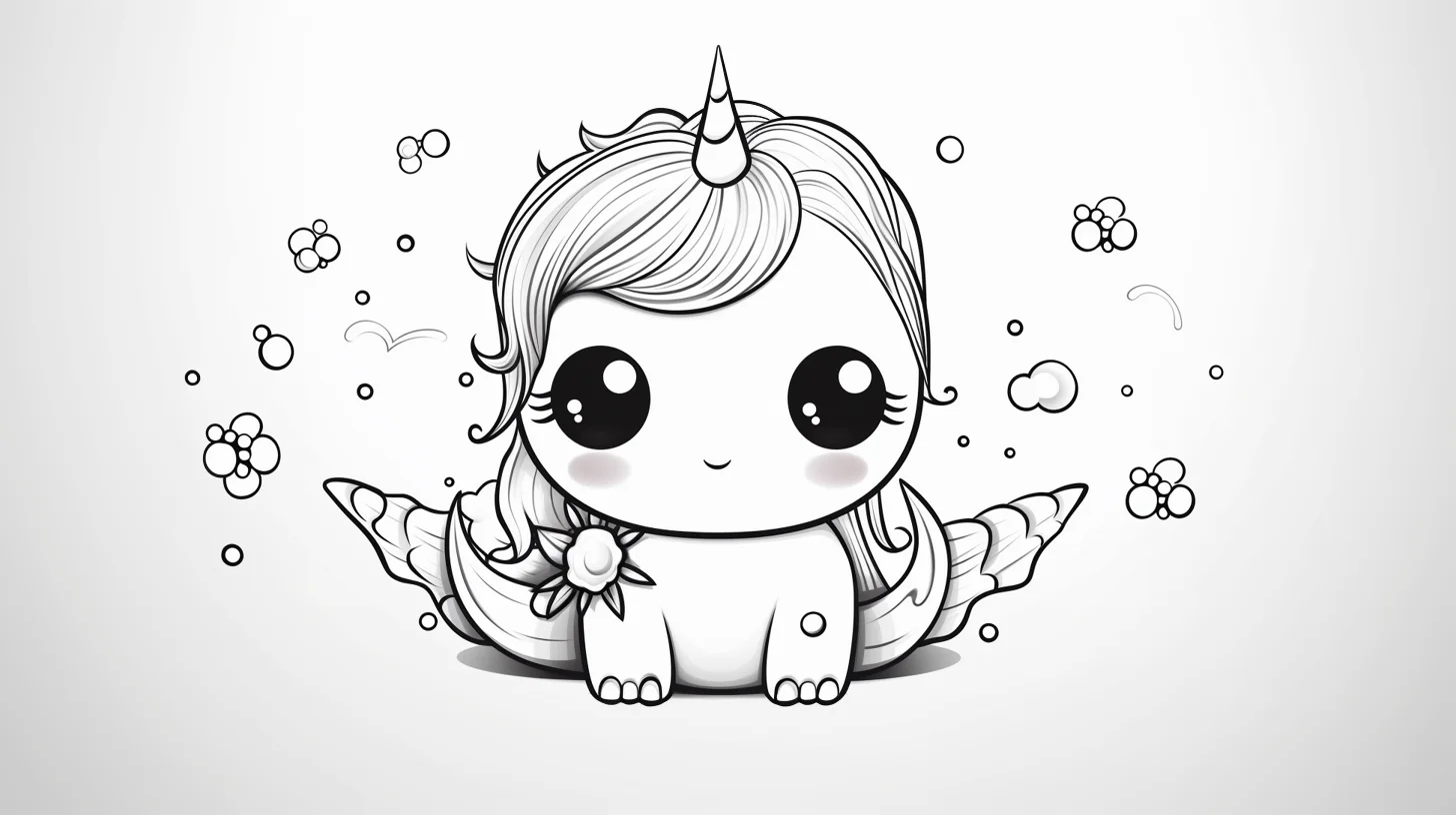




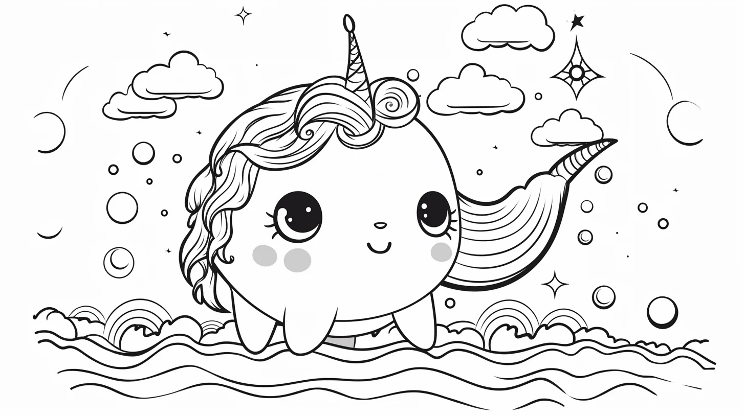
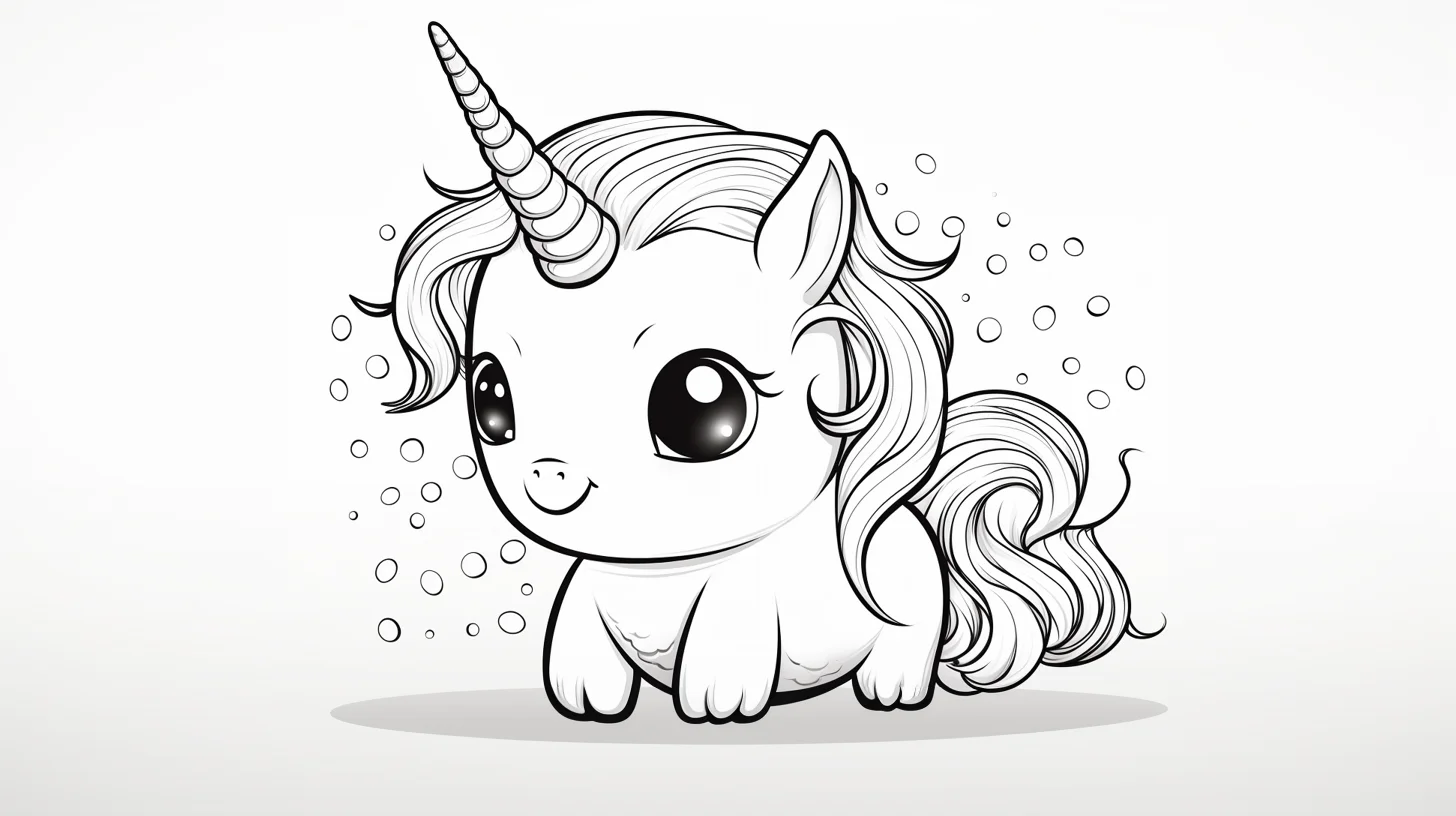
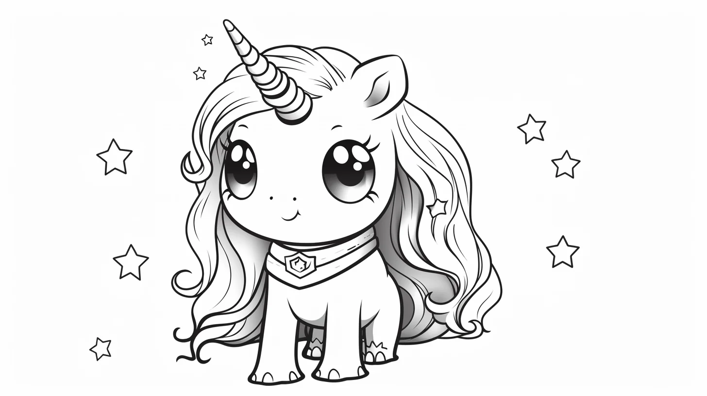
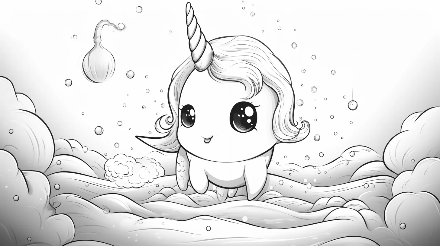
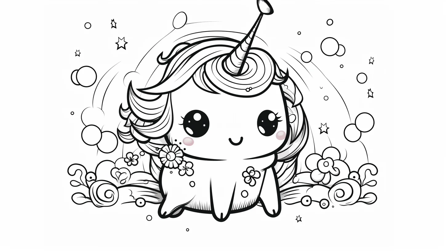


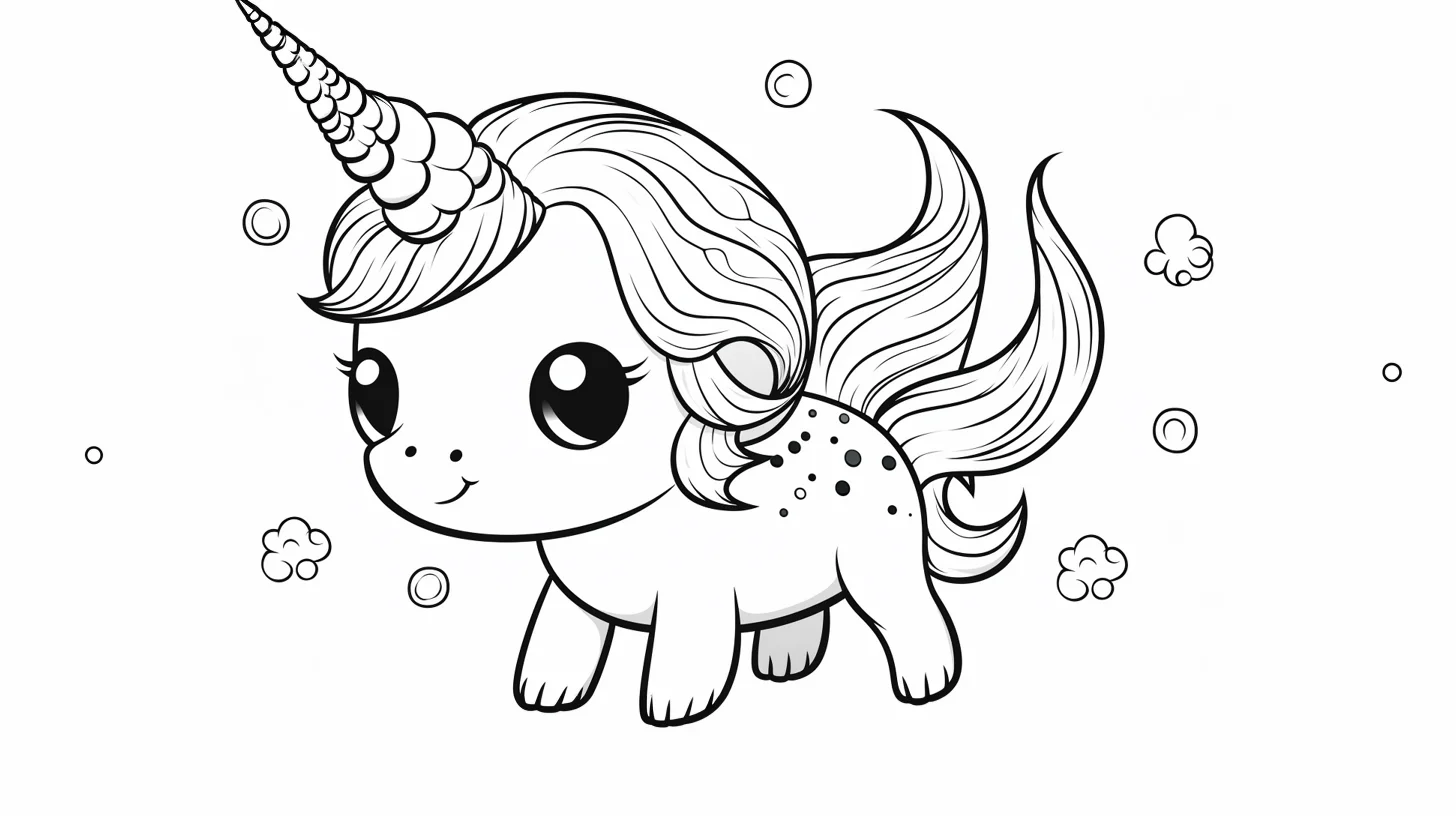

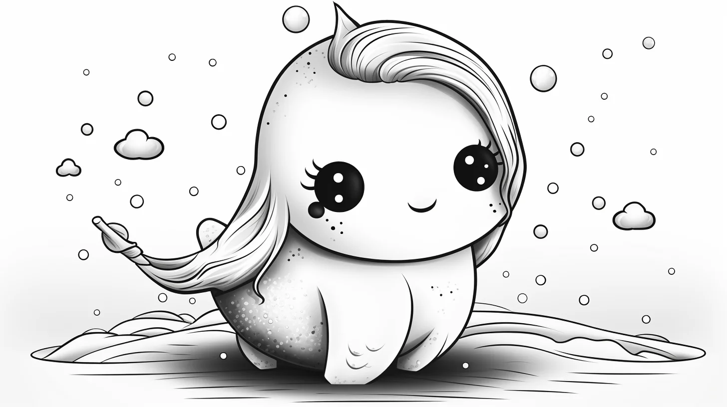

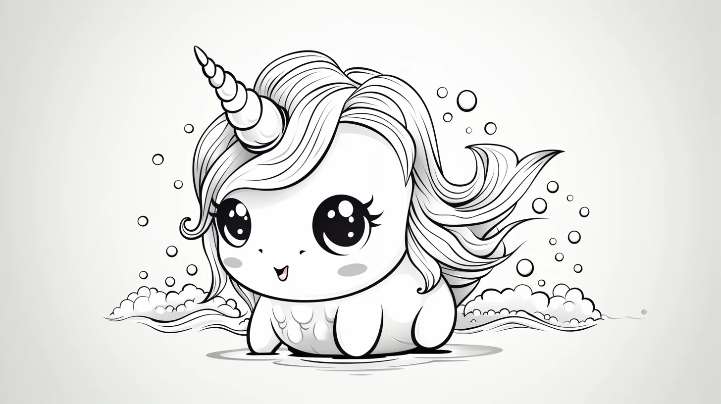

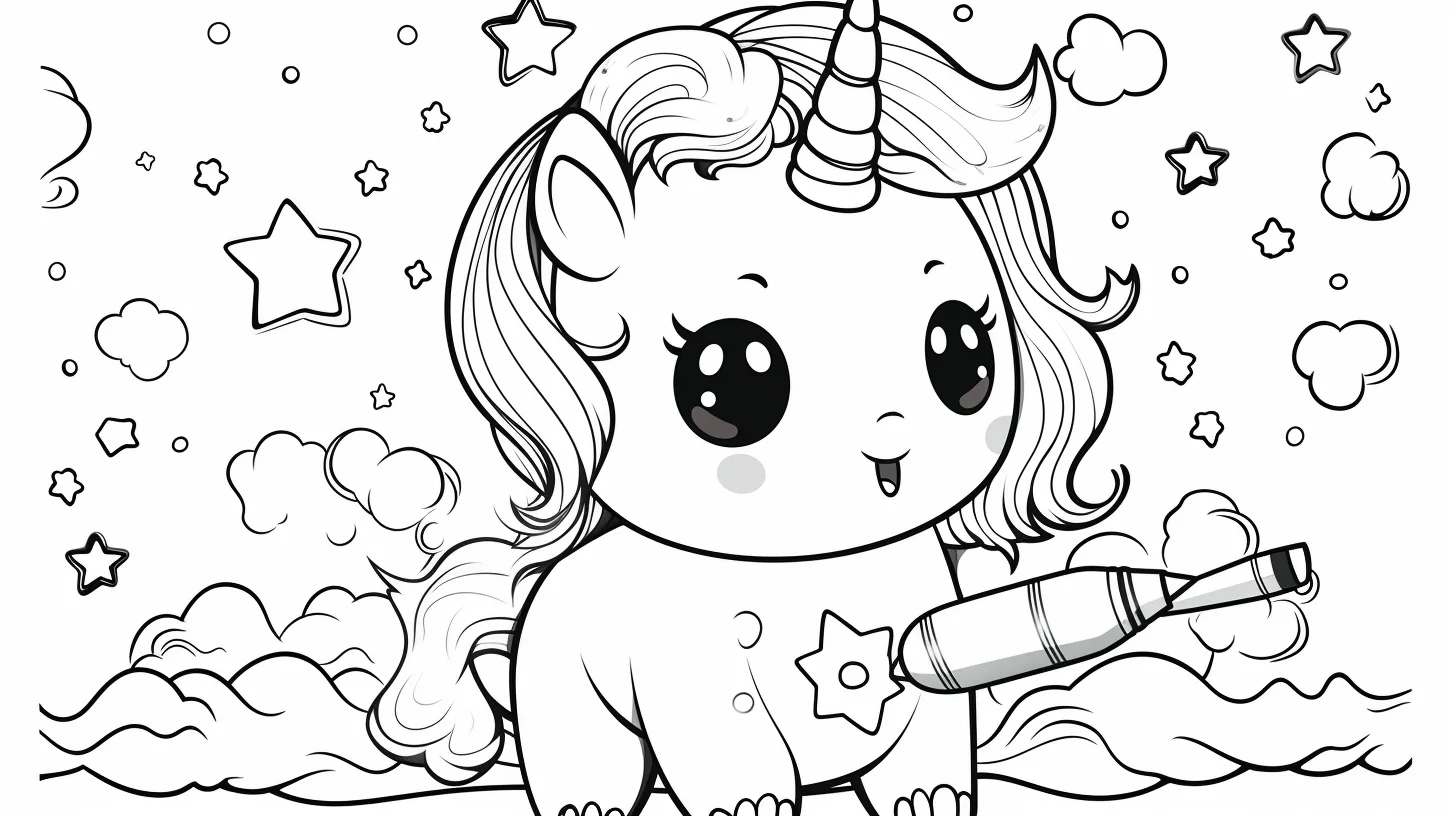
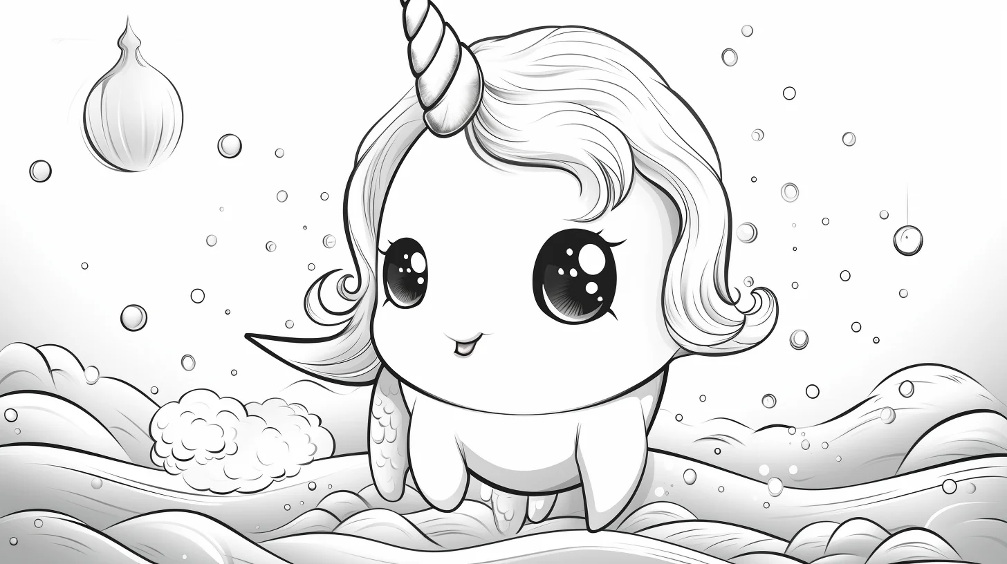
On the simplest narwhal pages, you can add bubbles, stars or a few small fish yourself if the background feels empty. Keep those additions lighter than the whale so they do not become the new focal point.
A simple way to color water without flattening the picture
- Color the narwhal first. Decide how light or dark the body will be before committing to the ocean.
- Leave a lighter zone around the silhouette. It does not need to be a literal white halo; simply use less pressure or a paler blue close to the body.
- Deepen the outer water. Add a darker blue toward corners, lower areas or behind distant details.
- Repeat one accent. If the tusk is lavender, use a tiny amount of lavender in a bubble, star or other small detail so the palette feels connected.
This creates separation with value rather than outlining the narwhal again in a dark color.
Crayons, pencils or markers?
Crayons are the easiest choice for the broad baby-narwhal designs. Colored pencils are better when you want a soft gray-blue body, gradual water changes or control around small bubbles. Markers suit the bold kawaii pages, but print on heavier paper and place scrap paper underneath because ink can bleed through ordinary copier paper.
Try this five-color challenge
Choose only five colors for the entire page: one body color, one belly/highlight color, one water color, one darker version of the water color and one accent. Finish the page without adding a sixth. The restriction makes it easier to see whether contrast and placement are doing the work instead of relying on lots of unrelated colors.
Common narwhal coloring problems
| Problem | What to change | Why it works |
|---|---|---|
| The whale disappears into the ocean | Lighten either the body or the water immediately around it. | The silhouette needs a value difference more than it needs a different hue. |
| The page feels too blue | Add one small warm accent such as coral, pink or peach. | A warm note breaks the cool palette without turning the whole scene rainbow-colored. |
| The tusk looks pasted on | Shade the lower edge of each spiral and repeat its main color once elsewhere. | Shading gives the tusk volume; color repetition connects it to the page. |
| A simple page feels empty | Add bubbles or two or three small fish at different sizes. | Size variation suggests depth while keeping the narwhal dominant. |
| The background overwhelms the character | Use less pressure or lower saturation in the water and reserve the darkest contrast for the face and body edge. | The eye naturally returns to the strongest contrast. |
| The body looks like one flat gray shape | Keep the belly light, use a midtone on the upper body and add a narrow darker area underneath. | Three values are enough to suggest a rounded body. |
A three-page narwhal practice progression
- Page 1 — silhouette and control: choose a large, simple narwhal. Use only a light body value, a darker body value and one water color. Concentrate on clean edges and keeping the belly lighter.
- Page 2 — depth in the water: choose a design with bubbles or small surrounding details. Keep the water lighter near the narwhal and gradually deepen it toward the edge of the scene.
- Page 3 — focal point: use a kawaii or sea-unicorn design. Make the face and tusk the highest-contrast area, then deliberately soften secondary decorations.
Using related colors across all three sheets makes the exercise more useful: you can compare control, depth and focal-point choices without a completely different palette hiding the improvement.
Make the tusk look round instead of striped
The spiral is easiest to read when every section follows the same light direction. Start with one pale base color. Add a darker version along the lower or shadow-facing edge of each spiral segment, then leave a thin lighter area on the opposite side. Avoid alternating unrelated colors on every band unless you specifically want a candy-cane or rainbow effect. For a pearly fantasy tusk, pale lavender with violet shadows works well; for a quieter Arctic palette, try cool gray with blue-gray shadows.
Narwhal coloring page questions
What color is a real narwhal?
For a natural-looking page, use cool gray, blue-gray and off-white rather than bright ocean blue. You can still simplify the pattern for a child-friendly result; the fantasy pages do not need to follow realistic coloring at all.
Which pages are easiest for preschoolers?
Choose designs with one large character and fewer tiny background shapes. Broad body and water areas are easier to control with crayons and make it faster to finish a recognizable picture.
How can I make a narwhal page look more three-dimensional?
Keep the belly and upper-facing highlights lighter, darken a small part of the underside, and make the water farther from the body slightly darker. You only need two or three values to create useful separation.
What paper should I use?
Standard printer paper is fine for crayons and light pencil work. For markers or heavier layering, use thicker paper that your printer supports and protect the surface underneath.
More ocean coloring pages
For a stronger black-and-white marine silhouette, try the orca coloring pages. The octopus coloring pages are useful when you want more repeated shapes and tentacle detail. For another playful sea-animal set, browse the baby shark coloring pages.

