
These 20 car wallpapers are made for portrait phone screens rather than desktop monitors. You’ll find dark cars, racing scenes, close-up automotive shots and cleaner backgrounds that leave more room for the clock or app icons.
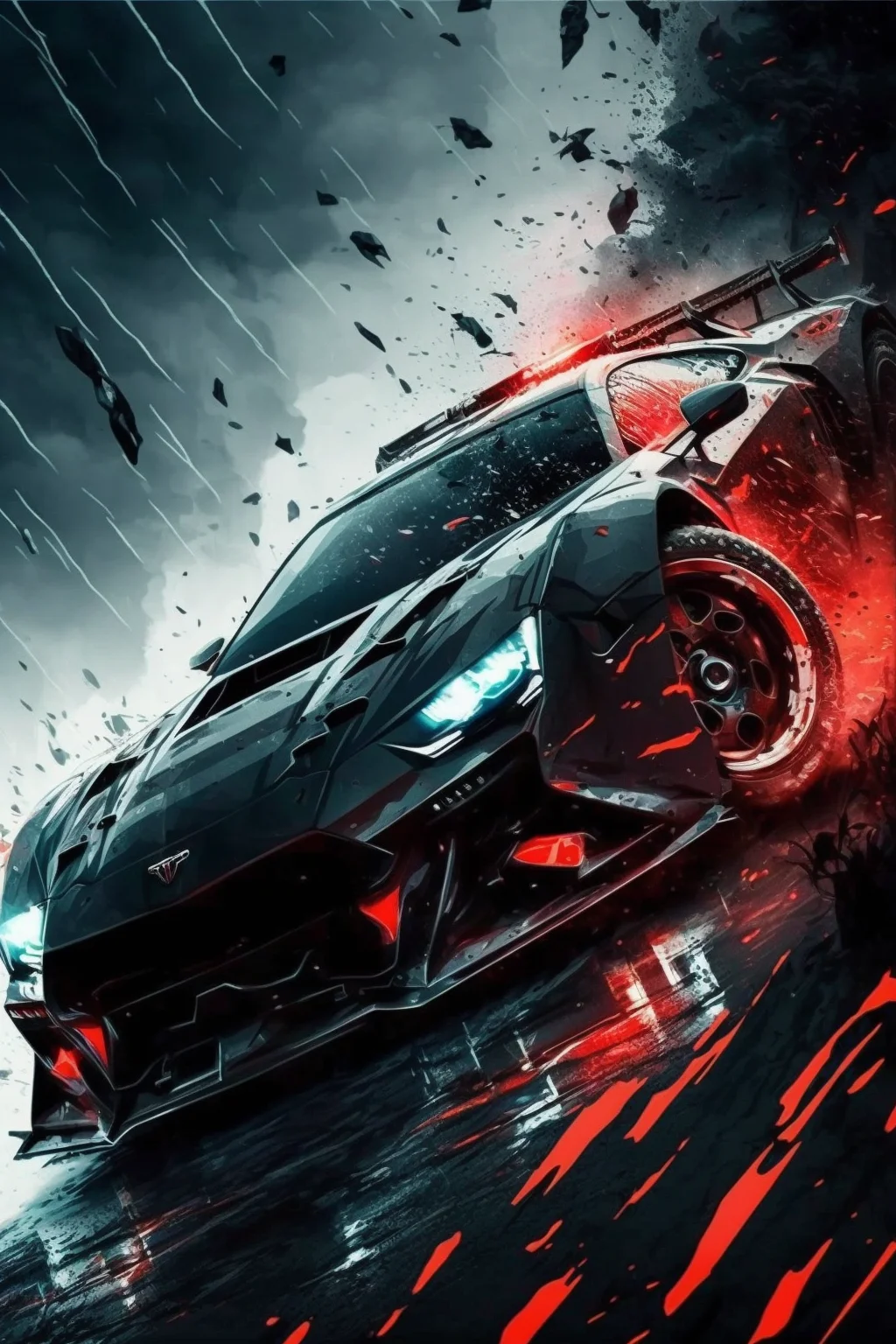
One useful detail before you download anything: the source files are 1024 × 1536 pixels. They look sharp enough for normal phone wallpaper use, but they are not native 4K files. I would rather tell you the real size than label every image “4K” just because that phrase is popular in wallpaper searches.
Pick differently for the Lock Screen and Home Screen
- Lock Screen: choose a car positioned lower in the frame, or a scene with relatively calm space near the top. That gives the clock and widgets somewhere to sit without covering the roof or windshield.
- Home Screen: darker or less detailed backgrounds usually work better because app names and icons have to remain readable all day.
- If you use lots of widgets: avoid a wallpaper where the most interesting part of the car fills the center and upper third of the screen.
A wallpaper can look great as a full image and still work badly once the phone adds the clock, dock, notifications and widgets. That is why composition matters more here than chasing the highest possible resolution number.
Run a 60-second crop test before you keep it
- Read the clock at a glance. If it disappears into a bright sky, headlight or windshield reflection, reposition the image or try a darker frame.
- Trigger one notification. Check whether the card hides the grille, badge or other feature that made you choose the image.
- Unlock and scan your first app row. If labels become hard to find, reserve that image for the Lock Screen.
- Check all four edges. A wheel, mirror or spoiler clipped awkwardly by the display usually looks worse than a slightly smaller car with breathing room.
If you keep pinching and repositioning but cannot protect both the car and the interface, switch compositions. A good phone wallpaper should survive the interface without constant compromise.
How to save and set one
- Open the image you like at full size rather than saving a small preview.
- Save it to your Photos or Downloads.
- Open your phone’s wallpaper settings and select the saved image.
- Move or scale the image only enough to keep the car clear of the clock, widgets and screen edges.
If the phone zooms in more than you expected, try a wallpaper with more empty space around the vehicle rather than forcing a tight crop. A different image often works better than endlessly pinching the same one into place.
For more background styles, browse our aesthetic wallpaper collection. If you prefer older vehicles and softer colors, see the vintage car wallpapers.
Car wallpaper collection
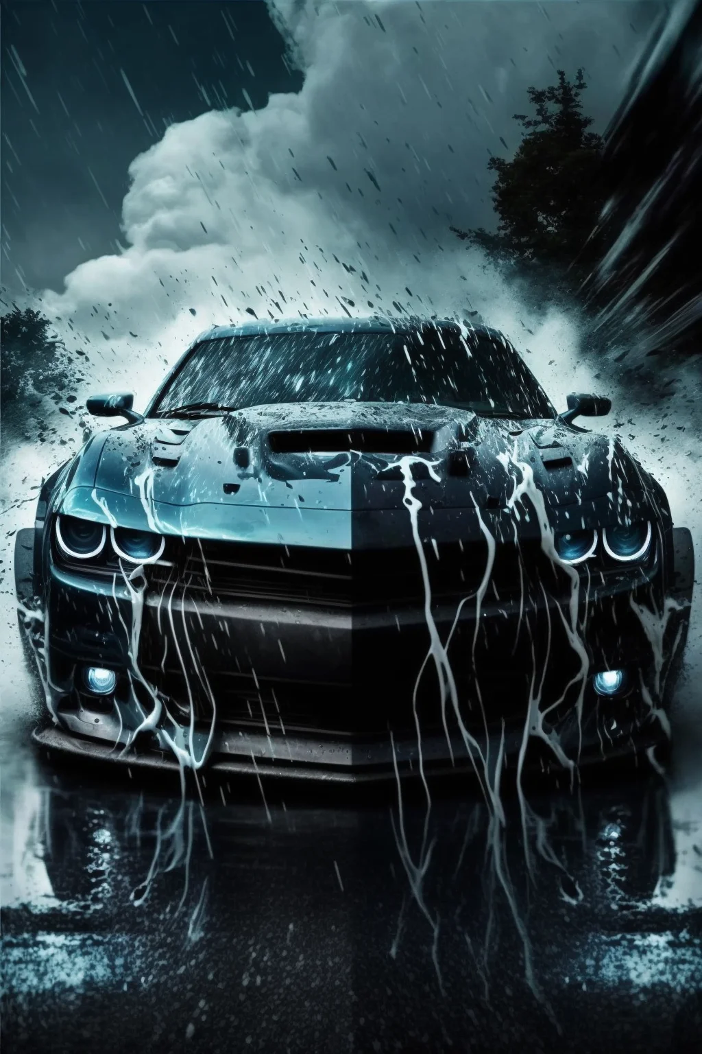
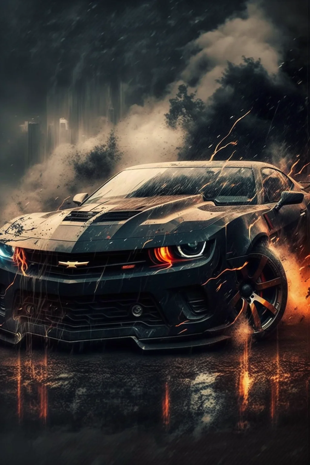
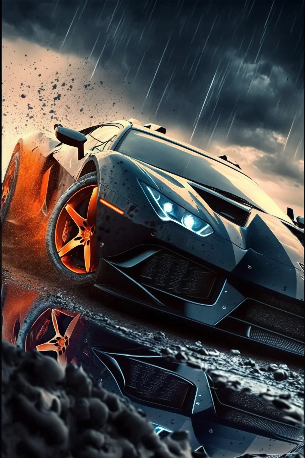
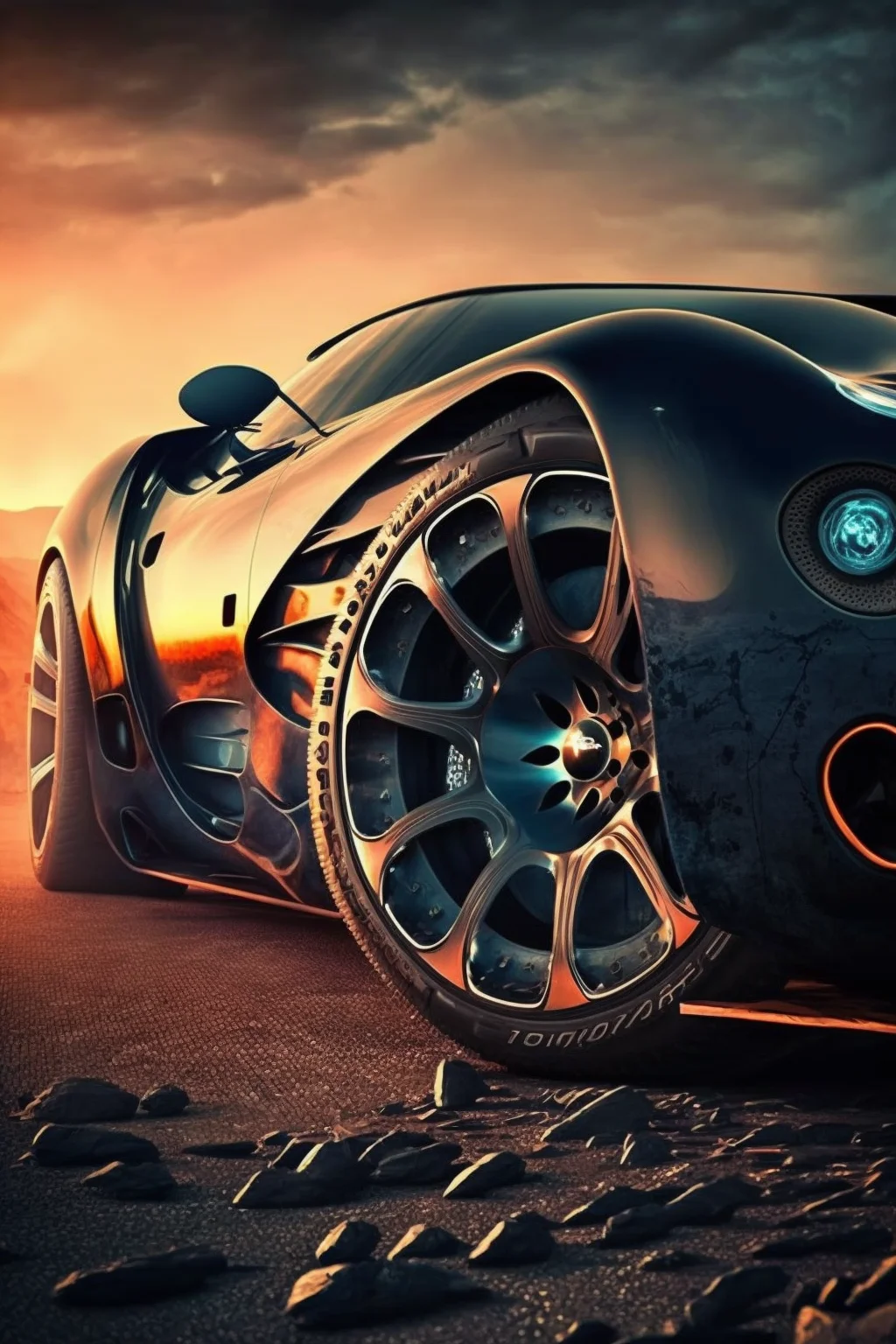
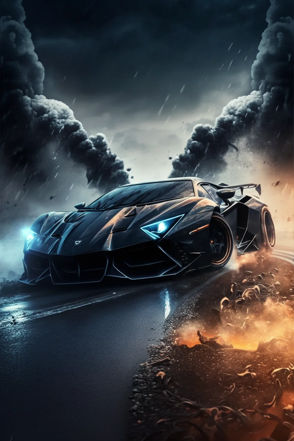
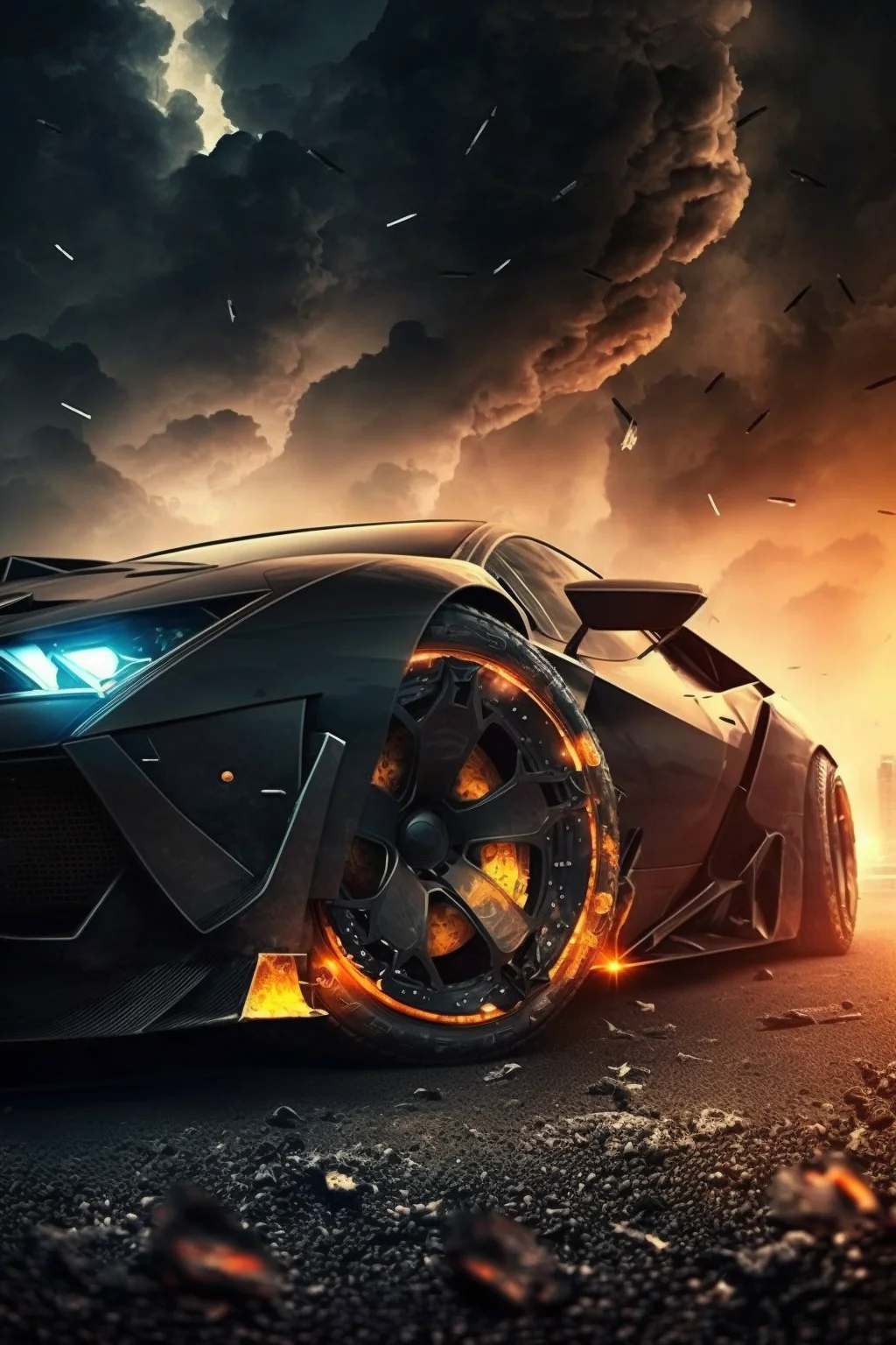
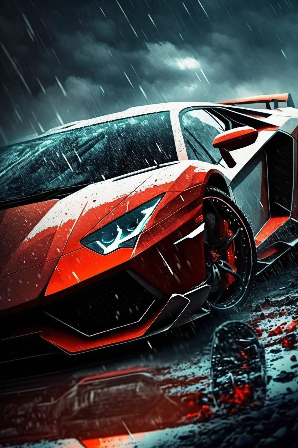
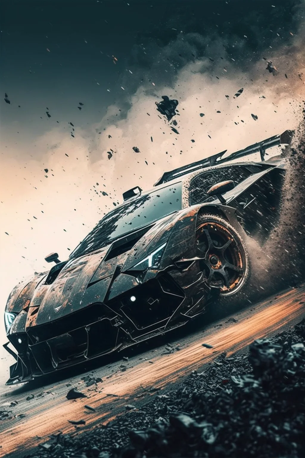
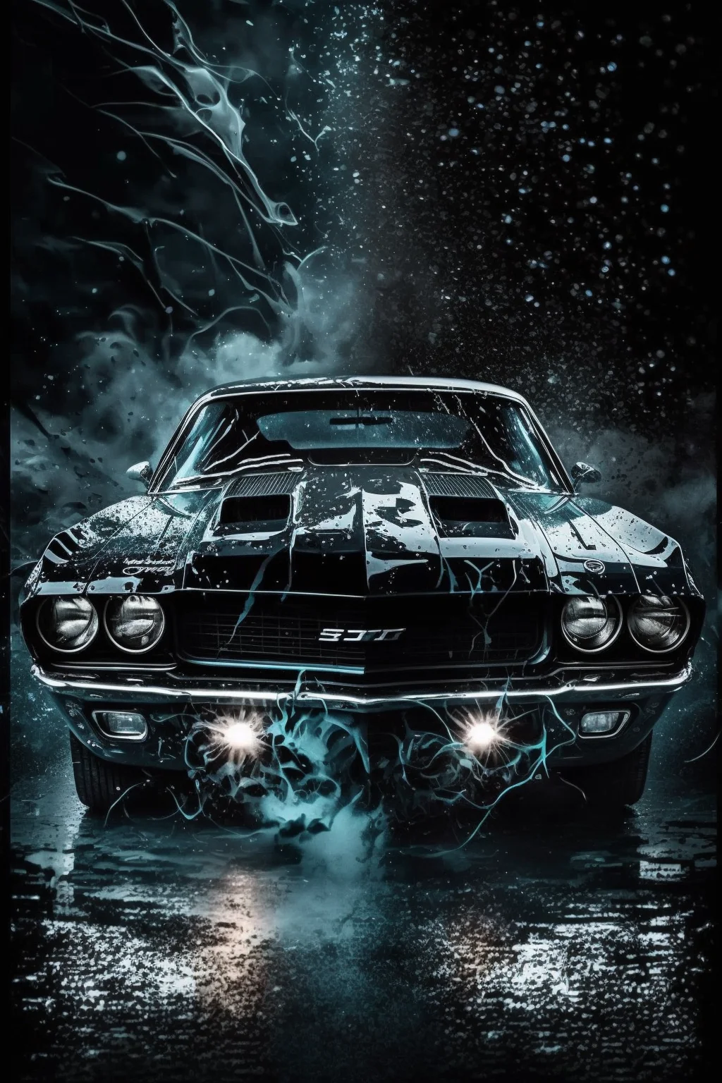
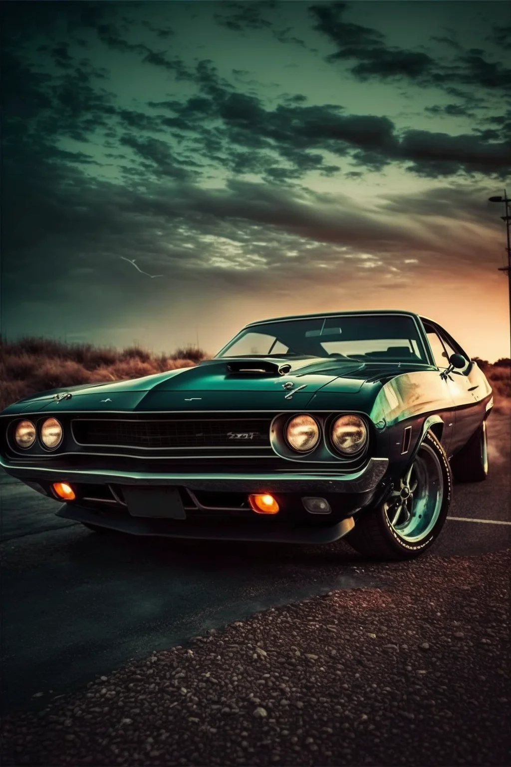
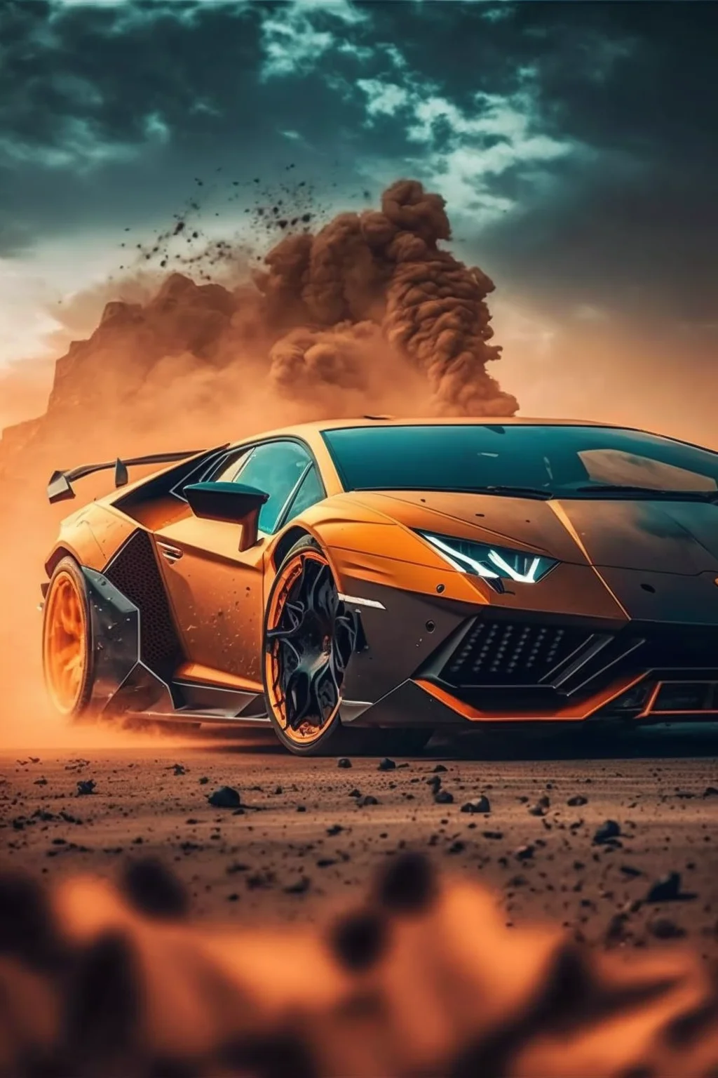
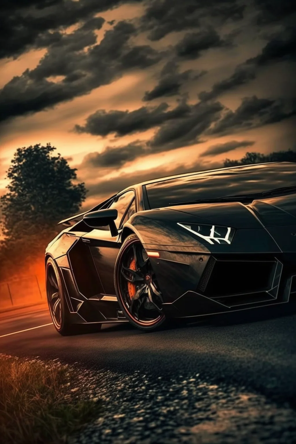
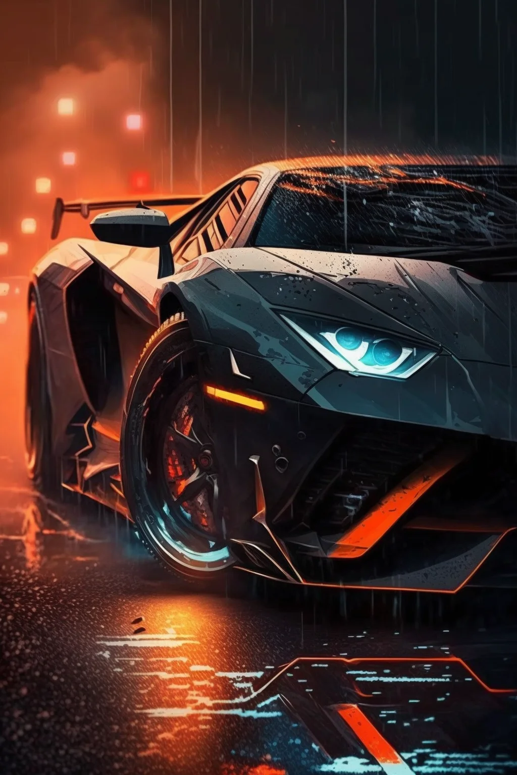
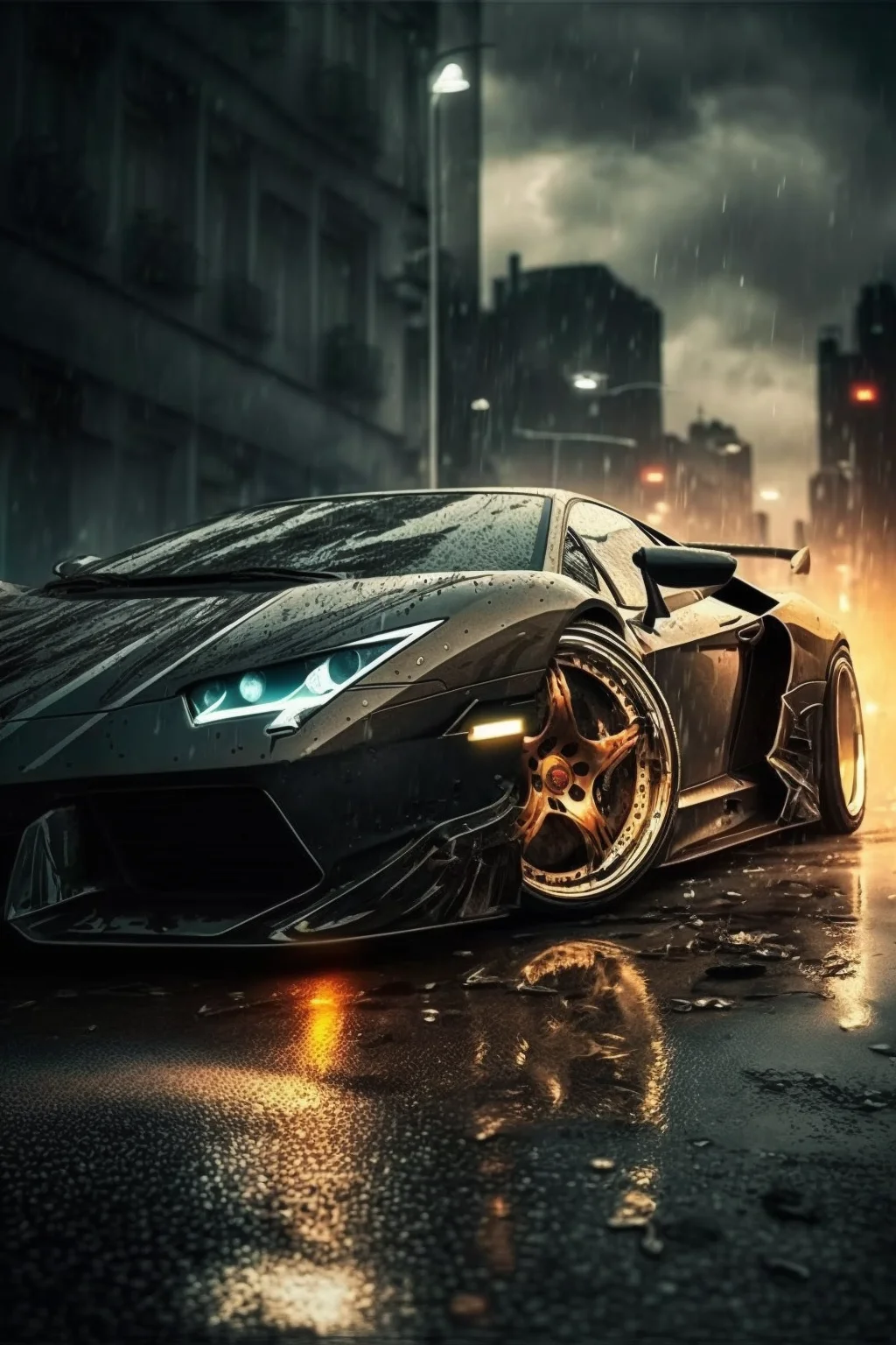
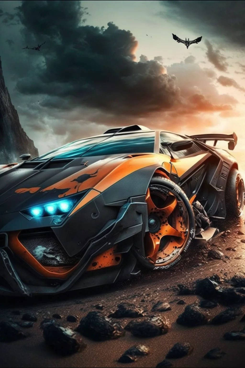
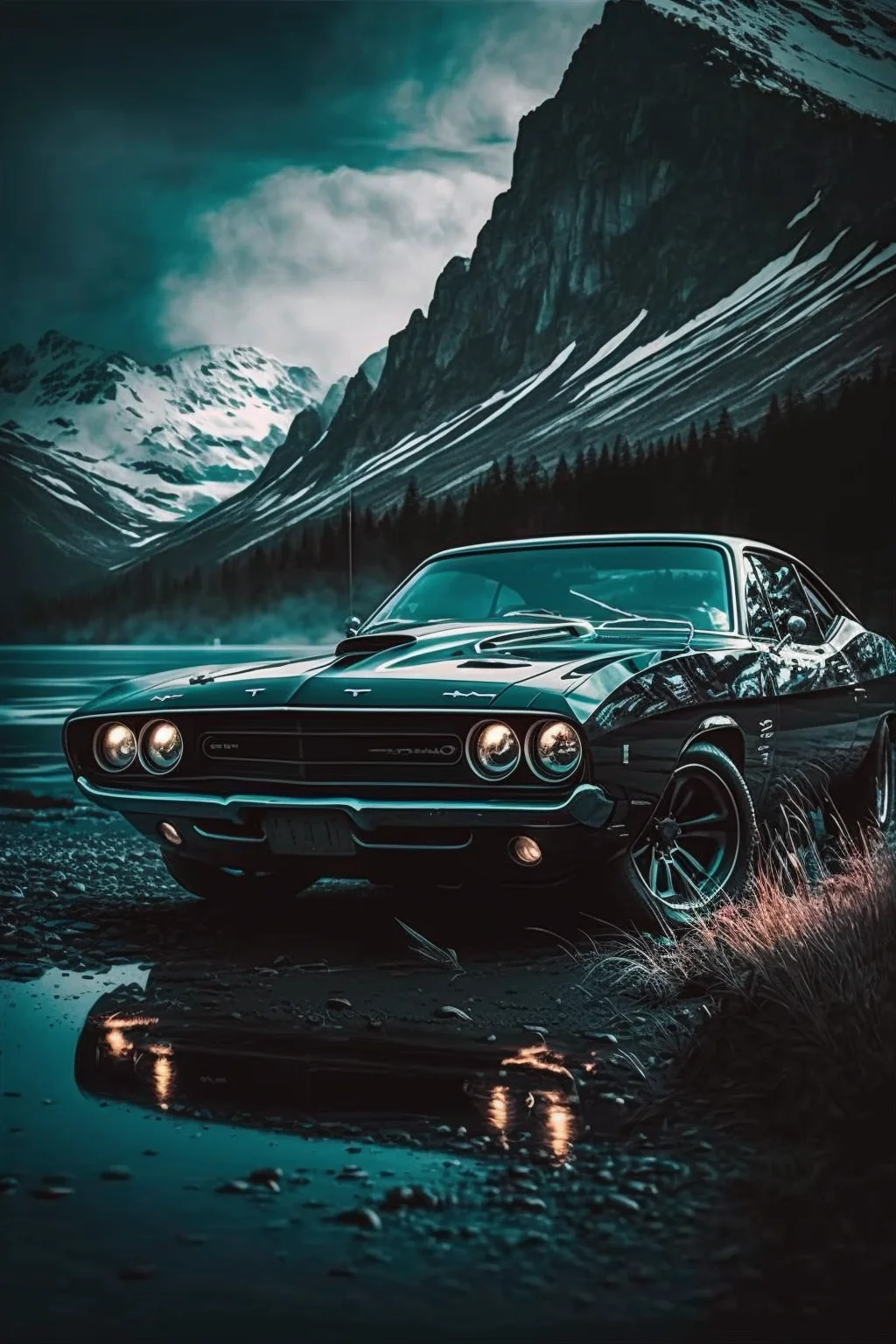
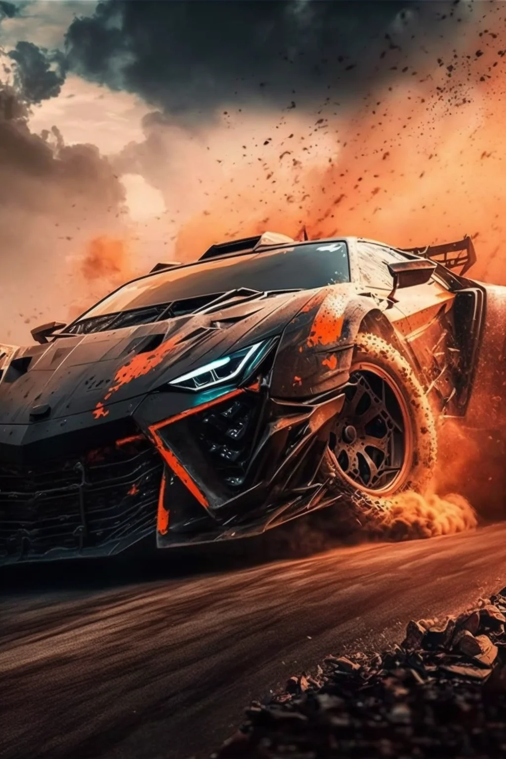
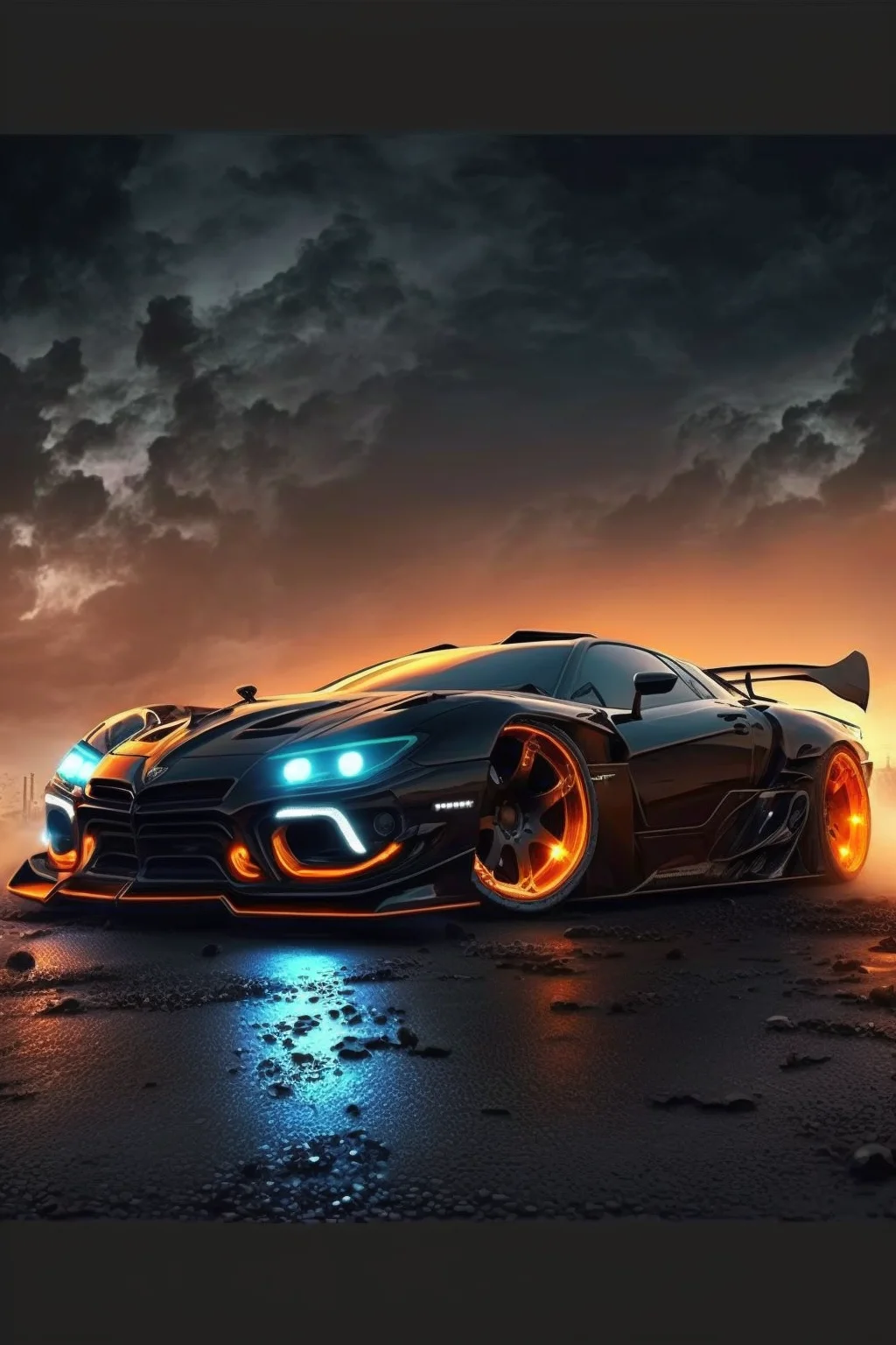
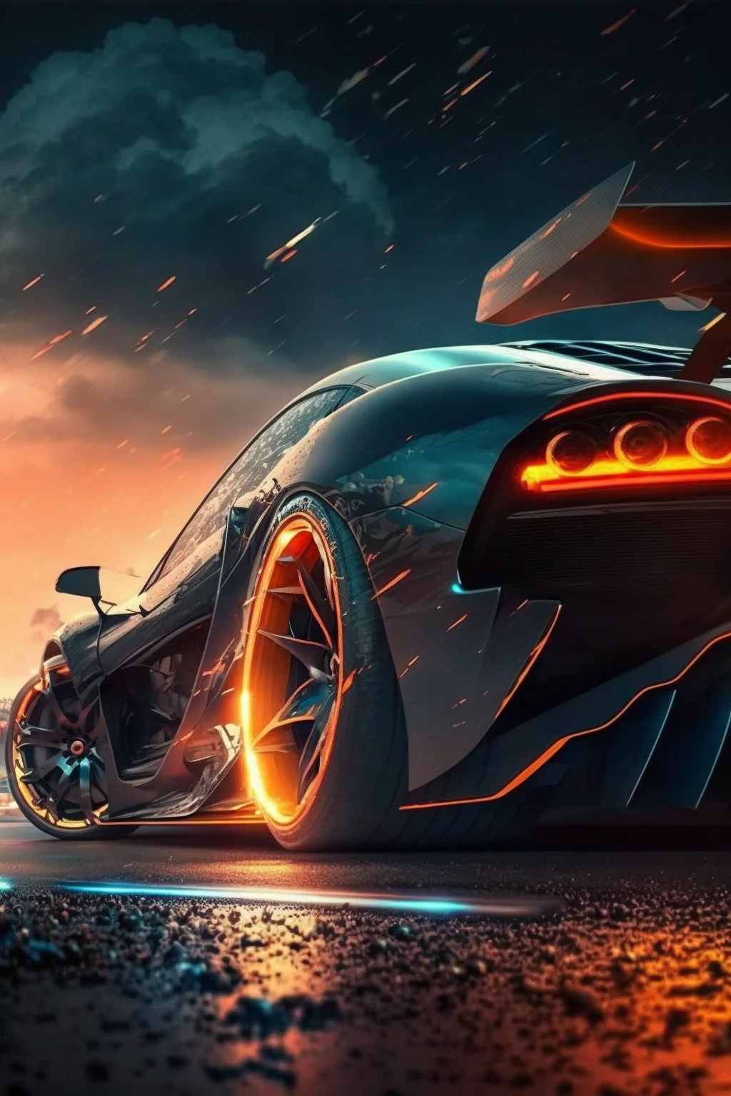
Which style works best?
- Dark cars and night scenes: a strong choice for the Home Screen because labels and bright app icons tend to stay readable.
- Racing scenes: better on the Lock Screen, where you can enjoy the image without covering it with several rows of apps.
- Centered close-ups: look dramatic, but check that the clock does not land directly over the windshield or hood.
- Cleaner backgrounds: the safest choice if your screen already has folders, widgets and notification badges competing for attention.
If the wallpaper looks blurry or badly cropped
First make sure you saved the original image rather than a thumbnail from the page. If it is sharp but the framing feels wrong, the problem is usually the crop, not the file. Try another image with more space around the car, especially if your phone has a taller screen ratio than the 1024 × 1536 source.
| What you notice | Likely cause | Best first fix |
|---|---|---|
| The car looks soft | A preview, screenshot or enlarged crop was saved | Save the full image and avoid zooming farther than necessary. |
| The clock covers the roof or windshield | The subject sits too high | Zoom out or choose a frame where the car sits lower. |
| App labels disappear | The Home Screen has too much local contrast | Use a darker, calmer image behind apps and keep the detailed one for the Lock Screen. |
| The car feels cramped | The phone’s crop removes too much surrounding space | Switch to a composition with more background rather than cutting into wheels or mirrors. |
| The wallpaper looks impressive but tiring | Bright highlights and icons compete all day | Reserve high-contrast racing or headlight scenes for the Lock Screen. |
For a matching pair, use the busier car photo on the Lock Screen and a darker, simpler image on the Home Screen. You keep the automotive look without making your apps hard to find.
A simple way to compare three finalists
Save three wallpapers instead of deciding from thumbnails. Use each one for a minute with the same clock style and Home Screen layout. Rank them on only three things: car visibility, interface readability and crop quality. Keep the image that performs best across all three, even if another looks more dramatic by itself. This avoids choosing a wallpaper for the gallery view rather than for daily phone use.

