
This collection has 20 butterfly coloring pages, ranging from very simple wing outlines to more decorative and mandala-style designs. Most sheets are wide landscape images, so landscape orientation usually gives the cleanest print result.
For a quick page, choose one of the plain butterflies with large open wing sections. The patterned and mandala-style butterflies take longer and are easier to control with colored pencils or fine-tip markers.
Open the image you want, save the full-size file and print it with “Fit to page.” If the preview crops the wings, switch to landscape orientation or use our Print & Save Help guide.
Symmetrical or completely different wings?
You can mirror the colors on both wings for a balanced butterfly, or deliberately make each side different. For younger children, symmetry can be a simple matching activity: color one section on the left, then find the corresponding shape on the right. For a more creative page, ignore symmetry and treat each wing as its own pattern.
- Simple butterflies: crayons and broad markers work well in the large wing sections.
- Wing templates: add your own dots, stripes, hearts or geometric patterns before coloring.
- Mandala butterflies: colored pencils or fine-tip markers give better control over repeated small shapes.
20 butterfly coloring pages
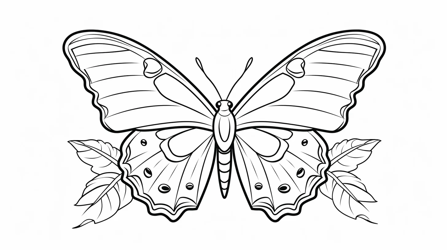
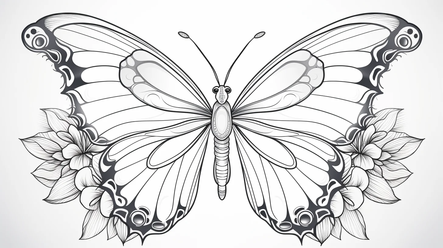
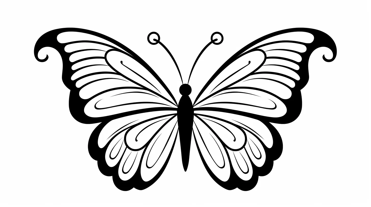
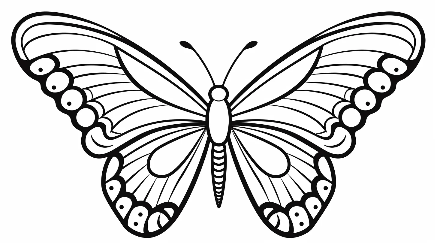
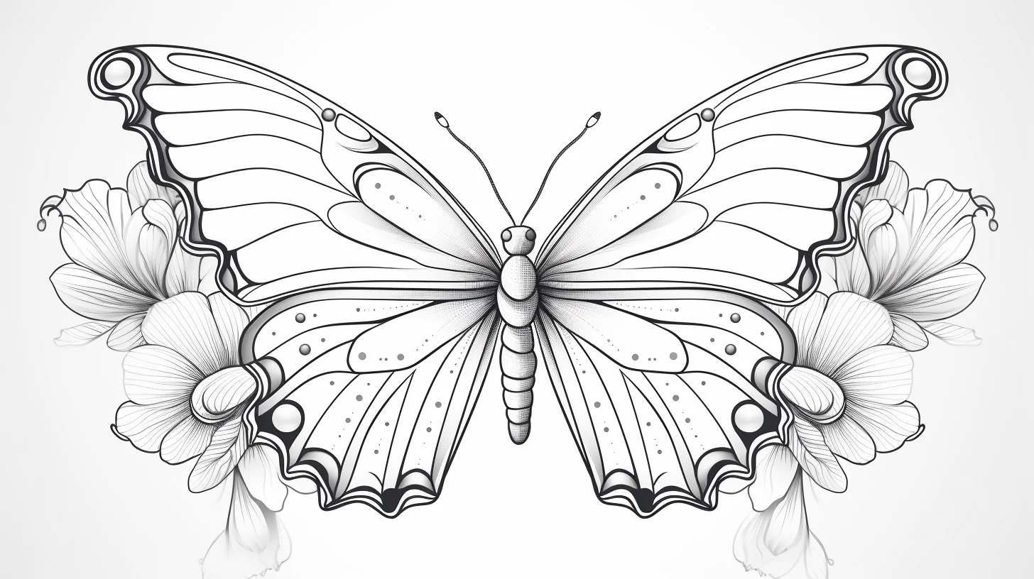

Easy and preschool group: choose two main wing colors plus one small accent rather than trying to fill every section differently. The larger open shapes are ideal for crayons, and small gaps outside the lines do not hurt the finished design.

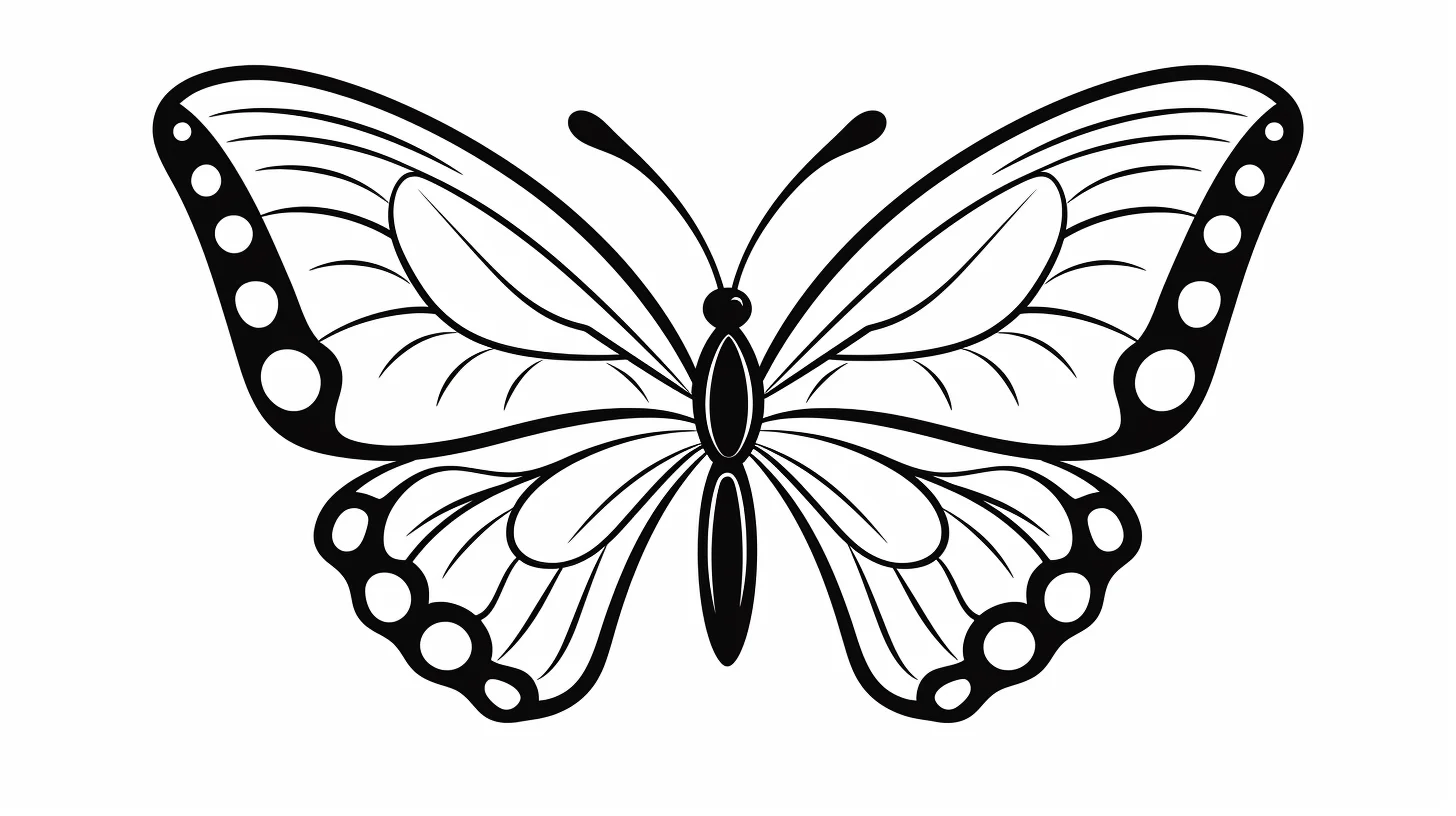
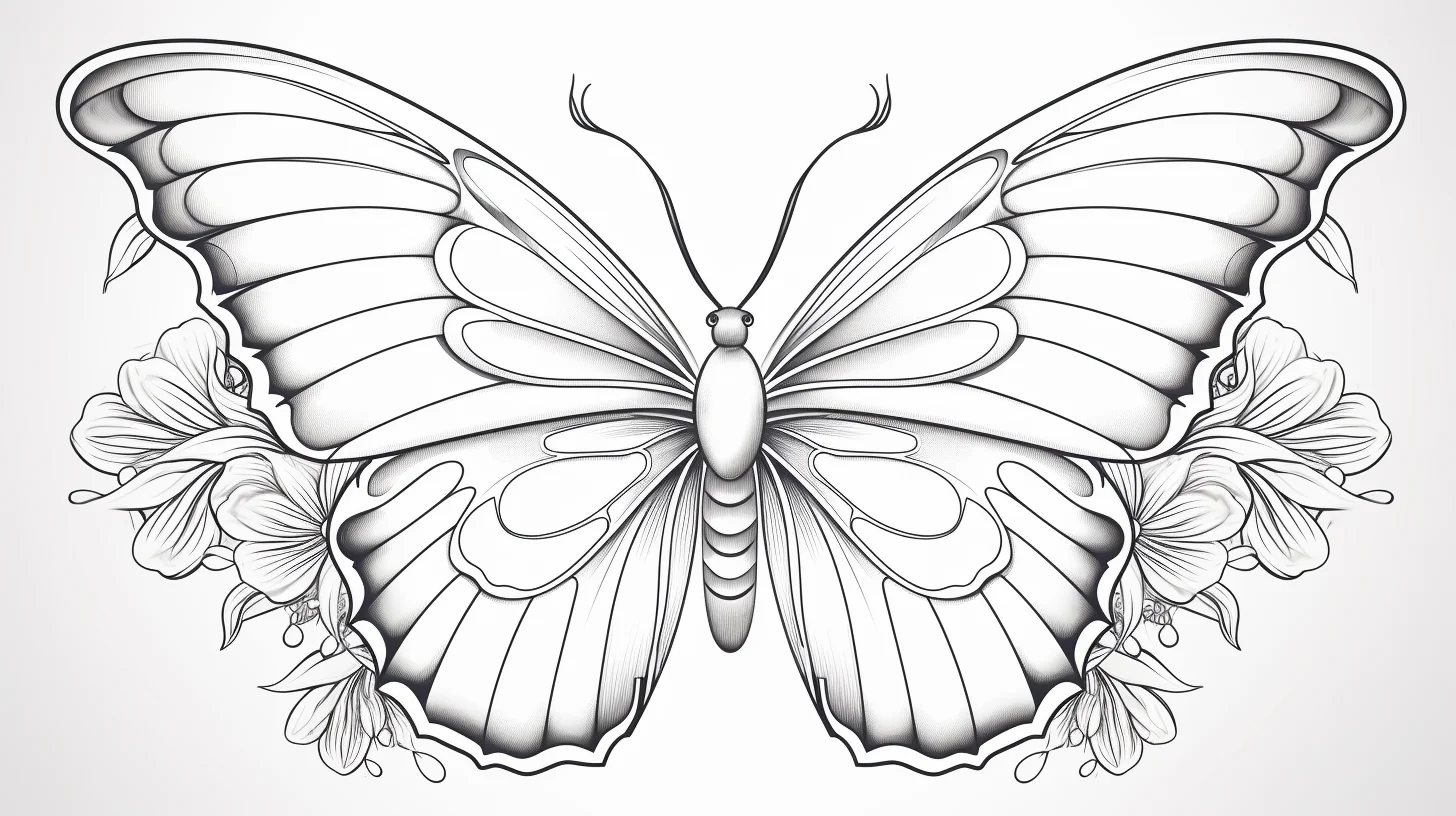
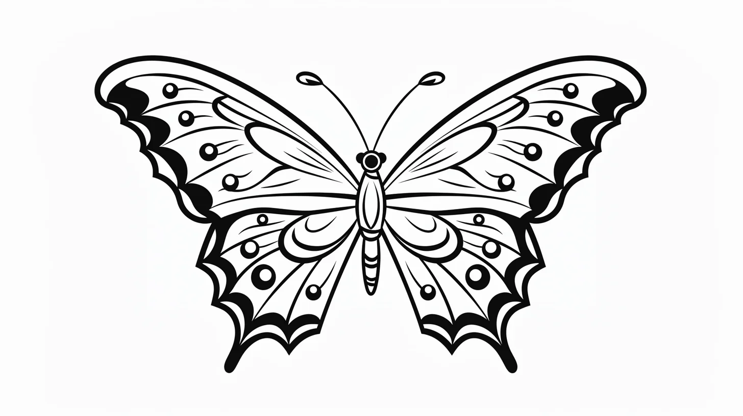
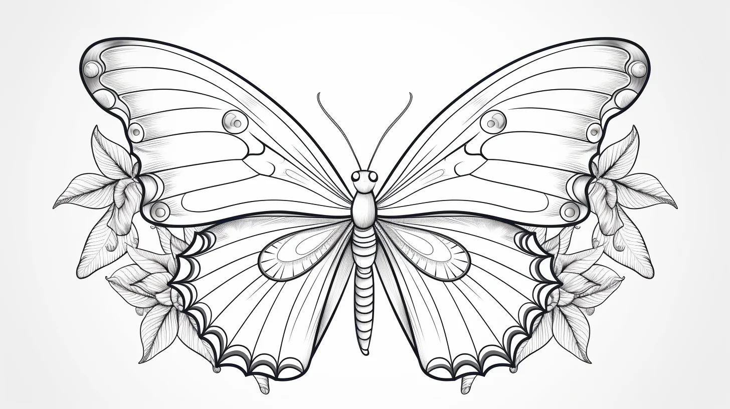
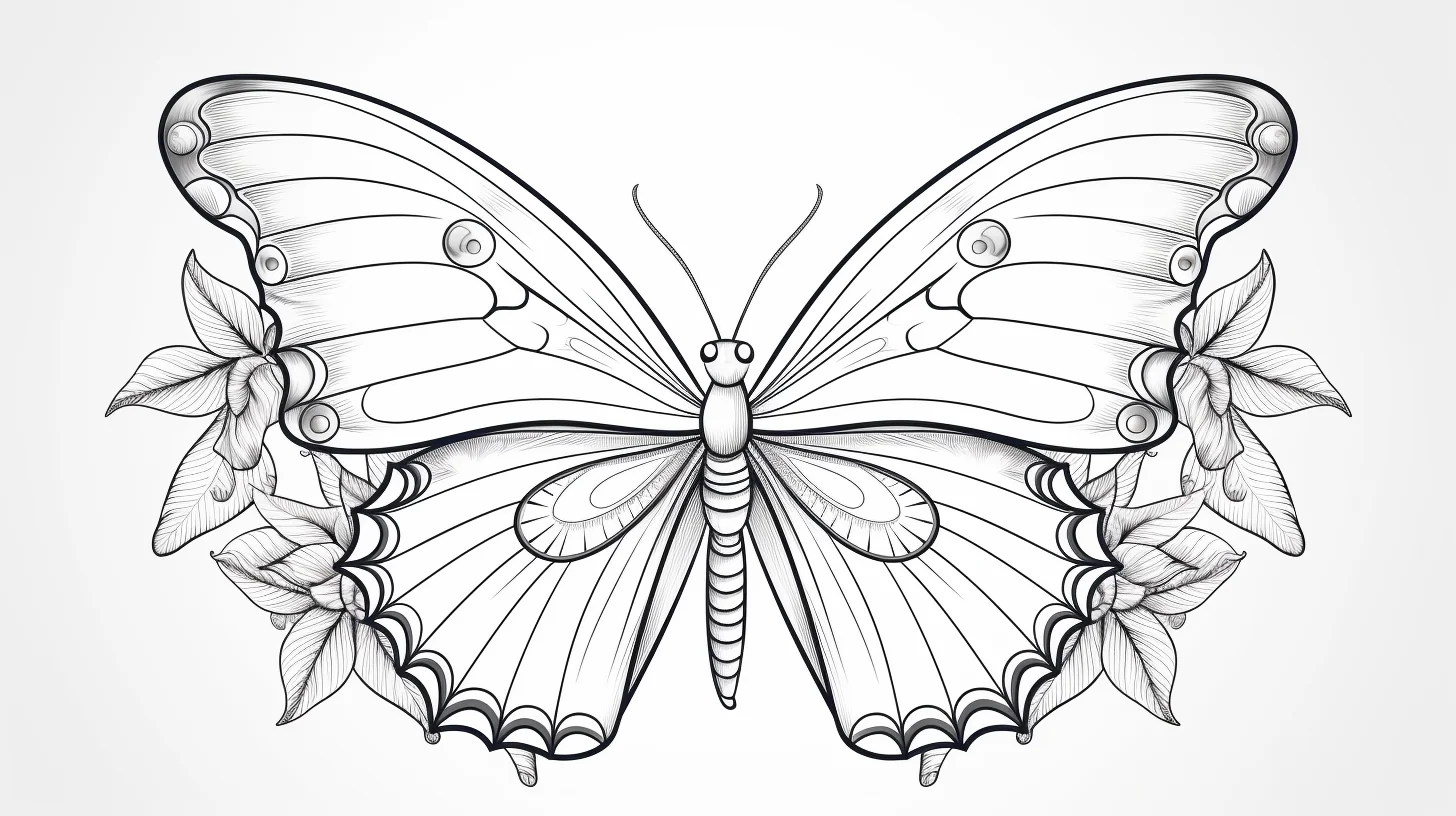
Blank and template-style wings: these are the best pages if the drawing itself should become part of the activity. Add spots, stripes or repeated shapes in pencil first, then color over the finished pattern once you are happy with it.
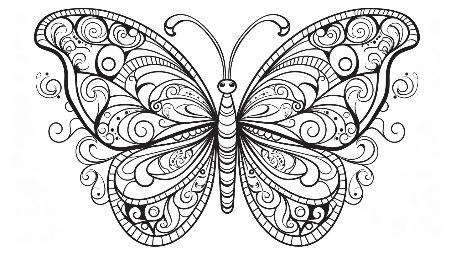
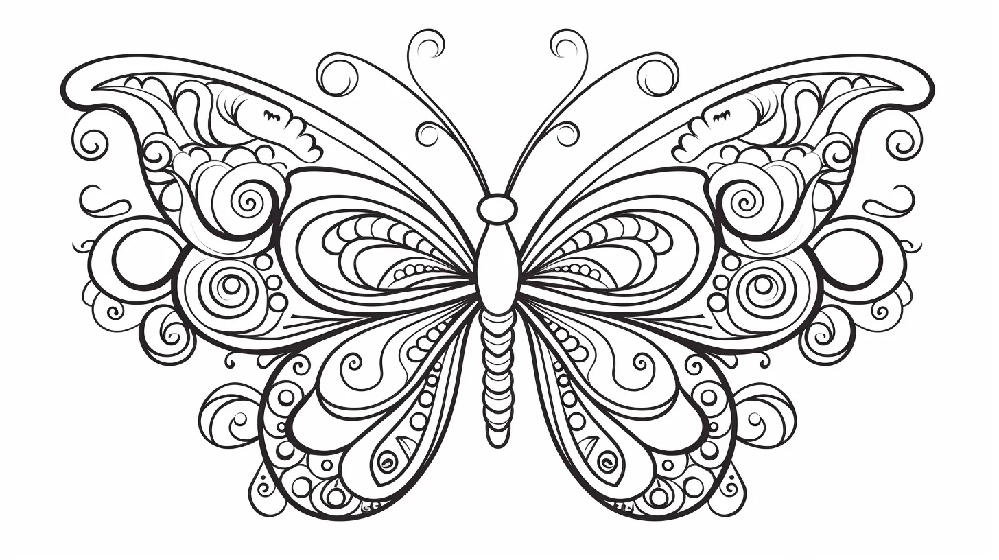
Mandala pair: pick a small repeating palette—three or four colors is enough—and reuse it across matching shapes. Repetition makes a busy design feel organized and saves you from making a new color decision for every tiny section.
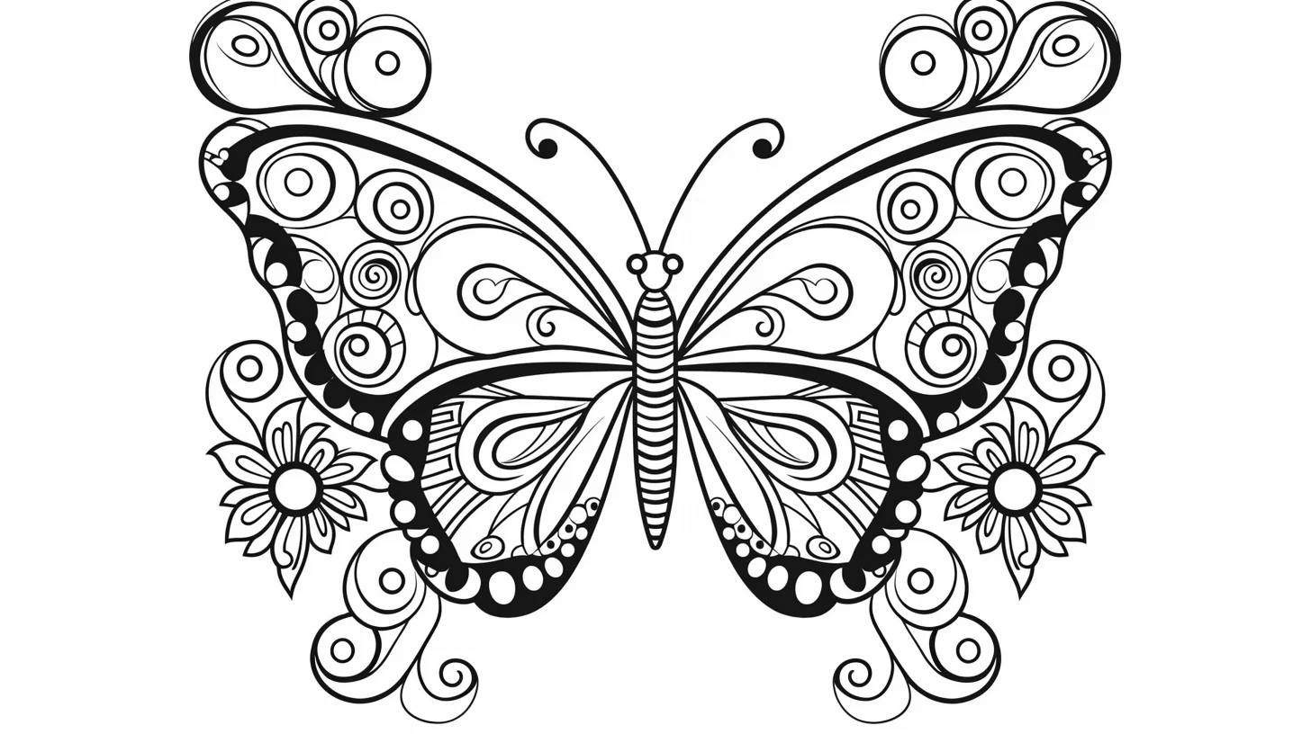
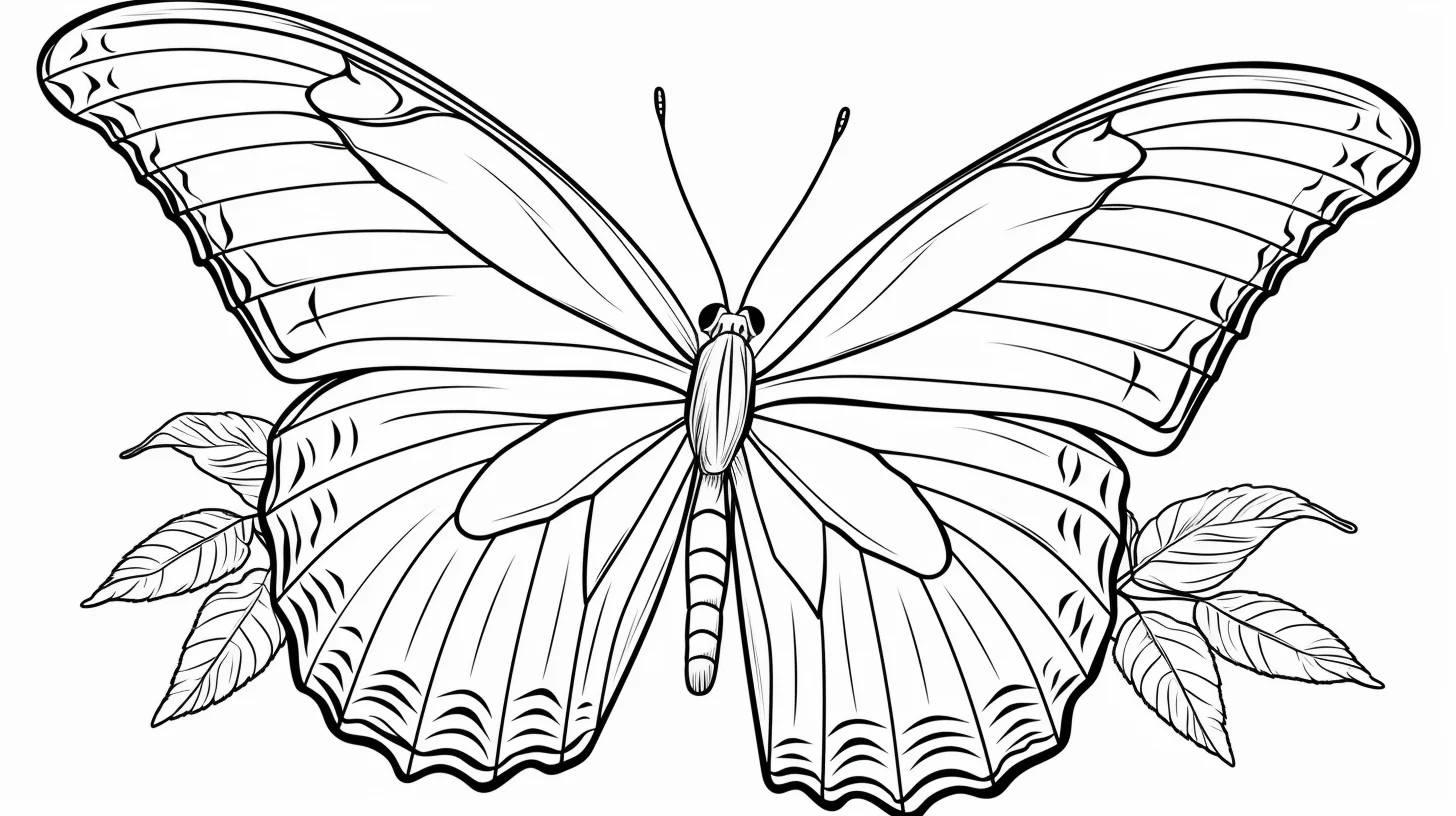
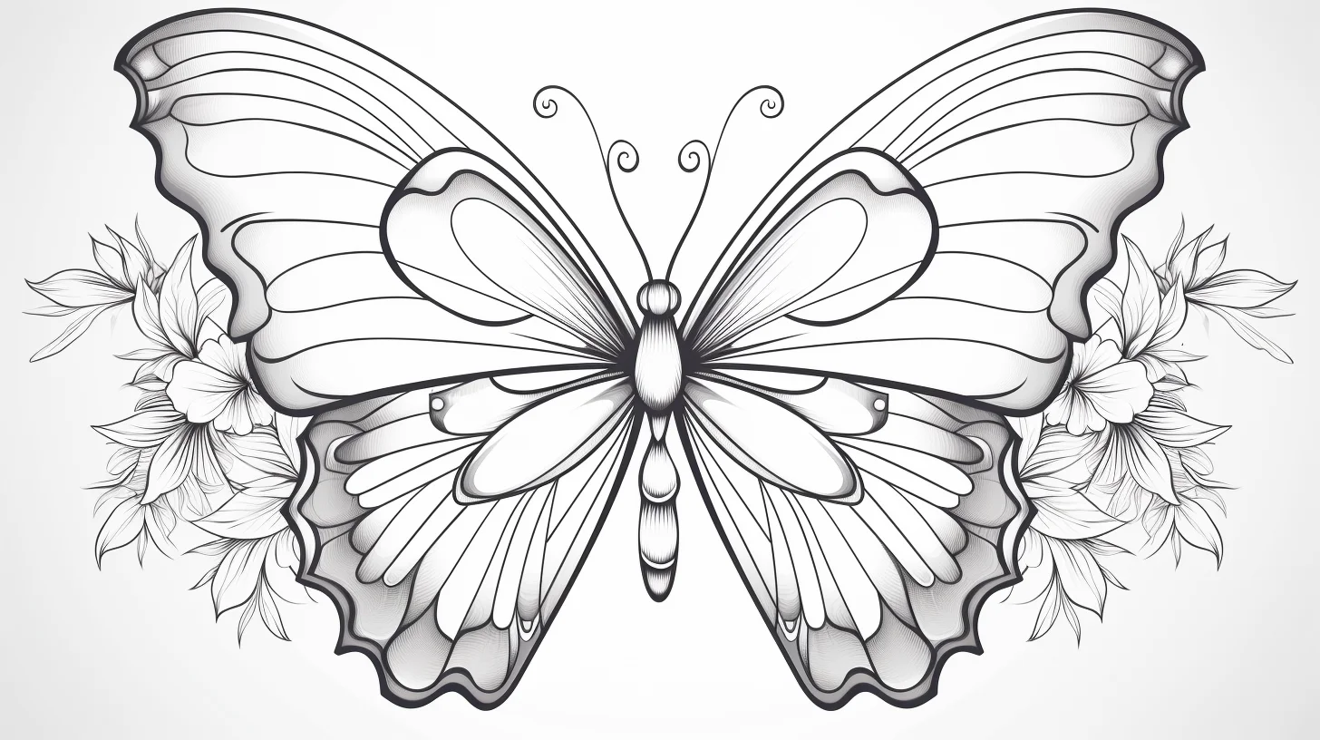
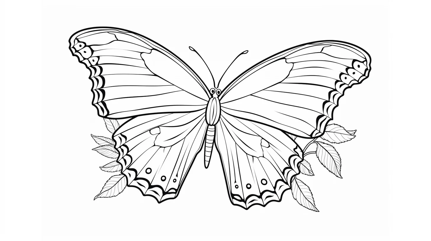
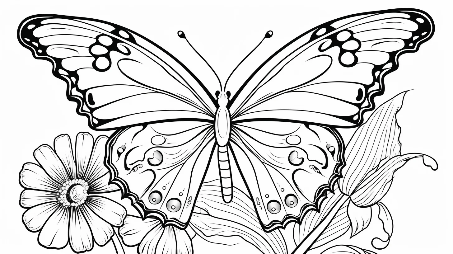
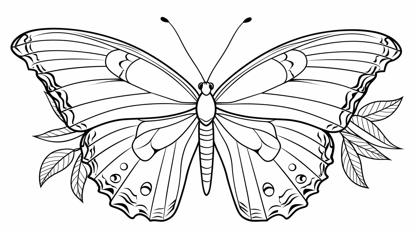
Practice butterfly wings in three passes
If you want to improve rather than simply fill the page, use three different sheets as a short practice sequence. Start with a plain butterfly and concentrate only on staying inside the outer wing shape. On the second sheet, choose a template-style butterfly and draw one repeated motif—dots, teardrops or short curved bands—on both sides. Finish with a mandala butterfly, where the challenge is not drawing but keeping a small palette consistent through many compartments.
- Page 1 — control: use two colors and make the fill smooth, especially along the black outline.
- Page 2 — symmetry: design the left wing first, then reproduce the major shapes on the right. It does not need to be mathematically exact; matching the visual weight is enough.
- Page 3 — repetition: assign colors to shape types before you begin. For example, circles always get the lightest color, narrow bands the darkest, and larger cells the middle color.
How to make patterned wings easier to read
A butterfly can become visually noisy when every enclosed shape receives an unrelated bright color. A more controlled method is to think in three values: light, middle and dark. Keep the largest wing areas light or middle, reserve the darkest value for the body and a few repeated wing marks, and use the brightest accent sparingly. This creates a clear silhouette even on the busier mandala sheets.
For a softer result, color from the body outward: darker near the thorax, medium through the middle of each wing and lighter toward the outer edge. With colored pencils, overlap the transitions with light pressure instead of drawing hard boundary lines. With markers, skip gradients and use flat repeated color blocks; markers are better at crisp pattern separation than subtle blending on ordinary printer paper.
Butterfly coloring problems and quick fixes
| Problem | Try this | Why it works |
|---|---|---|
| The wings look busy | Limit the page to three or four colors and repeat them. | Repetition groups many small shapes into one readable pattern. |
| The two wings feel mismatched | Match the largest shapes first, then worry about tiny details. | Large color masses affect perceived symmetry more than small marks. |
| The body disappears | Make the body one value darker than the adjacent wing sections. | Contrast separates the butterfly’s central form from its wings. |
| Pencil looks pale | Build two or three light layers instead of pressing hard immediately. | Layering deepens color while keeping the paper surface smoother. |
| Marker bleeds through | Put scrap paper underneath and avoid repeatedly soaking the same area. | Printer paper has limited capacity for wet ink. |
| A blank template feels empty | Repeat one large motif, one small motif and a border pattern. | Three scales create variety without turning the wing into clutter. |
Four palettes that work on butterfly pages
- Monarch-inspired: orange, warm yellow, black and a small amount of cream.
- Garden: leaf green, turquoise, violet and pale yellow.
- Sunset: coral, orange, magenta and deep purple.
- Cool mandala: teal, blue, indigo and lavender; repeat the sequence across matching cells.
These are starting points rather than species guides. If you are coloring for pattern practice, consistency matters more than realism. If you want a natural-looking butterfly, use a reference photo and notice that real wings often repeat a limited set of colors rather than displaying every color at once.
Choose a page by skill level
| If you want… | Choose… | Best tool | Main skill |
|---|---|---|---|
| A fast, relaxed page | Large plain wing sections | Crayon or broad marker | Clean filling |
| To invent your own design | Blank or template-style wings | Pencil first, then color | Pattern design and symmetry |
| More detailed coloring | Mandala-style wings | Colored pencil or fine-tip marker | Palette repetition |
| A natural-looking result | A simpler butterfly with clear wing divisions | Colored pencil | Value, edge control and restrained color |
For children who are still developing control, the simplest sheet is usually a better starting point than a detailed design labeled for a particular age. The size of the spaces and the coloring tool matter more than an age number.
Butterfly anatomy that helps the coloring make sense
You do not need to turn the activity into a biology lesson, but knowing the basic shapes makes pattern decisions easier. A butterfly has two forewings and two hindwings attached around the thorax, with the abdomen extending behind it. On a stylized coloring sheet, the exact anatomy may be simplified, but treating the body as the visual center helps keep the four wing areas connected.
When inventing markings, let larger bands or spots echo across the forewings and hindwings instead of scattering details randomly. Near the outer wing edge, a repeated border of dots, scallops or short bands can frame the design. Keep the antennae and narrow body details until the end so they do not become lost under broad crayon or marker strokes.
Make one sheet look more natural
For a less decorative result, choose a limited palette and work from a real butterfly photograph rather than guessing every marking. Look first at the overall color masses, then at the border pattern, and only then at small spots. Realistic-looking wings usually benefit from restraint: repeating two or three dominant colors can look more convincing than filling every compartment differently.
Do not feel obliged to copy a species precisely. These drawings are coloring pages, not scientific plates. A reference is most useful for observing relationships—where the darkest edges sit, whether the body is lighter or darker than the wings, and how markings repeat—not for forcing a stylized outline to match anatomy it was never drawn to represent.
Butterfly coloring questions
Should both wings use exactly the same colors?
No. Mirrored colors create a calm, balanced design, but asymmetry can be intentional. If the two sides differ, repeating at least one color or motif on both wings helps the butterfly still read as one design.
What is the easiest way to color a mandala butterfly?
Choose three or four colors before starting and assign them to recurring shape types. Work outward from the body or complete one pair of matching sections at a time. This reduces constant color decisions and makes mistakes less noticeable.
Which paper is better for markers?
Ordinary printer paper works for light marker use, but wet layers can bleed or buckle. Put scrap paper underneath and avoid repeatedly passing over the same spot. If your printer accepts heavier uncoated paper, that is usually more forgiving for marker coloring.
How do I keep colored-pencil wings smooth?
Use several light layers and small overlapping strokes. Increase pressure only in the darkest areas. Pressing hard at the beginning flattens the paper tooth and makes later blending more difficult.
Can I add my own patterns to the blank butterflies?
Yes. Sketch lightly in pencil first. Start with the largest repeated shapes, mirror or balance them on the other wing, then add smaller dots, lines or borders. Erase unwanted construction marks before applying marker.
Use the finished butterfly beyond the coloring page
On the simpler designs, cut around the finished butterfly and mount it on colored paper for a card, classroom display or simple nature collage. If you plan to cut it out, leave a narrow white border around the outer wing line instead of cutting directly through the outline.
For another nature-themed activity, pair these with the flower coloring sheets or browse the broader animal coloring pages.

