If your phone feels noisy, a good wallpaper is the fastest reset. This post is a calm, human-size tour through our favorite looks from inky blacks and retro grains to rose-gold glow and soft pastels so you can pick something beautiful and icon-friendly without scrolling forever.
A quick note on how to choose
Think about mood first, not color names. Want focus? Go darker, simpler. Want cozy? Go pastel or warm metallics. Want a bit of edge? Retro grain, neon accents, or crisp black-and-white do the trick. If you change your Lock often, keep the Home screen quieter so app names stay readable.
What’s inside this collection in plain words
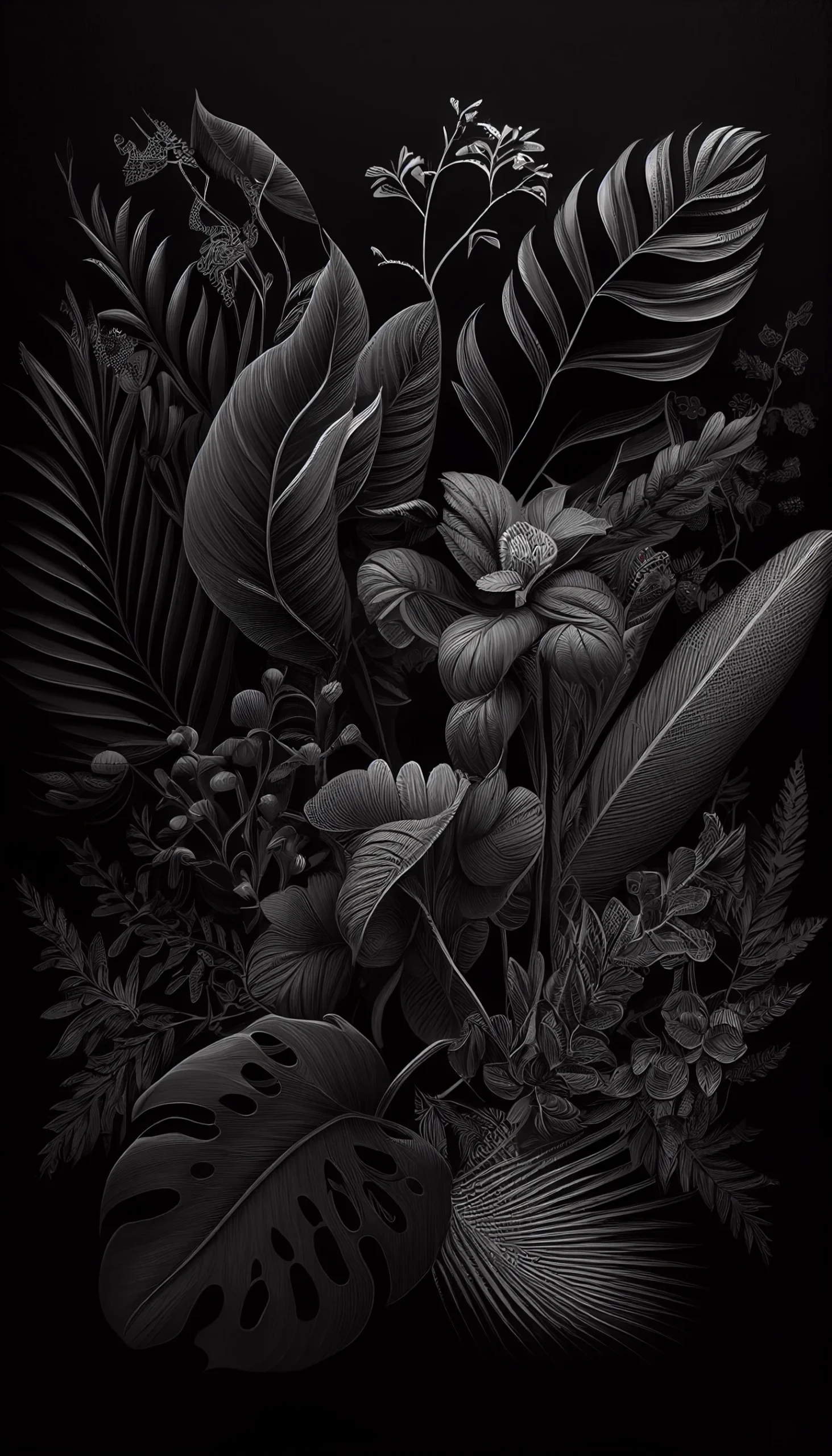
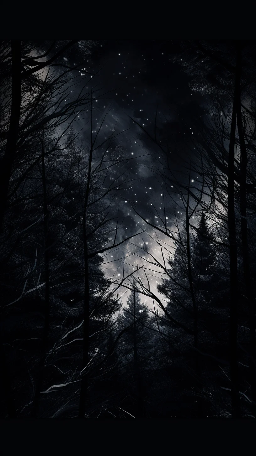
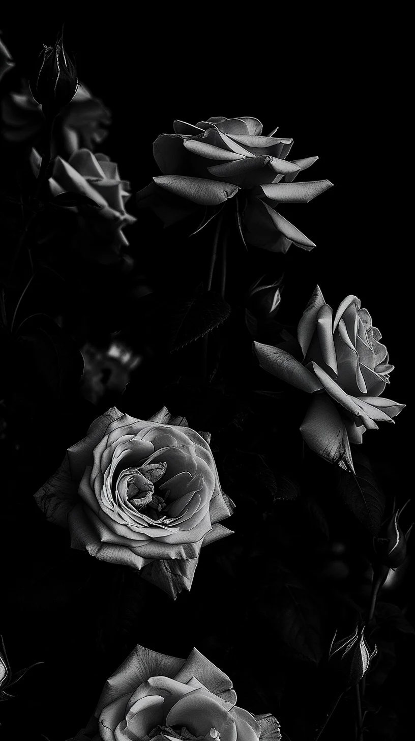
There’s a clean black aesthetic set that makes icons pop and helps OLED screens sip battery. You’ll also find black-and-white options with soft contrast great if you love widgets but hate clutter.
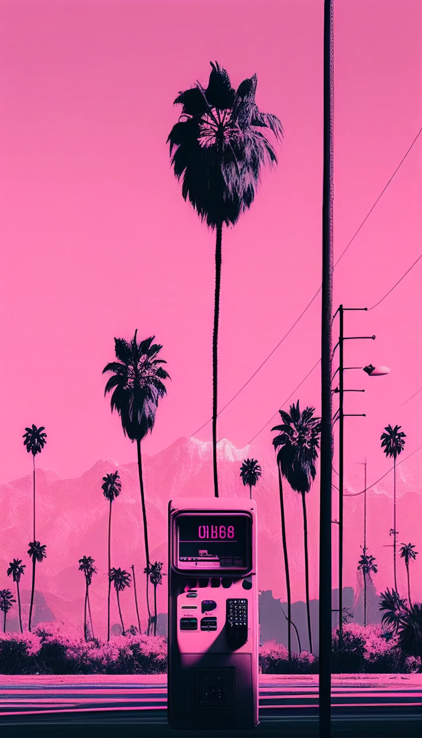
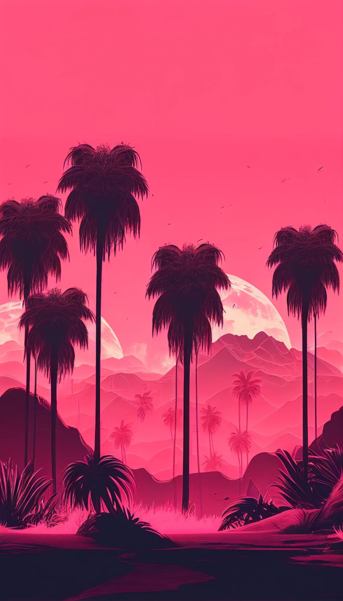
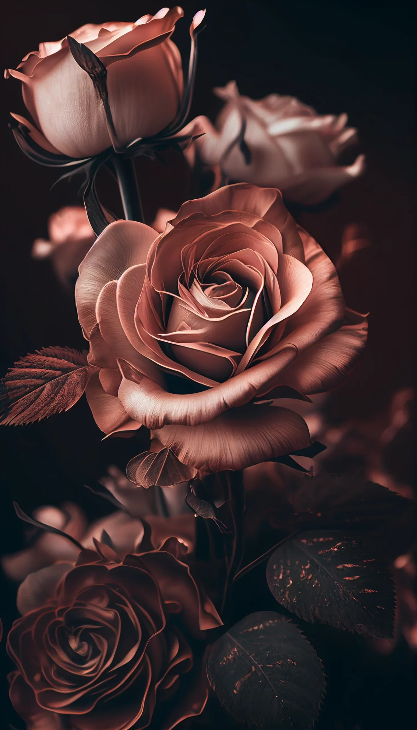
If you prefer warmth, the rose gold and pink looks add a gentle sheen without shouting. Some are minimal gradients; others have a subtle glassy depth that sits nicely under the time and Dynamic Island.
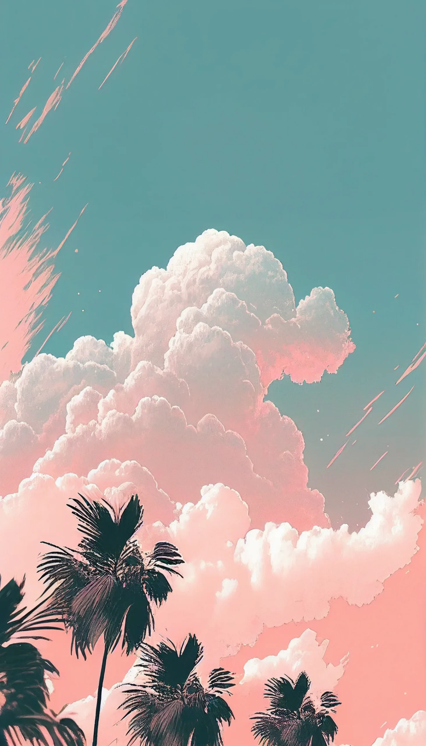
For a softer, breezier vibe, the pastel group leans into blush, lavender, powder blue, and cream light texture added so nothing looks plastic. There’s a blue aesthetic lane too: cool, tidy, and very “morning routine”.
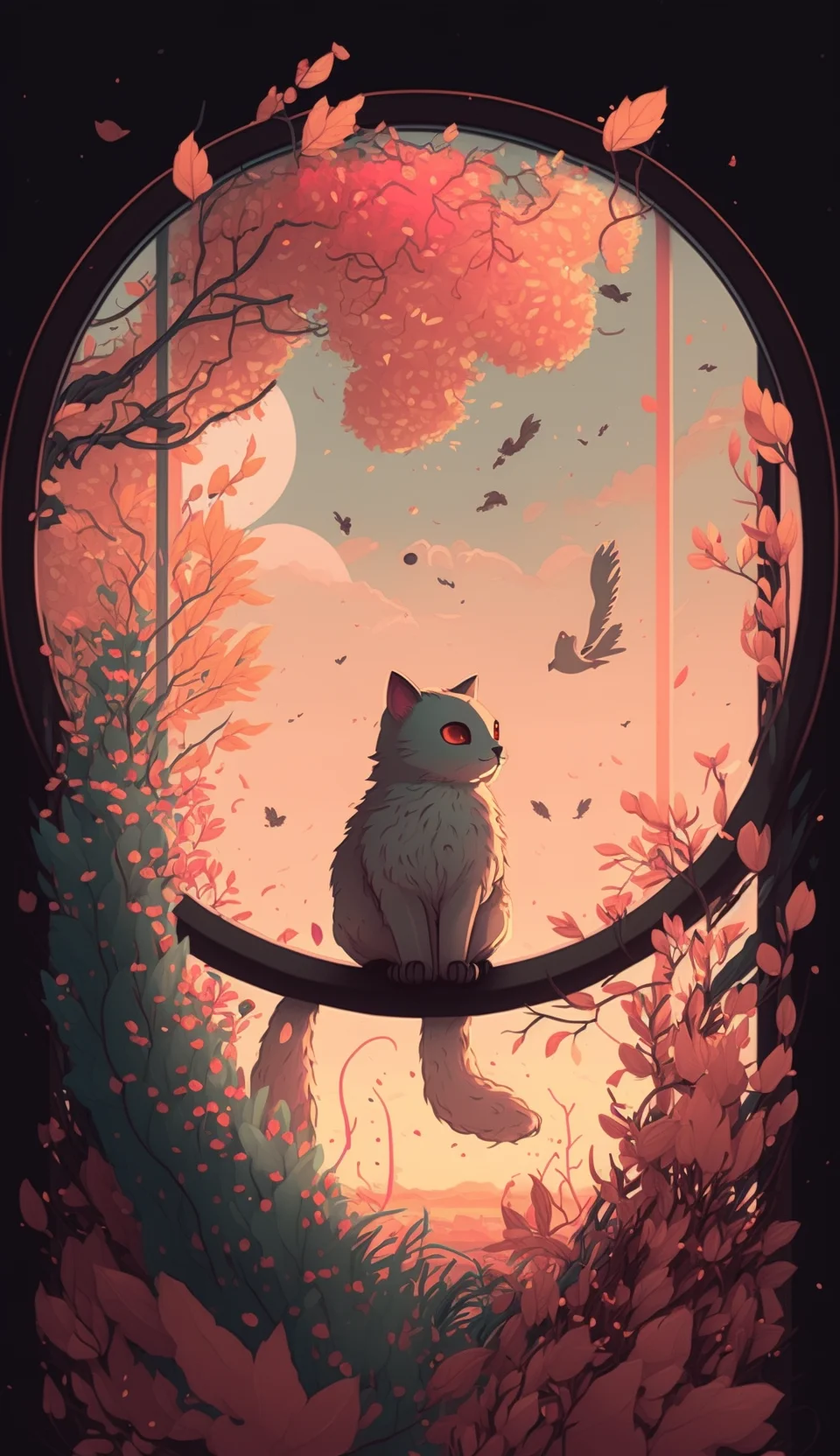
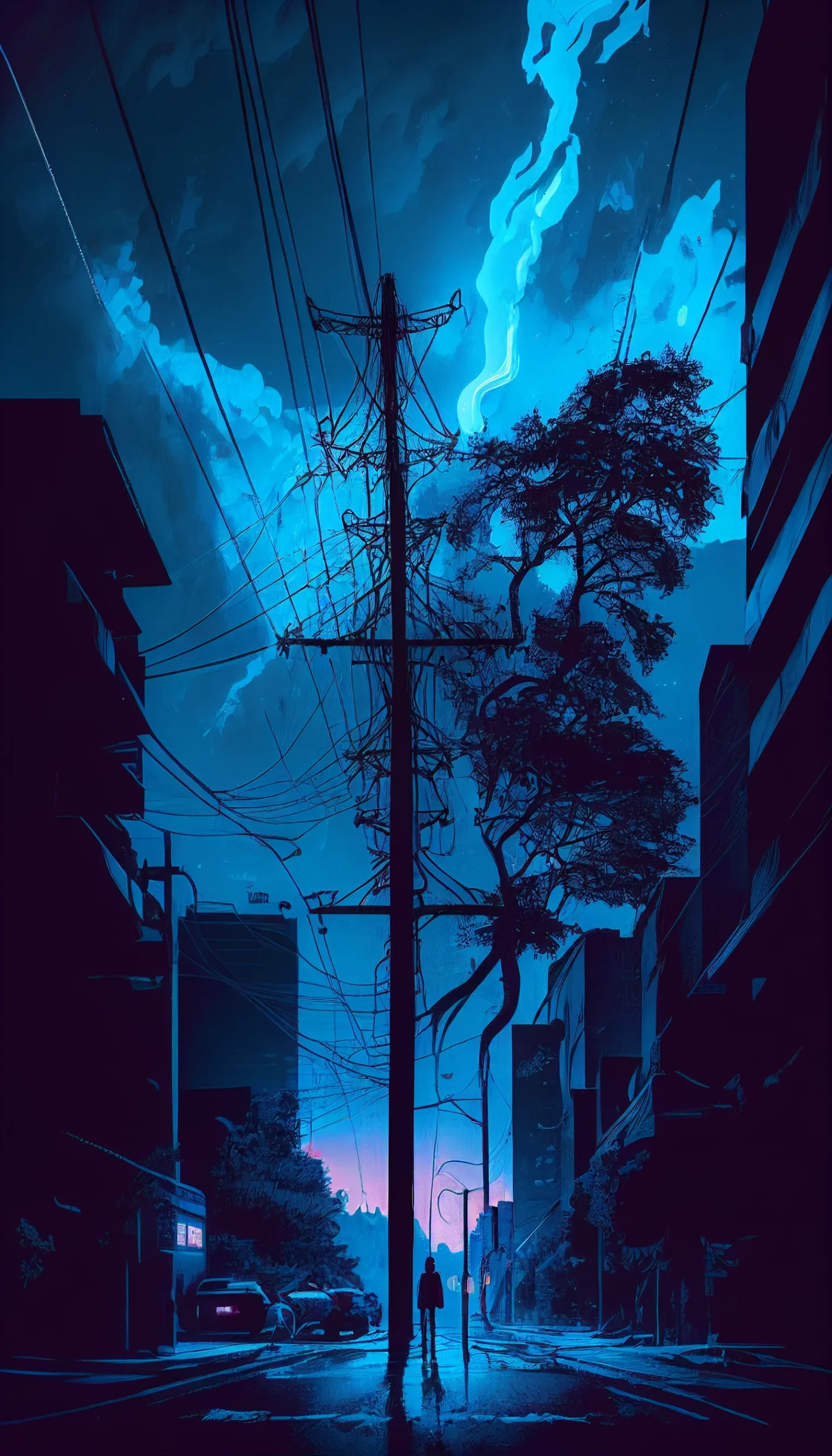
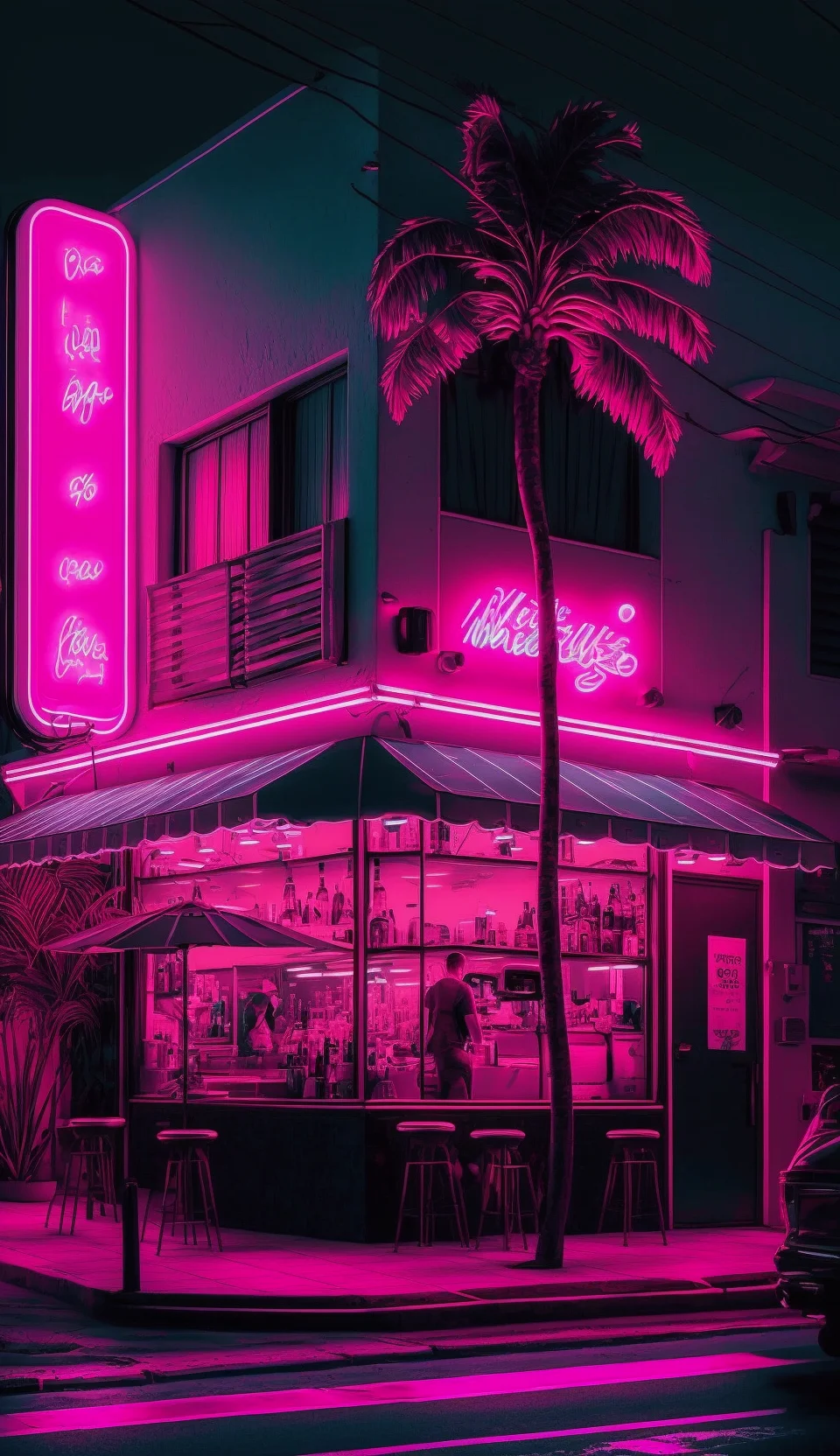
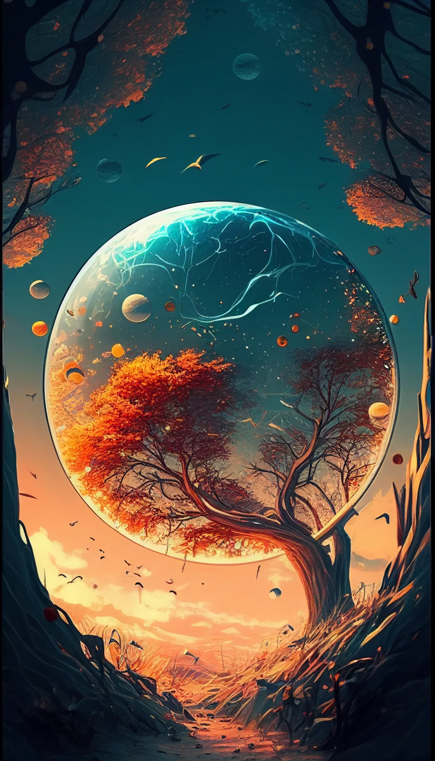
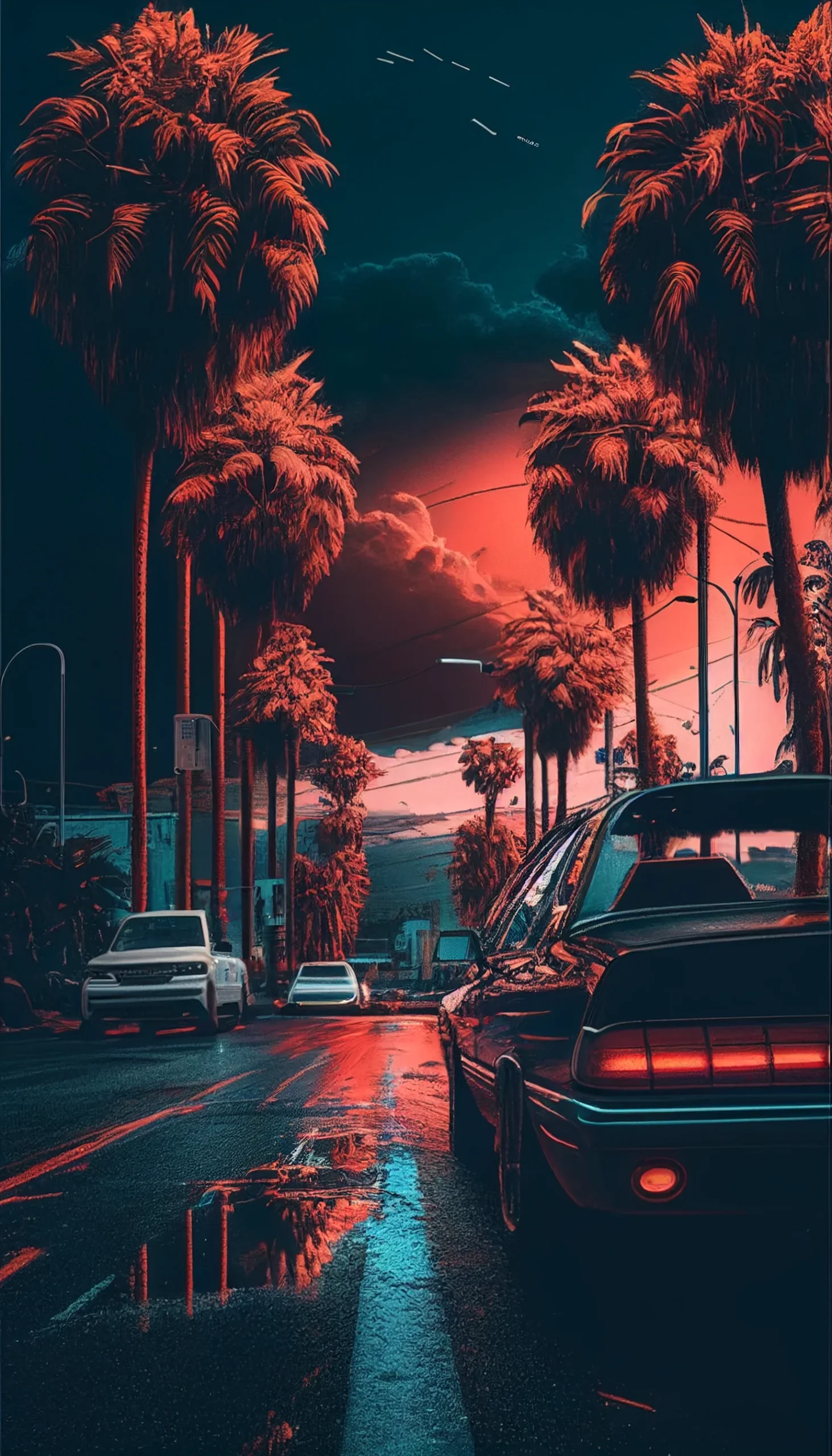
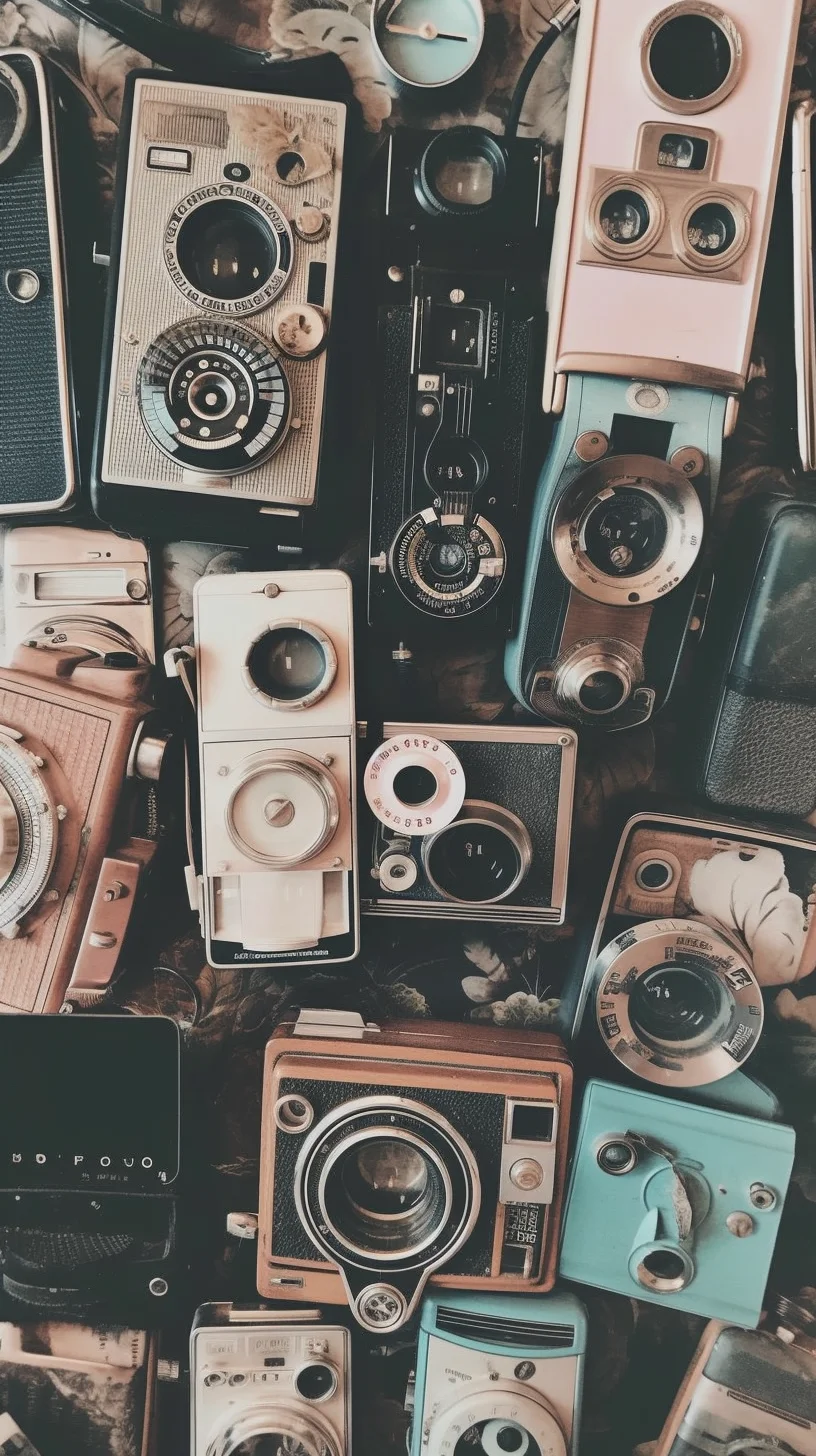
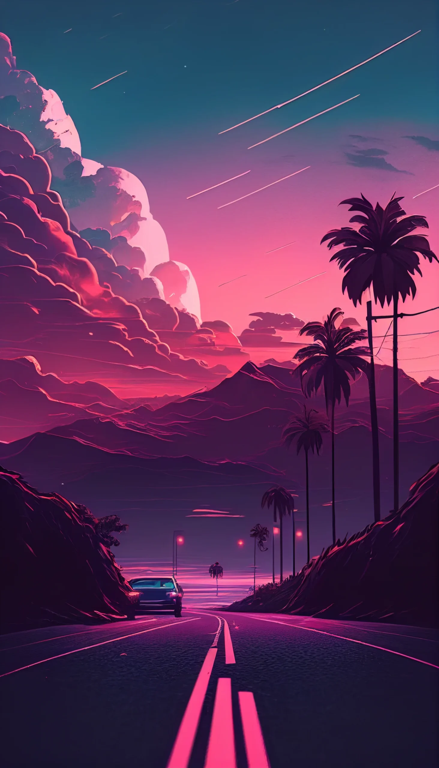
Feeling nostalgic? The retro/vintage pieces bring grain, film-y blur, and muted tones. They’re designed to feel lived-in without fighting your icons. And if you like a little drama at night, the neon pink choices give you that cyber-glow accent while keeping the rest of the screen calm.
We’ve also included a handful tagged as for guys, but honestly they’re just clean, neutral designs: matte textures, dark glass, and balanced shapes that anyone can use. Rounding it out are a few cute variants: soft hearts, friendly forms, small focal points that don’t overcrowd your Home screen.


Lock vs. Home: make them work together
Let the Lock Screen have a tiny focal point an off-center moon, a frosted shape, a brighter band. Keep the Home Screen flatter and lower-contrast so labels stay readable. Stick to the same color family (e.g., rose gold on Lock, warm beige on Home) and your phone suddenly feels intentional.
Set-up that takes 30 seconds
On iPhone: long-press the Home screen → Wallpaper → Add New. When you place an image, turn off Perspective Zoom for clean edges. If icons feel hard to read, lower wallpaper contrast a touch or switch to the matching “quieter” version in the gallery.
A few tiny tips that make a big difference
Pastels + a hint of paper texture = softer on the eyes.
Pure black with a single line or dot = elegant and battery-friendly.
Black-and-white = timeless; keep mid-tones soft so widgets don’t vanish.
Retro/vintage = add grain, not clutter; your icons are the main characters.
Neon accents = best on a dark field; think highlight, not headline.
Accessibility & readability
We balanced these to keep app names legible. If you use larger text or many widgets, aim for mid-tone backgrounds or deep blacks with a simple focal point. Avoid bright reds/cyans right under small widgets they strain more than they wow.
How to save and rotate looks
Tap any image in the gallery to open it full size, long-press, and Save to Photos. If you like switching with Focus modes, pick a darker version for Work and a lighter twin for Personal same palette, different mood.