
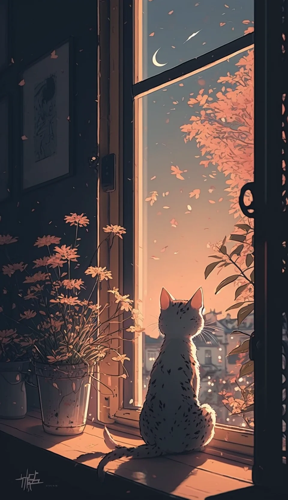
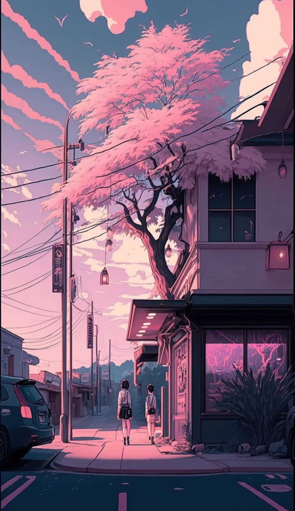
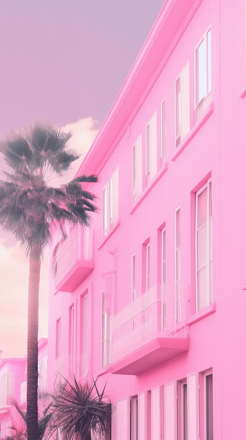
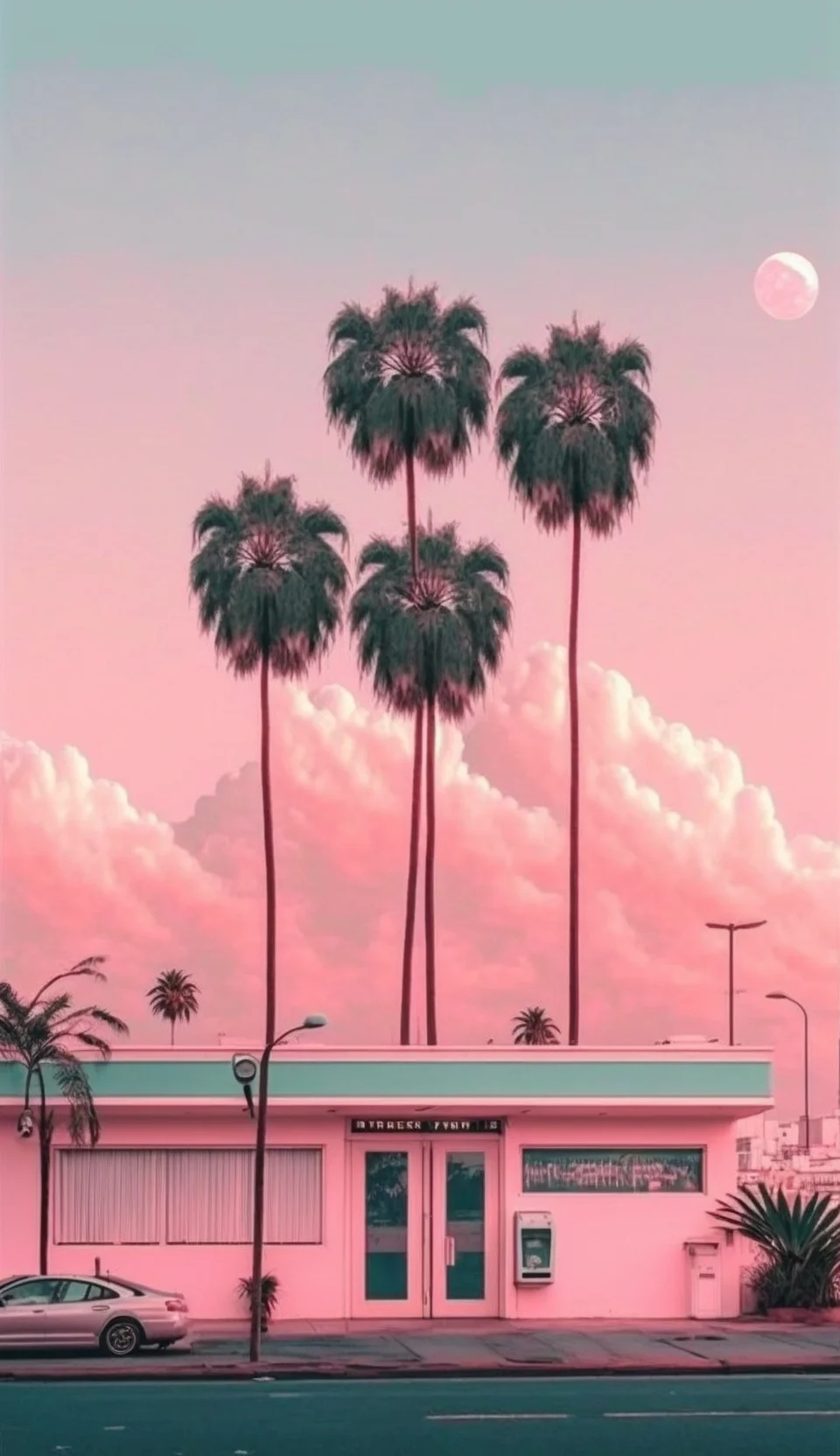
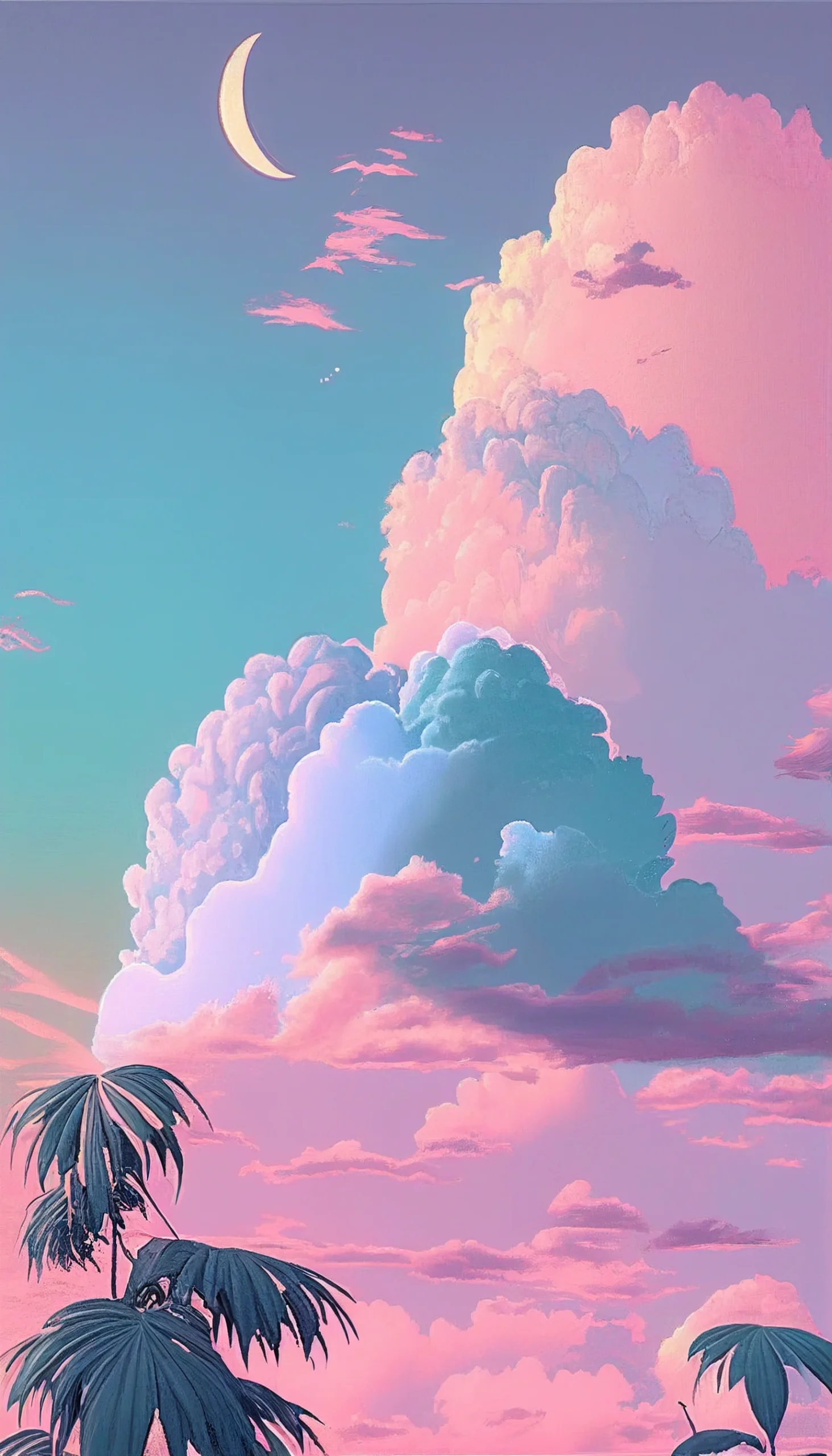
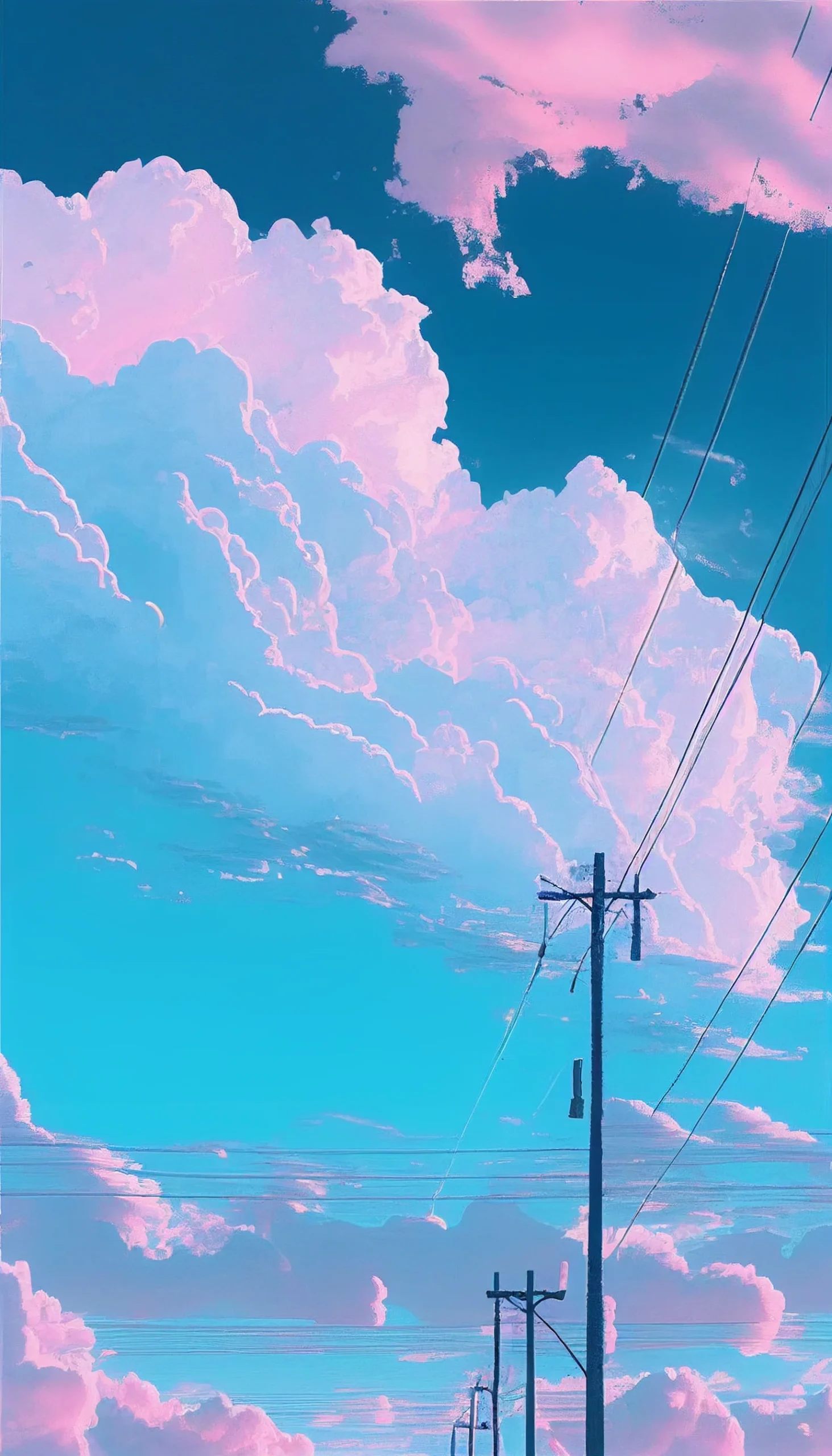
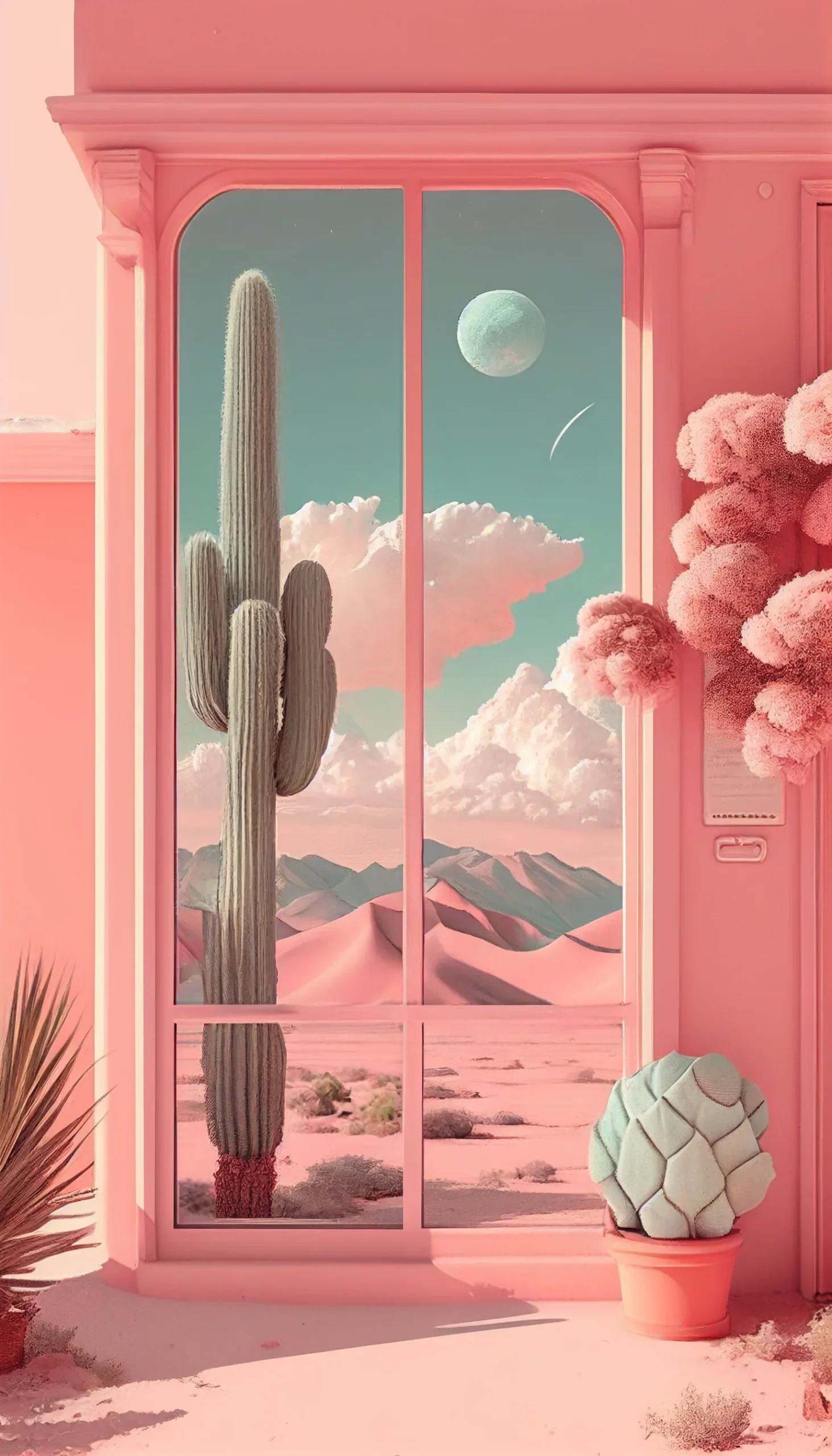
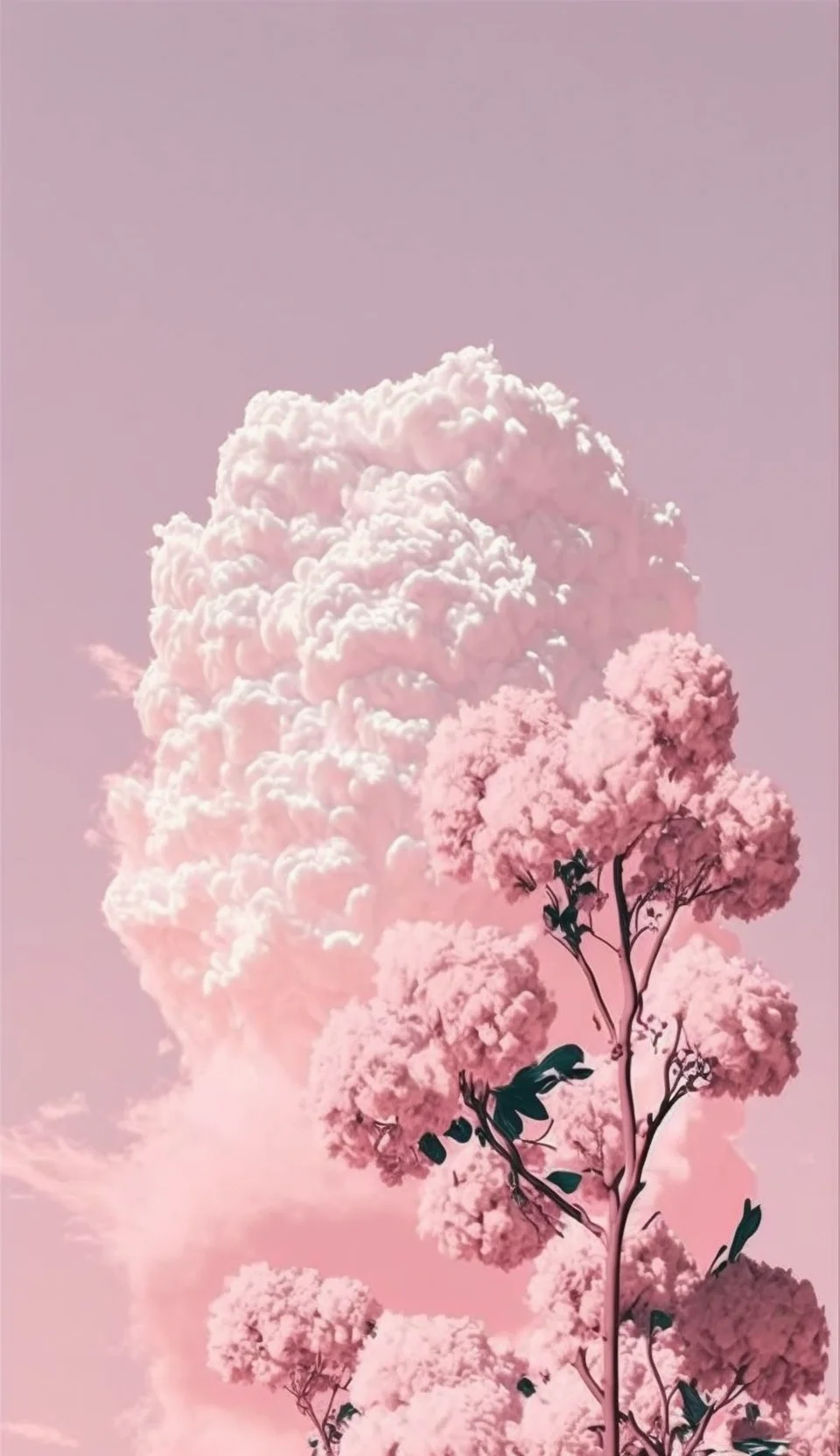
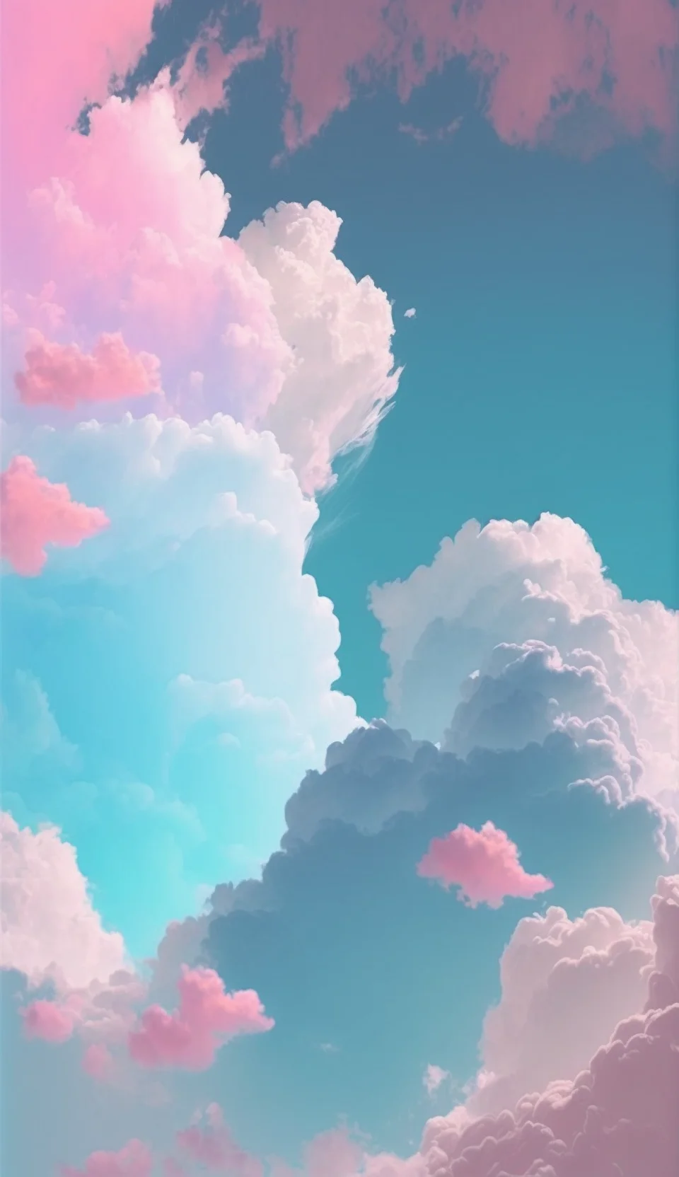
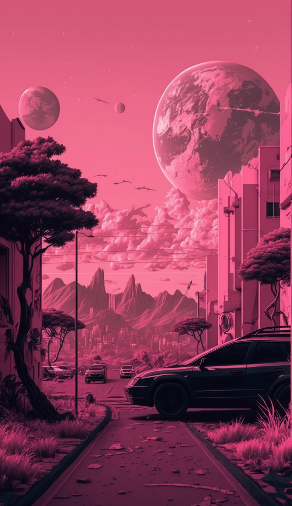
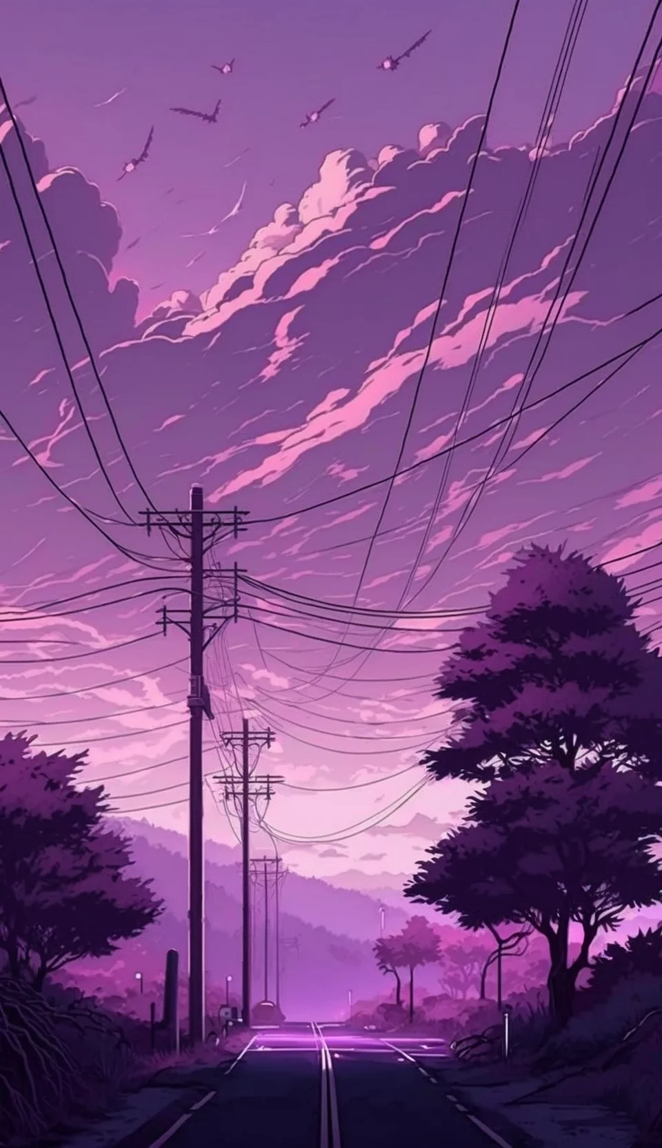
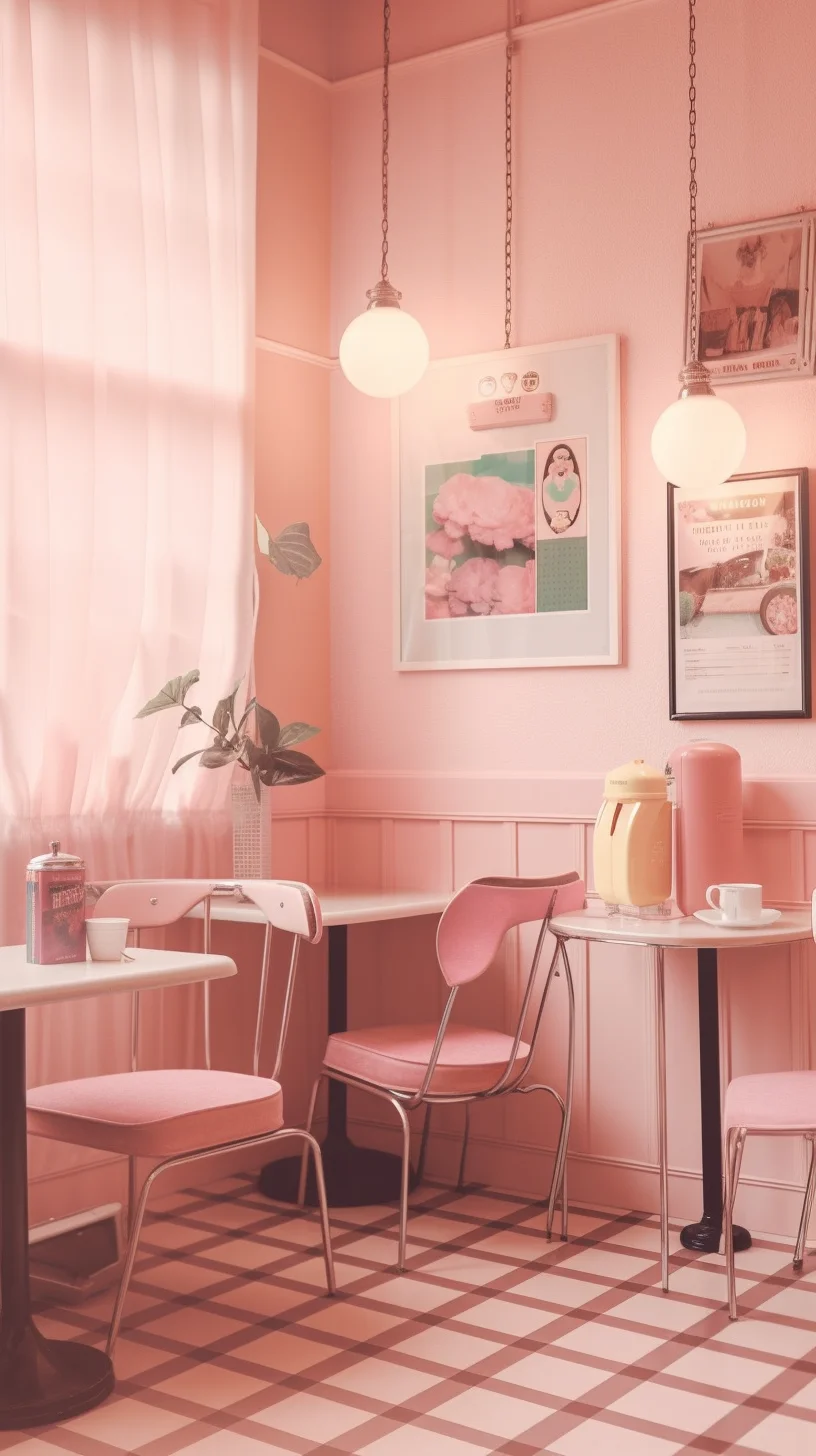
Pastels take the edge off a busy screen. Soft color, a hint of texture, plenty of breathing room so icons don’t shout. This set is for people who want their phone to feel calm without turning everything beige.
👉 Browse/Download: https://doitbeforeme.com/pastel-aesthetic-wallpaper/
The Vibe
Think paper, not plastic. A little grain so gradients don’t look fake. Colors that sit in the middle: blush, powder blue, sage, taupe, so labels stay readable and widgets don’t get lost. If you live in dark mode, the versions that float on deep gray feel especially good (and yes, a touch easier on battery).
Lock & Home that play nice
Lock screens look better with a small focal point: an off-center curve, a frosted shape, a soft horizon, so the time lands neatly. Home screens want quiet backgrounds so apps stay clear. Keep them in the same family (e.g., mauve on lock, cool gray on home) and the whole phone suddenly feels intentional.


Quick Setup Notes
Turn off perspective zoom for clean edges. If icons feel busy, lower wallpaper contrast a notch when you set it. Leave calm space near the Dynamic Island/notch and above the dock; it pays off every day. These files are sized for current iPhones, so you shouldn’t need to fight the crop.
Grab what you like
Open the gallery, long-press to save, done. If you rotate looks with Focus modes, pick one slightly deeper pastel for Work and a softer one for Personal: same palette and different tone.
Download: https://doitbeforeme.com/pastel-aesthetic-wallpaper/
Tell me your iPhone model and two colors you love and I’ll point you to a lock/home duo that won’t fight your icons.


